Your living room looks like a shoe box had a baby with a closet, and you’re tired of pretending it’s fine. Good news: I’ve found 15 real living rooms (not those fake magazine setups) where people actually solved the small space puzzle without selling a kidney for a bigger apartment.
These are spaces where real humans live, watch Netflix in their pajamas, and occasionally pretend to be adults who host dinner parties. Each one has specific tricks you can steal right now, from sneaky furniture placement to color choices that genuinely make your room look less like a sardine can.
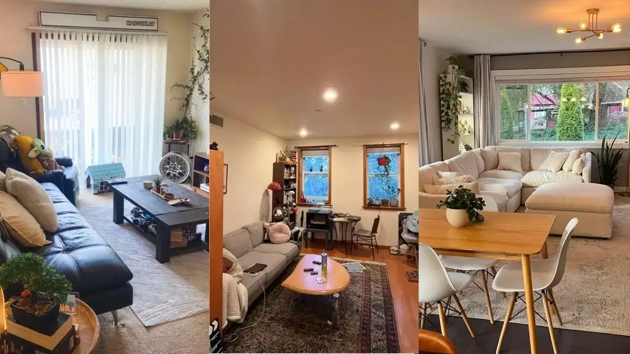
Neutral Sectional with Strategic Zoning

This space figured out how to separate living and dining areas without building actual walls, which is genius because walls cost money and make small spaces feel even smaller.
A cream sectional anchors the living zone while a simple wooden dining table claims its territory right behind it. One large area rug defines the seating area, creating visual separation without blocking anyone’s path or making the room feel chopped up.
The oversized sectional includes a chaise ottoman that gives you extra seating without cluttering everything with a million chairs. Notice those taupe curtains stretching from ceiling to floor? That’s the secret sauce that draws your eye upward and tricks your brain into thinking the room is taller.
Here’s the kicker: The walls are gray, which should theoretically make the space feel like a cave. But it doesn’t, because multiple windows flood the room with natural light and the white door plus trim create contrast that keeps things fresh.
The brass chandelier adds warmth without screaming for attention like that one friend who makes everything about them.
The takeaway: Start with your largest furniture piece in a neutral tone. Let it do the heavy lifting while smaller items like dining chairs and coffee tables bring in warmth through natural wood tones.
Compact L-Shape Layout with French Doors
Some rooms come with architectural features that seem specifically designed to ruin your life. This one has French doors eating up precious wall space, but the layout works around them like a pro.
The L-shaped sectional fits perfectly into the corner opposite those doors, leaving the center of the room beautifully open. The gray sectional has clean lines that don’t overwhelm the modest footprint, and a matching ottoman pulls double duty as both coffee table and extra seating.
What really stands out here is the restraint. One small side table. One floor lamp. Minimal wall art. That’s it.
The patterned rug adds visual interest without creating chaos, and its neutral tones tie together the gray furniture and warm hardwood floors in a way that feels intentional, not accidental.
French doors need clearance to swing open (shocking, I know). Positioning furniture away from their swing path keeps the room actually functional instead of just pretty. The single accent chair tucked to the side provides additional seating without blocking traffic flow.
Bold Pattern Mixing with Geometric Rug
Not every small living room needs to whisper politely in beige and white. This space proves you can go bold if you balance it right, and honestly, it’s refreshing.
A dark gray sectional grounds the room while a graphic black and white patterned rug creates instant visual drama. Throw pillows in mustard and teal pop against the neutral base, picking up the warm tones from the light wood furniture.
The round coffee table is small enough to navigate around without bruising your shins but large enough to actually hold your coffee. Revolutionary concept.
The checkerboard wall art echoes the rug’s geometric pattern without copying it exactly. That’s way smarter than perfect matching, which can look like you bought everything in one panicked IKEA trip.
The arc floor lamp with its woven shade adds texture and draws light into the seating area. White sheer curtains soften the window without blocking precious natural light, which becomes critical when you’re working with darker furniture in a small room.
The cube shelf unit provides vertical storage, keeping your stuff organized without spreading across the floor like a yard sale.
Also Read: 10 Inspiring Black Living Room Decor Ideas for Dream Homes
Teal Accent Wall with Built-In Storage

People love to hate on accent walls, calling them dated and basic. But they work when you do them with actual intention instead of just painting a random wall because Pinterest told you to.
This teal wall creates a focal point that gives your eye somewhere specific to land instead of bouncing around the room like a confused ping pong ball.
The fireplace sits centered on that teal wall, flanked by white built-in shelving that turns functional storage into actual decor. Books and personal items fill those shelves, proving you can display your stuff without it looking like clutter.
The gray sectional faces the fireplace, creating a natural conversation area even in this elongated room. Two accent chairs in different styles add character without demanding everything match like you’re living in a showroom.
One chair rocks the traditional wood-framed vibe, the other brings modern curved design in dusty rose. They provide extra seating without the visual weight of another sofa crushing the room’s vibe.
Dark wood floors throughout could have made this space feel heavy and depressing, but the white trim and neutral walls balance it out perfectly. Crown molding adds architectural interest that draws your eye upward.
Pro tip: If you’re considering an accent wall, put it behind your room’s natural focal point. It reinforces what’s already there instead of competing with it.
Tufted Seating Arrangement in Monochrome
Going monochromatic doesn’t equal boring when you actually vary your textures and shades. This room commits hard to a gray palette but keeps things interesting through tufted details on every single seating piece.
Three tufted pieces in different shades of gray create actual depth instead of that flat, sad look monochrome sometimes gives you. A loveseat, a larger sofa, and an armchair all sport button-tufted backs that add visual texture without introducing new colors.
The white and glass coffee table keeps the center light and airy. It doesn’t compete for attention, which is exactly what you want from a coffee table (hot take, I know).
Layered rugs in different shades of gray and teal add warmth to the hardwood floors without introducing colors that clash with everything else. That touch of teal appears again in the window treatment and small decor items, giving the neutral palette just enough color to feel intentional rather than unfinished.
The TV sits on a simple black console, maintaining the streamlined look. Plants bring life to the space without demanding a complete color overhaul or fighting with your existing palette.
When you limit your color palette this strictly, varying your textures and tones becomes absolutely essential to avoid that depressing hotel room flatness.
Family-Friendly Setup with Colorful Area Rug
Real life includes kids, pets, and the glorious mess that comes with both. This living room acknowledges that reality while still looking put together, which is basically magic.
Two gray sectionals face each other across a vibrant multicolored area rug that’s clearly designed to hide every stain known to humanity. Smart move.
A white fireplace anchors the room, with built-in cabinets on each side providing crucial storage (because kids own approximately 47,000 toys). The sectionals create a U-shape that defines the space and provides plenty of seating for family movie nights.
Notice the practical choices here: Dark floors, stain-friendly rug, washable-looking upholstery. The colorful rug brings personality without requiring you to treat it like a museum piece.
Small plants on the mantle and a snake plant in a decorative pot add life without taking up precious floor space that kids need for their chaotic floor activities.
The TV mounts above the fireplace, which design purists absolutely hate but families often desperately need. Sometimes function beats design rules, and that’s okay.
This room proves you can have kids and pets without living in complete chaos if you choose materials and layouts that work with your lifestyle instead of against it.
Also Read: 10 Stylish Shelf Decor Ideas to Transform Your Living Room
Bookshelf Room Divider in Studio Layout
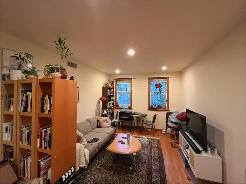
Open floor plans and studios need creative solutions for creating separate zones without building actual walls (expensive) or hanging sad curtains (depressing).
This space uses a tall bookshelf as a room divider between the living area and what looks like a dining or work space. The orange bookshelf serves triple duty: storage, display, and visual separation.
Books and decorative items fill the shelves, making it functional and interesting to look at from both sides. The gray loveseat sits perpendicular to the windows, creating an intimate seating area that feels separate from the rest of the space without requiring drywall.
An oval coffee table in light wood keeps the center open and its curved edges make navigation easier in tight quarters. You won’t destroy your shins on sharp corners at 2am when you’re stumbling around for water.
The patterned area rug defines the living zone clearly. Windows without heavy treatments let in maximum light, which helps the compact space feel less like you’re living in a cave.
Plants on top of the bookshelf draw the eye upward and add life to the room. The key here is using furniture as architecture when you don’t have walls to work with.
Narrow Room with Entry Console Styling
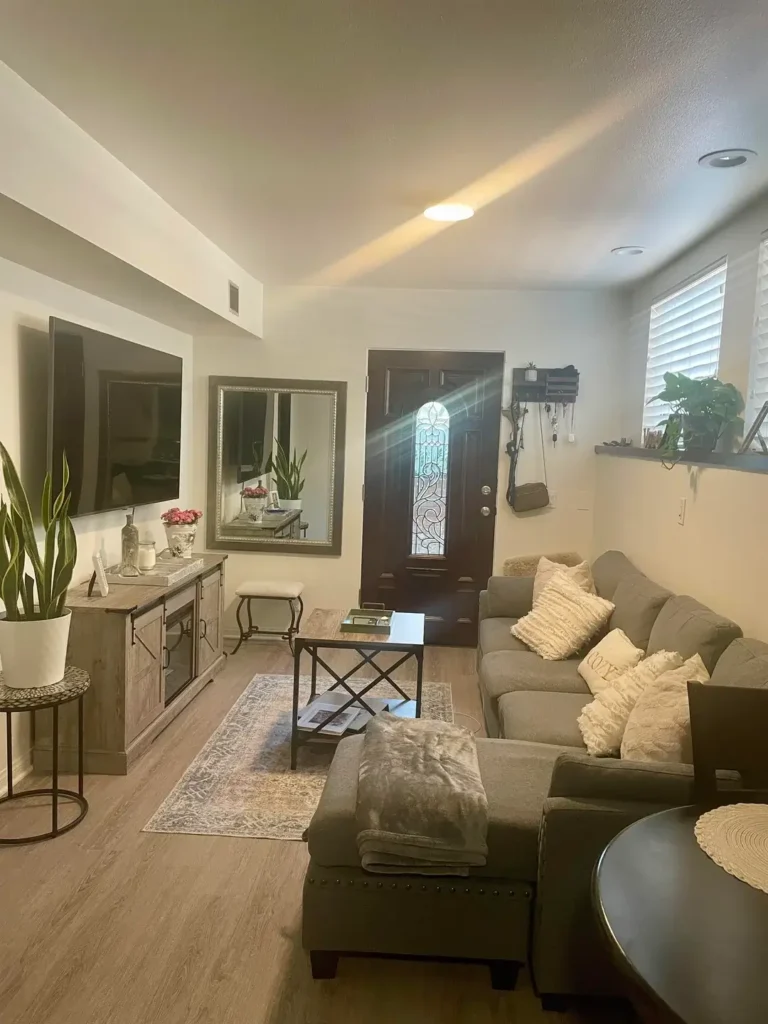
Some living rooms are basically hallways that someone optimistically decided to call a room. This narrow space makes the most of its awkward proportions through smart furniture choices instead of just giving up and crying.
A sectional with an ottoman sits against the longest wall, maximizing seating without cutting the room in half like a sad Berlin Wall situation.
An entry console with a large mirror sits against the opposite wall, serving the practical purpose of creating a landing zone. The mirror reflects light and makes the space feel wider, which is basically interior design witchcraft.
The console styling is intentional: A table lamp for ambient lighting, a small stool tucked underneath, and a plant for life. The mirror’s ornate frame adds elegance without requiring floor space you don’t have.
A small area rug grounds the seating area without overwhelming the limited floor. Cream and beige tones throughout keep the narrow space from feeling like a depressing tunnel.
Pops of texture from throw pillows and the textured ottoman add interest without visual clutter.
When you’re working with a challenging shape, embrace it instead of fighting it. This room succeeds because it works with its narrowness instead of pretending it’s something it’s not.
Decorative Wall Panels with Sectional Placement
Architectural details can transform plain, boring walls into focal points without requiring actual renovation or a construction crew tearing apart your life.
Gold-trimmed white panels frame the walls, creating a sense of architecture that the room likely didn’t have originally. It’s like giving your walls a fancy outfit.
A gray sectional faces a tufted bench that serves as a coffee table. The mix of furniture styles from modern to traditional gives the space personality without feeling like a confused showroom that can’t decide what it wants to be.
Large framed artwork anchors the main wall, placed at the right height to connect visually with your eye level when you’re sitting down. The floor lamp provides task lighting for reading, and plants on the windowsill bring the outside in without hogging floor space.
This room balances lived-in comfort with intentional design. You can see personal items and signs of everyday use, which makes the space feel authentic instead of staged for Instagram.
Adding architectural interest through panel molding or trim work can elevate a basic room dramatically, and it’s more accessible than most people think. You don’t need to be a master carpenter or rich.
Also Read: 12 Trendy Mid Century Modern Living Room Ideas Designers Love
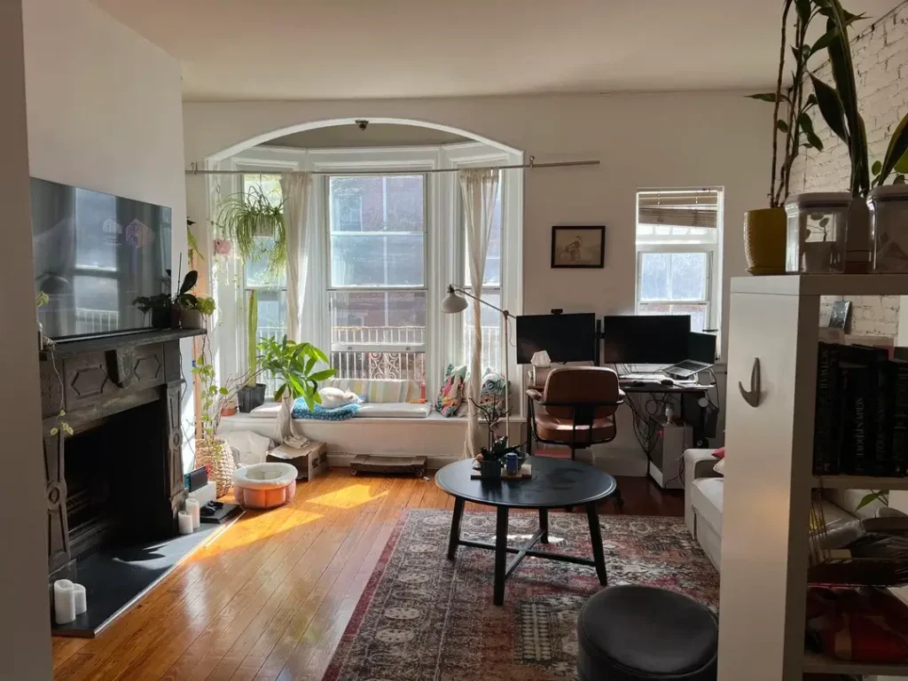
Multi-Functional Space with Desk Integration
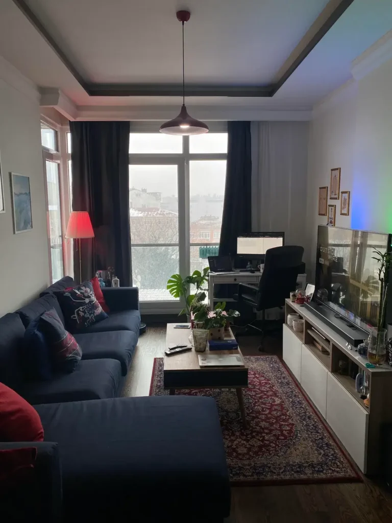
Not everyone has the luxury of a separate home office, especially in small apartments where every square inch counts for something.
This living room incorporates a work area without looking like a confused space having an identity crisis.
A navy sectional creates the primary seating area while a white desk setup occupies the opposite side of the room near the windows. The desk positioning takes advantage of natural light, which matters big time if you work from home and don’t want to feel like you’re in a dungeon.
The desk sits on a separate area rug, visually separating work from relaxation. This helps your brain understand that couch equals Netflix and desk equals actual productivity.
The narrow coffee table doesn’t obstruct movement between the seating and desk areas. A modern pendant light defines the dining zone in the background, showing how one small space can serve multiple functions if you’re deliberate about zoning.
Navy and white create a crisp, clean palette that works in both work and living contexts. Pops of red from throw pillows and a table lamp add warmth without overwhelming everything.
When you need your living room to multitask, use rugs and lighting to create distinct zones for different activities. Your brain will thank you.
Archway Division with Work-From-Home Setup
Architectural features like archways naturally create zones within open spaces, basically doing half the design work for you.
This room uses its existing archway to separate a bay window sitting area from the main living space, and it works beautifully.
The bay window becomes a dedicated work area with a desk positioned to maximize natural light and the view. The windowsill fills up with plants that thrive in bright conditions, creating a green backdrop for video calls that makes you look like you have your life together.
A round black coffee table anchors the main seating area, which includes a sectional and additional floor seating for when you have more guests than furniture.
The archway frames the work area perfectly, making it feel like a separate room without the isolation of a closed door. Warm wood floors throughout unify the spaces while the vintage area rug adds character and color.
A decorative fireplace on the left provides architectural interest even when it’s not functional (which is most fireplaces in apartments, let’s be honest).
The mix of modern and vintage elements creates an eclectic vibe that feels collected over time rather than bought in one panicked shopping trip.
When you have existing architectural features, lean into them as natural dividers instead of working against them.
Warm Yellow Walls with Traditional Furniture
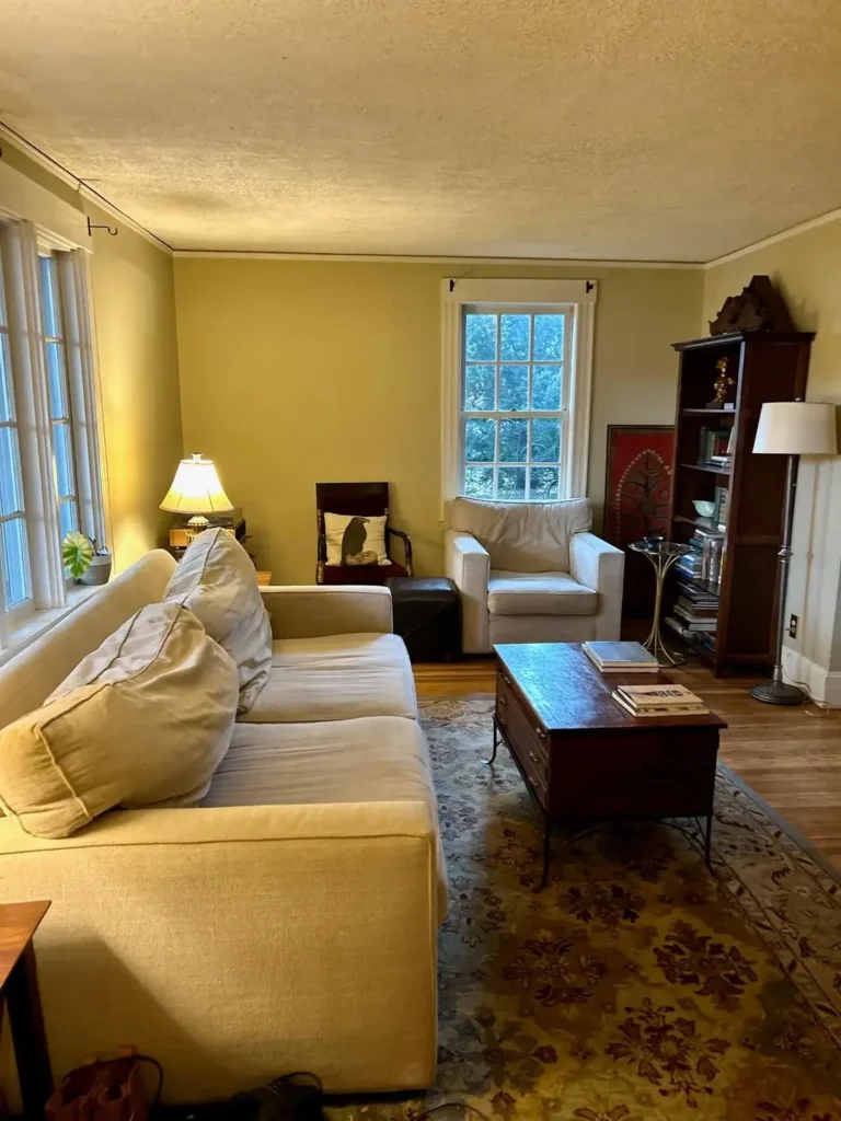
Yellow walls get a bad reputation, mostly because people remember that aggressive school bus yellow from the 90s. But the right shade creates warmth without making your eyes hurt.
This room uses a soft, buttery yellow that feels cozy rather than aggressive. It’s like sunshine decided to live on your walls without being obnoxious about it.
White furniture provides clean contrast against the yellow walls without fighting them. A deep sofa, two armchairs, and a dark wood coffee table trunk add storage and surface area in one piece.
The antique bookshelf in dark wood brings vertical interest and provides display space for personal items, books, and whatever random stuff you’ve collected over the years.
The patterned area rug pulls together the room’s colors while adding visual interest to the hardwood floors. Traditional furniture styles create a classic look that feels timeless rather than trendy (which will look dated in three years).
The room has a collected, lived-in quality with books, magazines, and personal items visible. It looks like people actually live here, which is refreshing.
Yellow can make a small room feel sunny and inviting when you balance it with enough white and neutral elements. The key is choosing a shade that leans warm rather than brash and shouty.
Plant-Filled Bohemian Living and Dining Combo
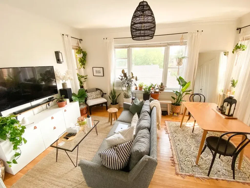
Plants can be decor, air purifiers, and a hobby all at once. This space embraces greenery as a primary design element instead of an afterthought or something you bought once and let die.
Multiple plants in various sizes occupy every available surface from the floor to shelves to the windowsill. It creates a jungle-like atmosphere that feels intentional and abundant rather than cluttered or chaotic.
A gray sectional provides seating while a wooden dining table shares the space, making this a true multi-use area that serves different purposes throughout the day.
The woven pendant light adds texture and reinforces the natural, organic vibe that plants naturally bring to a space.
White walls and curtains provide a clean backdrop that lets the plants and wooden furniture tones become the focus. The patterned area rug adds interest without competing with the plants for attention.
This approach works best if you’re genuinely committed to plant care, though. Half-dead greenery looks way worse than no greenery. Trust me on this.
But if you actually enjoy tending plants, letting them be a major design element creates a unique space that feels alive and personal. The oversized pendant light proves that going bold with one element can define an entire space.
Mid-Century Modern with Layered Textures
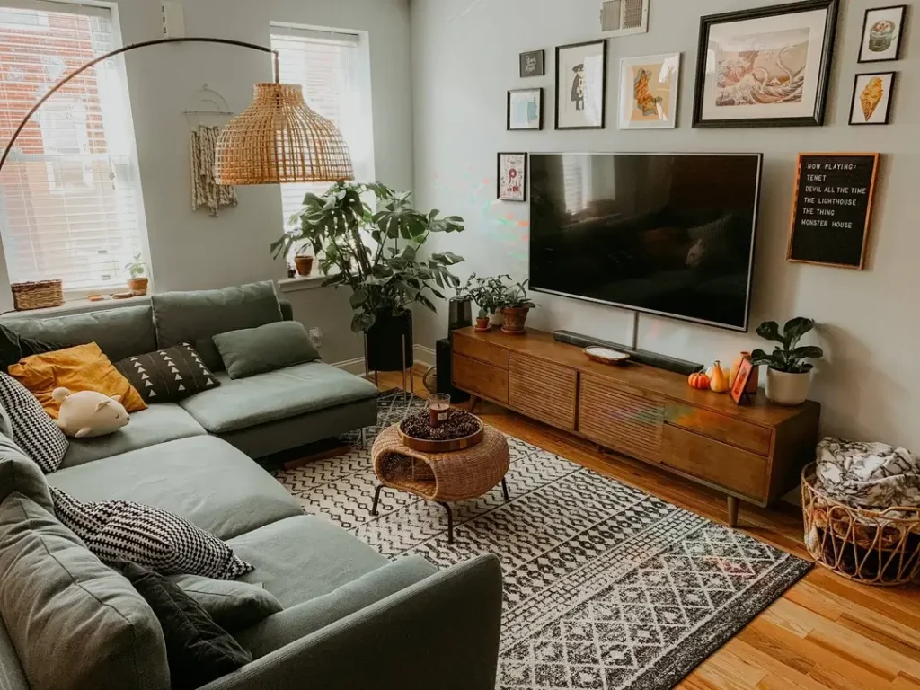
Mid-century modern furniture works particularly well in small spaces because of its clean lines and raised legs that create visual lightness. This room commits to the style fully instead of half-heartedly mixing it with random stuff.
A sage green sectional anchors the room with its low profile and simple silhouette. A wooden media console features the characteristic angled legs and horizontal slat details that define mid-century design.
A woven basket serves as a coffee table, adding texture and storage while maintaining the organic materials focus that mid-century style loves.
The gallery wall combines artwork in black frames, creating a curated look that adds personality without overwhelming the space or looking like you stuck random things on the wall with no plan.
A woven pendant lamp in an oversized teardrop shape makes a statement while providing ambient light that’s actually useful instead of just decorative.
The patterned area rug layers pattern and color in a way that feels cohesive with the overall aesthetic instead of fighting with it.
Plants in terra cotta pots continue the natural materials theme. What makes this room really work is the consistency of style throughout every element.
When you commit to a specific aesthetic and actually follow through with furniture, lighting, textiles, and accessories, even a small space reads as intentional and well-designed instead of random.
Compact Apartment with Vertical Plant Display
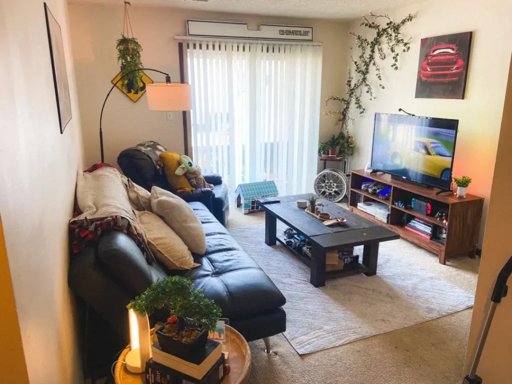
Vertical space often goes completely unused in small living rooms, which is basically wasting free real estate on your walls.
This apartment maximizes every available inch, including walls and corners for plant display, and it looks fantastic.
A black leather sectional provides seating while keeping the floor plan open. A simple black coffee table with lower shelf storage maintains function without adding bulk that makes the room feel crowded.
The wooden media console offers closed storage below and open shelving for displaying items you actually want to see.
What really distinguishes this space is the creative plant placement. A hanging planter near the window, plants on stands of different heights, climbing vines on the walls. The corner features what looks like a vintage wheel hung as art with plants arranged around it.
This layered approach to greenery creates depth and interest that flat decorating just can’t achieve.
The red and yellow artwork adds a pop of color that energizes the otherwise neutral palette. String lights or decorative lighting elements in the corner add ambiance for evening hours when overhead lighting feels too harsh.
When floor space is limited, think vertical. Walls, corners, and hanging options can add personality and life to your room without sacrificing precious floor space.
Comparing Styles: Finding Your Small Living Room Approach
Different spaces call for different strategies, and understanding the core approaches these examples demonstrate can help you figure out which direction makes sense for your specific situation.
- Neutral Minimalist works best for light-starved rooms and renters who can’t paint. Focus on cream and gray furniture with simple lines and strategic rugs. Budget is moderate.
- Bold Pattern Mix suits personality-driven spaces with good natural light. Think graphic rugs, mixed patterns, and statement pieces that actually make a statement. Also moderate budget.
- Monochromatic Layered creates calm and makes small spaces feel larger. Vary textures in one color family with tonal variation throughout. Slightly higher budget for quality pieces.
- Multi-Functional Zones saves studio apartments and work-from-home setups. Integrate desks, use area rugs for definition, and install flexible lighting. Moderate budget.
- Plant-Forward Design perfect for plant enthusiasts with spaces that get good light. Multiple greenery levels, natural materials, and organic shapes. Cheapest option if you propagate plants.
- Mid-Century Focused appeals to modern aesthetic lovers in spaces needing visual lightness. Raised-leg furniture, clean lines, and wood tones. Higher budget for authentic pieces.
Making These Ideas Work in Your Actual Space
The examples you’ve seen share common threads that matter way more than specific furniture pieces or exact color choices.
They use rugs to define zones instead of walls or dividers that chop up the space. They choose furniture scaled appropriately for the room rather than trying to cram standard-sized pieces into spaces where they don’t fit.
They maximize natural light through window treatments that don’t block it like sad heavy curtains. They create vertical interest when floor space runs out and adding more furniture would create a obstacle course.
Your small living room has constraints these rooms didn’t have, and advantages they didn’t either. Maybe you have better light, or worse. Maybe you need more storage, or less seating.
The principles remain the same: Work with your space rather than against it. Choose furniture that serves multiple purposes when possible. Create visual interest through texture and color even when you can’t add more furniture.
Small doesn’t have to mean cramped or sad. It just means you need to be more intentional about every single choice you make.
Final Thoughts
Look, small living rooms can absolutely work without feeling like you’re living in a closet. These 15 real examples prove that limited square footage doesn’t automatically mean limited style or comfort.
The trick is stealing the strategies that actually work (zoning with rugs, maximizing vertical space, choosing multi-functional furniture) and ignoring the stuff that doesn’t fit your life.
You don’t need a massive space to create a room you actually want to spend time in. You just need to be smart about it and stop trying to force solutions that work in big rooms into your small space.
Pick the approach that fits your style, your budget, and your actual lifestyle. Then commit to it instead of half-heartedly trying everything at once.
What small living room trick are you going to try first?