Let me be honest with you. Pinterest boards are beautiful, but they’re also kind of useless. Every room looks like a staged hotel lobby where nobody actually lives. No throw blankets shoved behind cushions. No pet hair. No mystery pile on the coffee table.
So I went to Reddit instead, and honestly? Best decision ever.
The mid century modern living rooms I found there belong to real people. People decorating on actual budgets, dealing with awkward layouts, and making bold choices that design rulebooks would probably flag as illegal. Some of these rooms will genuinely surprise you. A few might completely reshape how you think about what mid century modern can look like in a home where someone actually, you know, lives.
I pulled together twelve distinct examples, each taking a different approach to the style. Whether you’re starting completely fresh or just trying to add a few intentional pieces to what you already own, there’s something here worth stealing.
Bold Orange Velvet and a Fireplace That Actually Gets Used
There’s a version of mid century modern that plays it extremely safe. Walnut everything, muted sage green, tasteful restraint that quietly screams “I read three interior design blogs before I gave up.” Then there’s this room, which goes the complete opposite direction and is way more interesting for it.
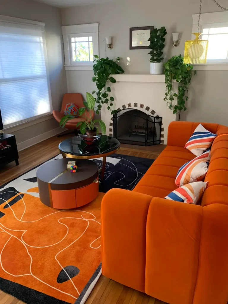
The r/CozyPlaces user who built this space centered everything around an orange velvet sectional that most designers would call a risk. The sofa’s chunky tufted form sits opposite a white painted fireplace flanked by cascading pothos plants. An abstract orange and black rug anchors the whole arrangement. A round black marble coffee table with brass trim keeps things grounded without stealing attention.
A matching burnt orange accent chair with a colorful woven pillow completes the warm, saturated palette.
What makes it work is commitment. Half-measures with bold color always look uncertain and a little sad. This room doesn’t hesitate for a single second. The plants soften the intensity while adding life to a scheme that could otherwise feel heavy. Walls are kept neutral light gray, giving all that orange room to breathe.
Here’s the move if you want to pull this off:
Choose a wall color that steps back and lets your furniture do all the talking
Pick your dominant color first and build everything around it
Repeat that color in multiple pieces (sofa, rug, accent chair, coffee table accents)
The MCM-Boho Crossover That Works Better Than It Should
Pairing mid century modern with bohemian décor sounds like a decorating mistake you’d make at 2am after too much confidence. Looking at this room makes you seriously rethink that assumption.
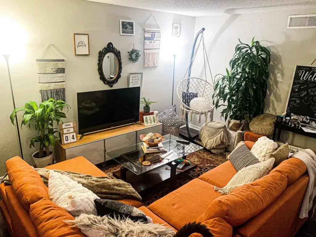
The r/depressedontheweeknd user created something genuinely warm by centering everything around another burnt orange sectional (clearly a fan favorite anchor in the MCM community) and then layering in macramé wall hangings, a hanging chair, woven baskets, and a richly patterned vintage rug. A glass top coffee table with a dark frame keeps things grounded. Houseplants in various sizes fill every corner with life.
The reason this works is texture. MCM furniture has clean lines and defined shapes, which creates natural tension with the soft handmade quality of bohemian textiles. That tension is actually interesting. A room that’s all clean lines reads cold. A room that’s all texture reads chaotic. This one finds the sweet spot between both.
To borrow this approach:
Keep plants large enough to make a statement, not just fill a corner
Start with a strong MCM anchor piece, something with a defined silhouette
Layer in organic textures gradually, not all at once
Macramé, rattan, woven throws, and layered rugs all play beautifully with MCM
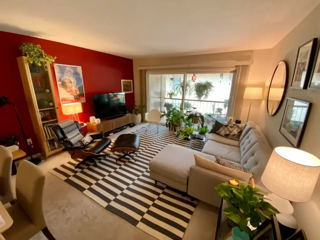
Wood-Planked Ceilings and Wall-Mounted Shelving Done Right
Some houses hand you a gift, and your only job is to not ruin it. A vaulted wood-planked ceiling with exposed beams is absolutely one of those gifts.
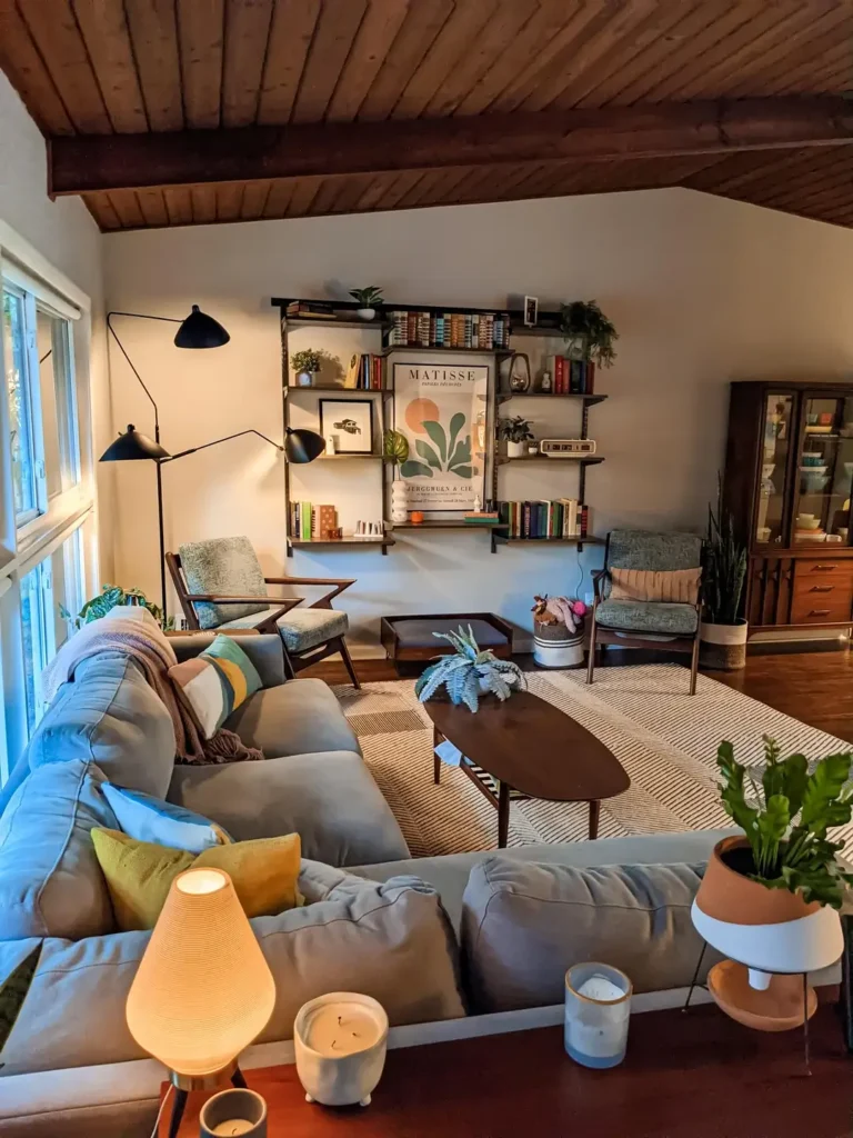
The r/motherly_wealth user accepted it graciously. A wall-mounted shelving system with black metal uprights and dark wood shelves creates an organized display wall without overwhelming the space. A Matisse poster anchors the center of the arrangement, surrounded by books, small plants, and carefully chosen objects. A gray sectional with tapered wooden legs faces a simple walnut oval coffee table. Two classic MCM accent chairs with visible wooden frames complete the seating area.
The lighting deserves its own moment here. A multi-arm black floor lamp near the window and a small glowing table lamp on the sofa tray add warmth at different heights. Candles on the coffee table finish the layered lighting effect.
People consistently underinvest in lighting, and it shows. The difference between a room that feels alive at night and one that doesn’t almost always comes down to how many light sources are working together.
Wall-mounted shelving is one of the smartest investments you can make in an MCM living room. It keeps floors clear, maintains the style’s emphasis on clean horizontal lines, and gives you a flexible display surface you can rearrange whenever you feel like it. If your home has architectural bones worth showing off, let them lead everything else.
Also Read: 10 Stylish Shelf Decor Ideas to Transform Your Living Room
Cognac Leather, a Kilim Rug, and More Plants Than You Think You Need
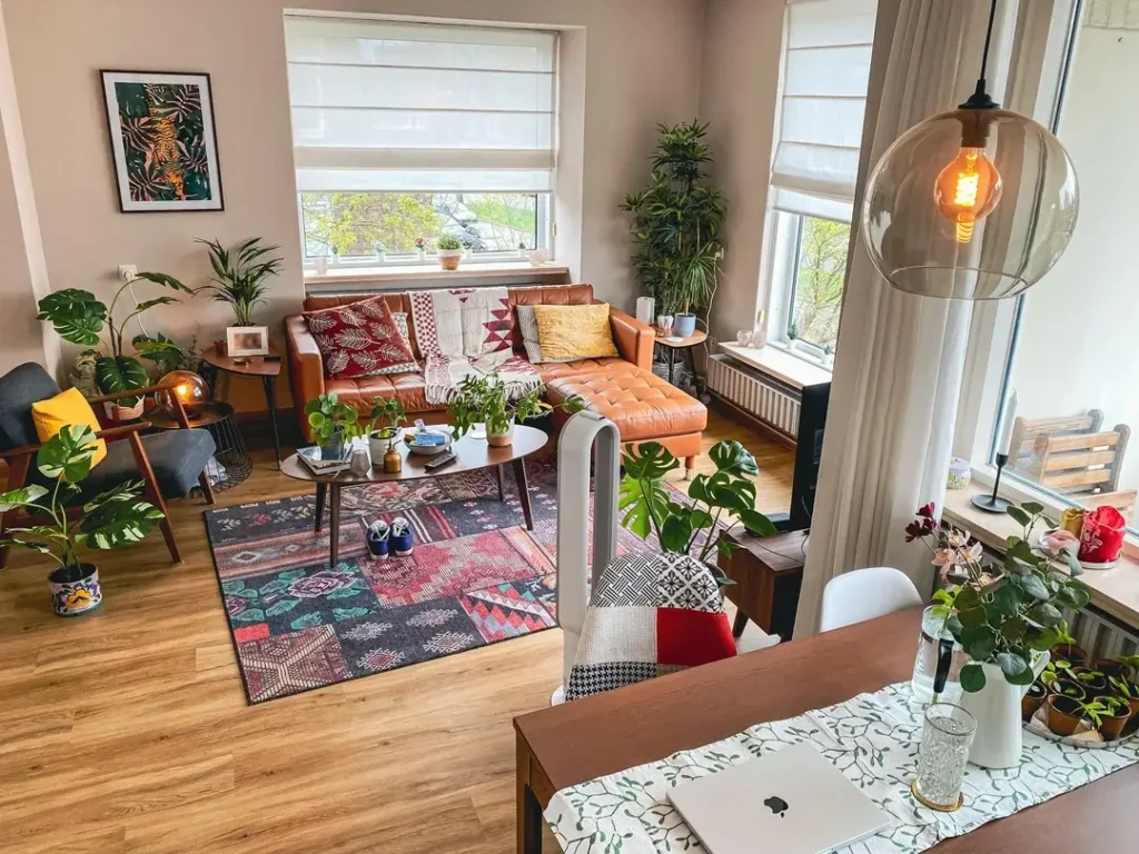
This apartment makes a strong case that mid century modern doesn’t have to be precious or minimal to feel genuinely refined. You can have abundance. You can have a lot of plants. Trust the process.
The r/BleuZ user assembled a room with real visual generosity. A cognac leather chaise sectional sits near floor-to-ceiling windows. An oval walnut coffee table on splayed legs anchors the center. A large patchwork kilim rug in deep reds, charcoals, and teals grounds the whole arrangement.
But the plants are what elevate everything. Monstera deliciosa in decorative pots, a tall dracaena in the corner, smaller plants on windowsills and the coffee table. The room is genuinely dense with green in a way that feels abundant rather than cluttered. There’s an art to that balance, and this room nails it.
A globe pendant light with a visible Edison bulb hangs nearby. A tiger print in jewel tones decorates the wall. The whole space feels curated but casual, which is honestly one of the hardest balances to actually achieve.
If you’re choosing one investment piece for your MCM living room, a well-made leather sofa might be it. Leather ages beautifully and pairs well with both warm wood tones and bold textiles. Pair it with a traditional or vintage rug to soften the combination and keep it from feeling too corporate and sterile.
The Full 1970s Time Capsule for People Who Mean It
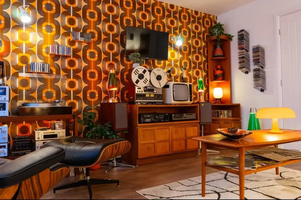
At some point, half-measures become their own problem. IMO, if you love the 1970s MCM aesthetic that deeply, why not just go all the way?
The r/macnerd93 user created what might be the most committed room in this entire collection. The feature wall is covered in bold geometric wallpaper in orange, brown, and amber, the kind of pattern that was everywhere in 1975 and is making a very confident comeback. A teak credenza holds a reel-to-reel tape recorder, a vintage CRT television, a turntable, and various audio components. An authentic Eames lounge chair and ottoman in black leather sits in front. A low teak coffee table holds a lava lamp and a record sleeve.
What separates this from a costume is intention. Every piece belongs here because it was genuinely used in this era. The wallpaper is a reproduction of a period design, not a novelty print you grab for irony. The audio equipment actually functions. This is a room built by someone who truly loves the music and culture of this period.
If you’re going this direction:
Surround them with thrift store finds and the room reads knowledgeable rather than theatrical
Invest in a few genuine vintage pieces to anchor the room
A real Eames chair, an original teak credenza, or authentic wallpaper give everything else credibility
Cognac Leather Meets Exposed Brick in an Urban Loft Setting
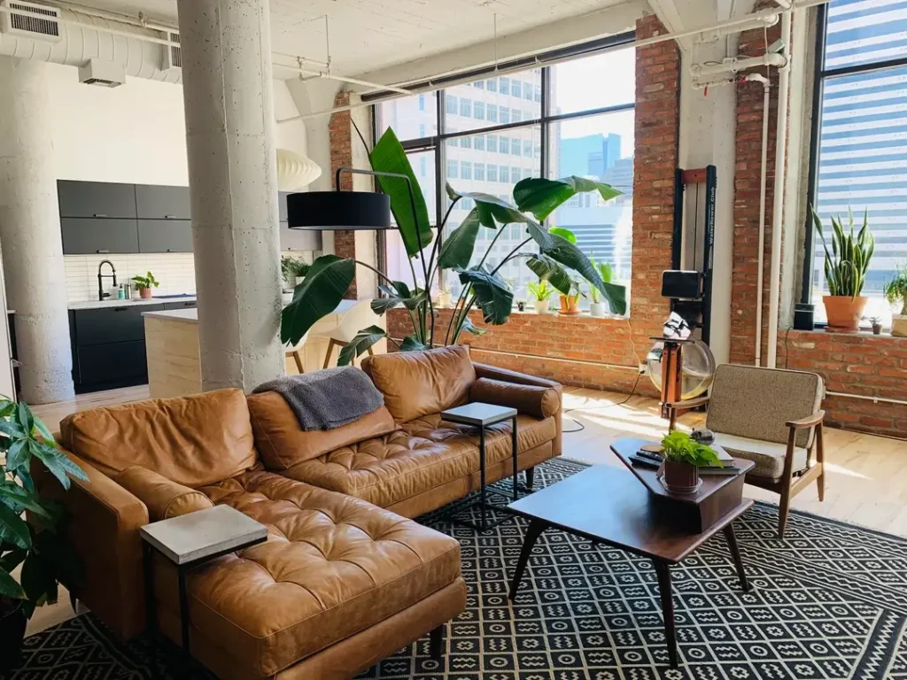
Not everyone decorating in mid century modern style is working with a 1962 ranch house. Some are working with converted industrial buildings, and this example shows exactly what that combination can look like.
The r/littleleach user demonstrates how MCM furniture translates beautifully into raw industrial spaces. A large cognac leather sectional with deep tufting and a chaise extension occupies the center of the room against floor-to-ceiling steel-framed windows. Exposed brick columns frame the view. A dark walnut coffee table on tapered metal legs sits on a geometric black and white rug. A massive bird of paradise plant reaches toward the ceiling.
The contrast between warm cognac leather and cool industrial concrete is doing exactly what great interior design does. It creates productive tension between opposing materials. Leather is warm, smooth, and luxurious. Brick is rough, cool, and historical. Together, they’re far more interesting than either would be alone.
If you’re working with exposed brick or concrete, don’t fight it:
It translates surprisingly well outside its original suburban context
Lean into warm wood tones, leather, and oversized plants as counterpoints
MCM was never afraid of raw materials
Also Read: 12 Trendy Mid Century Modern Living Room Ideas Designers Love
Deep Blue Accent Wall with Built-In Bookcases and Victorian Bones
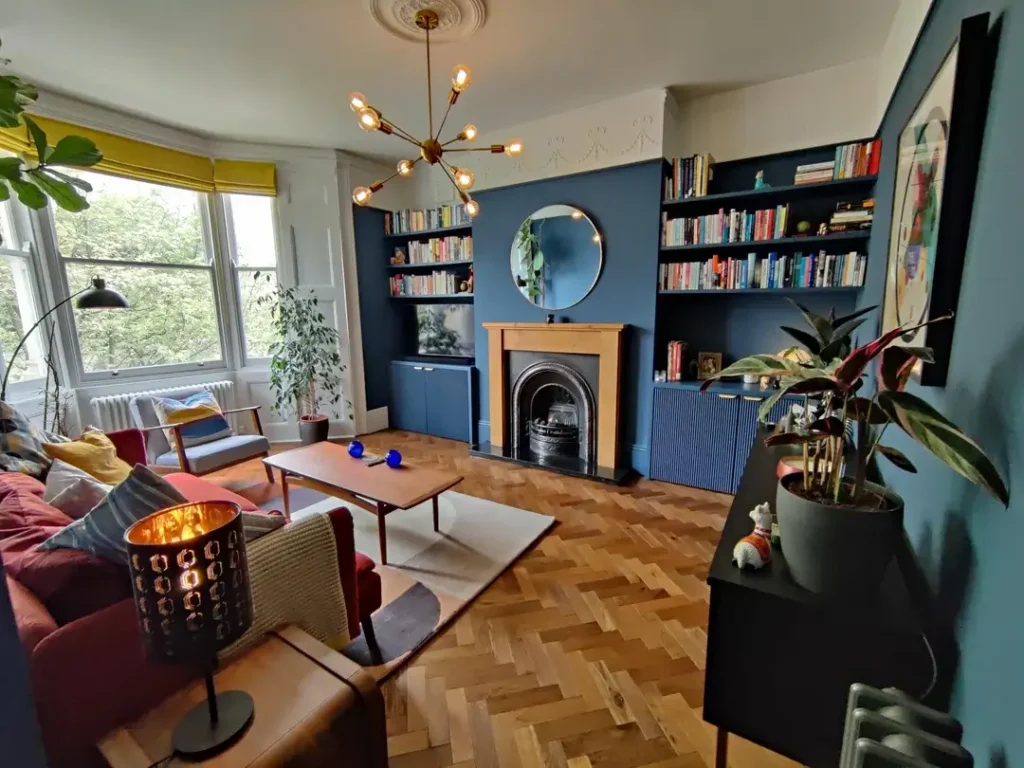
Plenty of homes have Victorian or Edwardian architectural features, original fireplaces, plaster ceiling medallions, tall sash windows, and their owners genuinely aren’t sure whether to lean into the history or work against it. This room answers that question pretty definitively.
The r/52north user painted the chimney breast and built-in bookcases a deep, moody blue-gray and let everything else follow that single decision. A Sputnik chandelier with exposed Edison bulbs hangs from the original ceiling medallion, one of the most effective possible combinations of old architecture and contemporary fixture. A parquet herringbone floor in warm honey oak anchors the space. A deep red-orange sofa provides color contrast against the blue wall.
The books themselves contribute to the overall design. Arranged loosely with plants, small objects, and framed art between them, they give the built-ins a lived-in quality that aggressively styled shelving often lacks. A round mirror above the fireplace reflects light from the large bay window opposite, preventing the darker wall from absorbing too much of the room’s brightness.
If your home has original architecture, paint is your most powerful tool. A strong wall color connecting built-ins to a chimney breast creates architectural unity and makes everything feel intentional. The Sputnik chandelier is a worthwhile investment, it does more work in a period home than almost any other single fixture.
Desert-Inspired Art, a Noguchi Coffee Table, and Vertical Moss Panels
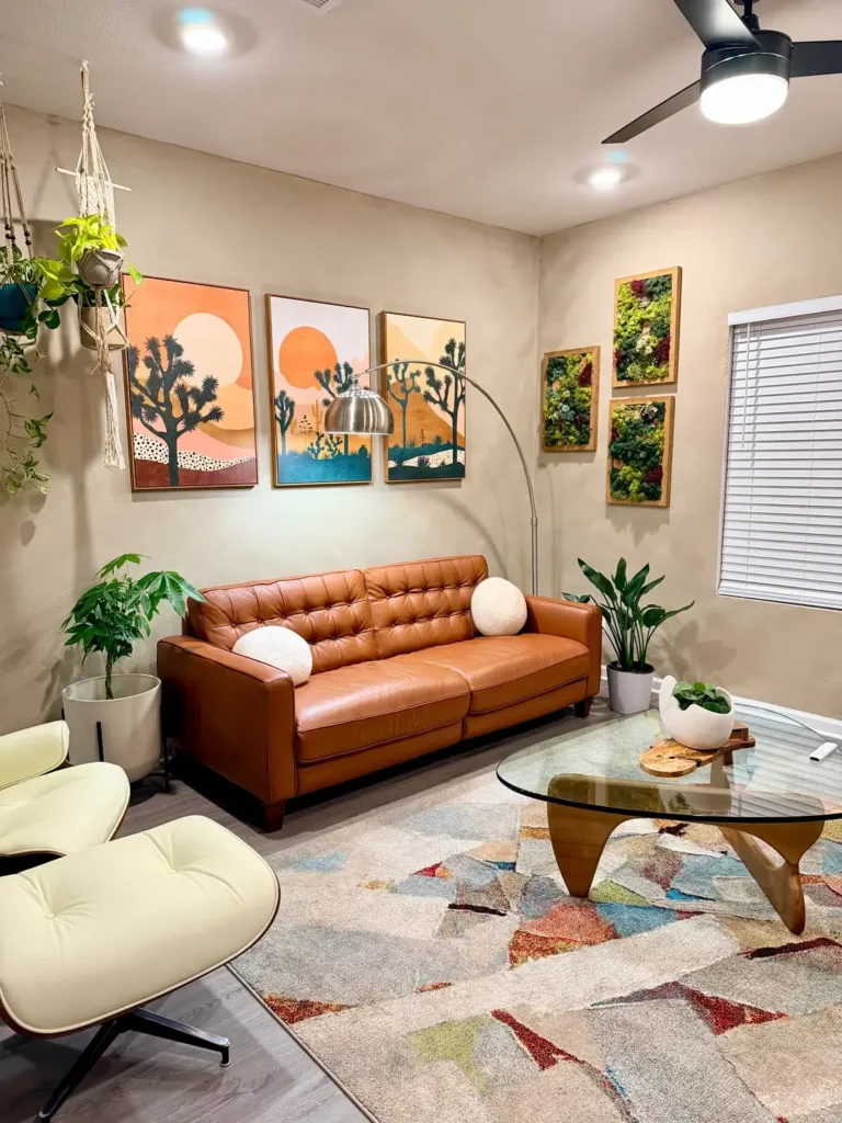
Some mid century modern living rooms feel anchored to a specific decade. This one somehow manages to feel completely timeless, which is genuinely harder to pull off than it looks.
The r/Dense-Worldliness463 user built a sun-baked, southwest-inspired version of the style that feels entirely coherent. Three Joshua tree landscape prints in terracotta, rust, and teal hang above a cognac leather button-tufted sofa. A Noguchi-style coffee table with a kidney-shaped glass top and sculptural wood base sits in front. A vintage Eames lounge chair and ottoman in cream leather anchors one corner. An arc floor lamp in brushed steel curves gracefully over the sofa.
On the adjacent wall, three framed panels of preserved moss in deep green and burgundy create a vertical garden effect that’s genuinely unexpected and kind of brilliant.
The color palette here reads as deliberately curated without feeling overdone. Warm beige walls, terracotta, rust, sage, and cream. Nothing in this room is accidental. The macramé plant hangers holding trailing pothos near the ceiling add the organic softness that leather furniture simply can’t provide on its own.
The Noguchi coffee table earns its iconic reputation. Its sculptural base functions as floor-level art. If your budget allows for one high-quality investment piece, this is worth serious consideration.
Navy Upholstery, Brass Accents, and a Sputnik Ceiling Fixture in a Ranch Home
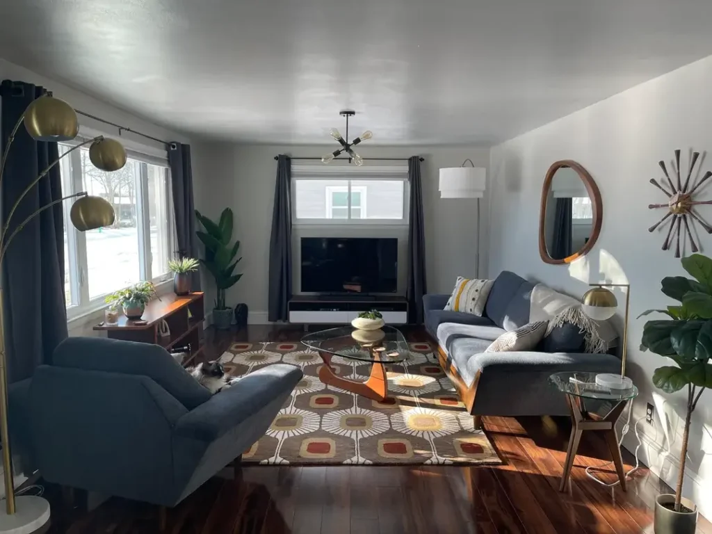
Ranch houses were genuinely built for this style. Seeing a well-executed MCM living room in one feels like watching something click perfectly into place, like finally finding the right puzzle piece you’ve been sitting on.
The r/timforreal user worked with a standard suburban ranch layout and produced something with real confidence. A navy blue sofa and matching accent chair with exposed wooden frames form the seating arrangement. A Noguchi-style coffee table in walnut and glass sits center-stage on a large area rug with a mid century geometric sunburst pattern in brown, orange, and yellow. A brass arc floor lamp stands to one side. A Sputnik pendant with a black canopy hangs from the ceiling.
On the wall, an organic-shaped walnut-framed mirror hangs near a starburst clock, both signature MCM decorative elements that work as well now as they did in 1962. Dark charcoal curtain panels add weight to the upper portion of the room. A cat appears to find the accent chair entirely acceptable. (Honestly, solid taste.)
Navy is a wildly underused sofa color in MCM spaces. Most people default to gray or tan, which are safe but a little forgettable. Navy paired with brass and walnut has a depth and elegance those safer choices just don’t achieve.
Also Read: 11 Creative Wall Decor Living Room Designs for Any Home
Dark Leather, Twin Palms, and the Power of Symmetrical Plants
Restraint is genuinely underrated. Not every room needs a statement wall, a bold rug, or a surprise color. Sometimes clarity is the statement.
The r/DeeZnutZzZ69 user (great username, by the way) proves this point with a room built around three strong choices that it then refuses to complicate. A dark chocolate leather sectional with visible button tufting faces a black and white media console. A walnut oval coffee table on splayed legs sits on a large vintage-style rug with soft faded tones in blue, rust, and sand.
Two large areca palms in white and natural fiber basket planters flank the TV symmetrically. The symmetry of those palms is doing serious heavy lifting. Plants placed symmetrically create a sense of calm and quiet formality that asymmetrical arrangements don’t. In a room that could feel stark with dark furniture and minimal décor, the plants add life, scale, and warmth all at once.
If you’re starting with a dark leather sofa, keep other surfaces lighter. The white credenza and light wood floors give this room its airiness. Too many dark surfaces together and the room starts closing in on you.
Teak Paneling, Yellow Accent Chairs, and a Scandinavian-MCM Blend
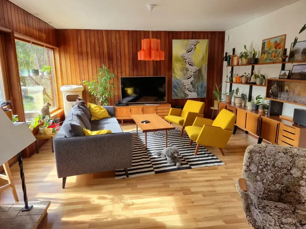
The overlap between Scandinavian modern and American mid century modern is real and historically documented. Both movements were happening simultaneously, sharing designers, materials, and ideas. This room lives comfortably in that overlap and looks fantastic doing it.
The r/Prisse112 user is working with a significant advantage: original teak wall paneling running floor to ceiling on one wall and wrapping around the corner. Two yellow mustard armchairs with slim black legs face a gray MCM sofa across a striped black and white rug. A walnut rectangular coffee table sits between them. A teak credenza holds a flat screen TV. An orange pendant lamp hangs above, adding a warm focal point against the paneled wall.
The yellow chairs are the room’s entire personality. Without them, this would be a pleasant but fairly subdued space. With them, it has energy and genuine wit. Yellow works particularly well against teak because the warm amber tones in the wood make yellow glow rather than shout.
If you have original wood paneling, treat it as an asset:
Keep your rug high-contrast to prevent the room from becoming too uniformly warm
Work with its warmth by adding colors that vibrate against it
Yellow, orange, and rust all perform brilliantly
Crimson Accent Wall, an Eames Lounge Chair, and a Room That Commits to Contrast
Red walls make people nervous. Looking at this room might genuinely cure that fear.
The r/SD_Seeker2 user painted one wall a deep, saturated crimson and built everything else in deliberate contrast to it. A cream tufted sectional and a classic Eames lounge chair with ottoman in black leather and rosewood veneer are the room’s primary furniture pieces. A bold black and white stripe-and-check rug provides strong graphic contrast underfoot. A vintage French film poster hangs on the red wall, its palette of reds, blues, and creams pulled directly from the room.
The Eames lounge chair and ottoman is arguably the most iconic single piece in mid century modern design history. Seeing it here in its natural habitat, facing a television in a real living room, is a good reminder that it was designed to be actually used, not carefully preserved behind a velvet rope.
What makes the red wall work is the specificity of the shade. This isn’t a bright primary red. It’s a deep, almost burgundy-leaning crimson that reads sophisticated rather than aggressive. Pair a bold wall color with neutral furniture and let the wall do all the storytelling.
What These Rooms Are Really Telling You
| Style Approach | Key Anchor Piece | Best Color Palette | Difficulty |
|---|---|---|---|
| Bold color-forward | Orange or red velvet sofa | Orange, amber, navy | Medium |
| MCM-Boho blend | Low-profile sectional | Warm neutrals + rust | Easy |
| Architectural showcase | Wall-mounted shelving | Soft gray + warm wood | Medium |
| Full vintage 1970s | Teak credenza + Eames chair | Brown, orange, amber | Advanced |
| Industrial loft MCM | Cognac leather sectional | Cognac, charcoal, green | Medium |
| Desert/southwest MCM | Button-tufted leather sofa | Terracotta, cream, sage | Easy |
| Period home MCM | Sputnik chandelier | Deep blue, brass, warm oak | Medium |
Running through twelve different mid century modern living rooms reveals a few consistent truths that most design guides skip right over.
This style is far more flexible than its reputation suggests. It absorbs bohemian textures, industrial materials, Victorian architecture, and desert palettes without losing its identity. That flexibility comes from the underlying principles: honest materials, functional furniture with considered forms, and a general preference for warmth over cold austerity.
The rooms that work best in this collection share one quality. They were clearly designed for people who actually live in them. The cat on the accent chair, the Rubik’s cube on the coffee table, the record sleeves on the floor. These rooms have real occupants. Mid century modern was always meant to serve living, not just display it.
The single most practical takeaway from all of this? Choose one strong anchor piece and build outward from it. Whether that’s a cognac leather sofa, a set of yellow accent chairs, or a deep blue accent wall, having something the room is organized around gives everything else a clear purpose. Rooms without an anchor tend to feel like they’re still searching for themselves, and honestly, we’ve all been there.
Pick your anchor. Start there. The rest gets a lot easier than you think.