Okay, real talk. If you’ve got a small bathroom and you think wallpaper will make it feel like a closet, you’ve been listening to the wrong people.
I’m so tired of seeing cramped bathrooms painted boring white because someone read a design rule from 1987 that said “small spaces need light colors.” That advice is keeping your bathroom trapped in bland territory when it could be the coolest room in your house.
Here’s the truth: small bathrooms are perfect for wallpaper. You don’t need much of it (hello, budget-friendly), you can go bold without committing your entire house to a risky choice, and guests actually notice powder rooms. Why waste that opportunity on boring builder beige?
I’ve rounded up 15 real-life examples that prove wallpaper transforms tight spaces into something worth talking about. These aren’t magazine shoots with unlimited budgets. They’re actual bathrooms that real people wallpapered, and they look fantastic.
Bold Geometric Palms That Add Vertical Drama
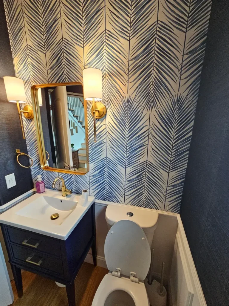
You know what’s cool? Using pattern to mess with spatial perception. This bathroom does exactly that.
The navy and cream palm frond wallpaper has strong vertical lines that basically force your eyes to look up. Pair that with a matching navy vanity and gold fixtures, and you’ve got something that feels way more expensive than it probably was.
Here’s why this works. The pattern moves in one clear direction: up. Those palm leaves sweep upward and create momentum that makes your ceiling feel higher. The dark walls also make white fixtures pop instead of disappearing into nothingness.
If you’re gonna try this approach, commit fully. Wallpaper all the walls, not just one accent wall. Half-measures in small spaces look choppy and indecisive. The unified look actually makes the room feel bigger because your eye isn’t stopping and starting at different surfaces.
Vintage Floral With Tile Wainscoting Balance
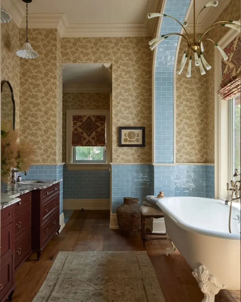
Sometimes you want pattern but you’re not ready to go full maximalist. Split the difference.
This bathroom features delicate floral wallpaper in cream with sage and burgundy accents on the upper half, then grounds everything with pale blue subway tile wainscoting below. The clawfoot tub and dark wood vanity lean vintage without looking like a museum.
The genius here is practical. Bathrooms are humid, and tile handles moisture way better than paper. You get durability where water hits most (lower walls) and pattern where you actually look (upper walls).
This works especially well if your bathroom has architectural details. The wainscoting height here lines up with the window frame, creating horizontal lines that balance the vertical pattern above. Small bathrooms thrive on this kind of intentional layering.
Maximalist Floral That Embraces Full Commitment
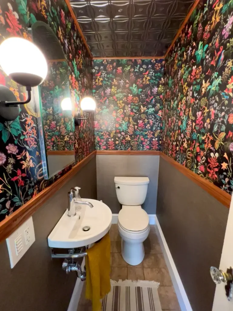
Some people tiptoe around pattern. Others cannonball into the deep end and never look back.
This space explodes with a dark botanical wallpaper featuring vibrant florals in pink, orange, green, and purple. Every surface gets covered (walls AND ceiling) in the same pattern, creating this immersive jewel box vibe. The tin ceiling adds texture that plays off the organic wallpaper shapes.
Bold choices require confidence, but they deliver impact that safe choices never will. The compact size actually helps here. In a bigger room, this much pattern might exhaust you. In a powder room where you spend three minutes max, it creates a memorable moment.
The key detail? Keeping fixtures simple. White toilet, small sink, straightforward lighting. When you go big with pattern, everything else needs to shut up and let it perform.
Also Read: 12 Genius Small Bathroom Ideas for Stylish Tiny Spaces
Artistic Floral With Gallery Wall Layering
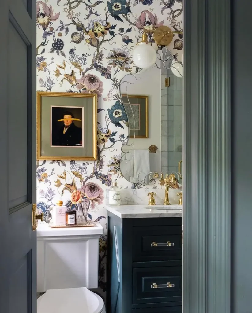
Who says wallpaper has to work alone? Use it as a backdrop for other stuff you love.
This bathroom rocks an artistic floral pattern in muted tones (dusty pink, navy, sage, mustard on cream). Then it layers framed artwork directly over the wallpaper, treating the pattern like you would a painted wall. The dark vanity and gold fixtures add warmth while the mix of frame styles creates that collected-over-time vibe.
This approach maximizes vertical real estate without sacrificing anything. You get wallpaper interest AND personal touches. The pattern holds its own but stays subtle enough not to fight with the artwork.
Scale matters here. The florals are medium-sized (not tiny, not giant), which lets them create atmosphere without drowning smaller framed pieces. The varied colors in the pattern also give you flexibility when choosing art since you can pull any of those tones into your frames.
Dramatic Dark Florals With Jewel Tone Contrast
Dark walls in small spaces supposedly make them feel smaller. Sometimes rules exist to be broken.
This bathroom installed moody floral wallpaper packed with yellow, teal, and cream blooms on a charcoal background. The white vanity provides sharp contrast while geometric floor tiles add another pattern layer that somehow doesn’t create chaos. Gold fixtures tie into the yellow wallpaper tones, and an arched mirror softens all the geometric shapes.
The dark background makes the space feel cocooned, not confined. This only works with adequate lighting, though. Notice the modern chandelier and sconces that prevent cave vibes. The light floor also keeps the darkness from getting oppressive.
You can totally layer multiple patterns if they share a color story. The floor tiles pull charcoal and white from the wallpaper while adding their own geometric rhythm. The secret is varying pattern scale. Large florals, medium geometrics, and small fixture details create hierarchy instead of competition.
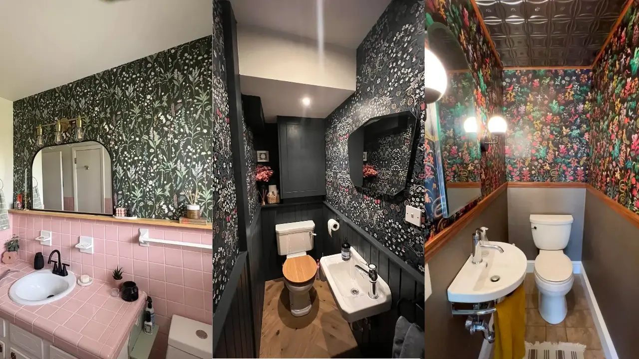
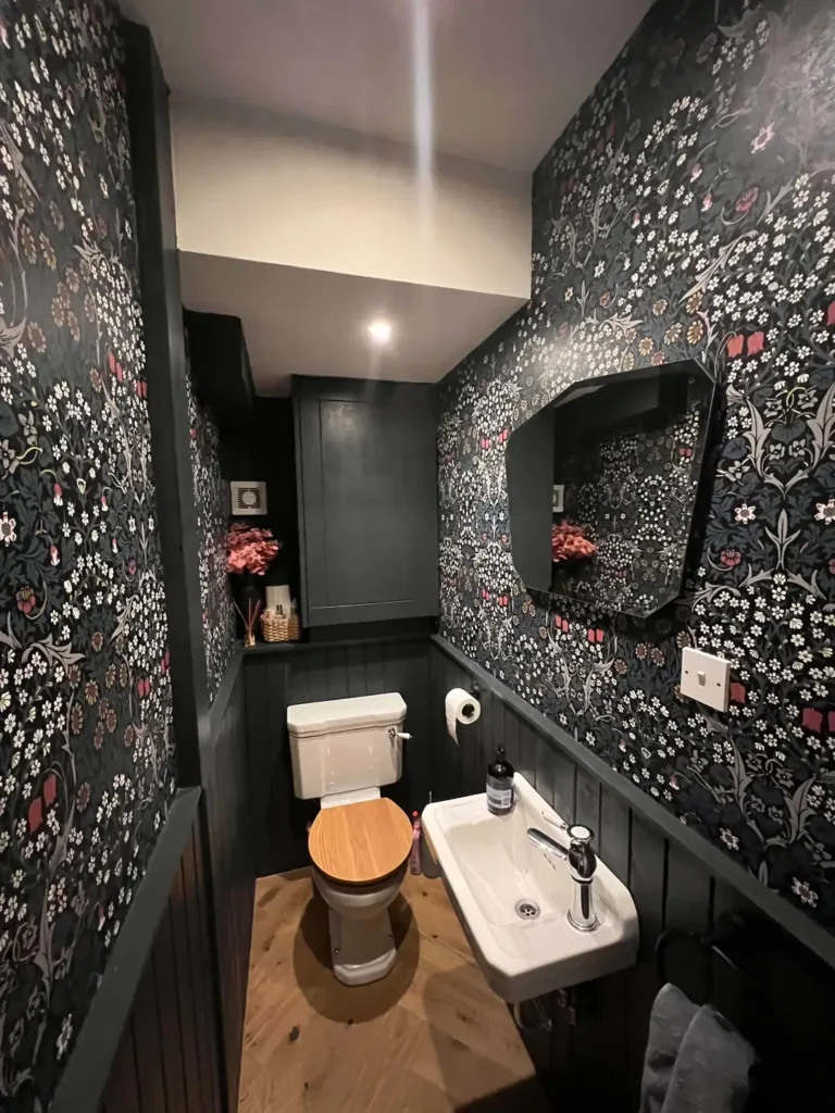
Whimsical Woodland With Dark Moody Atmosphere
Pattern doesn’t need to be formal. Sometimes playful motifs create the most personality.
The woodland creature wallpaper here features foxes, deer, trees, and botanical elements in rust, sage, and cream on a navy background. The ceiling matches the darkest wallpaper tone, creating this wrapped effect. The slatted wood vanity and gray countertop keep things grounded while gold fixtures add subtle warmth.
This works because it commits to a theme without getting cutesy. The sophisticated color palette and realistic illustration style keep the animal motifs from feeling juvenile. It’s whimsical without being childish, which is a tough balance to nail.
IMO, thematic wallpaper works best in powder rooms. You see them less than primary bathrooms, so bold theme choices stay fresh instead of making you tired of them. The novelty sticks around when exposure is limited to guest visits and quick stops.
Also Read: 8 Bathroom Shower Tile Ideas (Real Examples That Actually Inspire)
Elegant Cherry Blossom With Moody Paneled Base
Wallpaper plus wall paneling creates architectural interest that small bathrooms usually lack.
Black wall paneling covers the lower half while delicate cherry blossom wallpaper in white, pink, and gray fills the upper portion. The palette stays limited to black, white, and wood tones, letting the soft pink in the wallpaper provide the only color accent. The paneling frames the wallpaper like art.
This split-wall approach is perfect if you’re nervous about full pattern commitment. You get visual interest without overwhelming the space, and the paneling provides a stopping point that prevents your eye from getting lost. The dark base anchors the lighter wallpaper above, creating stability.
The small-scale pattern here is clutch for compact bathrooms. Large-scale florals would dominate this tiny footprint, but these delicate branches create movement without weight. When choosing wallpaper for genuinely small spaces, pattern density matters as much as color.
Serene Botanical Line Drawing With Natural Wood
Not all impactful wallpaper needs bold color. Line drawings create just as much interest with minimal palette.
This space features botanical line drawing wallpaper in sage, dusty blue, and cream on white. It pairs with a sage vanity and warm wood mirror frame that echoes the natural theme. Gold fixtures provide subtle warmth without competing for attention. The arched mirror adds soft geometry that balances the organic wallpaper motifs.
Pattern creates impact even without bold color. The varied line weights in the botanical drawings give your eye something to follow while maintaining overall calm. This works great for primary bathrooms where you want personality without stimulation at 6am.
Notice how the wood tones stay warm instead of matching the cool sage exactly. This slight temperature difference adds depth that a perfectly matched scheme would lack. Small bathrooms benefit from these subtle contrasts because they create layers without requiring actual physical space.
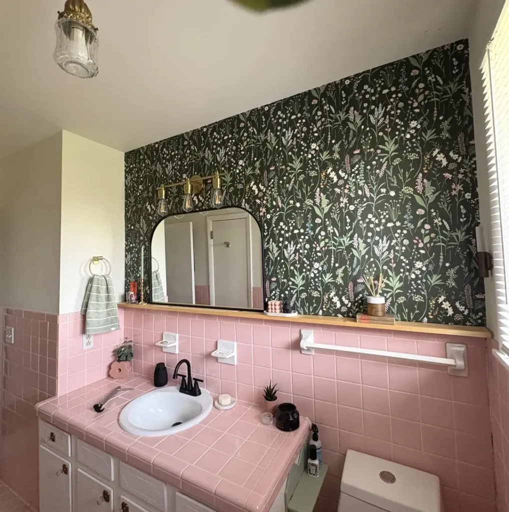
Vintage Bird Wallpaper With Pink Tile Revival
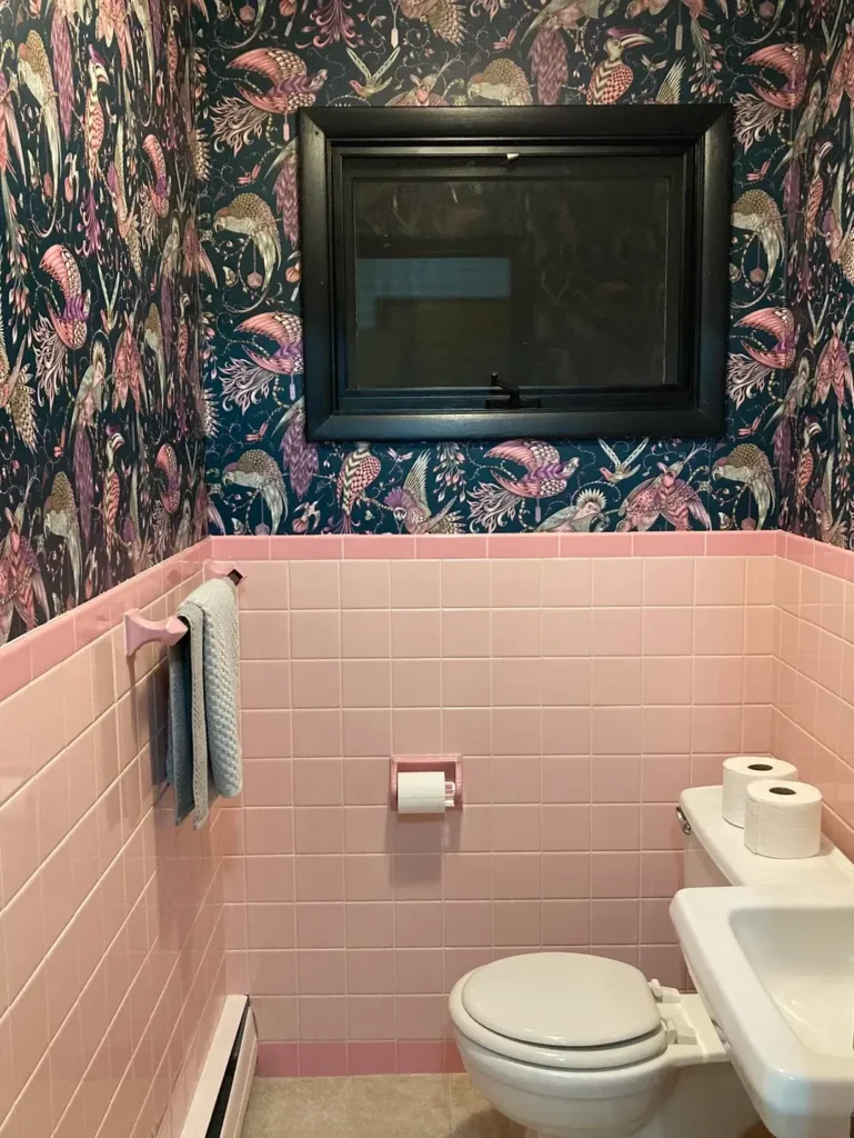
Working with existing tile instead of against it opens up wallpaper options you might otherwise skip.
The pink subway tile here could feel dated, but the designer leaned into the retro vibe with rich floral and bird wallpaper featuring deep teals, blush pinks, and coral on navy. The window stays black-framed, creating graphic contrast with both the tile and wallpaper. This shows how wallpaper can completely reframe existing elements you thought you’d have to replace.
Vintage tile is making a comeback, and wallpaper gives you a way to highlight it instead of hiding it. The colors in this wallpaper pull directly from the pink tile, creating intentional connection instead of awkward coexistence. This saves you the expense and mess of retiling while achieving a fresh look.
If you’re stuck with bathroom finishes you can’t change right now, choose wallpaper that treats those elements as intentional design choices. The reframing trick totally works. What looks like a dated mistake on its own becomes a curated vintage moment when surrounded by complementary pattern.
Also Read: Blue Tile Bathroom 11 Ideas That Actually Work (Straight From Real Homes)
Cheerful Oversized Florals With Floating Vanity Airiness
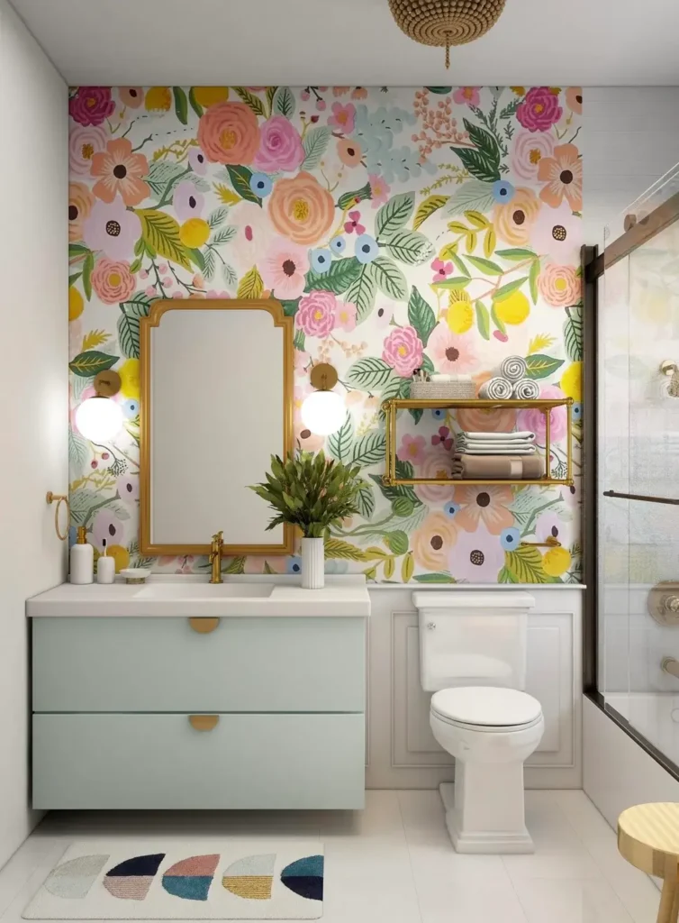
Large-scale patterns can actually make small bathrooms feel more spacious if you choose wisely.
This wallpaper features oversized blooms in pink, peach, yellow, and sage on white. The light background keeps things airy while bold florals create personality. A floating light blue vanity maximizes floor visibility, making the footprint feel larger. Gold accents throughout add cohesion without introducing another competing color.
The white background does critical work here. It reflects light and prevents the large-scale florals from closing in the walls. This is the secret to using bold pattern in small spaces: ground it with plenty of negative space. The flowers are substantial, but they’re surrounded by enough white that they feel joyful instead of suffocating.
Floating vanities help any small bathroom feel less cramped, and they work especially well with busy wallpaper. The visible floor creates breathing room that balances the pattern above. If you’re renovating alongside wallpaper installation, think about how your vanity choice either amplifies or counteracts the visual weight of your walls.
Intricate Moroccan Tile Print With Artistic Accents
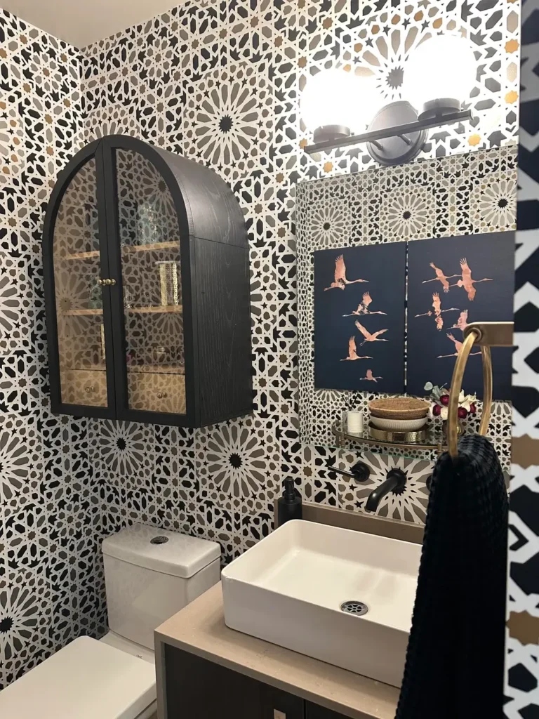
Geometric patterns bring completely different energy than florals or botanicals. They read as modern even when referencing traditional motifs.
The Moroccan-inspired tile print here features cream, gray, and gold on white. Black wall-mounted storage and framed bird artwork layer over the pattern, creating dimension. Gold fixtures and a marble-look vanity top add luxury touches. The geometric precision creates order that floral patterns can’t match.
This style works particularly well in bathrooms because tile patterns feel inherently appropriate for the space. You get the visual interest of patterned tile without the cost, permanence, or installation complexity. Wallpaper lets you achieve looks that would cost thousands in actual tile for a few hundred bucks instead.
The black accents are strategic. They pull the darkest tone from the wallpaper and create anchor points that prevent the light pattern from feeling too ethereal. Small bathrooms need these grounding elements. Without them, light patterns can make the space feel insubstantial instead of spacious.
Cottage Garden Florals With Pink Tile Coordination
Sometimes you inherit bathroom elements that seem impossible to work with. The right wallpaper makes them assets instead of problems.
This design works with existing pink tile by adding wildflower meadow wallpaper in deep green with pink, white, and yellow blooms. The dark green background makes the pink tile pop as an intentional accent instead of a dated leftover. A simple wooden shelf and arched mirror add cottage charm without competing with the busy pattern.
The dark wallpaper background is the genius move here. It creates enough contrast with the pink tile that the tile reads as decorative accent instead of overwhelming presence. This is exactly opposite of conventional wisdom. Instead of trying to minimize the pink with neutral wallpaper, this approach celebrates it.
If you’re dealing with colorful tile you didn’t choose, look for wallpaper that treats that color as one element in a larger scheme. Pull it in as an accent tone instead of trying to match or hide it. The reframing completely changes how the space reads.
Art Deco Scallop Pattern With Gallery Wall Personalization
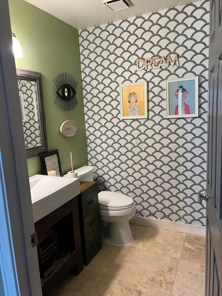
Geometric patterns from specific design eras bring instant style that feels both current and timeless.
The Art Deco scallop pattern here uses black line work on cream to create rhythm across the walls. A green accent wall, eclectic framed artwork, and a modern angular sink reference the geometric theme. The mix of pattern, color, and personal touches creates a space with clear personality.
This shows how wallpaper can serve as neutral backdrop even when it features obvious pattern. The cream and black reads as sophisticated instead of busy, leaving room for colorful artwork and that bold green wall. Pattern doesn’t have to scream for attention. It can provide texture while other elements take the spotlight.
The scallop motif specifically works well in bathrooms because the curves soften the hard edges of tiles, fixtures, and mirrors. Small bathrooms often have a ton of sharp angles competing for attention. A pattern with built-in curves creates visual relief without requiring you to change your fixture selections.
Delicate Chinoiserie With Soft Color Harmony
Chinoiserie wallpaper brings elegance that feels formal without being stuffy. The key is choosing the right color story.
This space features a chinoiserie pattern with birds, branches, and blooms in soft yellow, sage, and pink on pale gray-blue. It pairs with a dark vanity and marble countertop while keeping fixture finishes simple. An arched window and round mirror add curved elements that balance the organic pattern.
The muted palette makes this feel serene instead of overwhelming. Chinoiserie can get busy, but the low-contrast colors create cohesion. Every element in the pattern sits in the same tonal range, so even though there’s visual complexity, it reads as calm.
This approach works especially well in bathrooms attached to bedrooms. You want those transitional spaces to feel peaceful instead of stimulating. Pattern provides interest for guests while maintaining the restful quality you need in private spaces.
Classic Toile With Architectural Wainscoting
Toile wallpaper references traditional design in ways that feel both formal and approachable.
The William Morris-style toile here features acanthus leaves and florals in sage and cream. Cream wainscoting sits below the pattern while the vanity stays simple with marble countertops and chrome fixtures. The ornate round mirror adds traditional elegance that matches the wallpaper’s formality.
Toile works in small bathrooms because the repeating pattern creates cohesion instead of chaos. Your eye can’t find a focal point to get stuck on. Instead, it reads the pattern as unified texture. This creates an envelope effect that makes compact spaces feel intentional instead of cramped.
The wainscoting serves both aesthetic and practical purposes. It protects the lower wall from moisture while creating a visual break that prevents the pattern from overwhelming. If you love detailed wallpaper but worry about too much of a good thing, this split approach gives you both protection and restraint.
What to Actually Think About Before Buying Bathroom Wallpaper
Before you start ordering samples like a maniac, consider these practical elements that affect how wallpaper performs in compact, humid spaces.
Moisture Resistance Is Non-Negotiable
Bathrooms are humid. Shocking, I know.
Look for vinyl-coated or solid vinyl wallpapers that can handle humidity without peeling or growing mold. Powder rooms with less moisture exposure give you more flexibility than primary bathrooms with daily showers. If you’re wallpapering next to a shower, you’re basically asking for problems unless you choose the right material.
Pattern Scale Makes or Breaks the Look
Size matters when it comes to pattern.
Medium-scale patterns generally work best. Tiny prints can look busy and vibrate your eyeballs. Oversized motifs might not show enough repeat to read clearly on small walls. You need that Goldilocks zone where the pattern is big enough to see but small enough to repeat a few times.
Study how much of the pattern you’ll actually see on your specific wall dimensions. If you’ve got 4 feet of wall space and the pattern repeat is 3 feet, you’re only seeing one and a half repeats. That might look weird.
Color Temperature Sets the Mood
Cool tones create calm. Warm tones add energy.
Think about whether your bathroom gets natural light and what time of day you use it most. Morning bathrooms might benefit from energizing warm tones to wake you up. Evening spaces might want cooling blues and greens to help you wind down.
Also consider your lighting situation. Dark wallpaper in a bathroom with zero natural light and one sad overhead bulb will feel like a cave. Make sure you’ve got adequate lighting before you commit to moody colors.
Quick Reference Guide
Here’s a breakdown of what works where:
Large Florals
Best for powder rooms and statement walls. Medium installation difficulty. Low maintenance with vinyl coating.
Geometric Patterns
Perfect for modern spaces and full coverage. Easy installation because seams are forgiving. Low maintenance.
Delicate Botanical
Great for serene primary baths. Medium installation difficulty. Medium maintenance needs.
Bold Dark Patterns
Ideal for small spaces with good lighting. Medium installation difficulty. Low maintenance with quality material.
Toile or Chinoiserie
Works with traditional or eclectic styles. Advanced installation because pattern matching is fussy. Low to medium maintenance.
Final Thoughts on Small Bathroom Wallpaper
Small bathroom wallpaper ideas work when they match your specific space constraints and your personal tolerance for visual stimulation.
Here’s what I’ve learned from seeing hundreds of bathroom transformations: pattern doesn’t shrink spaces. Timidity does. Playing it safe with boring white walls doesn’t make your tiny bathroom feel bigger. It just makes it feel boring AND tiny.
The examples here prove that you can go bold with florals, geometric precision, or delicate botanicals as long as you commit to your choice. Small bathrooms actually give you permission to take risks you might avoid in larger, more visible spaces. Nobody spends hours in a powder room. Make it interesting.
Your bathroom might be tight on square footage, but that doesn’t mean it needs to be short on personality. Pick the wallpaper that makes you smile when you see it. Install it properly with moisture-appropriate materials. Then enjoy having the one room in your house that nobody expected to be the cool one.
Seriously, the worst that happens is you peel it off and try something else. It’s wallpaper, not a tattoo.
What are you waiting for?t that doesn’t mean it needs to be short on personality. Pick the wallpaper that makes you smile when you see it, install it properly with moisture-appropriate materials, and enjoy having the one room in your house that nobody expected to be interesting.