Your living room feels stuck somewhere between “just moved in” and “gave up trying.” You’ve scrolled past a thousand perfectly styled spaces that look nothing like real life, and you’re tired of advice that assumes you have unlimited budget and zero actual humans using the room.
I’ve gathered 18 real living rooms from people who’ve figured out how to make their spaces work. These aren’t staged designer showrooms. They’re actual homes with genuine solutions to the problems you’re probably facing right now. Each example shows you something specific you can apply to your own space, whether you’re working with awkward layouts, tight budgets, or just need to see what actually looks good when real people live in it.
Botanical Wallpaper as a Focal Point Feature
Creating a statement wall changes everything about how a room feels. This approach works especially well when you want character without committing to painting every surface.
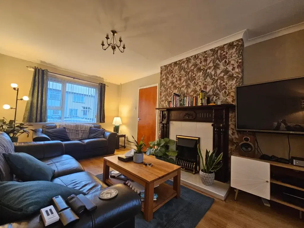
r/acousticpigeon uses a brown and cream botanical wallpaper behind built-in shelving to anchor the entire living room. The pattern adds texture and visual weight to what could otherwise be a plain backdrop for the TV and media console. Notice how the wallpaper stops at the alcove rather than covering the whole room, which keeps it from overwhelming the space while still providing clear definition.
The genius here is pairing the busy pattern with simple, clean-lined furniture. The dark leather sofas and wooden coffee table provide solid blocks of color that balance the intricate wall design. Even the fireplace gets integrated into the feature wall, making it feel intentional rather than like an awkward architectural afterthought.
If you want to try this, choose wallpaper with colors that already exist elsewhere in your room. The brown tones in this example connect to the wooden furniture and warm wall color in the rest of the space, which creates cohesion instead of making the feature wall feel random.
Light Neutral Furniture for Maximum Flexibility
Sometimes the smartest choice is the one that doesn’t lock you into a specific style. Neutral furniture gives you room to experiment with everything else.
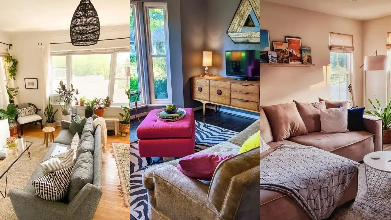
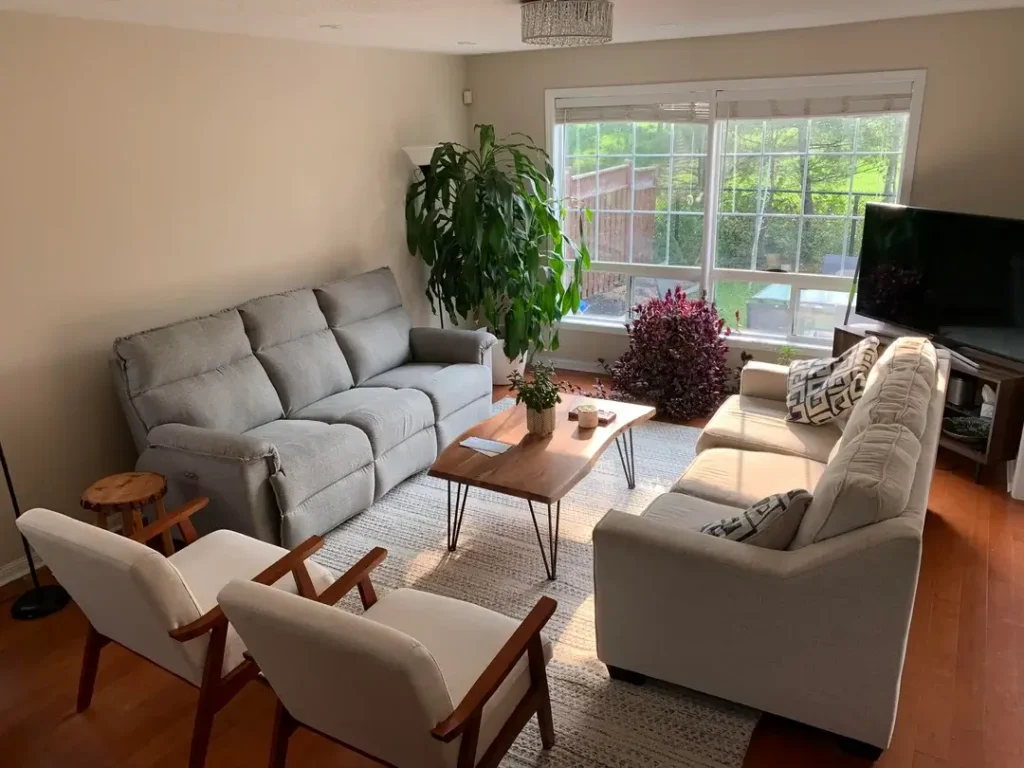
What r/neilxm demonstrates here is how cream and gray seating creates a foundation that works with multiple accent colors. The large window floods this room with natural light, and the neutral palette reflects that brightness instead of absorbing it. The mid-century accent chairs add warmth through their wooden frames without competing with the overall calm aesthetic.
The layered rug under the hairpin-leg coffee table adds pattern without commitment since rugs are easy to swap. Plants bring life and color in a way that photographs well but also serves the practical purpose of improving air quality and connecting the indoor space to the outdoor view.
For smaller living rooms, this approach works particularly well because light colors make spaces feel larger. The gray sofa and cream loveseat create distinct seating areas without creating visual heaviness that would make the room feel cramped.
Travel Poster Display Ledge for Personal Character
Generic wall art never tells anyone who actually lives in your home. Personal collections do that job much better.
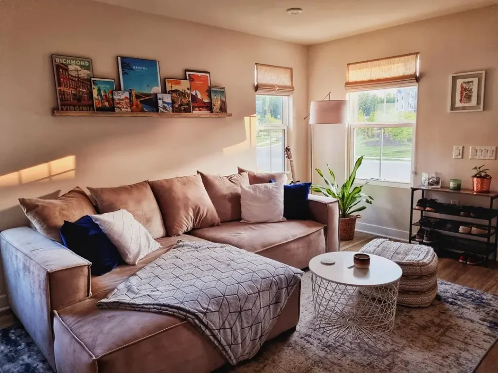
r/KrystianPL12 installed a simple ledge shelf to display overlapping travel posters from Richmond, Bristol, and other destinations. The casual overlapping arrangement feels collected over time rather than purchased as a set, which immediately makes the space feel more genuine. The soft blush walls provide a subtle backdrop that doesn’t compete with the colorful posters.
The sectional sofa with a chaise positions the seating to face both the windows and the gallery wall, making the room functional for conversation and TV watching. That geometric coffee table with the wire base keeps the center of the room visually light while still providing surface area.
You can recreate this with any collection that matters to you. The key is using a ledge instead of hanging everything flat against the wall, which allows you to layer items and change them out without putting new holes in your walls. Keep the poster frames consistent in color even if the sizes vary.
Maximalist Victorian Drama with Rich Jewel Tones
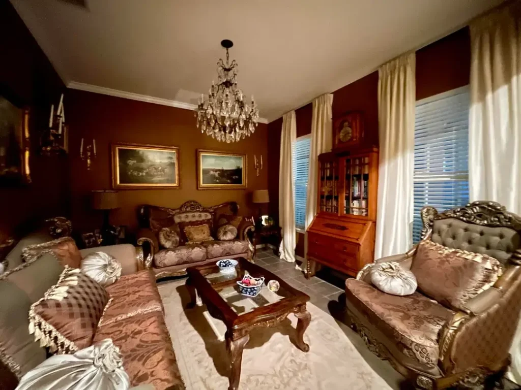
Not everyone wants minimal and neutral. Some spaces demand opulence and get better when you lean into that impulse.
The deep burgundy walls in this room create an intimate, cocoon-like atmosphere that r/Professional_Box5207 enhances with gold-framed artwork and a crystal chandelier. The floral upholstered furniture with tufted details and ornate wooden frames commits fully to a Victorian aesthetic rather than trying to modernize it. Even the china cabinet becomes part of the overall design story.
What prevents this from feeling like a museum is the cream carpet and flowing white curtains, which provide visual relief from all the heavy, dark elements. The brass wall sconces add functional lighting while reinforcing the historical theme.
This approach requires confidence because there’s no playing it safe with beige. But if you love a particular era or style, authentic commitment to it creates a stronger result than trying to tone it down to please everyone. Just make sure your lighting plan includes enough warm light sources to prevent dark walls from making the room feel cave-like.
Also Read: Small Farmhouse Living Room Ideas: 15 Beautiful Ways to Use Small Space
Traditional Florals in an Open Floor Plan
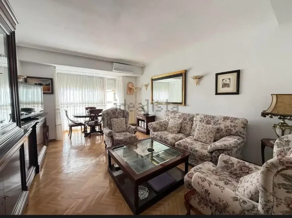
Formal furniture doesn’t have to mean stuffy when you balance it with the right elements. This setup shows how classic pieces work in contemporary homes.
r/itsric0001 chose floral-patterned upholstery for the sofa and chairs, which reads as traditional but gains freshness from the open, airy layout and abundant natural light. The glass-top coffee table with exposed shelving underneath keeps the center of the room transparent, preventing the patterned furniture from overwhelming the sight lines. Parquet flooring adds another layer of traditional detail that harmonizes with the furniture style.
The dining area visible in the background shares the same formal aesthetic, creating continuity across the open space. Notice how the minimal window treatments and clean wall color keep the focus on the furniture rather than competing for attention.
If you inherit or prefer traditional furniture, the mistake is trying to modernize it with conflicting contemporary elements. Instead, embrace the style but keep backgrounds and accents simple and light. The formality becomes elegant rather than outdated when you give it breathing room.
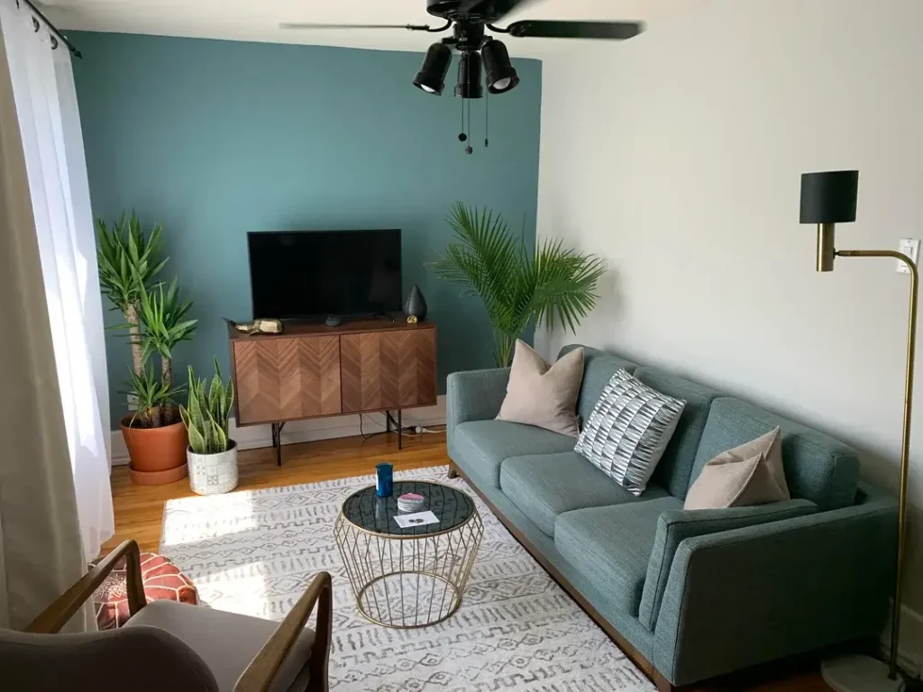
Bold Accent Wall with Complementary Color Blocking
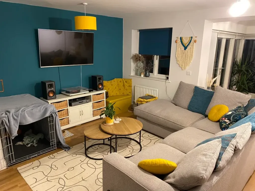
Color theory matters less than finding combinations that make you happy when you walk in the room. This example proves that unconventional pairings can work beautifully.
The teal accent wall behind the TV immediately draws attention, but r/DesignMyRoom makes it work by repeating that exact color in the throw pillows and the yellow accent chair tucked into the corner. The gray sectional provides a neutral anchor that lets the bold colors shine without competing. Even the yellow pendant light above the white media console ties back to the chair, creating a color triangle that guides your eye around the space.
The macramé wall hanging adds texture and a bohemian touch that softens the geometry of the color blocking. Wicker baskets in the media console bring in natural materials that warm up what could otherwise feel too modern.
When you choose a bold wall color, pull that exact shade into at least two other elements in the room. The repetition signals intentionality instead of randomness. And balance bright, saturated colors with plenty of neutrals so the room doesn’t exhaust you visually.
Oversized Mirror to Expand Small Spaces
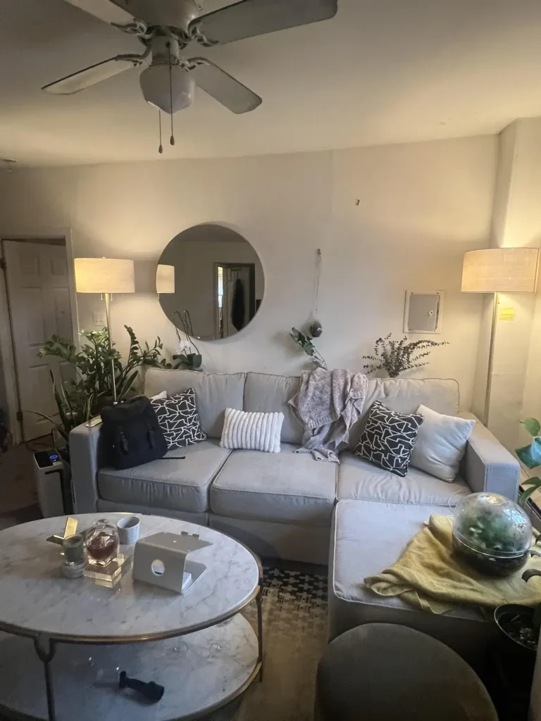
Small rooms need every trick to feel larger, and reflective surfaces deliver that effect instantly.
r/ModernUnicorn hung a large round mirror above a light gray sofa, doubling the perceived space by reflecting the opposite side of the room. The matching floor lamps flanking the sofa create symmetry that feels balanced and intentional. Black and white geometric pillows add pattern without introducing too many colors that would fragment the small space.
The marble coffee table brings in a touch of luxury while keeping the palette monochromatic. Plants in various sizes add life and height variation without taking up much floor space. The throw blanket draped casually over the arm adds a lived-in quality that prevents the room from feeling too styled.
For maximum impact, position mirrors to reflect windows or light sources rather than blank walls. The larger the mirror, the more dramatic the space-expanding effect, but make sure it’s properly secured since large mirrors are heavy.
Textured Baskets for Stylish Storage Solutions
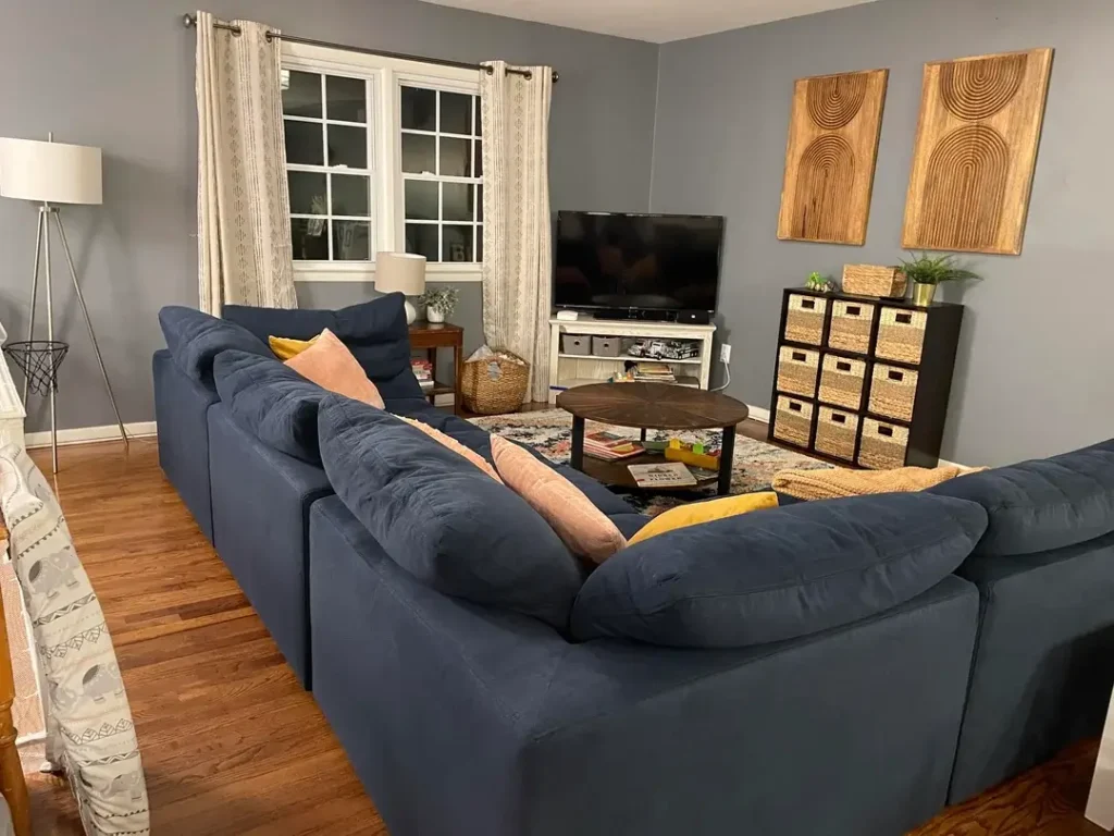
Storage doesn’t have to hide in closets when it looks this good out in the open.
The cube organizer with wicker baskets serves double duty in this room that r/lenorebeads13 designed with a navy sectional. The baskets hide clutter while adding organic texture that contrasts beautifully with the smooth painted walls and upholstered furniture. The navy sofa against gray walls creates a sophisticated color combination that feels mature without being boring.
Those wood-grain art panels on the wall add warmth and visual interest to what could be a bland wall space. The white media console keeps the area around the TV light and uncluttered. Coral and yellow throw pillows inject just enough color to prevent the blue and gray scheme from feeling cold.
When you need storage in a living room, choose pieces that work as both furniture and decor. Wicker, rattan, and other natural materials blend with almost any design style and add that textural variety that keeps rooms interesting.
Also Read: 15 Floating Shelves Living Room Decor Ideas That Actually Work
Minimalist Basement Media Room
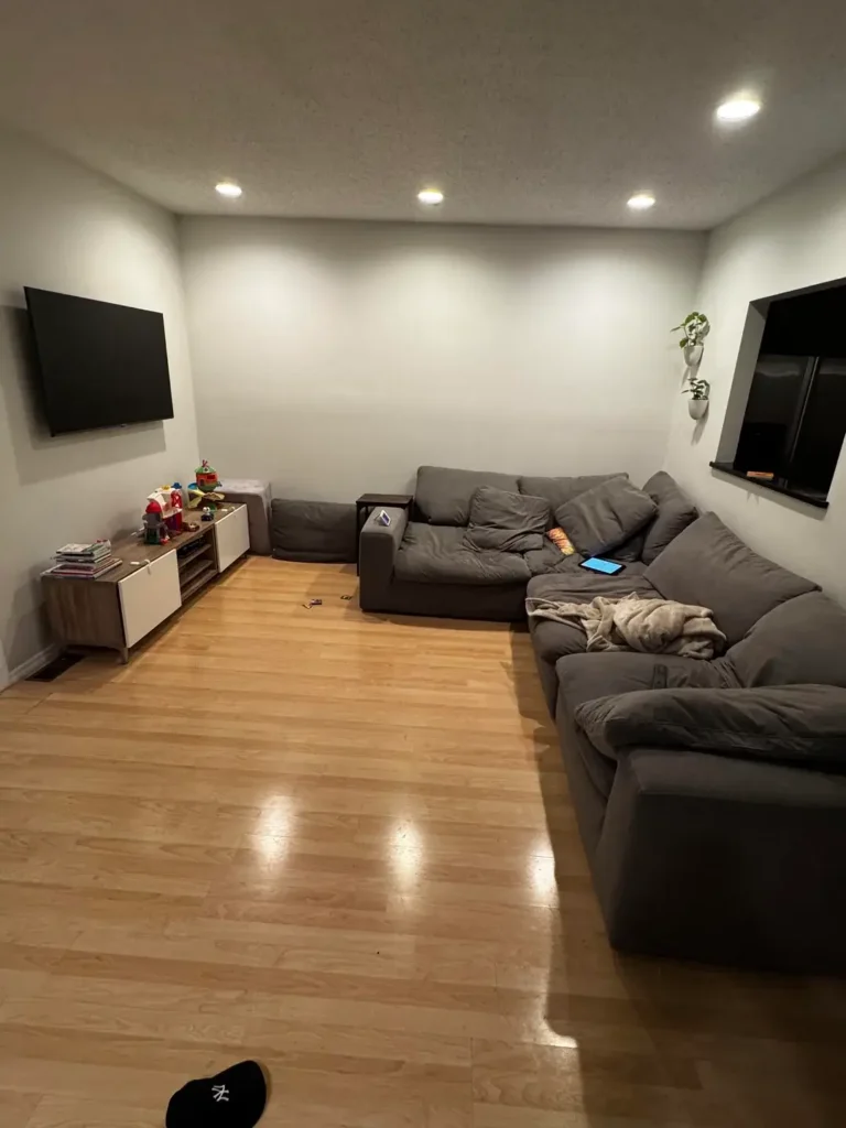
Not every living room needs a full furniture suite and coffee table books. Sometimes simple and functional is exactly right.
r/RU23NJ kept this basement space deliberately minimal with just a large sectional, wall-mounted TV, and low media console. The light wood flooring prevents the room from feeling like a dark cave despite the lack of windows. Recessed lighting provides ambient illumination that works for movie watching without creating glare on the screen.
The gray sectional offers plenty of seating for family movie nights without crowding the room with extra chairs. That small sculptural wall hanging adds a touch of personality without demanding attention. The open floor space in the center makes this room feel bigger than it actually is.
Basements often get overdecorated in an attempt to make them feel like upstairs rooms. Fighting the space rarely works as well as accepting its purpose and optimizing for that. Good lighting, comfortable seating, and clean lines create a room that functions perfectly for its intended use.
Circular Wall Art as Dimensional Sculpture
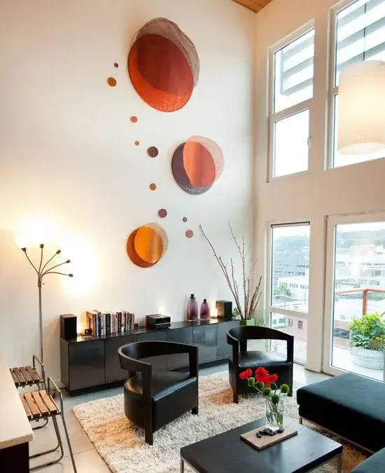
Flat art is fine, but three-dimensional wall pieces create shadows and depth that change with the light throughout the day.
The circular orange-toned wall sculptures r/myhousedesigns123 arranged on the white wall bring an unexpected artistic element to this modern space. The varying sizes create movement and interest without needing frames or glass. The black sculptural furniture, including that distinctive curved coffee table, provides strong geometric shapes that balance the organic circles on the wall.
Floor-to-ceiling windows flood the double-height space with natural light, which makes the wall sculptures cast different shadows at different times of day. The minimal approach to furniture and decor lets the architectural features and statement pieces shine.
If your walls feel blank but you don’t want traditional framed art, look for sculptural wall pieces made from metal, wood, or ceramic. They add texture and dimension that photographs and prints can’t match. Just make sure they’re properly anchored since dimensional pieces are usually heavier than flat art.
Compact Furniture for Actual Small Spaces
Working with limited square footage means choosing every piece carefully. This room shows how to maximize seating without feeling cramped.
r/stephaniemm1 selected a loveseat with an ottoman instead of a full-size sofa, which provides seating for three while keeping the room feeling open. The beige and geometric pillows add pattern without making bold color commitments. French doors to the adjacent room create an open feel that makes the small space work harder.
The patterned area rug defines the seating zone without covering the entire wood floor, which keeps the room from feeling too busy. That tripod floor lamp provides task lighting without requiring an end table. Simple striped curtains frame the windows without adding visual weight.
The biggest mistake in small living rooms is trying to fit standard-size furniture. Measure your space and shop for pieces that actually fit with room to walk around them. Sometimes that means loveseat instead of sofa, or armchair instead of recliner, and the result is a room that functions better even if it seats fewer people.
Single Accent Wall in a Calming Palette
You don’t need to paint every wall to create a focal point. One painted surface often does the job better.
The soft teal accent wall behind the TV in this room gives r/StandardIssueLad a place to anchor the media area without overwhelming the space with color. The mid-century modern media console with chevron wood pattern adds visual interest at furniture level. Tall potted palms bring life and vertical lines that draw the eye upward.
The teal sofa picks up the wall color while the beige cushions and woven rug keep things grounded and natural. That black wire coffee table with glass top maintains transparency in the center of the room. White walls on the other three sides keep the room bright and give the eye places to rest.
When choosing an accent wall color, consider picking up a shade that appears in your existing furniture or decor. The connection between the wall and sofa creates intentionality. Test paint samples on the actual wall at different times of day since lighting dramatically affects how colors appear.
Also Read: 15 Small Living Room Decor Ideas That Actually Work in Tight Spaces
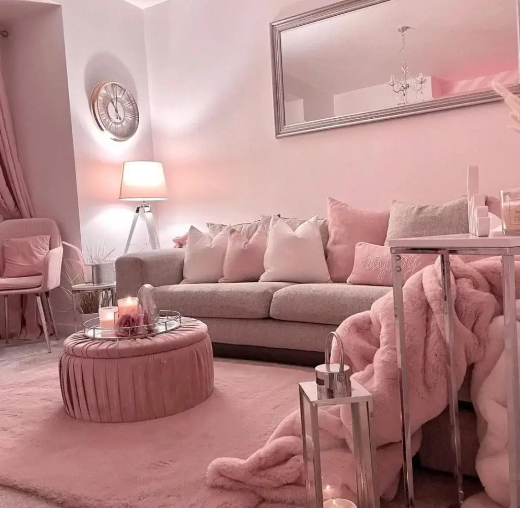
Monochromatic Pink Scheme for Bold Personality
Some people need a neutral base to feel comfortable. Others need color saturation to feel at home, and that’s equally valid.
r/caxepa2305 committed to a pink and gray palette that could easily feel juvenile but instead reads as sophisticated through material choices. The velvet textures on the sofa and ottoman create depth within the monochromatic scheme. Metallic accents in silver and mirrored surfaces add shine that elevates the softness of the pink.
The oversized wall mirror reflects light and makes the room feel larger while reinforcing the glamorous aesthetic. Plush throws and multiple pillows create a cozy, luxurious feel. Even the clock and table lamp get chosen to match the overall color story.
Monochromatic doesn’t mean boring when you vary the textures and finishes. Matte paint, velvet upholstery, glossy mirrors, and metallic accents all read as the same color but create visual interest through how they reflect light differently. If you love a color this much, go ahead and build the room around it.
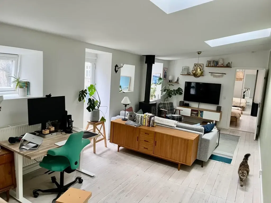
Multi-Functional Open Layout with Work Zone
Living rooms increasingly need to serve multiple purposes beyond just lounging. This layout addresses that reality head-on.
The open floor plan r/skippah created includes a living area with gray sectional, a home office with desk and monitor, and clear pathways between zones. The vintage teak credenza behind the sofa provides both storage and visual separation between the living and working areas. Light wood flooring and white walls keep the multi-use space feeling cohesive rather than chopped up.
Plants throughout the space, including large floor plants near the wood stove, bring nature inside and improve the environment for both working and relaxing. The white painted floorboards and skylight add to the bright, airy Scandinavian-influenced aesthetic.
When one room needs to serve multiple functions, use furniture placement rather than walls to define zones. The sofa creates a natural boundary between living and working areas. Keep the color palette consistent across zones so the space feels unified even though you’re doing different activities in different areas.
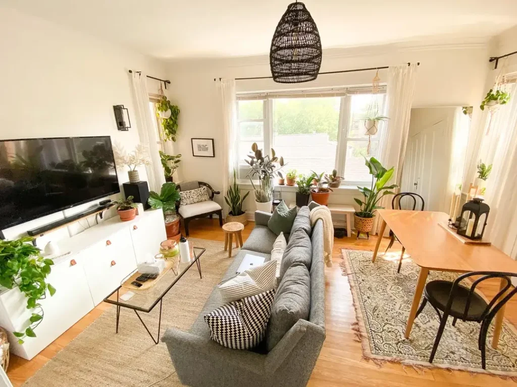
Plant-Filled Bohemian Living and Dining Combo
If you love plants, there’s no reason to limit yourself to one or two token specimens. Embrace the abundance.
r/starbucksordunkin turned this long narrow space into an indoor garden that happens to include furniture. Plants line the windowsill, hang from the walls, cascade from shelves, and sit on every available surface. The gray sectional and natural wood dining table provide simple, unfussy backdrops that let the greenery take center stage.
The woven pendant light and jute rug add natural textures that complement the organic plant theme. The narrow coffee table and small side tables keep the traffic flow open despite all the plants. White walls reflect maximum light to keep all those plants healthy.
The key to making this many plants work is choosing a variety of heights and types. Hanging plants, floor plants, and tabletop plants create layers that feel intentional rather than cluttered. And honestly, if you’re going to commit to this many plants, accept that watering and maintenance become part of your weekly routine.
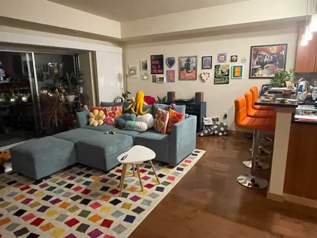
Eclectic Maximalist Style with Playful Elements
Design rules exist to be broken when you know what you’re doing and what you love.
This living room r/youryellowumbrella created mixes teal and orange, geometric rugs with pop art, mid-century bar stools with contemporary sectional, and somehow it all works. The eclectic gallery wall includes everything from vintage posters to modern graphics in mismatched frames. Colorful throw pillows in yellow, red, and teal tie together the disparate elements.
The multi-colored geometric rug grounds the space and contains enough colors to connect with almost anything else in the room. That tiny white side table looks almost invisible, letting the bold rug and furniture take focus. The casual, lived-in feel comes from the mix of plush and hard elements, vintage and new pieces.
Maximalism succeeds when there’s an underlying logic, even if that logic is just “things I genuinely love.” The mistake is trying to follow someone else’s eclectic aesthetic instead of building your own. Collect what speaks to you, find common threads (color families, eras, materials), and arrange them with confidence.
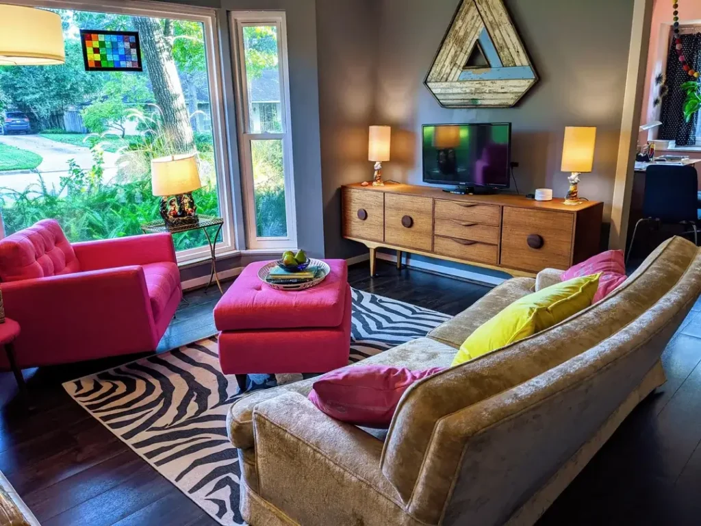
Bold Pattern Mixing with Zebra and Geometric Prints
Mixing patterns scares people more than it should. The secret is controlling your color palette while varying pattern scale.
r/friedtechamy layered a zebra print rug under mid-century furniture and paired it with solid fuchsia ottomans and chairs. The geometric triangle wall art picks up colors from throughout the room without competing with the floor pattern. Dark charcoal walls provide a dramatic backdrop that makes the bright colors pop even harder.
The vintage credenza with circular drawer pulls adds warm wood tones that ground all the bold pattern and color choices. Yellow and pink table lamps create symmetry while adding more color without more pattern. Large windows and verdant outdoor views balance the intense interior with natural elements.
When mixing patterns, vary the scale so they don’t compete directly. The large zebra stripes work with small-scale geometric prints because they operate at different visual scales. And stick to a limited color palette across all your patterns, which creates cohesion even when the patterns themselves are very different.
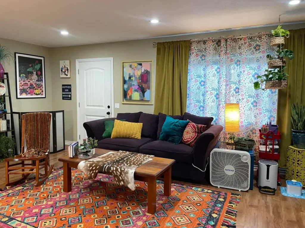
Bohemian Maximalism with Layered Textiles and Art
Sometimes more is more, especially when you curate carefully and layer with intention.
The floral curtain panel r/Bikini_Atroll hung creates an unexpected backdrop that transforms a standard window into a feature wall. Colorful abstract art and quirky signs cover the walls in an arrangement that feels personal rather than designed. The navy sofa anchors the room with a solid color that balances all the pattern and color happening elsewhere.
Jewel-toned pillows in teal, mustard, and burgundy create a rich, saturated palette. The patterned area rug layers pattern on pattern but works because the scale and colors connect to the overall scheme. Plants in baskets add organic shapes and living elements to soften all the hard-edged furniture and art.
The difference between this and chaos is the underlying color harmony. Despite the variety of patterns and objects, everything works within a warm, saturated color family. When you layer this much, periodically step back and remove anything that doesn’t contribute to the overall feeling you want.
Comparing Living Room Decor Approaches
Different rooms serve different needs and reflect different personalities. Here’s how these approaches stack up:
| Style Approach | Best For | Complexity Level | Budget Range |
|---|---|---|---|
| Botanical Feature Wall | Adding character to builder-grade rooms | Medium | $$ |
| Light Neutral Base | Flexibility and resale value | Easy | $ – $$ |
| Travel Gallery Ledge | Renters and frequent redecorators | Easy | $ |
| Victorian Maximalism | Historic homes and bold personalities | Advanced | $$$ |
| Traditional Florals | Inherited furniture and formal spaces | Medium | $$ |
| Bold Color Blocking | Modern spaces needing personality | Medium | $$ |
| Mirror Expansion Trick | Small rooms and dark spaces | Easy | $ – $$ |
| Textured Storage Solutions | Families and active households | Easy | $ |
Finding Your Living Room Identity
These examples prove there’s no single correct way to design a living room. The Victorian drama works for someone who’d hate the minimalist basement. The pink monochromatic scheme delights someone who’d find the neutral approach boring.
What matters is understanding what you actually need from your space and who you actually are as a person living in it. The botanical wallpaper won’t make you happy if you prefer clean simplicity. The abundant plants require commitment to maintenance. The bold patterns demand confidence every time you walk in the room.
Start with function and build toward beauty. If you work from home, you need a functional zone like the open layout with the desk. If you have kids, you need durable surfaces and storage like the wicker basket approach. If you entertain, you need seating arrangements that facilitate conversation rather than everyone facing the TV.
Your living room should welcome you home and support how you actually live. Everything else is just decoration.