Most people mount their TV, step back, and think “yeah, that’ll do.” Then five years pass and that wall still looks like it’s waiting for something. Sound familiar? Yeah, same.
Here’s the thing though: the wall behind your TV is honestly one of the easiest spaces to transform once you know what’s possible. You don’t need a massive budget or a contractor on speed dial. You just need some inspiration and a little direction.
I’ve rounded up eight real rooms that show exactly what’s possible, ranging from “I can do this this weekend” easy to “okay this is a full commitment” impressive. At least a couple of these will make you look at your own wall very differently. Let’s get into it.
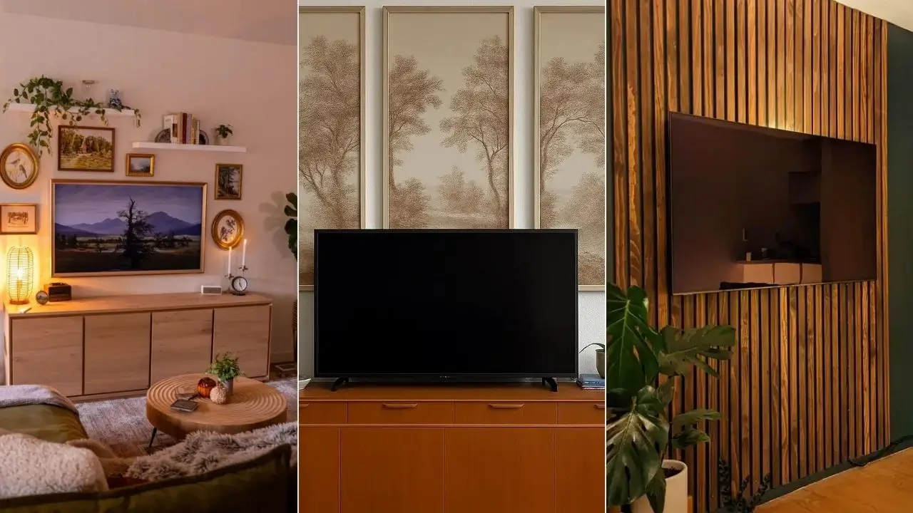
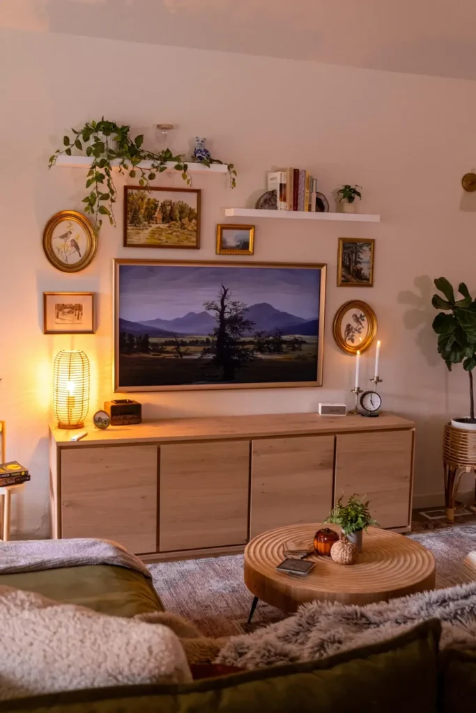
The Frame TV Gallery Wall with Warm Botanicals and Vintage Art
This one is genuinely unfair. In the best way possible.
Picture warm amber light from a rattan lamp spilling across a light oak media console. A trailing pothos cascading off a floating shelf above. And right in the center of it all, a Samsung Frame TV displaying a moody landscape painting like it’s been there forever.
A user from r/femalelivingspace put together one of the most cohesive gallery walls I’ve seen built around a television. The wall features a mix of gold oval frames, rectangular prints in warm ochre and forest tones, and a floating white shelf holding books, a blue-and-white ceramic figurine, and a small potted plant.
Nothing matches exactly, but everything belongs together. That’s the hardest thing to pull off in decorating, and somehow this setup nails it.
The secret weapon here is the Frame TV itself. Samsung designed it to look like actual artwork when it’s not in use, and this setup leans fully into that idea. The TV doesn’t interrupt the gallery wall. It anchors it. The gold-toned bezel blends with the surrounding warm frames, so the screen reads as one more piece of art rather than a black rectangle crashing the party.
How to Recreate This Look
- Start with a Frame TV or any ultra-thin, wall-flush mount
- Build your gallery wall outward from the screen using warm metal frames (antique gold, brushed brass, aged bronze)
- Keep your art nature-themed with greens, tans, and warm browns
- Add one floating shelf above for books and a trailing plant
- Finish with a warm-toned lamp on your media console
The small candlestick and clock on the console’s right side are subtle but worth copying. They give the whole setup that unhurried, lived-in quality that makes a room feel like a home.
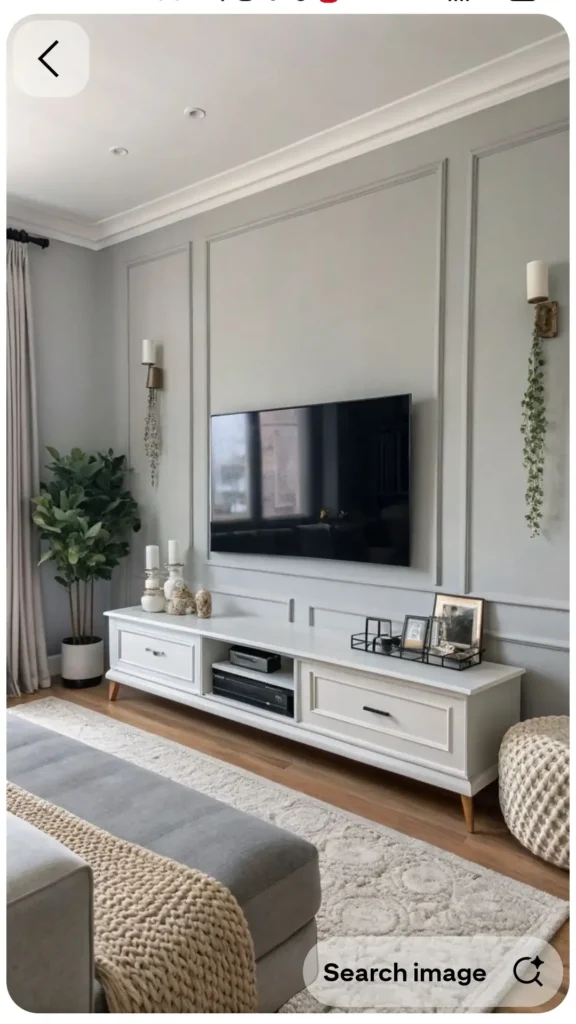
Wall Moulding Panels for a Polished, Elegant TV Surround
Wall paneling is having a serious moment right now, and honestly? It deserves all the hype.
A user from r/gothic-insomniac covered their entire feature wall in rectangular moulding panels painted in a soft, sophisticated grey, the kind of grey that reads almost lavender depending on the light. The TV sits flush within the largest central panel, and the whole thing looks custom-built even though it’s completely DIY.
The floor-to-ceiling symmetrical panel layout is what sells it. Two brass wall sconces flank the TV on either side, and a trailing vine plant hanging from one sconce adds just enough organic softness to keep things from feeling sterile. Below sits a long white media console with tapered wood legs, styled with ceramic candleholders, a small terrarium display, and a few framed photos.
What makes this better than a generic moulding job is the tonal consistency. The panels, the wall, and the console all live in the same grey-white palette. Nothing fights for attention. The sconces and that single green plant provide contrast without creating chaos.
Most of the cost here is paint, MDF moulding strips, and a miter saw, which means it looks like a million bucks without actually costing one.
Why Moulding Works So Well for TV Walls
Wall paneling gives your TV a visual context. Instead of a screen floating on a flat, empty surface, you get a screen set within architectural detail that makes it look like it was always meant to be exactly there. It’s one of those rare DIY ideas where the result genuinely looks professional.
Pro tip: Mark your panel layout in pencil first, use 1.5-inch MDF moulding strips, and paint everything in the same color after installation. That seamless finish is what turns “applied” into “intentional.”
Also Read: 10 Aesthetic Wall Decor Ideas Straight From Real Bedrooms
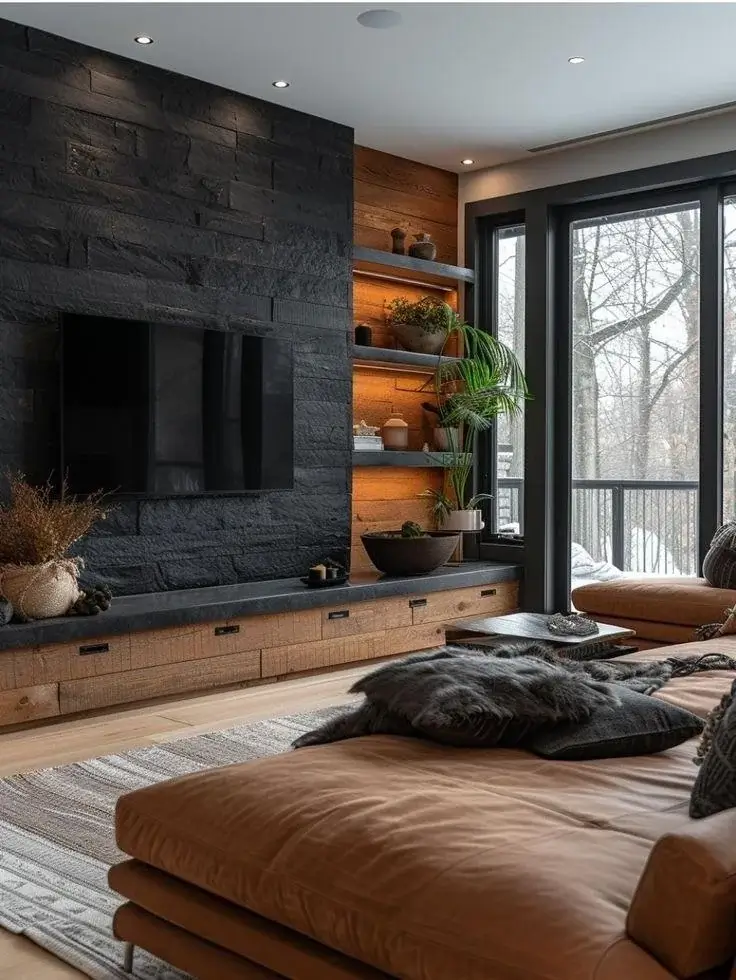
Dark Stacked Stone Accent Wall with Warm Wood Shelving
Some rooms don’t try to make the TV blend in. They build the entire wall around it as a statement. This is that room, and it slaps.
A user from r/AccidentalFolklore built what I’d describe as a cabin-meets-modern-industrial retreat. A full floor-to-ceiling accent wall of dark, charcoal-toned stacked stone creates a dramatic textural backdrop for the mounted TV. A reclaimed wood side panel runs adjacent, holding backlit open shelves filled with plants, ceramics, and decorative vessels.
The stone texture is deeply shadowed, almost black, with irregular shapes that catch light differently as the day changes. Against that rough backdrop, the flat TV screen reads almost like a portal. The warm reclaimed wood shelving alongside it provides visual relief from the heaviness of the stone, and the amber LED lighting behind each shelf gives the whole wall a gorgeous glowing quality after dark.
This approach takes real commitment. You’re not rearranging a few frames here. You’re choosing a material that will define the room for years. But when it works, it absolutely works.
The cognac leather sofa, the dark fur throw pillows, and the pale hardwood floors all reinforce the same masculine, textured aesthetic. This room knows exactly what it wants to be, and it went all in.
Not Ready for Full Stone? Here’s Your Alternative
If a full stone installation sounds like too much, look into stone-look panels or large-format tile in a similar dark slate tone. They deliver most of the same visual impact with significantly less structural commitment. Pair them with warm reclaimed wood elements to keep the space from reading too cold or industrial.
The Honest Approach: Asymmetric Plants and Bookshelf Flanking
Not every TV wall decor idea needs a custom build or a renovation crew. And honestly, it’s refreshing to include a room that reflects what most of us are actually working with.
A user from r/Marywhale shared this setup while asking for community feedback online. A white media console holds the TV, a tall monstera anchors the left side, and a white bookshelf packed with colorful book spines and small plants sits on the right. Simple, clean, and very real.
The monstera is a genuinely excellent choice. Large-leafed tropical plants create visual weight that balances a TV wall without requiring a single hole in the drywall beyond what’s already there. The bookshelf does double duty as storage and decor, with the varied book spines providing an organic background of color.
What This Room Is Missing (and What You Should Watch For)
The one gap here is above the TV. There’s a recessed section that creates a visual dead zone, making the wall feel slightly unfinished. A piece of art, a small floating shelf, or even a horizontal canvas print would close that gap and give the eye a place to settle.
But the bones are solid. A great plant, an organized bookshelf, and a tidy console are a legitimate and underrated approach to a well-decorated room. Don’t let anyone make you feel like you need to build a stone wall to have a good-looking space.
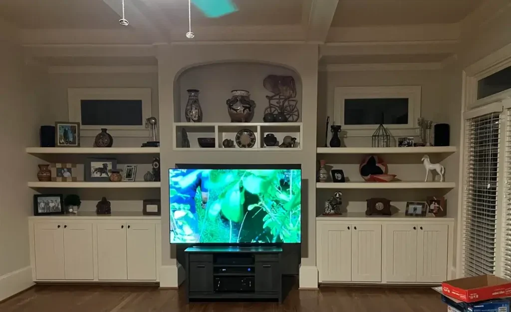
Full Built-In Wall Unit with Arched Display Niche
This is the kind of built-in that makes people stop mid-scroll. You know the one.
A user from r/Lithopsfanatic has a floor-to-ceiling white built-in wall unit spanning the entire width of their room. Open shelving flanks a central arched display niche above the TV. Cabinet doors with small black knobs run along the bottom. Every shelf is styled with ceramics, framed photos, figurines, clocks, and collectibles collected over time rather than staged for a photo shoot.
That distinction matters. This room feels personal, not performative. You can tell someone actually lives here, and that warmth is genuinely hard to fake.
The arch detail above the TV is the move that elevates this from “nice built-in” to something you remember. Arches add a classical, almost European quality to interior architecture. In this context, the arch frames a curated ceramic collection and draws the eye upward, which prevents the TV from dominating the wall even though it’s large and centrally placed.
Is a Built-In Worth the Investment?
Built-ins at this scale are a significant investment, either in money if you hire a carpenter, or in time and skill if you go the DIY route. But the payoff in storage, style, and perceived home value is hard to argue with.
If you’re planning a built-in, design the arch detail first. It’s the element that makes or breaks the overall impression, and it costs no more than the rectangular sections surrounding it.
Also Read: 8 Large Wall Decor Ideas for Your Living Room (That Actually Work)
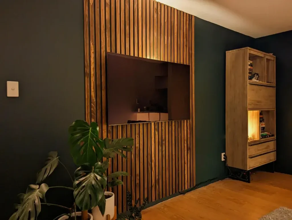
DIY Vertical Wood Slat Panel Against Deep Forest Green
Dark walls and natural wood together? That’s a combo that just works. Every single time. IMO this might be the most versatile look on this entire list.
A user from r/alanbishphoto built this panel themselves, and the craftsmanship really shows. A panel of vertical warm honey-toned pine slats runs floor to ceiling, forming the backdrop for a wall-mounted TV. The surrounding wall is painted a deep forest green that’s almost teal, and it makes the wood panel absolutely glow by contrast.
The TV sits flush within the slats as if it was always part of the design, which is exactly the vibe you’re going for. A large monstera in the lower left corner ties the natural wood and deep green together beautifully. A custom reclaimed wood shelving unit with warm interior lighting adds a secondary focal point on the right without competing with the main panel.
Why Vertical Slats Specifically?
The vertical orientation is a deliberate design decision, not just an aesthetic preference.
- Vertical lines draw the eye upward, adding perceived ceiling height
- Horizontal slats would widen the wall visually, which works in some rooms but not here
- In a room with a darker wall color, that upward movement keeps the space from feeling closed in
This is one of my favorite ideas on this list because the materials are genuinely accessible. Thin pine slats, basic hardware, and one careful afternoon of installation can produce a result that looks like a professional renovation. And don’t be afraid of that dark green. Feature walls with deep, rich colors almost always overdeliver.
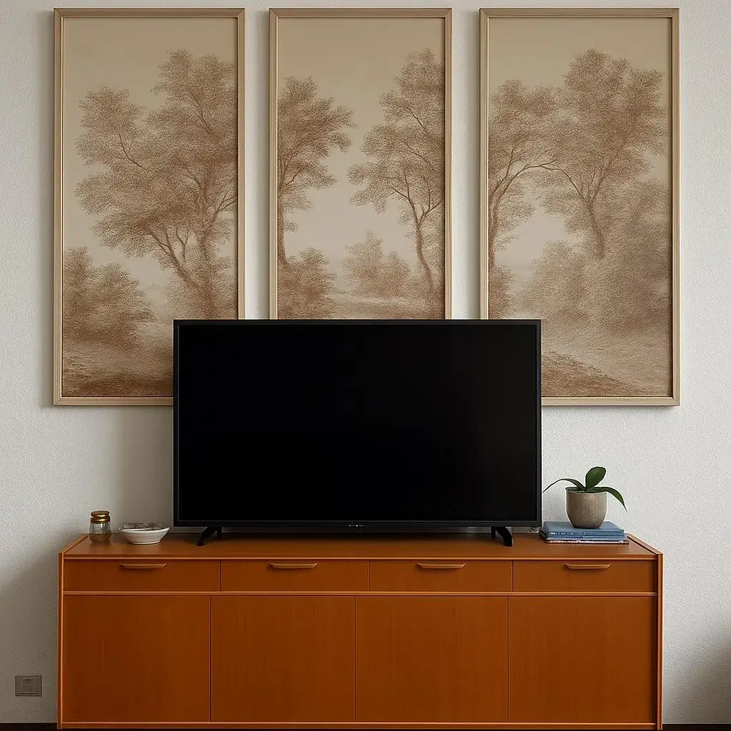
Tall Vertical Triptych Art Above a Warm Teak Console
Sometimes the most effective TV wall decor move is simply choosing the right art. No accent wall, no built-in, no moulding. Just three frames doing serious work.
A user from r/jmgr233 paired their flat-screen TV with three tall, narrow frames arranged side by side above the console. Each frame holds the same soft sepia-toned botanical landscape, misty trees in warm beige and brown tones, and together they form a panoramic triptych that spans the full width of the console below.
Proportion and repetition are doing all the heavy lifting here. The three identical frames create a sense of rhythm and intention. The sepia palette connects naturally to the rich orange-toned teak media console below. Two small items on the console surface, a ceramic bowl, a small jar, and a compact plant, keep the styling restrained and clean.
What I love about this approach is how low-effort the setup actually is compared to how good it looks. No renovations, no power tools, no weekends lost to a project that grew out of control. Just three well-chosen frames in a deliberate arrangement.
Getting the Scale Right
The most common mistake with triptych art? Frames that are too small for the space. They end up looking timid and out of proportion, which defeats the whole point.
Landscape, botanical, and abstract wash prints all work beautifully here
Size your combined frame width to roughly match the width of your console or TV
Keep all three frames in the same finish for visual unity
Search for “botanical triptych prints” or commission matching prints in a cohesive theme
Also Read: 10 Album Cover Wall Decor Ideas That Actually Look Great (With Real Inspiration From Real Rooms)
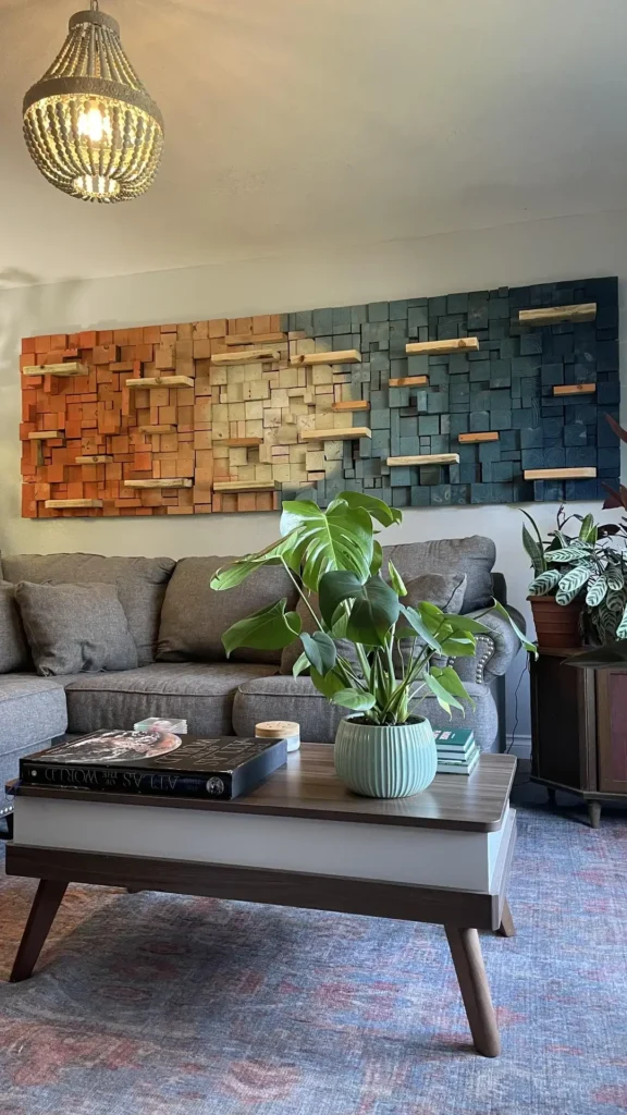
DIY Scrap Wood Mosaic Wall Art with Gradient Color Story
Okay, this one genuinely surprised me. Not because I didn’t think it would work, but because of the sheer scale of the ambition behind it.
A user from r/ZincSaucier5504 built an entire custom wood mosaic from scrap wood. Hundreds of individual wood blocks of varying depths, arranged in a roughly textured grid, transitioning in color from burnt orange on the left through natural pine in the center to deep slate blue-green on the right. It covers the entire wall above the sofa.
The gradient color story is doing serious design work here. It transitions like a sunset, from warm to neutral to cool, and gives the wall an almost painterly quality. Small horizontal ledge pieces protrude from the mosaic at irregular intervals, adding depth and shadow that shift throughout the day as the light moves.
The rest of the room respects the scale of the installation. A grey sectional sits below without competing. A mid-century wood coffee table anchors the seating area. A beaded pendant light echoes the handmade, artisan quality of the wall piece. A monstera in the foreground adds life without distraction.
This proves that statement wall art can serve the exact same purpose as any traditional feature wall treatment. You don’t need stone or moulding or built-ins. You need visual presence. And this scrap wood mosaic has it in abundance.
The material cost is genuinely low if you source scrap lumber. The time investment is real, but the result is something completely original that you’ll never see anywhere else.
Quick Reference: TV Wall Decor Styles at a Glance
| Style | Best For | Difficulty | Approx. Cost |
|---|---|---|---|
| Frame TV Gallery Wall | Renters, eclectic style lovers | Easy | $300 to $1,200+ |
| Wall Moulding Panels | Classic, transitional, modern glam | Medium | $100 to $400 DIY |
| Stacked Stone Accent Wall | Rustic, industrial, mountain modern | Advanced | $500 to $2,000+ |
| Plants + Bookshelf Flanking | Minimalists, renters, beginners | Easy | $50 to $300 |
| Full Built-In Wall Unit | Maximalists, long-term homeowners | Advanced | $1,500 to $8,000+ |
| DIY Wood Slat Panel | Mid-century, Scandinavian, boho modern | Medium | $150 to $500 DIY |
| Triptych Art Above Console | Any style, quick transformation | Easy | $100 to $600 |
| DIY Wood Mosaic Art | Eclectic, artistic, handmade lovers | Advanced | $50 to $200 DIY |
What All 8 Rooms Have in Common
Here’s the thing that’s easy to miss when you’re focused on the specific materials or styles: every single one of these rooms is intentional. None of them happened by accident. Each one reflects a deliberate decision about what the wall should communicate, and then followed through with every other element in the space.
The TV wall decor ideas that fail are always the ones that stop halfway. A gorgeous accent wall paired with a cluttered console. A beautiful built-in styled with random objects that have no visual relationship. Three frames that are too small for the wall they’re hanging on. The technique matters less than the follow-through.
So what’s your wall actually asking for? If your room is already neutral and soft, a gallery wall with vintage frames will add warmth without disrupting anything. If you want drama and you’re ready to commit, the stacked stone or vertical slat panel approach delivers a transformation that’s hard to reverse but also impossible to stop admiring. And if you’re just not ready for any of that, a triptych of well-chosen art above a good console is a weekend project that consistently punches way above its weight.
Final Thoughts: Your Blank Wall Is a Blank Canvas
That empty wall behind your TV doesn’t have to be a problem you just live with anymore. Every one of these eight rooms started as exactly that, a blank, unfinished surface that felt like it was missing something.
The good news is that no matter your budget, your skill level, or your style, there’s an approach here that fits. You don’t have to go all in on a built-in or commit to a stone wall if that’s not your thing. Sometimes three frames and a great plant are genuinely all you need.
Pick the style that resonates with you, gather your materials, and give that wall what it deserves. Your future self, the one sitting on the couch actually enjoying the room, will thank you for it. Now go make something great.