You know that feeling when you move into a new place, arrange all your furniture, and then just… stand there staring at that one massive blank wall like it personally offended you? Yeah. Been there.
Here’s the thing though. That big empty wall isn’t a problem. It’s actually prime real estate. The difference between a living room that looks “meh” and one that makes guests go “wait, who decorated this?” is usually just one smart wall decision.
You don’t need a designer on speed dial or a trust fund to pull this off. You just need the right idea and a little nerve to go for it.
I’ve rounded up real living rooms from real people (shoutout to Reddit for always delivering the goods) with ideas ranging from sculptural fish installations to floor-to-ceiling gallery walls. Something here will click for your space, your budget, and your vibe.
Let’s get into it.
Go Big with a Sculptural Wall Installation
Why a 3D Piece Beats a Flat Print Every Time
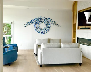
Flat art is great. But sometimes a painting just doesn’t cut it on a truly massive wall. That’s where sculptural wall installations swoop in and completely steal the show.
Take this living room posted by r/GlassyGirlk on Reddit. A swirling school of blue fish fans across the wall in a circular motion. The room itself is dead simple: white walls, neutral sofas, light wood floors. But that one sculptural piece makes the whole space feel like it was curated by someone with actual taste.
It adds movement. It adds shadow. It adds life. A framed print can’t do any of that.
Key tips for nailing sculptural wall art:
- Go bigger than your instincts tell you. A small piece on a large wall looks timid and sad.
- Keep surrounding furniture minimal so the art has breathing room.
- You don’t need an anchor motif to go coastal. A piece like this does the whole job without being cheesy about it.
IMO, sculptural art is one of the most underrated decorating moves out there. People always think it’s complicated or expensive, but one great piece can do what ten framed prints never could.
Try a Split-Panel Canvas for Instant Impact
The Triptych Trick Nobody Talks About Enough
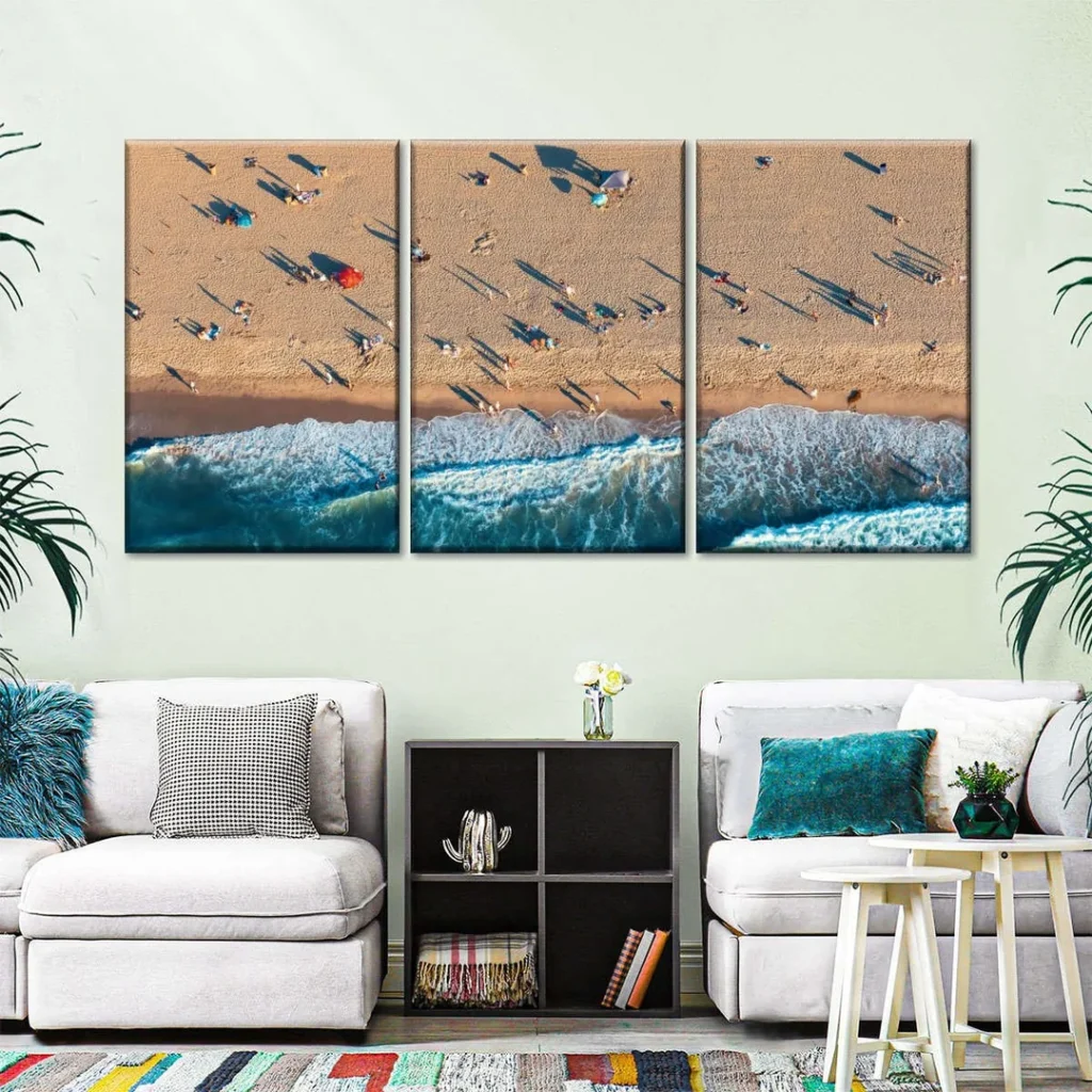
Can’t find a single piece wide enough for your wall? Stop searching. Three panels are often better than one anyway.
A triptych basically three canvases that form one continuous image gives you the visual scale of oversized art with way more flexibility. You can space them, rearrange them, and they’re a lot easier to hang than one giant canvas.
r/tm125690L nailed this with an aerial beach photo split across three tall vertical canvases. Warm sand, crashing waves, tiny sunbathers. It’s stunning on its own, but what makes it genuinely work as decor is the vertical composition. Those tall panels pull your eye upward and make the ceiling feel higher than it actually is.
Why this approach works so well:
- Vertical panels create the illusion of height
- Coastal tones (sandy beige, bright teal) naturally tie into existing furniture and plants
- Works with almost any image: forests, cityscapes, abstract landscapes, moody skies
Pro tip: Hang the panels with one to two inches of even spacing between each one. Any more and they read as three separate paintings. Any less and they look awkward. That sweet spot makes them read as one unified piece.
Frame It with Black for a Gallery-Ready Look
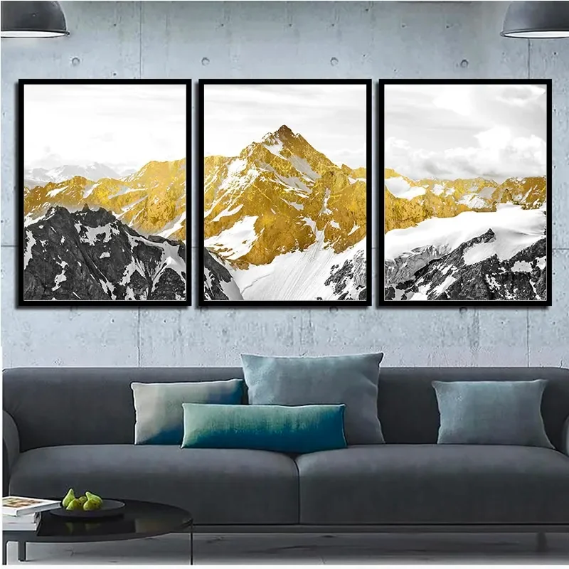
The Easiest Way to Make Cheap Prints Look Expensive
Here’s a styling secret that interior designers probably don’t love sharing: a black frame makes almost anything look more expensive. It sharpens the edges, cranks up the contrast, and gives your wall a gallery polish that’s honestly hard to fake with wood or metal frames.
r/Wallartaccents_2 did this beautifully with three matching black-framed prints of golden mountain peaks against a stormy grey sky. The colour palette is charcoal, white, and rich gold. Against a concrete-effect wall with a dark grey sofa underneath, everything just clicks.
It looks like it took hours. It probably didn’t.
The rules for pulling this off:
- Same frame style across every panel. No mixing.
- Same sizing. Consistency is everything here.
- Even spacing. Measure it. Don’t eyeball it.
- Stick to two or three colours in the artwork itself so it doesn’t turn into visual chaos.
The moment things go mismatched, it tips from “curated gallery wall” to “things I found in different rooms.” Don’t let that happen to you.
Also Read: 10 Aesthetic Wall Decor Ideas Straight From Real Bedrooms
Fill the Whole Wall with a Gallery Collection
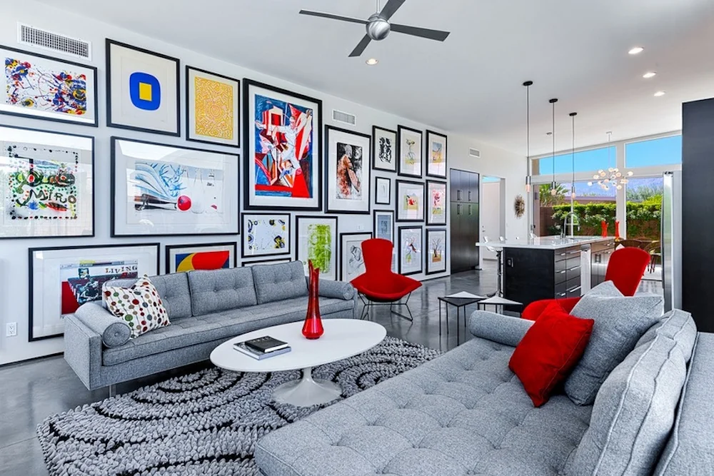
Go All-In or Go Home
Some people want one statement piece. Some people want twenty. If you’re firmly in the second camp, a full floor-to-ceiling gallery wall might be your living room’s calling.
r/Binary_Management went completely all-in. Bold, colourful prints in matching black frames cover nearly every inch of a tall white wall, running from just above the skirting board to almost the ceiling. It sounds like it should be chaotic. In the wrong hands, it absolutely would be.
But here’s what keeps it from tipping over the edge: the frames are all consistent. Same style, same colour. That single decision holds the whole thing together even when the artwork itself is wildly varied.
The room also helps. Grey sofas, red accent chairs, and red accessories give all that colour somewhere to land. Without those grounding elements, it could easily feel like visual overload.
How to pull off a large-scale gallery wall:
- Plan it on the floor first. Lay every frame out and adjust the arrangement before a single nail goes in.
- Curate by colour family or artistic style so there’s a through-line in the collection.
- Make sure your furniture gives the wall somewhere to breathe.
Trust me on the floor-planning tip. It saves you from a wall that looks like Swiss cheese from all the repositioned holes.
Use Two Pieces That Speak to Each Other
Sometimes Less Really Is More
More isn’t always the answer. Sometimes two carefully chosen pieces, positioned to complement each other, make a stronger statement than twenty ever could.
r/Edg-R demonstrates this perfectly in a room with tall ceilings. A single textured silver-and-black abstract piece hangs lower on the left. A quad of matching black-and-gold abstract canvases sits higher and to the right. They’re not identical, but they share the same colour story and the same abstract energy.
Together, they balance the vertical space without desperately trying to fill every inch of it.
What makes this work:
- Both pieces share a visual language (same palette, same mood)
- The height variation creates upward movement
- Negative space is used deliberately, not by accident
Here’s the real talk: a lot of people feel pressure to cover every inch of a large wall. You don’t have to. Negative space is a design choice, not a failure. It creates breathing room, makes your chosen pieces feel more intentional, and honestly just looks more sophisticated.
If you’ve got high ceilings, hang one piece lower and one piece higher. Let your eye travel up the wall naturally.
Also Read: 8 Large Wall Decor Ideas for Your Living Room (That Actually Work)
Let a Bold Accent Wall Do the Heavy Lifting
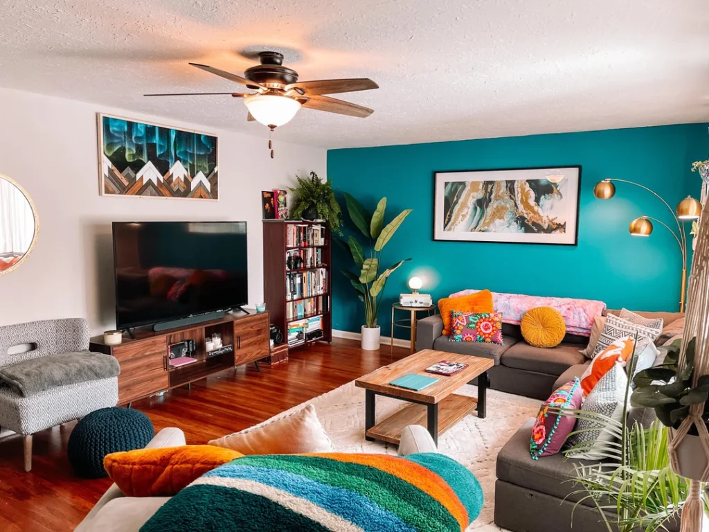
Sometimes the Art IS the Wall
Plot twist: the art doesn’t have to be a canvas. Sometimes the most powerful thing on your wall is the wall itself.
r/maximalism painted one wall a deep, saturated teal and completely changed the entire dynamic of the room. The teal backdrop makes a wide horizontal abstract print in blues and golds look like it was literally made for that exact spot. Add green plants, warm wood tones, and a pile of colourful cushions, and the whole room feels properly alive.
How to pull off an accent wall without it looking like a mistake:
- Pick a colour that already exists somewhere in the room. A cushion, a rug, a plant pot. That connection makes the wall feel intentional rather than random.
- Go big with the artwork on a coloured wall. Too small and it floats awkwardly. The right scale anchors everything.
- Horizontal prints work especially well on coloured walls because they mirror the width of the wall itself.
FYI, this is one of the highest-impact, lowest-cost moves you can make in a living room. A can of paint and one good print can genuinely transform a space.
One Big Piece, Hung with Intention
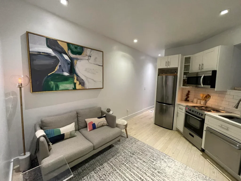
The “Just Commit to It” Approach
Not every large wall needs a collection. Not every wall needs layers and arrangements and planning sessions on the floor. Sometimes the most powerful move is finding one genuinely great piece and hanging it like you mean it.
r/melting_skittles did exactly this. A large abstract canvas in deep green, navy, grey, and gold hangs above the sofa. It’s slightly oversized for the space, which is precisely why it works. The scale creates drama. The rich colours don’t shout. The gold frame ties it all together neatly.
One piece. Maximum impact. No overthinking required.
The proportion rule you need to know:
Your artwork should fill roughly two-thirds to three-quarters of the wall width above your sofa. Go smaller than that and it looks like an afterthought you forgot to swap out. Hit that range and it looks like every other choice in the room was made to support it.
Bold move. Big reward.
Also Read: 10 Album Cover Wall Decor Ideas That Actually Look Great (With Real Inspiration From Real Rooms)
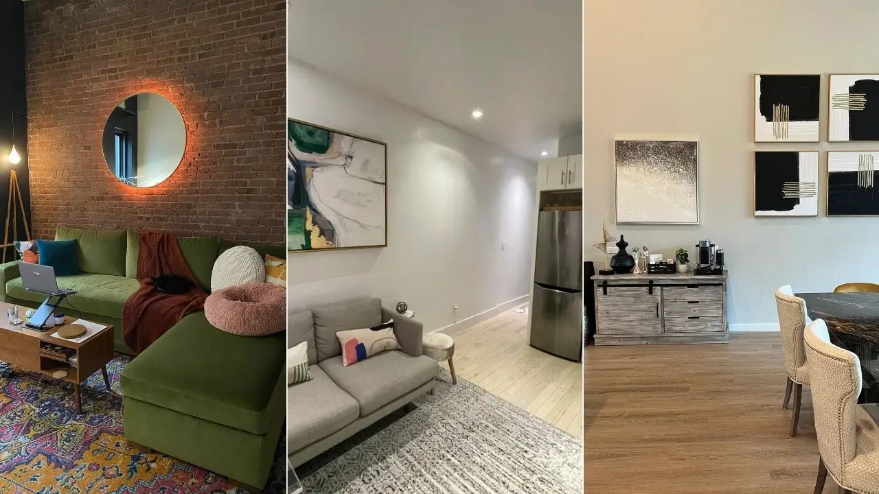
Lean Into Texture with a Backlit Mirror
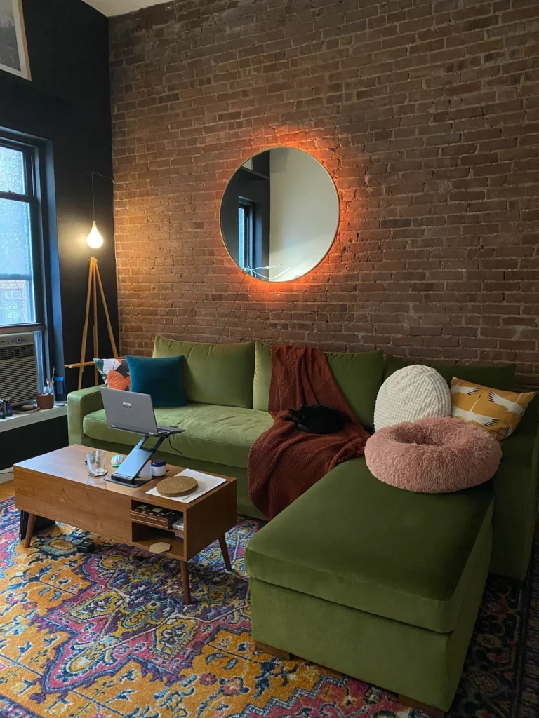
When Art Meets Atmosphere
Here’s one people don’t talk about enough: a mirror can be just as powerful as any painting. Especially when it brings a little drama with it.
r/cr0okedMC hung a large round mirror with built-in LED backlighting against an exposed brick wall, and the result is genuinely stunning. The warm amber glow against raw brick creates this moody, industrial, deeply inviting atmosphere that no canvas could replicate. Pair it with a green velvet sofa, a Persian rug, and warm-toned accessories and you’ve got a space that looks seriously designed.
When a backlit or statement mirror works best:
- Walls with existing character: brick, stone, textured plaster, or dark paint
- Smaller or darker rooms that need light bounced around
- Spaces where you want atmosphere over just decoration
A great mirror does three things at once. It creates a focal point, makes the room feel larger, and bounces light into corners that need it. That’s a pretty impressive return on one wall decision.
Wrapping It Up: Your Large Wall Is an Opportunity, Not a Problem
Here’s the bottom line. That big blank wall isn’t staring you down. It’s waiting for you to do something interesting with it.
Quick recap of what we covered:
- Sculptural installations add movement and life that flat art never can
- Triptych panels give you oversized impact with flexible hanging
- Black frames make anything look more expensive and gallery-polished
- Full gallery walls work when you keep frames consistent and plan on the floor first
- Two complementary pieces can be more powerful than twenty
- Accent wall paint combined with one strong print is a high-impact, low-cost win
- One oversized piece at the right proportion makes a bold, confident statement
- A backlit mirror creates atmosphere and bounces light in ways art can’t
Whether you’re drawn to one oversized canvas or a wall covered edge to edge in prints, there’s a version of this that works for your space and your personality. You don’t need a designer. You just need a direction.
Pick one idea from this list, commit to it, and go for it. Worst case? You repaint. Best case? Your living room becomes the thing people talk about after they leave. Give it a shot!
