Let’s be honest. Your half bathroom is tiny. Like, “I can touch both walls if I stretch” tiny. And yet, somehow, every guest who visits your home walks out of that little room with a full opinion about your design taste. No pressure though, right?
Here’s the thing nobody tells you: wallpaper is the single best investment you can make in a half bath. Small room means less wallpaper to buy, faster to install, and the impact is absolutely massive. I’ve seen people spend thousands on kitchen renovations that nobody notices, and then slap up $200 worth of bold wallpaper in their powder room and have guests literally pulling out their phones to take pictures.
These 15 real-world examples are proof that going bold beats playing it safe every single time.
15 Half Bathroom Wallpaper Ideas That Punch Way Above Their Weight
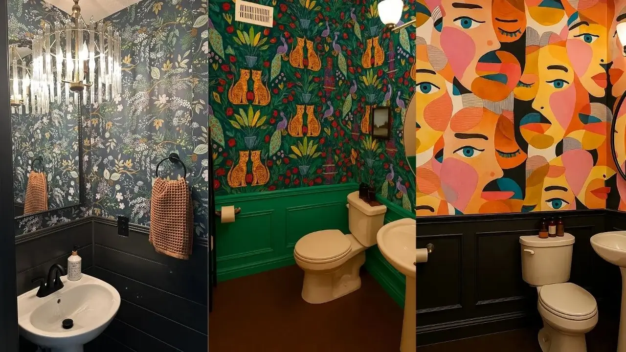
1. Vibrant Floral Explosion with Warm Wood Trim
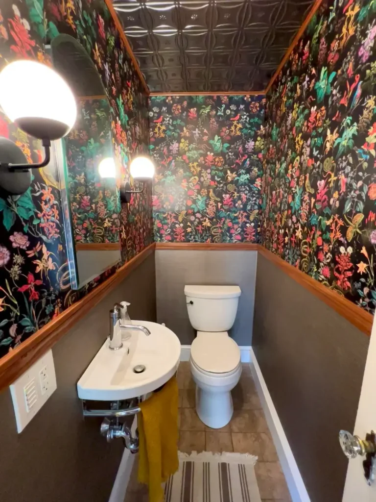
This space does not whisper. It walks in, sits down, and orders the most expensive thing on the menu.
The design wraps the entire half bath, floor to ceiling, in a multi-colored botanical print. Think coral, pink, yellow, and green blooms exploding against a deep black background. Warm oak wood trim creates distinct zones, separating the wallpaper from gray lower walls and framing a pressed tin ceiling. A yellow sink base pulls one of the wallpaper’s accent colors right down to eye level.
What makes this work:
- The black background keeps a busy pattern from feeling chaotic
- Full coverage (including the ceiling) creates full immersion, not just decoration
- Bright florals prevent the space from feeling like a cave
IMO, this is the kind of commitment that separates a memorable room from a forgettable one. If you’re going for it, go all the way.
Quick tip: Prep your walls properly before attempting full-room coverage. Measure twice, order 10% extra for pattern matching, and seriously consider hiring a pro for the ceiling. That’s where amateur mistakes become very obvious, very fast.
2. Textured Metallic Pattern with a Split Wall Design
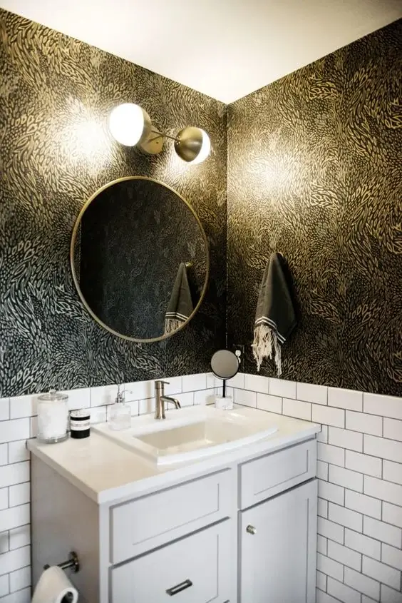
Contrast is a design superpower, and this bathroom uses it on purpose.
The upper walls feature a textured metallic wallpaper in warm gold and bronze tones with an organic, almost animal-print quality. The lower half stays clean with classic white subway tile. A round brass-framed mirror and a sleek white vanity keep things anchored in contemporary style without letting the glamorous wallpaper tip into “too much.”
Why the split wall works so well:
- The subway tile acts as a visual break in tight quarters
- Metallic finishes add depth through light reflection, no extra square footage needed
- The design feels intentional rather than chaotic
A standard chair rail height of 32 to 36 inches works in most half baths, but adjust based on your ceiling height. Also, fair warning: metallic wallpapers will expose every little wall imperfection. Surface prep is not optional here.
3. Whimsical Cat and Botanical Print with Bold Wainscoting
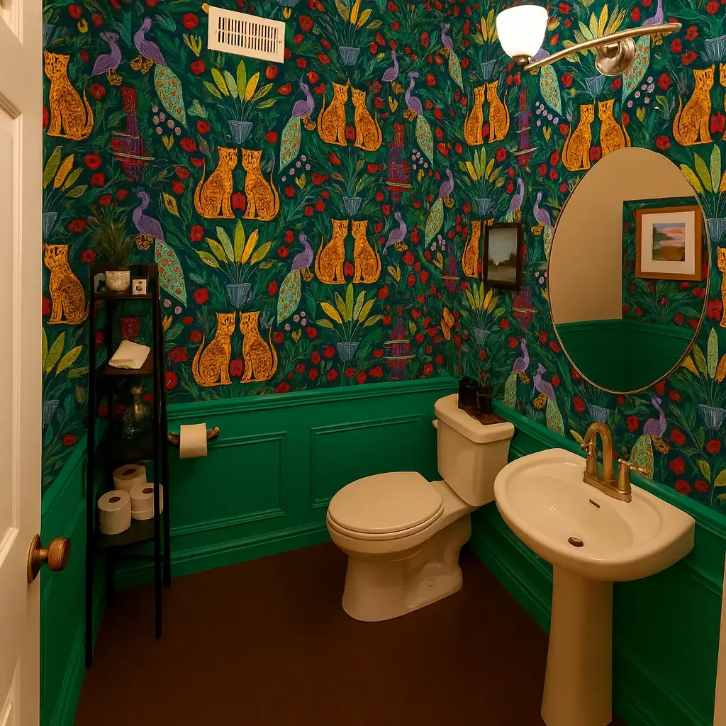
Some wallpaper patterns tell a story. This one writes an entire novel, illustrates it, and publishes the hardcover edition.
A deep teal wallpaper featuring stylized cats, peacocks, potted plants, and flowers in orange, purple, and gold sets the scene. The folk-art quality feels both vintage and fresh at the same time. But the real genius move here is the bright green wainscoting running along the lower third of the walls. It bridges the teal background with the green botanical elements in the pattern while also protecting the lower wall from water splashes. Practical AND beautiful. We love to see it.
A brass oval mirror and simple pedestal sink keep fixtures minimal so the walls can do all the talking.
Pro tip: When you go this bold with pattern, keep accessories extremely simple. One or two small decorative items max. The wallpaper is already the artwork.
Also Read: 15 Small Bathroom Layout Floor Plan Ideas That Actually Work in Tight Spaces
4. Botanical Leaf Print with Board and Batten
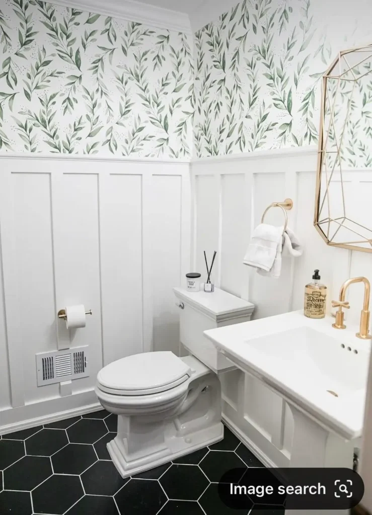
Not every half bath needs to be loud. Sometimes the most sophisticated choice is a quiet one.
This space features soft, watercolor-style greenery in sage and gray-green tones against an off-white background. White board and batten paneling extends halfway up the walls, adding architectural interest while protecting high-traffic areas. A gold geometric mirror and matching faucet add warmth without competing with the gentle palette, and black hexagon floor tiles provide a grounding contrast.
This design works especially well if your home leans:
- Traditional or farmhouse in style
- Toward neutral, adaptable color schemes
- Toward longevity over trend-chasing
The soft botanical won’t look dated in five years, and the neutral palette adapts to changing accent colors over time. Install the wainscoting first, then measure carefully for the wallpaper placement to avoid gaps at the seam.
5. Same Bold Pattern, Completely Different Mood
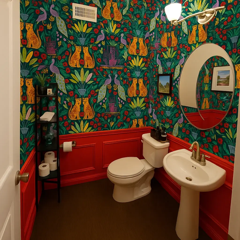
Wait. Haven’t we seen this wallpaper before?
Yes. Same cat and botanical print from design number 3. Same teal background, same orange cats, same purple peacocks. But swap the green wainscoting for fire-engine red, and the entire room transforms. The space feels warmer, more dramatic, and slightly more formal than its green-trimmed counterpart.
This is one of the best real-world demonstrations of how much trim color matters. The wallpaper stays the same, but the red pulls the warm tones forward while the green version emphasized the cooler botanical elements. Two completely different rooms from one pattern.
Lesson here: Don’t commit to trim color based on a paint chip alone. Hold large wallpaper samples next to painted sections on your actual wall before deciding. Paint at least two 2×2 foot sections and live with them for a few days.
6. Moody Floral with Traditional Wainscoting
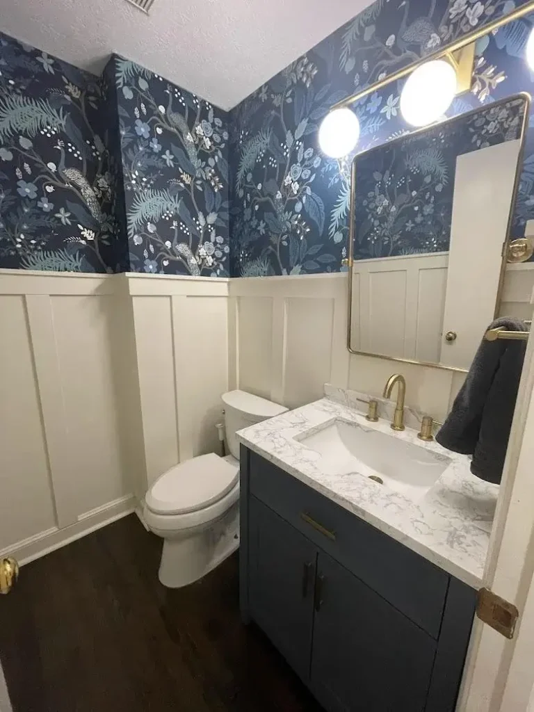
Dark doesn’t mean depressing when you execute it like this.
A charcoal or navy background gets covered in delicate white florals with soft touches of blue and peach. The pattern has a vintage botanical illustration quality that feels detailed without being fussy. Crisp white board and batten wainscoting runs halfway up the walls, creating breathing room around the moody upper section. A navy blue vanity with marble countertop and brass fixtures echoes the wallpaper’s sophisticated tone.
The white wainscoting does critical work here:
- It reflects light in a space that could otherwise feel too enclosed
- It provides a clean visual break that prevents darkness from overwhelming the room
- It makes the brass fixtures read warmer against the cool wallpaper tones
Lighting note: Dark wallpaper requires upgraded lighting. Add sconces, bump up bulb wattage, or install a fixture that brings both illumination and style. A gorgeous dark wallpaper in a dim room just looks muddy.
Also Read: 15 Small Bathroom Wallpaper Ideas That Transform Tight Spaces Into Design Statements
7. Classic Morris-Style Print on a Single Accent Wall
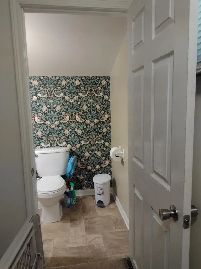
You do not have to wallpaper every surface to make a serious impact. This half bath proves it beautifully.
A William Morris-inspired pattern with birds, flowing florals, and soft blue-green, peach, and cream tones against a dark background covers just the wall behind the toilet. The other walls stay a simple neutral gray. The toilet and flooring remain basic and unfussy, letting that one wallpapered wall command all the attention in the room.
This is your safest bold wallpaper approach:
- One accent wall delivers pattern and personality
- Lower cost and less installation time than full coverage
- Easier to change in a few years if your tastes evolve
Pick the wall your eye lands on first when you open the door. Usually it’s the wall directly facing the entrance. Then keep everything else as simple as possible.
8. Contemporary Abstract Faces with Traditional Paneling
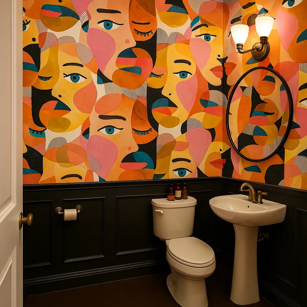
Modern art meets classic architecture. On paper, it should be a disaster. In practice, it’s stunning.
The wallpaper features overlapping stylized faces in orange, pink, teal, and gold with a retro-modern aesthetic that feels very 1960s. Black board and batten wainscoting grounds the playful pattern with visual weight. A white pedestal sink and toilet keep the focus on the wallpaper while brass hardware adds subtle warmth without chaos.
Why this unexpected combo works:
- The black trim is bold enough to hold its own next to a busy pattern without competing
- Traditional millwork acts as a timeless anchor for a trend-forward wallpaper
- When the wallpaper feels dated in five years, you can swap it without touching the wainscoting
This approach is genuinely smart for anyone who loves bold design but worries about commitment. The bones stay classic. The personality layer is swappable.
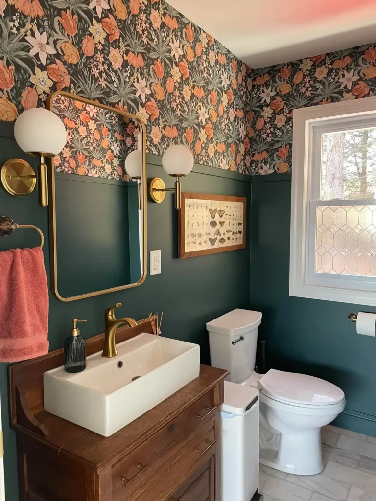
9. Large-Scale Floral Garden with Brass Accents
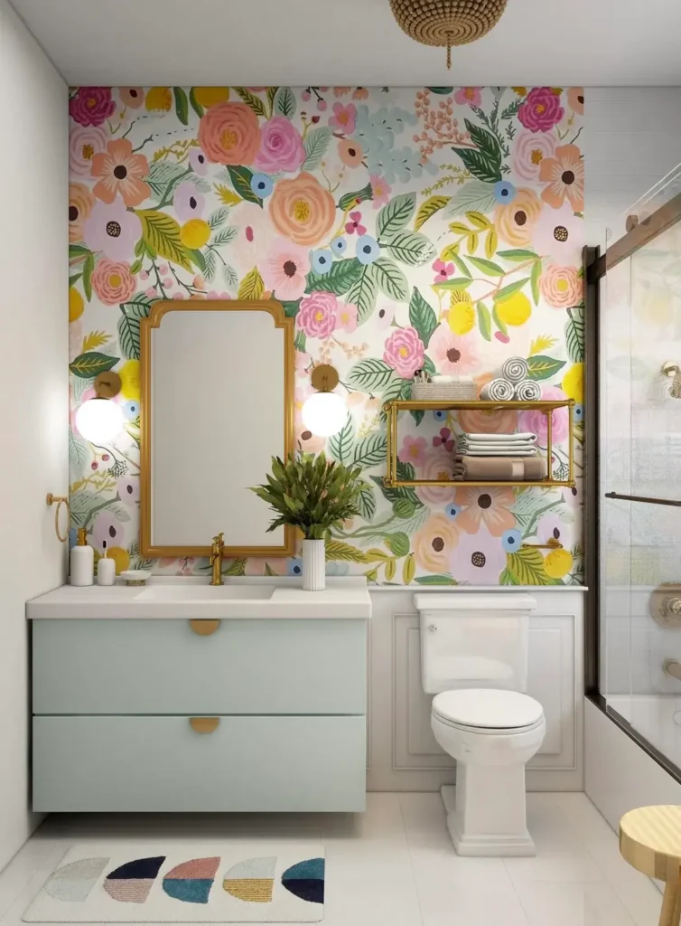
Scale matters, and this wallpaper proves that bigger florals are often better than smaller ones in tight spaces.
Oversized blooms in pink, peach, yellow, and blue sit against a soft cream background with green foliage throughout. A soft mint floating vanity with brass hardware and a brass-framed mirror create a cohesive, fresh look. A geometric floor mat adds pattern variation without competing with the wallpaper.
Here’s why large patterns can work in small rooms:
- They create impact without visual clutter when the design has enough breathing room between elements
- Cream or white backgrounds keep the space feeling open despite the large print
- Large repeats photograph beautifully, FYI, if you ever want to show off your space
Order 15 to 20% more material than your wall measurements suggest. Large-scale patterns require extra for seam matching, and running out mid-project when your pattern is discontinued is an expensive nightmare.
Also Read: Bathroom Wall Art: 15 Unique Designs That Look Expensive
10. Delicate Botanical with a Statement Chandelier
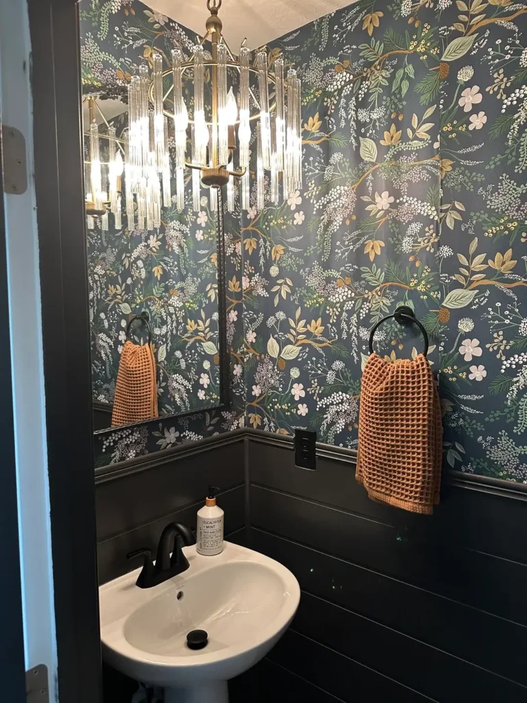
Sometimes the wallpaper is the supporting character, not the star of the show.
A charcoal background with intricate botanical illustrations in white, cream, peach, and green creates a sophisticated texture. But the brass and glass chandelier hanging overhead steals the opening scene. Black lower cabinets and brass hardware pull metals from both the wallpaper and the fixture together into one cohesive design. A waffle-weave hand towel in orange provides an unexpected color pop that pulls warm tones from the wallpaper forward.
The takeaway: When you invest in a statement light fixture, choose wallpaper that complements it rather than competes with it. Look for patterns that carry the same color tones as your fixture’s finish. Harmony beats a battle for dominance every single time.
11. Moody Bird and Botanical Print with Vintage Tile
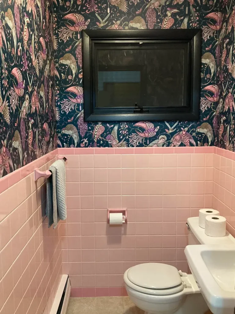
Combining design eras creates character. This bathroom understands that completely.
An intricate pattern of exotic birds in pink and gold tones with flowing botanicals sits on a deep teal or navy background. Instead of fighting the existing pink subway tile (probably original to the home), the design works with it. The pink tile becomes an unexpected color bridge to the wallpaper’s warmer tones rather than a dated eyesore. A black-framed window adds architectural contrast that ties everything together.
This is how you update a space with vintage elements you can’t or don’t want to change:
- Choose wallpaper that picks up a color from your existing tile or fixtures
- Suddenly that “outdated” pink tile becomes a curated design decision
- Your home’s history becomes a design asset, not a liability
Don’t fight your home’s character. Work with it. Homes with original details often look best when bold pattern choices celebrate their vintage rather than trying to disguise it.
12. Dramatic Wave Pattern with Vintage Fixtures
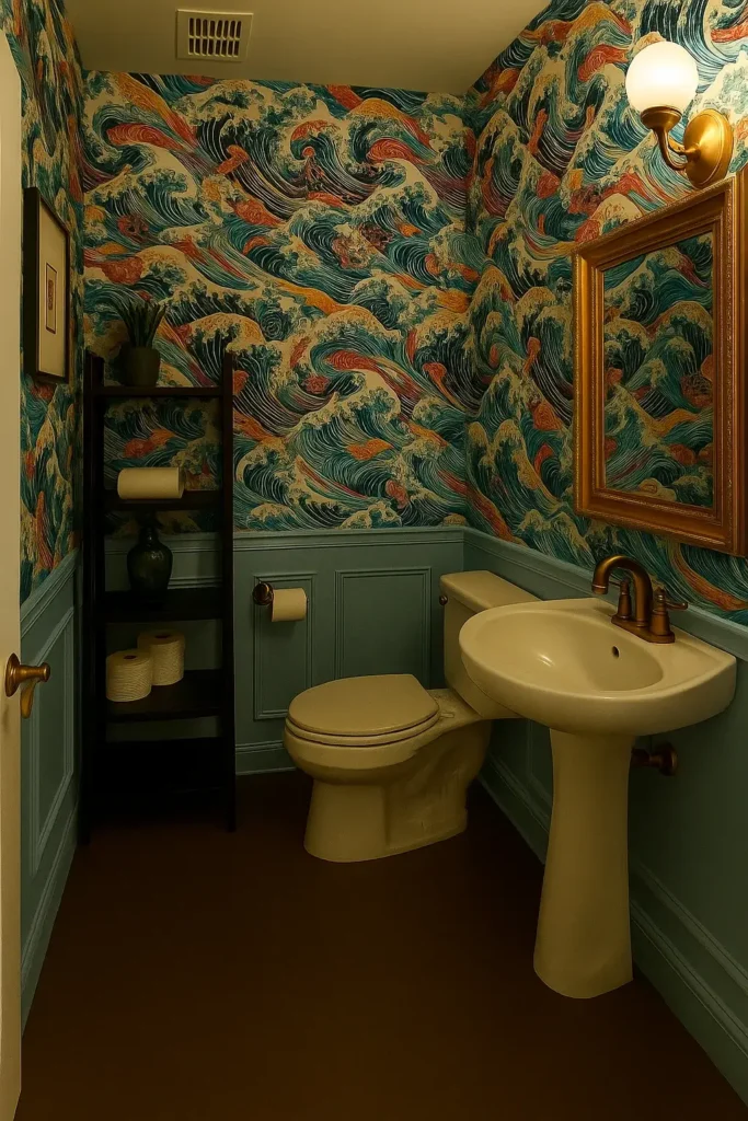
This wallpaper has movement. Literal movement. Waves of turquoise, coral, and cream swirl across every surface of the room.
A Japanese wave-inspired pattern covers walls and wraps into corners with full commitment. A cream pedestal sink and toilet lean slightly vintage, which pairs perfectly with a pattern that feels both retro and timeless. Sage green wainscoting and matching upper trim create frames that contain the pattern’s energy, while brass fixtures add the warmth the cool palette needs.
The psychology of wave patterns:
- Your eye follows the curves around the room rather than stopping at the walls
- Directional movement actually makes a small bathroom feel less confined
- The repeating rhythm has a meditative quality despite the pattern’s boldness
Heads up on installation: Patterns with strong directional flow require careful work to maintain continuity at seams. Start in the most visible corner and work around the room. This one is absolutely worth hiring a professional for.
13. Arts and Crafts Floral with Layered Wainscoting
Upper pattern, lower color, sophisticated execution. This split-wall design is a masterclass in intentional design.
Coral and peach flowers with gray-green foliage on a charcoal background give off strong Arts and Crafts movement energy. Deep teal painted wainscoting pulls the cooler tones from the pattern and creates a conversation between the wallpaper and the rest of the room. Brass globe sconces, a vintage-style vanity with vessel sink, and a framed butterfly collection on the lower wall add a naturalist touch that connects beautifully to the botanical wallpaper above.
The smart approach to wainscoting color:
- Pull a shade FROM your wallpaper rather than trying to match it exactly
- Exact matches often fall completely flat
- A complementary shade creates depth and looks intentional
The brass fixtures here feel chosen, not grabbed randomly from a hardware store. That “collected over time” aesthetic is something money can’t fully buy, but thoughtful color coordination can absolutely fake it.
14. Geometric Art Deco Pattern as an Accent Wall
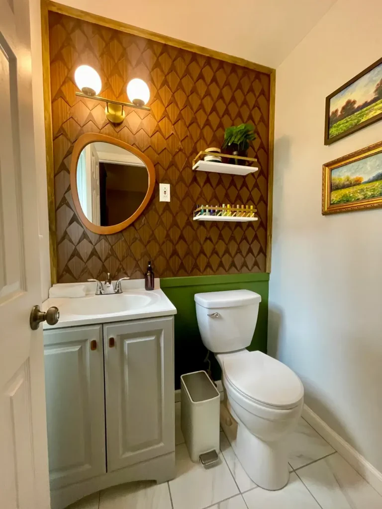
Not every bold wallpaper has to be floral. This Art Deco-inspired geometric makes a completely compelling case for structured pattern.
An interlocking scale or feather pattern in shades of brown and gold on a darker background creates depth through overlapping elements. Applied only to the wall behind the sink and mirror, it leaves other walls white so the texture can breathe. A teardrop-shaped wood mirror and simple white vanity keep focus entirely on that geometric pattern. A painted green stripe at chair rail height adds an unexpected color moment without overwhelming the space.
Why geometric patterns are beginner-friendly:
- Small alignment errors are far less noticeable than with floral repeats
- The structured design creates visual consistency even with imperfect seams
- Geometric patterns feel modern and architectural even when the motif itself is vintage
This is genuinely a great starting point if you’ve never hung wallpaper before and want to build confidence.
15. Maximalist Wildlife Print with Classic Contrast
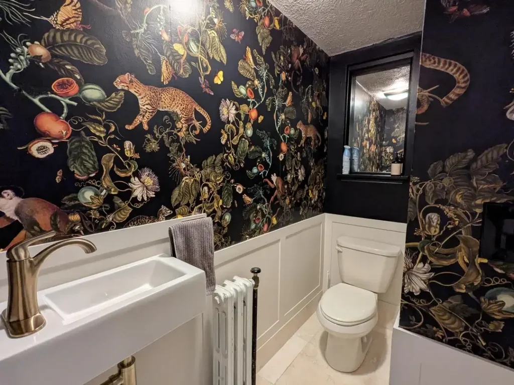
Go big or go home. This wallpaper chose violence, and it looks incredible.
Exotic animals including leopards, monkeys, snakes, and tropical botanicals in muted golds, greens, and corals explode across every wall surface on a deep black background. Bright white wainscoting and white fixtures ground the chaos just enough to prevent sensory overload. Brushed nickel hardware and a simple gray hand towel wisely refuse to compete with the pattern’s complexity.
The formula for making maximalist patterns work:
- Black backgrounds create depth while colorful elements pop forward
- White wainscoting prevents a dark background from closing in the room
- Every other design decision must be as simple as humanly possible
The wallpaper is the entire show. The fixtures, the hardware, the accessories, all play supporting roles. When you go this bold with pattern, minimalism everywhere else isn’t a compromise. It’s the strategy.
How to Choose the Right Approach for Your Half Bath
After looking at 15 very different designs, a few patterns emerge in what makes half bathroom wallpaper actually work.
Think About Your Commitment Level
Full room coverage delivers maximum impact but costs more, takes longer to install, and requires genuine confidence in your pattern choice. Single accent walls give you boldness with less financial and emotional commitment. Split-wall designs with wainscoting offer a smart middle ground that adds pattern while keeping classic architectural detail.
Match the Pattern to Your Actual Personality
- Florals work beautifully for traditional, cottage, and English garden aesthetics
- Geometrics lean modern, Art Deco, and mid-century in feel
- Abstract designs push contemporary and eclectic directions
- Wildlife and maximalist prints suit bold, adventurous design sensibilities
Don’t choose what you think you should like. Choose what genuinely excites you.
Understand Color Psychology
Dark backgrounds create drama and intimacy. Light backgrounds feel airy and expansive. Warm tones energize a space while cool tones calm it down. Your half bath might actually be the one room in your home where you can embrace moody, dramatic color without worrying about spending hours living in it every day.
Plan Your Lighting Before You Commit
Dark wallpaper requires upgraded lighting, full stop. Add sconces, increase bulb wattage, or install a statement fixture that provides both illumination and style. No pattern, regardless of how beautiful it is, looks good in a dim room.
Installation Basics That Actually Matter
Prep your walls first. Wallpaper exposes every imperfection. Fill holes, sand rough spots, and prime with proper wallpaper primer. This single step determines whether your finished result looks professional or like a rushed weekend project.
Calculate carefully. Measure wall height and width, multiply to get square footage, then add 10 to 20% based on pattern repeat size. Larger repeats require more overage for matching seams.
Know when to hire help. Ceiling installation, large-scale patterns, and expensive wallpaper all justify professional installation costs. Your half bath is small enough that professional fees stay reasonable, and the results will look dramatically better.
The Bottom Line
Your half bathroom is the best room in your house to take a design risk. It’s small enough to wallpaper on a reasonable budget, visible enough to genuinely impress guests, and intimate enough that bold choices feel appropriate rather than overwhelming.
Every single example in this list proves that confidence outperforms caution in a half bath. The spaces that work best commit fully to their chosen pattern instead of hedging toward safety.
Start with the pattern that genuinely excites you. Build your fixtures and finishes around it. Keep one element bold, either the wallpaper or a statement light, and keep everything else simple. And remember, wallpaper is removable. If you hate it in three years, you strip it and try something new. That’s not failure. That’s just design doing what design does.
Your tiniest room has the biggest opportunity for personality. Give it the attention it deserves.