Let’s be honest, most powder rooms are boring. White walls, a basic mirror, maybe a sad little hand towel hanging there doing nothing. And look, I get it. Small space, low priority, why bother, right?
Wrong. So wrong.
Your powder room is honestly one of the best design opportunities in your entire home, and most people completely waste it. Guests spend time alone in there, actually looking at your walls, your fixtures, your styling choices. So why not give them something worth staring at?
Dark powder rooms are having a serious moment, and once you see these 15 ideas, you’ll understand why. These aren’t scary or gloomy spaces. They’re dramatic, memorable, and honestly kind of luxurious.
Why Dark Powder Rooms Just Work
Here’s the thing about powder rooms that makes them perfect for bold design moves: you don’t actually live in there. You’re not going to wake up every morning regretting your black walls. Guests pop in, wash their hands, and leave completely shook by how cool your bathroom is.
Dark colors create a cocoon-like atmosphere that feels intentional and sophisticated. They make small spaces feel like they were designed, not just assembled from a clearance aisle. Plus, repainting a powder room costs you one can of paint and an afternoon. Low stakes, high reward.
Ready? Here are 15 real examples that’ll have you booking a trip to the paint store.
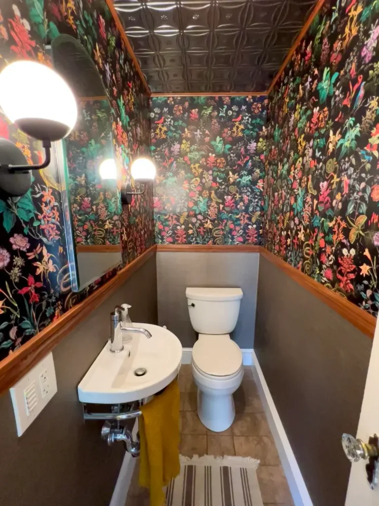
Botanical Wallpaper with Charcoal Wainscoting
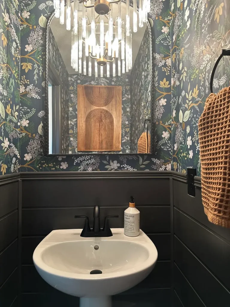
This combo is basically the little black dress of powder room design. Classic, always works, never fails to impress.
The idea here is botanical wallpaper with cream and gold florals on a charcoal base, paired with matching dark gray wainscoting on the lower walls. A white pedestal sink and crisp towels keep things from feeling too heavy, and a chandelier-style light fixture ties it all together with a touch of elegance.
What makes this work is the contrast between the busy pattern and the solid color below. Your eye gets to travel around the room without feeling overwhelmed, which is exactly what you want in a small space.
Pro tip: Always pick your wallpaper first, then match your wainscoting paint to the darkest tone in the pattern. Install the wainscoting at roughly one-third up the wall (also called chair rail height) and let the wallpaper steal the show above it.
Deep Emerald with Black Paneling and Statement Wallpaper
Okay, this one sounds like a lot. Multiple dark tones, a bold pattern, vertical paneling… But trust the process, because it absolutely delivers.
Jewel-tone emerald green walls create a rich foundation, while vertical black beadboard paneling adds texture that catches light differently throughout the day. The accent wall features a celestial-patterned wallpaper in coral and yellow that injects personality without making the space feel like a kindergarten classroom.
The key here is contrast in finishes. Matte walls against slightly sheened paneling create depth that flat paint alone never could. A granite countertop pulls together both the dark base and the lighter accent colors beautifully.
One thing you absolutely cannot skip with this many dark elements: layered lighting. Think wall sconces aimed at the counter and a dimmer switch so you can dial up or down depending on the vibe.
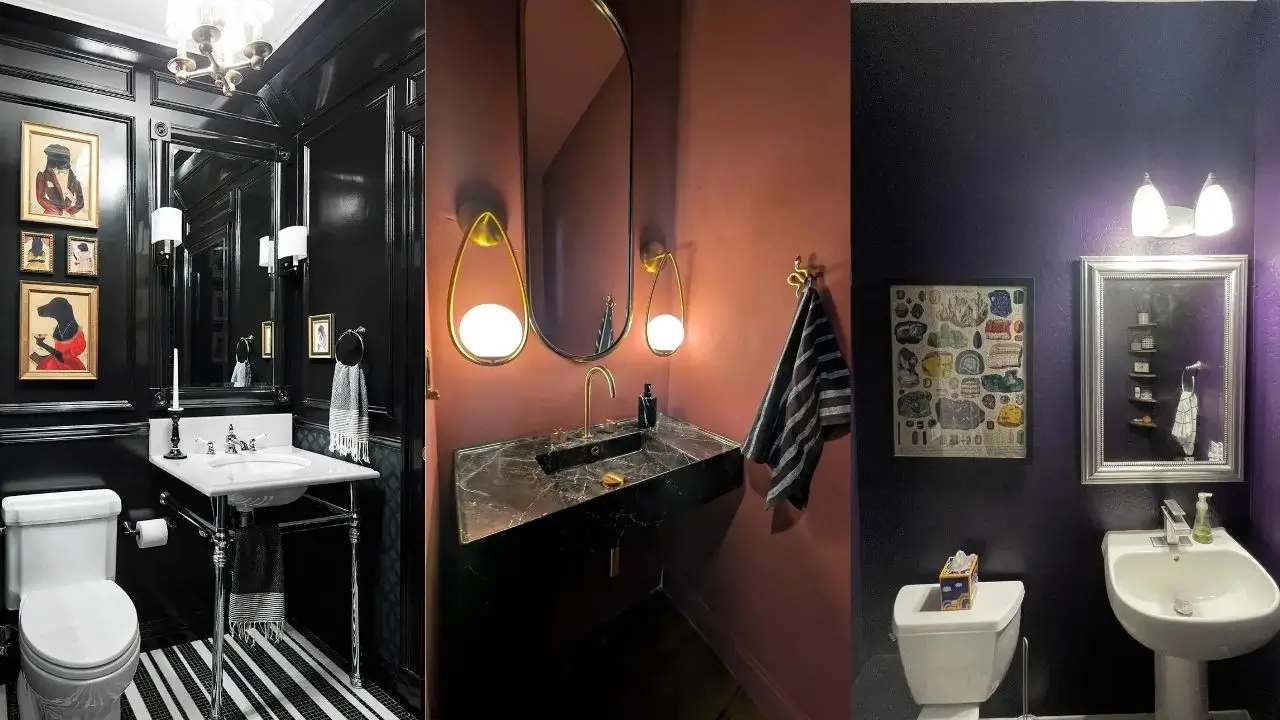
Matte Black Walls with Gold Crane Wallpaper
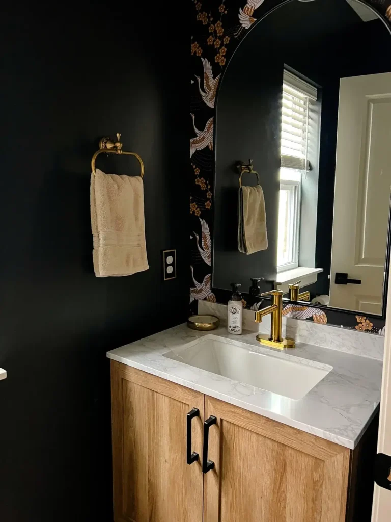
Pure black walls scare people. I understand. But matte black paired with the right accents? Chef’s kiss.
This setup uses matte black paint as a backdrop for gold metallic crane wallpaper inspired by Asian motifs. The birds create movement up the wall, which tricks your eye into thinking the ceiling is higher than it actually is. A natural wood vanity adds warmth, a white marble countertop provides clean contrast, and brass fixtures coordinate with the gold tones without looking matchy-matchy.
The rule here is simple: use true matte paint, not eggshell or satin. Any sheen on black walls highlights every bump, brush stroke, and fingerprint like a spotlight. Prime properly, apply evenly, and you’ll get that rich, dramatic effect that looks intentional rather than patchy.
Also Read: Half Bathroom Wallpaper Ideas: 15 Stylish Designs That Transform Small Spaces
Navy Blue with Brass Accents and Minimal Decor
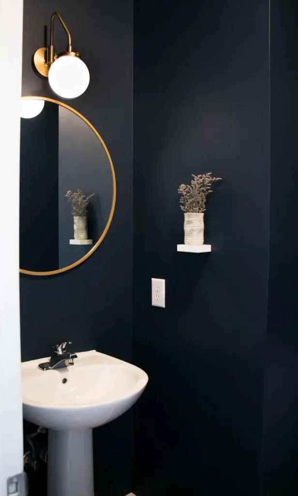
Sometimes the most powerful design move is restraint. This idea proves that less really is more.
Deep navy walls create a cocoon effect that makes the small space feel deliberate rather than cramped. The styling is minimal: a brass-framed circular mirror, a matching globe sconce, and one white shelf holding a textured vase with dried stems. The white pedestal sink keeps things timeless.
The brass finish brings warmth that chrome or silver simply wouldn’t deliver against navy. It gives your eye a focal point without fighting for attention. This is quiet confidence in design form.
Fair warning though: dark paint is ruthless with wall imperfections. Fill every hole, sand everything smooth, and prime before you paint. Your wall prep determines whether this looks luxurious or just dark.
High-Gloss Black Paneling with Dog Portrait Gallery Wall
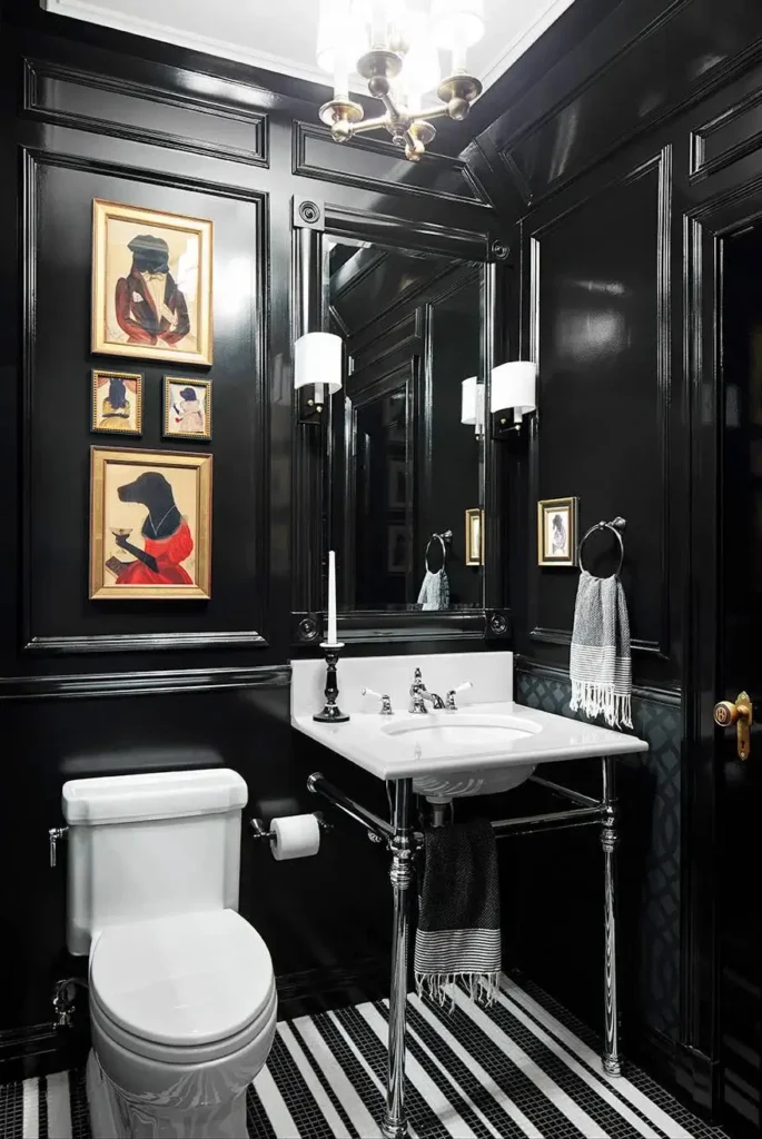
This one made me genuinely happy the first time I saw it. Because why not have a gallery of framed dog portraits in your powder room? Why not?
High-gloss black paneling creates depth through reflection, making the walls feel dimensional rather than flat. One entire wall becomes a gallery of dog portraits in gold frames, which is the kind of unexpected focal point that guests will absolutely talk about at dinner later. Black and white striped floor tiles continue the high-contrast theme, and painting the ceiling black extends the drama all the way up.
Most design rules say to keep small space ceilings white. This room breaks that rule on purpose, and it creates an envelope effect that feels intentional and bold.
When you hang a gallery wall in a small space: plan your layout on the floor first, use a level, and measure your spacing precisely. Eyeballing it in a tiny room does not work, I promise.
Dark Leopard Print Wallpaper with Black Lower Walls
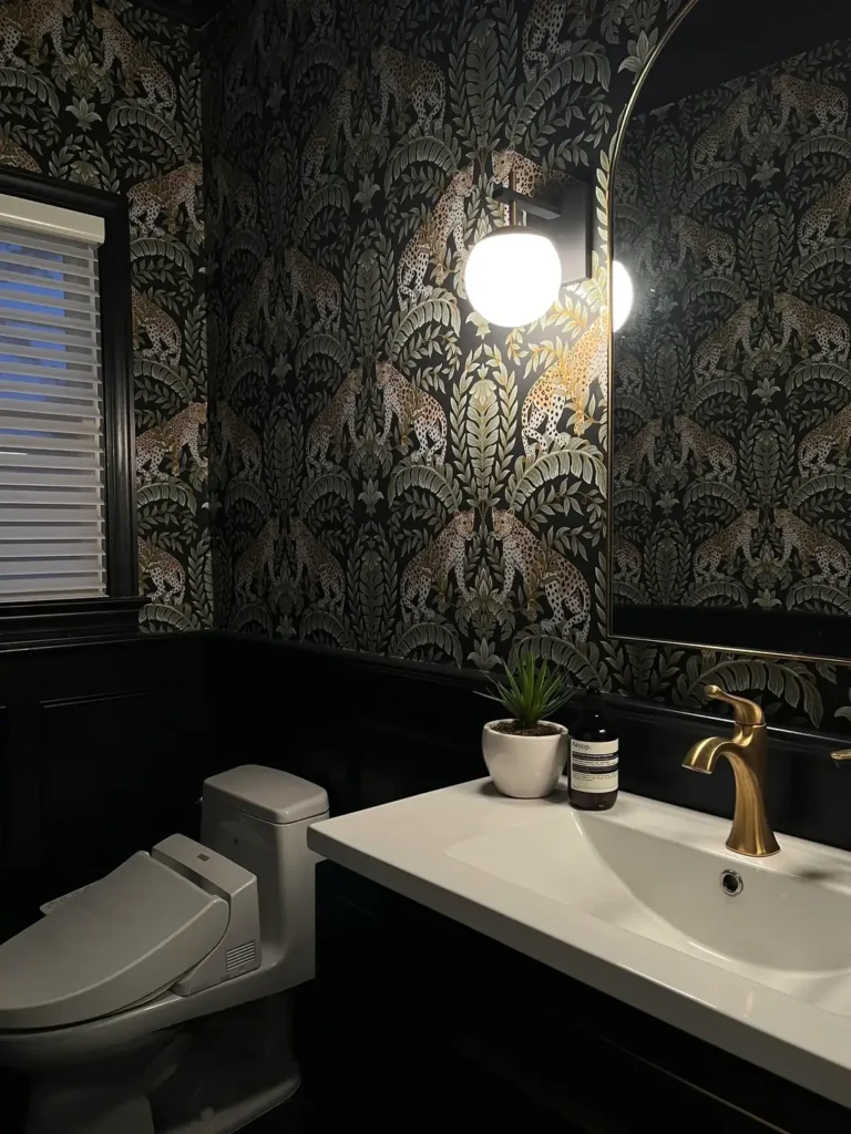
Before you exit this idea, hear me out. This isn’t the tacky leopard print of 2005. This is sophisticated, tonal, and genuinely cool.
The wallpaper features leopards among tropical foliage in muted grays and golds on a charcoal base, which keeps the pattern from screaming. Black lower walls and a matching black toilet create a grounded foundation, while a brass faucet on the white floating vanity ties in the warm metallic tones from the wallpaper.
The secret to making animal print work in a bathroom? Low contrast between the pattern and its background. High-contrast leopard print overwhelms a small space instantly. Tonal variations create interest without chaos.
Also Read: 15 Small Bathroom Wallpaper Ideas That Transform Tight Spaces Into Design Statements
Navy Gallery Wall with Eclectic Art Collection
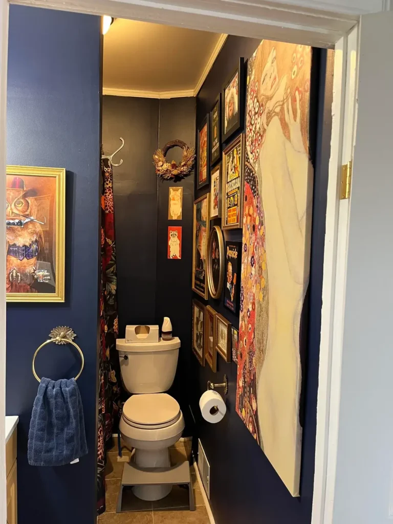
This idea treats the powder room like a mini gallery, and honestly, it’s kind of genius.
Navy blue walls recede just enough to let the art take center stage. An asymmetrical gallery wall features various frame sizes and styles, all unified by gold frames and consistent hanging height. The mix includes vintage-looking portraits, abstract pieces, and a small wreath, which creates visual interest from every angle.
White fixtures and a neutral tile floor keep the functional elements from competing with the display. A gold towel ring maintains the warm metallic thread running through the space.
Building a gallery wall tip: always lay everything out on the floor first to test your arrangement. Start with your largest piece and build around it. Perfect symmetry isn’t the goal, cohesion is.
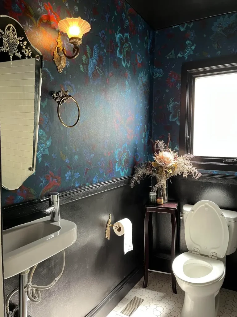
Vibrant Floral Wallpaper with Gray Lower Walls and Wood Trim
Dark doesn’t always mean muted. This space uses jewel-tone florals on a dark background and it’s absolutely alive.
Floor-to-ceiling floral wallpaper in coral, emerald, purple, and turquoise sits on a dark base, balanced by solid gray paint on the lower walls. Warm wood chair rail molding separates the two, and an unexpected yellow vanity base pulls one of the wallpaper’s accent colors down to eye level. A metal tin ceiling adds texture overhead while continuing the moody palette.
The rule this space follows perfectly: let one element be complex, keep everything else simple. Busy wallpaper demands solid, neutral floors and lower walls. Fighting pattern with pattern creates chaos, not design.
Whimsical Woodland Wallpaper with Black Ceiling and Natural Wood Vanity
Nature-themed wallpaper with a dark ceiling sounds like a lot. It’s actually really, really good.
Woodland wallpaper with foxes, trees, and botanicals in amber and sage on navy sets a playful but sophisticated tone. Painting the ceiling the same dark navy as the wallpaper background creates continuity that surprisingly makes the space feel larger rather than smaller. A natural wood vanity with horizontal slat detailing adds organic texture, and a gray marble countertop bridges the dark walls and warm wood.
Nature-themed patterns have built-in visual flow because your eye naturally follows branches and foliage. This creates a sense of movement in a static, small space. It’s one of those things you feel before you consciously notice it.
Also Read: Bathroom Wall Art: 15 Unique Designs That Look Expensive
Dusty Rose Walls with Black Marble Vanity and Gold Fixtures
Not every dark powder room idea involves navy or black walls. This one goes moody in a completely different direction.
Dusty mauve-rose walls create a warm, moody backdrop that pairs surprisingly well with a wall-mounted black marble vanity and black marble countertop. Brass fixtures, teardrop mirrors, and gold sconces create visual consistency throughout the space. Dark floor tiles continue the palette without repeating the exact wall color.
Rose and mauve tones have become a popular alternative to gray because they add warmth without reading as overly feminine. FYI: these tones shift significantly depending on your lighting, so test your paint at different times of day before you commit.
Pure Black Walls with Minimal White Fixtures
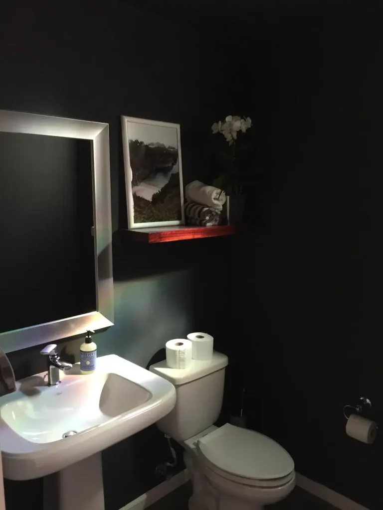
This approach requires confidence. Zero fluff, zero decoration for decoration’s sake. Just pure contrast and intention.
Jet black walls make the white pedestal sink, toilet, and mirror stand out like sculptural objects in a gallery. A single framed landscape photo, a floating wood shelf with minimal styling, and an LED-backlit mirror are all the room needs. Even the white toilet paper rolls become part of the design through sheer contrast.
When you go this minimal, lighting becomes your most important decision. Dark walls absorb light instead of reflecting it. You need more sources than you think: overhead for general illumination and task lighting at the mirror at minimum. Without proper lighting, this reads as cave, not cocoon.
Deep Purple with Mineral Chart Art and Traditional Fixtures
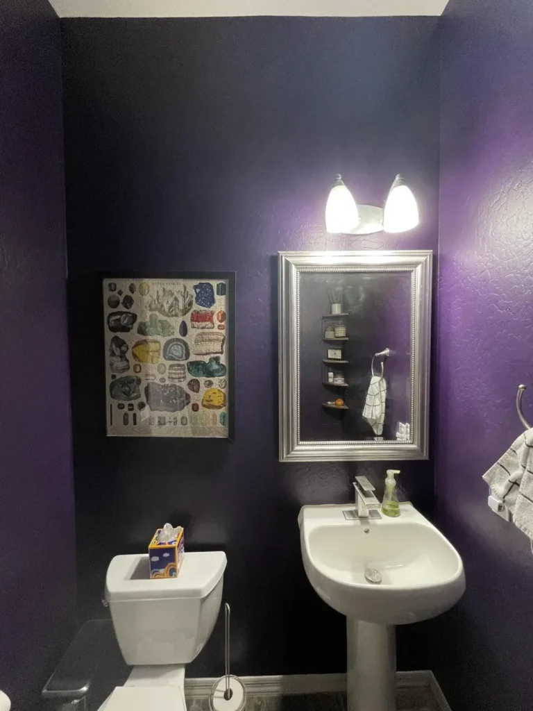
Scientific art in a powder room? Hear me out. When it’s framed properly, an educational piece becomes genuine decor.
Rich eggplant purple walls shift between blue and red depending on the lighting, giving the space a moody, ever-changing quality. A vintage-style mineral identification chart in a simple frame becomes real wall art. Traditional pedestal sink, standard toilet, white ceiling, white fixtures. The combination feels collected and personal rather than styled.
Purple is one of the trickier bathroom colors because it can swing between sophisticated and dated based entirely on the shade and undertone. Paint large swatches and live with them for at least a week before committing. Purple under warm lighting versus cool lighting can look like two completely different colors.
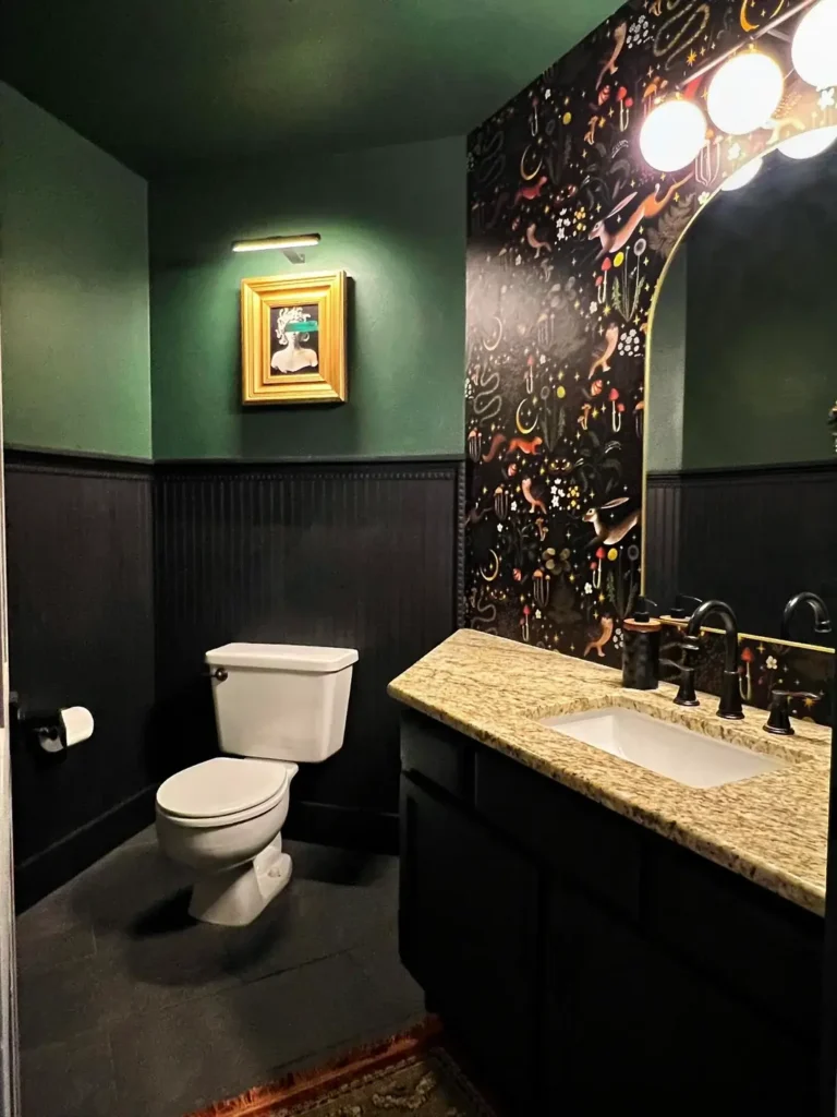
Moody Sage Green with Simple White Fixtures
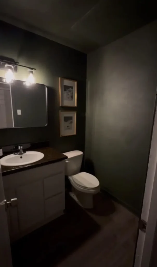
Green has officially left the mint-and-seafoam era. Welcome to the complex, moody, sophisticated version of green.
Sage-gray-green walls create a nature-inspired backdrop without leaning into obvious botanical clichés. Simple white vanity, standard toilet, white louvered storage cabinet, and a basic mirror keep the fixture selection clean. Brass sconces and a matching faucet provide warm metallic accents that complement the green’s undertones perfectly.
This color works especially well in windowless powder rooms because sage green maintains its character under artificial lighting better than most other paint colors. It doesn’t go muddy or weird under warm bulbs. A white shag rug adds texture underfoot without pulling attention away from the walls.
Dark Teal Walls with Painted Vanity and Practical Storage
Here’s proof that a beautiful powder room doesn’t require a total renovation. This one works with what it has.
Dark teal walls create drama while staying light enough to avoid feeling oppressive. The existing standard vanity gets painted to match the walls, which makes the white countertop and sink pop dramatically. A white wall cabinet above the toilet adds practical storage that most powder rooms desperately need, and a wood-framed mirror with matching sconces creates a traditional framework that balances the bold color.
Painting existing cabinetry is budget-friendly but only works if you prep properly. Clean thoroughly, lightly sand to give the paint something to grip, use a quality primer, and apply multiple thin coats. One thick coat will peel and chip faster than you’d believe.
Artistic Mural Wallpaper with Black Wainscoting and Vintage Fixtures
The final idea is for people who want their powder room to feel like art you walk into.
Mural-style wallpaper with abstract florals in coral, turquoise, and navy with painterly brushstrokes covers the upper walls. Black wainscoting anchors the visual intensity below and protects lower walls from wear. A vintage wall-mount sink with exposed plumbing and brass hardware leans into an eclectic, collected aesthetic without being period-specific. White hexagonal floor tiles add ground-level pattern without competing with the wall statement.
Mural wallpaper costs more per roll but requires fewer rolls in a small powder room. Always order one extra roll because dye lots vary between production runs and you do not want to be one strip short of a finished wall.
Comparing Dark Powder Room Styles
| Style Approach | Best For | Color Strategy | Complexity Level |
|---|---|---|---|
| Botanical Wallpaper | Traditional to transitional homes | Dark base + multicolor pattern | Medium |
| High-Gloss Black | Modern and contemporary spaces | Pure black with metallic accents | Advanced |
| Gallery Wall | Eclectic and personal aesthetics | Solid dark walls as backdrop | Medium |
| Vibrant Florals | Homes with existing color schemes | Multicolor pattern + neutral ground | Medium |
| Minimal Monochrome | Modern and minimalist preferences | Black or navy + white | Easy |
| Jewel Tones | Spaces needing warmth | Single bold color + metallic accents | Easy to Medium |
Essential Tips for Nailing Dark Powder Rooms
Before you grab a paint roller and go rogue, here are the things that actually determine whether dark walls look amazing or depressing.
Light it properly. Dark walls absorb light instead of bouncing it around. You need layered lighting: at least one overhead source and one dedicated task light at the mirror. A dimmer switch is not optional in my opinion. It takes the room from functional bathroom to actual experience.
Prep your walls. Dark paint exposes every flaw that light paint hides. Fill nail holes, sand bumps smooth, prime, and then paint. Skipping this step is how you end up with walls that look more chaotic than dramatic.
Test your color first. Paint a large swatch on multiple walls and observe it at different times of day over at least three days. Colors shift under different lighting, and dark colors shift dramatically. What looks perfect at noon can look completely different at 7pm.
Balance darkness with brightness. White or light-colored fixtures, countertops, and key accessories give the eye places to rest. An all-dark room without contrast points feels like a mistake, not a choice.
Think about maintenance. Matte paint looks sophisticated but fingerprints and water spots show up more clearly on dark surfaces. Choose your finishes based on how much cleaning you’ll realistically do, not just how good things look in photos.
Is Going Dark a Long-Term Commitment You’ll Regret?
This is the question everyone quietly worries about. What if you get sick of it? What about resale value?
Here’s the reality: powder rooms are low-stakes spaces. You spend minutes in there, not hours or mornings or entire work-from-home days. The bold choices that could feel exhausting in a living room barely register in a space you use so briefly.
And repainting a powder room costs you one gallon of paint and a free afternoon. It’s genuinely one of the cheapest design experiments in any home.
As for resale value, well-executed dark spaces photograph dramatically and stick in buyers’ minds after they’ve toured twelve beige boxes in a row. A distinctive, thoughtfully designed powder room becomes a talking point, not a liability.
The only version of dark that hurts resale is dark done badly. Mismatched fixtures, poor lighting, cluttered counters with the wrong wall color. That reads as a mistake. Dark walls with intentional design, proper lighting, and cohesive styling read as luxury.
Wrapping Up
Your powder room is genuinely one of the few spaces in your home where guests spend time completely alone, actually looking at your design. They notice the wallpaper. They notice the fixtures. They notice whether the space feels considered or thrown together.
Dark powder room ideas give you the fastest, most affordable route to a space that feels genuinely impressive. You don’t need a massive budget or a full renovation. You need a clear vision, proper preparation, good lighting, and the confidence to commit.
Pick the idea that made you stop scrolling and start there. Your guests will absolutely notice, and honestly, so will you every single time you walk past that door.