You hang a mirror, step back, and… it just sits there. Flat. Awkward. Nothing like the gorgeous inspo photos you spent 45 minutes saving. Sound familiar? Here’s the thing: the mirror isn’t the problem. It’s the thinking behind it.
I dug through real homes shared by real people online, not staged showrooms, not brand mood boards, and found eight mirror wall decor ideas that genuinely deliver. Some are budget-friendly DIY setups. Some are bold statement pieces. All of them work, and I’m going to tell you exactly why.
Let’s get into it.
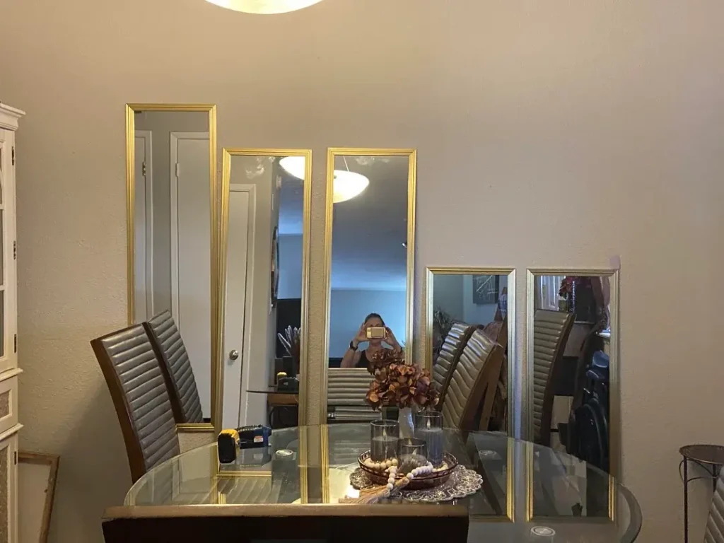
Three Warm-Framed Panels That Make a Small Room Feel Like an Art Installation
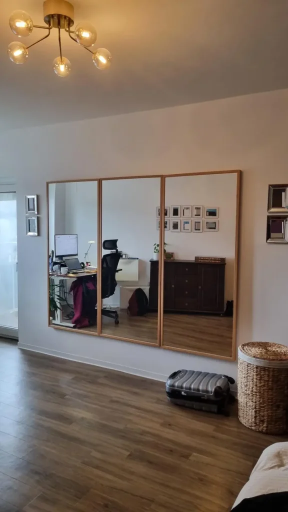
There’s something quietly cool about this setup. Instead of one big mirror screaming for attention, this approach uses three tall rectangular mirrors with warm wood frames, hung side by side to create a triptych effect on a plain white wall.
Reddit user r/EscapingMouse pulled this off in what looks like a multifunctional living space, and the result is genuinely impressive. The light honey-oak frames match the hardwood flooring below, which makes the whole arrangement feel intentional rather than thrown together on a Saturday afternoon.
Each panel is roughly the same size, and they’re hung close enough that your eye reads them as one unified piece. What makes this extra clever is what the mirror reflects: a desk, some artwork, a dark credenza. It effectively doubles the perceived size of the room.
How to recreate this look:
- Buy three individual full-length or three-quarter mirrors with coordinating frames (they don’t need to be sold as a matching set)
- Keep frames in the same finish family
- Leave roughly 1 to 2 inches of space between each panel
- Align the tops, not the centers, for a clean architectural feel
Pro tip: Warm-toned bulbs near these mirrors make the reflection look cozy and inviting. Cool white LEDs will make it look like a hospital corridor. Don’t do that to yourself.
Overlapping Circular Mirrors as a Living Room Focal Point
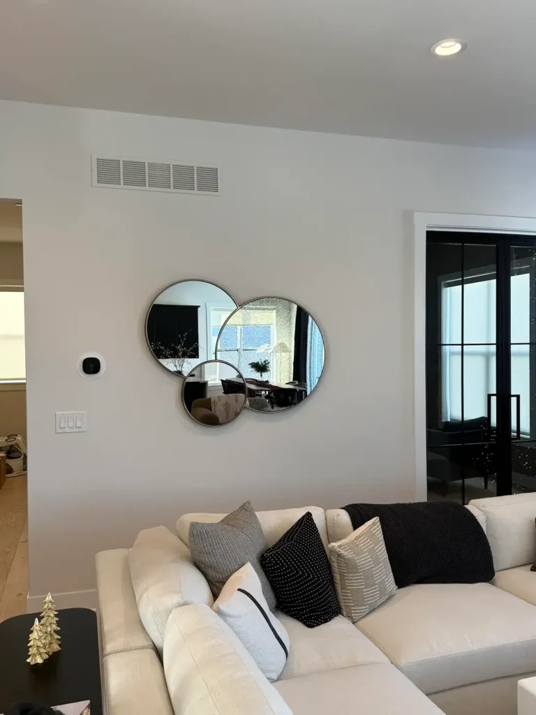
Okay, I’ll be honest. When I first saw this, I expected it to look chaotic. It doesn’t. It looks great.
Three round mirrors in different sizes, arranged in an overlapping cluster above a cream sectional sofa, manage to feel both casual and carefully designed at the same time. Reddit user r/cant_shut_up used thin metallic frames (matte silver or brushed gold, hard to tell in the photo) in three distinct sizes. The largest sits slightly left of center, the medium one overlaps it to the right, and the smallest tucks underneath.
The asymmetry is 100% intentional, and it works because the circular shapes themselves create enough visual harmony to hold everything together.
What keeps this from feeling messy is the restraint everywhere else in the room. Neutral cream sofa, black and gray pillows, flat white walls. The mirrors don’t have to fight for your attention.
A few things worth knowing about circular mirrors:
- They soften rooms full of right angles (boxy furniture, rectangular windows, square ceilings)
- They work really well in contemporary or transitional spaces
- Three sizes work better than three similar sizes. Go small, medium, and large, not three mediums pretending to be different
FYI, you can absolutely use five or seven overlapping circles if you’re feeling bold. But starting with three keeps it manageable and easier to balance.
An Organic-Shaped Mirror on a Bold Blue Accent Wall

Here’s where things get really interesting. A deep slate-blue accent wall is one of the most flattering backdrops you can put behind a mirror, and this example proves it.
The mirror itself has an irregular, almost pebble-like silhouette. Not quite round, with soft undulations around the edge. It hangs just above a rustic reclaimed wood console table that’s been styled with actual intention. Reddit user r/elforte22 built a full vignette here: a small black ceramic vase, a metallic amphora-style vessel, a miniature white lantern, a gold decorative dish, and a woven basket with greenery on the tabletop. Underneath: dark matte pottery, a gold decorative bird, and a glass hurricane candle holder.
Every single item was chosen. None of it just appeared.
The organic mirror shape works because it contrasts the straight lines of the console table and the rectangular wall behind it. Your eye bounces between the irregular silhouette and the rigid geometry of the room, and that tension is what makes it interesting.
The blue wall deserves a special mention. So many people play it safe with beige and then wonder why their decor looks flat. A deep blue-gray (think Benjamin Moore’s Van Deusen Blue or something similar) gives the mirror something to push against. The reflection looks richer. The whole space reads as designed, not just decorated.
Organic-shaped mirrors are widely available now in the $100 to $400 range. Pair one with a paint color you’d normally consider “too dark” and see what happens. You might surprise yourself..
Also Read; 10 Aesthetic Wall Decor Ideas Straight From Real Bedrooms
A Large Gold-Framed Round Mirror Paired With a Gallery Wall
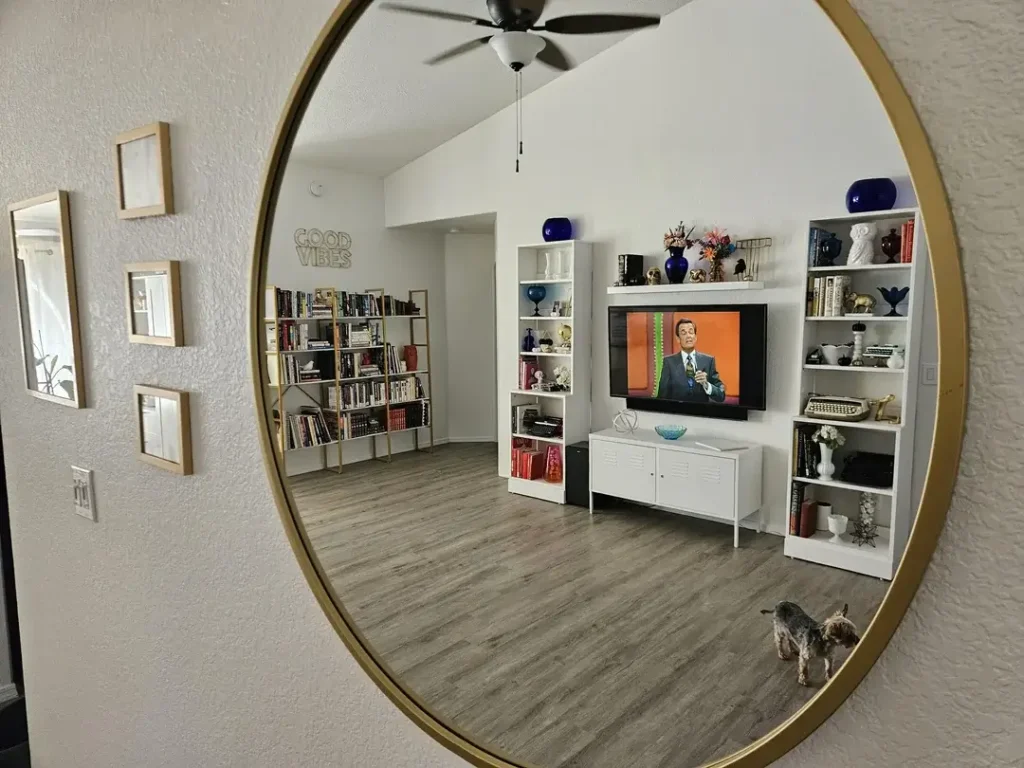
This one is a study in contrast, and it works because both elements know exactly what they’re doing.
A large round mirror with a thick gold metal frame dominates the center of the wall. To its left, three smaller rectangular framed mirrors in lighter wood tones hang in a vertical arrangement. Same wall, completely different energy, and somehow it all holds together.
Reddit user r/homedecoratingCJ set this up on a textured stucco-style wall, which adds a subtle organic quality that stops the whole thing from feeling too polished or showroom-ish. The large mirror reflects a lived-in room: bookshelves with actual books, white shelving with collected objects, a mounted TV. That reflection tells you a real person lives here.
The gold frame is doing serious work. Thin gold frames can look cheap. This one is thick enough to feel intentional and substantial enough to anchor the wall without looking desperate about it.
Here’s the part I find most interesting: the smaller mirrors don’t try to match the large one. Different shape. Different frame finish. And yet they coexist comfortably because both groups are well-proportioned and have enough breathing room around them.
This is the reminder most people need: mirror wall arrangements don’t require matching sets. Mix shapes and frames on purpose, give each piece enough wall space, and your eye will find the cohesion on its own.
Staggered Gold Narrow Mirrors in a Dining Room A DIY Work in Progress
Most decor articles only show you the finished, perfect version. This one doesn’t, and honestly, that’s what makes it useful.
Reddit user r/Fabulous_Clock9063 shared four slim gold-framed rectangular mirrors positioned at different heights on a dining room wall. Two taller ones toward the center, two shorter ones to the sides, creating a kind of stepped cityscape silhouette. It’s clearly still being figured out, and that’s fine. The concept has real potential.
Narrow mirrors in dining rooms are massively underused. Most people think dining room mirrors need to be one giant statement piece. But a series of slim verticals creates rhythm on the wall without overwhelming the space, and they pair naturally with the vertical lines of dining chair backs.
The gold frames catch the warm overhead light and bounce it off the glass-topped dining table below, which adds a nice layer of luminosity to an otherwise plain room.
If you want to try the staggered-height approach, here’s what I’d recommend:
- Map it out on paper first before you put a single nail in the wall
- Mark the center point of each mirror and work outward from the middle
- Vary the height by 4 to 6 inches between adjacent mirrors for a stepped effect that looks deliberate, not random
- Keep all mirrors in portrait orientation (vertical, not horizontal) to unify the series
IMO, rotating any horizontal mirrors to vertical would make this arrangement click immediately.
A Floor-Leaning Grid Mirror That Pretends to Be a Window
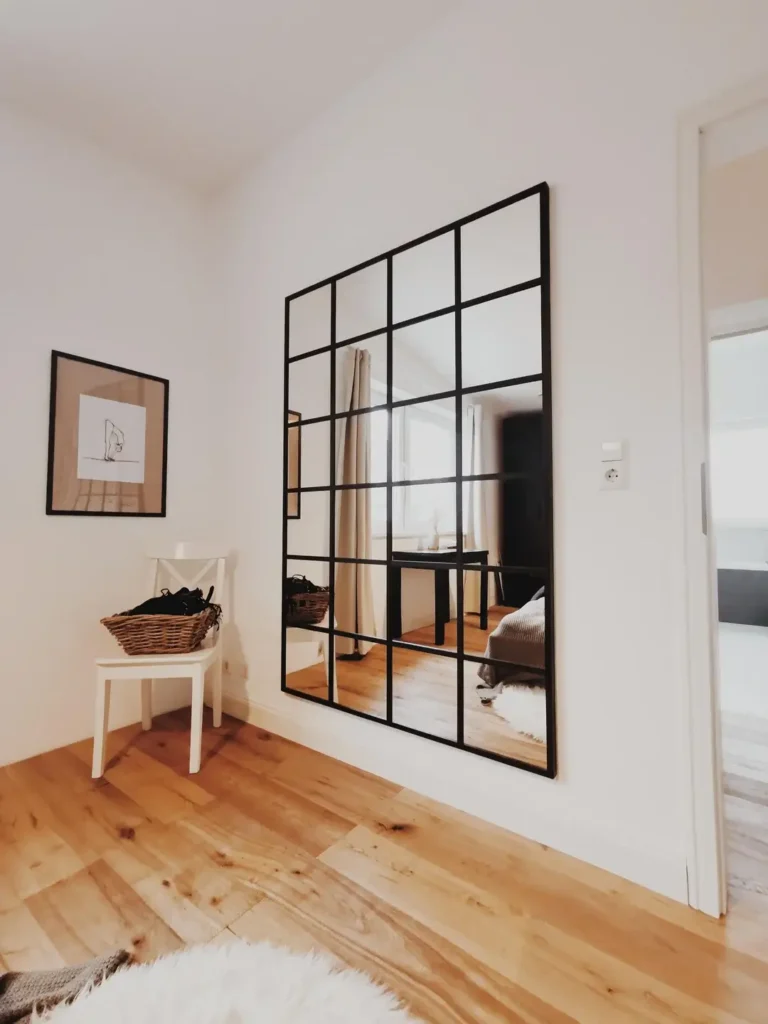
Some mirrors make a room feel bigger. This one makes a room feel like it’s somewhere else entirely.
The large black-framed grid mirror, styled after a factory window with its multi-pane grid pattern in matte black steel, leans against a white wall in what appears to be a bedroom or compact living space. At first glance, it genuinely reads as a window. Reddit user r/clehn8ok placed it precisely, surrounded by warm honey-toned oak flooring, a small white chair, a wicker basket, and minimal framed line art on the adjacent wall. Nothing competes. Everything belongs.
The Crittal-style or factory-window mirror is one of the most reliable mirror wall decor trends in modern interiors right now, and this image shows exactly why. The grid breaks the mirror into smaller visual units, which makes a very large piece feel graphic and architectural rather than heavy. The black frame gives the eye something to follow, the same way iron window muntins divide panes of glass.
Leaning rather than hanging is a deliberate choice here, and it works for two solid reasons:
- It softens the mirror’s presence. Leaning pieces feel casual and considered, not mounted out of necessity
- It lets the mirror catch floor-level light differently than a hung piece would
Look for mirrors described as “grid,” “paned,” or “Crittal-style.” They range from around $150 to $600 depending on size. Keep the surrounding decor minimal. This mirror is the feature. Let it be the feature.feature.
Also Read: 8 Large Wall Decor Ideas for Your Living Room (That Actually Work)
A Baroque Gold Mirror Against Dark Floral Wallpaper Maximum Drama
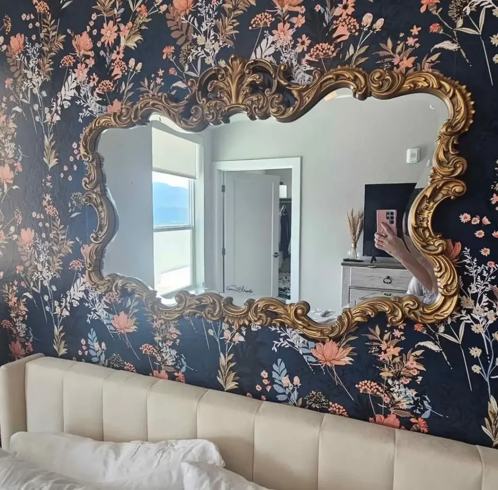
This is the most maximalist mirror wall decor idea in this collection, and it earns every bit of that title.
A large ornate mirror with an elaborate gilded Baroque frame (heavy scrollwork, acanthus leaf details, asymmetric flourishes across the top) hangs above the headboard on a wall covered in dark navy floral wallpaper. Salmon-pink blooms, cream botanicals, and gold-tipped stems cover every single inch of the background. Reddit user r/Hanshc17 committed completely to this aesthetic, and that commitment is exactly what makes it work.
There’s no hedging here. No “let’s keep one wall neutral just in case.” The cream upholstered headboard below provides the only visual rest in the whole composition.
Here’s what’s technically interesting: the decorative frame doesn’t compete with the busy wallpaper. It complements it. Both are working in the same decorative register: ornate, historical, layered. A simple frameless mirror against this wallpaper would look like a mistake. The Baroque frame says yes to everything the wallpaper is doing and then raises the stakes even further.
This approach requires genuine confidence. You cannot half-commit to maximalism and have it read as anything other than clutter. If you’re drawn to this look:
Go big or genuinely go home on this one
Start with the wallpaper and let the mirror choice follow from it
Find a frame with enough visual weight to hold its own against a busy background
Think ornate gold frames, heavily carved dark wood, or thick architectural molding
Also Read:10 Album Cover Wall Decor Ideas That Actually Look Great (With Real Inspiration From Real Rooms)
A Hexagonal Gold Mirror Cluster That Looks Like a Science Exhibit
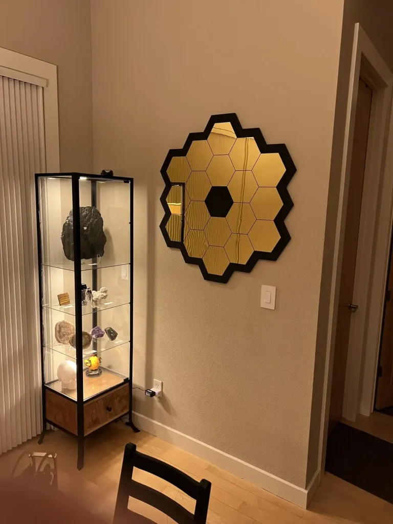
This last idea is the most unexpected one, and people will either immediately love it or immediately scroll past it. (If you’re still reading, you’re probably in the love-it camp. Welcome.)
Arranged in a honeycomb formation on a neutral beige wall, a series of gold hexagonal mirror tiles form a circular cluster that’s immediately recognizable as a nod to the James Webb Space Telescope’s primary mirror. Reddit user r/ryankrameretc paired this with a lit display cabinet full of crystals, minerals, and geological specimens to the left.
In context, the combination is completely coherent. This is a room built around scientific curiosity, and the mirror carries that theme rather than just filling wall space.
Each hexagonal tile has a warm gold tint to the mirror surface, set within dark-framed hexagonal segments. The central position holds a smaller dark hexagon, mimicking the actual telescope design, which gives the cluster a clear focal point even within its symmetrical shape.
What separates this from a novelty piece is the execution: flush, precisely aligned tiles, sizing that feels appropriate for the wall, and warm gold that catches ambient light in a way that makes the cluster glow softly in photos.
This works best in spaces with a clear personality: a study, a collector’s room, a home library, a home office. In a generic living room with no other personality markers, it would read as random. Surrounded by the right elements, it reads as a statement of who actually lives there.
Which Mirror Style Works Best for Your Space?
Before you start measuring walls or clicking “add to cart,” here’s a quick cheat sheet:
| Mirror Style | Best Room | Visual Effect | Difficulty |
|---|---|---|---|
| Three-panel triptych | Bedroom, living room | Architectural, space-expanding | Medium |
| Overlapping circles cluster | Living room, hallway | Soft, contemporary | Easy |
| Organic-shaped single mirror | Entryway, accent wall | Artistic, relaxed | Easy |
| Large round with gold frame | Any main living space | Bold, grounding | Easy |
| Staggered slim verticals | Dining room, narrow wall | Rhythmic, layered | Medium |
| Grid/Crittal-style leaner | Bedroom, minimalist space | Architectural, light-maximizing | Easy |
| Baroque ornate frame | Bedroom, bold accent wall | Dramatic, historical | Easy (if you commit) |
| Hexagonal tile cluster | Study, personality-driven room | Sculptural, graphic | Medium |
The Real Reason Some Mirrors Work and Others Just… Don’t
After looking at all eight of these examples together, one pattern becomes obvious. Every single arrangement that works was chosen to complement something specific about the room. A wall color, a furniture layout, an existing aesthetic, a personal interest.
The ones that fall flat were chosen in isolation and hung in the nearest available space. The mirror can’t do all the work by itself.
A few things worth remembering before you hang anything:
Position matters more than most people realize. A mirror facing a window doubles your natural light. A mirror facing a blank wall doubles the blank wall. Before you commit to a spot, stand where the mirror will go and look at what it will reflect. That’s exactly what your guests will see.
Go bigger than feels comfortable. Most people default to mirrors that are slightly too small for the wall. Every example in this collection features mirrors that feel proportionate to or slightly larger than what you’d expect. Size up. You’ll almost never regret it.
The frame is a design element, not just a border. A warm oak frame says Scandinavian and calm. A gilded Baroque frame says opulent and dramatic. A matte black grid frame says modern and architectural. Choose your frame the way you’d choose a throw pillow: with the whole room in mind, not just the empty wall in front of you.
Final Thoughts
Mirror wall decor doesn’t have to be complicated, but it does have to be intentional. Pick a style that actually fits your room’s personality, think about what the mirror will reflect, size up with confidence, and let the frame do its job as a design element.
Whether you go for a three-panel triptych that makes a small room feel enormous, a bold Baroque frame against dramatic wallpaper, or a hexagonal cluster that doubles as a conversation starter, the key is committing to the choice.
So go ahead, grab that measuring tape, and stop playing it safe with the tiny mirror above the console table. Your walls deserve better, and honestly, so do you. 😄
What style are you most drawn to? Give it a shot and see how it transforms your space!
