Let’s be honest. Your walls are just… sitting there. Doing absolutely nothing. And every time you walk into your living room, some part of your brain registers that something feels off, even if you can’t quite name it.
A blank wall isn’t neutral or “minimalist.” It’s just unfinished. The good news? You don’t need a designer budget or a Pinterest-perfect aesthetic to fix it. You just need the right idea for your specific space.
I pulled together 11 real examples from actual living rooms posted by real people online. No staged showrooms. No impossibly perfect lighting. Just rooms that genuinely work and the reasons why they pull it off.
Let’s get into it.
A Painted Arch Accent Creates a Focal Point Without Framing
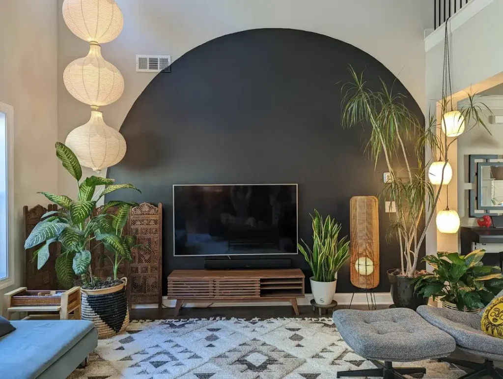
If you’ve ever looked at a blank wall and thought “I have no idea what to hang here,” this one’s for you. A painted arch skips the hanging question entirely.
One popular example from r/CozyPlaces features a massive matte black arch painted directly onto a cream wall. It frames the television, a slatted walnut media console, and a generous spread of greenery including a dieffenbachia, a dracaena, and a snake plant. A few hanging paper lanterns and pendant lights add warmth on either side.
Here’s why it works so well:
- The dark arch pulls every eye to that wall instantly
- The television blends into the dark background instead of sticking out awkwardly
- The plants soften the hard geometric shape so it doesn’t feel cold or clinical
To recreate this, all you need is painter’s tape, a string and pencil to map out your arch curve, and a couple of cans of flat or eggshell paint in deep charcoal or black. Honestly, the whole project costs around $20 to $60. That’s cheaper than most framed prints.
Pro tip: The balance between the sharp arch geometry and the soft organic greenery in front of it is the whole magic trick here. Don’t skip the plants.
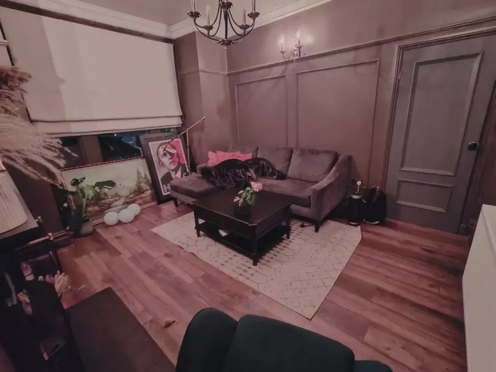
A Soft Sage Accent Wall That Does More Than You’d Expect
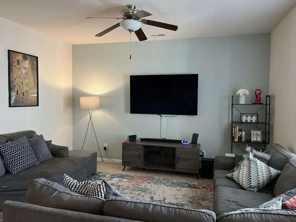
Okay, I know. “Accent wall” sounds like advice from a 2009 home makeover show. But hear me out, because the era of burgundy and chocolate brown accent walls is over. Muted sage green is a completely different situation.
A room shared by r/psyberdel shows a soft sage accent wall behind a wall-mounted TV, paired with gray upholstered sofas, patterned throw pillows, and a distressed vintage rug in rust and gray tones. A framed print of Klimt’s “The Kiss” hangs on the adjacent white wall. A tripod floor lamp fills in warm light without taking up much visual space.
Why this specific shade works:
- It reads as color and calm at the same time (a rare combo)
- It defines the TV wall without competing with anything else
- The three white walls surrounding it give the color room to breathe
IMO, the key is in the undertone. Skip anything that leans too pure or grassy green. You want a sage with gray undertones, something in the range of Benjamin Moore’s Pale Avocado or Sherwin-Williams Privilege Green. Those shades stay sophisticated instead of veering into “garden center” territory.
Keep your decor simple once you commit to this wall. The color itself is doing most of the decorating work.
Sculptural Wall Art That Solves the High-Ceiling Problem
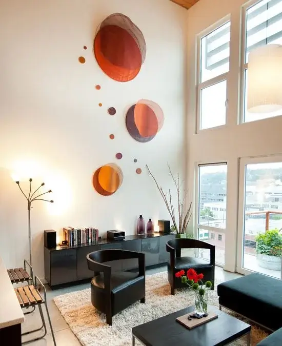
High ceilings look amazing in real estate listings. Then you move in and realize that double-height white wall is absolutely terrifying to decorate. A single canvas looks like a postage stamp. A gallery wall looks lost. So what actually works?
Dimensional, sculptural art arranged in a diagonal scatter.
r/myhousedesigns123 used a grouping of concave circular wall sculptures in terracotta, rust, and copper tones. They range from large to small and drift diagonally across a tall white wall above two black leather barrel chairs and a low media credenza.
The arrangement isn’t in a grid. It cascades. Larger circles anchor the composition, and smaller accent dots float between them, mimicking the way objects drift naturally. That sense of movement is exactly what gives the wall visual energy instead of visual weight.
This approach works because:
- It commits to the vertical plane rather than ignoring it
- The terracotta and copper tones warm up a space that could easily feel cold and cavernous
- The irregular layout looks intentional rather than overthought
For ceilings above 10 feet, you need wall decor that reaches upward with purpose. This is one of the most underrated wall decor living room ideas for anyone dealing with tall, awkward spaces.
Also Read: 8 Large Wall Decor Ideas for Your Living Room (That Actually Work)
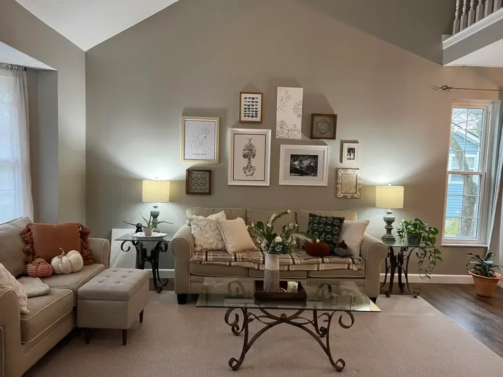
A Gallery Wall That Follows the Slope of a Vaulted Ceiling
Most gallery wall tutorials assume you’re working with a flat, standard-height wall. Vaulted ceilings completely change the game. But here’s the thing: instead of being a problem, that diagonal ceiling line is actually an asset.
r/takeouttessa followed the upward slope of a vaulted ceiling with a collection of 8 to 10 frames in gold, white, and wood tones. The art inside stays tightly edited: a Catalunya circuit map print, botanical illustrations, a black and white landscape photo, and a few geometric line drawings. All grayscale or very close to it.
The secret to making mixed frames work:
- Keep the art itself tonally consistent even if the frames vary
- Let the frame materials mix freely (gold, natural wood, ornate white) since the grayscale art creates harmony
- Follow the architecture rather than trying to create a rectangle where one doesn’t naturally exist
The fall-themed styling below the gallery (velvet pumpkins, plaid blanket, cream pillows) proves that a well-executed gallery wall can flex with seasonal decor without losing its character. That kind of versatility is genuinely rare.
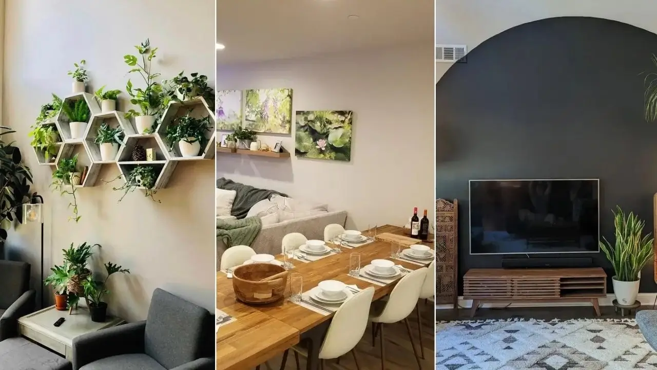
Hexagonal Plant Shelves as Living Wall Decor
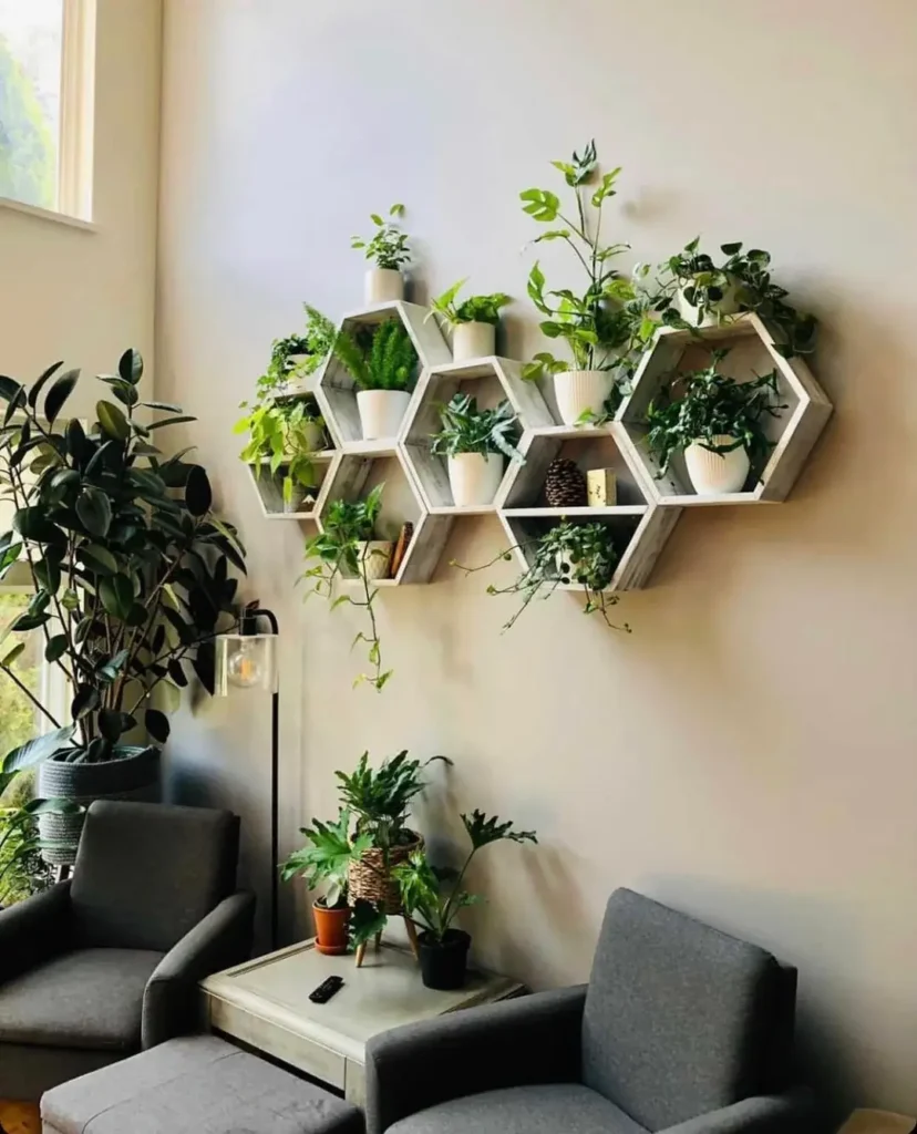
This is probably my personal favorite on the list, especially for plant lovers who haven’t figured out how to bridge the gap between “I have 12 houseplants” and “my room looks designed.”
r/Green-Friendship622 mounted seven interlocking hexagonal wooden shelves in a weathered whitewash finish and filled every single cell with houseplants. Pothos trail down in cascading vines. Monstera leaves push outward past the shelf frames. Ferns and small succulents fill the remaining spaces. A rubber tree in a woven basket anchors the floor below.
The effect is part indoor garden, part geometric sculpture. And it evolves.
Because the plants grow and change, this wall display is never static. It shifts with the seasons and responds to your care. No other wall decor on this list does that.
To pull this off effectively:
- Mix trailing plants (pothos, philodendron, string of pearls) with upright plants (small ferns, snake plants)
- Choose a weathered or natural wood tone for the shelves to keep things warm rather than clinical
- Invest in a watering can with a long thin spout. You’ll thank yourself later
The soft beige wall behind the shelves lets the plants do all the talking. This is one of those wall decor living room ideas that looks dramatically harder than it actually is.
Bold Abstract Art Against a Dark Teal Accent Wall

Some color combinations just hit differently. Deep teal paired with warm, expressive abstract art is one of them, and this room makes a strong case for committing fully to a bold wall color as your entire decorating foundation.
r/lovethatjourney4u painted one wall in a rich dark teal (think Sherwin-Williams Reflecting Pool but pushed slightly deeper) and hung three vertical abstract canvases side by side above the sofa. Each canvas features loose brushwork in gold, orange, blue, and pink. The warmth of the art pops dramatically against the cooler dark wall behind it.
A gray sectional, mauve and white throw pillows, a reclaimed wood coffee table, and a cream Moroccan-style rug complete the room. The warm wood tones ground everything without competing.
What makes the art placement work:
- Three vertical panels hung close together read as one cohesive horizontal mass
- The total width of the grouping roughly matches the width of the sofa below it
- That alignment is what separates intentional art placement from random wall coverage
Here’s a practical tip worth bookmarking: When hanging multiple pieces above a sofa, aim for a total combined width within 6 to 8 inches of the sofa’s length on each side. It makes everything look planned even when it wasn’t especially stressful.
Also Read: Your Living Room Walls Are Bored? 10 Ways to Turn Them Into a Quiet Escape (No Art Degree Required)
A Teal Accent Wall with Layered Greenery as Texture
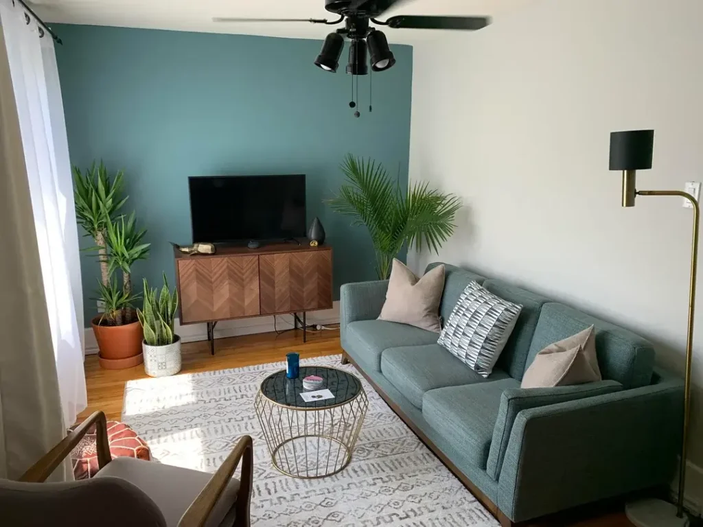
This room proves that the teal-and-plants combo doesn’t require a large space or a big budget. It scales down just as beautifully as it scales up.
r/StandardIssueLad painted the back wall of a compact living room in a warm teal-green, set a chevron-patterned walnut media cabinet against it, and flanked it with a tall yucca tree on the left and a large areca palm on the right. A snake plant and a smaller potted plant fill in the lower levels. No art. Just plants.
The mid-century modern sofa in a complementary teal-gray sits on a white Moroccan rug. A gold wire frame coffee table with a glass top keeps the center feeling light and open.
Why this works especially well in smaller rooms:
- The teal wall and teal sofa visually merge, making the space feel larger and more cohesive
- The plants add life and greenery without requiring a single hole in the wall
- A brass floor lamp adds a warm metal accent without cluttering the wall at all
If you’re in an apartment or working with a compact living room, this approach is one of the smartest wall decor living room ideas on this entire list.
Warm Yellow Walls with Layered Wall Art and Tapestry
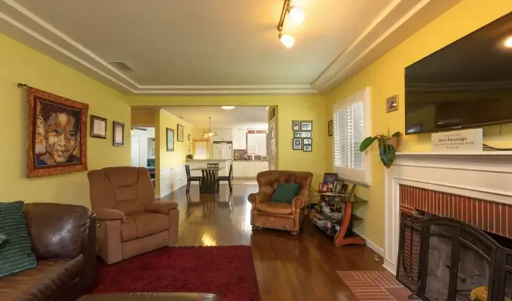
Yellow walls have a reputation problem and honestly, a lot of it is earned. Done wrong, yellow is the visual equivalent of someone shouting in a quiet room. Done right, it’s the warmest, most welcoming thing in your home.
r/bsmtbobasloth made it work by choosing a butter yellow (soft and warm, not screaming primary yellow) and layering the walls thoughtfully.
What’s on the walls:
- A textile tapestry in warm earth tones on the left wall
- A cluster of smaller framed photographs and prints arranged below the tapestry
- A flat-screen TV mounted above a fireplace with a white painted brick surround on the right
The leather furniture in cognac and deep brown complements the yellow walls naturally since warm yellow and warm brown share the same color family. A red area rug energizes the floor without clashing.
The real takeaway here is about the art approach. The decor isn’t precious or curated in a gallery-perfect way. It’s a mix of family photos, small prints, and a textile piece, and that’s exactly what gives it warmth. A single expensive canvas would feel cold in this room. The layered mix of mediums makes it feel genuinely lived-in.
Painted Wainscoting and Wall Paneling as Architectural Decor
Not every wall decor solution involves hanging something. Sometimes the wall treatment itself is the statement, and painted wainscoting or raised panel molding can transform a room more dramatically than any gallery arrangement.
r/ProfessionalAm4teur painted the entire room, including raised panel wainscoting running two-thirds up the walls, in a moody mauve-gray tone. The paneling creates horizontal rails, vertical stiles, and rectangular raised panels that catch shadow and shift depending on the light. A brass chandelier and matching wall sconce add warmth. A velvet gray sofa anchors the center.
The result sits somewhere between a Victorian parlor and a moody contemporary retreat. The character comes from the bones of the space, not from anything hung on top of it.
Fair warning: this is the most committed idea on the list. You’re not hanging decor, you’re changing the wall itself. Renters, this one isn’t for you. But if you own your space, even a simple painted grid of trim pieces from any hardware store can create a very similar effect at genuinely low cost.
Rough cost range: $150 to $600 depending on your room size and existing trim.
Also Read: 10 Inspiring Black Living Room Decor Ideas for Dream Homes
A LED Word Art Panel as the Sole Wall Statement
Sometimes the simplest move lands the hardest. One large, meaningful piece in an otherwise minimal room can do more work than a dozen smaller pieces fighting for attention.
r/mister-at chose a custom LED word art panel mounted on the far wall of a clean, modern open-plan space. Warm red-orange letters glow inside a natural wood frame against a pure white wall. The rest of the space features a wood beam pendant light, a natural wood dining table, and warm oak flooring.
Here’s what makes it genuinely clever:
- During the day, it reads as a framed wood panel
- At night, the illuminated letters create a warm ambient glow that functions almost like a fireplace
- It’s beautiful, functional, and personally meaningful simultaneously
For open-plan spaces that flow between living and dining areas, a statement piece like this can define the living zone without relying on furniture arrangements or rugs to do all the work.
One rule if you go this route: commit to scale. A small sign in a large room looks like an afterthought. The piece needs to be large enough to genuinely anchor the wall it’s on.
Split-Panel Nature Photography Above a Floating Shelf
Photography as wall art is seriously underrated. The problem is usually one of two things: the print is too small, or the subject is too generic. Large-format botanical or nature photography, especially split across two or three panels, can read at the level of painting when the subject is right.
r/iSirEnder hung two large canvas prints of lush botanical photography above a long floating wood shelf. Purple wisteria and lily pads with pink blooms fill both panels. The shelf below holds small potted plants, a few decorative objects, and a tiny framed photo. Below that, a casual sectional loaded with throw blankets and pillows creates an inviting, completely lived-in feel.
Why the photography works here:
- The subject connects directly to the room’s existing plant-heavy, natural-texture aesthetic
- The art extends the room’s values outward rather than decorating in isolation from them
- That coherence is what separates thoughtful decorating from random wall coverage
Practical bonus: Large-format photography as a single print is expensive. Two or three coordinated panels of the same subject are often significantly more affordable and visually more interesting. Leave a 1 to 2 inch gap between panels so they read as a cohesive set rather than unrelated pieces.
Quick Style Guide: Matching the Right Idea to Your Space
| Wall Decor Type | Best Room Type | Difficulty | Approx. Cost |
|---|---|---|---|
| Painted arch | Any size, high contrast rooms | Easy | $20 to $60 |
| Solid accent wall + art | Any size room | Easy | $50 to $300 |
| Gallery wall | Medium to large walls | Medium | $100 to $500+ |
| Sculptural 3D wall art | High ceilings, large walls | Easy | $100 to $600+ |
| Hexagonal plant shelves | Blank walls, plant lovers | Medium | $80 to $250 |
| Painted wall paneling | Rooms you own | Advanced | $150 to $600 |
| Large-format photography | Open-plan or dining areas | Easy | $60 to $400 |
| LED word art panel | Modern or minimal spaces | Easy | $80 to $300 |
What All 11 of These Rooms Actually Have in Common
Looking across all these examples, a few patterns show up consistently in the rooms that feel most complete and most considered.
They commit to scale. The art, the plants, the furniture choices all fit the actual dimensions of the space. Nothing apologizes for being too small or too sparse.
They embrace negative space. The rooms that look most designed are often the ones that deliberately left some wall space empty. Counterintuitive but absolutely true.
They connect the wall to the rest of the room. Plants on the shelves echo plants on the floor. Warm tones in the art mirror warm tones in the wood furniture. The wall doesn’t exist separately from the room. It extends and reinforces everything already happening at ground level.
The most effective wall decor living room idea isn’t necessarily the most expensive or the most elaborate. It’s the one that makes your room feel like it was always supposed to look exactly this way.
Final Thoughts
Your walls genuinely don’t have to stay blank and uninspiring. Whether you’ve got high ceilings you’ve been ignoring for two years, a rented apartment where you can’t drill many holes, or just a living room that feels like it’s missing its personality, there’s something on this list that fits.
Start with what your room already has. Its proportions, its light, its existing palette. Then pick one idea and actually try it. You don’t need to transform the whole room at once.
Pick one wall. Make one decision. See how it feels.
What idea are you most tempted to try? Drop it in the comments. I’d genuinely love to know.