Most people stare at a blank wall for months, paralyzed by the fear of making the wrong choice. These nine rooms prove there is no single “right” approach only what works for the personality living inside those walls.
I’ve pulled together nine real examples that cover the full spectrum, from maximalist chaos to restrained minimalism.
Each one offers something genuinely useful: a technique, a principle, or a permission slip to try something you’ve been too cautious to attempt. Let’s get into it.
When Every Wall Becomes a Canvas: The All-In Gallery Apartment
There’s a particular kind of person who looks at a blank wall and sees not negative space, but wasted opportunity. This is their room.
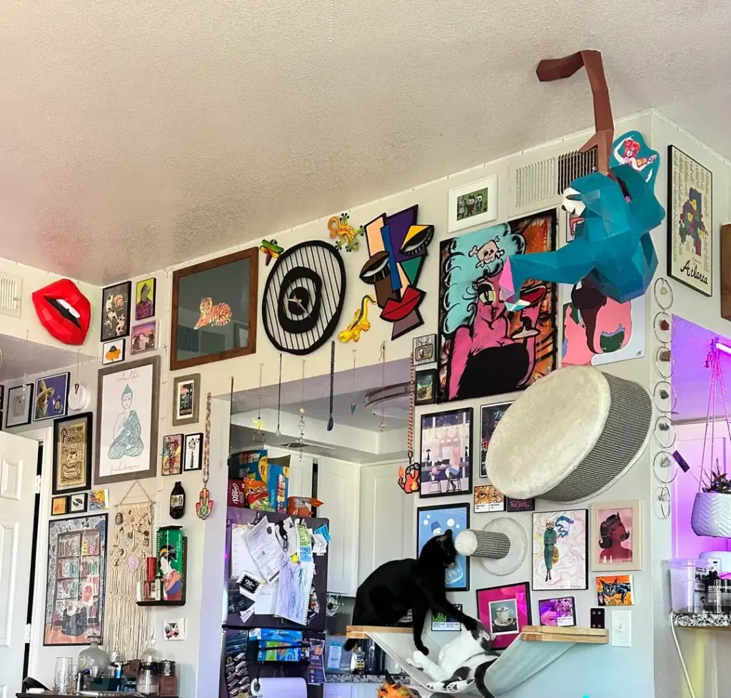
r/illlameoutwithyou has covered nearly every inch of available wall space in what can only be described as a joyful visual explosion.
The collection includes framed prints, a bold red 3D lip sculpture, a circular black metal wall piece, a teal geometric animal figure mounted near the ceiling, colorful pop-art panels, a macramé hanging, and what appears to be an Atlanta city print in the corner. Two cats oversee the whole operation from a mounted cat shelf, which honestly fits perfectly.
What makes this work and it does work is the underlying commitment to color and personality rather than visual coherence.
The palette leans heavily into saturated primaries: red, teal, yellow, pink, black. When your entire collection shares that kind of bold chromatic energy, the eye reads it as intentional rather than chaotic.
There’s a difference between “collected over time by someone with taste” and “randomly accumulated,” and this leans hard into the former.
The practical takeaway here is that going all-in requires you to stop editing. Restraint is the enemy of this style.
If you find yourself removing pieces because they “don’t quite match,” you’re working against the aesthetic. Commit fully or the whole thing reads as an accident.
A Forest Mural as the Room’s Anchor Point
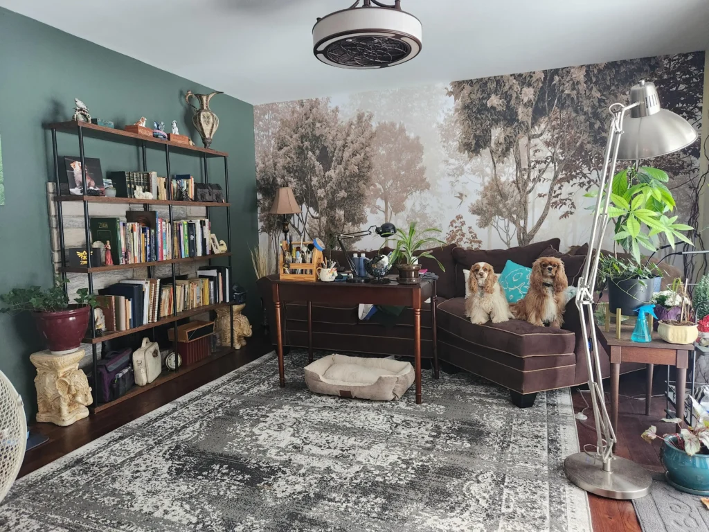
Paint colors and framed art are the obvious wall decor choices. A full-scale photographic forest mural is the less obvious choice that occasionally makes an entire room.
r/ArrowFeathers installed what appears to be a large-format woodland scene mural in muted, atmospheric tones misty trees rendered in soft grays and browns on a single accent wall painted deep hunter green.
The combination of the painted wall color with the mural creates a layered forest effect that’s surprisingly immersive.
A brown leather sofa sits in front of it, flanked by two golden Cocker Spaniels, which may be the most on-brand detail possible for this aesthetic.
The mural functions as the room’s single dominant decorative statement. Notice that nothing else on the walls competes with it.
A tall black metal bookshelf loaded with books, plants, and objects sits to the left, but it’s a furniture piece, not a wall treatment. The restraint elsewhere allows the mural to land with full impact.
Murals and large-scale wall art often intimidate people because of the perceived commitment. But peel-and-stick mural panels have made this far more accessible than it was five years ago.
The key design principle here is choosing one wall and making it extraordinary rather than spreading medium-effort decor across all four walls.
Art on Bold Color: The Case for Painting Your Kitchen Walls
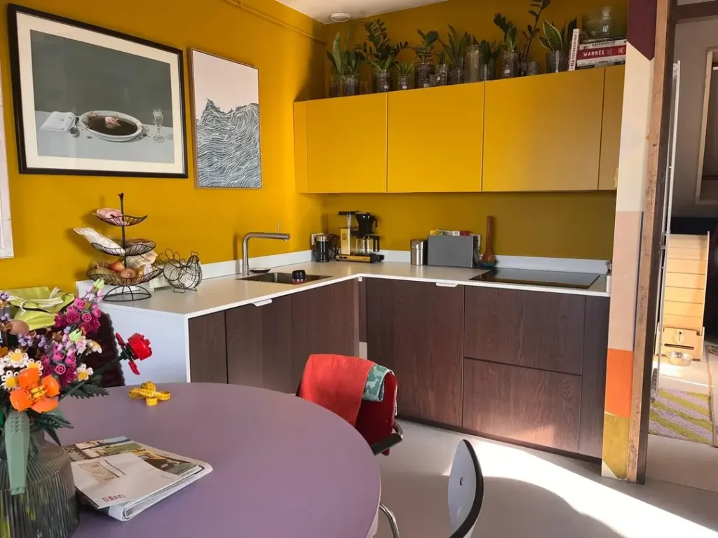
Here’s a counterintuitive wall decor idea: the wall itself is the decor, and art simply adds a second layer on top of it.
r/jipver painted the kitchen walls a saturated golden mustard yellow and didn’t stop there. Two framed pieces hang on that yellow expanse: a large black-framed photorealistic work and a smaller abstract line-drawing print in a simple white frame.
The pieces are deliberately understated in their subject matter, which creates a pleasing tension against the boldness of the wall color beneath them.
The genius of this approach is the contrast in temperature and texture. The cool, muted artwork one piece featuring a bowl with a dark liquid, another showing wave-like topographic lines in black and white gains visual weight and drama against the warm yellow background that would be impossible on a white wall. Neutral art becomes interesting art when the wall beneath it is doing work.
Hanging art in kitchens is underused as a wall decor idea. Most people stick to open shelving or tile backsplashes for kitchen visual interest, but a couple of well-chosen prints on a painted kitchen wall can transform the cooking space into something that feels intentional and personal.
The key is keeping the frames simple so the wall color and the art can share the spotlight.
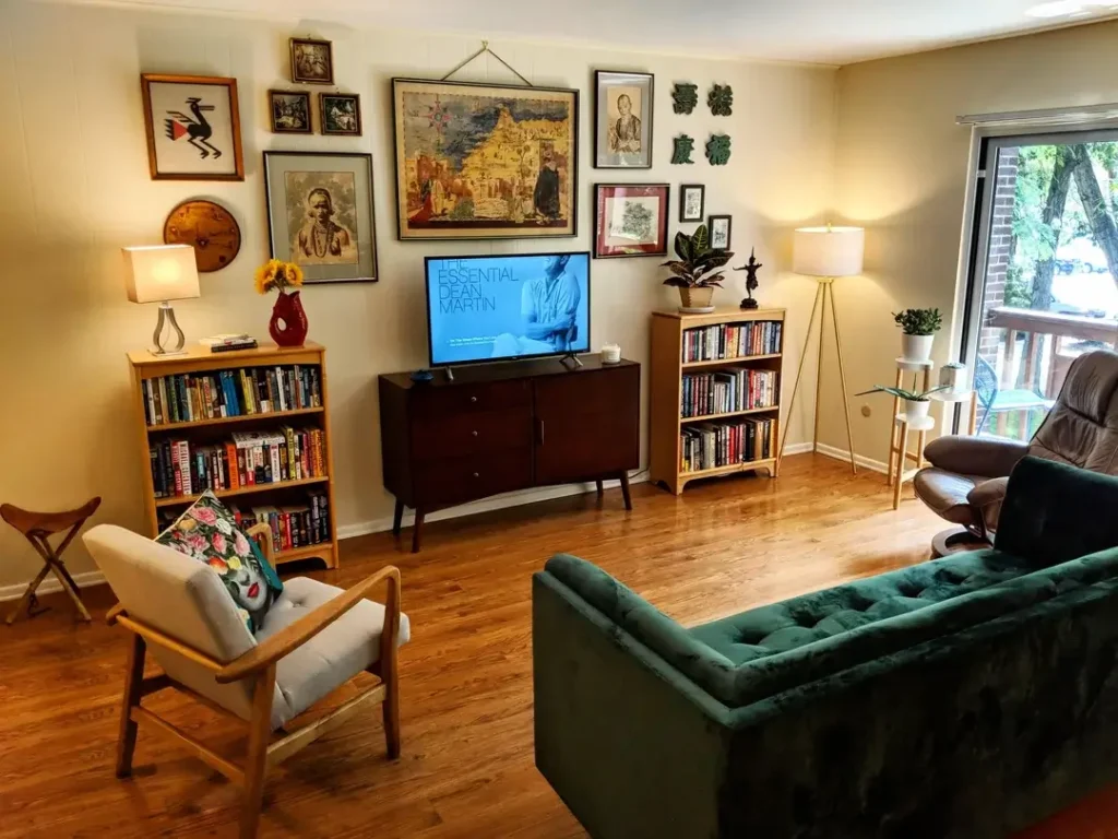
The Eclectic Gallery Wall Above a TV Console
The TV wall is one of the hardest design problems in a living room. The television itself is a visual black hole, and most people give up and leave the surrounding wall bare.
r/ShiroiKabochaPumpkin solved this with an eclectic gallery arrangement positioned above and around a mid-century media console.
The collection includes a striking framed portrait, a large textile or tapestry piece depicting a golden cityscape, several smaller vintage-style prints, a circular wooden wall piece, and a set of green Asian characters mounted directly to the wall without frames.
The variety of formats framed art, frameless typography, textile, decorative objects is what gives the arrangement its richness.
The TV is integrated into the composition rather than fighting against it. By treating the entire wall as a gallery and placing the television at console height rather than mounting it high, the screen becomes one element among many rather than the room’s only focal point.
Two matching bookshelves flank the console symmetrically, which grounds the whole arrangement.
The lesson from this setup: mix your formats. All frames of the same type create a uniform look that can feel flat. Combining framed prints, mounted objects, and textiles gives a gallery wall texture and dimension that keeps the eye moving.
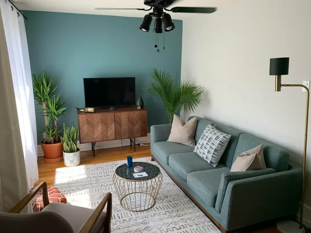
The Single Accent Wall That Does Everything
Sometimes the most effective wall decor idea isn’t actually about what you hang it’s about what color you put behind your furniture.
r/StandardIssueLad painted one wall in a deep teal-green, leaving the remaining three walls white, and the result is a room that feels designed without a single framed print in sight.
A walnut-finish herringbone media console sits against it, flanked by a yucca plant on the left and a large areca palm on the right. The plants against that deep teal create a lush, almost tropical vibe that feels deliberate and complete.
The teal wall functions as an oversized piece of art. It creates depth, defines the seating area, and gives the sage-gray sofa a backdrop that makes it read as intentional rather than default.
The brass-accented floor lamp and the geometric gold wire coffee table both pop against the dark accent wall in a way they wouldn’t against plain white.
What I find most useful about this example is the reminder that plants are wall decor. A large architectural plant placed in front of a colored wall creates a living, breathing installation that no framed print can replicate.
If you’re committed to painting one wall and want maximum impact for minimal cost, choose a deep jewel tone and place at least one large plant in front of it.
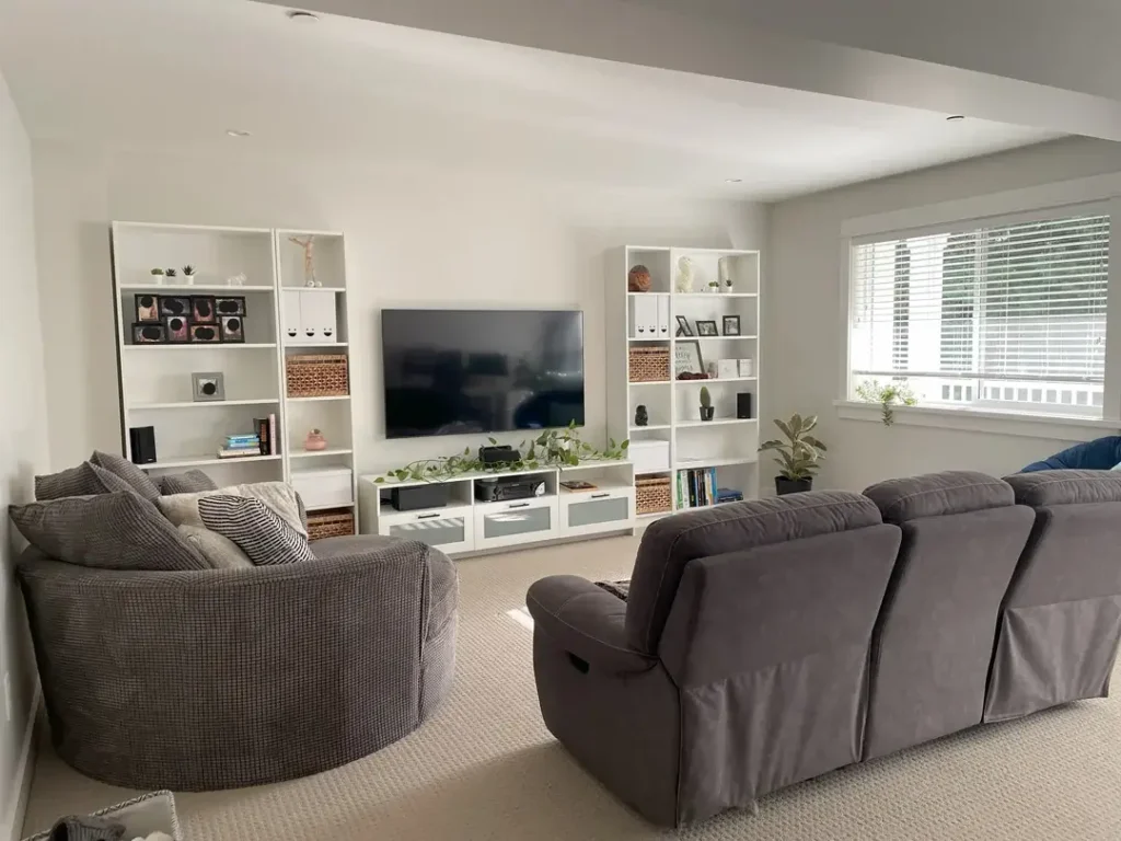
Floor-to-Ceiling Shelving as Wall Architecture
White shelving units aren’t a neutral backdrop they’re a design statement when used at the right scale.
r/PetesHa flanked a large television with two tall white shelving units that run nearly floor to ceiling, creating a built-in media wall effect without any actual construction.
The shelves hold a mix of wicker baskets, small potted plants, sculptures, framed photos, and decorative objects.
A trailing vine plant cascades from the media unit between the two shelving towers. The effect is structured but organic.
What this setup accomplishes that framed art can’t: it creates actual three-dimensional depth on the wall.
Shelving brings the wall forward into the room, adding architectural interest that flat art simply cannot provide.
The mix of storage baskets with decorative objects also solves the perennial problem of keeping a living room both functional and visually interesting.
The symmetry here is doing a lot of work. Matching units on either side of the television create a sense of intention and balance that makes the overall composition feel polished rather than improvised.
If you’re working with a TV wall, consider building out rather than hanging up vertical shelving can define a room’s character more powerfully than a gallery wall.
| Approach | Visual Impact | Cost Level | Difficulty |
|---|---|---|---|
| Gallery wall (framed art) | High | Medium | Medium |
| Accent paint wall | High | Low | Easy |
| Floor-to-ceiling shelving | Very High | Medium-High | Medium |
| Full-scale mural | Very High | Medium | Easy (peel-and-stick) |
| Hexagonal plant shelves | High | Medium | Medium |
| Ledge shelves with art | Medium | Low | Easy |
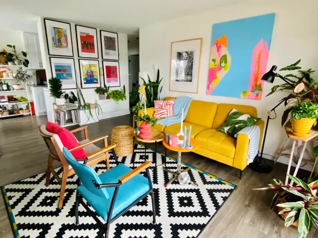
Bold Art Mixing: Posters, Paintings, and Plants Together
There’s a version of maximalism that works, and there’s a version that doesn’t. The difference, as far as I can tell, is whether the underlying color story is coherent.
r/sylviatrench01 pulls off an energetic, art-forward living room by grounding the entire space in a strong chromatic logic.
A yellow sofa anchors the seating area. A large abstract canvas in sky blue, hot pink, coral, and lime sits on the right wall. A 3×2 grid of black-framed movie and music posters occupies the left feature wall.
The black and white geometric rug, the teal vintage chair, the red cushion every piece is a saturated, confident color. Nothing is beige. Nothing is tentative.
The poster grid on the left wall demonstrates an important principle: when you want to hang multiple pieces of different content, consistency of framing creates unity.
All six posters use the same black frame with white mat.
The content which includes what looks like Reservoir Dogs, some album art, and film stills could hardly be more varied.
But the matching presentation makes the arrangement read as a curated collection rather than a pile of stuff.
For anyone who loves bold art but fears the combination, the approach here is to commit to a color temperature and let every piece operate within it.
Warm or cool, saturated or muted pick a lane and stay in it, even while mixing styles and formats wildly.
Ledge Shelves: The Gallery Wall You Can Rearrange Forever
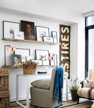
Committing to nail holes is the thing that keeps most people from building a proper gallery wall. Ledge shelves solve this problem entirely.
r/Direct_Armadillo755 mounted two horizontal wooden ledge shelves at different heights on a white wall, then layered framed prints and small paintings of varying sizes across both levels.
A large portrait in a black frame anchors the top shelf. Smaller pieces lean against it and beside it.
A vintage industrial sign reading “TIRES” stands vertically at the right edge, adding an unexpected typographic element that grounds the whole composition. The result feels curated but casual like a studio wall, not a formal gallery.
The beauty of the ledge shelf system is flexibility. You can add a new piece, move things left or right, swap a print without touching a wall anchor.
For renters especially, this is a practical wall decor idea that avoids the landlord problem entirely. Two shelves, a few command strips to secure the shelves themselves, and you’re done.
Notice also how the layering works here. Pieces slightly overlap or lean against each other, which creates the kind of lived-in depth you find in antique shops and real studios.
Perfect alignment and rigid spacing make a gallery wall feel stiff. Slight overlap and varying heights make it feel like something that evolved naturally over time.
Hexagonal Plant Shelves: When Wall Decor Becomes a Living Garden
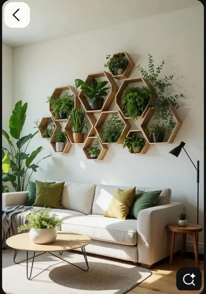
The most interesting wall decor ideas right now are the ones that treat the wall as a growing surface, not just a hanging surface.
r/Competitive-Ad4941 installed a cluster of natural wood hexagonal shelves in varying sizes across a white wall above a light gray sofa, filling each compartment with a different potted plant.
Ferns, snake plants, pothos, monsteras, and trailing herbs occupy the geometric frames. Some plants spill over the edges. Others stand upright.
The arrangement builds from smaller units at the edges to larger units at the center, creating an organic cloud shape across the wall.
The effect is architectural and natural simultaneously. The honeycomb geometry brings structure, while the varied plant textures and growth patterns introduce the kind of organic irregularity that keeps it from feeling sterile.
Against the white wall, the contrast of warm wood tones and multiple shades of green is genuinely striking and I say that as someone who usually finds the phrase “living wall” to be overselling a shelf with a succulent on it. This earns the description.
Practically, this setup requires some thought about light and maintenance. Position the arrangement on a wall that receives indirect natural light, and choose plants that tolerate similar watering schedules so you’re not maintaining six different plant care regimens.
Start with drought-tolerant varieties pothos, snake plants, ZZ plants before adding anything more temperamental.
Finding Your Wall Decor Identity
After looking at nine genuinely different approaches, a few things become clear. Wall decor ideas exist on a spectrum from “paint the wall and stop there” to “cover every available surface with something,” and both ends of that spectrum can produce rooms that feel completely intentional and right.
The most common mistake isn’t choosing the wrong style it’s choosing half a style. The rooms that feel incomplete are the ones where someone started a gallery wall but left gaps, or painted an accent wall but hung nothing on it, or bought a great piece of art and centered it on a wall too small to hold it. Commitment is the actual design skill being exercised in every one of these rooms.
The practical question worth sitting with is: what do you own that you love, and what wall space do you have? Start there rather than starting with a style label.
The best wall decor arrangements grow from real collections, real interests, and real constraints not from deciding you want a “Scandinavian minimalist” bedroom and buying things to fill that brief.
Whatever direction you choose, make the decision fully. A room decorated with confidence in one clear direction will always read better than a room decorated with caution in five.