Look, most studio apartment advice online is written by someone who’s never actually lived in one. You know exactly what I mean. Perfectly staged rooms, zero personality, and a budget that assumes you recently inherited a small fortune.
I went a different route.
I pulled together ten real setups from actual guys living in studios right now. No influencer fantasy rooms. No showroom staging. Just lived-in spaces with real budgets, real constraints, and real solutions you can actually steal for yourself.
Every single setup here has at least one idea worth borrowing. Let’s get into it.
A Vintage Studio with Stained Glass That Basically Decorates Itself
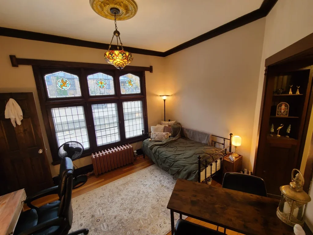
Some apartments come with character already baked into the walls. This one from r/BilingualTRex1303 is a perfect example of that.
We’re talking dark walnut-stained trim running along the ceiling, original stained glass fanlight windows sitting above divided-light lower sashes, and a pressed plaster ceiling medallion that most people would pay serious money to replicate. The whole room feels like a Craftsman-era townhouse, and the furniture choices lean right into that energy.
What Makes It Work
The wrought-iron bed frame with ball finials fits the period without feeling costume-y. An olive pintuck duvet and layered neutral rug keep everything grounded. And that Tiffany-style pendant light hanging from the ceiling medallion? Absolute chef’s kiss. It connects the ceiling to the rest of the space and adds warmth that generic overhead lighting never pulls off.
A dark wood bookcase holds collectible figurines and small decorative items in the corner, while a wooden desk with a leather task chair fills the foreground. The brass lantern on the table edge ties the whole thing together beautifully.
Nothing in this room fights for attention. The stained glass windows are the star, and everything else plays backup. That’s the whole secret right there.
The Takeaway
If your studio has original architectural features like exposed brick, old molding, or wide-plank floors, resist the urge to go full modern. Build around what’s already there. Older buildings reward period-sympathetic choices way more than they reward trendy minimalism. Trust the bones.
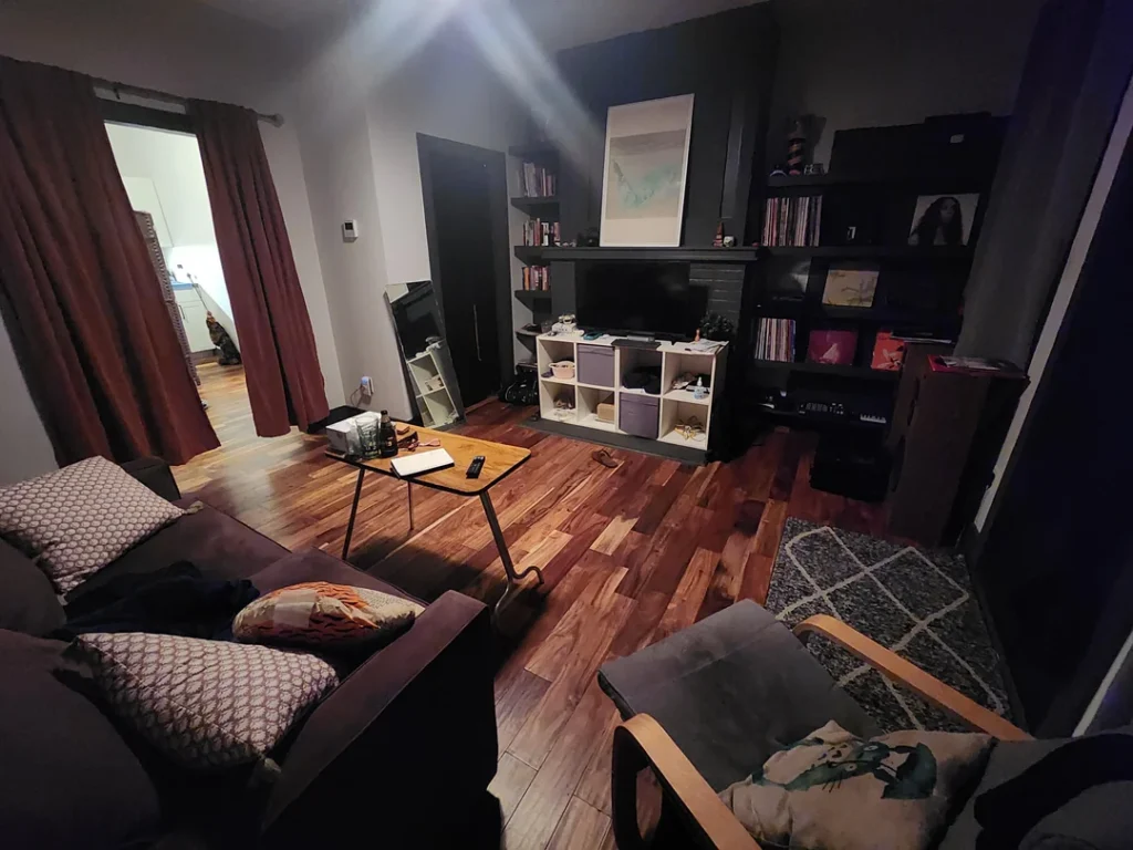
The Eclectic Plant and Vinyl Setup That Just Hits Different
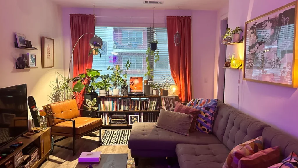
You walk into a room like this and something shifts. It’s not tidy in the traditional sense, but it has a clear point of view, and honestly, that matters way more than tidiness ever will.
r/madmanandabox has built something genuinely personal here. Deep crimson curtains frame the windows and cast the whole space in warm tones even during daylight hours. A gray tufted sectional anchors the living area, paired with a cognac leather chair on a black metal frame. Classic mid-century silhouette. Masculine without being stiff.
Where It Gets Really Good
The media console beneath the window pulls double duty as a plant shelf and vinyl record display. Monstera, pothos, and smaller potted plants create a little indoor jungle up top, while records line up in organized rows below.
Books are stacked everywhere. Art prints lean against walls. A disco ball pendant light hangs from the ceiling (yes, really). Neon signage glows in the window. Purple LED ambiance fills the background.
On paper, this shouldn’t work as a coherent room. In real life, it completely does.
The secret? Every element reflects a genuine interest. The vinyl collection, the plant obsession, the art curation. This isn’t a decorated room. It’s a room built around a lifestyle. Big difference.
How to Apply This
Identify two or three things you genuinely care about and give them physical space in your apartment. The rest of the room can support those things. When everything competes for attention, nothing wins. FYI, this approach works regardless of budget.
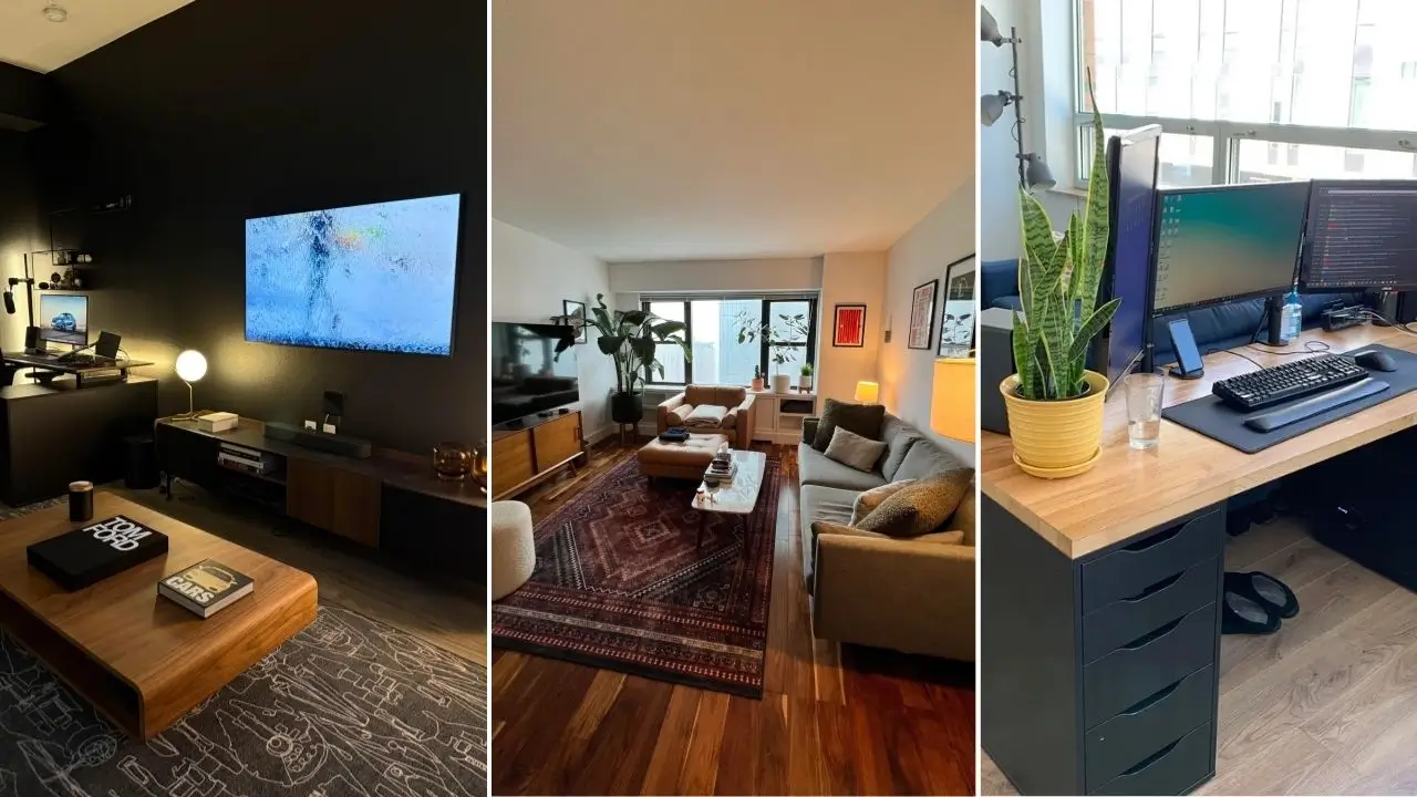
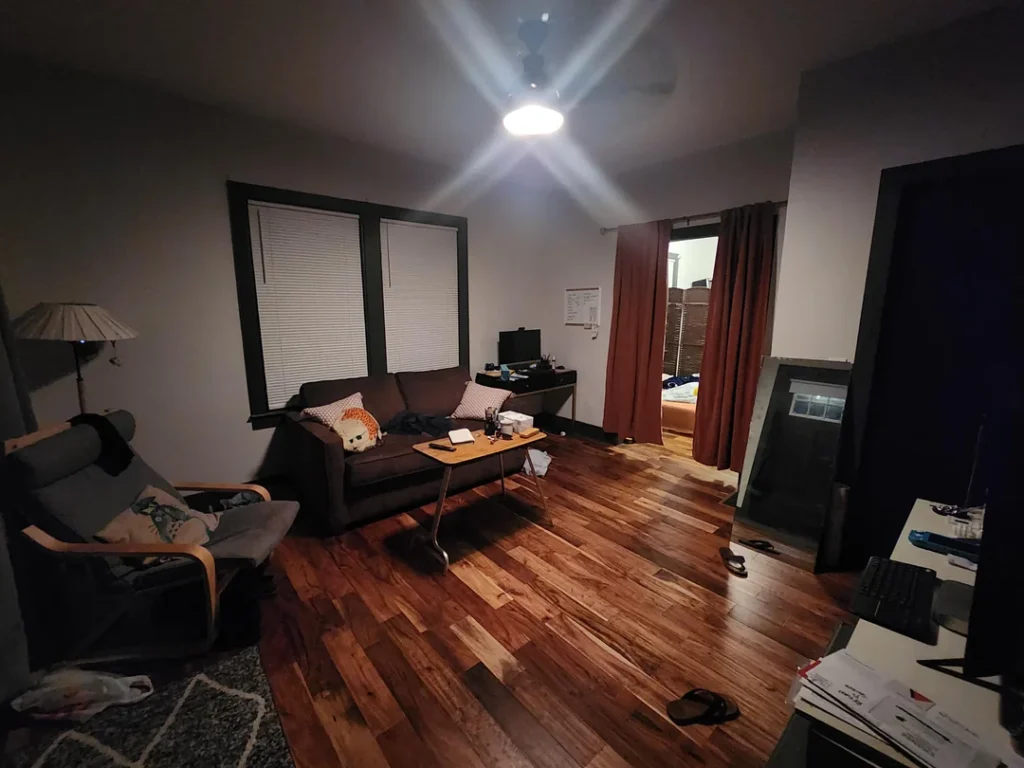
The Dual-Monitor WFH Desk That Doesn’t Eat Your Entire Studio
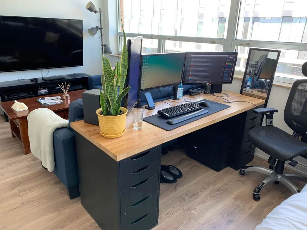
Here’s the question every guy working from a studio apartment eventually faces: how do you set up a legit workspace when your bedroom is also your living room, your dining room, and your everything room?
r/ta8013215 figured it out with a setup that’s equal parts functional and smart-looking. No compromises, no excuses.
The Desk Situation
A classic IKEA ALEX drawer unit paired with a butcher-block wood top. This combo has basically become the gold standard for home desks, and for good reason. The warm oak desktop contrasts cleanly with the matte black drawers. Two large monitors sit side by side with a mechanical keyboard and a full-size mouse pad. A yellow-potted snake plant sits at the desk’s edge, adding just enough life without cluttering the workspace.
The Zone Divide
Here’s where it gets clever. The desk runs parallel to the sofa, creating a natural boundary between work mode and chill mode. The sofa faces away from the desk toward a TV on a walnut media console across the room. A floor lamp with adjustable gooseneck heads sits in the corner doing double duty for both zones.
You can literally see where work ends and relaxation begins. That’s thoughtful zone planning in action.
Want to Recreate This?
- Grab a desk with built-in storage. The ALEX-style drawer unit solves the “nowhere to put anything” problem that plagues tiny desks.
- Pair it with a butcher-block top from IKEA’s GERTON line for around $100. Looks way more expensive than it actually is.
- Keep your desk chair visually separate from your lounge furniture. Even a different material or color signals to your brain (and your guests) that this is a different zone.
Also Read: Stop Decorating for Mood Boards: 10 Lived-In Lofts With Genius Ideas
The Dark Academia Living Room That Proves Dark Walls Aren’t Scary
Not everyone wants a bright, airy studio. Some of the best male studio apartment ideas actually lean into darkness as a deliberate design choice rather than treating it as a problem to solve with more lamps.
r/castlesystem went there, and it looks incredible. IMO, this is one of the most underrated aesthetics for a guys’ studio.
The Setup
A dark charcoal, nearly black, accent wall sits behind the TV. A substantial floor-to-ceiling bookshelf unit filled with books, records, and framed artwork flanks it. That dark wall makes the TV recede visually, turning the entire back section into a display surface instead of just a screen on a wall.
Rich walnut hardwood floors keep things warm. A deep plum-gray sofa faces the entertainment setup. A small tripod-style side table with a glass surface holds a drink and remote without eating up floor space. Red-brown curtains on the left side add a hit of burgundy warmth to the whole palette.
Why Dark Walls Work in Small Spaces
I know what you’re thinking. Conventional wisdom says never paint a small room dark. But look at this room. Dark paint makes a small space feel intentional and contained rather than just small. It works especially well when you balance it with warm-toned floors and furniture.
Think of the dark wall as a backdrop for everything else, not a fight against natural light. Those are two completely different goals.
All-Black Everything: The High-Contrast Studio That Actually Pulls It Off
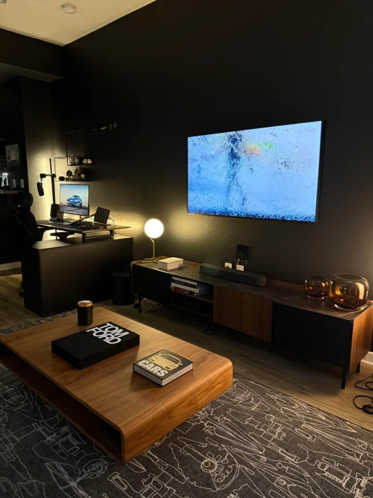
Okay, this one took guts. Painting every wall matte black is not a casual weekend decision. Rooms like this either work completely or fail spectacularly. This one works, and it works beautifully.
r/SpenyM committed fully to a dark, moody aesthetic that reads more boutique hotel than cramped studio. Respect.
Breaking It Down
- Every wall is matte black, which eliminates visual boundaries between surfaces and makes the room feel like one contained environment.
- A large flat screen TV sits wall-mounted flush against the dark surface. When it’s off, it basically disappears into the wall.
- A low walnut TV console keeps visual weight toward the floor.
- A low-profile walnut coffee table holds a Tom Ford coffee table book and an automotive photography book. Deliberate choices that signal taste without screaming about it.
- Amber glass spheres on the console provide decorative weight.
- A gold-stem globe table lamp creates a single warm glow that bounces beautifully off the dark walls.
In the background, a standing-height black desk with a monitor, microphone arm, and gaming chair carves out the work zone. The rug with its automotive technical illustration print adds personality without overwhelming the space. Subtle enough to not distract, specific enough to tell you exactly who lives here.
If You Want to Try This
Go fully dark or don’t bother. One black accent wall surrounded by white walls usually reads unfinished. Commit to the whole room, pick warm-toned wood furniture to prevent things from feeling cold, and invest in at least two warm light sources. The result? A studio that feels curated, not just painted.
Mid-Century Plants and City Views: Let the Window Do the Work
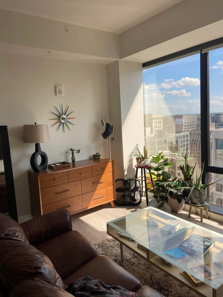
Floor-to-ceiling windows change everything. When you have a view like this, your only job is to support it. Not compete with it. Not block it. Just support it.
r/hoozierwins understood this instinctively, and the result is one of the cleanest setups in this entire collection.
The Plant Game
A collection of plants including a fiddle-leaf fig, cactus, snake plant, and pothos clusters near the floor-to-ceiling window to soak up natural light. They’re arranged at varying heights using floor placement, a small red stool, and a stacked plant stand. The effect is a living curtain that softens the glass wall without blocking the skyline.
The Furniture Move Nobody Talks About
A seven-drawer walnut-toned dresser anchors the left side of the frame, topped with a ceramic ring lamp, a small vase with greenery, and a tray with curated objects. A Nelson-style sunburst clock on the wall above ties it to mid-century modern without making the whole room feel like a theme park.
Here’s what’s particularly smart: that dresser does double duty. In a studio, bedroom furniture has to earn its place in the living area. A nice dresser styled like a console table, with a lamp, a clock, and curated objects on top, becomes a feature rather than an eyesore. That’s the kind of thinking that separates a good studio from a great one.
Pro Tip
If you’re working with a high-floor studio with city views, keep things low and let the view do the heavy lifting. Resist the urge to fill the window wall with tall furniture. Let the city be your art.
Also Read: 10 Apartment Living Room Ideas from Real People (No “Influencer” Fluff Included)
NYC-Style Studio Done Right: Eclectic Art Wall Meets Vintage Rug Energy
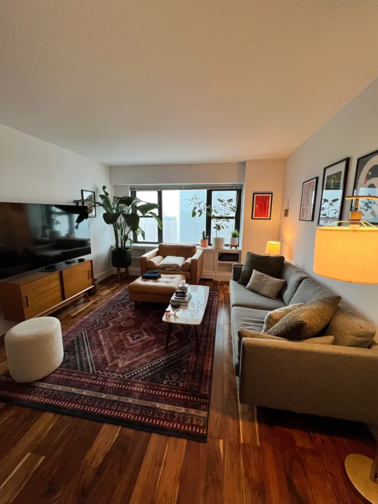
New York studios teach you things about space that no design book ever could. When you’re living in 400 square feet in Manhattan, every single decision gets pressure-tested fast. No room for error, literally.
r/CapitalAdvice665 put together a setup that looks expensive and considered. Here’s the thing though, the individual pieces are genuinely accessible.
The Foundation
A deep burgundy vintage-style rug with geometric medallion patterns anchors the entire room and sets the color story. A warm gray sofa and cognac leather chair face a walnut media console topped with a flat screen. The plant situation is thoughtful too. A large bird of paradise in a black floor pot holds down the corner near the window, with smaller potted plants lining the windowsill.
The Gallery Wall
This is the room’s defining feature. Three or four framed prints in varying sizes, including a bold red text piece, a photography print, and a graphic print, arranged in a loose cluster rather than a rigid grid. A large gold drum shade floor lamp sits at the edge of the seating area providing that warm, diffused light that studios desperately need.
A boucle barrel ottoman at the foot of the rug adds textural contrast to the leather and fabric. IMO, this is one of the most underrated pieces of furniture for studios. It works as a footrest, occasional seating, or a surface when you toss a tray on it.
Gallery Wall Tips
- Start with your largest piece and work outward.
- Don’t overthink spacing. Gallery walls that look deliberate often have slightly uneven gaps between frames.
- Trust the overall composition more than individual measurements.
The Honest Starter Setup: Getting the Bones Right First
Not every studio in this list looks like a finished product. I deliberately included this one because it’s the most honest representation of where a lot of guys actually are right now, and that’s genuinely useful.
r/castlesystem is working with a space that has excellent raw material. Rich walnut-toned hardwood floors run the full length of the room. Neutral gray walls. Black-trimmed windows that add definition. The layout is clear: a dark brown sofa faces a low media setup with TV, and a compact side table holds a shaded floor lamp in the corner.
What’s Missing (and Why That’s Useful Info)
The room needs layering. A rug, curtains that pool to the floor, framed art, throw pillows with texture. The furniture choices are solid and the bones are there. This room is literally one rug and two art prints away from looking genuinely intentional.
That’s actually super useful information for anyone at an early stage. Here’s the move:
The single highest-impact upgrade for a basic setup is a large area rug. It defines the seating zone, adds warmth to hardwood floors, and makes furniture feel anchored rather than floating. Quick rule of thumb: your rug should be large enough that the front legs of every piece of seating sit on it. Most guys buy a rug that’s too small, which makes everything feel disconnected.
Rusty-red curtains partially visible through the doorway suggest the bedroom space has more personality going on. Bringing some of that warmth into the main living area is the obvious next step.
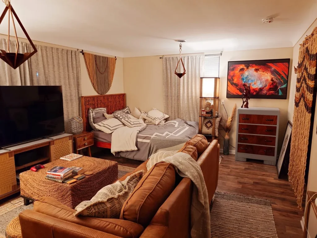
Boho Warmth: How Texture and Warm Tones Transform a Studio Bedroom
This is the most maximalist setup in the entire collection, and it earns every single layer.
r/Wiidiwi has built something that feels genuinely cozy rather than cluttered. That distinction comes down to two things: color palette consistency and material choice.
Why It Works
Every element pulls from the same warm spectrum:
- Cognac leather sofa
- Rattan and woven coffee ottoman
- Woven headboard in warm browns
- Geometric patterned bedding in cream and gray
- Macramé wall hanging above the bed
- Sheer cream curtains diffusing window light softly
A large canvas print in reds, oranges, and blues serves as the room’s color anchor point. Below it sits a two-tone dresser that somehow reads as intentional despite being an unusual combo. Geometric wire pendant lights hang from the ceiling. Pampas grass in a floor vase, a southwestern-pattern side table, and layered rugs complete the picture.
This room works because the aesthetic commitment is total. There’s no random IKEA-white bookcase fighting for visual space. Everything speaks the same language.
If You’re Into This Vibe
Commit fully. Mix materials like leather, rattan, linen, and jute, but keep the color range tight. Warm neutrals with one or two saturated accent colors hold everything together beautifully.
Also Read: 10 First Apartment Tours: Real Renters, Real Budgets, Total Style
The Loft-Style Studio That Turns No Closet Into a Design Feature
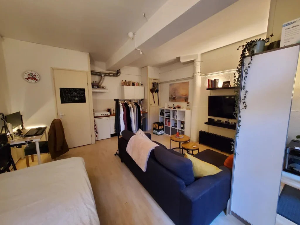
Small studios often come with the worst closets imaginable. Or no closets at all. This setup from r/matthiasdesu treats that limitation as a straight-up design opportunity, and honestly, it slaps.
The Space
This appears to be a converted ground-floor space with exposed structural columns, white painted beams across the ceiling, and industrial ductwork visible above the doorway. The solution for clothing storage? An open rail mounted just inside the entry, holding a curated row of garments that reads as intentional rather than improvised. White wall-mounted cabinets next to it provide closed storage for smaller items.
The Living Area
- Navy blue sofa with mustard yellow and orange cushions for brightness
- Nesting round side tables serving as a coffee table (they stack under each other when not needed, which is genius for small spaces)
- White modular shelf unit below the TV providing both open and closed storage
- Trailing ivy cascading down from a pot mounted high on a column, which is one of the cleverest uses of vertical space I’ve ever seen in a studio
A standing desk with a monitor sits to the left, clearly separated from the living zone. Everything has a place, and that place is visible.
The Open Clothes Rail Secret
This only works because the clothing itself is styled. Similar tones, mostly neutrals and darks, hung at consistent heights. If you try this in your own studio, edit your wardrobe before you put it on display. Ten curated pieces look like a boutique. Forty random items look like a yard sale. You’ve been warned.
What All 10 Studios Have in Common
Looking at these ten spaces together, some clear patterns jump out. Here’s a quick breakdown of the highest-impact upgrades you can make:
| Upgrade | Impact | Difficulty |
|---|---|---|
| Large area rug | Very High | Easy |
| Warm lighting (lamps, not overhead) | Very High | Easy |
| Plants (1 to 3 large ones) | High | Easy |
| Gallery wall or single large print | High | Medium |
| Dark or bold accent wall | High | Medium |
| Open shelving with curated items | Medium | Easy |
| Vintage or patterned layered rug | Medium | Easy |
| Defined work zone with a proper desk | High | Medium |
The Two Things Every Good Studio Has
Every single room in this list has at least two warm light sources that aren’t overhead fixtures. That one detail separates rooms that feel livable from rooms that feel like a dentist’s office. Turn off the overhead light, switch on your lamps, and watch the whole room transform instantly.
The other common thread? Personality. None of these studios are anonymous. They reflect the people living in them through book collections, plant choices, art prints, and small objects that actually mean something. A studio apartment for a man doesn’t need a theme or a style label. It just needs to feel like someone actually lives there.
Make It Yours Before You Make It Perfect
I get the urge to wait. Wait until you have more money, more space, or the “right” furniture before you start decorating. But that’s the exact reason so many studio apartments look identical on month 24 as they did on move-in day.
Pick one area of your studio this week. The desk, the wall behind the sofa, the corner near the window. Make it genuinely yours. A framed print. A plant. A lamp with warm-toned bulbs. Then build outward from there.
Every studio in this article got built incrementally, with deliberate choices made over time. Nobody finished theirs in a weekend. The ones that look best are the ones where the person living there cared enough to keep going.
That’s the only interior design secret that actually matters. Now go make your studio feel like home. You’ve got everything you need to get started.