So your furniture finally arrived. You excitedly dragged everything in, and now your sofa is blocking the dining table, your TV has absolutely nowhere logical to go, and you’re standing in the middle of the room questioning every decision you’ve ever made. We’ve all been there.
Here’s the good news: people figure this out all the time. Real people, with real awkward rooms, not professional interior designers with unlimited budgets and perfectly proportioned spaces. I pulled together ten actual living and dining room combo setups that genuinely work, each one solving a different version of the same puzzle you’re staring at right now.
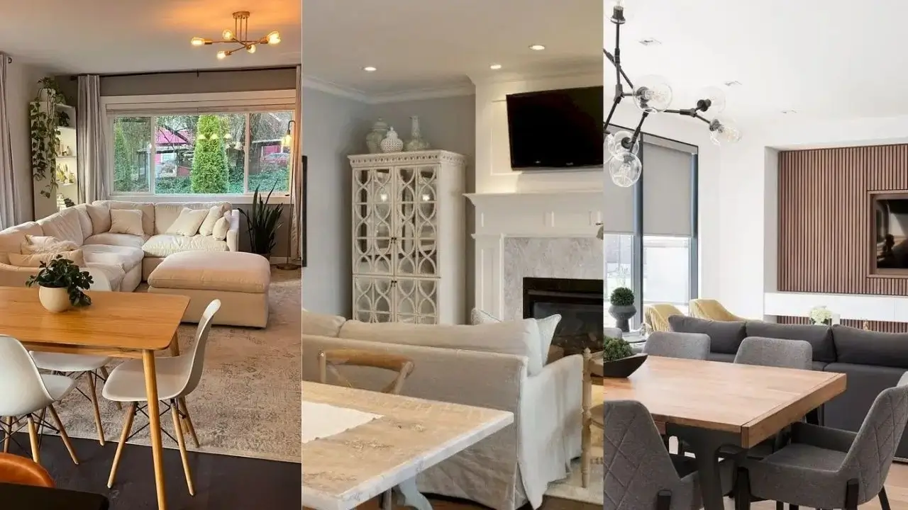
Scandinavian Simplicity with Strategic Furniture Placement
If your room has decent natural light, this approach is honestly one of the easiest wins you can get.
The setup uses pale wood floors as a base, and the furniture respects the light instead of fighting it. A light gray sectional faces the windows, clearly marking the living zone without walling off the dining area. The dining table sits to the side with woven placemats that add texture without making things feel heavy.
Here’s the detail that ties it all together: both the coffee table and dining table share the same dark wood finish. That repetition creates cohesion even though the pieces serve completely different functions. It’s one of those tricks that sounds simple but makes a huge visual difference.
The rustic wooden beam chandelier draws your eye upward, which is a clever move in combo spaces. When you emphasize vertical elements, the room feels less crowded horizontally. Throw in a few plants and you’ve got a space that feels intentional, calm, and genuinely livable.
How to nail this look:
- Start with your largest piece of furniture and face it toward your best feature (usually a window)
- Stick to three main tones max
- Let natural materials do the decorating work instead of accessories
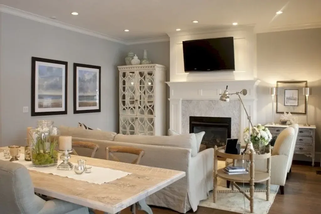
Stone Fireplace as a Natural Room Divider
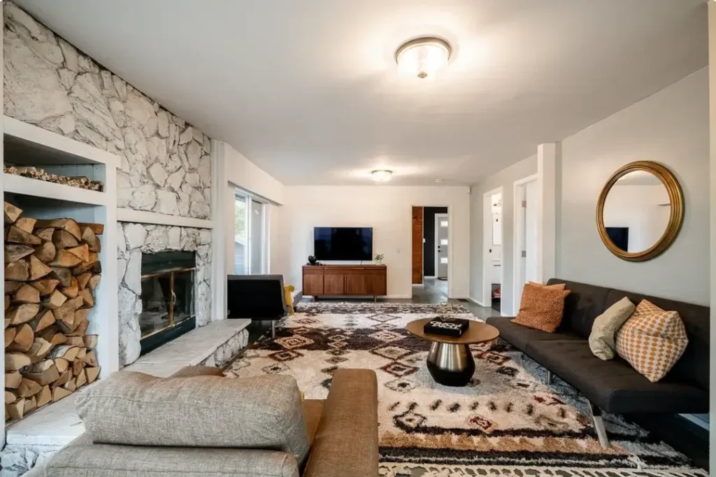
Some rooms hand you the solution on a silver platter. This is one of them.
A stone fireplace does the heavy lifting here, defining two separate zones without blocking sightlines or killing the conversation flow. The built-in firewood storage on one side reinforces that vertical dividing line in a way that feels natural, not forced.
A low-profile charcoal sofa runs parallel to the fireplace, keeping the living area contained but still open. A geometric patterned rug anchors the seating arrangement and visually marks where the living space ends. Everything sits low and streamlined, which prevents the room from feeling top-heavy. A round coffee table and sculptural side table introduce just enough curves to soften those hard stone lines.
The dining area on the other side has darker walls and warm wood cabinetry, giving it its own personality while staying within the same neutral scheme. Two zones, one room, zero confusion.
The big takeaway here: if you have any architectural feature that naturally divides your space, work with it. The fireplace is essentially a free room divider that also happens to look stunning.
Cozy Corner Sectional with Integrated Dining
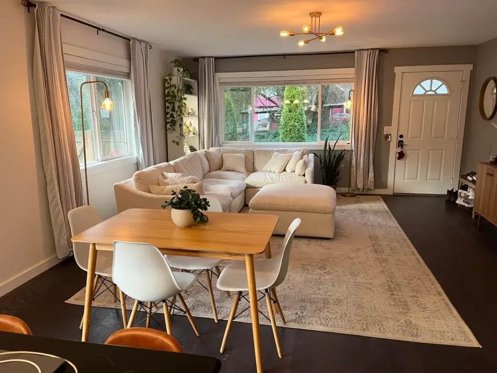
Most people completely waste their corners. This setup flips that script entirely.
Pushing a deep cream-colored sectional into the corner maximizes seating while keeping the center of the room open for movement. A matching ottoman floats nearby and can tuck in or shift around depending on what’s happening. The light wood dining table sits close enough to feel connected to the living area, while mid-century modern white chairs keep things visually airy.
Gray walls create a sophisticated backdrop that lets the natural wood tones breathe. Brass accents in the pendant lights and a circular mirror add warmth without introducing new colors into the mix. One large rug under both zones unifies the areas far more effectively than two smaller rugs ever could.
This layout works especially well for rectangular rooms where you need a clear walkway. The sectional doesn’t eat into the main traffic path, and the dining table placement leaves plenty of room to move around it comfortably.
Quick tips for this look:
- Measure your corner before you shop so the sectional fits snugly
- Leave at least 36 inches between your dining table and surrounding furniture for chair clearance
- One cohesive rug beats multiple smaller ones every time
Also Read: 15 Stylish Living and Dining Room Combo Ideas You’ll Love
Elegant Neutrals with Symmetrical Balance
Symmetry is basically a cheat code for making busy spaces feel calm. This room proves it beautifully.
Two identical framed prints hang on one wall, visually balancing the fireplace and media center on the opposite side. Matching upholstered chairs flank a neutral sofa in a traditional arrangement that feels put-together without being fussy. A weathered wood coffee table introduces rustic texture that keeps the space from tipping into “too formal” territory.
A decorative china cabinet in the corner adds vertical interest and useful storage without overwhelming the room. Crown molding and recessed lighting bring architectural detail that elevates the whole setup. The soft gray walls and cream-and-white furniture create a monochromatic scheme that feels intentional rather than boring.
What really makes this work is the editing. Every piece serves a clear purpose. Nothing looks like it wandered in from another room and just stayed.
If you love traditional styling, invest in quality upholstered pieces in neutral tones. Let wood finishes and decorative accessories carry the character, and keep your layout symmetrical wherever you can.
Modern Statement Wall with Open Layout
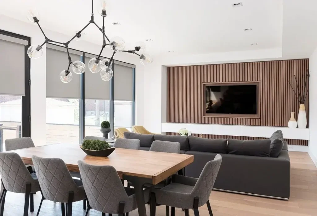
A wood slat accent wall is genuinely one of the most effective ways to define a living zone in an open-concept space without building an actual wall. IMO, it’s underused and underrated.
The vertical slat treatment behind the TV creates a focal point that anchors the living area immediately. A charcoal sectional faces this feature, and the furniture stays low-profile so it doesn’t compete with the drama of the wall. A live-edge dining table brings organic texture that plays beautifully against the linear precision of the slats.
Floor-to-ceiling windows flood the space with natural light, and a modern chandelier above the dining table adds sculptural interest while covering the task lighting needs for meals. The color palette stays disciplined: charcoal, natural wood, white, and touches of brass. That restraint lets materials and textures do all the visual heavy lifting.
This layout is perfect for open-concept spaces where you want definition without physical barriers. The accent wall gives the TV a proper home and makes the living area feel like it belongs exactly where it is.
To pull this off:
- Pick one bold architectural element rather than multiple competing features
- Keep furniture silhouettes clean and let materials provide texture
- Make sure your lighting plan covers both ambient and task needs
Compact Charm with Multifunctional Pieces
Small spaces don’t have to feel like punishment. This setup is proof that choosing the right scale changes everything.
A dark gray sofa with a chaise extension handles lounging without needing a separate ottoman eating up more floor space. It faces the fireplace while leaving the center of the room open. An oversized mirror above the mantel reflects light and makes the room feel noticeably larger than it actually is. (Mirrors in small spaces are basically magic. Use them.)
The dining area sits near the door with a simple wooden table and black chairs that tuck in completely when not in use. Every piece was chosen with dimensions in mind, and the result is a room where two functions coexist without either one feeling cramped.
Patterned throw pillows, decorative mantel items, and a floor lamp with a traditional base add genuine personality without cluttering the space. A ceiling fan handles practical comfort needs without throwing off the room’s proportions.
For tight quarters:
- Measure everything twice before buying, seriously
- Look for furniture with exposed legs to create visual space underneath
- Use mirrors strategically to reflect light and open up sightlines
- Choose multifunctional pieces that earn their square footage
Relaxed Layout with Flexible Furniture Arrangement
Not every combo space needs a rigid, perfectly structured layout. Sometimes casual is exactly the right call.
A gray L-shaped sectional sits at a slight angle, creating a relaxed living area that doesn’t just hug the walls. A glass-top coffee table maintains sightlines across the room without adding visual weight. A wooden dining table with simple chairs sits perpendicular and close enough that someone could easily join conversations from either zone.
A ladder shelf in the corner provides vertical storage without requiring a bulky bookcase. Botanical prints on the walls bring in a nature vibe without competing for attention. The round mirror and oval wall hanging introduce curves that soften all the rectangular furniture lines.
The real strength of this layout is flexibility. The furniture feels lived-in rather than staged, and nothing is built-in or permanent. This is a fantastic setup for renters or anyone whose needs tend to shift over time.
For a similar vibe:
- Avoid pushing all furniture against walls (floating seating creates better conversation zones)
- Keep storage solutions lightweight and movable
- Choose neutral backgrounds that work with a range of furniture arrangements
Also Read: 10 Small Living and Dining Room Combo Ideas That Actually Work
Gallery Wall with Separated Rug Zones
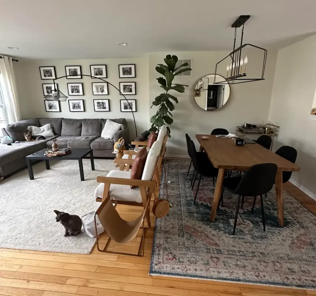
Sometimes two distinct rugs work better than one large one, especially when your space has awkward proportions or natural divisions already built in.
A gallery wall of twelve matching black frames in a perfect grid creates a strong focal point that anchors the living area. A gray sectional sits on a plush cream rug that defines the lounging zone, while the dining area has its own patterned rug in complementary colors. Two rugs, two zones, zero confusion about where one ends and the other begins.
A live-edge dining table adds organic character, and the mix of wooden accent chairs with black upholstered dining chairs shows thoughtful eclecticism rather than random grab-what-you-have mixing. An oversized floor lamp arcs over the seating area, handling reading light without requiring end table space.
The fiddle leaf fig in the corner adds height and life. The round mirror reflects light while breaking up the angular lines from the frames and furniture. Black and natural wood carry the color story, with the gray sofa bridging between them.
For defined zones:
- Use separate rugs to mark each functional area clearly
- Create a gallery wall with identical frames for visual impact without chaos
- Mix seating styles by connecting them through shared colors or materials
- Use lighting to reinforce each functional zone
Smart Storage Solutions in a Compact Footprint
When floor space is limited, you go vertical. Full stop.
A dark teal sofa with a chaise handles all the seating without needing extra chairs cluttering the space. Floating shelves flanking the fireplace hold books, plants, and personal items without requiring a single square foot of floor space. The coffee table includes lower shelf storage for magazines and books, because every piece of furniture should pull double duty in a small room.
The fireplace surround includes built-in shelving on one side and a TV spot on the other. Dark wood floors throughout provide continuity, and a ceiling fan keeps things comfortable without compromising the aesthetic. The dining area manages with a small table near the door because that’s genuinely all it needs.
Deeper, richer colors in the palette make the small space feel cozy rather than cramped. That’s a mindset shift worth making: sometimes cozy and functional beats open and sparse.
For maximum storage:
- Install floating shelves instead of floor-standing bookcases
- Choose furniture with built-in storage compartments
- Embrace darker, saturated colors if “cozy” is your actual goal
Modern Urban with Playful Accent Wall
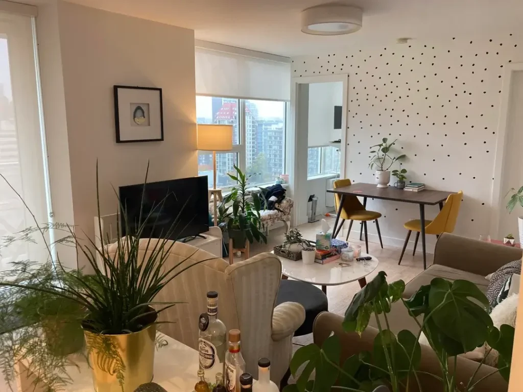
Accent walls don’t have to be paint or wallpaper. A polka dot wall? Absolutely valid, and honestly kind of brilliant.
The polka dot treatment defines the dining zone with a permanent but playful feature. Cream-colored seating faces away from it, creating a clear living zone. A white circular coffee table continues the curved theme introduced by the dots. The small dining table with yellow chairs sits directly against the accent wall, making that corner feel intentional and designed rather than an afterthought.
Floor-to-ceiling windows bring in tons of natural light, and simple roller shades keep window treatments from getting fussy. Plants throughout the space add greenery without requiring any kind of matching scheme. The overall palette stays neutral with white, cream, and natural wood, letting the yellow chairs and polka dots provide all the personality.
This layout works brilliantly for studio or one-bedroom apartments where the living and dining combo shares space with sleeping areas. The accent wall creates a focal point that gives the dining area its own identity without needing a full room to do it.
To recreate this approach:
- Consider a bold accent treatment for just one wall
- Keep furniture lightweight and scaled appropriately for the space
- Use color sparingly but intentionally
- Statement chairs can define a dining area without needing a large table
Also Read: 15 Small Space Living Room Ideas Ideas That Actually Work in Tight Spaces
Comparing Small Living and Dining Room Combo Approaches
| Layout Style | Best For | Key Feature | Difficulty Level |
|---|---|---|---|
| Scandinavian Light & Airy | Rectangular rooms with good natural light | Pale woods and minimal color palette | Easy |
| Architectural Divider | Spaces with fireplaces or columns | Using existing features as zone markers | Easy |
| Corner Sectional | Square or near-square rooms | Maximizing seating in corners | Medium |
| Symmetrical Traditional | Formal spaces with architectural detail | Balanced furniture placement | Medium |
| Statement Wall | Open-concept layouts | Accent wall creates visual separation | Medium |
| Compact Multifunctional | Very small spaces under 300 sq ft | Furniture with dual purposes | Advanced |
| Flexible Casual | Renters or frequently changing needs | Movable, non-permanent arrangements | Easy |
| Separate Rug Zones | Irregular or L-shaped rooms | Multiple rugs define distinct areas | Medium |
| Vertical Storage Focus | Limited floor space | Wall-mounted and built-in storage | Medium |
| Accent Feature Dining | Studios or one-bedroom apartments | Bold wall treatment defines dining zone | Advanced |
So, Which One Is Right for Your Space?
The common thread running through all ten of these setups is intentionality. Every person made deliberate choices about what mattered most in their space and built everything else around those priorities.
Some prioritized light and openness. Others needed maximum seating or serious storage. A few went bold with design choices while others kept things calm and neutral. The right approach depends entirely on how you actually live in the space, not what looks good in someone else’s photo.
Start with your non-negotiables. What does this room absolutely have to do? Then find the examples above that tackled those same challenges. Your combo probably won’t look exactly like any of these, and that’s perfectly fine. Understanding why each layout works is what helps you make better decisions for your specific situation.
The furniture you already own might work great with just a different arrangement. Or one key piece might change everything. Either way, you’ve got ten real starting points now. Pick the one that speaks to your situation and give it a shot! Your room is figuring itself out, one deliberate decision at a time.