The gap between a kitchen and dining room that functions and one that genuinely feels good to be in is smaller than most people think and it rarely requires a full renovation to close.
I’ve spent a lot of time looking at real homes, not staged showrooms, and the kitchen and dining room ideas that stick are almost always the ones born from practical creativity rather than unlimited budgets.
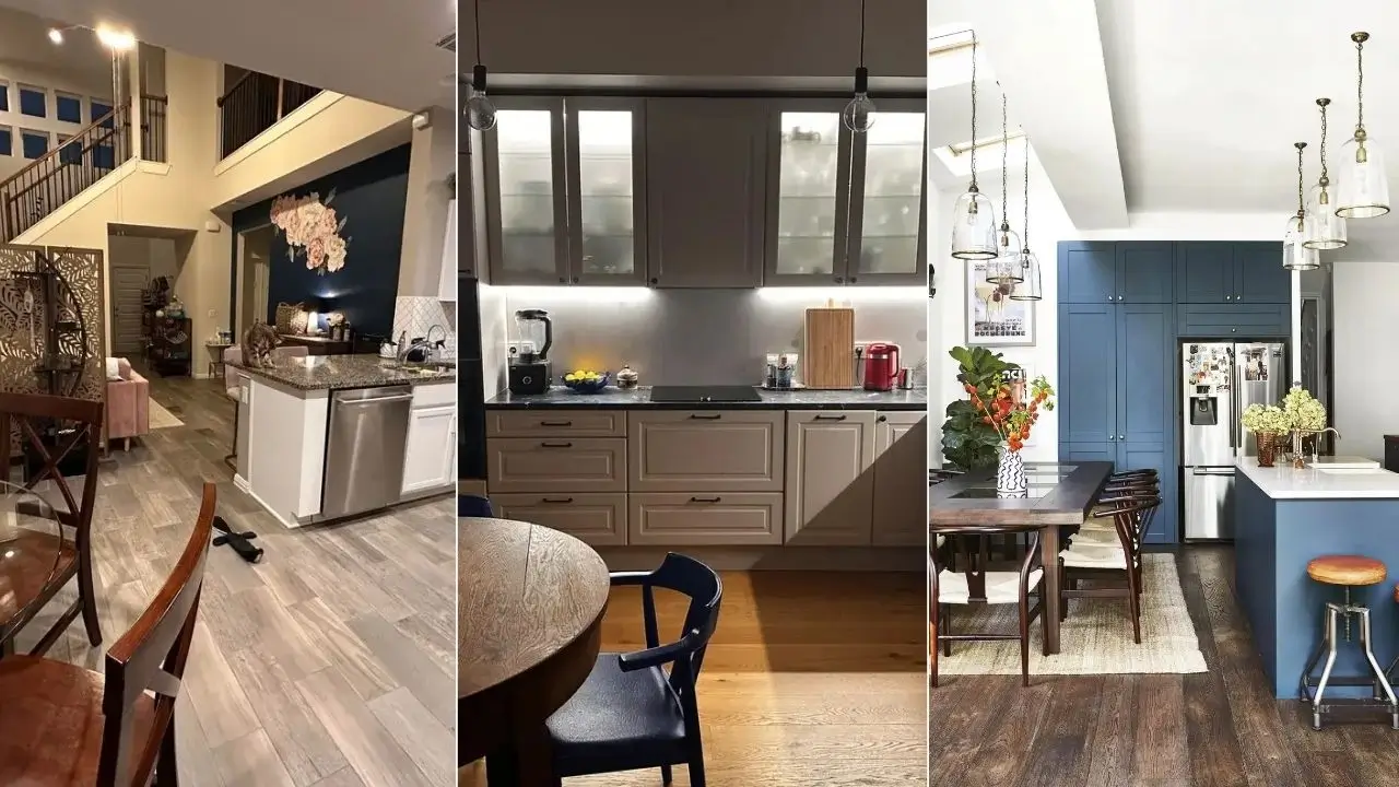
What you’ll find here are 12 real examples pulled from people who figured out something worth sharing.
Some spaces are polished. Others are still works in progress. All of them have at least one idea worth stealing.
White Cabinetry, Mason Jar Pendants, and the Open-Plan Farmhouse That Gets Everything Right
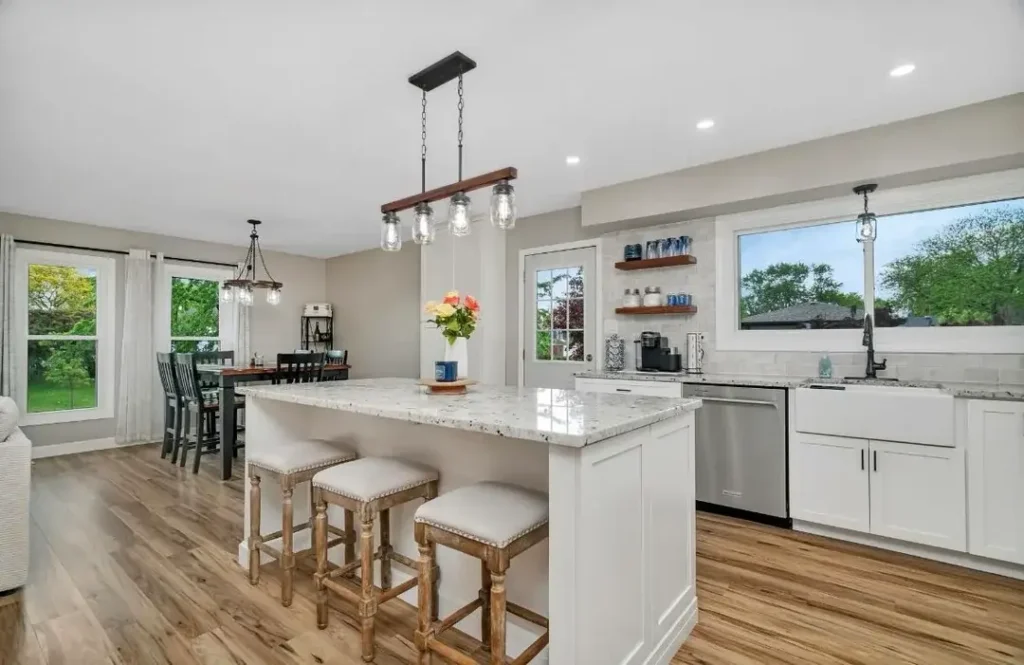
This is the kind of kitchen and dining room combination that makes you understand why the open-plan layout became so popular in the first place.
The space flows naturally from a white shaker-cabinet kitchen with a large granite-topped island into a dining area anchored by a dark wood farmhouse table and contrasting black chairs.
r/Jvgso put together a setup that demonstrates how much work lighting does in these combined spaces.
Over the island hangs a reclaimed wood beam pendant with mason jar bulbs a fixture that bridges the rustic and the modern without forcing either.
Over the dining table, a wrought iron chandelier with a vintage candelabra style echoes the warmth without being matchy-matchy. The two fixtures feel related but not identical, which is exactly the right call.
What makes this space work beyond the lighting is the restraint in color. Warm grey-beige walls, white cabinets, light hardwood floors, and natural wood accents throughout nothing fights for attention.
The open floating shelves near the sink carry a small collection of blue glassware and canisters that add just enough color to keep the palette from going flat.
If you want to recreate this approach, the key is treating the lighting in your kitchen zone and your dining zone as a pair.
They don’t need to match, but they should share at least one material or finish. Here it’s the black metal and warm bulb tone that ties both fixtures together across the open space.
The Bold Dark Accent Wall That Transforms an Otherwise Plain Open Plan
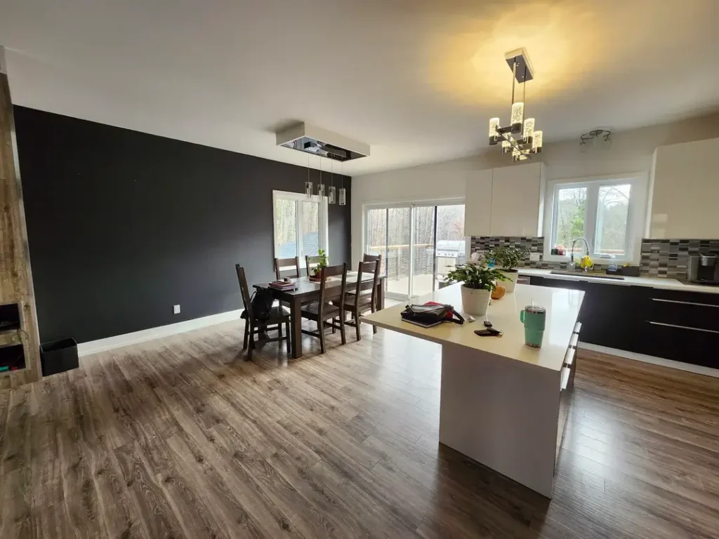
Most people staring at a large blank wall in an open-plan kitchen and dining room default to hanging a piece of art and calling it done.
This space takes a more committed approach: paint the entire thing a deep charcoal-black and let it do the heavy lifting.
r/xvickyj shared this space as a work in progress, and honestly, that dark accent wall is already the best thing in the room.
The dramatic near-black tone grounds the dining area, gives the space a clear focal point, and makes the large sliding glass door and windows pop against it. Without that wall, this would read as a generic new-build with nice floors.
The rest of the space is fairly neutral white kitchen cabinets, a mosaic tile backsplash in grey tones, light wood floors, and a contemporary chrome chandelier over the dining table.
The contrast between the dark wall and the bright kitchen zone is what creates visual structure in a room that has no walls or architectural details to do that work.
The lesson here is that you don’t need furniture or decor to define zones in an open-plan kitchen and dining area. A single bold paint choice can accomplish that on its own.
This is also one of the most budget-friendly moves on this list a can of dark paint and a weekend is genuinely all it takes to change the feeling of a space this dramatically.
Rich Walnut Cabinets and Crown Moulding in a Classically Proportioned Home
Some homes have bones that deserve to be honored rather than updated. This kitchen and dining space is in a house with serious traditional architecture deep crown moulding, a wide entryway hall, rich stained walnut cabinetry, dark granite countertops, and hardwood floors the color of dark espresso. It would be a shame to modernize any of it.
r/dude_ratsarecool has left this space largely as it was designed, which I think takes more confidence than renovating.
The pendant lights over the peninsula are simple clear-glass drops on black rods a contemporary choice that reads quietly against the warm, traditional backdrop rather than clashing with it.
That’s a useful trick: if your existing kitchen has strong traditional character, you can introduce one or two cleaner-lined elements without undermining the overall feeling.
The peninsula itself is worth examining. White beadboard paneling on the front face of the island provides textural contrast against the dark hardwood floors.
Two slim industrial-style metal bar stools sit at the overhang functional and unobtrusive. The dining area visible at the edge of the frame has a round table with a leather-look accent chair that suggests a transitional mix of traditional and modern.
For homes with existing character like crown moulding or traditional cabinetry, the best kitchen and dining room ideas are usually additive rather than transformative. Work with what the space already does well.
Live-Edge Dining Table as the Statement Piece in a Neutral Open Plan
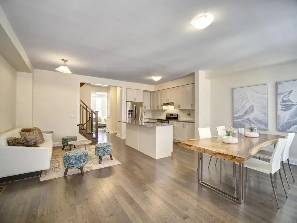
There’s a recurring mistake in open-plan kitchen and dining rooms: people furnish both zones with the same energy level, and everything ends up competing.
The better approach is letting one piece lead and everything else support. This space does exactly that with a live-edge wood dining table on a brushed steel base.
r/dhritarashtrauvaca created a space where that dining table is clearly the focal point of the entire floor plan.
The kitchen behind it is crisp and neutral white shaker cabinets, granite-look counters, stainless appliances and the living area to the left has a simple white sofa and low ottomans in teal.
Neither zone is trying to outshine the other, which makes the raw organic edge of that dining table even more striking.
The flooring is medium grey-toned hardwood throughout, which provides a consistent base that lets the eye travel across the space without interruption.
Two abstract landscape paintings hang in the dining area, large enough to anchor the wall without feeling crowded.
A live-edge dining table is a significant investment, but it’s one that tends to hold up as a design choice over time precisely because no two are the same.
If your kitchen is on the neutral side, a statement dining table is one of the most effective ways to give the combined space a memorable identity.
Deep Blue Cabinetry and Bell Jar Pendants in a Kitchen Full of Personality
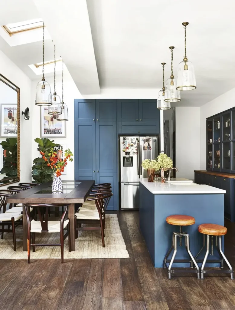
This is the space I keep coming back to in this collection because it does something rare: it has a strong, opinionated design perspective without feeling overdone.
The kitchen cabinets are painted a deep steel blue think a color between navy and teal and that choice alone transforms what might otherwise be a serviceable kitchen into something with genuine character.
r/ManiaforBeatles worked with skylights and high ceilings, which helps, but the design choices here would carry the space even without those architectural advantages.
Glass bell jar pendants on aged brass chains hang in clusters over both the island and the dining table two distinct groupings of the same fixture that create visual continuity across the open plan.
The brass finish echoes the brushed gold hardware on the dark hutch cabinet at the far right of the frame.
The dining area features dark wood wishbone-style chairs around a long wooden table on a natural jute rug.
Industrial-style leather-and-chrome bar stools at the island add a contrasting material that keeps the space from feeling too precious.
A large gilded mirror on the dining wall and vintage travel posters layered around it give the space a gathered, collected quality like it developed organically over time rather than being installed all at once.
If your kitchen and dining room ideas include color, this is proof that committing fully to one bold tone throughout the kitchen cabinets is far more effective than hedging with a two-tone approach. The depth of that blue makes everything else in the room respond to it.
Layered Rugs, Decorative Plates, and Rattan Barstools in a Bright White Kitchen
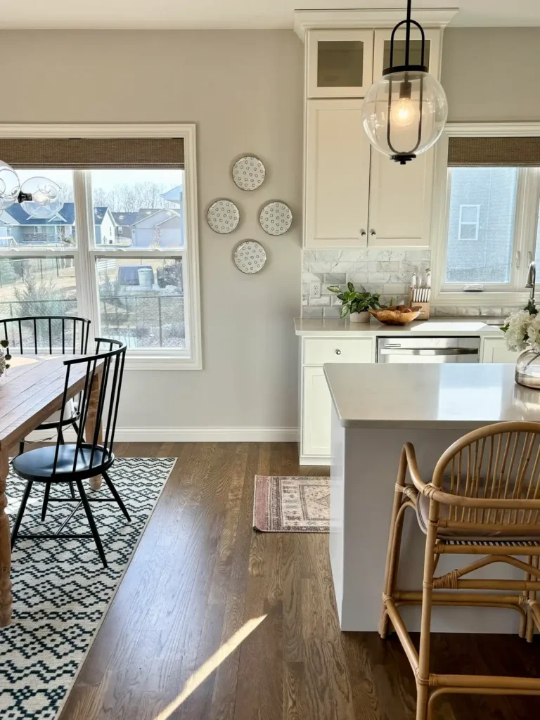
Not every kitchen and dining room idea needs to be about architecture or major renovation. Sometimes the most satisfying changes are made through layering textiles, wall decor, contrasting seat materials and this space is a clean example of that approach done well.
r/Britney023 decorated what is essentially a white-and-grey kitchen with modest square footage by bringing in pattern and texture through the smaller elements.
A black and white geometric rug under the dining table, a faded pink vintage-style rug in front of the kitchen island, three decorative plates clustered on the wall between the dining windows, and a rattan-and-cane barstool at the island counter.
None of these are expensive moves, but together they give the space warmth and visual interest that bare white walls and plain hardwood floors would not.
The kitchen itself is classic tall white shaker cabinets, a marble-look backsplash, white quartz counters, and a globe pendant with a black cage fixture hanging over the peninsula.
The black Windsor-style dining chairs add a graphic contrast to the light table and walls.
What I find most instructive about this example is the plate wall. Three patterned plates in matching black-and-white polka dot and circle motifs, hung at slightly different heights in a loose cluster, fill a tricky transitional wall between the dining and kitchen zones without requiring any major commitment. It’s inexpensive, removable, and it works.
Terracotta Tile and a Round Dining Table in a Kitchen Flooded with Natural Light
This space has a quality that no renovation budget can buy: afternoon light that comes in at an angle through French doors and turns the terracotta floor tiles the color of embers.
The warm-toned kitchen cabinetry in honey-stained wood and white upper cabinets is nothing unusual on its own, but that tile and light combination elevates everything it touches.
r/kookarookoo made a smart table choice for this space a round oak table with curved-back moulded chairs in a muted sage green.
A round table in a kitchen dining area reads less formally than a rectangular one and encourages a more relaxed, everyday kind of gathering.
The singular black dome pendant above it is simple and unobtrusive, which is the right call when the natural light and tile are already doing so much work.
There’s also a useful principle visible in the cabinetry setup: the lower kitchen cabinets are a warm wood tone while the uppers are white, which prevents the space from feeling too heavy.
This two-tone approach is one of the more reliable kitchen ideas for homes where the existing lower cabinets have strong grain character.
If your dining area connects to a kitchen with natural light potential, prioritize window treatments that let light in rather than filtering it. This space uses no curtains on the French doors, and it’s one of the best things about it.
Floral Accent Wall and an Ornate Room Divider in a High-Ceiling Open Plan
Open-plan homes with high ceilings can feel like you’re eating dinner in an airport terminal if you’re not deliberate about creating intimacy in the dining zone.
This space tackles that challenge with an interesting combination: a carved wood room divider screen and a painted floral accent wall in deep navy.
r/Kibbie17 used a laser-cut wood panel screen the kind with an elaborate botanical cut pattern to create a soft visual boundary between the dining area and the living space beyond. It defines the dining zone without closing it off.
The navy accent wall behind the kitchen carries large painted peony flowers in soft blush and white, which is an unexpected and bold choice that surprisingly works at the scale of a double-height ceiling.
The dining setup includes a glass-top round table with dark wood chairs, and a large fiddle-leaf fig plant in a white pot adds a living element on the kitchen side.
White upper cabinets with dark granite counters keep the kitchen zone from competing with the dramatic wall.
Two things are worth noting for anyone with a similar open-plan challenge: first, a room divider screen can define a space without the commitment of a wall or even a rug; second, large-scale painted murals or oversized florals read very differently at ceiling height than they do in a small room the scale actually helps them feel intentional rather than overwhelming.
Mid-Century Round Table and a Grey Island in a White Kitchen with Garden Views
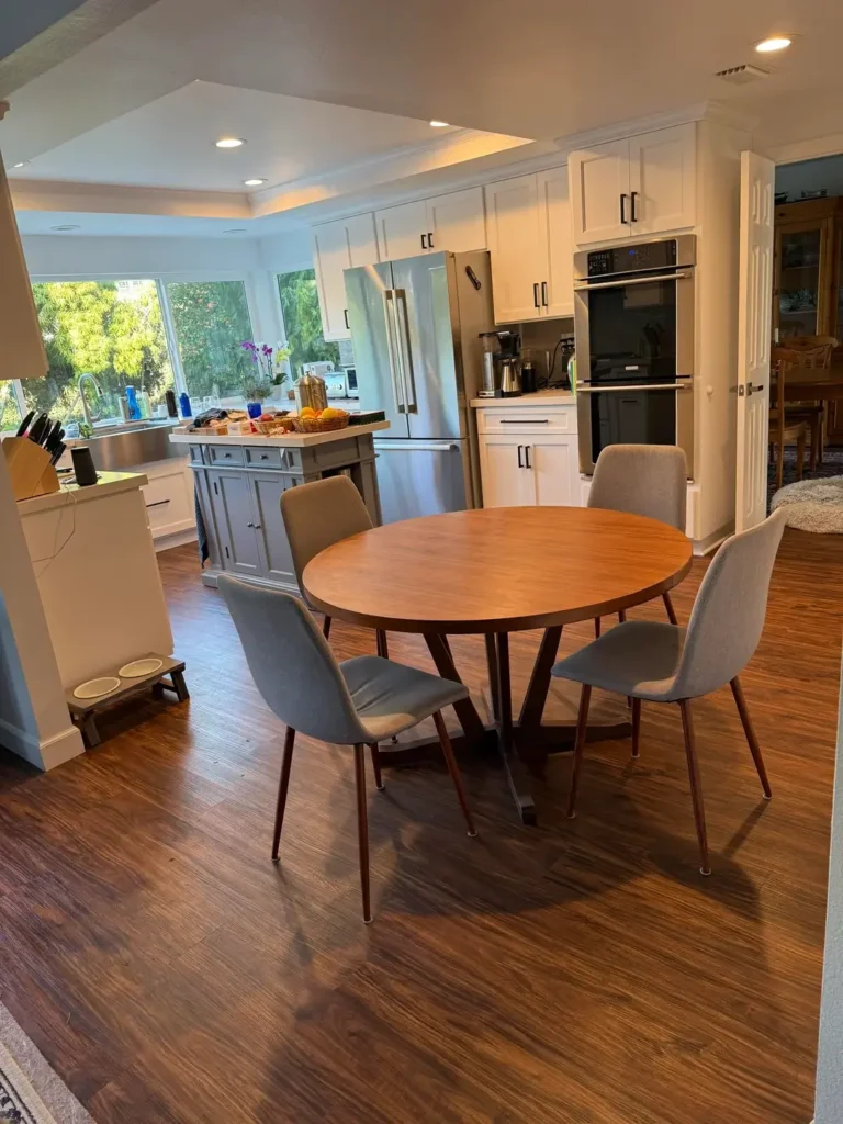
There’s a case to be made for the round dining table that I don’t think gets made often enough. In kitchens where the dining zone sits adjacent to the cooking area rather than in a separate room, a round table softens the geometry and makes the space feel less like a workplace. This kitchen and dining room does that well.
r/sharedroadspace23 placed a warm walnut-tone round dining table with four upholstered grey chairs in a mid-century silhouette directly adjacent to a white kitchen with a blue-grey painted island.
The table’s warm wood tone and the island’s cooler grey sit in a comfortable conversation with each other close in tone but distinct enough to separate the two zones.
The kitchen has considerable natural light from a wide window above the sink overlooking a garden, which floods the space with greenery without requiring any interior plants.
Wall ovens are stacked in a tall white cabinet tower, which frees up counter space and creates a clean vertical line on that side of the kitchen.
The recessed ceiling detail above the kitchen adds an architectural touch that separates the kitchen zone from the dining zone without a physical wall.
For anyone working with a white kitchen and trying to decide on an island color, this grey-blue is a genuinely useful reference point.
It’s cooler than navy, warmer than true grey, and it works with both warm wood tones and stainless steel appliances simultaneously.
Under-Cabinet Lighting, Glass-Front Upper Cabinets, and the Power of Atmosphere at Night
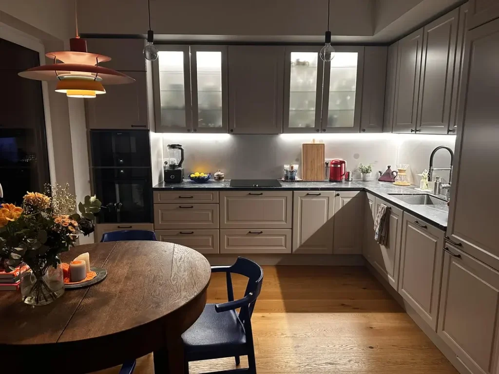
Everything looks different at night, and a kitchen that photographs beautifully in daylight can feel harsh and clinical after dark without the right lighting layers in place.
This space gets nighttime atmosphere exactly right, and it’s worth examining specifically for that reason.
r/EfficiencyContent206 has a kitchen with greige-painted raised-panel cabinetry, dark marble-look countertops, and glass-front upper cabinets with interior lighting.
The under-cabinet LED strip lighting casts a clean warm wash across the backsplash and work surfaces.
A bold PH 5-style multi-tiered pendant in an orange-red-copper colorway hangs over the dining zone and creates a completely different light quality than the kitchen zone behind it.
That pendant is doing an enormous amount of work. At night, the dining side of the room reads as warm, intimate, and residential, while the kitchen retains a functional clarity from the under-cabinet and cabinet-interior lighting.
The dark exposed-filament bulbs on simple black cord drops over the island add a third lighting note ambient but directional.
The dining table itself is a classic round dark-stained wood with navy wishbone chairs, centered under that pendant.
Fresh flowers in autumn colors add a final layer of warmth. If your kitchen and dining room needs one upgrade before any other, I’d argue it’s lighting specifically the layering of at least three distinct light sources set to different levels after dark.
A Dated Kitchen with Good Bones and a Practical Island That Earns Its Keep
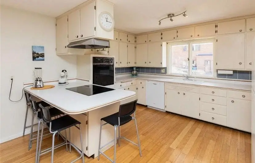
Not every space on this list is trying to win a design award, and that’s part of what makes this one worth including.
This kitchen has cream-colored raised-panel cabinets that are clearly from an earlier decade, a black cooktop built into a peninsula counter, black wall oven, and blue tile trim accents. It is, to put it plainly, overdue for an update.
r/Smooth_Confusion_453 shared this space as-is, and there’s something I find genuinely useful about seeing a kitchen that hasn’t been renovated: it makes you see the bones.
The layout here is excellent. The peninsula with its cooktop and overhanging counter creates a natural eat-in zone with three bar stools a dedicated kitchen dining area that doesn’t require a separate room.
The L-shaped cabinet run provides ample storage. The light hardwood floor is in good shape.
The path forward for a space like this is clear: the bones are worth keeping, and targeted cosmetic updates would transform it.
Painting the cabinets a warm white or soft sage, replacing the hardware, and updating the light fixture above the peninsula would modernize the space significantly without touching the footprint.
What this example really illustrates is that function matters more than finish in the short term. A kitchen that works well with a clear workflow, generous counter space, and an integrated dining spot is a better foundation than a beautiful kitchen with poor layout.
A Minimalist Dining Room with a Sputnik-Style Chandelier and Space to Grow
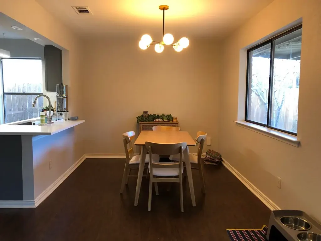
The last space in this collection is the one that most honestly represents where a lot of people actually are: a clean, tidy room that works fine but feels like it’s waiting for something.
The dining area here has dark hardwood floors, beige walls, a simple light wood table with four white-seat wooden chairs, a small sideboard against the back wall with a few plants, and a mid-century modern multi-globe chandelier in brass.
r/RhynosaurRex asked for feedback on this space, which tells you something it’s functional, it’s not offensive, but it lacks the warmth and definition that would make it feel finished. The chandelier is the strongest element in the room and it’s doing a lot of lifting on its own.
What this space needs isn’t more furniture it needs layering. A rug in a warm tone or pattern under the dining table would immediately ground the set.
Art on the two bare walls, sized large enough to read from across the room, would add personality. A table runner or centerpiece would give the table a focal point. These are all small moves.
The kitchen visible through the pass-through opening has charcoal-grey cabinets with a white counter, which provides a strong color contrast that the dining room could afford to respond to.
A piece of art or an accent element in a similar dark charcoal or navy would connect the two zones and make the pass-through feel intentional rather than arbitrary.
Quick Reference: Which Style Matches Your Space?
| Style Shown | Best For | Key Feature | Difficulty |
|---|---|---|---|
| Farmhouse open plan (Image 1) | Families, everyday living | Mason jar pendants, granite island | Medium |
| Dark accent wall (Image 2) | New builds needing character | Single bold paint choice | Easy |
| Traditional walnut (Image 3) | Older homes with good bones | Crown moulding, dark hardwood | Easy |
| Live-edge statement table (Image 4) | Neutral open plans | One bold furniture investment | Easy |
| Blue cabinetry with bell jars (Image 5) | Design-forward owners | Full cabinet color commitment | Medium |
| Layered textures, plates, rattan (Image 6) | Budget-conscious decorators | Textile and wall decor layering | Easy |
| Terracotta tile and round table (Image 7) | Sun-filled homes | Existing tile and light quality | Easy |
| Painted floral wall and screen divider (Image 8) | High-ceiling open plans | Mural and room divider | Hard |
| Grey island, round mid-century table (Image 9) | White kitchen owners | Island color + table shape | Medium |
| Layered lighting at night (Image 10) | Anyone upgrading atmosphere | Three distinct light sources | Medium |
| Functional dated kitchen (Image 11) | Renovation planning stage | Layout first, finishes second | Advanced |
| Minimalist dining with chandelier (Image 12) | Fresh movers, first homes | Layering through textiles and art | Easy |
The Takeaway from Twelve Real Kitchens
What strikes me most after looking at all twelve of these spaces together is that the ones that feel most resolved have one thing in common: a clear decision was made and followed through.
Whether that was a commitment to deep blue cabinetry, a dark accent wall, a live-edge dining table, or simply thoughtful lighting layering the spaces that feel finished are the ones where someone picked a direction.
The spaces still in progress and there are a few here mostly need less than their owners think. A rug, a larger piece of art, a second light source, or one plant placed with intention can shift the quality of a room more than most people expect until they try it.
The best kitchen and dining room ideas aren’t necessarily the most dramatic ones. They’re the ones that understand what the space already is and build on it honestly. Start there and you’re most of the way to a room you’ll actually want to spend time in.