Let’s get one thing straight. Your first apartment will never look like a Pinterest board, and honestly, it shouldn’t. Those staged photos with the $4,000 sofas and suspiciously perfect throw pillows? Nobody actually lives like that. Especially not on a first-apartment budget.
I spent way too much time scrolling through real setups posted by real first-time renters online. People who actually figured out how to make their spaces look great without selling a kidney. These 10 examples come from folks who worked with tight budgets, rental restrictions, and the kind of creativity that only happens when you genuinely can’t afford to hire a designer.
Some of these will surprise you. A couple might completely rewire how you think about first apartment decorating. Let’s get into it.
LED Accent Lighting and Bold Wall Decor Can Transform a Plain Rental Living Room
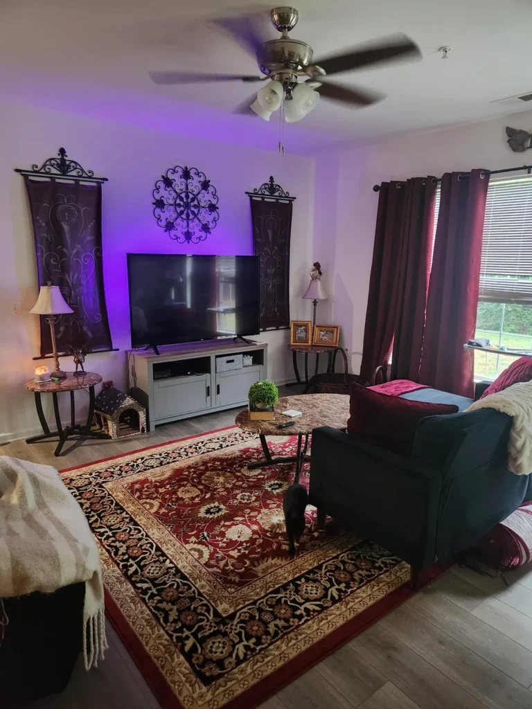
Most people slap a random poster above the TV and call it a day. This setup from r/MSMIT0 goes full dramatic, and honestly? It’s kind of stunning.
What Makes This Room Work
The star of the show is purple LED backlighting washing up the wall behind the TV. That soft violet glow ties together a whole bunch of bold choices that would look chaotic in any other room.
Here’s what’s happening:
- Deep burgundy curtains flanking the window
- A red-and-black Persian-style area rug grounding the space
- An ornate black metal medallion mounted above the screen
- Two dark tapestries with baroque scroll patterns on either side of the TV
- A teal wingback armchair thrown in for good measure (and somehow it totally works)
The reason this room succeeds is commitment. Every single piece belongs to the same moody, maximalist family. The warm table lamp, the small coffee table with a potted succulent, even the little pet house tucked in the corner. Nothing fights the overall vibe.
How to Pull This Off in Your Own Place
Start with your LED strip color and build your palette around it. Purple light reads warm against red and burgundy tones, and cool against blue or green. Once you lock in the dominant hue, source your curtains, rug, and throw pillows within that same color family.
The ornamental wall pieces don’t need to cost much. Thrift stores and estate sales are loaded with wrought-iron and metal decor that looks way more expensive than it is.
One thing I really appreciate here: the media console is a simple gray piece that stays completely understated. It lets the wall above do all the talking. Your furniture doesn’t always need to make a statement. Sometimes its job is to just stay out of the way.
Gallery Wall Meets Trailing Vines in a Studio That Refuses to Be Boring
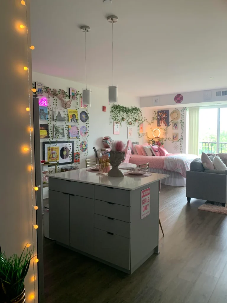
Studio apartments have this unfair reputation for feeling like one messy room with a kitchen shoved into the corner. This setup from r/Ashlala13 absolutely destroys that stereotype.
The Secret Ingredient: Faux Ivy Everywhere
The real magic here is trailing faux ivy vines acting as the connective tissue across every wall. Strands of greenery weave between framed prints, vinyl records, and photographs, creating an organic gallery wall that looks like it grew there naturally.
A few more highlights worth noting:
- A pink neon sign adding a punchy focal point
- Warm Edison-style string lights wrapping a column near the entrance
- The same ivy treatment continuing in the sleeping area above a pink bed
- A circular LED ring light and more framed art tying everything together
Without those vines, this would just be a lot of stuff on a lot of walls. With them, it becomes a curated little world. The trailing green connects everything the way a consistent paint color would, but with texture and dimension that paint can’t touch.
Why You Should Own Faux Ivy Right Now
IMO, faux ivy is one of the most underrated tools in a first apartment decorator’s kit. It’s cheap, it’s damage-free when you hang it with removable adhesive clips, and you can shape it however you want.
Loop it across a shelf. Drape it over a mirror. Cascade it from a curtain rod. The key is going generous with it. A few sad little strands look like you gave up halfway through. Abundant, layered greenery reads as intentional.
The pink and gray color pairing in the bedding and kitchen island also deserves a shoutout. The ruched pink duvet, gray sofa, and gray kitchen island all speak the same soft, modern language without being matchy-matchy.
A Plant-Lover’s Living Room Where the Greenery IS the Decor
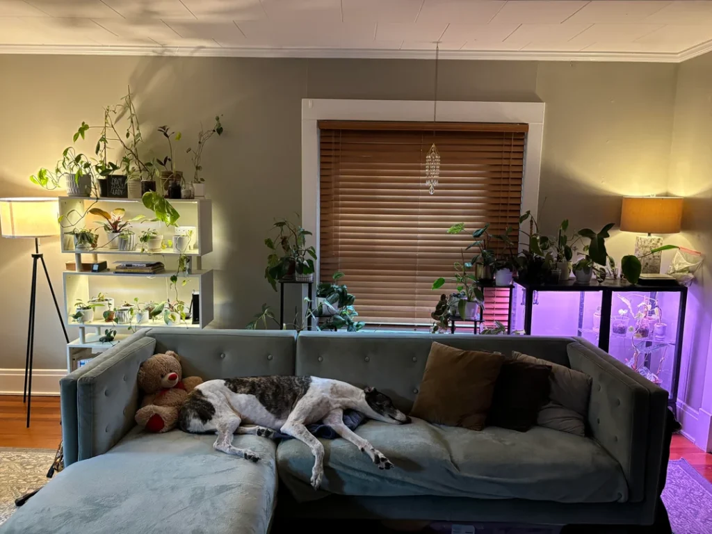
Here’s a thought that might change your whole approach: what if your plants weren’t accessories to your decor but the actual main event?
r/davidbowiepompadour built a living room around an extensive plant collection, and it’s easily one of the coziest spaces in this entire roundup.
What This Setup Looks Like
White open shelving units on either side of the window are densely packed with pothos, philodendrons, snake plants, and a dozen other varieties in mismatched pots. A purple grow light glows from the right-hand shelf, proving these aren’t just decorative props. They’re actually thriving.
A teal-gray sectional sofa anchors the seating area. And a greyhound napping contentedly on one end makes the whole scene feel perfectly lived-in. (Honestly, the dog might be the best design element here.)
The warm amber glow from two floor lamps balances the cool daylight coming through the window. That interplay of warm and cool light gives the room real depth without relying on a single overhead fixture.
How to Get This Look Without Owning a Jungle
You don’t need fifteen plants on day one. Start with three or four easy-care species:
- Pothos (basically unkillable)
- Snake plant (thrives on neglect)
- Heartleaf philodendron (forgiving and grows fast)
Place them at different heights. Let them trail over shelves. Add a grow light if your apartment doesn’t get much natural sunlight. Don’t feel weird about the grow light looking like equipment. In this room, it’s literally part of the charm.
A shelf full of trailing green plants costs less than most art prints and looks way more interesting. The varying leaf shapes, sizes, and shades of green build visual complexity that no single piece of wall art can match.
Two Abstract Art Prints and a Well-Placed Tree Can Anchor an Entire Room
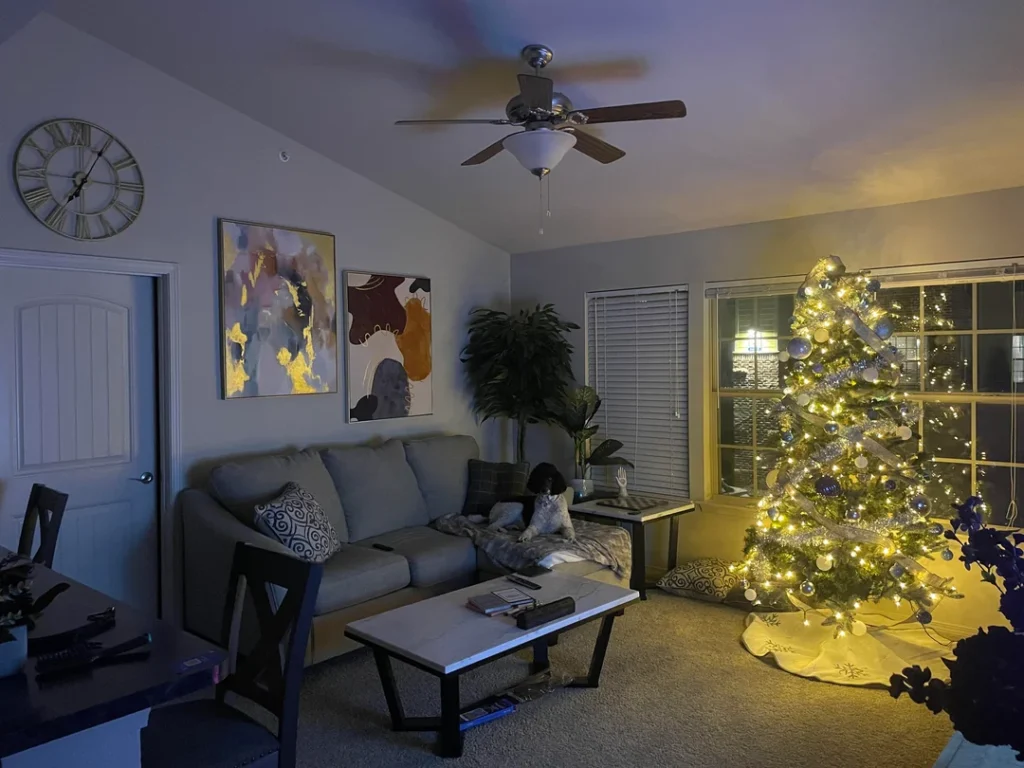
Sometimes the right wall treatment makes everything else just fall into place. This living room from r/YSL666LuhV proves that with zero ambiguity.
The Wall That Does All the Work
Two abstract prints hang side by side on the main wall. One features gold, blue, and gray brushstrokes. The other shows burgundy, orange, and taupe organic shapes. They’re not perfectly matched, and that’s exactly why they work. They complement each other without being identical, like two sentences in the same paragraph.
A large Roman numeral wall clock in antique gold sits to the left, adding visual interest without competing for attention.
The rest of the room plays it smart:
- A tall potted fiddle-leaf fig fills the corner, providing height and organic contrast
- A gray sofa and white marble-topped coffee table stay within a tight neutral palette
- A dark dining set keeps things grounded
- A Christmas tree with warm white lights and silver-blue ornaments acts as a seasonal anchor
The tree fits so naturally because the rest of the room isn’t competing with it. Everything stays calm enough to let seasonal decor actually shine.
Quick Tips for Hanging Abstract Art
Abstract art is a reliable choice for first apartments because it introduces color and mood without locking you into a specific theme. Here’s the basic formula:
- Hang two prints at the same height
- Pick frames that share at least one material or finish
- Leave about two to three inches of spacing between them
- Add a wall clock nearby for an extra visual anchor
That wall clock is a detail many first-time decorators skip, but it fills the kind of empty space that bare walls desperately need.
The Intentionally Minimal Setup That’s Smarter Than It Looks
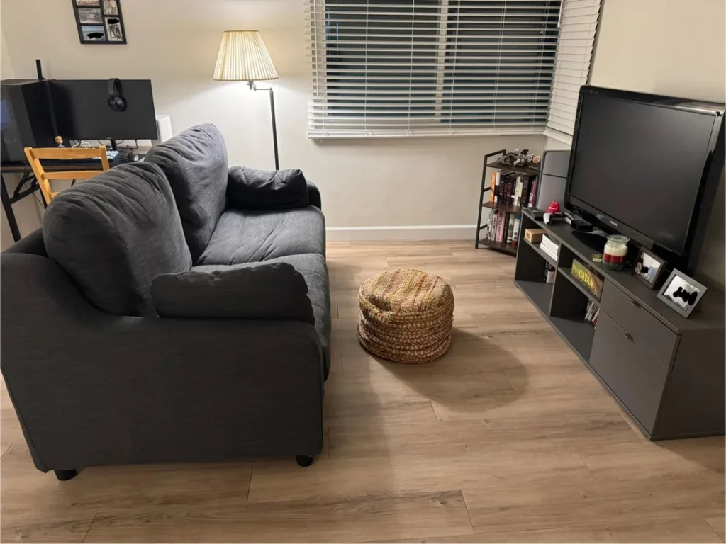
I’ll be real with you. When I first saw this room from r/-OnTheRocks-, I thought it was unfinished. Then I looked longer and realized it was completely deliberate. And honestly, kind of brilliant.
Less Really Can Be More
Here’s the full inventory of this living space:
- A dark charcoal sofa (substantial enough to fill the space without overpowering it)
- A woven jute pouf as a flexible secondary seat and footrest
- Light oak-tone LVP flooring
- A dark media console with a bookshelf unit stacked beside a flat-screen TV
- A single tall arc floor lamp with a pleated shade
- Two framed photos above a desk in the corner
That’s it. And it works.
Why This Room Is Actually Smart
The pouf is a genius choice over a traditional coffee table. Push it aside when you need floor space. Pull it forward when you want to put your feet up. It adds flexibility that a heavy coffee table never could.
The light oak flooring deserves way more credit than it usually gets. It makes small spaces feel larger, reflects light efficiently, and pairs with virtually every furniture tone. That matters a lot when you’re buying pieces incrementally like most first-time renters do.
If you’re moving into your first place with basically no budget for decor, this is your template. Buy what you need. Choose neutral tones. Leave negative space. Add one warm light source. Rooms don’t need to be full to feel like home.
A Statement Sectional and a Colorful Rug Can Do the Heavy Lifting
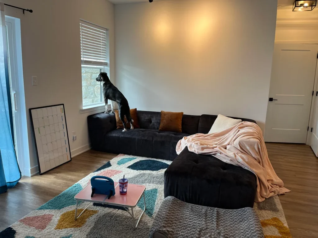
This living room from r/ItsAnonCat is almost entirely empty. And it still feels comfortable, functional, and put-together. That tells you something really important about furniture selection in first apartment decorating.
The Power of Two Good Pieces
A large, low-profile black velvet sectional commands the space with real confidence. Three throw cushions in rust brown, cream, and light blush break up the dark surface just enough. A draped peach blanket across one end adds casual softness that makes the room feel lived-in rather than staged.
The geometric shag rug in teal, pink, mustard, and white supplies almost all of the color in the entire room. A small pink foldable laptop table sits on the rug, practical without pretending to be anything fancier.
The walls? Completely bare. And that’s totally fine.
The Real Lesson Here
A bold, quality sofa and a distinctive rug can carry a room while you figure out the rest. Choosing quality over quantity on your anchor piece is almost always the right call. Everything else can come later.
Not every wall needs something on it. This room is in the process of becoming, which is honestly the most realistic representation of what first apartments actually look like in the early months.
Even in a nearly empty room, the small details create quiet coherence. The black door hardware, the cage-style ceiling light, the sheer blue curtain panel in the corner. It all adds up.
Vintage Frames and a Dusty Rose Sofa Prove That Secondhand Style Is a Skill
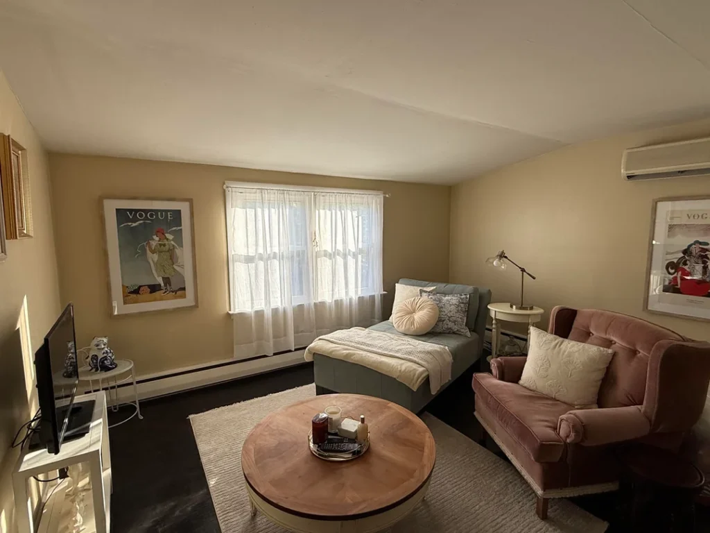
There’s a particular kind of effortless charm that’s really hard to fake and surprisingly easy to find in thrift stores if you know what you’re looking for. This studio from r/HawaiianSurf absolutely nails it.
The Mix That Shouldn’t Work But Totally Does
A vintage teal chaise longue, a dusty rose velvet love seat, and a round wooden coffee table. None of these pieces come from the same decade. All of them look like they belong together.
Two large Vogue art prints in natural wood frames hang on opposite walls, framing the space without overwhelming the modest room size. A brass adjustable task lamp provides reading light. Cream linen curtains diffuse natural light without blocking it.
The dark hardwood floors anchor everything, adding contrast to the warm beige walls and light upholstery. And here’s something that’s harder than it looks: there’s actual breathing room between the pieces. The room doesn’t feel stuffed.
How to Shop Secondhand Like a Pro
The power move here is a restrained color palette: beige walls, cream textiles, dusty rose and teal as accent colors, and natural wood tones. That’s the entire palette.
When you don’t introduce competing colors, even totally mismatched vintage pieces feel cohesive.
For first apartment decorating on a budget, the secondhand approach works best when you:
- Commit to a palette first, then shop within it
- Don’t buy a piece just because it’s cheap
- Buy it because it fits your existing color story
- Look for framed vintage magazine covers (they’re everywhere online and at estate sales)
- Focus on frame finish consistency over matching content
Those Vogue prints aren’t expensive, but they add a graphic, editorial quality that immediately elevates the whole room.
A Disco Ball, Cane Chairs, and Fresh Flowers Turn a Breakfast Nook into a Personality Statement
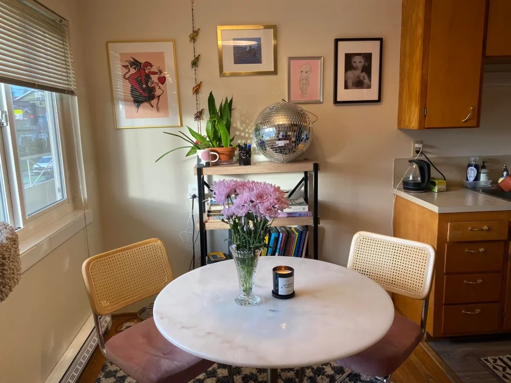
Dining areas in first apartments usually get zero love. A table, some chairs, done. This corner from r/wildflowerchild_mc proves those square feet deserve way more attention.
The Setup That Makes Guests Smile
A round marble-top table paired with two cane-back chairs in natural wood and chrome. Behind them, a small industrial-style shelving unit holds:
- A snake plant in a terra cotta pot
- A ceramic mug holding pens
- A stack of colorful books
- And the piece that makes this corner unforgettable: a large mirror disco ball 🪩
A cluster of pink chrysanthemums in a glass vase sits on the table next to a lit black candle. Above it all, four framed prints hang in an asymmetric gallery arrangement with a tattooed cherub, an abstract blue photo, a whimsical pink cat illustration, and a black-and-white figurative print.
Why the Disco Ball Actually Works
The disco ball isn’t ironic. It catches natural light from the nearby window and scatters it across the ceiling and walls, creating the kind of casual magic that no pendant light can replicate. It also tells you something about who lives here: someone with taste AND a sense of humor.
The marble table does a lot of work in a small footprint. Its circular shape keeps the nook from feeling cramped, and the stone surface adds material richness that elevates everything around it.
FYI, fresh flowers are the single fastest way to make any surface look intentional. Budget two bucks a week for whatever’s seasonal at the grocery store, and your table will always look like you put in effort.
A Boho Gallery Wall and Bookshelf Styling That Feels Effortlessly Collected
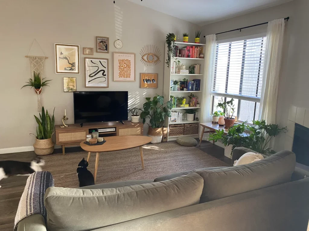
This living room from r/sardonic_gavel is the kind of space people spend years trying to achieve and then one day accidentally stumble into. The secret ingredients? Patience and plants.
The Gallery Wall With a Brain
A warm-toned collection of prints hangs above the TV in natural and gold frames:
- A Matisse-style abstract
- An ink brush painting
- A vintage travel poster
- A fabric macramé piece hanging to the left
- A decorative brass sun-eye motif punctuating the arrangement
The TV console features a rattan front with warm wood legs, tying into the organic, earthy tone of the entire room. A kidney-shaped oak coffee table sits on a jute rug. And the bookshelf beside the window is layered with books, trailing plants, woven baskets, and small objects that have clearly accumulated over time.
What Separates Boho From Chaotic
The plant count here is significant. Snake plant in a woven basket, pothos trailing from the bookshelf, a large-leafed tropical plant beside the sofa. They don’t feel like a collection. They feel like a natural extension of the room’s personality. Green is the accent color, and it’s doing serious work.
What keeps this from looking messy is the gallery wall’s internal logic:
- The frames share a warm metal-and-natural-wood finish family
- The prints vary in scale and content but stay within an earthy, artful tone
- There’s a clear center of gravity (the largest, most prominent print)
- Smaller pieces radiate outward from it
Building this kind of wall takes time. Start with one or two anchor prints. Decide on your frame finish. Add pieces slowly rather than trying to arrange twenty things at once. The best gallery walls grow organically.
Open Shelving, Warm Tones, and a Multi-Zone Layout That Makes a Small Space Work Overtime
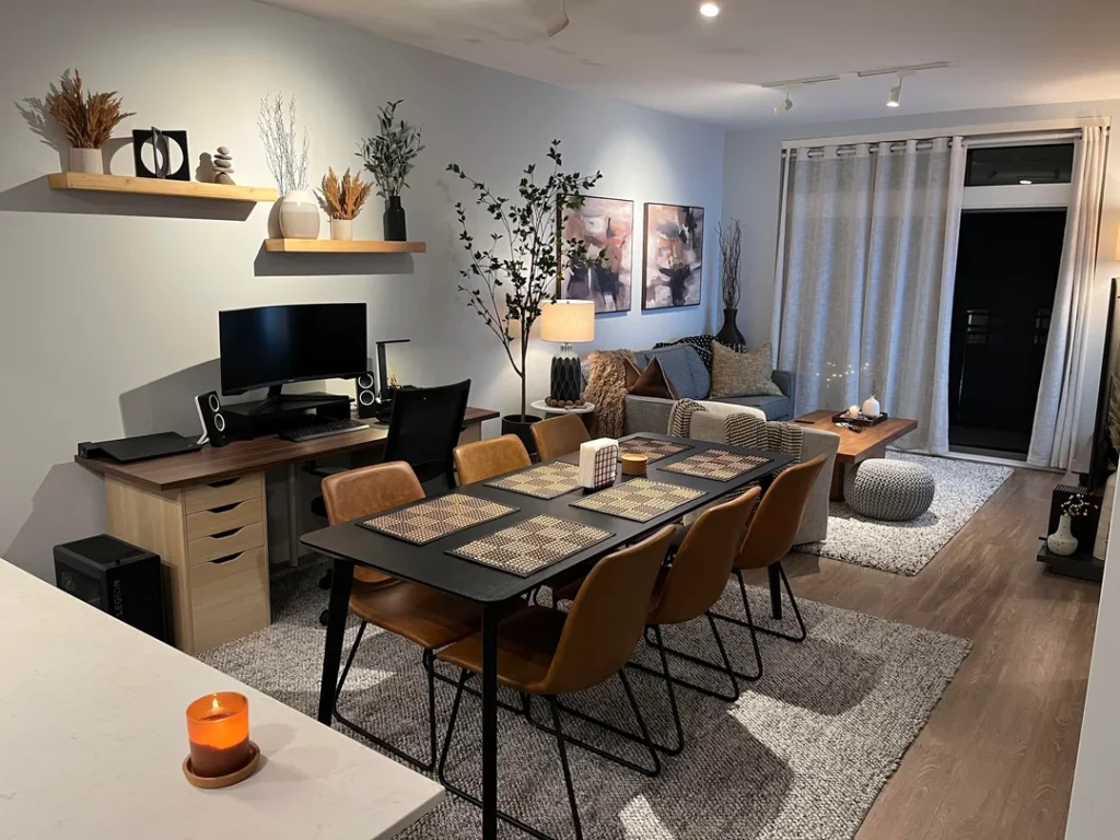
The most impressive thing about this apartment from r/wdDrake isn’t any single piece. It’s how much is happening without any of it feeling crowded.
Three Zones, Zero Clutter
This compact open-plan space splits into three distinct zones using only furniture placement and lighting:
Dining area: A black rectangular table with six cognac-leather chairs (warm, practical, and easy to wipe down)
Workspace: A walnut-tone desk with a monitor setup and drawer units. Two floating shelves above display dried grasses, sculptural objects, small vases, and a black geometric frame
Living zone: A gray sofa layered with caramel, blue, and knit throw cushions, a faux indoor tree for height, a ceramic table lamp, and two abstract art prints in muted terracotta and burgundy tones
A round knit pouf and a long wooden bench coffee table complete the seating area. Warm recessed lighting and track lighting keep the whole space glowing amber, which makes those cognac leather chairs look even richer.
The Dried Botanicals Trend That Actually Makes Sense
Those dried botanicals on the floating shelves deserve a special mention. Pampas grass, dried wheat, and cotton stems are having a long moment in interior decor, and for good reason:
- They’re zero maintenance
- They literally cannot die
- They add organic warmth that manufactured objects can’t replicate
- A small cluster in a ceramic vase costs almost nothing
If you’re decorating a first apartment on a budget, dried botanicals give you a lot of visual impact for very little investment.
The Essentials: First Apartment Decorating Decisions That Actually Matter
After looking at ten genuinely different spaces, a few clear patterns emerge. Here’s a quick reference for the decisions that make the biggest difference:
Anchor rug: Size it to fit under the front sofa legs. Don’t get one that floats awkwardly in the middle of the room.
Art placement: Hang two to three pieces in a thoughtful cluster. A single small print on a big wall looks lonely and sad.
Lighting: Use multiple warm light sources at different heights. A single overhead light flattens everything.
Plants: Group them for impact at varying heights. One lonely plant in the corner isn’t doing you any favors.
Color palette: Stick to three or four tones max. If every piece belongs to a different color family, your room will feel chaotic.
Secondhand pieces: Unify them by finish or palette. A random mix with no connecting thread just looks like a garage sale.
Four Principles Worth Remembering
- Layered lighting changes everything. Every cozy room in this article has at least two light sources. A floor lamp and a table lamp. Or a lamp and an LED strip. Overhead lighting alone will make your space feel like a waiting room.
- Empty space is not wasted space. The most livable rooms in this collection have breathing room between pieces. Fight the urge to fill every surface.
- One unexpected element earns the whole room. The disco ball. The neon sign. The trailing ivy. In each case, one surprising choice made the entire space memorable.
- Your first apartment doesn’t need to be finished. Decorating is a process. Every space shown here was someone’s work in progress.
What All of These Spaces Have in Common
Here’s the most useful thing I noticed across all ten setups: none of them look like they were decorated to impress anyone. They look like they were decorated to feel like home. That’s a completely different goal, and a way more achievable one.
First apartment decorating doesn’t require a massive budget or a design degree. It requires some patience, a willingness to commit to a few clear choices, and the confidence to let your actual taste show up in the room.
Whether that means a purple LED glow with gothic tapestries or a spare room with a pouf and a single floor lamp, both approaches work when you execute them with intention.
The spaces that felt most complete weren’t the ones with the most stuff. They were the ones where every visible piece seemed like it belonged. That’s the standard worth chasing. Not perfection. Not a specific aesthetic. Just coherence.
Your first apartment is yours. Decorate it like you actually mean it. And hey, if a disco ball ends up being your signature move, I fully support that decision.