Let’s be real for a second. Most small living room advice online is basically “paint it white, add a mirror, buy a plant, done!” And while that’s not wrong, it’s also about as helpful as telling someone with a broken leg to “just walk it off.”
If you’re working with a tight living room and you’re tired of generic tips, you’ve landed in the right place. I dug into 15 real setups from real people who figured out how to make their small spaces feel intentional, warm, and actually livable. No showroom staging. No pretending a 300-square-foot room is secretly a loft.
Some of these ideas are clever. A few are surprisingly bold. And every single one has at least one thing worth stealing for your own space.
Bold Gallery Walls and Eclectic Color Blocking
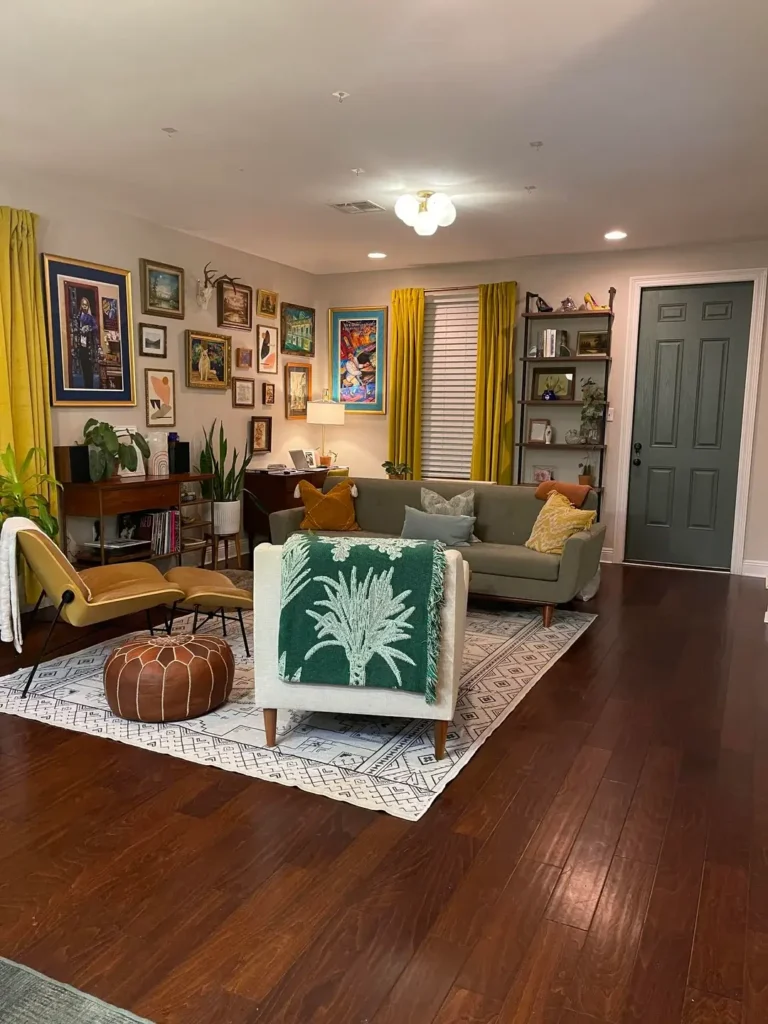
Here’s the thing about small rooms: restraint is overrated.
The entire left wall is covered in a packed gallery arrangement featuring gold-framed paintings, abstract prints, a landscape piece, and yes, antler mounts. Nothing matches in size or style, and that’s exactly the point. Mustard yellow curtains run the full length of the wall, pulling the whole chaotic collection together into something surprisingly cohesive.
The furniture follows the same fearless energy:
- A sage green sectional sitting on a black-and-white geometric rug
- A cream armchair draped in a deep green botanical throw
- A leather Moroccan-style pouf that adds texture without eating floor space
- A dark walnut console and a leaning bookshelf for vertical storage
The secret to why it works? Color discipline. Everything stays within greens, yellows, and warm browns. Individual pieces are loud, but together they’re speaking the same language.
If you want to try a gallery wall in a small room, start with your color story first. Build the collection around that, not the other way around.
Maximizing Vertical Storage in a Studio-Style Room
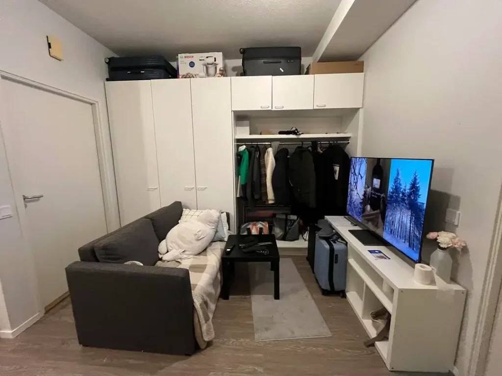
A room this small could easily feel like a storage unit. The fact that it doesn’t comes down to one smart decision: go vertical with everything.
The entire back wall with floor-to-ceiling white IKEA-style cabinetry. Upper cabinets store luggage and bulky appliance boxes. A built-in closet section keeps clothing organized. Lower open shelving holds the TV and a few small accessories. Not a single inch of that wall gets wasted.
The rest of the room keeps it simple:
- A gray sectional sofa and a small black coffee table for function
- A beige area rug to soften the floor and define the seating zone
- White and gray palette throughout to keep things feeling open
The blunt takeaway here: If your living room is doing double duty as a bedroom, office, or storage space, the walls are your best allies. Closed cabinets hide the mess. Open shelving shows off only what’s worth seeing.
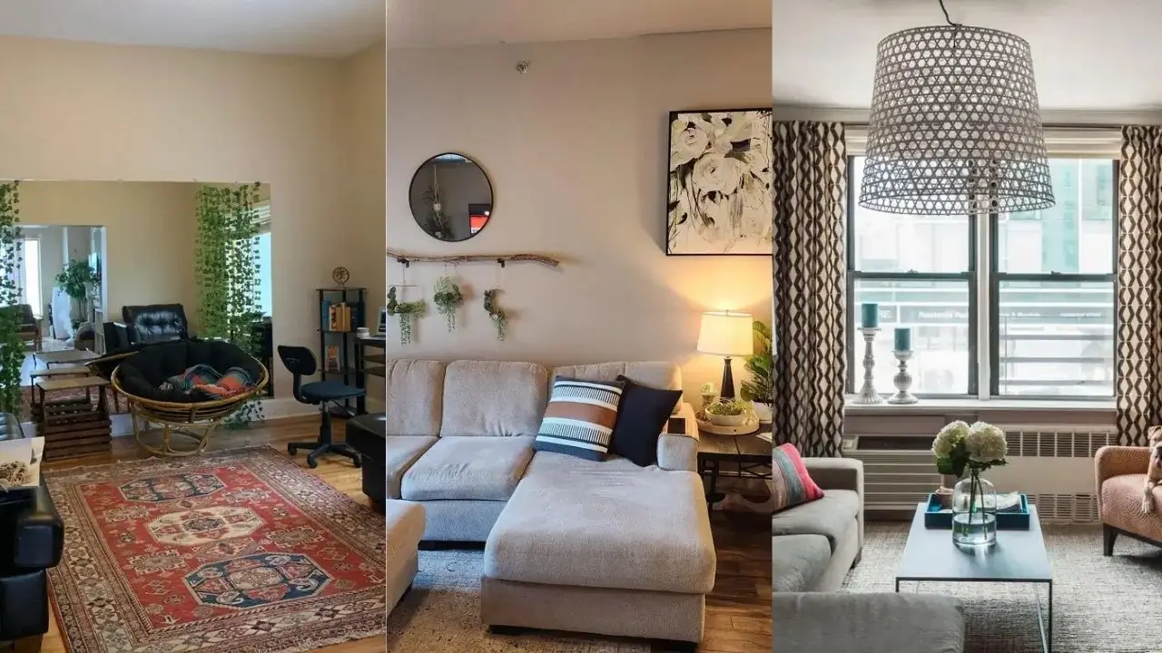
Using a Large Mirror to Fake Depth and Add Light
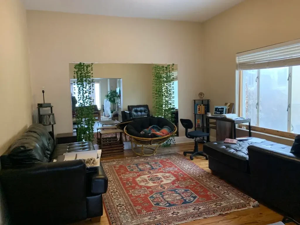
FYI, this might be the single most underrated trick in small-space design.
A large mirror mounted on the far wall immediately doubles the perceived depth of the room. It bounces natural light from the opposite windows and reflects the seating area, which stops the space from feeling boxed in. Trailing pothos vines frame both sides of the mirror, softening the edges and making it feel intentional rather than just “stuck up there.”
The rest of the room layers in beautifully:
- Two black leather sectionals sitting parallel to each other
- A rattan papasan chair tucked between them
- A rich red Persian-style rug anchoring the whole grouping
- A small desk near the window carving out a workspace without disrupting the flow
If your small living room feels like the walls are slowly closing in, a large mirror is worth every penny. Aim for one that’s at least half the width of the wall. Position it where it catches the most light, and consider adding some trailing greenery around it for that integrated, lived-in look.
Also Read: Small Farmhouse Living Room Ideas: 15 Beautiful Ways to Use Small Space
The L-Shaped Sectional as the Room’s Anchor
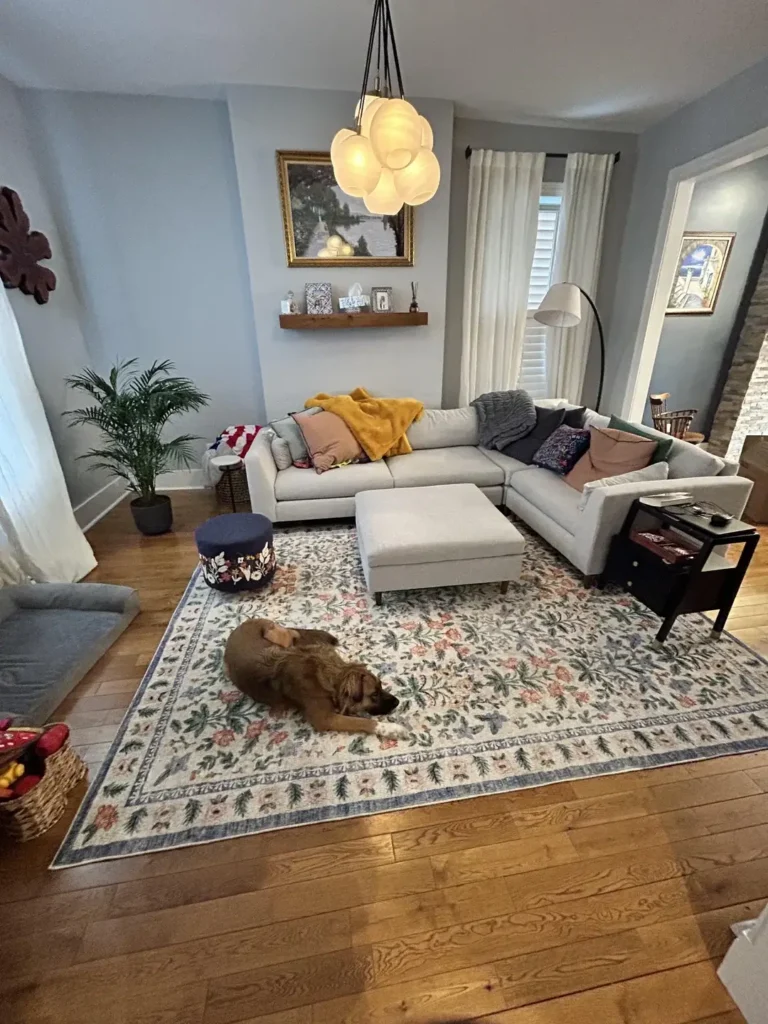
Picking the right sofa for a small room is genuinely half the battle. Too big and it swallows the space. Too small and the room feels weirdly empty. This cream-colored L-shaped sectional hits the sweet spot.
The sectional sits against two walls, which is the standard move. But the details are what make it pop:
- Throw pillows in peach, mustard yellow, gray, and green for visual warmth
- A matching ottoman doubling as extra seating or a footrest
- An oversized floral rug in soft greens and blush tying everything together
The pendant light above is a standout feature. A multi-globe white fixture draws the eye upward, which subtly makes the ceiling feel higher. A single gold-framed landscape painting sits above a floating wooden shelf. A tall palm plant in the corner adds height and life without demanding much floor space.
When you go with a sectional in a tight room, keep everything else streamlined. The sofa is already the largest piece. Let it lead. Let the rest of the room stay low-profile and neutral.
Layered Wall Decor with Macramé and Mixed Media
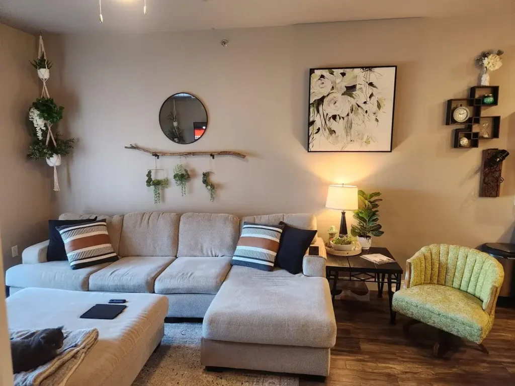
Wall decor doesn’t have to be just frames. Mixing textures and materials on a single wall creates a depth that flat prints simply can’t match.
The wall arrangement includes:
- Macramé plant hangers with trailing ferns on the left
- A round black-framed mirror at eye level in the center
- A driftwood branch mounted horizontally with hanging succulents
- A large floral canvas in white and green as the focal point
- Small stacked box shelves holding a clock and decorative objects
Below all of this sits a cream sectional with navy and brown striped throw pillows, a sage green channel-back armchair for secondary seating, and a small table lamp casting a warm glow across the corner.
The key to pulling this off is spacing. Each element needs breathing room. Leave at least six to eight inches between major pieces. If you cram everything together, it reads as cluttered. Let the natural textures do the heavy lifting on visual interest.
Making a Narrow Room Feel Cozy and Complete
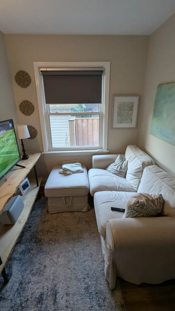
Not every small living room is a tidy square. Some are narrow rectangles, and those come with their own unique challenges. This setup leans into the coziness rather than fighting it, and it works really well.
A white slipcovered sectional runs along one wall, with the ottoman tucked into the corner where the sofa turns. White slipcovers reflect light and keep a narrow space from feeling dark or heavy. Leopard-print pillows and a knit blanket add texture without visual bulk. A gray-blue plush area rug covers most of the floor and softens everything.
The opposite wall features:
- A live-edge wood console table running nearly the full length of the room
- A flat-screen TV on one end
- Framed artwork including a vintage map and an abstract green piece
- Decorative clay medallions adding a handmade touch
Narrow rooms benefit from furniture that runs parallel to the length. Placing the sofa and console along the longer walls creates a natural flow and solves the “what do I even do with this weird shape” problem. Keep colors light, textures soft, and the narrow dimensions start feeling like a feature.
Also Read: 15 Small Living Room Decor Ideas That Actually Work in Tight Spaces
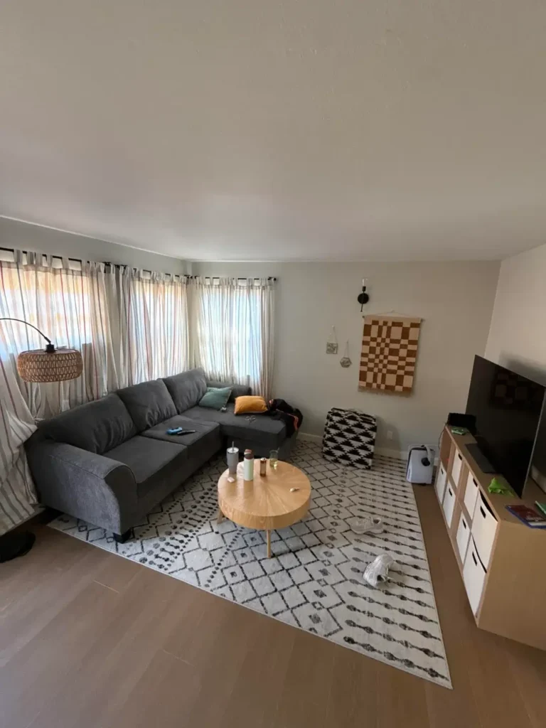
Pattern-Forward Design with a Statement Pendant Light
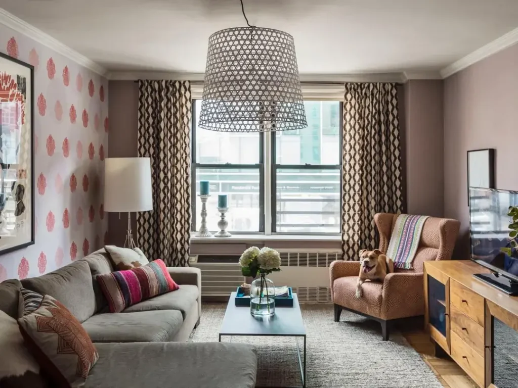
A small room does not need to play it safe. Sometimes the boldest choice makes the space feel the most alive.
One accent wall is covered in red botanical wallpaper with a repeating motif. The remaining walls stay in a muted mauve-gray. Geometric brown-and-cream drapes frame the window. Two distinct patterns sharing the same warm color family, and somehow it all works together.
The furniture plays along with the vibe:
- A gray sectional with colorful throw pillows including a magenta and gold striped accent piece
- A terracotta wingback chair adding warmth and a secondary seat
- A simple wooden media console providing grounded contrast
- Fresh hydrangeas on the coffee table for a final organic touch
A large woven drum pendant light hangs from the ceiling, drawing the eye up and acting as a visual anchor for the room. IMO, that pendant is the quiet hero of this whole space.
Mixing patterns in a small room works when you follow the 60-30-10 rule. 60% dominant color or material, 30% complementary secondary, 10% accent punch. Here, neutral gray dominates, warm browns fill the secondary, and the red wallpaper delivers the impact.
Exposed Brick, Art Posters, and a Casual Bohemian Vibe
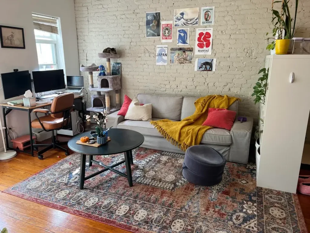
Some rooms feel curated. Others feel lived-in. This one lands firmly in the second category, and that’s exactly what makes it magnetic.
The exposed white brick wall does the heavy lifting as a backdrop. Layered directly onto it is a collection of unframed art posters arranged in an asymmetric cluster. We’re talking a Picasso print, a Hokusai wave reference, a “Make Art Not War” poster, and several others. None of them match. The casually pinned presentation gives the whole arrangement a gallery-in-progress energy that feels genuinely cool.
The rest of the room keeps it comfortable:
- A light gray sofa with a mustard yellow knit throw and coral pillows
- A dark round coffee table grounding the seating area
- A Persian-style rug in muted reds and blues over hardwood
- A simple desk with dual monitors blending naturally into the room
The real lesson here is that not everything needs to be expensive or polished. Art posters cost a fraction of framed prints and can be swapped out anytime you want a change. In a small space, keeping things flexible and low-commitment often feels better than locking into permanent decisions.
Open-Concept Living and Dining with Warm Lighting
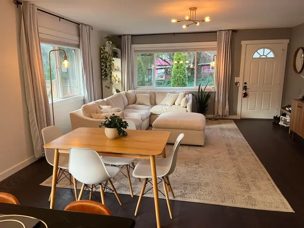
Combining a living area and a dining area in one space is one of the most common small-space headaches. The trick is defining each zone without blocking the flow between them.
A cream cloud-style sectional anchors the living area under large windows flooding the room with natural light. In the foreground, a round natural wood dining table sits with four white modern chairs, the kind of streamlined seating that doesn’t visually crowd a shared space.
The gold sputnik-style pendant chandelier ties both areas together. It hangs between the dining and living zones, casting warm light across both without belonging exclusively to either. Genius, honestly.
Other details worth noting:
- Taupe curtains framing the windows beautifully
- A gray-toned area rug defining the living zone on dark hardwood
- Trailing plants on the windowsill and a snake plant near the sofa adding fresh greenery
When you share living and dining in one room, lighting is your best zone-definer. A pendant over the dining table, a floor lamp in the living corner, these cues tell the eye where one space ends and another begins without needing any walls or partitions.
Also Read: 18 Living Room Decor Ideas That Actually Work in Real Homes
Dark Furniture and Geometric Patterns in a Compact Space
Here’s a misconception worth busting: dark furniture does NOT automatically make a small room feel smaller. Used correctly, it adds depth and real sophistication.
A charcoal gray sectional fills the seating area without overwhelming it. A gray-and-white geometric lattice rug adds visual energy to the floor and keeps the dark sofa from feeling heavy. A small industrial-style coffee table in natural wood and black metal sits at the center, its open design letting light pass through rather than blocking the space.
The walls stay notably restrained:
- Light gray paint keeping things bright
- Floating shelves on the left holding candles, small frames, and a round convex mirror
- A tufted cream accent chair offering a lighter counterpoint to the darker sofa
- Dark espresso built-in cabinetry on the right providing storage with moody contrast
Contrast is everything when working with dark furniture in a small room. Pair dark sofas with light walls, light rugs, and at least one piece of lighter seating. The interplay between shadow and brightness keeps the room feeling dynamic rather than dim.
The Cozy Bohemian Apartment with Personality to Spare
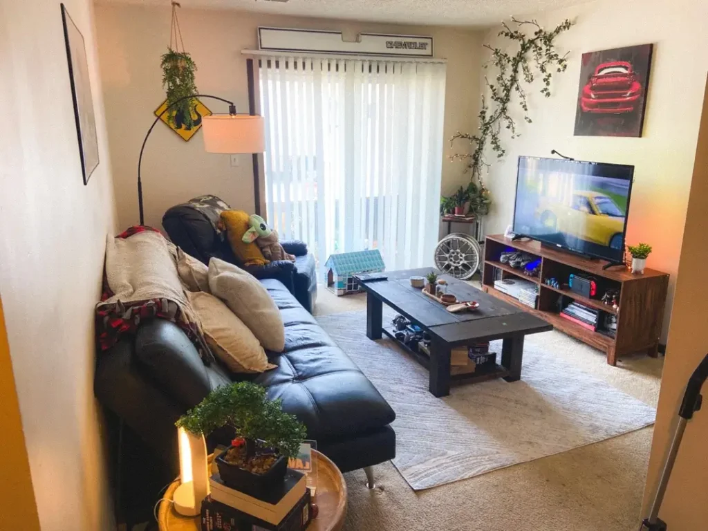
A black leather sectional sits against the left wall, piled with mismatched throw pillows in cream, mustard, and plaid. An arc floor lamp with a unique sign-shaped shade adds character overhead. Trailing vines climb the right wall organically. A red automotive painting hangs above the TV console.
The details throughout add layers of personality:
- A walnut media console holding a TV, books, small plants, gaming consoles, and collectibles
- A dark wood coffee table with a lower shelf holding a bonsai tree, candles, and decorative objects
- A simple cream carpet keeping the floor calm while everything above it competes for attention
The reason this works despite the density is intentional warmth. Every piece feels chosen with care, not just dropped in. When a small room has genuine personality, visitors stop measuring square footage and start noticing character instead.
Minimalist Scandinavian Style with a Textured Wall Hanging
Sometimes the quietest room makes the strongest statement. This space strips everything back to essentials and lets texture do all the talking.
The palette stays strictly within soft grays, warm whites, and natural wood tones. A dark charcoal sectional with a chaise sits against the left wall with just a few throw pillows in teal and mustard. A round natural wood coffee table anchors the center. On the right wall, a single brown-and-cream woven checkerboard textile hangs as the sole focal point.
Other thoughtful details include:
- Sheer striped curtains filtering light without blocking it
- A wicker pendant lamp adding handmade texture in the corner
- A small black-and-white patterned storage pouf near the sofa for extra seating
Scandinavian-inspired small rooms succeed because they resist the urge to fill space. Every item has a purpose. The textures (woven cotton, natural wood, wicker) provide enough visual interest that the room never feels empty. If your instinct is to add more, resist it. One quality textile piece on the wall outperforms ten mediocre frames every single time.
A Multi-Use Room with Books, Plants, and a City View
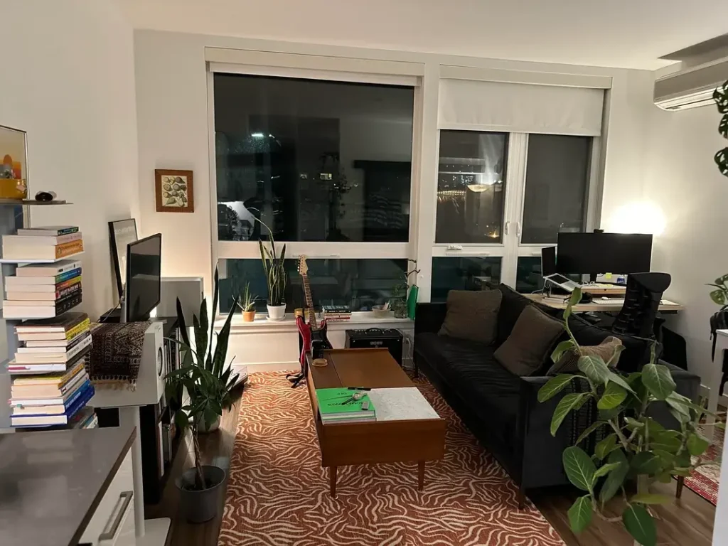
Small apartments in cities often force one room to do absolutely everything. This setup handles it with grace by letting each function occupy its own visual lane, all without a single partition wall.
Three distinct zones share the space:
- Left side: A workspace with a desk, dual monitors, and a bookshelf stacked with paperbacks
- Center: The living area with a dark leather sofa, a mid-century walnut coffee table, and an orange-and-cream zebra-print rug
- Right side: Another desk setup positioned near large windows
Plants are scattered throughout, a tall snake plant, a fiddle leaf fig, and several smaller pots on the windowsill, creating a green thread that visually connects all three zones. A guitar leaning against the window ledge adds personal story. The city lights visible through the glass at night add an ambient backdrop that no interior design budget can replicate.
The trick to making a multi-use room work is visual continuity. Use the same rug, the same color palette, and recurring elements like plants to unify zones that serve different purposes. Functionally distinct doesn’t have to mean visually chaotic.
Warm, Cozy Shelving with Ambient Lighting
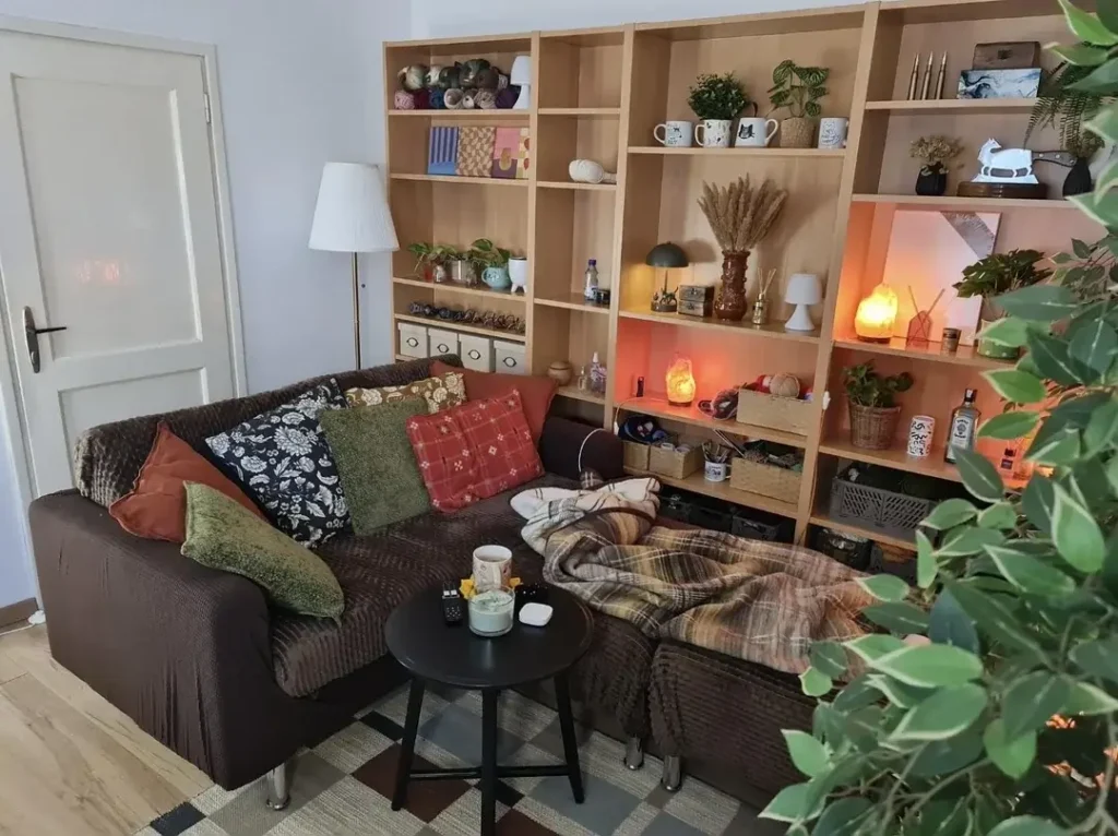
There’s a specific kind of small-room atmosphere that feels like your favorite café. Warm, layered, and impossible to leave. This room from r/awwkwarrd nails it completely.
The entire back wall features a large birch wood bookshelf unit, floor to ceiling, loaded with personality. The shelves hold:
- Plants and ceramic mugs
- A salt lamp glowing warm amber
- A small table lamp casting golden light
- Dried wheat stalks in a vase
- Books and decorative objects throughout
A dark brown textured sofa sits in front of the shelving, covered in an eclectic mix of throw pillows, floral, solid green, rust red, and a dark patterned cushion. A plaid blanket drapes casually over one end. A small black round coffee table holds a candle and a mug. A large leafy plant in the foreground frames the whole scene.
Ambient lighting on shelves transforms a room’s mood entirely. A salt lamp or a small LED shelf light costs almost nothing, but the effect is dramatic. In a small space, that warm glow makes the room feel bigger, softer, and more inviting than any paint color or furniture upgrade could achieve on its own.
Sophisticated Minimalism with a Statement Artwork and Velvet Accents
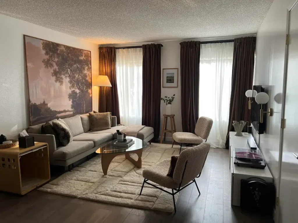
A large landscape painting in warm browns and golden tones commands the left wall. The sofa beneath it is a light gray sectional with just two or three muted throw pillows. A sculptural glass-and-wood coffee table sits deliberately bare except for a small stack of books. Two boucle accent chairs in cream and camel face the sofa, adding warmth and a secondary seating option.
Rich burgundy-brown velvet curtains frame the windows floor to ceiling. They do two things at once: they add luxurious texture that elevates the whole space, and they frame the room like a stage, giving it a sense of real intentionality.
Other polished touches:
- A white media console on the right holding a vinyl record player and decorative objects
- A brass-and-white globe sconce adding a sculptural lighting element
The takeaway is simple. One strong focal point does more than five mediocre ones. That painting anchors everything. The curtains frame it. The furniture supports it. When you’re working with limited square footage, invest your design energy into one piece that truly earns its place, then let the rest of the room serve it.
The Bottom Line on Small Living Room Decor
A small living room isn’t a limitation. It’s a constraint that forces better decisions. Every piece of furniture, every color choice, every item on a shelf has to earn its spot. That’s actually an advantage, even when it doesn’t feel like one.
Here’s what every room in this list has in common, regardless of budget or square footage:
- They feel lived-in, not staged
- They commit to a direction instead of playing it safe with beige everything
- They use personality as a design tool, not an afterthought
The best small living room ideas aren’t about making your room look bigger. They’re about making it feel right.
Pick one idea from this list. Just one. The gallery wall, the statement mirror, the velvet curtains, the ambient shelf lighting. Start there and build from it. The best rooms don’t happen all at once. They grow one good decision at a time. What are you trying first?
