Your entry hallway has about three seconds to make an impression. Three. Seconds. And most of us treat it like a dumping ground for shoes, mail, and that one jacket we swore we’d hang up properly. Sound familiar?
The good news? Fixing your hallway doesn’t require a full renovation or a designer on speed dial. I’ve pulled together 15 real hallway ideas from real homeowners who figured out how to make this tiny space work harder and look way better. No staged showroom nonsense here.
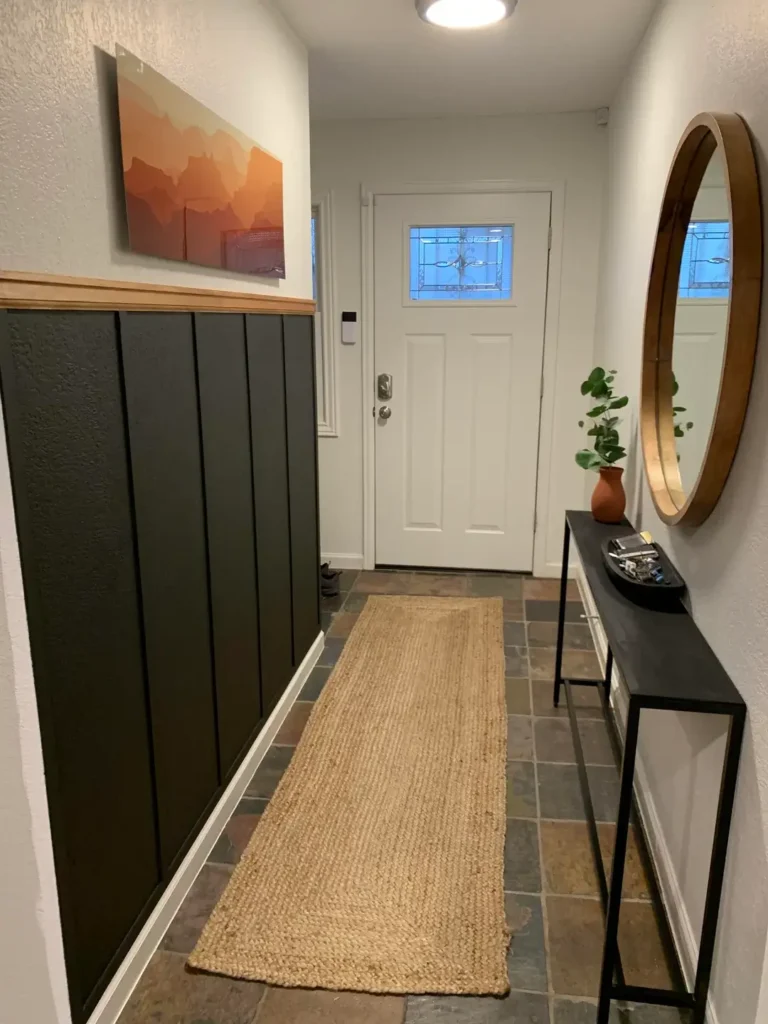
Dark Walls with Crisp White Wainscoting
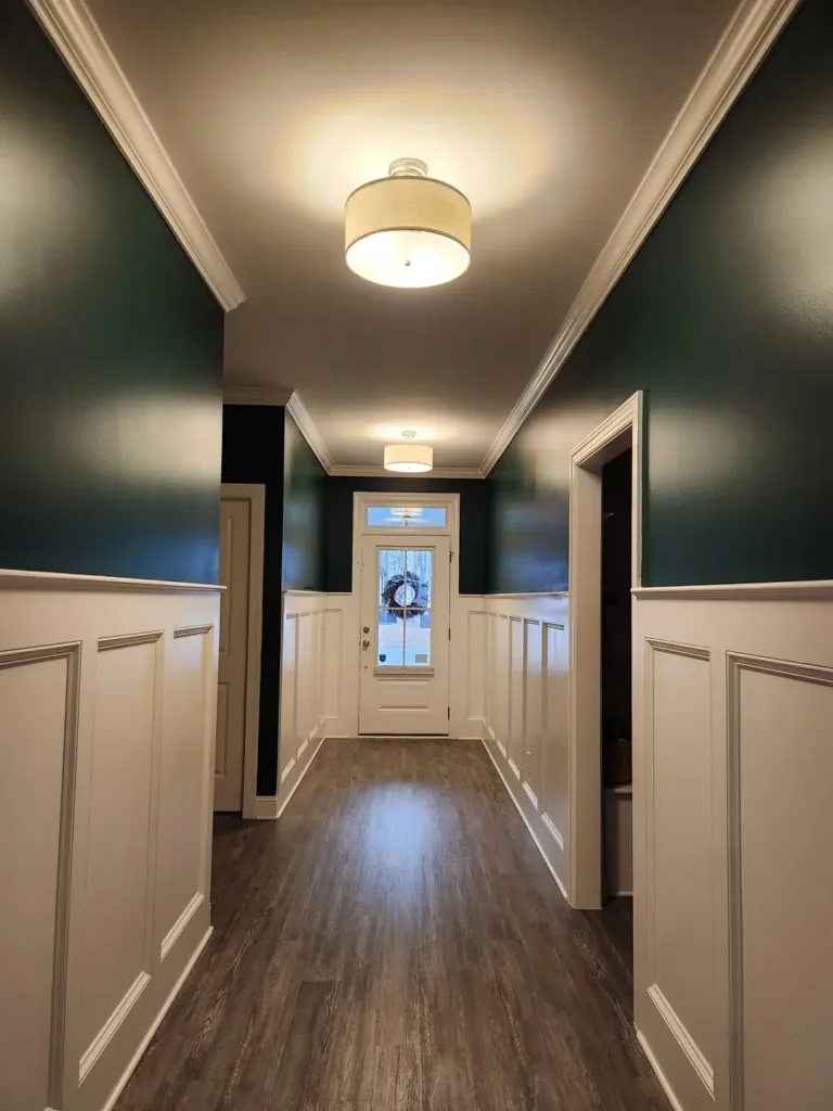
Most people run from dark walls like they owe them money. But when you do it right? Absolutely stunning.
This hallway goes all in with deep teal walls climbing straight to the ceiling. Bold move. The secret weapon here is the white wainscoting running waist-high on both sides, which breaks up all that drama and keeps the space from feeling like a cave. Warm drum pendant lights do the heavy lifting to make sure the room never feels gloomy.
What makes this work:
- The wainscoting height hits the sweet spot, not too short, not too tall
- Crown molding at the ceiling gives it that finished, high-end look
- Wood-look flooring ties the warmth in and grounds everything
Pro tip: If you’re going dark, invest in quality trim work. The contrast only pops when your white elements are genuinely crisp and clean. Cheap trim with dark walls looks sad.
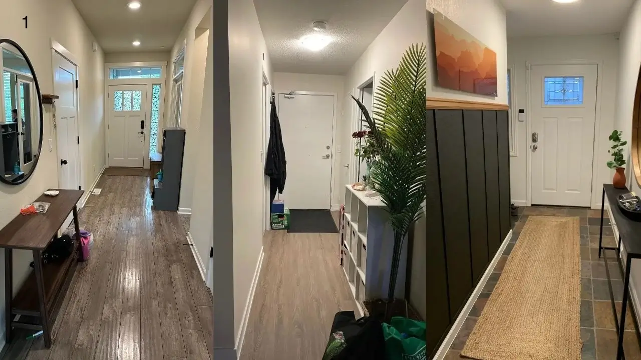
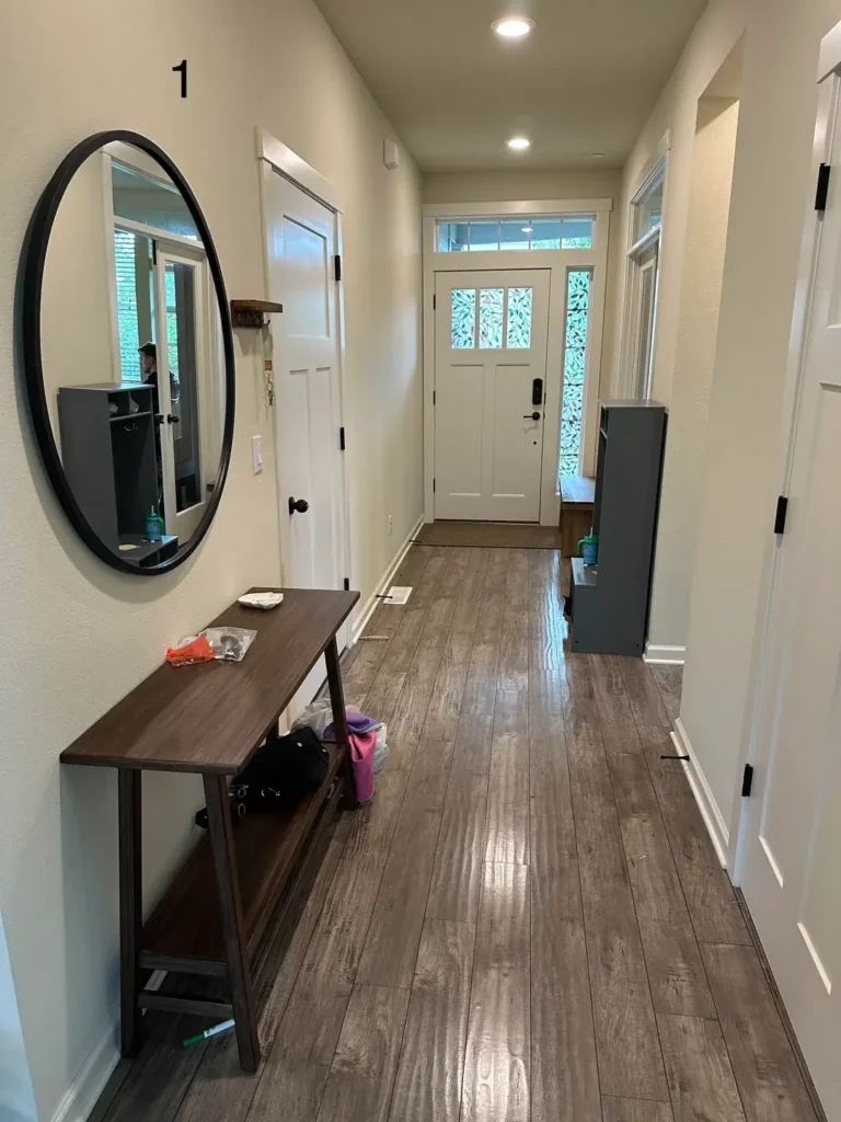
Functional Mudroom Setup with Smart Storage
Small entryway? Don’t panic. You just need to be smarter about every single inch.
This setup proves you can have both function AND style without sacrificing one for the other. A slim white shoe cabinet handles footwear without hogging floor space. A large mirror with a natural wood frame pulls double duty, making the space feel bigger AND giving you that last-second “do I look okay?” check before you leave.
The details that matter:
- Light gray walls keep things neutral and bright
- Simple hooks at a practical height handle bags and coats
- The mirror reflects light from the door window, which genuinely expands the feel of the room
Real talk: Before you buy a single piece of furniture, count your actual shoes and coats. Generic storage solutions almost never solve specific problems. Know what you need, then shop.
Bold Black and White Checkerboard Runner
One rug. One decision. Completely transformed hallway.
A diamond-pattern runner does something sneaky here. It creates diagonal lines that trick your eye into thinking the hallway is wider than it really is. Smart, right? Textured white walls stay neutral so the rug can be the star. Black interior doors at each end create symmetry and tie into the rug’s darker diamonds.
Why this runner actually works:
- It’s wide enough to make an impact without going wall-to-wall
- The wood flooring framing around it looks intentional, not lazy
- One small plant on a corner shelf adds life without creating clutter
Shopping tip: Always bring samples home before committing to a patterned rug. Store lighting lies. What looks amazing under fluorescent lights might completely overwhelm your actual space.
Also Read: How to Decorate a Long Hallway: 10 Real-Life Examples and Pro Tips
Streamlined Modern Entry with Minimal Fuss
Sometimes less really is more. Revolutionary concept, I know.
This entry keeps it deliberately simple: a narrow console table, an oversized oval mirror, and nothing else fighting for attention. White walls, gray wood-look flooring, and natural light from the front door’s windows do the rest. Black door hardware gives just enough definition without turning into a whole thing.
Why restraint wins here:
- The slim console table depth doesn’t eat into walking space
- The vertical mirror orientation pulls the eye upward and makes ceilings feel higher
- Multiple doors benefit from the cohesive, uncluttered look
Measure before you shop. Seriously. Furniture that looks normal-sized in a store can completely overwhelm a narrow hallway. For tight spaces, aim for console tables under 12 inches deep.
Apartment Entry with Vertical Storage
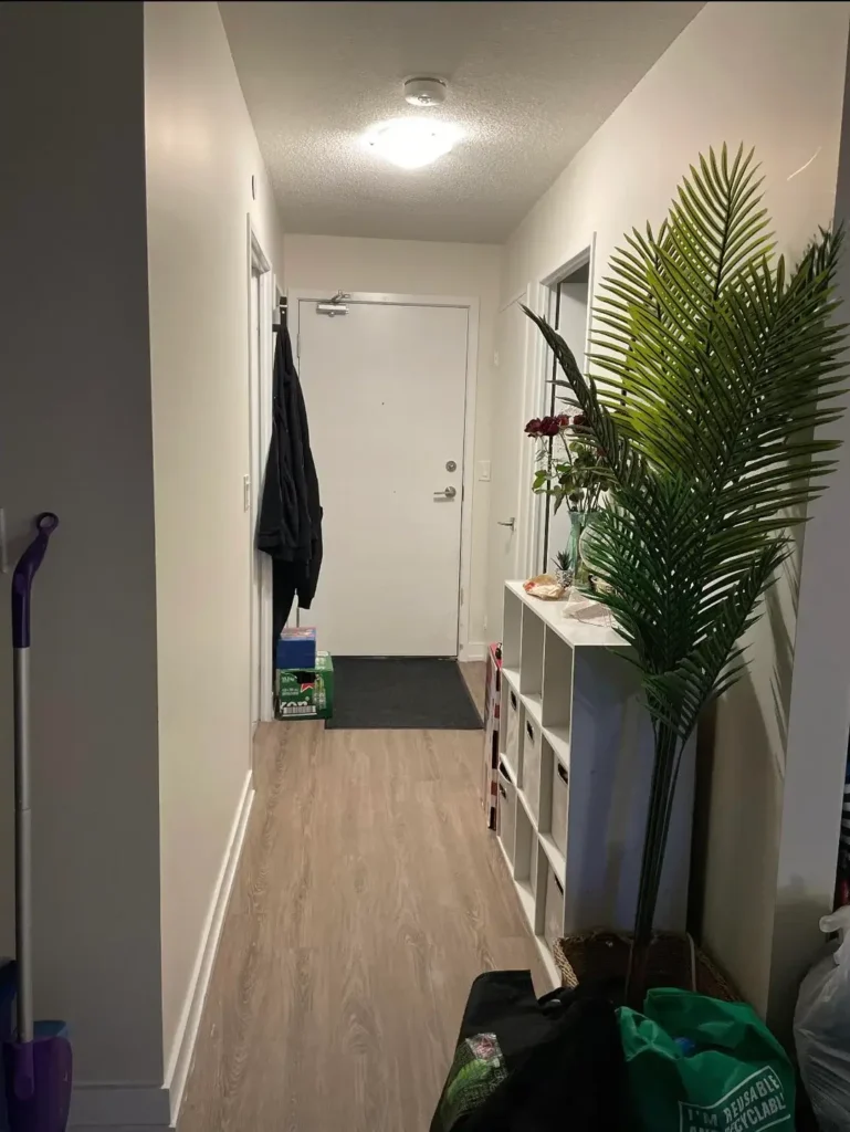
Renters, this one’s for you. No drilling required.
When you can’t touch the walls permanently, you go vertical. A white cubby storage unit handles shoes, bags, and all the random stuff you need near the door. A tall artificial palm fills vertical space beautifully without requiring wall mounting or stealing floor space from the walking path. Everything here picks up and moves when the lease ends. Genius.
What to steal from this setup:
- Neutral color palette of white, beige, and wood keeps it from feeling cramped
- The doormat defines the entry zone on the light flooring
- Vertical storage draws the eye up, making low ceilings feel less oppressive
Renter’s advice: Don’t cheap out on freestanding furniture. Particleboard falls apart after one or two moves. Invest in solid wood or metal pieces with removable sections. You’ll thank yourself later.
Scandinavian Simplicity with Natural Materials
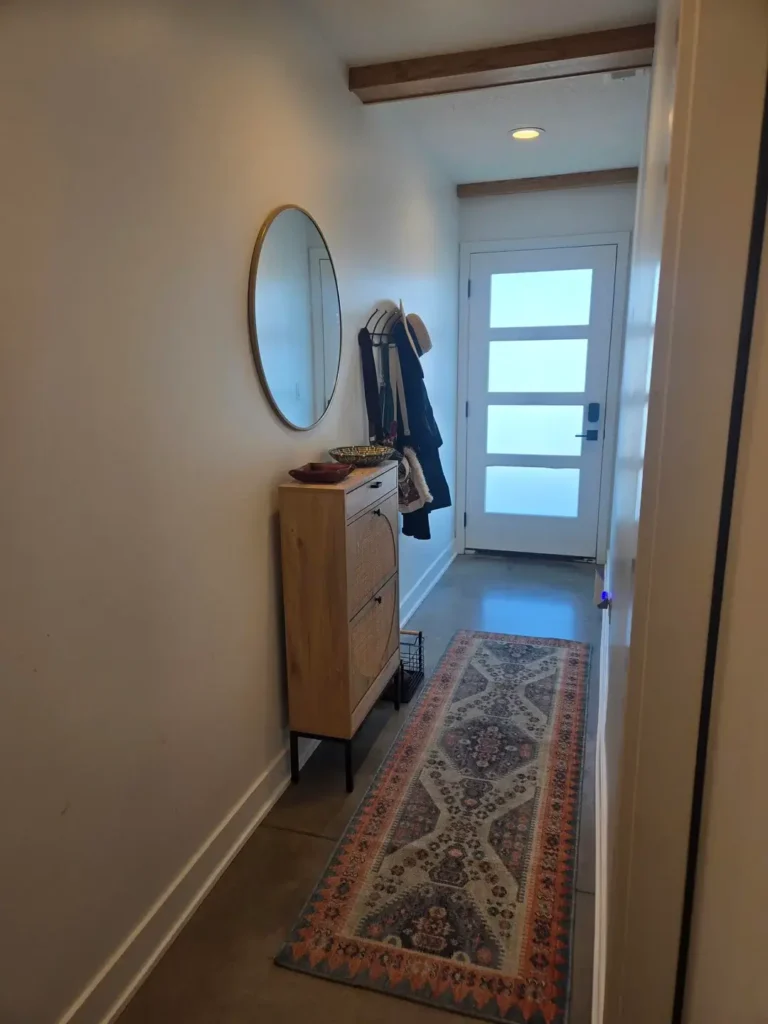
Clean lines, natural textures, zero drama. This is the hallway equivalent of a deep breath.
A wood shoe cabinet with black metal legs keeps storage minimal and sleek. A round wood-framed mirror echoes the cabinet’s material for a cohesive look. An intricate runner in muted tones adds pattern without overwhelming everything. Exposed wood ceiling beams bring architectural character, and frosted glass door panels diffuse light in the most beautiful way.
Key Scandi details:
- Tilt-out shoe storage hides footwear behind clean fronts
- Lifted legs on the cabinet prevent that heavy, boxy look
- The muted tones keep it calm without being boring
Be honest with yourself here. If you rarely wear shoes inside, elaborate shoe storage is wasted space. Design around how you actually live, not how you wish you lived.
Also Read: 10 Small Hallway Decor Ideas That Actually Make Narrow Spaces Feel Bigger
Narrow Gallery Hallway with Strategic Art Placement
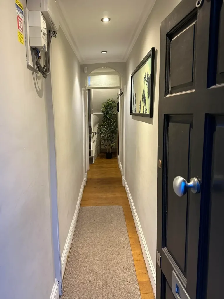
Long, narrow hallway? Stop fighting it. Lean into it.
Treat it like a gallery and suddenly it’s a feature, not a flaw. A single framed piece hung at eye level creates a focal point. A textured runner softens the floor. An arched doorway at the end frames the view into the next room like a painting itself. Black door hardware gives subtle definition against white doors.
The gallery approach works because:
- Art hung at 57-60 inches from floor to center hits that museum-standard sweet spot
- One well-chosen piece creates more impact than a chaotic gallery wall in a tight space
- The neutral runner adds interest without competing with the artwork
Less is genuinely more in narrow hallways. Resist the urge to hang everything. Two pieces, well placed, beat ten pieces fighting for attention every single time.
Eclectic Entry with Board and Batten Feature Wall
Minimalism is great. But sometimes you want a little personality in the room.
Board-and-batten paneling on one wall adds texture and architectural interest instantly. Painting it charcoal while keeping the other walls bright white creates a bold focal point without overwhelming the whole space. A jute runner brings natural texture, a slim black console handles function, and terracotta tile flooring adds warmth and durability where you need it most.
Why the board and batten works:
- Vertical lines draw the eye upward, making ceilings feel taller
- The dark accent wall creates depth without requiring expensive renovations
- Terracotta tile handles heavy foot traffic like a champ
DIY warning: Board-and-batten looks incredible when done precisely. Uneven spacing or crooked lines are painfully obvious. Use a level on every single board. If you’re not confident, hire a carpenter. Sloppy execution completely kills the effect.
Layered Rugs for Visual Depth
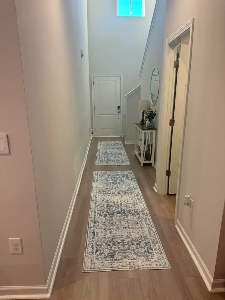
One runner is good. Two is a whole vibe.
Layering rugs in a hallway adds visual complexity that a single rug just can’t achieve. A larger neutral runner goes down first, then a smaller patterned rug in muted blues and grays sits on top. The pattern concentration near the door naturally draws attention to the entry point. A white console with a lower shelf and an oval black-framed mirror handle all the practical stuff.
Layering rules to follow:
- The bottom rug should extend 6-12 inches beyond the top rug on all visible sides
- Keep color temperatures cohesive, either both warm or both cool
- Both rugs sharing a similar palette prevents the “accident” look
IMO, layered rugs are one of the easiest ways to add a designer touch without spending designer money. Just be intentional about it.
Also Read: 10 Narrow Hallway Ideas That Actually Make These Tight Spaces Feel Intentional
Statement Lighting in Neutral Hallway
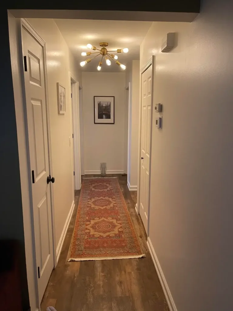
Here’s a wild idea: what if the light fixture was the whole point?
A brass sputnik-style chandelier absolutely commands attention in this hallway. And it earns that attention because everything else stayed intentionally quiet. Warm white walls, light wood flooring, neutral tones throughout. The fixture gets to be the star. A Persian-style runner in rust and cream tones complements the brass without competing. Simple black-framed wall art adds just enough at eye level.
Why this lighting approach works:
- The brass finish adds warmth that elevates the neutral palette from bland to sophisticated
- The sputnik design creates visual interest from every angle you approach it
- The fixture’s size is generous but not obstructive for a pass-through space
When picking statement lighting, think 360 degrees. Hallways are pass-through spaces, which means you’ll see that fixture from multiple angles constantly. Make sure it looks great from all of them.
Classic Elegance with Chandelier and Console
Traditional style done right never goes out of fashion. Done wrong, it’s grandma’s house. Let’s aim for the former.
An ornate cream chandelier with floral metalwork sets a formal, elegant tone immediately. A console table with turned legs, a decorative gold-framed mirror, and a patterned rug defining the entry zone carry that elegance through the whole space. An arched doorway adds architectural charm, and lighter wood flooring prevents the traditional elements from feeling dark or heavy.
The proportions here are everything:
- The chandelier is substantial enough to anchor the vertical space properly
- Console table height aligns with ideal mirror placement
- The rug extends beyond the table, creating an intentional zone rather than an afterthought
Edit ruthlessly with traditional style. Choose a few genuine statement pieces and let them breathe. Too many ornate items tips quickly from timeless elegance into something far less flattering.
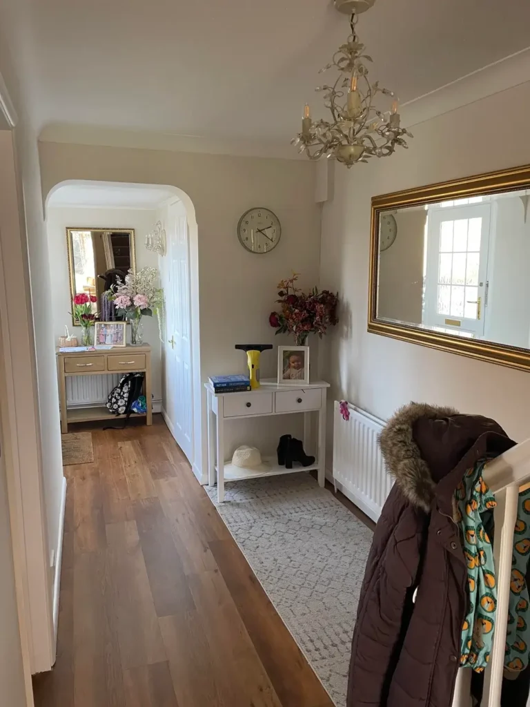
Cozy Entry with Vintage Console and Personal Touches
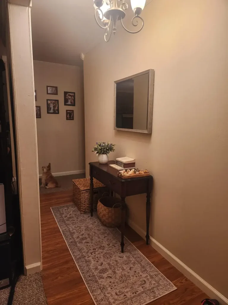
Rules are helpful. But your personality matters more.
A dark wood vintage console with a drawer and lower shelf handles storage and display beautifully. Styled with flowers, a framed photo, books, and meaningful decorative objects, it feels collected and personal rather than catalog-perfect. Wicker baskets tucked underneath contain the less attractive necessities. A vintage runner adds color and warmth underfoot.
What keeps this from looking cluttered:
- Items on the console are grouped intentionally with varying heights and breathing room
- Baskets below hide the stuff that doesn’t look great on display
- The overall palette stays cohesive even with personal items mixed in
Style in odd numbers. Groups of three or five create naturally balanced arrangements. And edit regularly, because surfaces accumulate stuff fast. When in doubt, remove half of what you think looks good and reassess.
Minimalist Before Example
Not every hallway needs saving. Some just need a direction.
This hallway shows a very common starting point: white walls, terracotta tile, a basic skylight, and a floor-to-ceiling mirror that helps with the sense of space. Functional. Totally forgettable. But here’s the thing, this is actually a great starting point. No strong existing choices to fight against. Just bones waiting for a vision.
When you’re starting from scratch:
- Identify what you can’t change (floor, ceiling height, door placement)
- Build your plan around enhancing those fixed elements
- Don’t try to disguise what’s there. Work with it
Think of the blank canvas as freedom, not a problem to solve.
Moody Sophistication with Dark Paint and Molding
Bold colors require commitment. Half-hearted dark walls look like a mistake. Full-commitment dark walls look like a choice.
Charcoal gray walls paired with crisp white wainscoting and crown molding create serious drama here. Persian runners in burgundy and cream bring warmth against the cool wall color. Medium-toned wood floors transition between the dark walls and white trim in a way that feels natural rather than jarring. The molding detail throughout, baseboard, chair rail, picture rail, and crown, is extensive and completely worth it.
Why the molding matters so much:
- Each trim piece creates visual breaks in the dark color
- Without trim detail, dark walls go flat and oppressive fast
- The shadow lines add architectural depth you genuinely can’t fake
Dark paint shows every flaw. Patch holes carefully. Prime properly. Use quality paint with good coverage. Cheap dark paint looks streaky and never achieves the depth you’re going for.
Architectural Drama with Coffered Ceiling and Bold Color
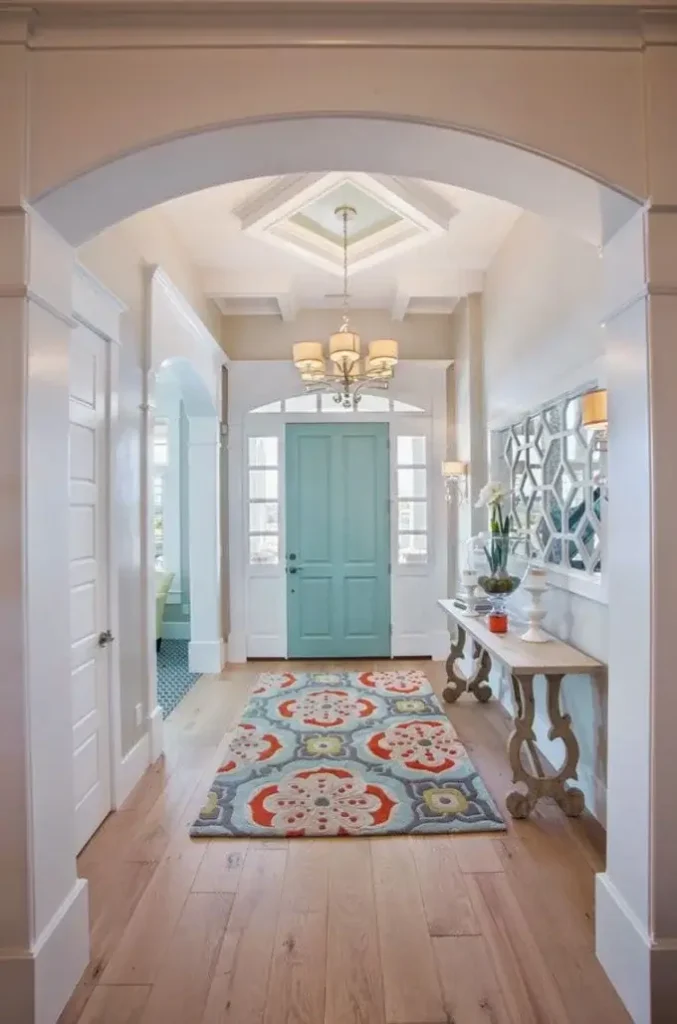
When your home gives you architectural gifts, you use them.
A coffered ceiling painted in soft blue-gray creates depth and shadow play that shifts beautifully throughout the day as natural light moves. A vibrant turquoise interior door creates an unexpected pop of color your eye finds immediately. White wainscoting runs throughout. A colorful patterned runner grounds the space. A vintage console and decorative mirror handle the functional pieces with elegance.
Smart color decisions made here:
- The coffered ceiling stays subtle so it doesn’t compete with the bold door
- The turquoise door is the single focal point rather than one of many competing elements
- Wainscoting ties the bold color choice back to something classic and grounded
FYI: If your home has architectural features, emphasize them. Coffered ceilings, high ceilings, arched doorways. These give you built-in character that no amount of furniture can replicate. Paint, lighting, and thoughtful color choices make them genuinely shine.
How to Pick the Right Approach for Your Hallway
After looking at 15 totally different approaches, a few things become really clear regardless of your personal style.
Scale beats style every time. Furniture that’s too large makes hallways feel cramped no matter how beautiful the pieces are. Measure obsessively. Most hallway furniture should sit under 14 inches deep to keep comfortable walking space.
Lighting transforms everything. Whether you go statement chandelier or simple flush mount, adequate lighting makes every other decision look better. A dark hallway feels unwelcoming even when it’s perfectly decorated.
Storage only works when it’s specific to your life. The most beautiful console is useless if you need shoe storage. The most efficient cubby looks chaotic if you don’t have enough items to fill it properly. Figure out exactly what needs to live in your entry, then shop for solutions to those specific needs.
Commit to your color choice. Both the dark teal hallway and the all-white hallway work because their owners fully committed to the vision. Halfhearted color choices that try to please everyone end up pleasing no one.
| Approach | Best For | Difficulty |
|---|---|---|
| Dark walls with trim | Hallways with good natural light | Medium |
| Functional storage focus | High-traffic family entries | Easy |
| Statement lighting | Spaces lacking architectural interest | Easy (hire electrician) |
| Layered runners | Long, narrow hallways | Easy |
| Minimal approach | Small or rental spaces | Easy |
Final Thoughts
Your entry hallway doesn’t need to look like anyone else’s version of perfect. These 15 ideas cover wildly different budgets, styles, and priorities, and they all work because each one solves a real problem for a real space.
Start by asking yourself one honest question: what actually frustrates you about your hallway right now? Is it the clutter? The darkness? The lack of storage? The soul-crushing blandness? Fix that specific thing first before you start pinning inspiration boards.
The best entry hallway is the one that works for how you actually live and gives you a tiny moment of happiness every single time you walk through your front door. That’s genuinely not too much to ask from a few square feet.
Now go give that hallway the attention it deserves. It’s been waiting patiently.hat’s not too much to ask from a few square feet of flooring.