So you’ve got a hallway that just… keeps going. It’s long, it’s awkward, and every time you try to decorate it, something feels off. Too empty? Too cluttered? Like a hotel corridor that forgot what personality means?
Yeah, I’ve been there. And honestly, long hallways are one of those spaces that intimidate people way more than they should.
Here’s the thing though: a long hallway isn’t a design problem. It’s actually a design opportunity most people are too scared to use. Once you stop treating it like a corridor and start treating it like a room, everything changes.
Let me walk you through 15 real hallway setups that actually work, explain why they work, and help you figure out which approach fits your space.
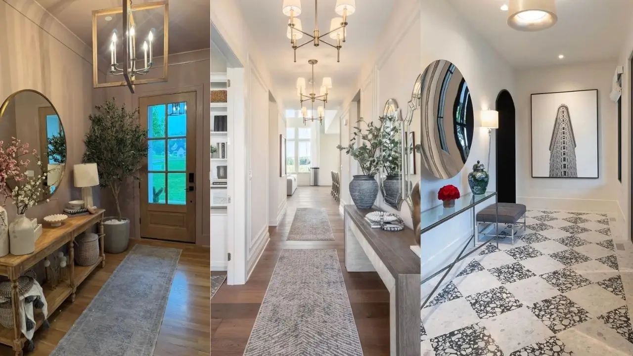
Layered Feminine Elegance with Console Styling
This look is proof that treating your hallway like an actual room (instead of a passageway you sprint through) makes all the difference.
Picture a white console table against pale gray walls, with an ornate gold mirror leaning casually against the wall instead of hanging perfectly centered. Two white ceramic lamps with blush pink ribbon details sit on either side, creating symmetry that feels collected and curated rather than staged.
Why does the leaning mirror work so well? Because it looks like you found it somewhere amazing and just… placed it. Not like you ordered a “complete hallway set” online at 2am.
The lower shelf keeps things restrained: woven baskets, cream-toned ceramic vessels, and faux eucalyptus that adds life without demanding you remember to water it.
How to get this look:
- Start with your console table as your anchor
- Choose one statement mirror (lean it, don’t hang it)
- Add symmetrical lighting on both sides
- Fill lower shelves in a single color story
- Edit ruthlessly: remove one item for every two you want to add
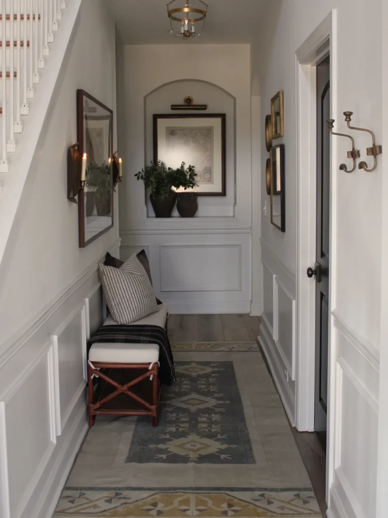
Grand Arched Entry with Repeating Architectural Details
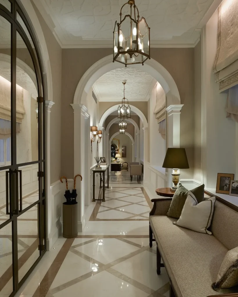
If your hallway has beautiful architectural bones, your only job is to highlight them, not compete with them.
This setup leans into repeated arches that frame each other down the length of the space. Cream marble floors with geometric inlay create a natural pathway. Brass lantern fixtures hang at intervals, reinforcing the vertical rhythm of each arch. The result? A hallway that feels intentional, almost palatial.
A neutral upholstered bench and side table tucked to one side give the space actual purpose beyond passage. People can sit, remove shoes, drop bags. It becomes a space you use, not just walk through.
Keep your color palette tight when you have strong architecture. Let the bones do the talking and just bring the right supporting cast.
Dramatic Dark Ceiling with Gallery Wall
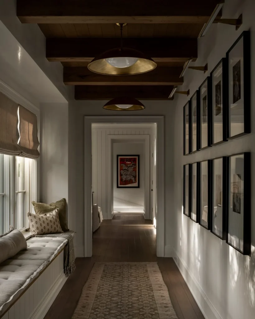
Okay, this one takes commitment. But hear me out.
Dark wood beams on the ceiling create horizontal lines that work against the hallway’s length, making your eye move across rather than straight down the tunnel. Meanwhile, the walls hold a staggered arrangement of black-framed photographs in varying sizes, turning what would be dead space into an actual gallery worth stopping for.
A window bench with gray cushioning adds function. Two brass pendant lights with dome shades hang at different heights, casting warm light that softens the drama above.
The key move here: keep the walls light while going dark on the ceiling. That balance is what prevents the space from feeling cave-like. If you’re going to do dark overhead elements, fully commit. Half-measures look like an accident.
Also Read: The Best School Hallway Ideas: 8 Real-Life Transformations to Try
Traditional Entry with Painted Door Focal Point
Sometimes all a hallway needs is one strong focal point, and this setup nails it with a blue-gray painted door framed by an arched doorway with a transom window.
Cherry wood floors add warmth. A black console table provides contrast. Decorative wall medallions create vertical interest without eating up floor space. And a bowl-shaped pendant fixture handles ambient lighting without hanging so low it becomes a forehead hazard.
The color rule this hallway follows: three tones max. Cream, wood, and that specific blue-gray. When you limit colors, you can vary textures freely without things getting chaotic.
This is the hallway equivalent of a capsule wardrobe. Fewer decisions, better results.
Slim Storage Solution with Moroccan Tile
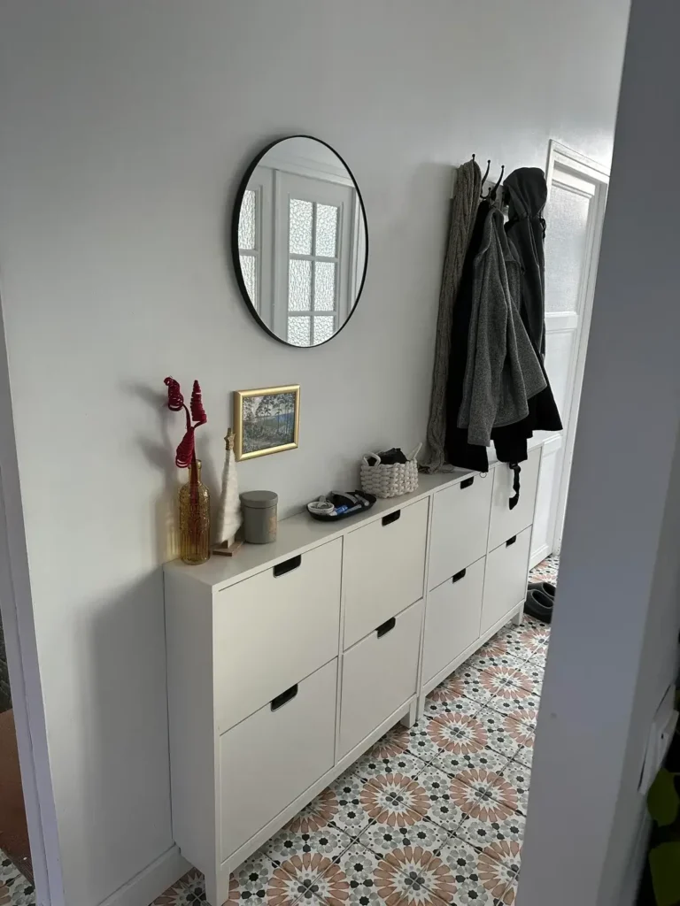
This one’s for anyone whose hallway is basically a glorified closet in terms of width. Under four feet? This is your answer.
White IKEA STÄLL shoe cabinets run along the wall, providing practical storage while only protruding about 12 inches. A black-rimmed oval mirror reflects light and tricks your eye into thinking the space is wider. A wall-mounted coat rack handles jackets and bags without taking up floor space.
But the real showstopper? The Moroccan-inspired tile floor in terracotta, white, and charcoal. It draws your eye downward instead of making you focus on how narrow the walls are. Smart move.
The tile also continues into the adjoining room, which visually expands the space. That continuity trick is free and effective.
The takeaway: in super narrow hallways, go vertical with storage and bold with the floor. Don’t try to cram freestanding furniture in. You’ll regret it every single time you carry groceries through.
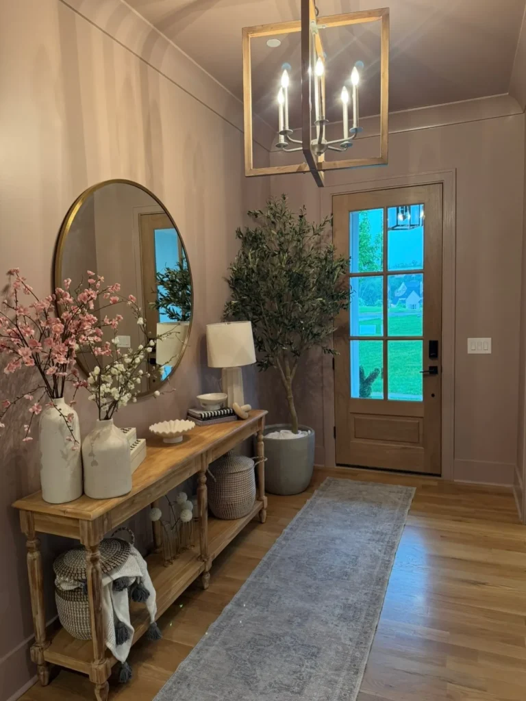
Rustic Farmhouse Console with Layered Lighting
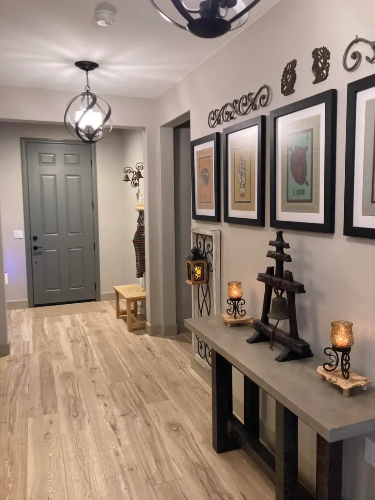
One overhead light in a hallway is basically the interior design equivalent of hospital lighting. This setup does it right by layering multiple light sources.
A twisted sphere pendant provides ambient light from above. Wall sconces with amber glass add warm task lighting near the console. The result is a space that feels lived-in and intentional rather than functional and forgotten.
The gray console holds pillar candles on wrought iron stands for height variation. A whitewashed ladder shelf leans against the wall, adding dimension without any drilling or permanent commitment (FYI, great option for renters).
The front door is painted in that same gray-blue tone that appears throughout. Color repetition like this ties a space together without requiring a design degree.
When styling any console, remember: vary your heights, mix your materials (wood, metal, glass, fabric), and always include at least one organic element.
Also Read: How to Style Your Hallway: 12 Lighting Setups for Every Budget
Bold Graphic Runner with Minimal Walls
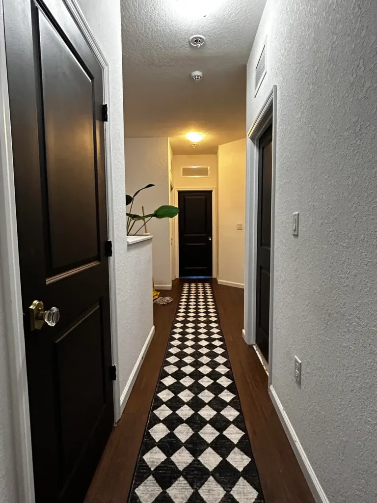
Less is genuinely more in this hallway. The walls are nearly bare. Simple flush-mount lights. No gallery wall, no floating shelves, no accumulated stuff.
Just a black and white diamond-pattern runner doing all the heavy lifting.
The high-contrast geometric pattern creates movement and pulls your eye forward. Dark wood floors flank the runner. A single potted plant near the far end provides just enough softness to stop things from feeling too stark.
Interior design lesson right here: you don’t need to fill every wall when you have one strong element elsewhere. The runner is the design choice. Everything else just supports it.
One caveat though: if you go this route, make sure the runner is actually long enough. A too-short runner in a long hallway doesn’t look minimalist. It looks like you gave up.
Mid-Century Modern Lighting with Traditional Bones

Got a traditional hallway with panel doors and crown molding but want it to feel more current? Change the light fixture. Seriously, that’s it.
This hallway proves it with a brass sputnik chandelier that transforms an otherwise conventional space into something with genuine personality. The traditional architecture stays. The modern fixture shifts the whole vibe.
Light wood flooring reflects warm brass tones. Cream walls keep everything airy. A Persian-style runner in rust and cream adds warmth without competing with the chandelier. A single framed photograph centered on the end wall gives your eye somewhere to land.
The lesson: lighting is your fastest, most impactful lever for changing how a space feels. One distinctive fixture can do more work than an entire wall of decor.
Just check your ceiling height before you go sputnik-shopping. Scale matters more than style.
Layered Rugs with Minimal Furniture
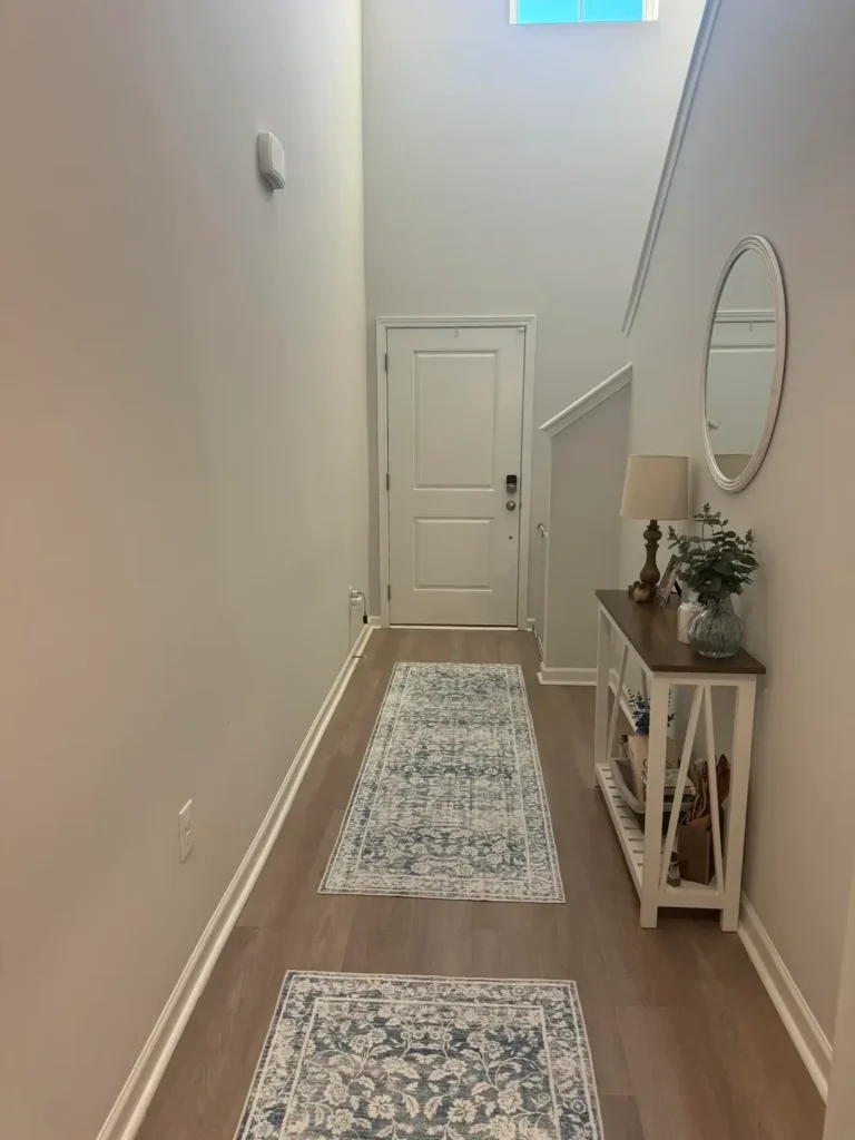
Two vintage-style rugs, layered at different points down the hallway, solve one of the most common long-hallway problems: the space feels like one long, undifferentiated stretch with no stopping points.
The larger rug features a traditional floral pattern in muted blues, grays, and creams. The smaller one near the entrance carries similar tones. Together, they create zones that break up the visual length.
A slim white console on the right keeps the walkway clear while providing a surface for a lamp, vase, and small plant. The tall oval mirror leans rather than hangs. Walls stay minimal.
This works because the rugs give your eye natural stopping points rather than letting it slide straight from one end to the other. Think of it as visual punctuation.
If you try this: make sure both rugs share a color family. Different patterns are fine. Clashing color families look like you grabbed two things off a clearance rack. (No judgment, but still.)
Also Read: How to Decorate a Long Hallway: 10 Real-Life Examples and Pro Tips
Checkerboard Luxury with Statement Art
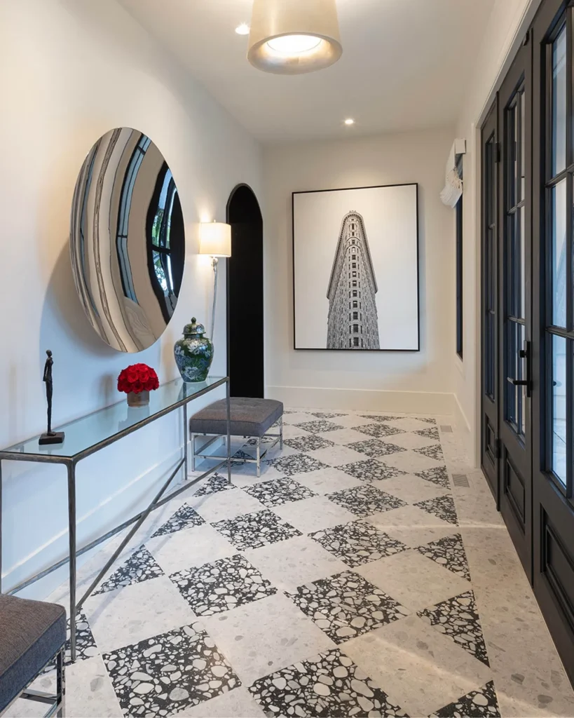
This entry commits to pattern in a way that demands confidence. Alternating squares of cream terrazzo and black terrazzo create a classic checkerboard floor that somehow reads as sophisticated rather than retro diner chic.
The rest of the space earns its restraint as a direct response to that bold floor. A glass and brass console keeps visual weight light. A round mirror with concave striped detailing reflects light without adding pattern competition. One piece of architectural photography in a thin black frame provides a clean focal point.
A small brass pendant echoes the console’s material. An upholstered stool tucks neatly underneath.
The rule this space follows: choose one bold element and let everything else support it. When you pick a statement floor like this, solid furniture, a tight color palette, and minimal accessories are not boring choices. They’re the right choices.
Colorful Maximalist Entry with Galaxy Flooring
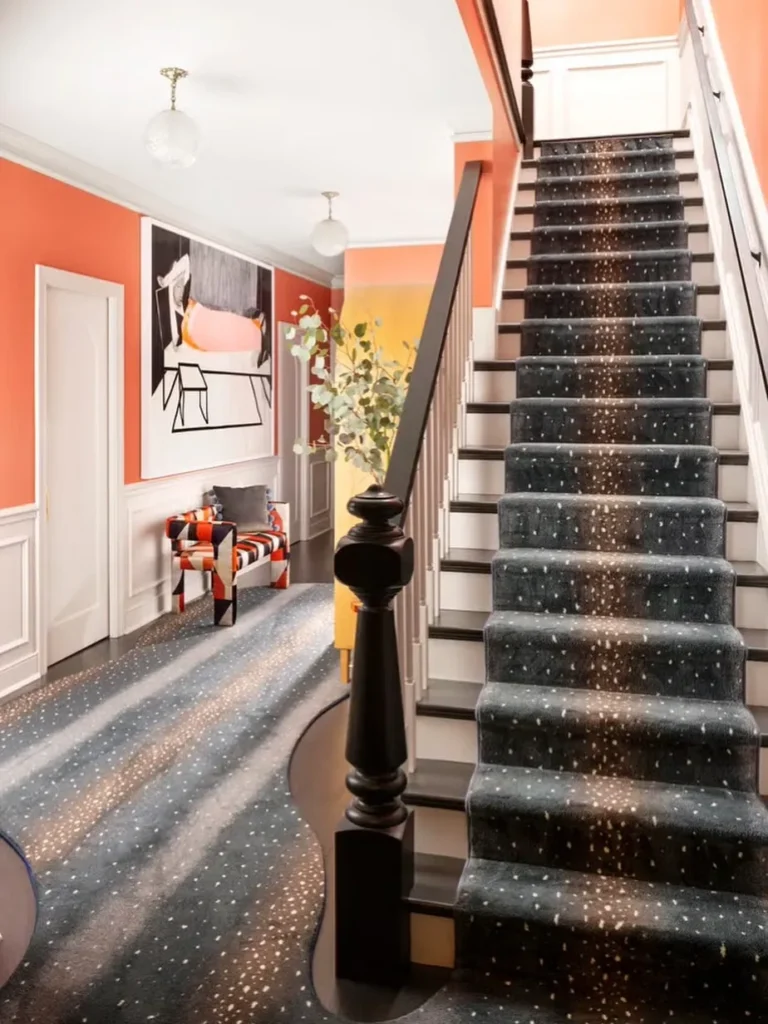
Not a neutral person? Great news: color absolutely works in narrow hallways, but only if you fully commit to it.
This hallway features walls that graduate from coral-orange to soft yellow in an ombre effect. White board-and-batten wainscoting grounds the space visually. The staircase runner resembles a galaxy or terrazzo in dark charcoal with white speckles. An upholstered ottoman in bold orange and black geometric fabric sits in the seating area. Large-scale graphic art ties it all together.
Why doesn’t this feel chaotic? Color theory. Orange and yellow are analogous colors that naturally harmonize. Black and white elements provide grounding contrast. And the patterns vary enough in scale to read as coordinated rather than competing.
IMO, this is the bravest hallway in the list. But if bold is your thing, go all the way. Doing this halfway is worse than not doing it at all.
Gallery Wall with Brass Statement Lighting
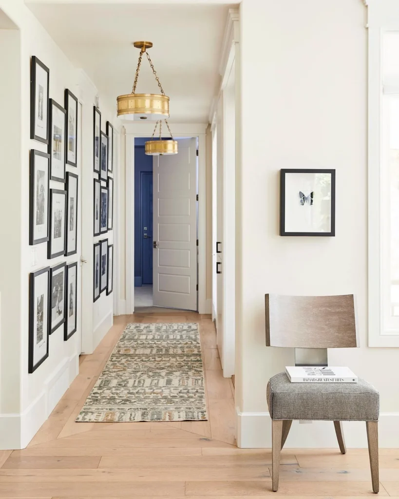
Two substantial brass drum pendant lights establish this hallway’s personality immediately. They hang at slightly different heights down the corridor, creating rhythm and ensuring the space is well-lit throughout its length.
The left wall holds an asymmetrical gallery of black-framed photographs and prints, styled in the salon-wall tradition with varying sizes and orientations. The consistent black frames provide cohesion while the varied sizing keeps things from looking rigid.
A small upholstered bench sits against the right wall. A navy-painted interior door creates a striking focal point at the far end.
What I love about this setup: it commits to asymmetry rather than forcing perfect symmetry. The lights aren’t perfectly centered. The gallery arrangement has intentional irregularity. The bench placement feels casual. In long hallways, forced symmetry can actually create more visual tension than it resolves.
Built-In Shelving with Repeating Light Fixtures
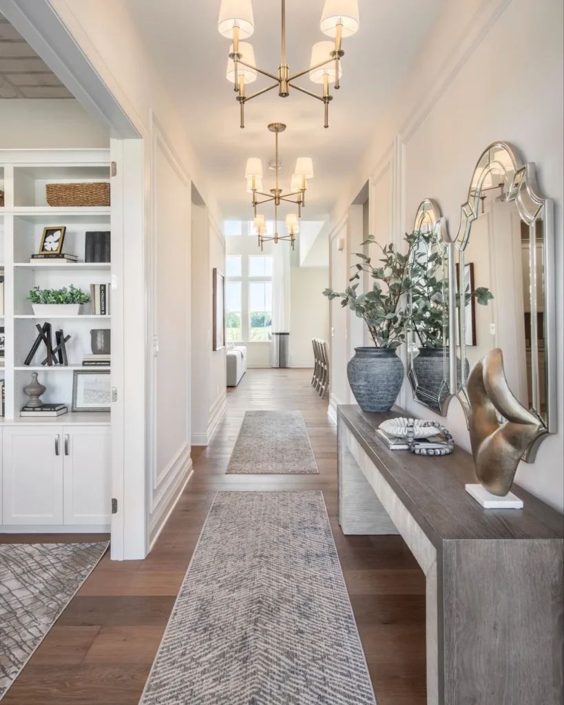
This hallway solved its length problem the smart way: by adding purpose to the space rather than just aesthetics.
White built-in shelving on the left creates functional storage that also breaks up the wall plane. Books, baskets, and carefully curated decor fill the shelves without looking cluttered. The mix matters: vertical books, horizontal stacks, decorative objects at varying heights.
Three brass chandeliers with white drum shades hang at even intervals, creating visual rhythm that moves you forward while lighting the space consistently. Repeated fixtures work because of how distinctive they are — generic builder-grade fixtures repeated three times look institutional. Interesting fixtures repeated three times look like a design decision.
The right side features a long console in driftwood gray with decorative mirrors above it and large textured vases with eucalyptus branches at a scale that actually matches the hallway’s proportions.
The balance between built-in storage and open flow is what makes this work. Function and beauty coexisting without either one suffering.
Architectural Niche Styling with Traditional Details
This narrow hallway turns its architectural features into assets instead of obstacles.
A built-in arched niche at the corridor’s end creates a natural focal point, styled with framed artwork, two dark vessels with eucalyptus, and subtle wall-mounted lighting above. White board-and-batten wainscoting runs the full length of both walls, adding horizontal lines that counteract the vertical length.
A leather campaign-style stool offers seating without bulk. A patterned runner provides the only real pattern in the space. Wall sconces and mirrors flank the corridor for light and reflected space.
The gray-painted interior doors blend into the upper walls rather than standing out. This minimizes their visual impact and keeps the focus on the architectural details you actually want people to notice.
If your hallway has niches, moldings, or other built-in details, style them. Don’t cover them up or ignore them. They’re doing free design work for you.
Warm Wood Console with Oversized Mirror and Greenery
Scale is everything in this final entry, and this hallway nails it.
An enormous brass-rimmed circular mirror hangs on the wall, reflecting light throughout the space and making the narrow hallway feel noticeably wider. It works because the size is bold enough to actually make an impact. A small mirror in the same spot would look lost.
The natural wood console with turned legs and multiple shelves provides substantial storage. Woven baskets on the lower shelves add texture. Fresh greenery in various vessels creates an organic, layered feeling with different heights: tall branches in floor vases, medium stems on the table, smaller plants on different shelf levels.
A brass lantern-style pendant light echoes the mirror’s frame material. Pale gray walls and light wood flooring keep everything feeling open despite the sizable furniture.
The proportion lesson here is worth repeating: always measure your ceiling height and wall space before shopping. Small-scale furniture in a tall hallway looks timid. Right-sized furniture looks intentional. Style is secondary. Scale comes first.
Quick Comparison: Which Hallway Approach Fits You?
| Approach | Best For | Difficulty | Budget |
|---|---|---|---|
| Console with symmetrical styling | Traditional homes, moderate width | Easy | Moderate |
| Architectural emphasis, minimal furniture | Homes with existing details | Medium | Low |
| Gallery wall with statement lighting | Modern or eclectic styles | Medium | Moderate |
| Bold floor pattern, minimal walls | Contemporary spaces | Advanced | High |
| Built-in storage with repeated fixtures | Long hallways needing function | Advanced | High |
| Oversized mirror with substantial furniture | High ceilings, wider hallways | Easy | Moderate |
Making Your Long Hallway Actually Work
Here’s what every hallway in this list has in common, regardless of style:
- They create focal points so your eye has somewhere to land instead of just sliding down an empty corridor
- They use multiple light sources instead of relying on one sad overhead fixture
- They balance practical storage with visual interest so the space works for real life, not just photos
- They use rhythm and repetition rather than randomly scattering objects along the walls
Your hallway probably sits somewhere between these examples. Maybe it has the architecture of one and the width of another. That’s fine. Take the elements that fit your specific constraints and leave the rest.
The hallways that actually succeed are the ones that lean into their awkwardness rather than apologizing for it. Use that length to build gallery moments. Add functional stopping points. Make bold choices that smaller spaces couldn’t pull off.
Your long hallway might just be the most interesting design opportunity in your entire home. You’ve just been looking at it like a problem this whole time.
Give one of these approaches a shot and see what happens. Start with the console table. Or the runner. Or just paint that front door a color you actually love. Sometimes one committed decision is all a hallway needs to finally click into place.