So you spent weeks picking the perfect sofa. You agonized over paint swatches. You even dropped real money on a statement rug. And then you got to the windows and thought, “Whatever, I’ll just grab something cheap on sale.”
Honestly? Same. We’ve all done it.
Here’s the reality though: curtains can do more for your living room than almost any other single change. They control light, set the mood, and they can make a budget room look like it came straight out of an interior design magazine. The right curtains are genuinely that powerful.
I dug through real living rooms shared by real people online (no staged showroom shots, no sponsored-by-a-curtain-brand vibes) and pulled together 10 setups that actually impressed me. Let’s get into it.
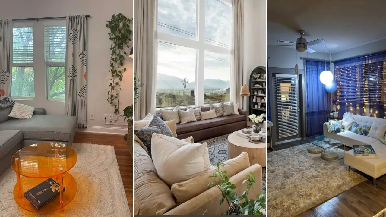
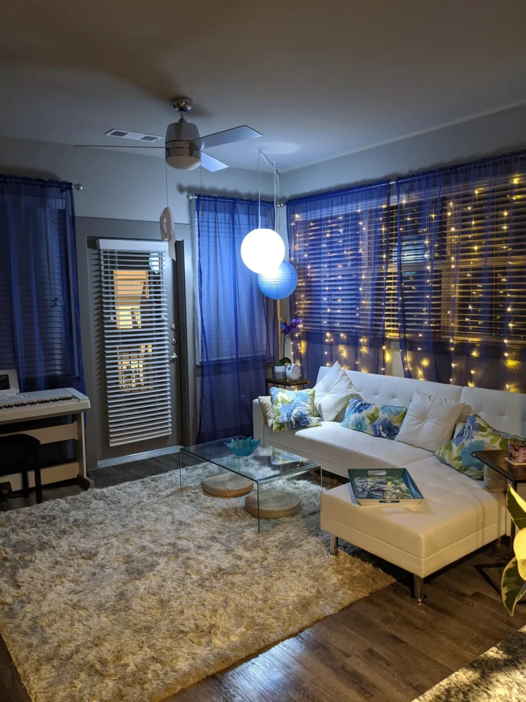
Navy Sheer Curtains With Fairy Lights Woven Through Them
Some ideas sound completely ridiculous until you see them in real life. This is 100% one of those ideas.
A Redditor on r/CozyPlaces hung navy blue sheer curtains across an entire window wall, then wove warm fairy lights directly behind the fabric. The evening effect looks like a starry night crossed with an underwater cave. That warm amber glow bleeding through deep blue sheer fabric is genuinely magical.
A white tufted sectional loaded with blue and green floral cushions sits in front. A glass coffee table keeps the foreground clean. Everything feels intentional without looking like someone tried too hard.
Why This Works
The secret is color temperature contrast. Cool blue sheers paired with warm 2700K fairy lights create that dreamy amber glow. Swap in cool white LEDs and the whole thing looks like a hospital waiting room. Not the vibe.
How to Recreate It
- Choose sheer voile panels in indigo or navy (go bold, not white or cream)
- Mount them on a ceiling track or tension rod
- String warm white curtain lights at 2700K behind the fabric
- Add blinds underneath for daytime privacy
Pro tip: Navy sheers are criminally underused. Most people default to white, but darker sheers create far more dramatic light filtering. Give them a real shot before you dismiss them.
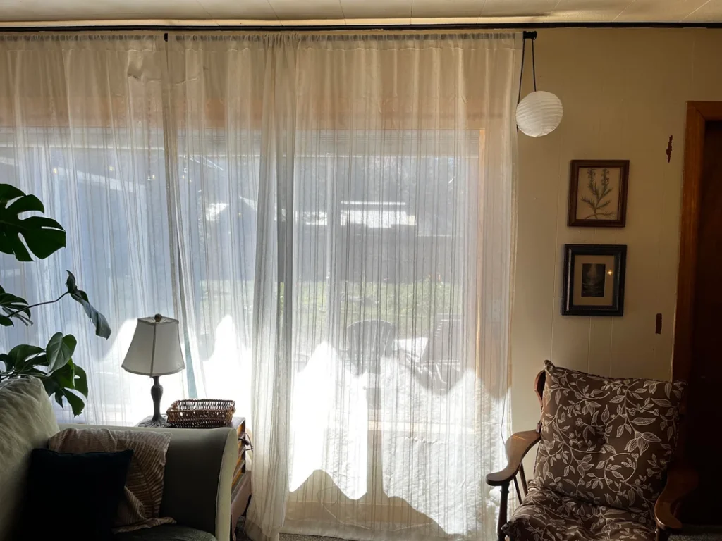
Wide Sheer White Panels Across a Full Window Wall
SoSometimes the simplest move is the smartest one. This setup is proof.
A Redditor installed off-white sheer panels across an entire window wall using a minimal black rod. Not just framing the glass either. Spanning the entire wall from side to side. The result is a gorgeous flood of soft natural light that makes everything in the room glow. The monstera plant in the corner looks like it’s absolutely thriving.
The Detail That Makes It
The rod placement is doing all the heavy lifting. It’s mounted at ceiling height and runs wall to wall, which tricks your eye into thinking the room is wider than it actually is. The curtains pool just barely at the floor, adding elegance without looking sloppy.
Getting the Measurements Right
- Mount your rod within 2 inches of the ceiling (as high as physically possible)
- Use panels that total at least 2x the width of your window for proper fullness
- Let the fabric just kiss the floor, nothing more
Here’s a truth bomb: cheap sheer curtains hung at the right height will look better than expensive curtains hung too low. Height and width matter way more than thread count. Nail the installation and save your money.
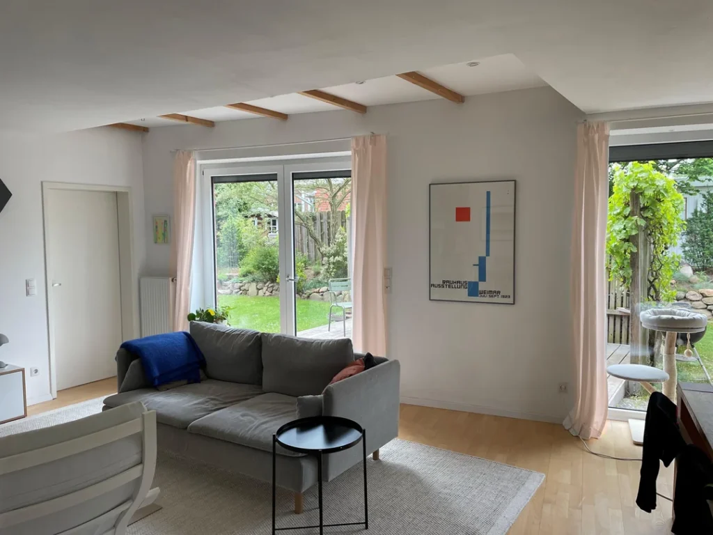
Blush Pink Curtains in a White Scandinavian Living Room
I know. Pink curtains? In a living room? Before seeing this room, I would have said absolutely not.
A Redditor paired soft blush pink linen curtains with white walls, light wood floors, exposed wooden ceiling beams, and a grey sectional. A Bauhaus exhibition poster on the wall adds one bold graphic punch. The pink curtains flank both French doors and a terrace entrance, staying open all the time because they’re purely decorative.
Why Pink Doesn’t Look Cheesy Here
It comes down to color temperature alignment. Blush pink sits in the warm spectrum, matching the warmth of those wooden beams and light floors perfectly. The grey sofa bridges everything together.
If the sofa were cool-toned or the floors dark, the pink would feel way too sweet. Context is genuinely everything.
Tips for Pulling Off Pink Curtains
- Choose linen or linen-blend fabric (texture matters big time here, ditch polyester)
- Stick to blush, dusty rose, or muted pinks (not hot pink, not bubblegum)
- Hang them wide enough to stack completely off the window frame when open
- Keep the rest of your palette neutral and warm
IMO, blush curtains bring warmth without the intensity of red or terracotta. They’re basically the introvert’s bold color choice, and I’m fully here for it.
Also Read: 10 Inspiring Black Living Room Decor Ideas for Dream Homes
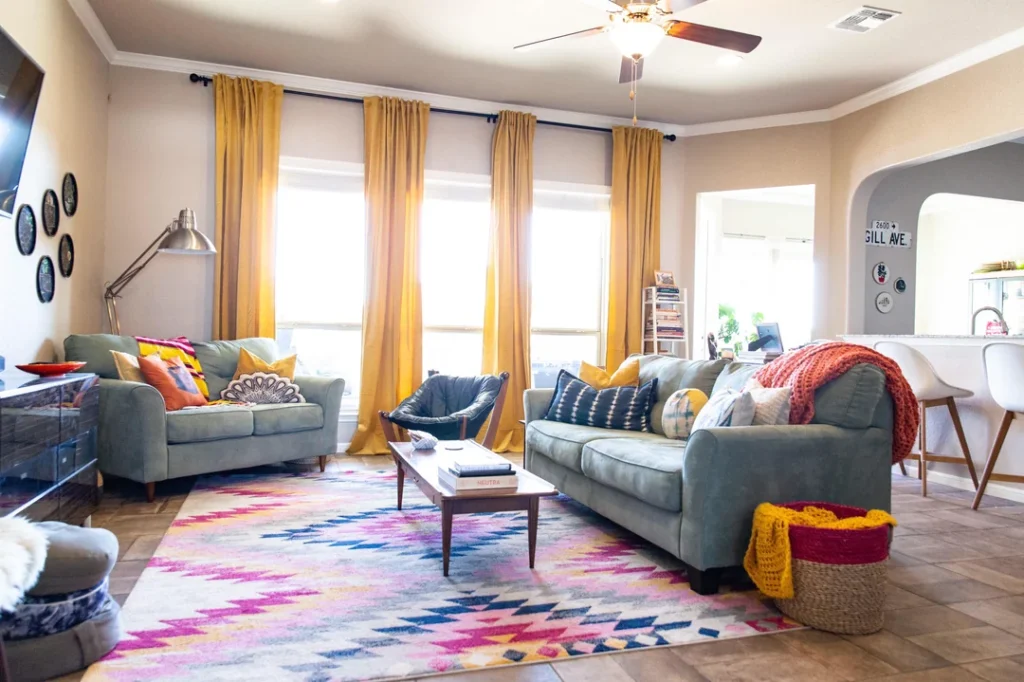
Mustard Yellow Curtains in a Boho Eclectic Living Room
Okay, stay with me. Mustard yellow curtains have absolutely no business working this well, yet here we are.
A Redditor hung rich mustard yellow panels on a black rod across three large windows, letting them pool slightly at the floor. The room below is beautifully chaotic in the best way: two grey-blue sofas, a wildly colorful geometric rug, a leather sling chair, mixed pattern pillows everywhere, and an industrial floor lamp.
This is not a “less is more” room. This is a “more is more and I love every second of it” room.
Why Mustard Works in Maximalist Spaces
In a boho or eclectic living room, curtains need enough visual weight to anchor the space rather than fight with it. Mustard yellow delivers that weight. It’s warm, earthy, and makes a statement without yelling.
The black rod ties into the other dark metal accents in the room, keeping everything grounded.
The Golden Rule for Bold Curtain Colors
Here’s the trick that separates “looks intentional” from “looks like a yard sale”:
Echo your curtain color at least twice elsewhere in the room at a smaller scale.
In this room, mustard shows up in the throw pillows on both sofas. That repetition is what makes the whole thing feel like a cohesive palette instead of a random accident.
- One pop of color = accident
- Two pops = coincidence
- Three pops = a real palette
Classic White Sheers With a Tieback on a Double Hung Window
Credit: r/Heysmare
No drama. No statement color. No complicated layering. Just a white sheer curtain with a tieback, and somehow it’s one of the most satisfying setups on this entire list.
A Redditor used simple white sheer panels on a dark metal rod with ornate finials. One panel hangs straight while the other gets pulled back with a hook-style tieback mounted on the window trim. The room around it is warm and neutral with wood floors, a grey chaise, botanical prints in gold frames, and black and brass wall sconces.
The Power of Asymmetry
That one-panel-straight, one-panel-pulled-back detail is the whole move. It creates visual interest and movement without adding a single extra thing to the room. It’s an old-school technique that still hits differently because it feels effortless and slightly romantic.
Why Tiebacks Deserve a Comeback
- They give you light control and soft privacy in one setup
- They add a nostalgic, romantic quality that purely modern rooms sometimes miss
- A simple hook tieback costs almost nothing and completely changes the look
- They work beautifully in traditional and transitional living rooms
FYI, decorative tieback hooks go for under $10 and take about five minutes to install. If your living room leans classic or transitional, this is one of the easiest upgrades you can make.
Retro Print Black and White Curtains in a Plant Filled Apartment
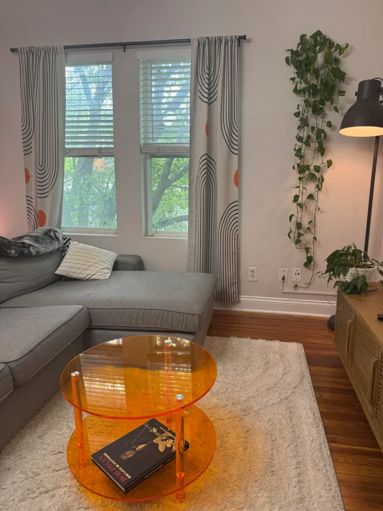
This setup caught me completely off guard. The curtains are doing something really specific here: providing pattern in a room that relies on texture and plants for its personality.
A Redditor chose white curtains with a bold black abstract arch print accented with orange circles. Very mid-century modern, very retro-pop. The rest of the room stays deliberately chill: a grey sectional, warm hardwood floors, a fluffy cream rug, and an impressive collection of trailing pothos cascading down the wall.
The Sneaky Color Connection
Here’s what makes this room feel so pulled together. The orange dots in the curtain print connect directly to the amber acrylic coffee table sitting in front of the sofa. It’s not accidental, but it’s not precious either. It just feels like someone who genuinely enjoys decorating put this room together.
Getting Started With Printed Curtains
If printed curtains intimidate you (totally valid), here’s where to start:
- Black and white graphic prints are the safest entry point
- They give you pattern without locking you into a specific color palette
- Keep the rest of the room restrained enough to let the print breathe
- Never pair busy curtains with busy everything else or the room loses all visual hierarchy
Bottom line: printed curtains can absolutely be the star of your living room. But every star needs a supporting cast that knows when to step back.
Also Read: 10 Stylish Shelf Decor Ideas to Transform Your Living Room
Full Width Layered Curtains in Forest Green and Natural Linen
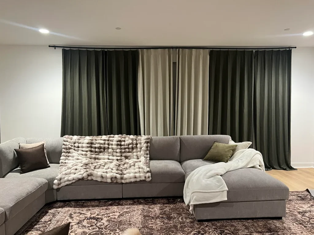
This might be the most dramatic window treatment in the entire collection, and honestly, it earns eThis might be the most dramatic window treatment on the entire list, and honestly, it earns every bit of that drama.
A Redditor installed a continuous ceiling-mounted track across an entire wall and used two fabric types: deep forest green panels on the outer edges and natural linen panels in the center. The layering effect looks almost like stage curtains. The green frames the lighter panels and gives the whole wall incredible depth. A large grey sectional with olive and brown cushions ties everything back to the curtain palette.
Curtains as a Wall Treatment
Here’s the part that blew my mind. There might not even be windows behind the entire span. Interior designers use this technique to make a room feel larger and more architectural by covering a whole wall in floor-to-ceiling fabric.
A ceiling-mounted track is essential for this look. A standard rod would look completely wrong at this scale.
Why This Color Combo Works
- Forest green and natural linen both live in the same organic, earthy family
- They complement each other rather than contrast
- The combination feels grounded and sophisticated without being stuffy
Fair warning: this approach costs more than a standard curtain setup because of the ceiling track and the sheer amount of fabric. But the visual payoff is absolutely worth it if you have a large wall that needs anchoring.
Floor to Ceiling Linen Curtains in a Double Height Living Room
This is the aspirational entry on the list, and I’m not going to pretend otherwise. But the execution is so flawless that it teaches something genuinely useful about curtains in tall spaces.
A Redditor hung long cream linen curtains running the full height of double-story windows in a living room with panoramic mountain views. The curtains frame the view instead of blocking it, pulled to the sides and functioning as architectural elements. Below, the room layers earthy neutrals: a caramel leather sofa, tan linen seating, a round wood coffee table, warm rugs, and a dark arched bookcase.
The Principle of Proportion Matching
In a double-height room, standard 96-inch curtains look like they gave up halfway. You need panels that run the full height of the wall, hung as close to the ceiling as possible. This makes the vertical space feel intentional instead of overwhelming.
This Applies to Your Room Too
Even without double-height ceilings, this principle scales down perfectly:
- 10-foot ceilings? Go with 108-inch or 120-inch panels
- Standard 8-foot ceilings? 96-inch panels hung at ceiling height still look miles better than 84-inch panels hung at the window frame
- Custom-length panels are more accessible than ever through IKEA, Amazon, and specialty retailers
The difference between “right height” and “close enough” curtains is genuinely dramatic. Your curtains should feel like architecture, not an afterthought.
Frosted Roller Shades in a Lived In Eclectic Living Room
I know, I know. Roller shades aren’t technically curtains. But this setup solves a very specific problem I know, I know. Roller shades aren’t technically curtains. But this setup solves a very specific problem so elegantly that it earned a spot on this list.
A Redditor uses frosted white roller shades across three windows in a warm, eclectic living room packed with personality: a grey sectional with bold red and mustard pillows, a vintage mustard velvet armchair, hanging plants in macramé holders, and a large black-and-white print on the wall. The roller shades are basically invisible. They quietly do their job while everything else in the room gets to shine.
Knowing When to Step Back
Here’s the real lesson: not every living room needs statement curtains. Sometimes the smartest window treatment is the one that completely disappears.
This approach works especially well when:
- Your room already has multiple patterns, colors, and textures competing for attention
- Adding bold curtains would tip the space from “eclectic” into “chaotic”
- You want natural wood window frames to provide their own architectural warmth
- You prefer a clean window line that doesn’t add more visual clutter
If your living room is already doing a lot, consider whether plain shades or minimal sheers might serve you better than curtains that add yet another competing layer. Restraint at the windows can be exactly what makes everything else in the room readable.
Also Read: 12 Trendy Mid Century Modern Living Room Ideas Designers Love
Emerald Green Velvet Curtains on a Brass Rod
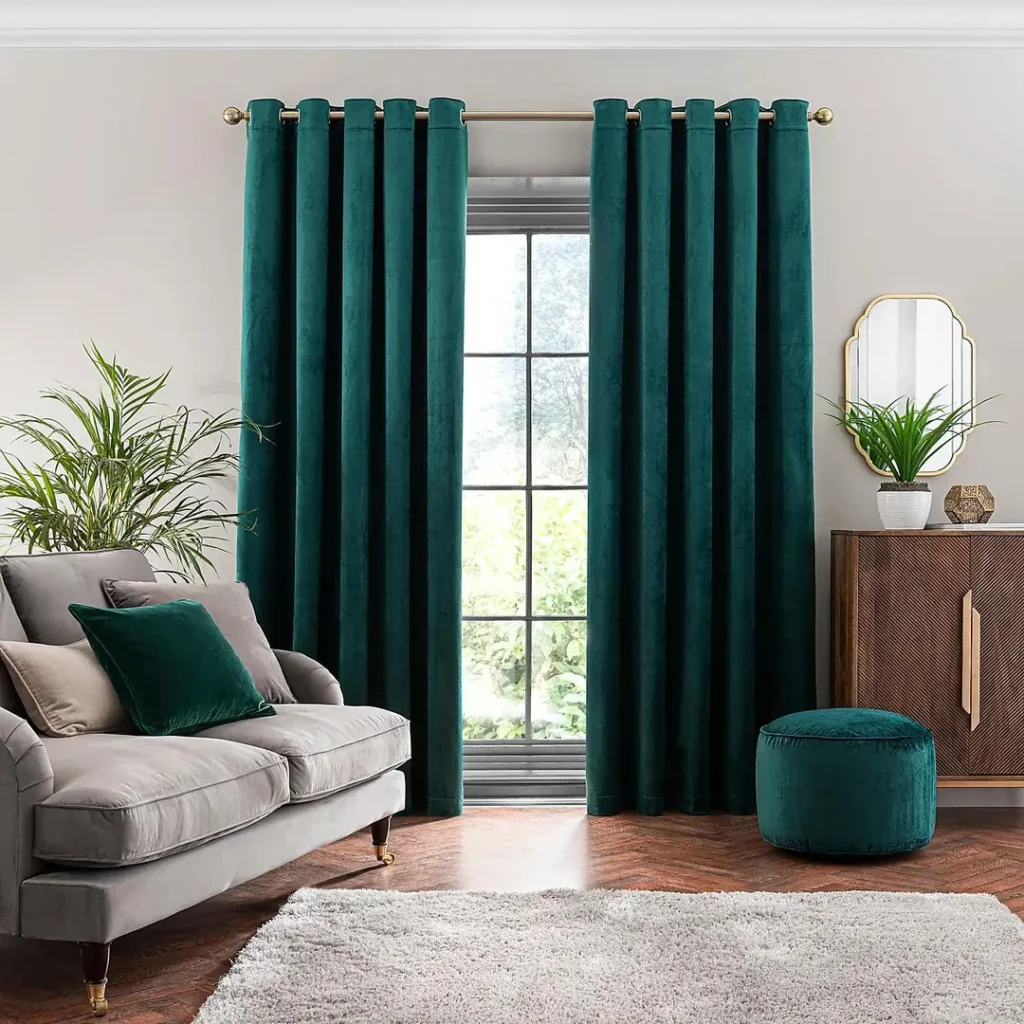
TThere was zero question about what would close this list. Emerald green velvet curtains on a brass rod is the kind of choice that makes a room look like you hired a designer, even if you absolutely did not.
A Redditor went full commitment with deep teal-emerald velvet panels featuring brass eyelet rings on a polished brass rod. A grey velvet sofa with a matching emerald cushion locks the palette together. A teal velvet pouf, a dark wood sideboard, a geometric brass mirror, and a palm plant complete what can only be described as editorial-level styling.
Why Velvet Hits Different
Velvet’s pile catches light differently depending on the angle, which means these curtains literally change color throughout the day. They look brighter near the window and deeper in shadow. That natural variation gives them a presence that flat woven fabrics simply cannot replicate.
The Practical Side of Velvet Curtains
Before you rush to order velvet panels, here’s what you actually need to know:
- They’re heavy, so make sure your rod hardware can handle the weight
- They attract dust and pet hair like nobody’s business
- Clean them by steaming, not washing (for most velvet types)
- They can fade in direct sunlight, so south-facing windows need UV-filtering glass or a sheer liner
- They fall in the $$$ price range, so consider them an investment
Handle those practical details and emerald velvet curtains will make your living room look like a place you chose to live on purpose.
Quick Reference: Curtain Styles at a Glance
| Style | Best Room Type | Light Control | Cost |
|---|---|---|---|
| Navy sheer + fairy lights | Apartment, rental | Low | $ |
| Wide white sheers (wall to wall) | Any room, any size | Low to Medium | $ |
| Blush pink linen panels | Scandinavian, minimal | Low | $$ |
| Mustard yellow panels | Boho, eclectic, maximalist | Medium | $$ |
| Classic white sheers + tieback | Traditional, transitional | Low to Medium | $ |
| Retro graphic print panels | Eclectic, mid-century modern | Medium | $$ |
| Layered green + linen (full width) | Modern, contemporary | High | $$$ |
| Double-height linen panels | High ceiling, formal | Low | $$$ |
| Roller shades (minimal) | Eclectic, maximalist | Medium to High | $ |
| Emerald velvet + brass hardware | Glam, art deco, jewel tone | High | $$$ |
What All 10 Rooms Have in Common
Ten wildly different rooms. Ten completely different curtain choices. Ten distinct personalities. And yet a few clear principles keep showing up across every single one.
Proportion matters more than price. The most effective setups in this collection, whether they cost $40 or $400, nailed the height and width. Curtains hung too low or too narrow will underperform no matter how gorgeous the fabric is. Every single time.
Color repetition separates “designed” from “random.” In every room with a bold curtain color, that same color pops up at least once more somewhere else in the space at a smaller scale. It’s not a strict rule. It’s just what makes a room feel intentional instead of accidentally assembled.
The best curtains solve a specific problem. Too much light? Not enough height? Too much visual noise? Not enough warmth? Every great curtain choice in this collection started with a problem and ended with a solution. Nobody picked curtains from a catalog in isolation and somehow lucked into a great room.
Final Thoughts
Your living room curtains should never be a default choice. They should be a deliberate one.
Look at your room first. Figure out what it actually needs. Then find the curtains that deliver exactly that. Whether you spend $20 on sheer panels or $200 on emerald velvet, the rooms that look the best are always the ones where someone thought carefully about what they wanted and then actually went and got it.
So go measure your windows (properly this time), figure out your room’s biggest need, and pick the curtains that solve it. Your living room will seriously thank you. And hey, if you end up going with the navy sheers and fairy lights combo, I need to see it.