I’m so tired of “decorating inspiration” that shows rooms where literally no one lives. No dog hair on the sofa. No weird corner that defeats every furniture arrangement you try. No exposed pipes that came with the apartment and apparently came to stay forever.
So I went digging for the real stuff. Actual loft living rooms from actual people who figured things out through trial, error, and honestly just having a good eye. Ten rooms. Ten real lessons. Zero staged nonsense.
Whether you’re moving into a loft space or just staring at one stubborn wall wondering what it’s trying to tell you, there’s something here worth stealing.
Dark and Moody Done Right With Brick, Beams, and Pendant Lighting
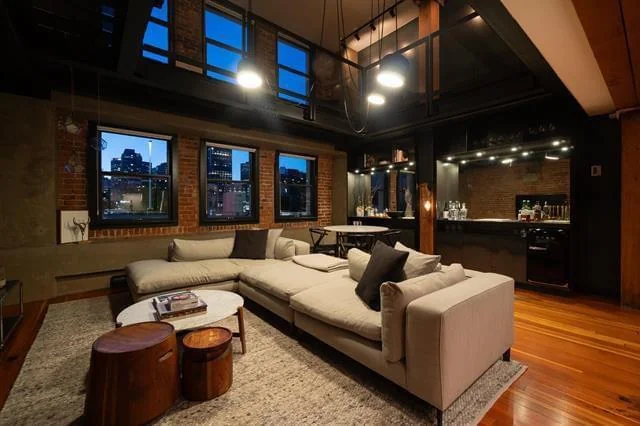
There’s a version of “dark apartment decorating” where your living room ends up feeling like a basement dungeon. And then there’s the version that makes guests stop in the doorway and go “wait, this is incredible.” The difference comes down to one thing: layering.
Why This Dark Room Doesn’t Feel Like a Cave
u/jamesbwsutton pulled this off beautifully. Warm honey-toned hardwood floors sit under a low-profile pale grey linen sectional, all anchored against exposed red brick walls and dark steel-framed windows. But the move that makes the whole thing work? The lighting.
A cluster of pendant bulbs hanging at different heights from an industrial ceiling pulls your eye upward while bathing everything in warm, focused light. A round marble-topped coffee table paired with two stacked walnut drum stools breaks up the rectangular furniture layout just enough to feel intentional rather than catalog-perfect.
Dark rooms only fail when nothing reflects light. In this room, every surface pulls its weight. The cream sectional bounces light back into the space. The oversized windows frame a city skyline like living artwork. Contrast saves everything here.
Want this look? Here’s where to start:
- Pick a light-colored sectional against dark walls. It’s one of the most reliable contrasts in loft living room decorating.
- Keep your rug light too. A pale, low-pile rug stops the floor from swallowing all available light.
- Let your lighting do the heavy lifting. Industrial pendant clusters are your best friend in dark spaces.
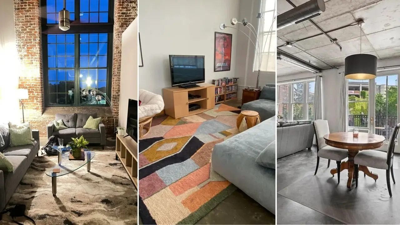
Eclectic Comfort With a Papasan Chair, Bold Rug, and Oversized Sectional
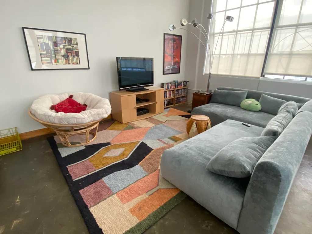
Not every apartment living room needs to look like it came out of a single showroom. This space makes that argument better than any design book ever could. And yes, there’s a papasan chair in a grown-up living room. It works. Relax.
The Secret Weapon? That Rug.
u/4thDimensionEmily put together something unapologetically personal here. A large grey velvet sectional dominates one side of the room while a classic rattan papasan chair with a white cushion and red throw pillow anchors the opposite corner.
The real star is the bold geometric rug in terracotta, sage, black, and cream. It ties these mismatched pieces together through sheer visual confidence. Framed prints on the wall, a bookshelf packed with media, and an arc floor lamp with a chrome finish round everything out. The concrete floors show character instead of hiding under wall-to-wall carpet.
Here’s the thing about this kind of decorating: it requires you to actually commit to your own taste. Every piece reflects a real person’s preferences, not a coordinated furniture package from a showroom.
The big takeaway? A rug with a strong pattern can unify pieces that have absolutely no business being in the same room together. If you love a chair that doesn’t match your sofa, find a rug bold enough to claim them both. Problem solved.
Also, those large grid windows? Leave them uncovered. Diffused natural light through factory-style windows flatters almost any color palette. Don’t fight that gift.
Double-Height Drama and Using Vertical Space as Your Biggest Asset
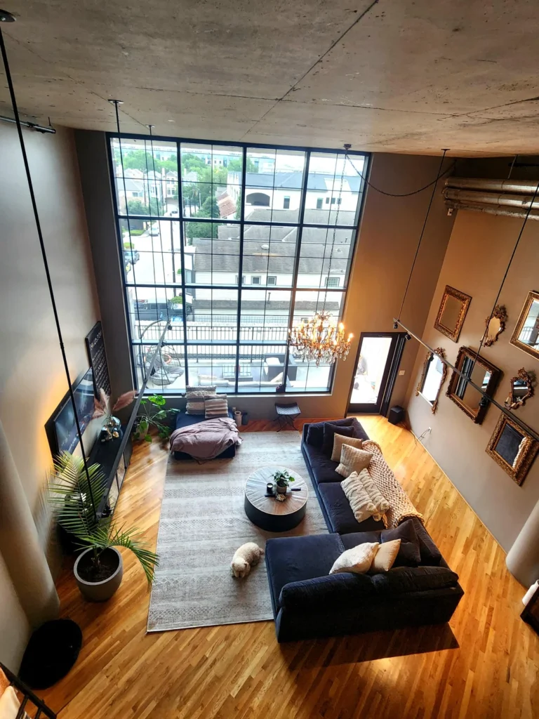
Looking straight down into this Houston loft from a mezzanine level, the scale hits you immediately. Double-height ceilings and a floor-to-ceiling grid window wall aren’t decorating decisions. They’re architectural gifts.
Those Mirrors Are Doing More Than You Think
What r/JLS did with this space is the actual lesson here. The furniture arrangement stays low and grounded, which is exactly the right call. Keeping furniture height low lets the ceiling height actually register. Filling a tall room with tall furniture defeats the whole point. IMO, that’s one of the most common mistakes people make with high-ceiling spaces.
A gold-toned chandelier suspended at mid-height bridges the gap between floor life and that upper volume beautifully.
On the right wall, there’s an unconventional gallery arrangement of gold-framed mirrors in varying sizes and styles. Ornate baroque shapes mix with simpler rectangles, all in warm gold tones. The finish ties every piece together while the mirrors bounce light from those massive windows across the entire room. That’s a practical benefit dressed up as pure style.
For apartments with high ceilings, remember:
If your walls feel bare, consider mirrors before art. They work harder in every measurable way.
Resist the urge to fill vertical space. Let it breathe.
A single statement light fixture does more than a collection of floating shelves ever will.
Also Read: 10 Apartment Living Room Ideas from Real People (No “Influencer” Fluff Included)
Farmhouse Warmth in a Loft-Style Condo Space
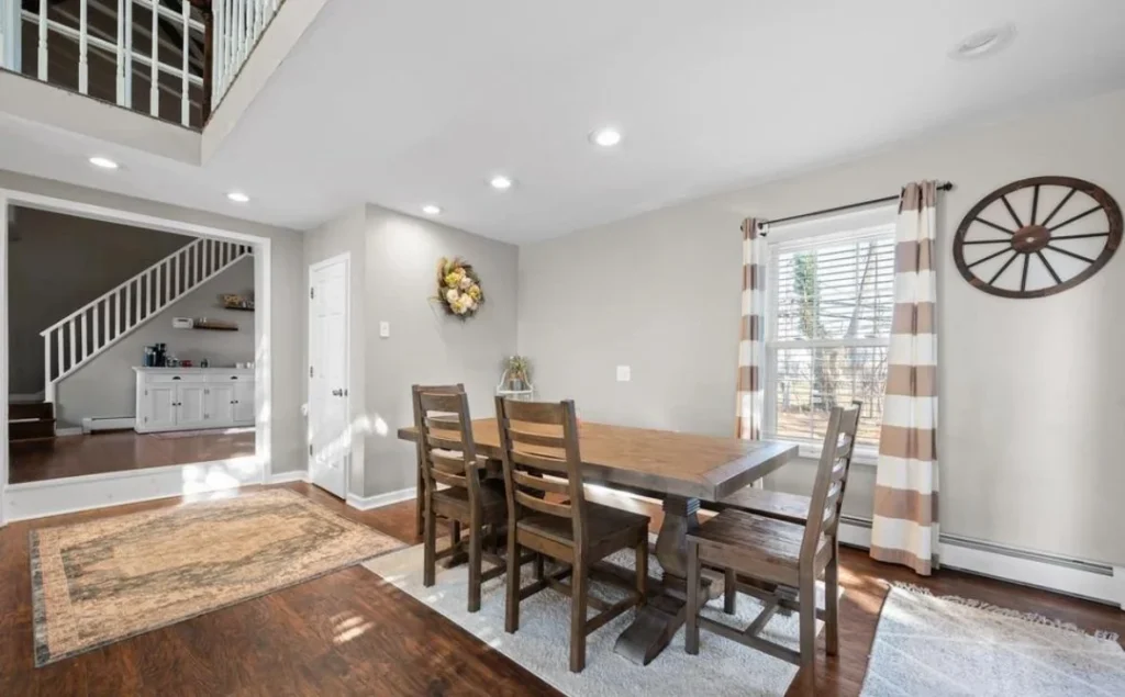
ThiThis one surprised me. It sits apart from the industrial aesthetic that dominates most of these spaces, and honestly it works better for that contrast.
Why Texture Matters More Than Color Here
u/HomeDecorating shows how a farmhouse-inspired dining zone can anchor an open apartment living area without feeling out of place. A dark walnut trestle-style dining table surrounded by matching ladder-back chairs sits on a plush cream area rug over rich dark hardwood floors.
A rustic wagon wheel mounted on the wall beside the window doubles as art and texture simultaneously. Striped curtains in cream and warm tan frame a bright window while keeping a relaxed drape.
The neutral grey walls give this space enormous flexibility. Everything belongs to the same warm, earthy family of browns, creams, and tans. It should feel monotonous, but it feels incredibly calm instead.
The trick is layering textures rather than colors:
- Rough-hewn wood grain on the table
- Woven fabric on the chair seats
- Plush rug underfoot
- The organic shape of a wreath on the wall
Staying within one color family while varying textures is seriously underused in apartment decorating. The recessed lighting keeps the ceiling clean and modern, which balances the rustic furniture so nothing tips into “themed restaurant” territory.
Concrete Floors and Raw Ceilings: Leaning Into Industrial Architecture
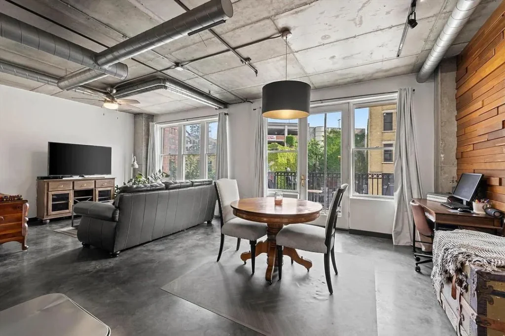
Some apartments practically decorate themselves if you just stop fighting the bones. This space understands that completely.
Why a Round Table Wins in Industrial Spaces
u/Elegant_Argument_605 shows a loft where exposed concrete floors, open ductwork, and raw concrete ceilings set the entire tone. The furniture follows that lead instead of arguing with it.
A substantial dark leather sectional anchors the seating area. A round antique pedestal dining table with upholstered chairs sits under a large drum pendant in charcoal and gold. A warm wood accent wall on the right introduces the only real warmth in an otherwise cool-toned room, and it earns every bit of attention it gets.
The round dining table is both a practical and visual win. It avoids the rigid geometry of rectangular tables and softens all those industrial hard edges.
If you live in a space with exposed mechanical systems like ductwork, pipes, or conduit, the instinct to hide them is understandable. But here are your actual options:
- Paint the ceiling dark or charcoal to visually absorb the mechanical clutter
- Just embrace it as texture and let it read as character
This room leaves everything exposed and looks fantastic. The key is keeping floor-level furniture clean and relatively simple so the ceiling drama has something to contrast against.
Fairy Lights on a Staircase Rail: Big Warmth on a Tiny Budget
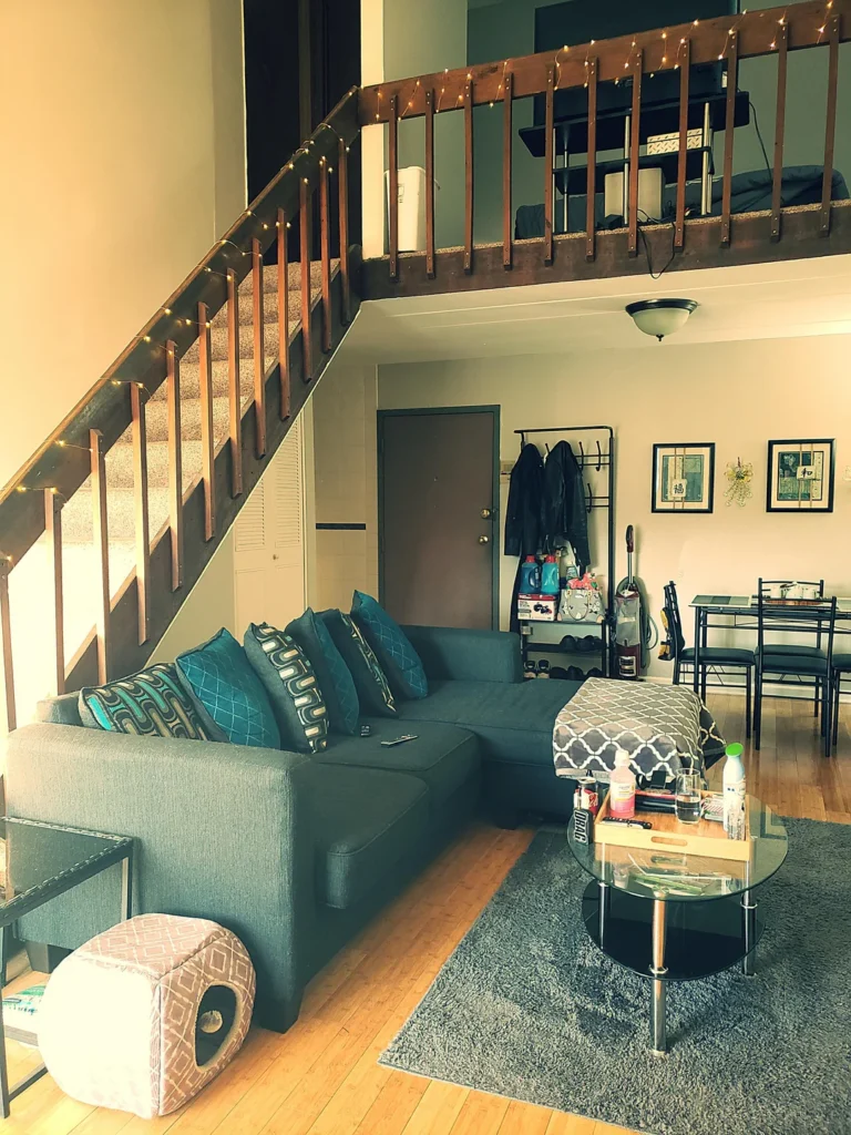
Budget decorating in a loft space usually means working with the structural elements you can’t change. This living room turns that constraint into genuine charm.
Small Moves With the Biggest Impact
u/Liberatorofsouls has a space that’s still very much a work in progress. There are cleaning supplies visible near the door and the styling is clearly practical over polished. But one decision elevates the entire room: a string of warm fairy lights wrapped along the wooden staircase railing leading to the mezzanine above.
It costs almost nothing. It takes twenty minutes to install. It completely transforms the warmth of the space after dark. Honestly, if you do nothing else this weekend, try this.
The grey sectional gets layered with teal, navy, and geometric-patterned throw pillows, which breathes life into an otherwise neutral base. A round glass-topped coffee table keeps the floor feeling open beneath it.
What matters is identifying which small, low-cost moves create the biggest warmth return.
Highest-yield budget moves for loft living rooms:
- Fairy lights on wooden railings (seriously, just do it)
- A shaggy grey area rug to define your seating zone and add texture
- Layered throw pillows in two or three coordinating colors
- One piece of meaningful wall art that actually reflects your personality
Also Read: 10 First Apartment Tours: Real Renters, Real Budgets, Total Style
Open-Tread Wood Staircase as the Room’s Focal Point
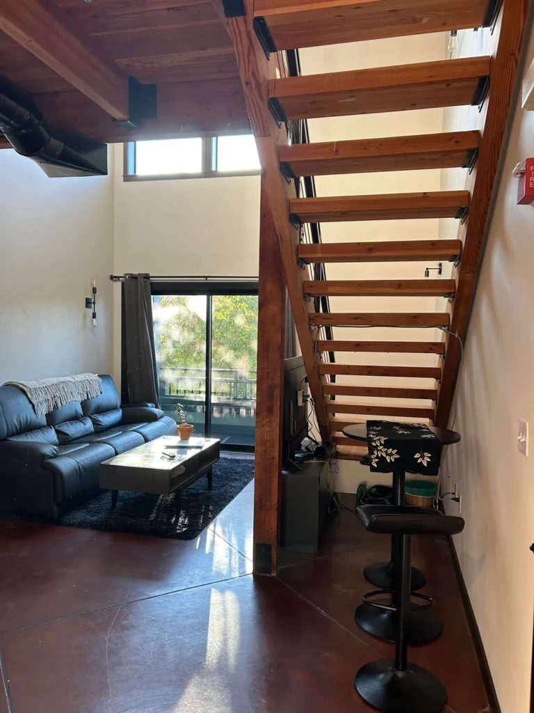
What do you do when a staircase basically takes over your living room? You stop fighting it and make it the main character.
Match Your Furniture to the Architecture, Not Against It
u/Aggressive_Action lives with a striking open-tread staircase built from warm reddish-brown timber that rises through the center of the space and visually connects two levels. Instead of trying to minimize it, the approach lets it be the room’s primary structural statement. Smart move.
A black leather sofa with a fringe throw sits against the opposite wall, paired with a simple glass-topped coffee table. A small terracotta pot plant sits at the base of the stairs. Bar stools tucked under a counter beside the staircase show how under-stair space gets used practically.
The polished concrete flooring in a deep chocolate tone picks up the wood color of the staircase and creates cohesive warmth across the entire ground plane. That’s intentional material storytelling, and it works effortlessly.
When a structural element this prominent sits center-frame in your space, fighting it costs more effort than celebrating it. Match your furniture to at least one element of the staircase material rather than contrasting against everything.
Exposed Brick and Timber Joists: The Raw Urban Living Room
There’s a version of a “before” photo that already looks better than most finished rooms. This is exactly that.
Mid-Century Furniture and Raw Brick Are Best Friends
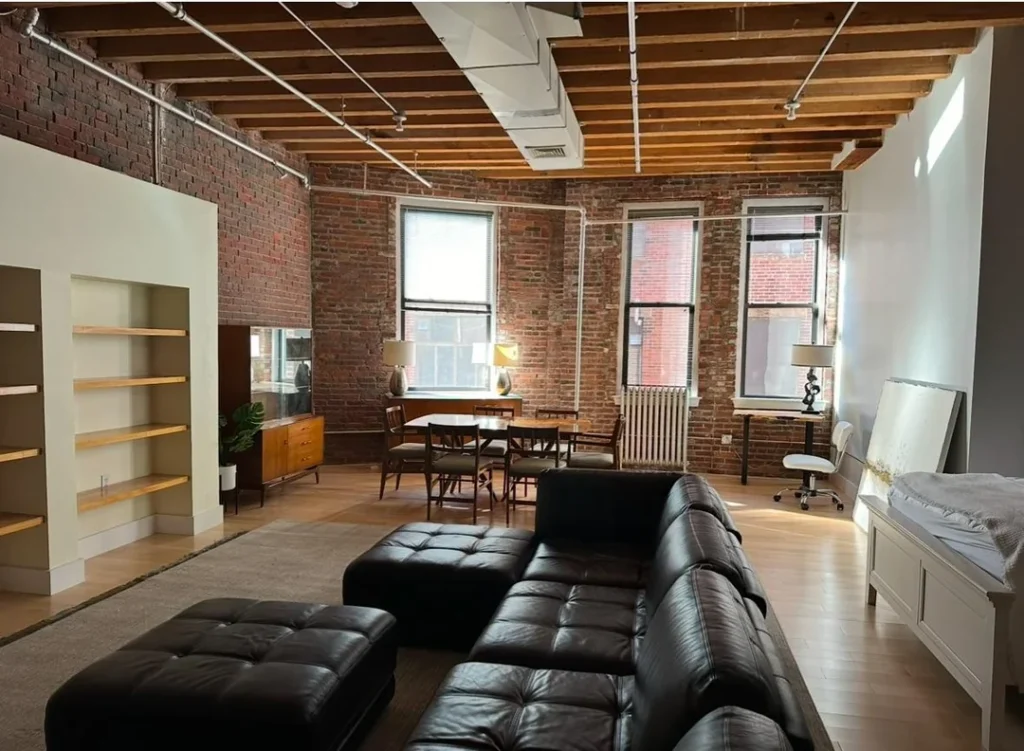
u/Perpetualshopper shares a space that appears to be mid-setup. The built-in shelves sit empty, a canvas leans against the wall, and the room hasn’t been fully furnished yet. But the bones here? Extraordinary.
Three rows of exposed double-hung windows flood the room with natural light. Red brick wraps the perimeter at full height. Timber ceiling joists hang completely open above. A large black tufted leather sectional with a matching ottoman sits in the foreground while a mid-century walnut credenza and dining set occupy the middle ground beautifully.
The walnut tones of the credenza and dining chairs warm the brick rather than competing with it. That’s the whole lesson in one furniture choice.
If you’re moving into a raw loft and feeling overwhelmed about where to start, this image gives you a clear roadmap:
- Start with your seating. It’s the biggest decision and gets the scale right immediately.
- Add a dining arrangement that suits the room’s proportions.
- Let the architecture carry the rest while you figure out the finer details.
FYI, built-in shelving like the alcove on the left wall? Worth leaving unfilled rather than rushed. Empty shelves are patient. Cluttered shelves are not.
Minimal Grey and Green in a Raw Coffered Ceiling Loft
Here’s proof that you don’t need a lot of stuff if what you have gets placed with real intention.
That Blank Wall Isn’t a Mistake. It’s Restraint.
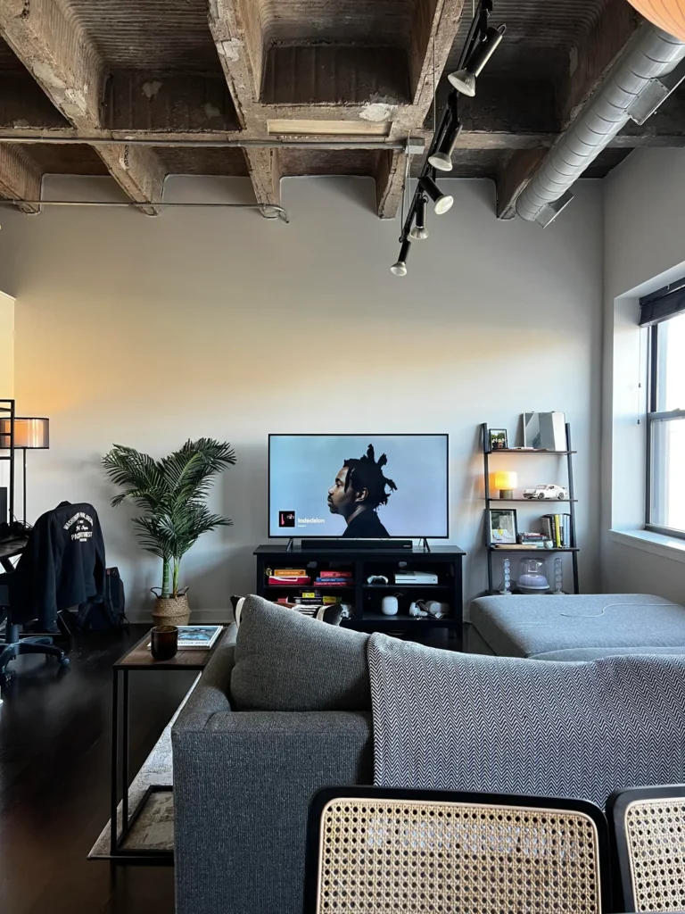
u/Cmac2011 shows a loft where the ceiling is genuinely extraordinary. A coffered concrete grid with visible aggregate texture and industrial track lighting running through it. Rather than matching the ceiling’s visual weight with heavy furniture, the approach goes deliberately understated.
A grey textured sectional faces a flat-screen TV on a simple black media console, flanked by a potted areca palm. A leaning ladder shelf holds books, a small lamp, and a few carefully chosen objects.
The negative space on the main wall behind the television is the most interesting choice in the whole room. Nothing hangs there. That blank wall beneath such a visually rich ceiling isn’t an oversight. It’s restraint doing exactly what it should. Your eye travels straight up to the ceiling texture and track lighting instead of getting distracted.
And that potted palm? It’s carrying way more weight than you’d think. In loft living room arrangements, a large statement plant next to a media console breaks up the rectangular geometry of screens and stands while introducing organic height.
A six-foot areca or fiddle leaf fig in a woven basket does the same work as a piece of art but adds dimension instead of flatness. If you’re looking for one easy upgrade, an oversized plant is genuinely hard to beat.
Also Read: The Ultimate Studio Apartment Guide for Men: 10 Pro-Level Setups
Warm Brick, Grey Sofas, and Green Accents at Dusk
The last room in this collection might be the most immediately livable of all ten. And honestly, the timing of the photograph plays a huge part in why.
Why Sage Green Is the MVP Accent Color
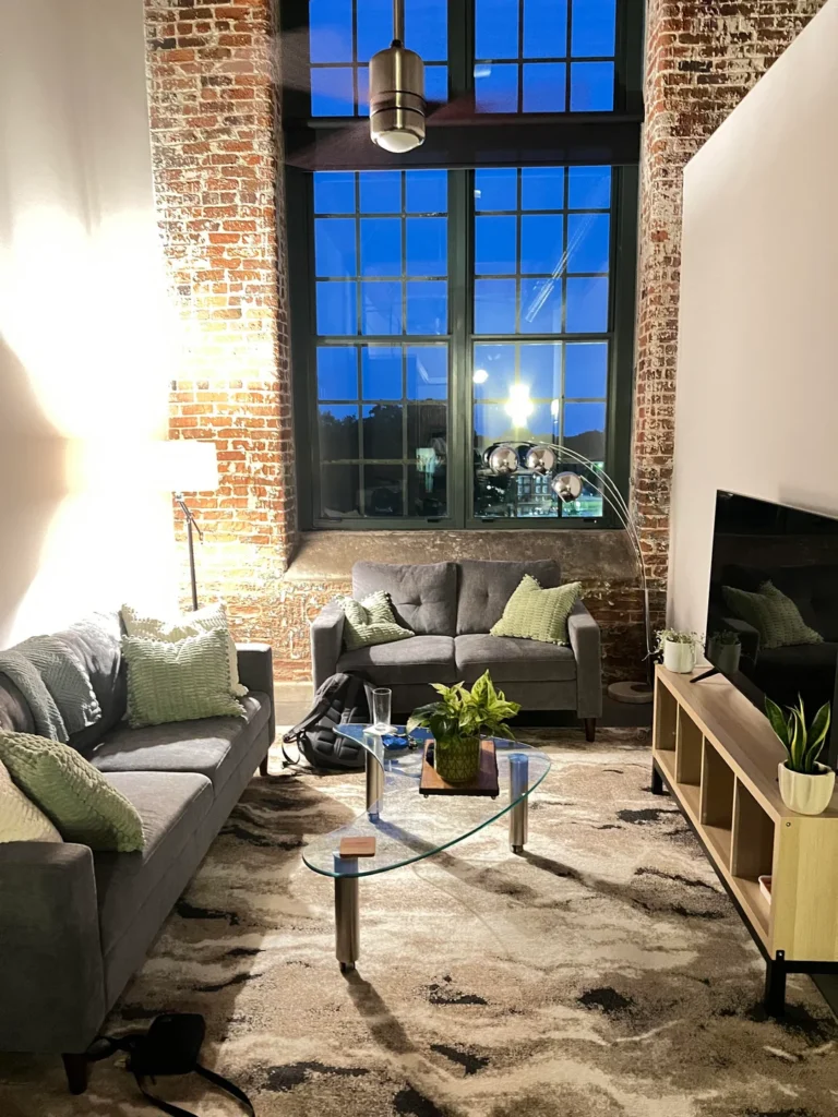
u/SnappedPee captured this space at dusk, when interior lighting overtakes the fading blue evening sky through tall grid windows flanked by exposed brick columns. Two grey loveseats face each other across a glass oval coffee table, both dressed with sage green textured throw pillows. A light wood media console holds the television and small potted plants. An arc floor lamp with a chrome spherical head provides task lighting over the seating area.
The sage green accent color does significant work here. Against warm red brick and cool grey upholstery, green sits at a precise midpoint that flatters both. It shows up in the pillows, the plants, and the potted arrangement on the coffee table. The repetition makes it feel like a deliberate design decision, not a happy accident.
But this photo also teaches something practical: your living room lighting after dark is a completely separate design problem from the daytime version.
If your apartment looks great in sunlight but falls flat at night, address your lamp placement before buying anything else. This room combines a well-placed arc lamp with a warm ceiling fixture, creating at least three distinct light sources. That’s the minimum for a living room that feels layered and inviting instead of either harshly lit or weirdly dim.
Quick Reference: Loft Living Room Approaches Compared
| Decorating Approach | Best For | Difficulty |
|---|---|---|
| Dark moody with pendant lighting | High ceilings, brick walls | Medium |
| Eclectic mix with bold area rug | Rented spaces, personal style | Easy |
| Double-height with low furniture | Converted industrial lofts | Medium |
| Farmhouse warmth, neutral palette | Open-plan condos | Easy |
| Industrial raw with leather seating | Concrete-floor lofts | Easy |
| Fairy lights and layered pillows | Budget-conscious renters | Easy |
| Staircase as focal point | Split-level lofts | Easy |
| Mid-century in exposed brick | Pre-war or historic buildings | Medium |
| Minimal with statement ceiling | High-end industrial lofts | Medium |
| Brick plus grey plus green accents | Any loft with natural brick | Easy |
What All Ten Rooms Are Really Telling You
Ten different lofts. Ten different approaches. But a few clear threads run through every single one.
Architectural honesty comes first. The rooms that work best never hide their bones. Exposed brick, open ductwork, raw concrete, timber staircases. Every standout example here treats these features as assets rather than problems to solve.
Scale is the other non-negotiable. In every successful room, the furniture suits the space instead of fighting it. Double-height ceilings get low furniture and a single hanging fixture. Compact lofts get pieces that serve multiple functions without crowding. Getting scale right before anything else is the single highest-leverage decision you can make in loft apartment decorating.
Start with what you can’t change. The ceiling height. The floors. The windows. The architectural details. Build toward them rather than against them. Every room here that reads as confident does exactly that, whether the budget was minimal or generous.
And one last thing worth taking from these spaces: living rooms are allowed to be in progress. Several of these are clearly mid-journey. Empty shelves, visible cleaning supplies, a canvas leaning against a wall. None of that makes the room worse. It makes it honest.
Decorate for the life you’re actually living right now, not the one you keep planning to start eventually. Your apartment will thank you for it. Now go look at your living room with fresh eyes. I bet there’s at least one idea here you can try this weekend. 🙌h eyes. I bet there’s at least one idea here you can try this weekend.