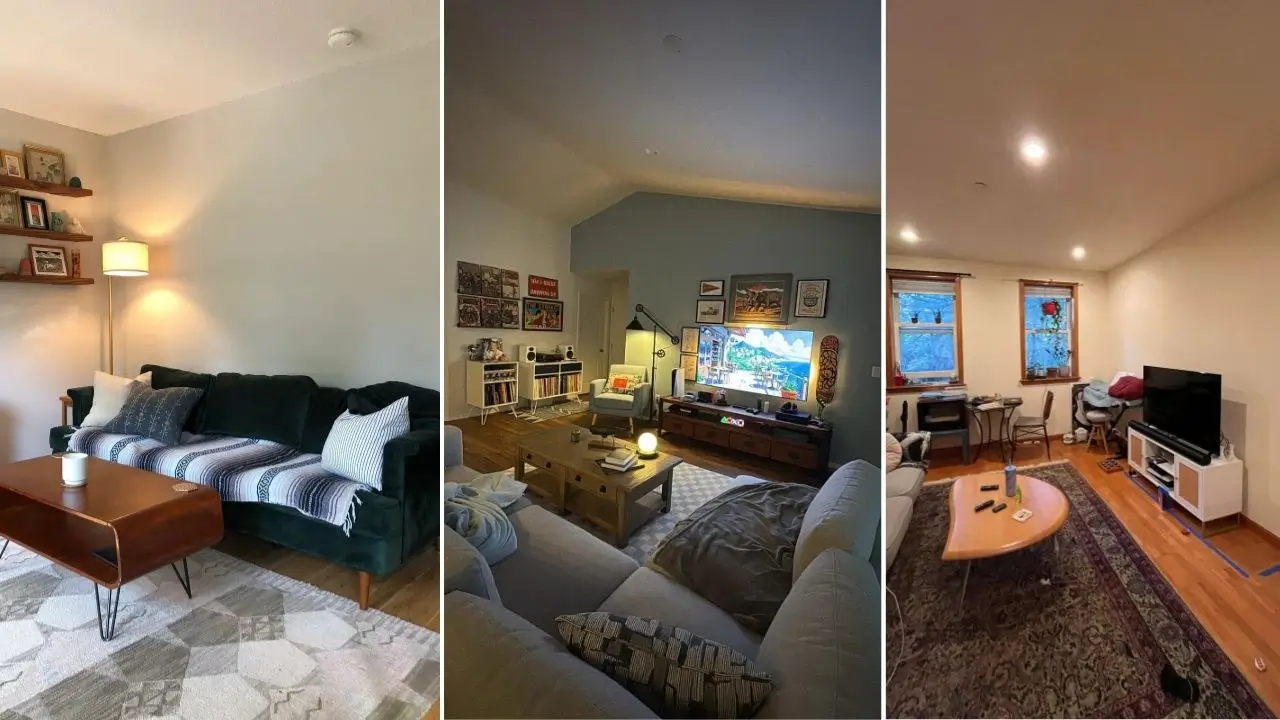
Your living room is basically running a three-shift operation. It’s the first thing guests judge, the place you collapse into after a long day, and the room you’ve been saying you’ll “fix up eventually” for approximately two years now. No judgment. We’ve all been there.
I went digging through real apartment living rooms shared by actual people online. Not Pinterest fantasies. Not sponsored influencer sets. Just regular folks who figured out how to make their spaces look genuinely good without hiring anyone or spending a fortune. What I found were ten rooms that each teach a lesson worth borrowing.
Let’s get into it.
Warm Wood Tones and Statement Art: Rich, Layered Warmth That Hits Immediately
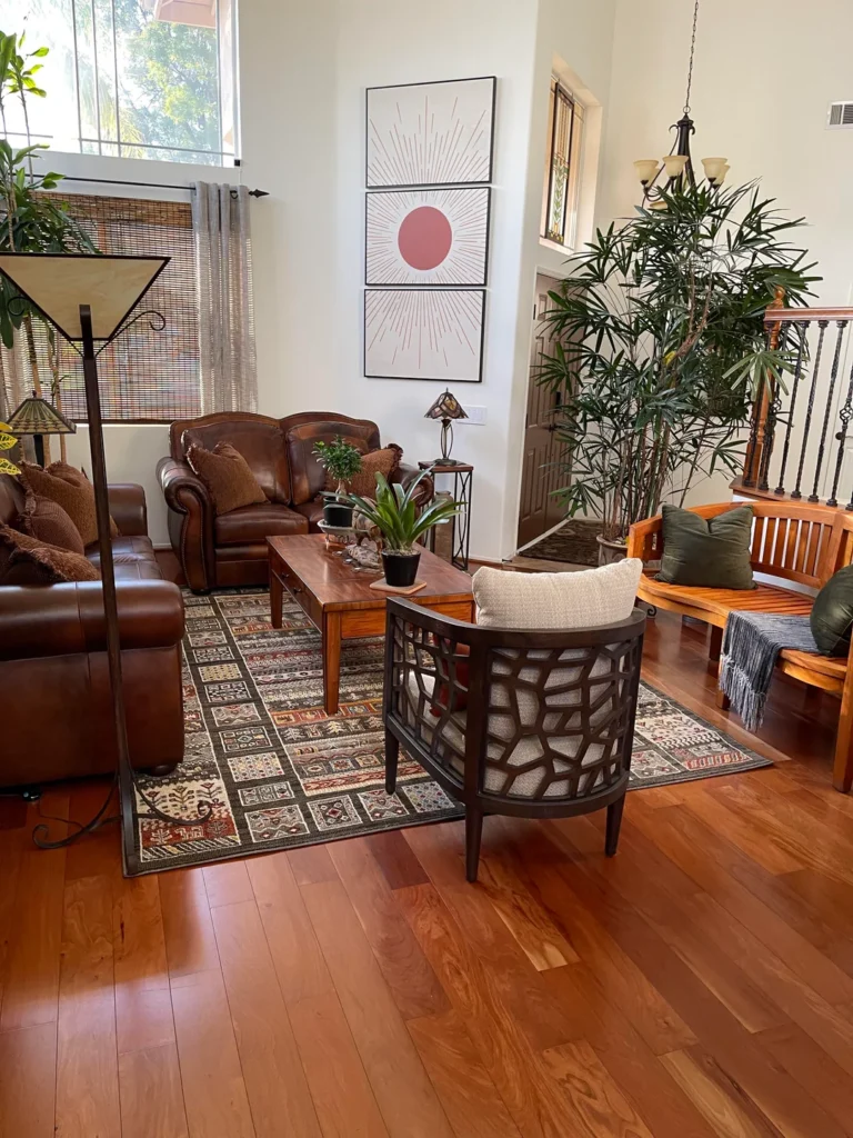
The unexpected star of the room? A bold three-panel sun artwork in muted terracotta and cream Some rooms just feel like a hug the moment you see them. This one absolutely delivers that.
The whole space leans into warm, earthy tones without tipping into “cozy mountain lodge” territory. Rich cherry hardwood floors anchor everything. A pair of deep cognac leather sofas bring that worn-in, tufted, nailhead-trimmed character that lighter furniture simply can’t replicate. These are sofas that look like they’ve actually been sat in. They’ve earned their patina.
The unexpected star of the room? A bold three-panel sun artwork in muted terracotta and cream hanging above a delicate Tiffany-style accent lamp. That pairing sounds chaotic on paper. In practice, it gives your eye somewhere interesting to land.
The plants here also deserve credit. A large indoor palm in the corner, a pothos on the side table, and a small succulent on the coffee table create greenery at three different heights. That vertical layering keeps the room feeling alive without turning it into a jungle.
A few details worth stealing:
- A patterned area rug in earthy reds, tans, and deep greens defines the seating zone and adds pattern interest that keeps things visually dynamic
- Woven bamboo blinds filter afternoon sun into warm amber tones, and you can grab these for under $100 per window
- The entire furniture palette sticks to one material family (leather), which creates automatic cohesion without any extra effort
How to borrow this look: Start with a warm-toned rug. Build upward from there. Pick one material family for your seating, add plants at three different heights, and let one piece of statement art carry the wall. That’s genuinely the whole formula.
Maximalist Curiosity Cabinet: When “Too Much Stuff” Actually Works
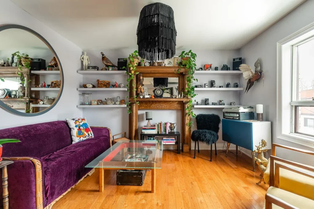
The standard advice for small apartment living rooms is to go minimal. Fewer things. Cleaner lines. More breathing room. This room apparently never heard that advice. Honestly? Thank goodness.
This space looks like a living curiosity cabinet, and I mean that as a genuine compliment. Full-wall floating shelves run at two heights across the entire back wall, packed with vintage cameras, taxidermy birds, ceramic figures, clocks, trailing pothos, and what looks like a fully functioning turntable setup. A carved wooden fireplace mantle sits in the center of the wall, draped with vines. Pretty sure it’s decorative. Doesn’t matter. It looks incredible.
So why doesn’t this feel like a hoarder situation? Intentional grouping. Each shelf section follows its own visual logic. Cameras cluster together. Clocks arrange by size. Figurines face inward. Your brain reads order even when the quantity is screaming chaos.
Other smart moves happening here:
- A purple velvet sofa introduces a bold jewel tone that commands attention without fighting the shelf display
- A black fringe chandelier pulls the vertical composition all the way up to the ceiling
- A glass-top coffee table on a trunk base reduces visual weight, which matters a lot when every wall surface is busy
Could most people pull this off? Probably not without some practice. But the lesson is gold: themed collecting creates cohesion. If your stuff tells a consistent story, quantity stops being the problem you think it is.
Boho-Casual With a Bookworm’s Soul: The New Haven Approach
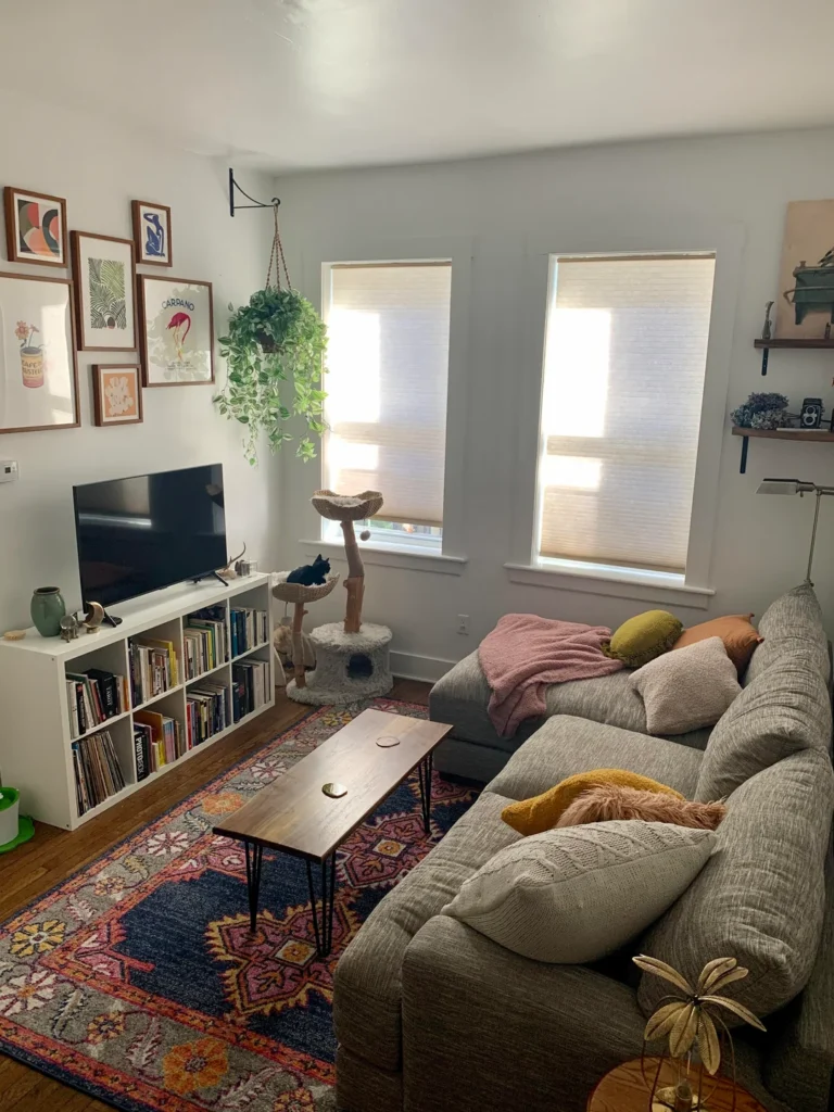
What happens when someone who genuinely loves books, art, and plants treats their living room like a personal sanctuary instead of a showroom? You get a room where you could burn an entire Saturday without guilt, and feel completely fine about it.
A large L-shaped gray sectional dominates the seating zone, draped in a dusty pink throw and layered with mustard yellow, blush, and rust-toned pillows. Underneath, a vibrant jewel-toned rug in navy, coral, and gold pulls those accent colors together and basically transforms the whole space from “generic apartment” to “this person has actual taste.”
The gallery wall deserves special attention. Five or six frames in mixed warm wood tones display botanical illustrations, a flamingo Campari ad, and a Matisse-inspired figure drawing, all hung at slightly different heights and scales. The frames read as a cohesive set while the art itself creates variety. That’s a gallery wall done right, which is rarer than you’d think.
More details that make this space work:
- A walnut hairpin-leg coffee table adds clean mid-century lines without visual clutter
- A white IKEA Kallax unit moonlights as a media console stuffed with books and vinyl records
- A hanging pothos from a ceiling hook on a wall-mounted swing arm bracket adds greenery without eating floor or surface space
- A cat tree tucked naturally into the composition proves you can integrate pet furniture without it looking like an afterthought
The fastest transformation hack from this room: A colorful statement rug paired with warm-toned frames and layered textiles can turn any neutral apartment living room into something that actually feels like yours. Full stop.
Also Read: Stop Decorating for Mood Boards: 10 Lived-In Lofts With Genius Ideas
The Gaming Lounge Done Right: Moody, Personal, and Zero Dorm Energy
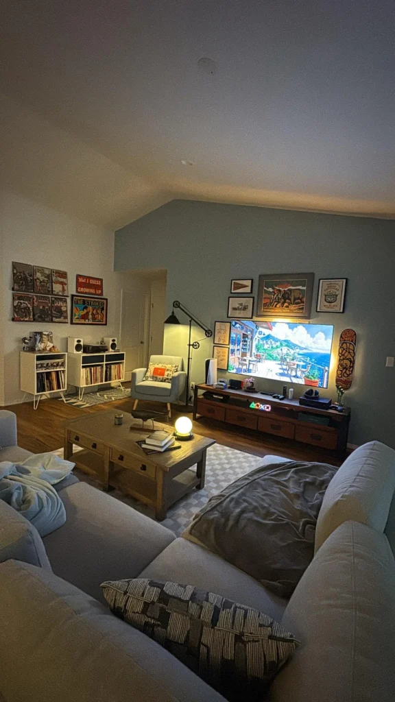
This room proves that building your living space around entertainment doesn’t have to scream “I just graduated and bought a beanbag chair.”
Concert posters, a vinyl record setup, vintage wildlife art, a skateboard mounted on the wall, PlayStation RGB lighting. Every item screams personality. But the execution reads as intentional because of one crucial decision: a sage green accent wall behind the media setup. That muted blue-green grounds the television area and separates it visually from the rest of the room. No room divider needed. Just paint.
The lighting design is where this room really levels up. Instead of relying on harsh overhead lights (which, FYI, are the fastest way to make any room feel like a dentist’s office), this space runs on layered warm accent sources:
- A globe table lamp glowing on the coffee table
- An industrial swing-arm floor lamp for directional reading light
- The soft halo from the TV itself
The result? A room that photographs warmly and feels even better when you’re actually sitting in it.
The real lesson here: Paint an accent wall behind your TV for instant visual depth. Layer your lighting sources. Let your actual interests drive the decor instead of trying to recreate a style you spotted in a magazine you don’t even read.
The Family-Friendly Apartment: Two Zones, One Room, Zero Meltdowns
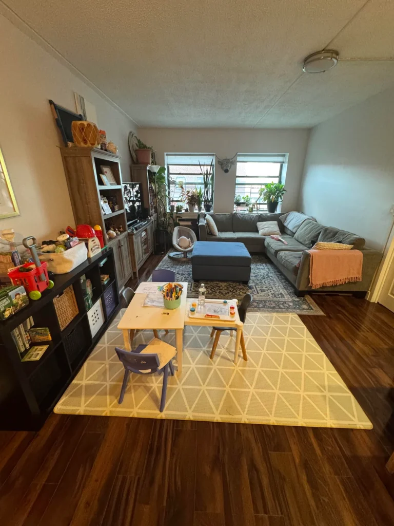
Most apartment decorating guides pretend kids don’t exist. This room acknowledges reality head-on, and the result is surprisingly put-together.
The secret weapon is zoning with rugs and furniture placement. The back half of the room functions as a traditional adult seating area with a gray sectional, blue storage ottoman, Persian-style rug, windowsill plants, and a media tower. The front half becomes a kids’ art and play zone anchored by a cream geometric rug and a natural wood toddler table with small chairs.
This works because both zones feel intentional rather than like someone lost a negotiation with a toddler.
Smart details parents should notice:
- Each rug signals clearly where one zone ends and another begins
- A dark Expedit-style shelving unit along the left wall serves double duty, with lower cubbies accessible to kids and upper surfaces styled for adults
- The cream rug in the play zone reads cleanly, shows dirt uniformly (easy to monitor), and doesn’t clash with colorful toys
- The adult seating area stays deliberately simple, creating visual balance when the other half of the room inevitably accumulates kid chaos
For apartment-dwelling parents: Define your zones before you buy a single piece of furniture. Use rugs to physically mark those boundaries. Your living room will feel twice as organized almost overnight.
The Downtown Toronto View-Forward Apartment: Let the Window Win
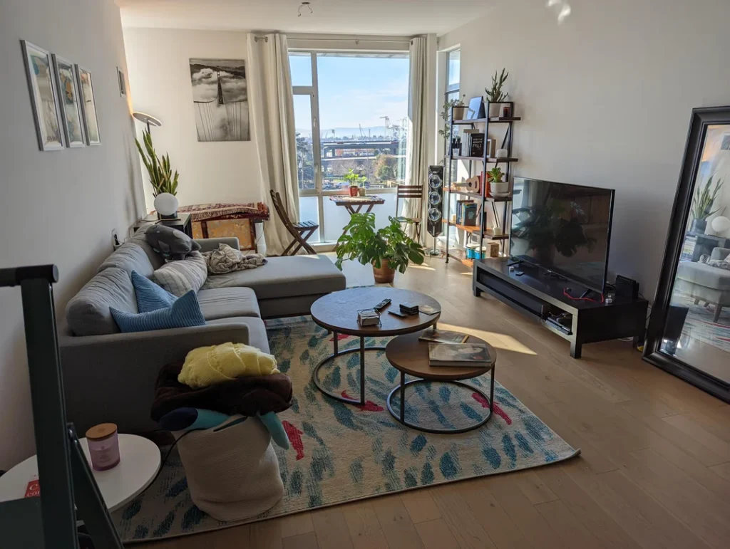
When you have a killer view, the decorating rule is dead simple: don’t compete with it. This room follows that rule perfectly.
A corner apartment with floor-to-ceiling windows gets furnished with a deliberately light touch. The gray L-shaped sectional faces both the TV and the window simultaneously. That’s a layout decision that respects the view while keeping Netflix fully accessible. Smart thinking.
A round and half-round nesting coffee table in dark walnut sits on a teal and cream abstract area rug, adding pattern interest at floor level without pulling attention away from the windows. Everything stays low-contrast so the natural light does most of the heavy lifting.
Other moves worth borrowing:
- A ladder-style shelving unit on the right wall holds books, small plants, a vintage camera, and decorative objects without requiring a single nail hole (perfect for renters)
- A black-and-white architectural photograph on the shorter wall adds visual weight without introducing color that might fight the bright daylight
- A large monstera in a terracotta pot sits between the sofa and the window. Obvious choice? Sure. But obvious works when the plant is thriving and the light is this good.
The principle: In a bright apartment, keep your color palette low-contrast and let natural light become the room’s warmth. Save your visual complexity for specific moments: one strong art piece, one textured rug, one statement plant. That’s plenty.
Also Read: The Ultimate Studio Apartment Guide for Men: 10 Pro-Level Setups
The Audiophile Apartment: Building a Room Around What You Hear
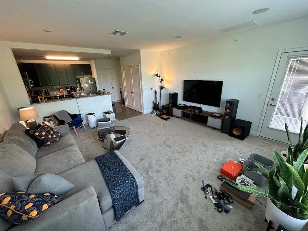
Not everyone decorates for Instagram. Some people build their living room around sound quality, and this room is refreshingly honest about that priority. IMO, there’s something genuinely cool about that.
Large floor-standing speakers flank a dark walnut media console. A guitar leans against the wall with the casual energy of something that gets played daily, not displayed. The speaker setup is substantial but high ceilings and an open-plan kitchen layout give the system room to breathe without feeling crowded.
The color palette stays deliberately quiet, which is probably the right call when your speakers are already making a visual statement. Greige carpet, cream walls, light gray sofa, charcoal throw. The walnut tones of the media console anchor the composition. Navy and gold leaf-print accent pillows provide the only color moment, and it’s a well-chosen one.
A couple of smart technical choices:
- A glass-top triangular coffee table keeps visual weight low in a room where speaker towers could easily feel overwhelming. Choosing transparent surfaces when you have large equipment is a trick designers use constantly.
- A snake plant in the corner and a small potted plant on the console add just enough greenery to signal “someone lives here and cares” without distracting from the room’s actual purpose.
The takeaway is bigger than audio: Organize your apartment living room around your actual primary activity. Rooms with a clear purpose always feel more finished than rooms trying to do everything at once.
The Car Enthusiast’s Small Apartment: Personality Without Apology
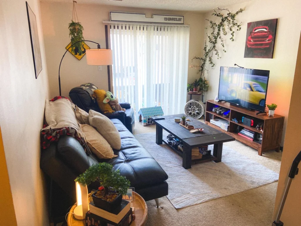
Small apartment living rooms often suffer from the same disease: they look like the person decorating them was terrified to have an opinion. This room has zero symptoms of that condition.
A bold red automotive canvas print hangs on the right wall. A Chevrolet badge mounts above the sliding glass door like a coat of arms. Trailing vines climb the wall around the TV corner, weaving between the badge and the canvas in a way that makes the whole right side of the room feel designed rather than just decorated.
The black leather sectional is scaled perfectly for the space. Low-profile enough to avoid overwhelming the room, substantial enough to actually seat people comfortably. A chunky dark-stained wood coffee table with an open storage shelf underneath sits on a cream shag rug. Practical and good-looking.
One detail worth noting: the bonsai tree on the side table near the entry. It’s small, requires real care and attention, and sits at eye level with perfect posture. Plants that require intentional tending communicate something different about a space than a cactus just barely surviving in the corner. That distinction matters more than people realize.
For enthusiasts of anything: Find one or two ways to bring your passion into the room with visual integrity. A quality print, a meaningful object, a material that connects to what you love. You want personality in your space, not a themed restaurant.
The Blueprint Stage: Tape on the Floor and a Great Instinct
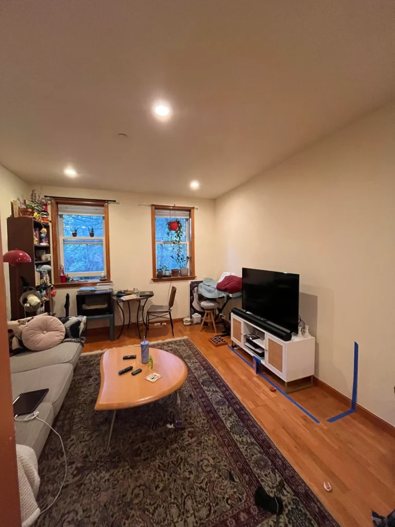
I included this room specifically because it shows something most decorating content completely ignores: the planning phase. And there’s real value in seeing it.
This living room is mid-renovation. Blue painter’s tape marks out where a second piece of furniture will eventually live. The existing setup is spare but thoughtful: a gray sectional facing the TV, a heart-shaped wooden coffee table on a Persian-style rug with burgundy and cream tones, and a compact bookshelf with plants and collectibles tucked beside the window.
The painter’s tape trick is genuinely one of the best free decorating tools available. Before you buy any new furniture, tape its footprint onto your floor and live with it for a few days. Walk around it. Sit near it. Check if the traffic flow still works and whether the scale feels right. It costs nothing and prevents expensive mistakes you’ll regret every time you stub your toe on an oversized coffee table.
A few other observations:
- Warm wood window frames add architectural warmth that keeps a fairly bare room from feeling cold. If you have features like this, complement them instead of covering them.
- The room clearly needs more wall interest and a defined TV corner, but the bones are solid.
- The instinct to plan before purchasing is exactly right.
The fundamental principle: Measure twice. Tape first. Buy second. A well-planned apartment living room will almost always beat an impulsively furnished one.
Also Read: Stop Overspending: 10 Genius Apartment Decorating Ideas for Tight Budgets
The Dark Green Velvet Moment: Small Space, Total Style Commitment
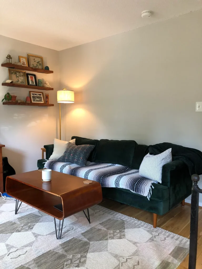
This final room is my personal favorite, and I don’t think that’s a controversial pick. It’s a small rental apartment living room that made one bold choice and nailed every single decision after it.
A forest green velvet sofa anchors the entire room. This is the kind of piece that will either define your space or destroy it depending on what you put around it. Here, every surrounding decision is correct. The sofa sits on a cream geometric rug that provides contrast without competing. A striped Baja blanket draped across the cushions adds earthy, southwestern texture that softens the velvet’s formality perfectly.
The floating walnut shelves on the left wall are installed at two heights with deliberate spacing. Each shelf holds a small curated collection: a framed art print, a small figurine, a tiny plant in a terracotta pot, a lantern. The objects vary in scale and material but share warm, natural tones that echo the walnut of the shelves. That’s restraint executed with real confidence.
A brass floor lamp between the shelves and the sofa casts warm ambient light that makes the green velvet absolutely glow. Warm light on deep jewel-toned fabric is one of those combinations that looks ten times better in real life than on any mood board. It rewards actually living with it.
The sage green wall paint (slightly cooler and more muted than the sofa) creates a monochromatic foundation that makes the whole room feel considered rather than thrown together. You don’t need many colors in a small space. You just need the right ones.
Quick Comparison: All Ten Apartment Living Room Styles at a Glance
| Style | Best For | Rental-Friendly | Difficulty |
|---|---|---|---|
| Warm earth tones with leather | Classic, long-term spaces | Moderately | Medium |
| Maximalist collected display | Enthusiastic collectors | Very | Advanced |
| Boho-casual with gallery wall | Creative renters | Very | Medium |
| Moody gaming and entertainment | Media-first households | Very | Medium |
| Dual-zone family room | Apartment-dwelling parents | Very | Easy |
| Light-forward minimal | Bright corner units with views | Very | Easy |
| Audiophile and equipment-forward | Music and tech enthusiasts | Very | Medium |
| Enthusiast personality room | Interest-driven decorators | Very | Easy |
| Planning stage with tape method | Anyone moving or renovating | N/A | Easy |
| Statement sofa with curated shelves | Small spaces with a clear style vision | Very | Medium |
So, Which Apartment Living Room Direction Is Right for You?
After looking at all ten of these real spaces, one pattern jumped out across every single room. The rooms that feel finished and livable are the ones where someone made a clear decision about what mattered most and built outward from there.
Not every room needs gallery walls, statement plants, or velvet sofas. But every room needs a point of view. A reason the furniture sits where it sits. A reason the rug is that color. A reason the art hangs where it hangs.
The rooms that feel frustrating to live in? They’re the ones where decisions kept getting postponed. The blank accent wall that was “going to get art eventually.” The sofa that landed in the center of the room because nobody thought about traffic flow. These are fixable problems, and most of them need planning more than they need money.
Here’s my suggestion: Pick one clear anchor. A rug, a sofa, a statement piece. Build every other decision outward from that single starting point. What you’ll notice, looking back at these ten real spaces, is that the best ones always reflect the person who actually lives there.
That’s not just a decorating principle. That’s what makes a place feel like home.
Now go grab some painter’s tape and get started. Seriously, what are you waiting for?