You know that feeling when an album just gets you? Like certain records didn’t just soundtrack your life, they basically wrote parts of it. So why are those albums sitting in a Spotify playlist while your walls stay tragically blank?
Here’s the thing: album cover wall decor is one of the most personal and affordable ways to transform a room. It tells people who you are the second they walk in. It sparks conversations. It makes your space feel lived-in and intentional, not like you just moved in six months ago and gave up on decorating.
But there’s definitely a right way and a very wrong way to do this. The difference between a thoughtfully curated music wall and a chaotic mess of covers taped up with blu-tack? Planning, intention, and a little inspiration.
We pulled together ten real ideas from people who actually pulled it off. Let’s get into it.
The Organised Grid: Clean, Curated, and Surprisingly Satisfying
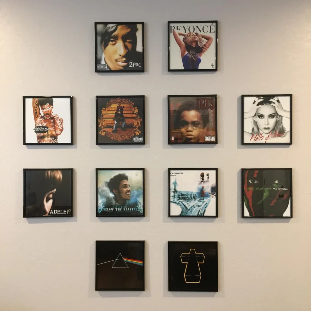
If you’re someone who color-codes your bookshelf, this one’s for you. A well-executed grid wall is deeply satisfying to look at, and the concept is simple: same frames, same size, same spacing, let the artwork do all the talking.
Reddit user r/SocialAssassin1990 pulled this off with a tight 3×4 grid of framed album prints in uniform black frames, all perfectly spaced across their bedroom wall. The selection spans 2Pac, Beyoncé, Radiohead, and Pink Floyd basically a personal music hall of fame.
The secret here is consistency:
- Same frame color and style across every print
- Same size prints so nothing looks out of place
- Measured, equal spacing between each frame
This works especially well in bedrooms and living rooms where you want something visually strong but calm. It looks intentional, not chaotic, and that’s the whole point.
The Artist Tribute Wall: Go Deep on One Act
Some artists aren’t just favorites. They’re everything. If that’s the case for you, give them their own wall. Not one framed print tucked in a corner but a proper, dedicated tribute.
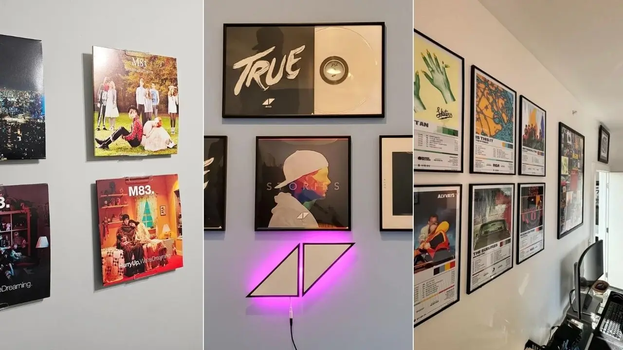
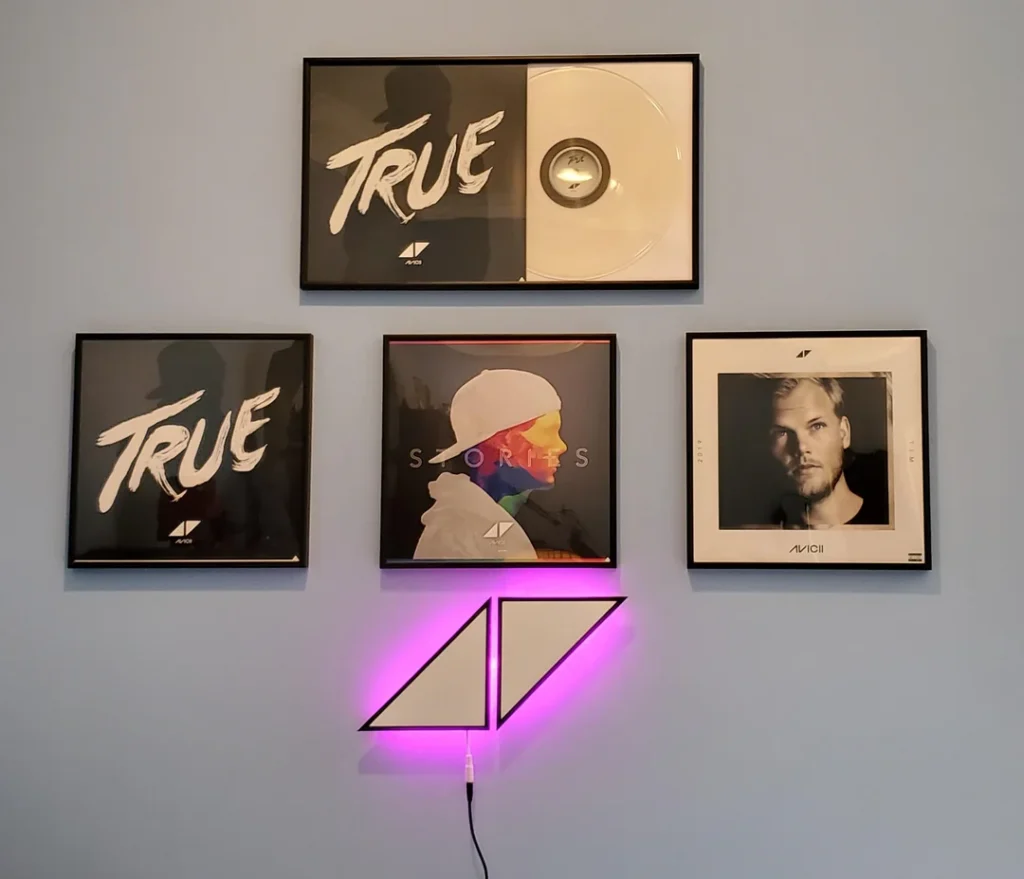
Reddit user r/Teck3r did exactly this with an Avicii-dedicated display that’s genuinely moving. Three framed album covers (True, Stories, and TIM) sit alongside a wider landscape frame featuring the True artwork paired with a physical white vinyl. Below everything, an illuminated neon version of Avicii’s iconic triangle logo glows pink against a grey wall.
The lighting is what takes this from “cool” to unforgettable. It adds warmth, atmosphere, and a sense that this wall actually means something. It’s a memorial and a celebration rolled into one.
If you’ve got one artist whose discography you’ve listened to front-to-back more times than you can count, this idea is worth serious consideration.
The Tracklist Poster Style: More Than Just a Cover
Some music lovers want the full experience on the wall, not just the album art. Custom tracklist posters combine the album artwork with a clean, stylish tracklist layout underneath, and they’ve exploded in popularity for a good reason.
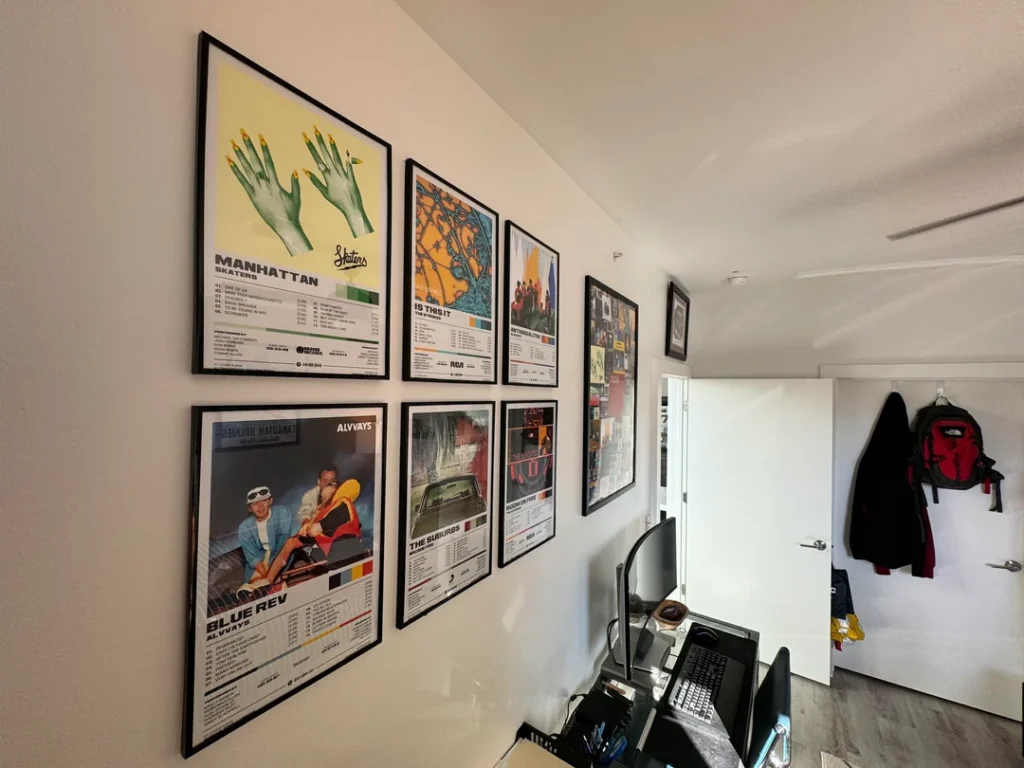
Reddit user r/professor-ligma90 showed off a home office wall lined with these prints, featuring albums like Alvvays’ Blue Rev, Arcade Fire’s The Suburbs, and The Strokes’ Is This It all in matching black frames along an angled wall beside a desk.
This style works brilliantly in a workspace because:
- It gives you something genuinely interesting to look at between tasks
- The posters feel more considered than raw album covers, so they read as proper art
- It adds a layer of depth beyond just hanging covers
You can find custom tracklist designs on Displate and various Etsy sellers for pretty much any album you can think of. IMO, this is one of the most underrated options on this list.
Also Read: 8 Bathroom Shower Tile Ideas (Real Examples That Actually Inspire)
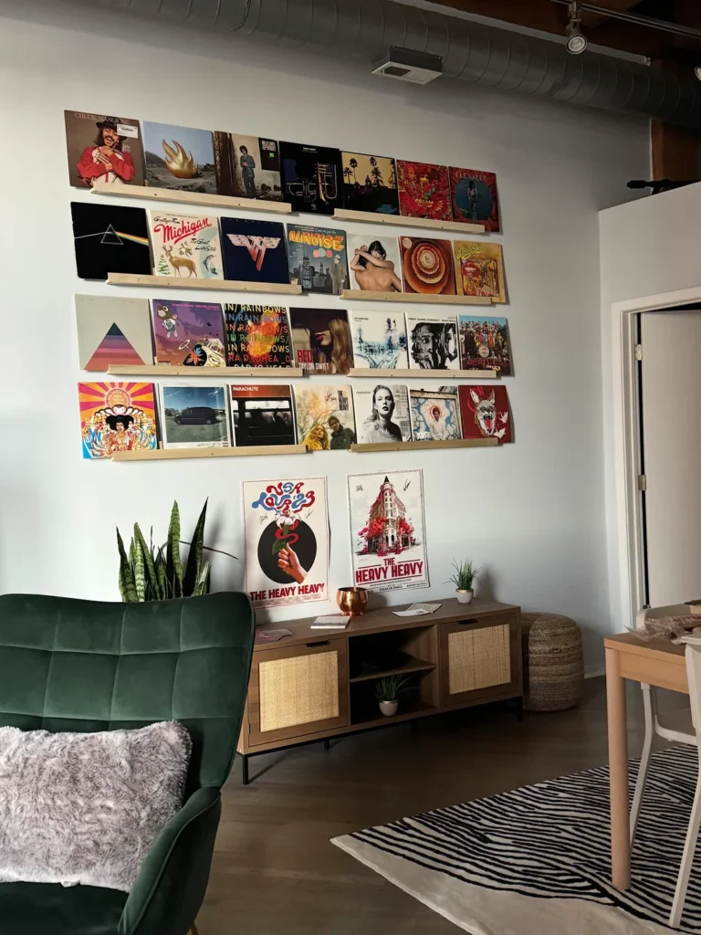
The Vinyl Shelf Display: Functional and Beautiful
What if your wall decor could also double as storage? Vinyl shelf displays do exactly that. Long horizontal ledges (usually wood) hold records upright with the covers facing outward, turning your collection into a rotating gallery you can switch up whenever the mood strikes.
Reddit user r/lowkeyf1sh nailed this in their living room. Four long wood shelves run across a white wall, each filled with records displayed face-out featuring classics like Dark Side of the Moon, In Rainbows, Rumours, and Van Halen. Below the shelves, two concert posters lean casually against a sideboard. A green velvet armchair and a snake plant pull the whole room together.
The beauty of this setup is that it’s alive. You can swap covers in and out whenever you want a change. And because vinyl is inherently physical and tactile, the display has a warmth that printed posters simply can’t match.
If you already own a collection, this might be the most natural way to show it off.
The Single-Artist Discography Wall: Show the Full Story
Similar to the tribute wall but with different energy, the discography display is about showing one artist’s complete evolution. Every album. Every era. Laid out so you can see the full arc of their work at a glance.
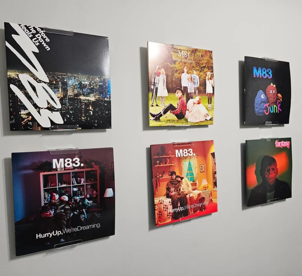
Reddit user r/commandercody414 did this beautifully with their M83 collection, mounting six real vinyl sleeves directly on the wall using clear acrylic ledge holders. The varying sizes (some double vinyl, some standard LP) create visual rhythm without feeling messy.
What makes this approach genuinely compelling is the storytelling element. You can trace how an artist’s sound evolved just by looking at the artwork in sequence. For anyone who’s been following an artist across multiple eras, there’s something quietly profound about seeing it all laid out like this.
It’s not just decoration. It’s documentation.
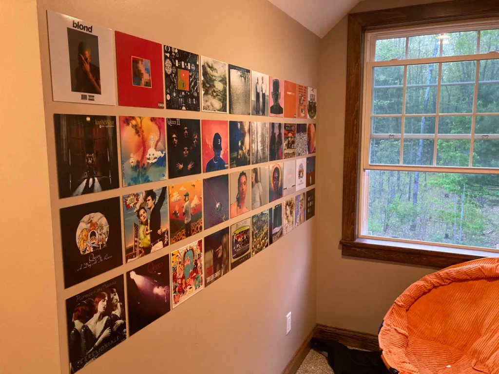
The Colour-Coordinated Gallery: When Taste Meets Aesthetics
Some people care less about grouping by artist and more about how the overall wall looks. Fair enough, honestly. Colour-coordinating your album covers so the palette flows across the wall turns your music taste into something that functions almost like abstract art.
Reddit user r/CrimsonBrit pulled this off in a slanted-ceiling bedroom with covers arranged in rough rows with a sense of colour blocking:
- Blonde by Frank Ocean anchors the top in soft beige and warm tan
- My Beautiful Dark Twisted Fantasy brings rich red tones
- Ceremonials by Florence and the Machine sweeps in with deep violet
The result is warm, layered, and genuinely gorgeous.
The key is not being too rigid about it. You don’t need a perfect gradient, just a general sense of visual harmony. Keep high-contrast covers separated, cluster similar tones together, and let the arrangement breathe a little.
Also Read: Subway Tile Bathroom 8 Ideas That Actually Work in Real Homes
The Mixed Media Approach: Frames, Vinyls, and More
Who said a gallery wall has to be just one thing? Mixing formats (framed prints, actual vinyl sleeves, physical records, posters) adds texture and dimension that a single-format wall simply can’t pull off.
Reddit user r/tanish047 demonstrated this with a multi-format display mixing square album frames in different sizes, a wider landscape print, and an actual vinyl disc incorporated into one of the frames. The result has visual variety without feeling random because the consistent black frames tie everything together while the different sizes keep the eye moving.
This approach suits people who can’t commit to one aesthetic, and honestly? That’s totally fine. Music doesn’t fit neatly into one format either. If you have a mix of physical vinyls, printed posters, and framed art prints, lean into that eclecticism. Just keep your frames consistent enough to hold it all together.
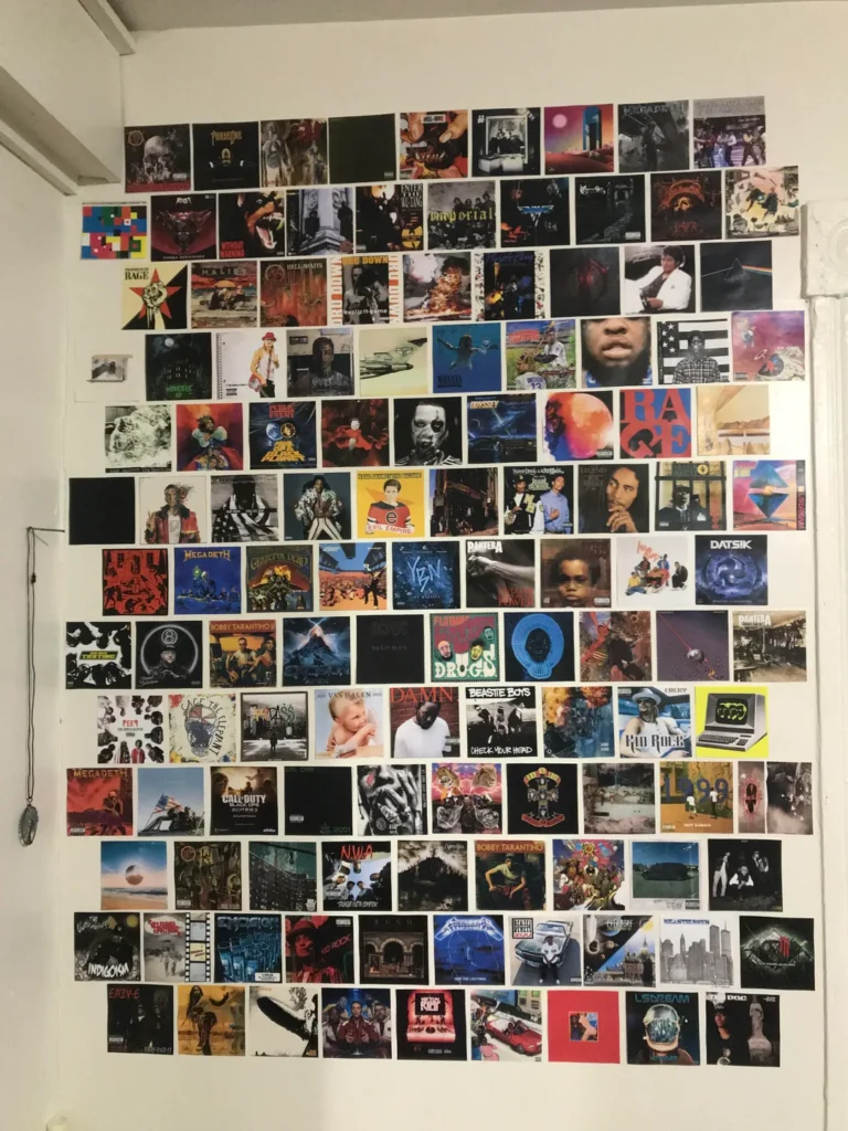
The Floor-to-Ceiling Print Mosaic: Go Big or Go Home
Sometimes you don’t want a curated gallery. You want a statement. A wall that makes people stop mid-conversation and spend ten minutes just scanning through everything on it.
Reddit user r/musashi_smh went all in with what can only be described as a monument to musical obsession: hundreds of small printed album covers covering a wall from near the ceiling down to the skirting board, arranged in tight horizontal rows that create a full mosaic of color and imagery.
Megadeth next to Nirvana. Wu-Tang two rows above Pantera. Beastie Boys somewhere in the middle. It’s overwhelming in the best possible way.
This isn’t for everyone, and that’s kind of the point. It requires real commitment in terms of printing and patience. But for someone who genuinely can’t pick favorites, it’s the most honest display of all. No hierarchy, no curation, just the raw breadth of a genuine music obsession laid out for the world to see.
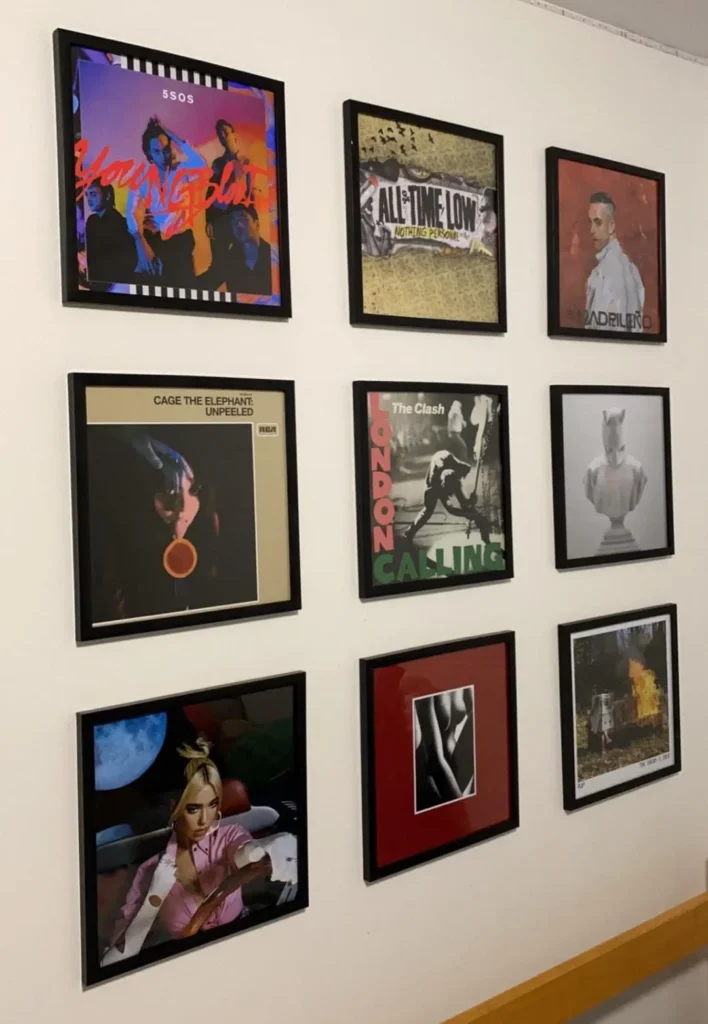
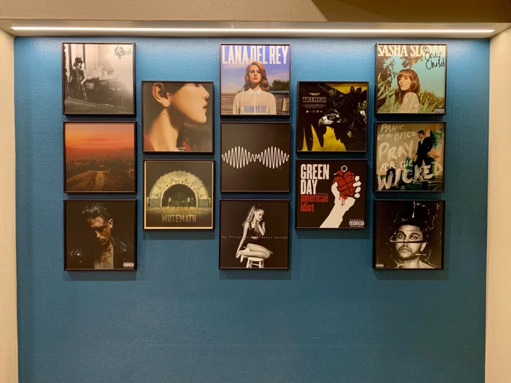
The Accent-Wall Feature: Bold Colour, Bolder Covers
Here’s an idea that most people overlook: the wall color itself can be part of the display. A deep, bold wall color transforms album covers from simple art prints into something bigger, they become part of a total room statement.
Reddit user r/IddyBiddyChuck showed this off with a teal and deep blue textured feature wall, onto which they mounted framed covers including Born to Die by Lana Del Rey, AM by Arctic Monkeys, Trench by Twenty One Pilots, and American Idiot by Green Day. The teal backdrop makes the artwork pop in a way that plain white walls simply never could.
If you’re thinking about repainting anyway, consider what color would actually complement your specific collection:
- Warm terracotta works beautifully with earthy, vintage album covers
- Near-black walls make colorful covers explode with contrast
- Deep jewel tones (like teal or forest green) make cooler-toned artwork sing
Don’t treat the wall as neutral territory. Make it part of the piece.
Also Read: 10 Modern Bathroom Floor Tile Designs You’ll Want Now
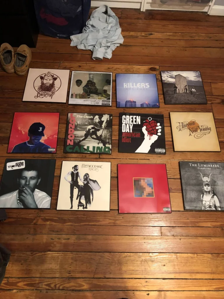
The Pre-Hang Flat Layout: Plan Before You Commit
This last idea is less about a finished look and more about a method that makes every other idea on this list easier to execute. Before you put a single nail in the wall, lay everything out on the floor first.
Reddit user r/twb85 shared a photo of exactly this process: twelve album canvas prints arranged in a 4×3 grid on a wooden floor, all laid out to assess spacing, color flow, and overall composition before anything went up on the wall.
It sounds obvious, but most people skip this step and regret it immediately. Here’s what to think about during your floor layout:
- Which albums feel right at eye level? Those should sit in the center.
- Do colors flow or clash? Adjust until it feels balanced.
- Does anything feel out of place? Swap it out before it’s on the wall.
The floor is a forgiving place to make mistakes. The wall really isn’t.
Final Thoughts: Your Wall, Your Story
Album cover wall decor works because it’s personal in a way that most home decoration just isn’t. A print from a homeware store is fine. An album that genuinely changed your life, framed and hung where you see it every day? That’s a whole different thing.
The best versions of these walls don’t happen by accident. They happen because someone actually thought about what they love and found a real way to show it. Whether that’s a perfectly symmetrical grid, a wild floor-to-ceiling mosaic, or a glowing tribute to one artist, the common thread is always intention.
Here’s a quick recap of the ten ideas:
- Organised grid for clean, symmetric impact
- Artist tribute wall for deep fans who want to go all in
- Tracklist posters for something that feels like proper art
- Vinyl shelf display for collectors who want function and beauty
- Discography wall to document an artist’s full journey
- Colour-coordinated gallery when aesthetics matter as much as music taste
- Mixed media display for people who embrace eclecticism
- Floor-to-ceiling mosaic for the truly obsessed (no judgment)
- Accent wall feature when you want a full room statement
- Floor layout planning because this step saves so much frustration
Pick the idea that fits your space and personality. Mix a couple together if nothing feels quite right on its own. And don’t rush it. The best gallery walls grow over time, a frame added here, a cover swapped out there, until one day you look up and realize the wall looks exactly like you.
So, which one are you trying first?
