Let’s be honest. Most bedroom walls are either holding up a sad discount store print from five years ago or just… sitting there doing absolutely nothing. A nail hole and some regret, basically. If that hits too close to home, good. You’re in the right place.
I went through real bedrooms shared by real people online and pulled together 10 wall decor ideas that genuinely make a difference. No staged showrooms. No “aspirational” nonsense that costs $4,000 and requires a professional decorator. These are lived-in rooms with actual personality, and every single one has something worth borrowing.
The best part? These ideas cover different budgets, styles, and room sizes. So whether you’re renting a tiny apartment or finally committing to your forever bedroom, you’ll find at least two or three ideas here that make sense for your life right now.
Let’s get into it.
Dark Walls, Warm Wood Shelves, and a Statement Mirror
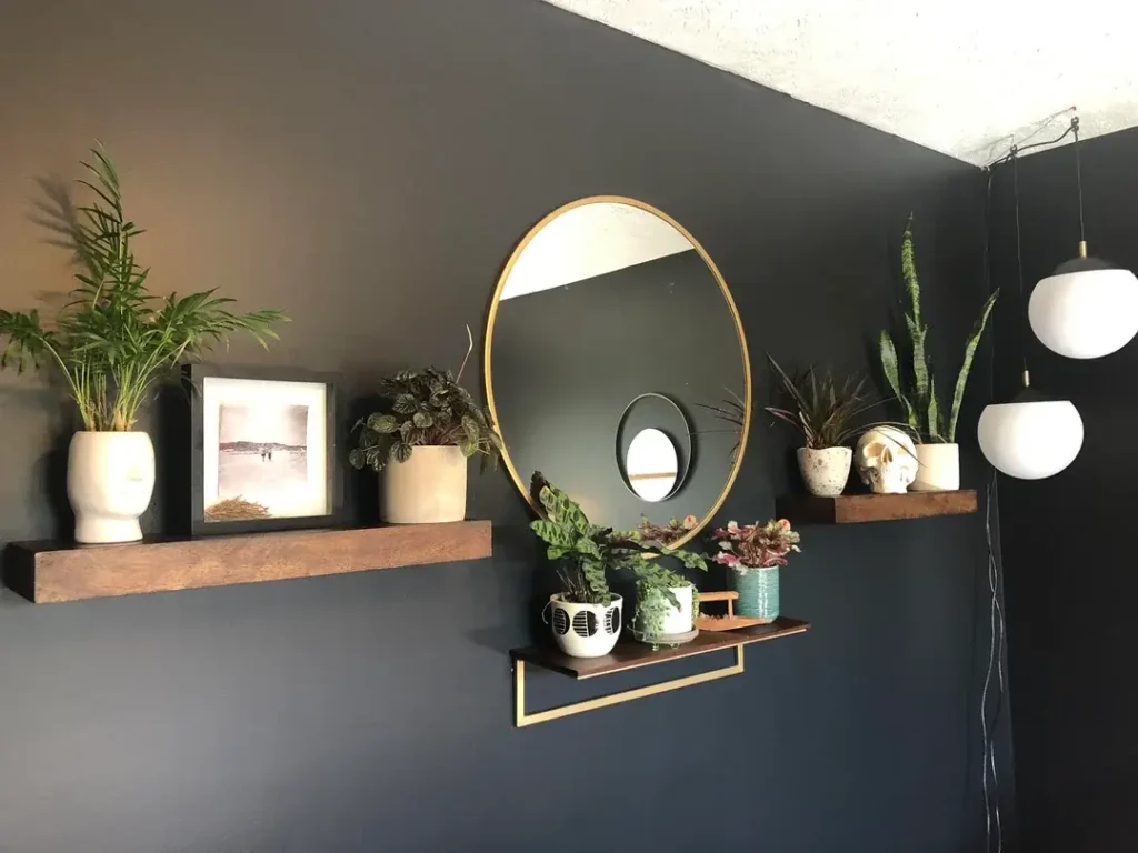
There’s a reason dark bedroom walls keep showing up everywhere in interior design, and this setup is the clearest argument for going bold with paint.
The look: deep charcoal or navy blue paint as a backdrop, two floating shelves in warm walnut-toned wood, and a large oval mirror with a brushed gold frame sitting centered between them. The mirror reflects just enough light to keep the dark wall from feeling like a cave.
The contrast logic is everything here. Dark wall, warm wood, white ceramics, gold metal. Every single element plays off another. The mirror is the star, but it only lands that way because everything around it is doing supporting work.
Here’s how to pull it off:
- Start with the wall color (dark paint is the single most dramatic change you can make to a room)
- Bring in one warm-toned wood element, like shelves, a headboard, or a nightstand
- Add a round mirror with a metal frame and hang it with intention
- Layer in plants. Seriously, plants do more work in dark rooms than people realize. They soften the hard geometry and add life that dark spaces desperately need.
One extra detail worth noticing: two pendant lights with exposed cords hanging from the ceiling. Intentional cords can work. Badly hidden cords always look worse than just leaving them visible. Pick a lane and commit to it.
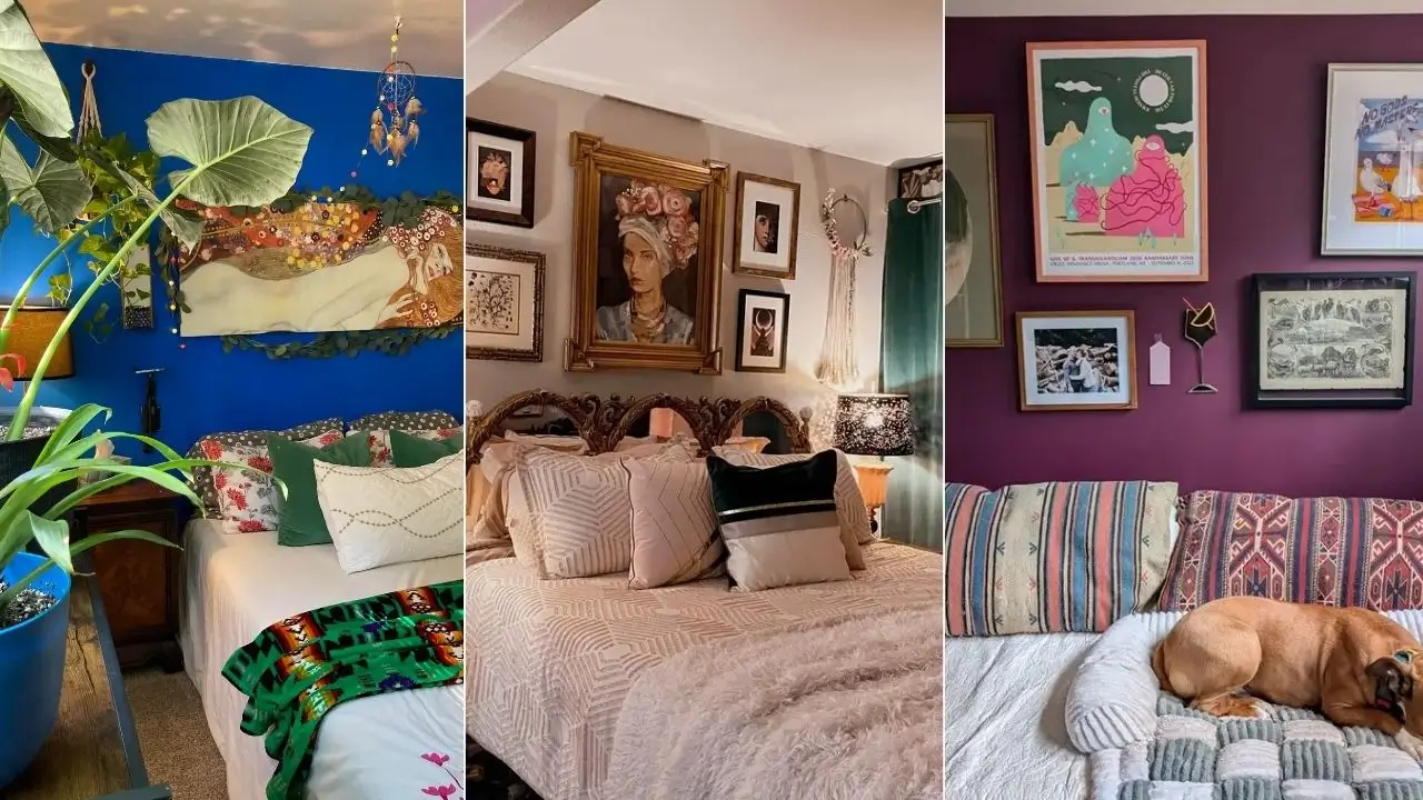
Eclectic Poster and Tapestry Mix on a Muted Blue Wall
Not every bedroom wall needs to be coordinated. Sometimes the most interesting rooms are the ones where everything on the wall means something specific to the person living there, even if it doesn’t match at all.
This setup features a soft dusty blue-gray wall holding a Mazzy Star band poster, a Hokusai-style Japanese wave print, a macramé plant hanger with a trailing pothos, a casual cluster of pinned photos, and a couple of traditional framed prints near the door. A leaning full-length mirror sits below the whole collection.
This kind of wall tells a story. The Mazzy Star poster says something about music taste. The Japanese print signals art appreciation. The macramé hanger with a living plant brings texture and organic energy. What ties it together isn’t matching frames or a consistent color palette. It’s the consistent voice of one person’s taste.
The key insight here is breathing room. The pieces aren’t crammed together. Each one has space around it, and that’s exactly what separates an eclectic wall from a chaotic one.
Want to build something similar? Here’s the move:
- Collect what you love first, not what looks good together
- Pin things with masking tape before committing to holes
- Add one hanging plant element. Macramé planters are having a very long, well-deserved moment.
Also, the muted blue wall is doing serious heavy lifting here. It’s soft enough to not compete with the prints but interesting enough to show between them as part of the composition. A white wall would have made this feel sparse. This color makes it feel intentional.
Wood Slat Accent Wall Behind the Bed
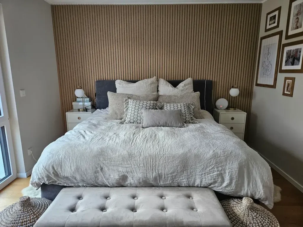
IMO, this is the most underestimated idea on this entire list. And it’s the one that delivers the most visual transformation per dollar spent when done right.
Vertical wood slat paneling across the entire wall behind the bed gives a room an architectural quality it clearly didn’t have before. The natural oak-toned slats run floor to ceiling, creating vertical lines that make the wall feel taller. A dark charcoal upholstered bed with layered gray and white bedding sits in front of it, letting the wall serve as the visual headboard.
The vertical orientation is not accidental. Horizontal slats would widen the room. Vertical ones draw the eye upward, which is almost always the goal in a bedroom.
Good news for anyone nervous about this one:
- Wood slat panels are now widely available as peel-and-stick or interlocking systems
- Real wood veneer looks best, but quality MDF versions are nearly indistinguishable in photos
- MDF versions are significantly less expensive
One smart secondary detail: a small gallery cluster of frames in warm wood tones on the adjacent wall. Those frames pick up the color of the slat paneling and echo it on a neighboring surface, creating cohesion across the whole room rather than treating the accent wall like an isolated island.
Pair this with globe or cylinder-shaped lamps in warm brass or gold. White or chrome lamp bases against warm wood will create a tonal clash that undermines the whole effect. Don’t do it.
Also Read: 9 Wall Decor Ideas That Actually Work (Real Rooms, Real Results)
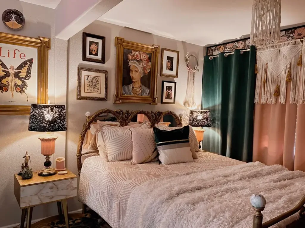
Maximalist Gallery Wall with Gold Frames and Vintage Art
Some people worry maximalism in a bedroom will feel chaotic and mess with their sleep. This room disagrees pretty persuasively.
The setup layers gold ornate frames, velvet curtains, a macramé ceiling piece, and vintage artwork in a way that reads as opulent rather than cluttered. The hero piece is a large Life magazine butterfly print in a wide gold ornate frame. A painted portrait of a woman with flowers in her hair anchors the center. Smaller botanical illustrations, portrait photographs, and fashion illustrations fill the surrounding space. A decorative clock sits at the top.
Warm ambient lighting is doing enormous work here. Star-pattern lamp shades on both bedside tables cast everything in a golden glow that makes the gold frames feel intentional rather than like mismatched thrift store finds. Lighting is genuinely the single most important factor in how a maximalist wall feels. The same arrangement under harsh white overhead lighting would feel overwhelming. Under warm lamp light, it becomes cozy.
Deep teal velvet curtains on one side add a jewel tone that grounds the pink-and-gold palette. That teal is worth studying closely because it provides visual rest and keeps the eye moving rather than getting stuck.
Want to try this style? Here’s the approach:
Add a macramé ceiling piece to contrast the hard frame edges. Structured plus organic is what keeps maximalist rooms from tipping into overwhelming territory.
Collect gold ornate frames first without worrying about what goes in them
Thrift stores have them for almost nothing, and they look better aged than new
Fill them with vintage magazine prints, classical reproduction art, or soft-toned photographs
String Light Gallery Wall with Music and Travel Posters
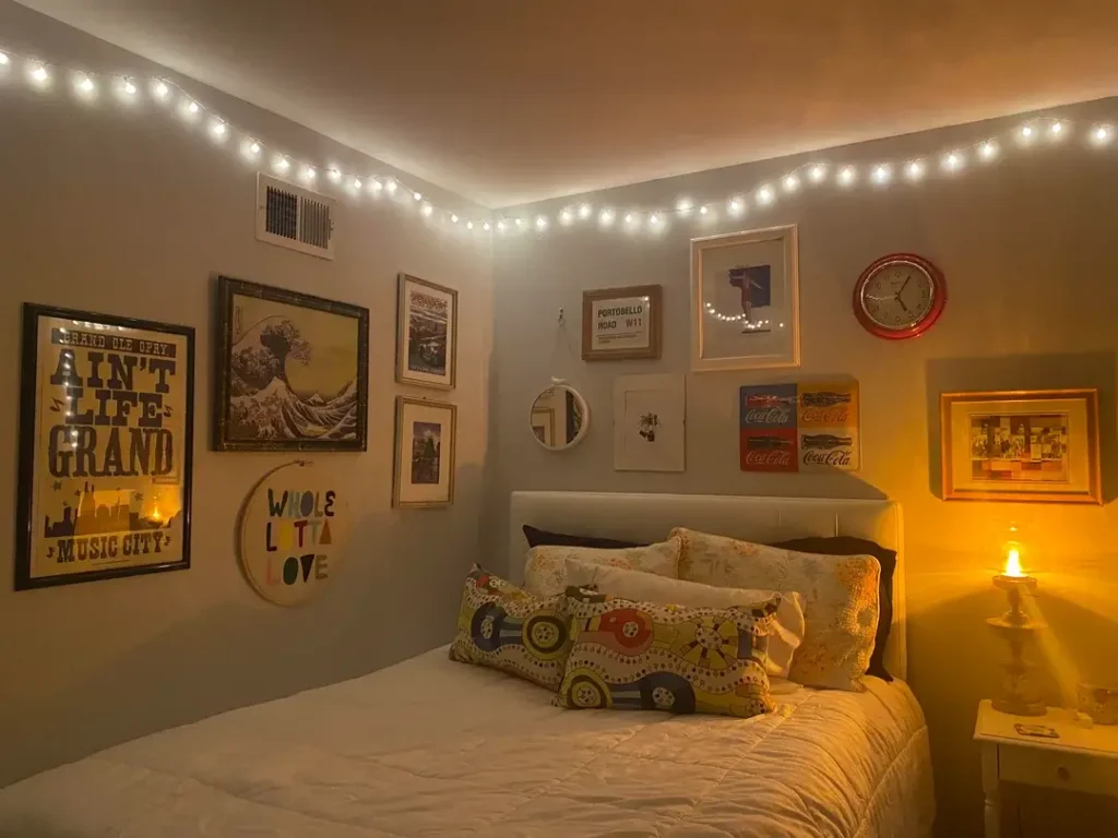
Warm string lights strung along the ceiling perimeter should be too simple to work this well. And yet here we are.
Globe string lights run around the upper edge of the room, and the warm orange light pools down the walls and casts everything in a golden tone. The gallery wall beneath holds a Grand Ole Opry print, a Hokusai “Great Wave” reproduction, a Portobello Road street sign print, a Coca-Cola advertisement panel, a round wooden “Whole Lotta Love” sign, a small circular mirror, and a red vintage clock.
These pieces span wildly different cultural references. American country music, Japanese woodblock art, British market culture, pop art advertising. By themselves, they’d fight each other. Bathed in the same warm string light, they read as a collection with a single personality: someone who has traveled, listened widely, and kept what mattered.
The small circular mirror tucked into the gallery arrangement is a detail I find genuinely clever. Mirrors inside gallery walls reflect the room from an unexpected angle and add depth that flat prints simply cannot create. One small mirror among framed art almost always improves the arrangement.
One important note on the string lights: avoid cheaper LED versions that pulse a cool blue-white. Go for incandescent-style warm white globe bulbs with visible filaments inside. The difference is significant. This specific look requires warmth, full stop.
Striped Wallpaper as the Primary Wall Decor Statement
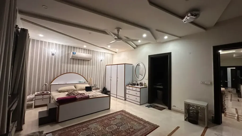
Not every wall decor idea involves hanging things on walls. Sometimes the wall treatment itself is the decor, and this room makes that case without breaking a sweat.
A classic vertical stripe wallpaper in silver and off-white behind the bed brings a formal, elegant energy to the space. The stripes are narrow enough to read as texture at a distance rather than a bold graphic pattern, which keeps them from competing with anything else in the room. Wall sconces on either side add warm light that plays off the wallpaper’s slight sheen.
This approach is especially smart in large bedrooms where a single piece of art or a gallery arrangement would get completely lost against the scale of the wall. Wallpaper handles scale effortlessly. It fills the wall completely and creates ambiance without requiring careful placement decisions.
Vertical stripes specifically draw the eye upward and make ceilings feel higher. This room already has a coffered ceiling creating significant height, and the vertical stripes amplify that sense of vertical space even further.
If wallpaper feels like too big a commitment, peel-and-stick versions have improved a lot. For renters or anyone uncertain about long-term commitment, they’re a solid testing ground before committing to paste-up wallpaper.
Also Read: 11 Stunning Dining Room Wall Decor Ideas For Stylish Homes
Floor-to-Ceiling Travel and Vintage Poster Collection
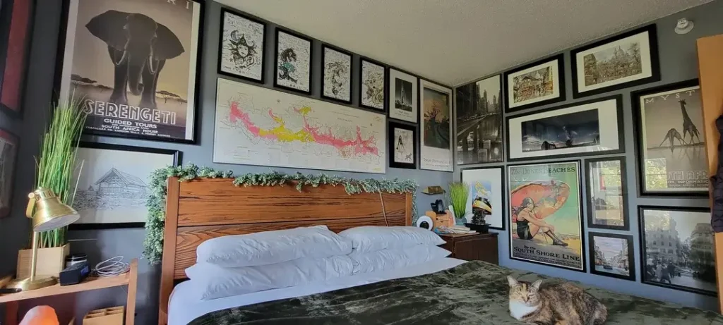
Most gallery walls stay in one zone above the bed, across one wall, centered between windows. This one doesn’t. And that’s exactly the point.
Two full walls covered from floor to ceiling with framed prints create what amounts to an immersive personal museum. Travel posters dominate: a Serengeti guided tours poster, a South Shore Line beach advertisement, a Myst video game poster, a South Africa print with giraffes, and a detailed city illustration are all visible. A large horizontal map print runs across the center of the main wall at eye level. The frames are predominantly black with thin profiles, creating consistency across wildly varied content.
When frames extend from near the floor to near the ceiling and wrap around a corner, the room stops being a room with art on the walls and starts being a room defined by art. That’s a fundamentally different design intention, and it works here because the black frames unify everything regardless of what’s inside them.
A bed dressed with simple white pillows, a warm brass task lamp, and green plant stems in a vase provide the functional living layer while the walls do the visual work.
Consistent framing is the single most important rule if you want to try this. Mixed frame styles across this many pieces would create visual chaos. Uniform black frames let the content do the talking without the frames themselves demanding attention.
Bold Plum Wall with Eclectic Mixed-Media Gallery
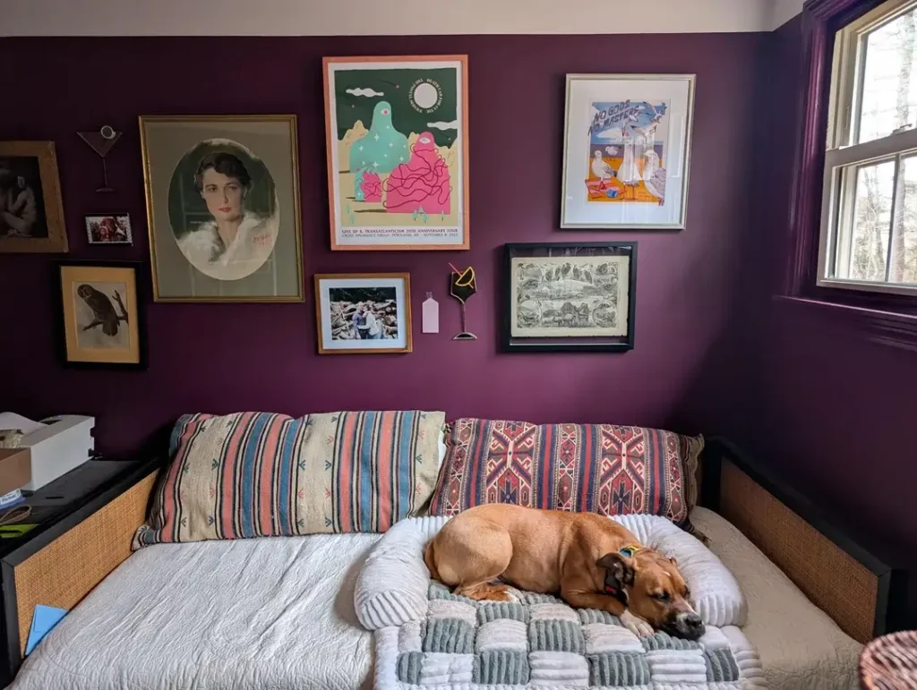
The wall color debate, dark vs. light vs. neutral, comes up constantly in bedroom decor discussions. This room settles it decisively in favor of bold.
Deep plum-purple walls create a rich, saturated backdrop that immediately signals intentionality. Against that backdrop, a gallery arrangement mixes genres freely: a large oval vintage-style portrait in a gilt frame, a psychedelic concert poster in a pink-orange frame, a gig poster with abstract figures, an antique natural history print in a dark frame, a personal photograph in a simple gold frame, and a few small sculptural elements mounted directly to the wall including a decorative cocktail glass and a small bottle.
This room teaches the single most important gallery wall lesson. On white or beige, this mix of frames and styles would feel scattered and accidental. Against deep plum, it reads as curated and deliberate. The wall color is the organizing principle.
The frame styles here are wider than most gallery wall advice would recommend, ranging from gilt to dark wood to orange-painted wood to white mat frames. But they work together because the deep purple wall absorbs the differences and presents them as part of a unified composition.
A bold wall color gives you more freedom with mismatched frames, not less. That’s the takeaway, and it’s worth writing down somewhere.
Floating Shelf Gallery Mix with Personal Memorabilia and Art Prints
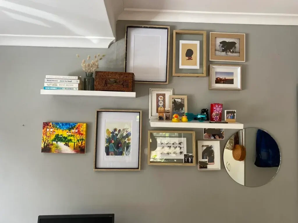
Gallery walls don’t have to live entirely in two dimensions, and this setup shows exactly what happens when you combine shelves with hanging art.
Two white floating shelves at different heights sit alongside multiple frames hung directly on the wall in a loose cluster. The shelves hold a curated mix of Brené Brown books with dried pampas grass in a glass vase, a carved wooden box, and a small collection of personal trinkets including a rubber duck, a red decorative candle, and a few figurines that are clearly meaningful rather than purchased as decor. The frames around and below the shelves include a colorful autumn street painting, a botanical print, black-and-white photographs, and a circular mirror.
The mix of surface levels is what makes this work. Frames flat against the wall, objects on shelves in front of them, varying depths creating a composition that has physical dimension rather than sitting in one flat plane. When light hits it from the side, the shadows make the whole thing feel more like an installation than a standard gallery wall.
The personal objects deserve a specific mention here. Rubber ducks and small figurines are not conventional decor advice, obviously. But genuinely personal items mixed among art prints are what make a wall feel inhabited rather than styled. A wall full of purchased art prints signals taste. A wall where your books, your meaningful objects, and your personal photos exist alongside that art signals a real person’s life.
If you want to combine shelves and wall art, plan the shelf positions first and build the art arrangement around them. The shelves anchor the composition, and the art floats around them, not the other way around.
Also Read: TV Wall Decor – 8 Ideas That Actually Work (Real Rooms, Real Results)
Electric Blue Wall with Klimt Print and Lush Plant Integration
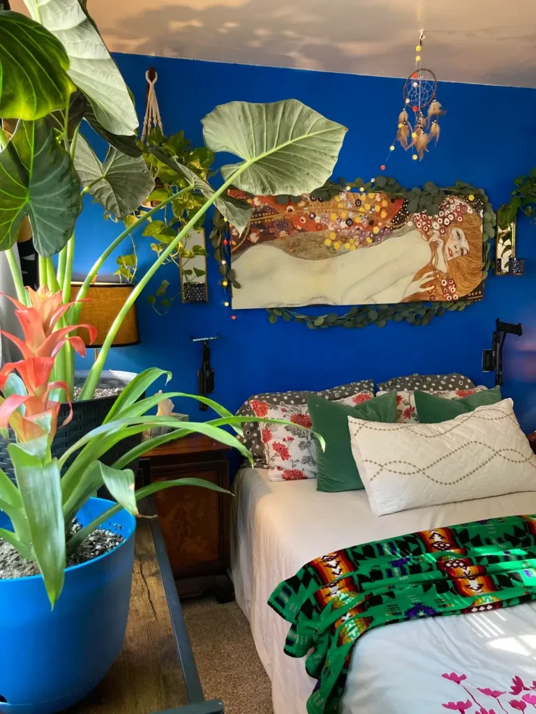
The most committed idea in this whole collection also happens to be the hardest to half-do. This one requires going all the way in, no dipping a toe.
Deep cobalt blue walls command the entire room. A large horizontal Klimt reproduction print hangs at the center, surrounded by living plants extending from wall-mounted planters and cascading around the frame. A macramé hanger with trailing vines sits in the upper corner. A dreamcatcher with colorful beads hangs from the ceiling. Large tropical plants in the foreground include a giant taro or elephant ear leaf and a bromeliad in full bloom. The ceiling appears to have a painted sky or cloud mural in warm amber and gray tones.
The plants here are not a background detail. They’re co-equal with the wall art. The blue wall connects visually to the water imagery in the Klimt print. Whether that connection was calculated or intuitive doesn’t matter. It works.
What can you take from this at a smaller scale?
- Plant integration around wall art is massively underused
- A single trailing pothos or ivy cascading beside a framed print creates organic layering that no amount of carefully chosen frames can replicate
- Start with one plant placed near existing wall art and see how it shifts the whole composition
The honest risk: if you hate plant maintenance, they’ll be stress rather than decoration. But if you already keep plants, moving them toward the walls and treating them as part of the display rather than separate room elements opens up an entirely different category of bedroom design.
What Actually Ties All 10 of These Together
Looking at all ten rooms together, one thing is obvious. None of these walls happened by accident. Someone made a decision about color, about scale, about what to hang, and then they committed to it. That commitment is what separates a room that feels finished from one that still feels like a work in progress.
Wall decor ideas only fail when they stop halfway through. A dark wall with one small frame looks abandoned. A gallery wall with three frames and empty space looks like it gave up. Every single room in this list works because whoever put it together kept going past the point where it felt like enough, until it finally felt complete.
Here’s a quick cheat sheet before you go:
| Approach | Difficulty | Best For |
|---|---|---|
| Dark wall with shelf display | Moderate | Renters, plant lovers |
| Eclectic poster wall | Easy | Personal expression |
| Wood slat accent wall | Moderate | Behind-bed focal point |
| Maximalist gallery wall | Moderate | Bold personalities |
| String light gallery wall | Easy | Budget-friendly warmth |
| Striped wallpaper | Easy to Moderate | Large walls, formal spaces |
| Floor-to-ceiling poster collection | Time-intensive | Collectors and travelers |
| Bold color gallery wall | Easy | Renters who paint |
| Shelf and art hybrid | Moderate | Personal memorabilia |
| Blue wall with plant integration | Advanced | Committed plant owners |
Pick the one idea that connects with how you actually live. If you collect things, lean into the personal memorabilia wall. If you love plants, make them part of the wall composition. If you hate maintenance, choose a structural element like wood slat paneling that requires nothing from you after installation.
The right wall decor idea isn’t the one that looks most aspirational on a screen. It’s the one you’ll actually execute and actually live with. Now go pull that discount store print off the wall and replace it with something that actually means something. You’ve got more than enough ideas now. No excuses.
