Here’s the thing nobody tells you when you move into an open-plan space: combining a living room and dining room sounds like a great idea until you’re sitting in a room that feels like neither. It’s awkward. It’s confusing. And rearranging the furniture for the fifth time isn’t helping.
The good news? Square footage is almost never the real problem. The problem is usually that the two zones are fighting each other instead of working together. And once you fix that, everything clicks.
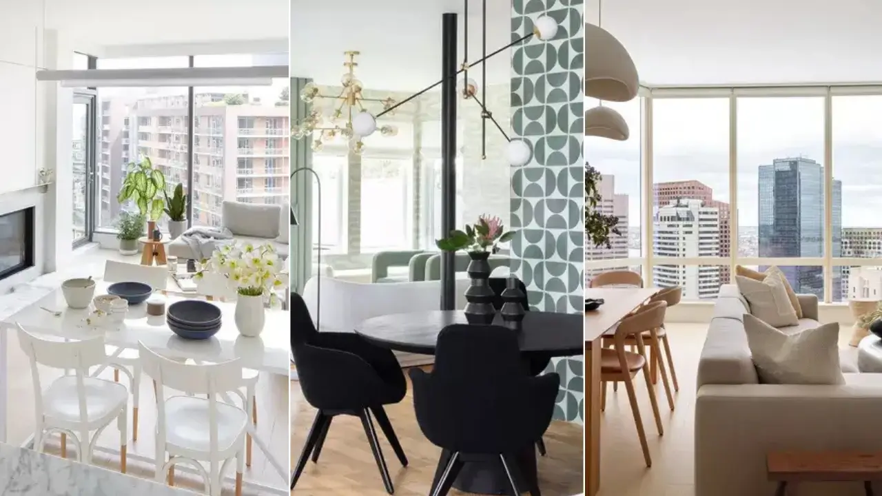
I’ve pulled together 13 real living and dining room combo ideas that genuinely nail this balance, ranging from tiny city apartments to sprawling open-plan homes. Each one has at least one thing worth stealing, and I’ll tell you exactly what it is.
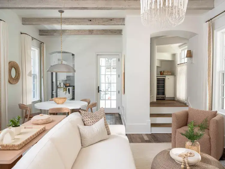
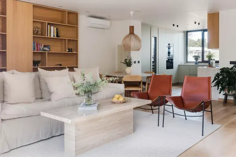
Rustic Beams and Coastal Warmth in a Soft White Open Plan
![Image Source: Kate Marker Interiors]
Some rooms just feel like they’ve always been there, like they weren’t designed so much as they grew. This is one of those rooms, and exposed wood ceiling beams against white walls are doing most of the heavy lifting.
Here’s how the zones break down:
The dining area anchors itself with a round white pedestal table and warm wood chairs sitting under a matte silver dome pendant. On the other side, a cream linen sofa faces a woven-top ottoman, with a dusty rose boucle armchair rounding out the seating. No dividing wall needed because the reclaimed wood ceiling beams run across the entire room like an architectural spine, tying everything together.
What really sells it is the arched doorway framing the transition into the kitchen. It creates a sense of destination without closing anything off. Each zone also has its own pendant light (a white chandelier on the living side, a dome pendant over the dining table), which gives both areas their own identity while staying in the same calm palette.
The takeaway: If your open-plan feels like two random rooms sharing a floor, start at the ceiling. A beam, a coffered detail, or even a consistent ceiling color can unify a space in ways that no amount of furniture rearranging ever will.
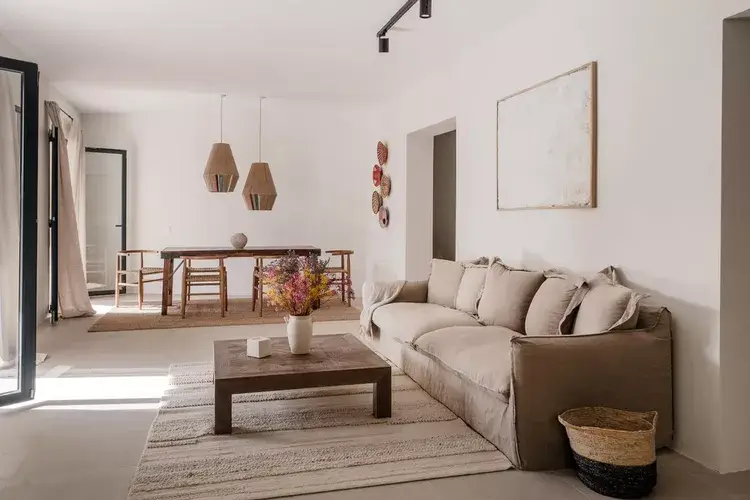
Wabi-Sabi Mediterranean Minimalism with Raw Textures
![Image Source: Fantastic Frank]
Most people assume minimalist means cold and sterile. This room proves that assumption wrong, and honestly, it surprised me the first time I looked at it.
White plaster walls and a concrete-tone floor set a completely neutral canvas. The living area gets an oversized linen sofa in warm greige, while a dark-stained wood dining table with cross-back chairs sits at the far end beneath two hexagonal rattan pendants. A woven jute rug grounds the seating, and a single white ceramic vase holds dried flowers that add soft color without demanding attention.
The genius here is restraint. One large abstract canvas hangs only in the living zone, signaling that space’s purpose without overdoing it. Small woven baskets and decorative wall plates add texture at eye level without making things feel cluttered or try-hard.
The takeaway: Pick one material family and commit. Natural linen, raw wood, woven fibers, and matte ceramics all speak the same language here. Mixing too many material families is usually what makes open-plan rooms feel chaotic, not the size of the space.
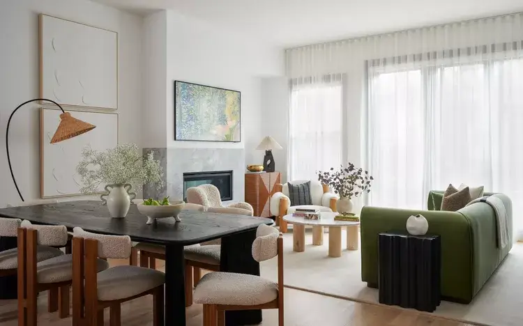
Bold Green Sofa Against Neutral Art Walls in a Modern Combo
![Image Source: Desiree Burns Interiors]
This room refuses to play it safe with color, and I respect that enormously. The olive green velvet sofa anchors the living zone with real confidence, and it works precisely because everything else in the room stays quiet.
The dining table is a matte black rectangle flanked by boucle chairs in off-white. A rattan arc floor lamp curves over the dining table from the living side, physically bridging both zones. Two large-format abstract artworks hang in the dining area, while a colorful landscape painting sits on the fireplace ledge in the transition zone. The room uses art as a deliberate zone marker, not a decorative afterthought.
A round natural wood coffee table and cylindrical pedestals keep the floor plan feeling light despite the visual weight of that sofa. This matters more than most people realize. Heavy furniture at floor level makes rooms feel smaller. Keeping the floor plane open preserves the sense of flow.
The takeaway: If you want a bold sofa color in your combo space, balance it with one other strong anchor piece (here, the black dining table) and keep every other choice subdued. Two anchors can share a room peacefully. Three will start an argument.
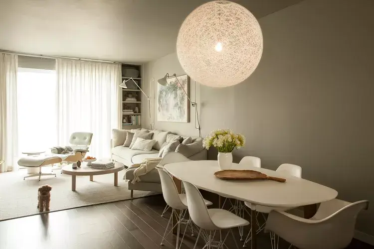
Also Read: How to Style Sheer Curtains: 10 Living Room Setups from Real Homes
Clean-Line Contemporary with Glass and Eames Accents
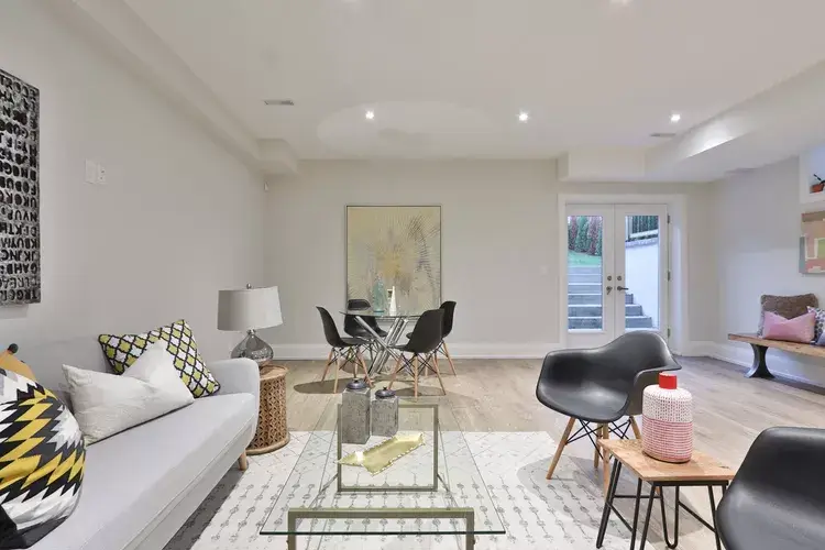
![Image Source: Sidekix Media / Unsplash]
Minimalism and personality are not mutually exclusive. This lower-level living and dining room combination makes that point without fuss.
Light ash hardwood floors carry continuity between zones. The living area features a classic white sofa with yellow-and-black geometric throw pillows, which is exactly the kind of detail that stops a room from looking like a furniture showroom. The dining area uses a round glass-top table with classic Eames DSW chairs in black, a combination that’s been working for decades for one simple reason: it takes up visual space without physical bulk.
Recessed lighting replaces pendant fixtures here, which keeps the vertical lines clean and lets a large-format typography artwork on the living wall do the decorative heavy lifting. French doors at the back flood natural light across both areas.
The takeaway: For lower ceilings or tighter proportions, recessed lighting and glass furniture are your best friends. They keep the room open while a strong artwork choice delivers the personality that statement pendants and oversized tables would otherwise provide.
The Oversized Pendant as the Hero of a Gray and White Combo
![Image Source: OreStudios]
Here’s something most people don’t think about: a pendant light isn’t just a light source. In an open-plan space, it’s a territorial marker. It tells you exactly where dining ends and living begins. This room leans into that idea completely.
A large sphere woven pendant, easily 60 to 70 centimeters in diameter, hangs low over a white oval tulip-style table surrounded by molded white chairs. The scale is almost audacious. But it works because the rest of the room stays deliberately quiet: a greige sectional sofa, a round maple coffee table, and a pair of classic Eames lounge chairs with ottoman. Dark hardwood floors ground all the white and gray happening above.
IMO, one large-scale fixture beats a cluster of small pendants every time. A single oversized fixture reads as intentional. Multiple small pendants can look indecisive, like you couldn’t commit to one idea.
The takeaway: Most people choose dining pendants that are too small for the table and the room. When in doubt, go larger than feels comfortable. You’ll almost never regret it.
Maximizing a Small City Apartment with All-White Surfaces and Greenery
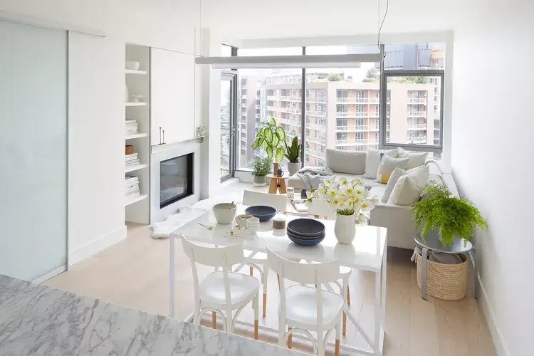
![Image Source: OreStudios]
Small apartment living and dining room combos get a bad reputation for feeling cramped. This high-rise space rejects that completely with a strategy that’s actually pretty easy to replicate.
Everything is white. Walls, built-in cabinetry, dining table, chairs, fireplace surround. The marble-topped dining table and glossy white built-ins bounce light across the room, while floor-to-ceiling windows handle the rest. Plants are placed strategically throughout: a large tropical on the sofa ledge, a hanging fern on a side table, a small cactus near the window. Green is the only color in the room, and it earns every bit of attention it gets.
What saves this from feeling like a white box is the layering of textures. The sofa has linen cushions in pale sage. The dining chairs have a slight curve. The rug is a subtle natural fiber. Tone-on-tone works when the textures vary. Remember that.
The takeaway: Pick one color family, commit completely, and let plants handle the variation. Simple strategy, genuinely effective results.
Also Read: Stop Choosing Curtains Last: 10 Living Room Ideas from Real Homes
Arched Niche Sofa with Floor-to-Ceiling Storage in a Paris-Inspired Combo
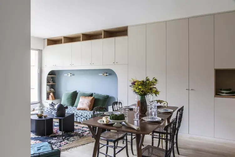
![Image Source: Bertrand Fompeyrine / Atelier Steve]
This might be the most space-efficient combo on this entire list, and it approaches the problem from an angle most people would never consider: treating the sofa as built-in furniture.
The living zone features a dusty blue arched alcove with sconce lighting and a sofa fitted snugly within it, framed by floor-to-ceiling matte white cabinetry on either side. The cabinetry extends across the full wall and continues over the alcove, unified and seamless, providing enormous storage without visual clutter. In front, a walnut dining table with woven rattan chairs and mixed vintage pieces adds personality against that clean cabinet backdrop.
The blue alcove is genuinely brilliant. It creates a “room within a room” feeling for the sitting area, which means both zones feel purposeful despite sharing a compact apartment footprint. I’ve seen this technique in Paris apartments and compact London flats, and it consistently outperforms the standard floating sofa approach.
The takeaway: If you have a wall that could be built out, this concept is worth serious consideration. Custom cabinetry costs more upfront but pays back every single day in storage, organization, and the feeling that someone actually meant to design this room.
Dark, Moody, and Layered: A Dramatic Approach to the Dining-Living Zone
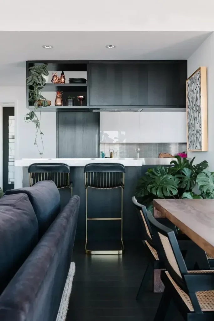
![Image Source: Alvin Wayne]
Not every open-plan space needs to be light and airy. This room makes the case for the opposite, and it does so with complete conviction.
Charcoal wood cabinetry, dark hardwood floors, and a deep navy leather sofa create an atmosphere that most people would call moody. I’d call it deliberate. The kitchen island at the back features a white marble countertop and brass-detailed black barstools that bridge the kitchen and living zones. A natural live-edge wood dining table sits between the sofa and island, with black-framed cane-back chairs adding warmth and texture to the otherwise dark palette.
Monstera plants in two corners bring real life to a scheme that might otherwise feel heavy. Gold-framed abstract artwork and copper accessories introduce warmth through metallic accents rather than color.
The takeaway: Dark rooms absorb light and can feel smaller if you’re not careful. This room avoids that trap with two techniques: a white marble countertop acts as a reflective surface, and organic plant shapes break the room’s geometric rigidity. Use both if you’re going dark.
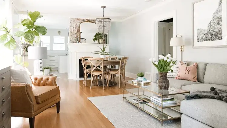
Fiddle Leaf and Vintage Crystal: Traditional Open Plan Done Right
![Image Source: Jessica Nelson Design / Carina Skrobecki Photography]
This room understands its bones and works with them rather than fighting them, which is honestly refreshing. Traditional architecture, original warm honey hardwood floors, arched doorways, and a brick fireplace surround set the terms, and the furniture simply follows.
A beaded crystal chandelier hangs over a round dining table with bentwood chairs, positioned in what was likely the original dining room footprint. The living zone uses a gray linen sofa, a tufted caramel leather armchair, and a gold-and-glass coffee table, a mix of textures that keeps the traditional frame from feeling dated. A tall fiddle leaf fig near the kitchen doorway adds significant scale and warmth.
What this room gets right is not forcing a style update onto a traditional space. The crystal chandelier, warm wood tones, and brick fireplace are celebrated exactly as they are. The contemporary furniture choices (glass coffee table, minimal throw pillows) modernize without erasing.
The takeaway: If you own a home with traditional architectural details and keep trying to force a contemporary update onto it, try meeting the architecture in the middle instead. It almost always works better.
Also Read: 10 Apartment Living Room Ideas from Real People (No “Influencer” Fluff Included)
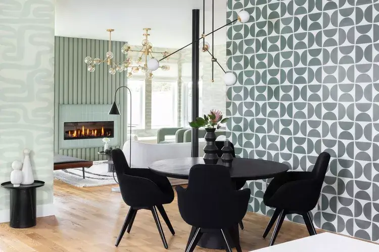
Geometric Wallpaper and a Brass Chandelier in a Retro-Influenced Combo
![Image Source: Michelle Boudreau Design]
This one surprised me. Wallpaper on adjacent walls rather than a single accent wall is a choice that could easily tip into overwhelming, but it somehow stays completely cohesive.
The dining area features a round black table with black molded armchairs under a sculptural brass and glass bubble chandelier. A large-scale sage green geometric wallpaper covers the fireplace wall, while a different but coordinating geometric pattern in the same green-gray palette covers the dining wall. A black column between the two zones draws the eye upward and reinforces the boundary without using a physical divider.
The key to making this work is the shared color family across both wallpapers. Different patterns, same palette. The black furniture, black column, and black arc floor lamp in the living zone serve as visual anchors that prevent the patterned walls from taking over.
The takeaway: If you’re using wallpaper in an open-plan space, commit fully. Half-measures with pattern tend to read as unfinished. Go bold or go home. (Literally, since we’re talking about your home here.)
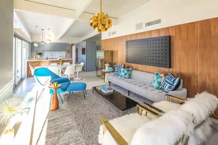
Mid-Century Modern Meets California Cool in a Long Open-Plan Room
![Image Source: Michelle Boudreau Design]
This room is unapologetically retro, and there is zero hedging happening here. It commits entirely to a mid-century modern aesthetic that runs from the living space all the way to the kitchen at the far end.
A walnut wood panel wall backs the living zone, with a low-profile tufted gray sofa on a thick shag rug. Electric blue bucket chairs provide the accent color that ties to the teal kitchen cabinetry visible at the far end. A gold starburst pendant above the living zone and a geometric gold chandelier over the dining area are period-correct choices that anchor the style in the 1960s without feeling costume-like. White tulip chairs around the dining table add lightness to an otherwise warm-toned scheme.
What works here is the color thread. Teal, electric blue, and gold run from the front of the room to the back. Your eye travels the full length of the space rather than stopping at arbitrary zone boundaries.
The takeaway: This is one of the more advanced approaches in this collection. Getting a layered, eclectic style like this to cohere requires either significant design experience or the courage to commit and keep editing until it’s right.
Oak Shelving, Rust Leather Chairs, and a Serene Neutral Flow
![Image Source: Fantastic Frank]
This room resolves the tension between living and dining zones in the most quietly confident way possible: by choosing materials so harmonious that the two zones feel like one continuous environment.
A full-height oak shelving unit lines the living area wall, filled with books and objects at a density that creates visual interest without clutter. The sofa in cream fabric sits opposite, with a pale birch coffee table in front. Two rust-red leather sling chairs on a wire frame introduce both color and material contrast. They’re the most distinctive pieces in the room, and they earn that position completely.
Behind them, a round dining table with bentwood chairs and a warm-toned pendant sits in the transition space between living area and kitchen. The entire room operates within warm neutrals and natural oak, and the rust leather chairs are the single deliberate deviation.
The takeaway: One departure from a neutral palette is enough to make a room feel curated rather than just decorated. Pick your one thing and make it count.
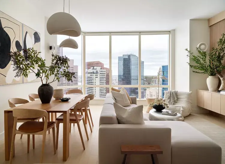
Floor-to-Ceiling City Views as the Third Design Element
![Image Source: Desiree Burns Interiors]
FYI, if your apartment has a wall of glass overlooking a city skyline, the view IS your dominant design feature. Everything else in the room exists to support it. This room gets that completely.
The furniture palette sticks strictly to warm beige and natural oak. A mushroom-cap dome pendant in matte clay hangs over a natural oak dining table with rounded saddle-leather chairs. A matching pendant hangs over the living zone. The sofa is low and deeply cushioned in warm linen. A Togo-style chair in cream adds seating with a silhouette interesting enough to hold its own against the view. Matte black abstract art panels and a large organic-branch arrangement in a dark ceramic vase add contrast without competing with the windows.
The room understands something that many high-rise apartments get completely wrong. When the view is the star, the interior must support it, not compete with it. Every material choice here, the linen, the oak, the clay pendants, creates warmth that complements a glass-and-sky backdrop rather than fighting it.
The takeaway: Lean into your strongest architectural feature. Design the room around it, not in spite of it.
Choosing the Right Approach for Your Space
With 13 examples in front of you, the challenge becomes picking a direction. Here’s a quick breakdown to help:
| Style Approach | Best For | Key Design Move | Effort Level |
|---|---|---|---|
| Soft coastal neutrals | Homes with traditional character | Unified ceiling element | Easy |
| Mediterranean minimalism | Rentals or simple renovations | One material family throughout | Easy |
| Bold color sofa | Neutral rooms needing personality | Single statement piece | Medium |
| All-white with greenery | Small city apartments | Texture variation within one palette | Easy |
| Built-in alcove sofa | Compact apartments needing storage | Custom cabinetry as design feature | Advanced |
| Dark and moody | Spaces with good artificial lighting | Reflective surfaces to balance dark tones | Medium |
| Geometric wallpaper | Rooms with strong architectural bones | Coordinated pattern in same palette | Medium |
| Mid-century modern | Long, open-plan rooms | Consistent color thread across full length | Advanced |
| View-forward minimalism | High-rise apartments | Supporting palette, not competing | Medium |
The Principles That Make Every Combo Space Work
After going through all 13 of these rooms carefully, a few ideas keep showing up regardless of style.
Zone definition doesn’t require walls. Pendants, rugs, ceiling details, and built-in elements all create zone boundaries that feel intentional without closing off space. The most successful rooms here use at least two of these tools working together.
Rooms that feel unfinished, and you know exactly the type, usually lack a clear idea of where one zone ends and another begins. Two pieces of furniture on a bare floor without any overhead or underfoot anchoring will always feel incomplete, no matter how beautiful those individual pieces are.
A shared material or color thread running through both zones is what separates a room that feels designed from one that feels assembled. It doesn’t need to be complicated. The same wood tone on dining chairs and coffee table legs, or the same textile in two different forms, is genuinely enough.
Restraint at the material level is more powerful than anything you can do with paint color or furniture arrangement alone. The rooms you’ll want to spend time in are the ones where someone made real decisions and actually meant them.
Final Thoughts
Living and dining room combos don’t have to feel like a compromise. When you approach them with intention, they can actually feel more cohesive and interesting than two separate rooms ever would.
Pick one of these approaches that fits your space, your style, and honestly your budget. Start with the zone-defining elements first (pendant lights, rugs, ceiling details), then layer in the furniture and materials. Edit as you go.
And if your room still feels off after all of that? Chances are you need one strong anchor piece you haven’t committed to yet. Go find it.