Let’s be honest. Decorating a studio apartment feels like solving a Rubik’s cube blindfolded while someone keeps adding more furniture to the pile. Every single piece you own has to justify its existence, and “it was on sale” doesn’t count as justification.
I’ve spent way too much time scrolling through real people’s studios online, and here’s what I’ve noticed. The best small studio apartment decorating ideas don’t come from magazines or staged photo shoots.
They come from regular people who got creative with what they had. No design degrees. No massive budgets. Just smart choices and a willingness to commit.
These ten examples all come from real homes shared by real people. Some of them might challenge everything you thought you knew about small space living. At least one will probably make you want to rearrange your entire apartment tonight.
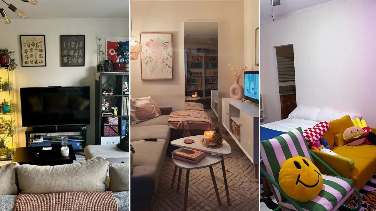
Bold Colors and Playful Energy Actually Make a Small Studio Feel Bigger
You know that classic advice about sticking to neutrals in small spaces? Yeah, this room ignored all of that and somehow came out on top.
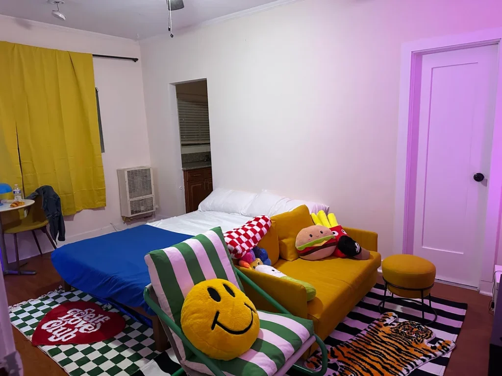
One Reddit user (r/Efficient_Listen1877) went full send with a mustard yellow sofa, matching yellow curtains, a green-and-pink striped floor cushion, and a black-and-white checkered rug layered under a tiger-print rug. Oh, and throw pillows shaped like burgers, fries, and a smiley face. I’m not making this up.
Blue bedding anchors the whole composition, while pink-purple LED lighting along one wall softens the brightness just enough to keep things from tipping into visual chaos.
Why This Actually Works
Full-commitment maximalism reads as intentional. Half-hearted maximalism just looks like a mess. That’s the key difference here. Every single item feels deliberately chosen, not randomly accumulated.
The overlapping rugs pull double duty by defining different zones without using any walls or physical dividers. The floor cushion area near the bed feels separate from the seating area near the sofa. Pretty clever for zero construction work.
How to Pull This Off in Your Own Space
- Start with one anchor color and build everything else around it. The mustard yellow appears in both the sofa and curtains, which creates cohesion despite the visual party happening everywhere else.
- Keep your furniture clean-lined. The sofa here is simple. The accessories do all the personality work. The moment your furniture starts competing with your accessories, the whole thing falls apart.
- Grab a strip of LED lights. Seriously, a single strip of colored ambient light transforms a boring rental-white wall into something personal. It costs almost nothing and makes a massive difference.
Warm Boho Layering That Turns a Tiny Space Into a Cozy Retreat
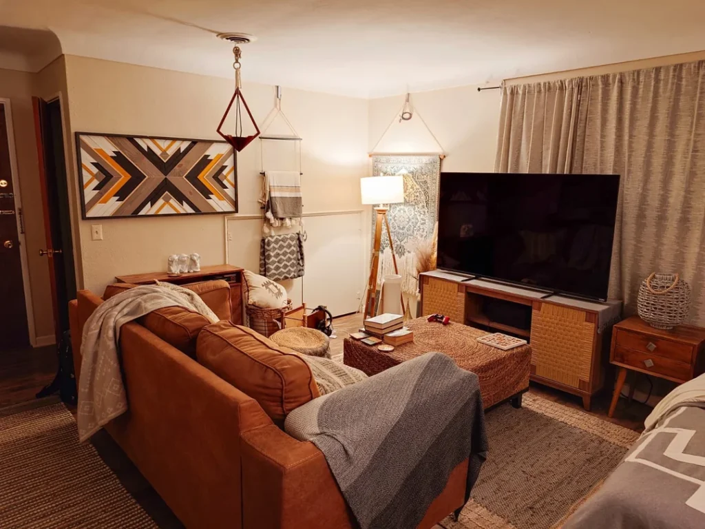
Some rooms look decorated. This room looks settled in. Like someone spent years collecting exactly the right things and they all just happened to land perfectly together.
r/Wiidiwi built a southwestern-boho space around a cognac leather sofa that anchors everything. A large geometric wood wall art piece in charcoal, amber, and tan fills the wall above a small cabinet. A wicker ottoman doubles as a coffee table. A macramé pendant hangs from the ceiling. A tripod floor lamp adds vertical interest. Floor-length linen curtains in warm gray stretch across the full window wall.
The Color Palette Is Doing All the Heavy Lifting
Amber, tan, warm gray, and natural wood tones. That’s basically it. Nothing fights anything else. The throw blankets, the woven basket, the patterned cushion on the sofa rack… they all speak the same tonal language.
Here’s what most people get wrong about boho decorating: the warmth comes from texture, not color. Leather, woven rattan, macramé rope, knit fabric. Each material catches light differently and creates that layered richness you see in this room. You could strip every color to gray and it would still feel warm because of the material variety alone.
A Practical Trick Worth Stealing
The layered rug approach here is genius for small studio apartment decorating. A jute base rug covers most of the floor, and the sofa sits partially on top of it. This visually expands the seating area and connects it to the rest of the floor. IMO, this is one of the most underrated tricks in small space design.
An Indoor Plant Wall That Doubles as Living Art
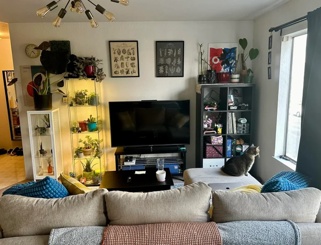
This room completely changed how I think about using plants in small spaces. Plants aren’t just cute accessories here. They’re structural design elements.
r/dreamsOfPowerlines set up a tall glass-and-metal shelving unit right beside the TV and filled it entirely with plants under warm grow-light illumination. The amber glow creates a completely different light zone from the ceiling fixtures. On the other side of the TV, a dark cube bookshelf holds an organized mix of personal items. Botanical print posters hang between the two units, tying the nature theme together.
The Grow-Light Shelf Is the Star of This Show
This single idea solves two problems at once. It keeps light-hungry plants healthy in a space that might not get enough natural light, AND it acts as a warm accent light source that softens the entire room at night.
The amber tone feels way gentler than overhead lighting. It completely changes the room’s mood after dark. The cat sitting comfortably on the sofa arm tells you everything you need to know about how livable this space actually is.
You Don’t Need 30 Plants to Get This Look
Let me be real. This approach does require some commitment to plant care. But you absolutely don’t need a jungle to pull it off.
- Five or six plants on a lit shelf create the same warm, living-wall quality
- A small IKEA Milsbo cabinet with a grow strip works perfectly
- Start with low-maintenance varieties: pothos, snake plants, ZZ plants
- The aesthetic looks just as good with ten plants as it does with forty
Using Curtains as Room Dividers to Create a Real Bedroom Zone
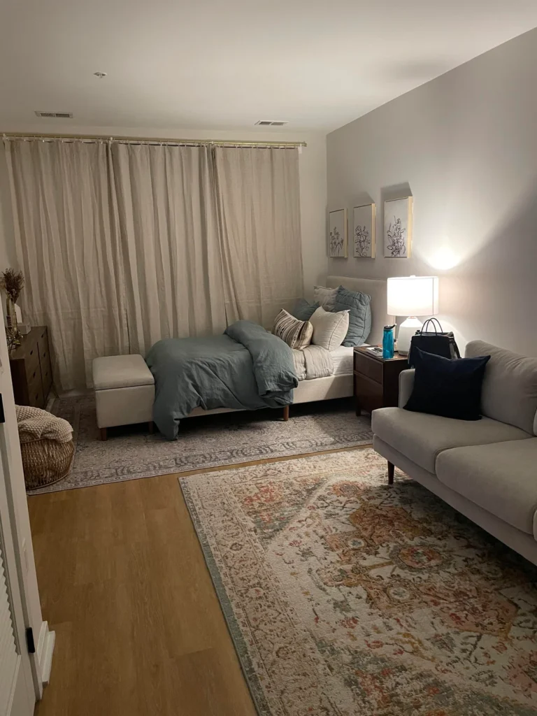
This solution is so clean it honestly looks like a completely different floor plan than what’s actually there. We’re not talking about a curtain on a window. We’re talking about a floor-to-ceiling curtain spanning most of one wall, creating the visual impression of an actual separate bedroom.
r/kourtlove17 hung heavy linen curtains in warm natural beige on a gold curtain rod that runs nearly the full width of one wall. The sleeping area sits inside a soft, low-lit zone with sage green linen bedding, layered pillows, and a botanical print triptych above the bed. A dark walnut nightstand with a warm table lamp seals the bedroom atmosphere. On the other side, a gray sofa and a Persian-style area rug define the living zone.
The Two-Rug Technique You Should Study
Two different rugs appear in this space, with different patterns at different scales. One sits under the bed, one under the sofa. This contrast tells your eye that these are two separate rooms sharing one address.
The bed rug leans more geometric and neutral. The living room rug carries more color. No walls needed. Just rugs doing the zoning work.
What Makes the Curtain Divider Actually Convincing
Fabric choice matters enormously here. Cheap sheer curtains won’t create this effect. You need heavy linen or velvet curtains that puddle slightly on the floor. That signals permanence. They read as architectural rather than decorative.
The result? A studio that photographs like a one-bedroom. FYI, this is 100% renter-friendly since most curtain rods need minimal hardware.
A Bookshelf Room Divider That Handles Storage and Privacy Simultaneously
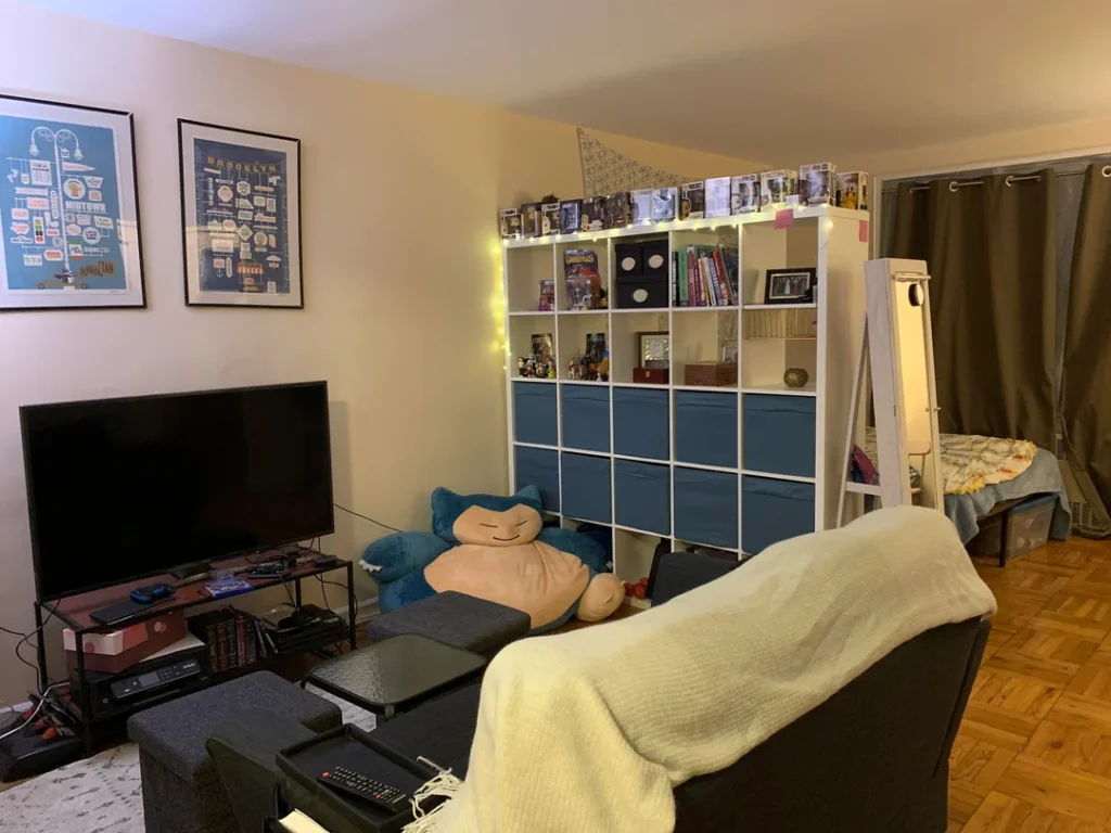
Here’s a question that’s honestly worth thinking about. Why would you build a wall when a shelving unit can do the same job while also holding your entire book and collectible collection?
r/HomeDecorating used a large white 5×5 cube shelving unit (think IKEA Kallax) to divide the living and sleeping areas of a NYC studio. The shelves face the living area and hold books, Funko Pop figures, board games, and small collectibles. Warm string lights line the top edge, wrapping around the displayed items. The sleeping side tucks behind the shelf, visible through the open backs but clearly separate in function.
One Piece of Furniture, Three Jobs
This shelf simultaneously works as:
- A room divider that creates genuine visual separation
- Storage for books, games, and everyday items
- A display surface for collectibles and personal treasures
That’s exceptional efficiency from a single piece of furniture. The blue drawer inserts in the lower cubes add color and provide closed storage, which matters because let’s be honest, not everything deserves to be on display.
Making This Work in Your Studio
City map posters of Manhattan, Brooklyn, and Midtown hang on the living room wall, adding personal character. A Snorlax plush sits against the shelf base. These specific, personal details make the space feel truly inhabited rather than generically decorated.
For best results, use a shelving unit at least 60 inches tall. Shorter units don’t create enough visual boundary to feel like a real zone separator. A 4×4 Kallax at full height with a mix of open and closed storage hits the sweet spot between openness and privacy.
Earthy Tones and Eclectic Layering With an Art-Lover’s Eye
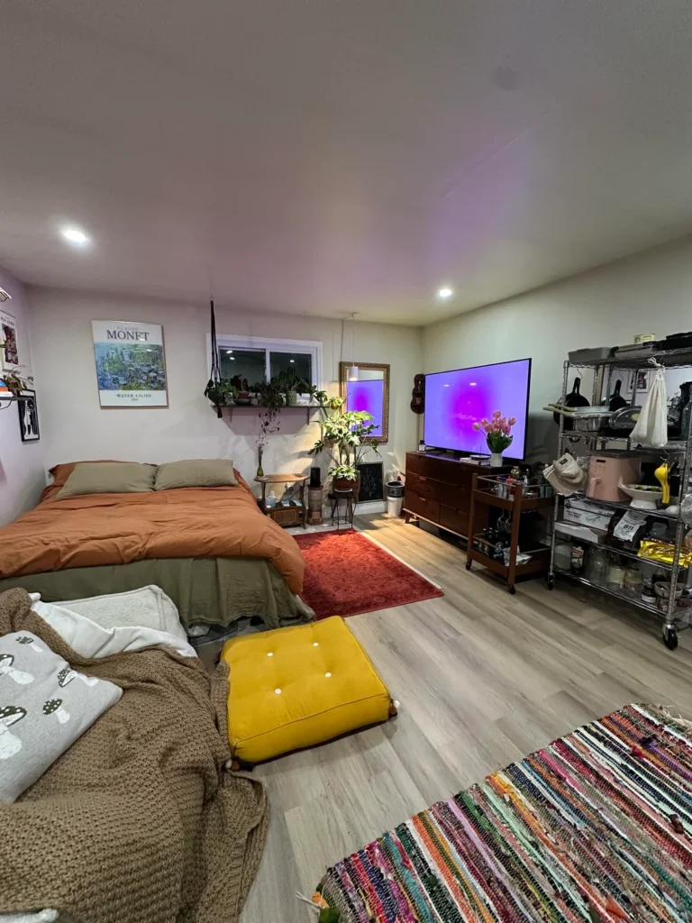
Some studios look like showrooms. This one looks like a life being lived in full color. And I mean that as the highest compliment possible.
r/Master-Ganache7014 layered a rich mix of warm and earthy elements across this open studio. Terracotta orange bedding. Olive green throw pillows. A deep red shag rug beneath a walnut dresser. A yellow tufted floor cushion serving as extra seating. A colorful woven rag rug near the foreground. A Monet Water Lilies exhibition poster on a pale lavender wall. And a macramé plant hanger suspending greenery near a window shelf packed with more plants.
This Space Normalizes Utility (And I Love It)
The kitchen side features an open wire metro shelf loaded with cookware and supplies. The kind of industrial shelving that looks purposeful rather than temporary when you organize it thoughtfully. The walnut dresser topped with a TV and fresh tulips ties the sleeping and media areas together.
Nothing here is hidden or staged. Yet the room feels cohesive because the color choices run consistently warm across every zone. Terracotta, amber, olive, rust, and natural wood tones show up in every single corner. Even the multicolored rag rug pulls from the same warm spectrum.
The Monet Poster Trick
That exhibition poster matters more than you might think. A single piece of recognizable fine art signals intentionality and anchors every other design decision in the room. You don’t need expensive original art. A quality reproduction print in a proper frame achieves the exact same effect for a fraction of the cost.
Candlelit Warmth and a Full-Length Mirror That Opens Up a Narrow Space
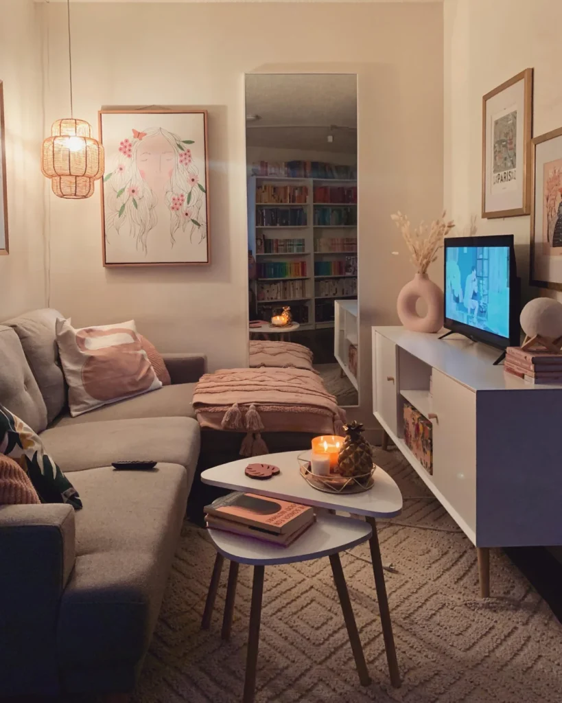
This room earns its warmth. Every light source feels considered. Every surface carries something intentional. The result is the kind of cozy small studio apartment decorating that makes guests want to overstay their welcome.
r/lemonlemonades built a soft, feminine space around a neutral sofa with blush pink and tropical-print throw pillows. A woven rattan pendant light hangs low on one side, casting a warm amber wash across the corner. A large original illustration of a woman’s face surrounded by painted flowers anchors the wall in a natural wood frame. Two nesting coffee tables in white hold a lit candle arrangement and a small stack of books.
The Mirror Is the MVP Here
A full-length mirror sits between the sofa and the media console, and it’s doing the most important design work in the entire room. It reflects candlelight, bounces warmth from every light source, and makes this narrow space read as considerably wider.
Mirrors in small studios aren’t a cliché. They’re structural. But placement is everything. A mirror that reflects a dark wall or another mirror is basically wasted. This one reflects the lit room, which multiplies the warmth. That’s the difference.
The color-organized bookshelf visible in the mirror’s reflection says a lot. Someone who organizes books by spine color thinks visually about every part of their space.
Want This Atmosphere? Here’s the Recipe
- Candles are non-negotiable. Overhead lighting alone will never create this vibe.
- Combine a warm pendant light, table lamps, and two or three lit candles in the evening
- This light layering transforms even the most basic furniture into something that feels intentional and inviting
How to Let Natural Light Do the Heavy Lifting in a Studio Layout
There’s a version of small studio decorating that fights the space with furniture and fills every corner. And then there’s this approach, which simply steps back and lets the room breathe.
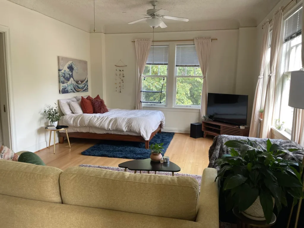
r/oliviaev2 made an exceptionally confident choice. Keep the floor largely open. Let natural light from multiple windows flood the space. Use furniture sparingly. That’s it. That’s the whole strategy.
A low platform bed with a walnut frame sits against one wall, dressed simply in white linen with terracotta and deep red throw pillows. A replica of Hokusai’s The Great Wave hangs above it, bold and perfectly scaled. A deep navy shag rug anchors the bed area.
The Pink Curtain Trick Photographers Already Know
The living zone sits on the opposite side with a sage green sofa, a small black oval coffee table, and a Persian-style rug underneath. Two large plants add organic softness without claiming much floor space.
But here’s the detail worth noting. Pink linen curtains on the windows warm the natural light as it enters, shifting it from flat white toward golden. This is literally a trick photographers use. Warm the light source and the whole room shifts. Curtain color is a genuinely underrated factor in how any space feels.
The Power of Knowing When to Stop
The restraint in this room isn’t emptiness. It’s confidence. Not every wall needs a gallery. Not every corner needs a plant or a lamp. Sometimes the most effective small studio decorating decision is knowing when to stop adding things.
A Tiny NYC Studio That Proves a Rose-Gold Mirror Can Change Everything
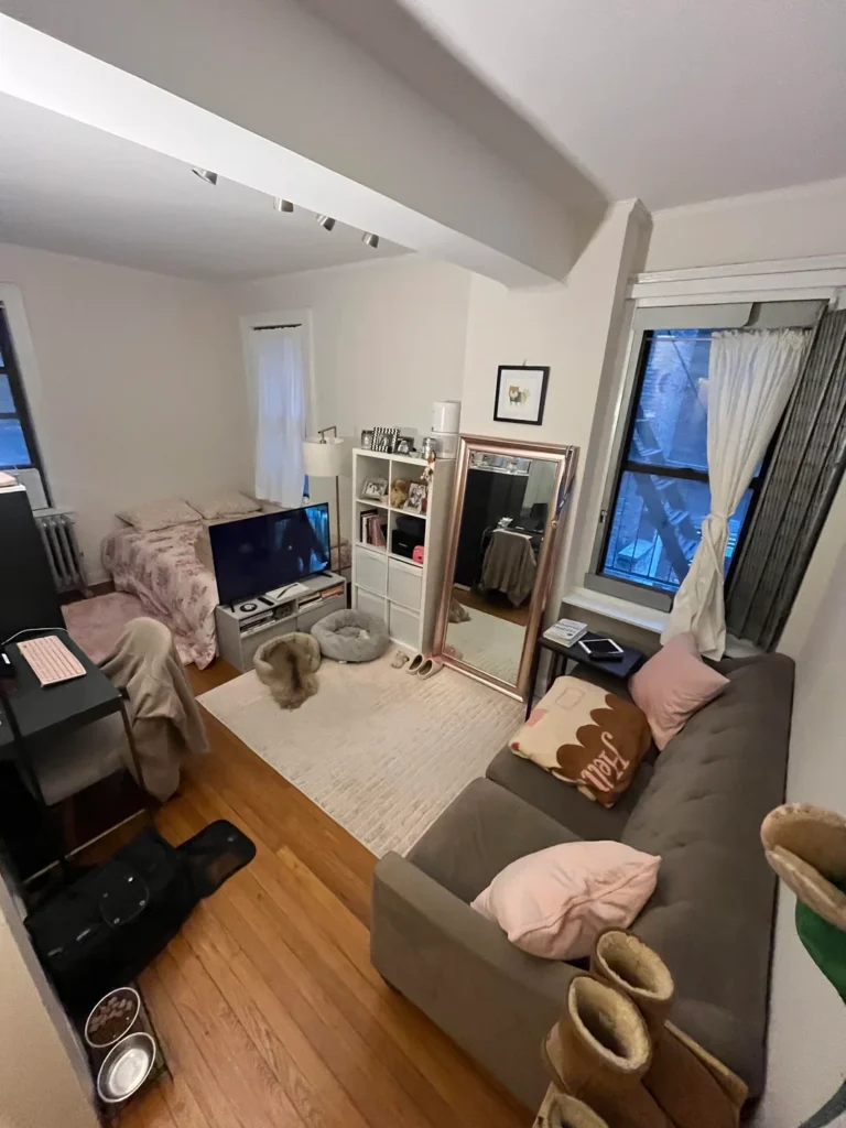
This is the kind of studio that would crush most people’s spirits on move-in day. Small. Dark windows. Architectural beams cutting through the ceiling. Minimal closet space. And yet, somehow, it works.
r/floofyfluffpuff made a few precise decisions that elevated this challenging space dramatically. A large rose-gold-framed leaning mirror stands against the far wall, positioned to catch and reflect light from both windows at once. A white 2×4 cube shelf holds a small TV, books, framed photos, and a lamp. A soft cream area rug defines the central zone, and blush pink and brown throw pillows warm up the gray sofa.
Why Leaning Beats Hanging
A leaning mirror requires no wall anchors, works perfectly for renters, and you can reposition it anytime to optimize light reflection as seasons change and light angles shift. For a small studio, that flexibility is honestly worth more than the mirror itself cost.
The track lighting on the ceiling beam, which could easily look like an industrial eyesore, becomes a practical asset here. Multiple adjustable spotlights let you direct light exactly where you need it. That matters enormously when natural light is limited and your fixed overhead fixtures aren’t cutting it.
Real Homes Have Pet Stuff (And That’s Fine)
The pet bowls and dog bed visible in the corner are honest and I genuinely respect it. Real homes have pets and pet accessories. Incorporating them naturally rather than hiding them away is part of what makes this space feel complete and truly lived-in.
Scandinavian Minimalism That Packs a Full Apartment Into One Room
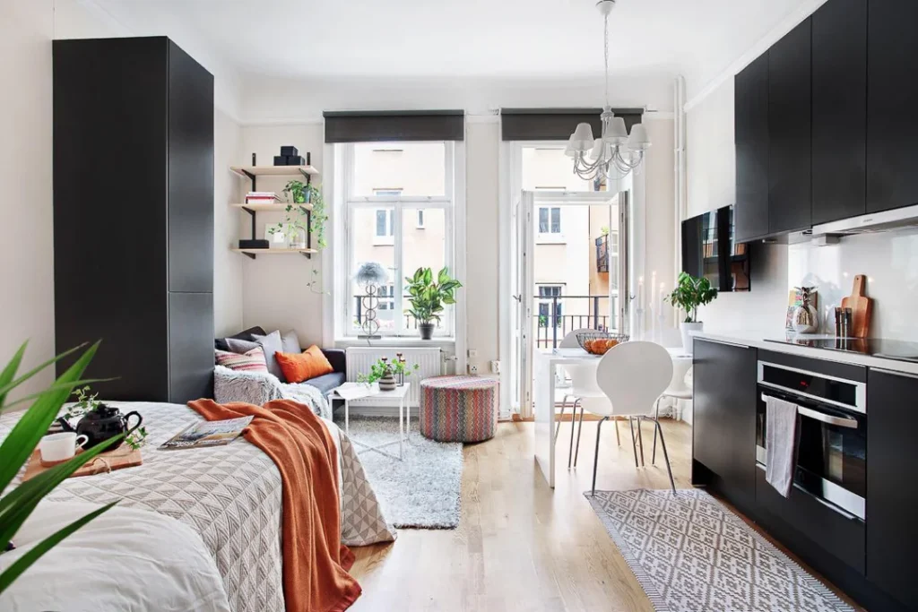
This is the most architecturally composed studio in the entire collection, and it earns that title through radical clarity. Every single decision serves the same goal: maximum function, minimum visual weight.
r/Binary_Management designed a space anchored by matte black cabinetry. Floor-to-ceiling kitchen units on one side. A tall wardrobe on the other. Both create bold vertical contrast against crisp white walls. The kitchen counter space is generous, the appliances integrate seamlessly, and the cooking area feels like a proper kitchen rather than a galley afterthought.
High Contrast, Low Clutter
The living area occupies the center with a compact gray sofa, orange and coral throw pillows, a small round shag rug, and a patterned pouf. A small dining table with two white Tulip-style chairs sits near the balcony doors and doubles as a workspace when needed.
Natural light pours through floor-to-ceiling balcony doors. The design acknowledges this by keeping window treatments minimal with simple charcoal roller shades that disappear when open.
Here’s the principle at work: when your structural elements are bold, your accessories can stay quiet. The black cabinetry creates all the drama this room needs. Plants and a few throw pillows handle the rest. No clutter required.
Quick Reference: Studio Decorating Approaches at a Glance
| Decorating Style | Best For | Zone Division Method | Difficulty |
|---|---|---|---|
| Bold maximalist color | Expressing personality, energetic spaces | Layered rugs | Easy |
| Warm boho layering | Cozy atmosphere, texture lovers | Furniture placement | Medium |
| Indoor plant wall | Nature lovers, low-light spaces | Lit shelving unit | Medium |
| Curtain room divider | Renters wanting bedroom separation | Floor-to-ceiling curtains | Easy |
| Bookshelf divider | Collectors, readers, gamers | Open shelving unit | Easy |
| Earthy eclectic mix | Artistic personalities, warm tones | Color consistency | Medium |
| Candlelit feminine warmth | Evening ambiance, narrow layouts | Mirror + layered lighting | Easy |
| Natural light minimalism | Bright spaces, confident restraint | Rug placement | Easy |
| Urban compact feminine | Small NYC studios, renters | Mirror + neutral palette | Easy |
| Scandinavian black-and-white | Maximum function, bold contrast | Architecture + color | Advanced |
What Every Single One of These Studios Has in Common
Strip away all the different styles. The smiley-face pillows. The Scandinavian black cabinetry. The boho leather sofa. Every single one of these spaces shares one trait: the person living there made a decision and fully committed to it.
That sounds simple. It really isn’t. Most unsuccessful small studio apartment decorating happens not because of bad taste but because of indecision. A piece of furniture that doesn’t match anything. A gallery wall that never got finished. A rug that was “good enough for now” three years ago and is somehow still there.
These ten rooms all feel complete because someone picked a direction and actually went that direction. Full speed. No looking back.
The Practical Takeaways Worth Remembering
- Position mirrors to reflect light sources, not blank walls
- Use rugs to define zones, not just cover floors
- Hang curtains high and wide to make ceilings feel taller
- Choose shelving units that divide space while also serving as storage
- Layer your lighting with pendants, table lamps, and candles instead of relying on overhead fixtures alone
These are techniques anyone can learn and apply regardless of budget. What you can’t learn from a list, though, is the willingness to let your space actually be yours rather than some generic version of what a small apartment is “supposed” to look like.
The tiger rug. The Snorlax plush. The Monet poster. The burger-shaped pillow. These all come from people who stopped worrying about what their studio should be and started making it into something they actually wanted to come home to.
That shift is where real small studio decorating begins. So go make your space weird and wonderful and completely, unapologetically yours.