
Green tile has a way of making people nervous before they commit and then absolutely obsessed once they do. I’ve pulled together ten real examples that span everything from 1920s originals to brand-new renovations, so you can see how green tile bathrooms actually look in practice, not just in a perfectly staged showroom.
These aren’t aspirational renders. They’re real bathrooms that real people live with, and that’s exactly what makes them useful.
Whether you’re working with vintage tile you inherited or planning something from scratch, there’s a green tile bathroom idea here worth stealing.
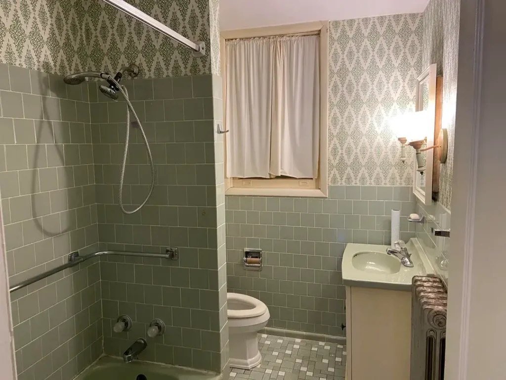
Sage Green Subway Tile with Coordinating Wallpaper: A Vintage Gem Worth Preserving

Some bathrooms were designed in an era when coordination was taken seriously, and this is one of them. The sage green subway tile runs from floor to wainscot height across the shower surround and walls, paired with a white-and-green damask wallpaper that ties the whole palette together without competing with it.
r/Coastal_Elite410 shared this bathroom as a study in original mid-century design, and it’s easy to see why. The tile itself sits in a soft grey-green almost sage with a hint of blue and the mosaic penny tile floor picks up the same tone in a smaller format.
The matching green sink completes what designers today would call a “tonal” approach, though back then it was just called good sense.
What strikes me most is how the wallpaper works with the tile rather than against it. The damask pattern uses the same grey-green on a white ground, which means the wall and tile sections feel unified even though the materials are completely different. That’s a harder trick to pull off than it looks.
If you have original tile in this color range, resist the urge to paint over it or rip it out. The chrome fixtures and white ceiling are doing quiet work here, keeping the space from feeling dark.
Lean into the vintage character by finding wallpaper or paint colors that share the same green undertone rather than introducing contrast you’ll regret.
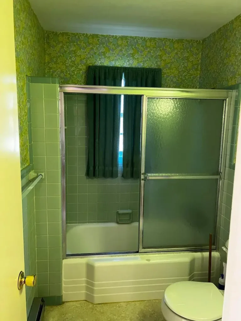
Full Commitment: All-Green Everything in a 1970s Bathroom
This bathroom did not come to play. Lime-green walls, sage-green square tiles floor to ceiling, a green tub surround, matching toilet, and an avocado-floral wallpaper that covers every inch above the tile line — this is the full 1970s experience, uncut.
r/lovetoallofyou posted this as the definition of what vintage green tile bathrooms looked like at their most maximalist, and honestly, I find it fascinating.
The tiles themselves are a muted sage, probably 4×4-inch squares, running in a simple grid pattern. The sliding frosted glass shower door adds a chrome-framed element that gives some visual relief.
The matching dark green curtain inside the shower is a detail that most people would swap out first, but it’s period-accurate to the point of being a time capsule.
Does it work by current design standards? Depends on your perspective. The coordination is total every surface speaks the same language which is either a design strength or a design headache depending on how you feel about maximalism.
What it demonstrates clearly is that green tile bathrooms don’t require restraint to function. They can be fully committed to a single color world and still feel intentional.
If you inherited something like this and want to update it without a full gut renovation, start with the wallpaper. Replacing the floral with a clean white or a simple stripe immediately shifts the room toward a retro-chic aesthetic rather than untouched 1973. Keep the tile it’s honest about what it is, and that’s worth something.
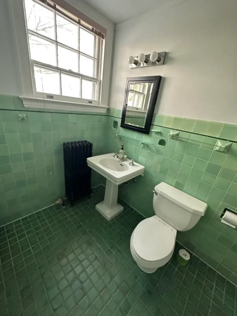
1920s Green Tile with a Pedestal Sink: When History Does the Decorating
There’s a specific shade of green that only shows up in pre-war American bathrooms, and this bathroom has it. The tile is a warm jade-to-mint that shifts slightly depending on the light walls covered in larger 4×4 squares transitioning from a deeper green at the floor to a lighter tone near the window, with the darker, almost forest-green floor tiles creating contrast underfoot.
r/centuryhomes described this as their 1920s green bathroom, and the details confirm the era: original tile corner pieces with decorative built-in soap and toothbrush holders, a cast-iron radiator painted black, and a classic white pedestal sink with chrome cross-handle faucets.
The black-framed medicine cabinet mirror and the globe vanity light are sympathetic additions that don’t fight the original character.
What makes this work is the white above the tile line. The upper walls are painted white, which gives the room breathing room that full-height tile wouldn’t.
The ceiling stays white too, so the space reads as airy despite the intense green below. That’s the move in period tile bathrooms let the tile be the star and keep everything above it neutral.
If you want this look, reproduction 4×4 field tile in jade and mint tones is available from several specialty manufacturers. The important detail is getting the grout color right: off-white or light grey matches the original aesthetic far better than bright white, which reads as modern against period tile.
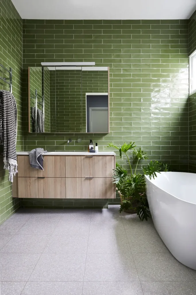
Olive Green Subway Tile Floor to Ceiling with a Floating Vanity: Contemporary Confidence
This is what happens when someone takes the green-tile-everywhere concept and executes it with a sharp modern eye.
Deep olive green subway tiles glossy, with slight variation in the glaze that gives them a handmade quality cover every wall from floor to ceiling. The floor is a large-format grey terrazzo tile that grounds the space without adding pattern noise.
r/ManiaforBeatles demonstrates exactly what I mean about material contrast making a room work. The floating wood-grain vanity in warm oak cuts across all that green with a horizontal band of warmth, and the white freestanding soaking tub does the same at floor level.
A monstera plant in a wicker basket sits between vanity and tub, adding living green that reads as a completely different texture from the ceramic tile behind it.
The tile itself is the key decision here. The slight glaze variation across individual tiles some catching more light, some reading darker gives the wall a depth that flat, uniform tiles couldn’t achieve. That handmade zellige-adjacent quality is what separates this from a standard tile job.
For anyone planning something similar, the floating vanity height matters more than most people realize. It creates visual space between the floor and the cabinet, which prevents the room from feeling heavy despite all that saturated color on the walls. Pair olive green tile with warm wood tones rather than cool grey cabinetry — the warmth keeps the room from going cold.
| Style | Green Tone | Best Paired With | Difficulty Level |
|---|---|---|---|
| Vintage/Original | Sage, jade, mint | Matching fixtures, wallpaper | Easy (preserve what’s there) |
| Mid-century Modern | Avocado, lime | Chrome fixtures, period wallpaper | Medium |
| Contemporary Maximalist | Olive, forest | Warm wood, terrazzo, plants | Medium |
| Jewel-toned Luxury | Emerald, deep forest | Gold/brass fixtures, marble | Advanced |
| Eclectic/Retro Revival | Teal-green, chartreuse | Bold color combinations | Advanced |
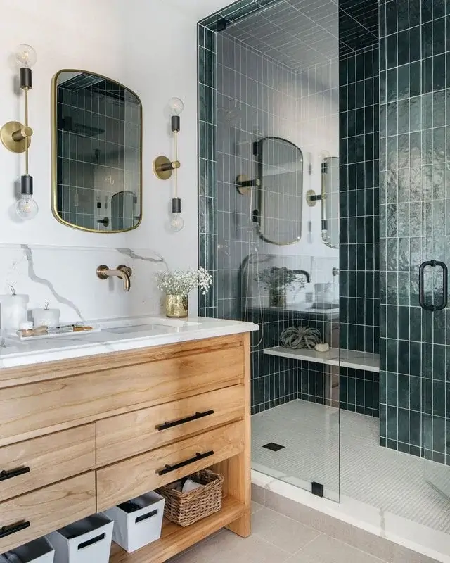
Forest Green Grid Tile Shower with Brass Hardware: Moody and Modern
Dark green tile in a shower enclosure is a commitment that pays off. This bathroom pairs deep forest green square tiles laid in a clean grid with bright white grout with a glass-enclosed shower that lets you see the full effect without the tile swallowing the room.
r/mtlgrems put together a bathroom that’s genuinely hard to stop looking at. The shower walls are covered in deep teal-green tile with a slight variation in surface texture.
Outside the shower, the walls are white with white marble-look countertops on the natural wood vanity. That contrast is what makes everything pop the green tile reads as a contained jewel box rather than something oppressive.
The hardware choices here are deliberate. Brushed brass wall-mount faucets, brass-framed rounded mirrors, and black drawer pulls on the vanity create a warm metallic palette that softens the coolness of the green tile.
The mix of black and brass is a detail worth noting it works because both metals appear in the same room, so neither feels out of place.
What to take from this: confine your green tile bathroom statement to the shower if you want impact without full commitment.
The rest of the bathroom stays white and light, which makes the shower feel like an intentional design feature rather than a contractor’s leftover. The glass enclosure is non-negotiable in this approach a curtain would block the whole effect.
Chartreuse Picket Tile with Black Penny Tile Floor: Pattern Meeting Pattern
This one surprised me. Chartreuse is a genuinely difficult color too yellow to read as green in some lights, too green to blend with yellow decor and picket tiles are a shape that can easily look fussy. Together, they shouldn’t work as well as they do.
r/egtved_girl shows a bathroom where lime-chartreuse elongated hexagonal (picket) tiles run floor to ceiling on the walls, meeting a black and white penny tile floor with a Greek key border.
A black vanity with silver hardware anchors the lower half of the room, while a simple white shower curtain with black edge trim keeps the tub area from competing with the tile.
The reason this works is the floor. The black and white penny tile with geometric border provides a sophisticated counterweight to the energetic wall color.
It says “this is intentional” in a way that simple white penny tile wouldn’t. Black window frames and hardware reinforce that the chartreuse isn’t a mistake it’s the whole point.
If you’re drawn to bright, yellow-leaning green tile, the floor is where you balance it. Don’t match the green down below. Go graphic and high-contrast instead. A black and white floor pattern signals confidence and stops the room from feeling like it belongs in a nursery rather than a well-designed bathroom.
Teal and Chartreuse Two-Tone Tile: A Retro Color Combination That Earns Its Boldness
Most two-tone tile schemes involve one neutral. This one doesn’t. Turquoise-teal square tiles dominate the floor and lower walls while bright chartreuse-yellow-green tiles run in horizontal bands through the shower and somehow, it works.
r/urkala pulled off something that takes real commitment: a bathroom where two equally saturated colors share equal real estate. The teal covers the floor, lower bathroom walls, and the lower half of the shower.
The chartreuse appears in stripe bands across the shower interior and continues as an accent along the upper wall.
A teal pedestal sink matches the floor tile, and the warm brass pendant light above the shower plus the bronze vanity bar lights add warmth that keeps the whole scheme from feeling cold.
Is it for everyone? Absolutely not. Is it executed well? Without question. The grout is white throughout, which acts as a breathing space between the competing colors.
That single decision is probably what keeps the room from feeling chaotic. White grout unifies the scheme in a way that matching grout could not.
The lesson here is that bold color combinations need a unifying element. In this case it’s the white grout. In another context it might be consistent hardware or a single material floor. Find your thread and pull it through every surface that’s what separates intentional from accidental.
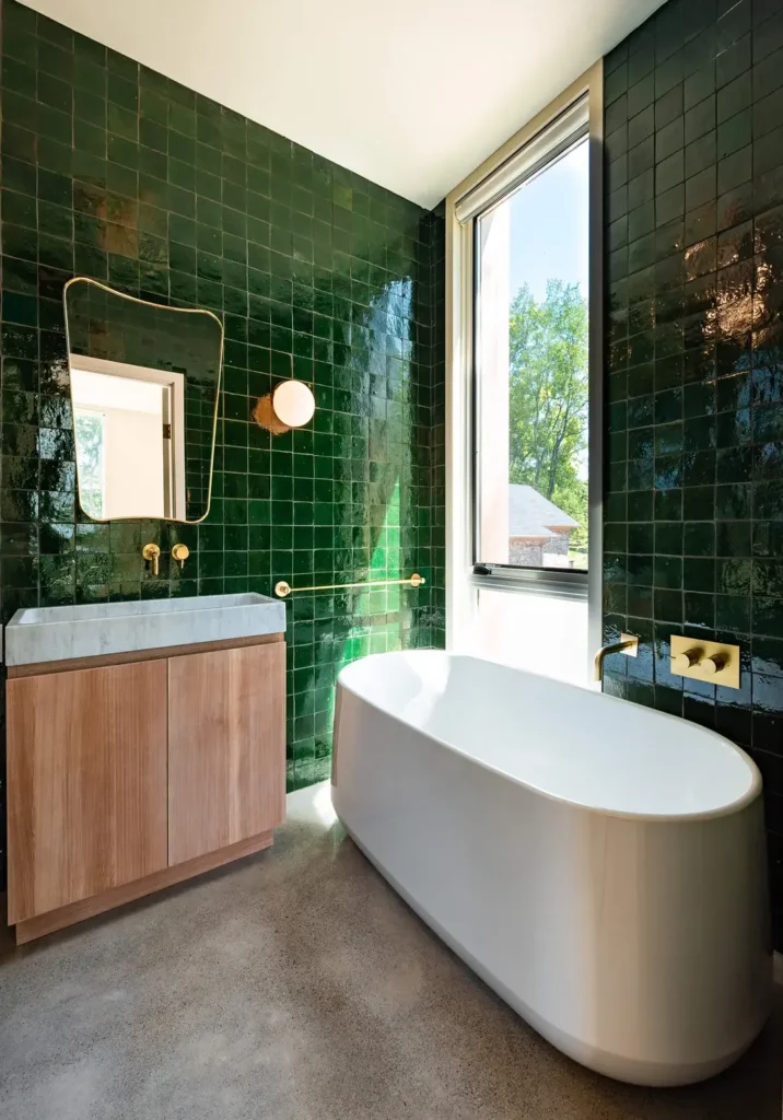
Emerald Zellige Tile with Brass Fixtures and Concrete Floor: High-Low Done Right
This is the version of a green tile bathroom that lands in architecture magazines, and looking at it, the reason is clear.
Emerald green zellige tiles small squares with the characteristic uneven glaze and slight surface variation that gives zellige its depth cover every wall from floor to ceiling. The reflections shift as light moves across them, creating a surface that feels almost wet even when dry.
r/perfect_wonders built a bathroom that treats the tile as architecture rather than decoration. The floor is polished concrete, which is about as far from the tile’s texture as you can get smooth, matte grey against the glossy, irregular green walls.
A freestanding white soaking tub sits directly on the concrete, and a wood vanity with a white marble top completes the material story: ceramic, concrete, marble, and wood all in one room.
Brass fixtures throughout wall-mount faucets, towel bar, globe sconce tie together with the warm brown wood tones in the cabinetry.
The irregular window is unglamorous by itself, but positioned next to the tub it creates a connection to the outdoors that mirrors the forest quality of the emerald tile.
Zellige tile is not cheap and it’s not easy to install uniformly, which is actually the point. The imperfection is the product.
If you want this look but the budget is a concern, similar glaze variation is available in manufactured tiles marketed specifically for zellige-effect finishes less authentic, but far more consistent in thickness, which your installer will appreciate.
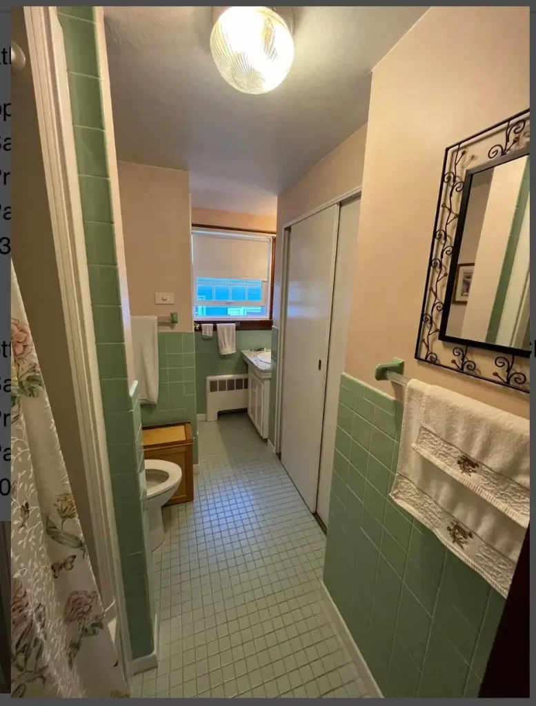
Mint Green Tile in a Narrow Long Bathroom: Vintage Proportions, Intact
Long, narrow bathrooms are a layout problem that most people try to solve with light colors and mirrors. This bathroom took the opposite approach sage-mint green tile runs from floor to tile-height on both long walls, with warm peach paint above, and somehow the space doesn’t feel smaller for it.
r/Kalternativejunk shared this as a classic example of mid-century bathroom proportions, and the bones are worth studying.
The tile wainscoting runs to about four feet high on both walls, with the green carrying through a small mosaic penny tile floor in the same color range.
A floral shower curtain at the far end and a wrought-iron mirror frame on the near wall are the only real decoration, and neither fights the green tile.
What makes the proportions work is the contrast between the green tile and the warm peach/tan paint above.
Those are analogous colors in a warm-cool balance the peach warms up the coolness of the mint, which prevents the tunnel effect that pure white walls would create.
It’s a color relationship that most vintage homeowners stumbled into, but it’s one worth replicating deliberately if you’re working with a similarly narrow space.
The floral shower curtain choice is smart too. A solid white curtain would interrupt the green accent at the far end of the room. The floral picks up both the green and the warm tones from the walls, keeping the eye moving through the space rather than stopping at the curtain line.
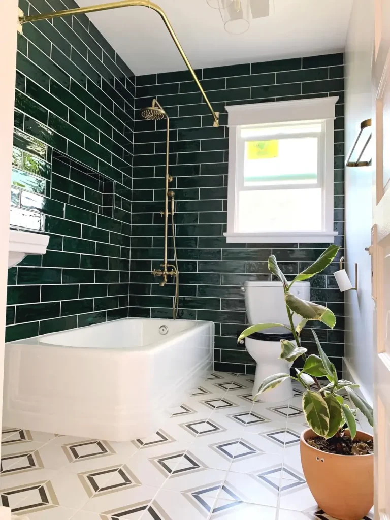
Forest Green Subway Tile with a Brass Exposed Shower and Patterned Floor: The Renovation That Got Everything Right
There’s a version of the green-tile bathroom renovation that plays it safe one accent wall, one neutral everything-else and then there’s this.
Deep forest green glazed subway tiles cover the walls floor to ceiling on two sides, white-framed window punched through the green for light, and the floor is a white geometric diamond-pattern tile that provides complete visual contrast.
r/fauxfoxfilm renovated what appears to be a small traditional bathroom into something that reads as both period-appropriate and genuinely fresh.
The exposed brass shower system a full height column with rain head, handheld, and curved arm is mounted directly on the green tile and becomes the room’s jewelry.
An asymmetric white soaking tub with angular silhouette sits front and center. A terracotta pot with a trailing plant adds organic warmth at floor level.
The floor tile is the detail that seals it. A diamond-within-diamond geometric pattern in white, black, and grey is complex enough to be interesting but anchored in a neutral palette that doesn’t compete with the green walls.
That combination bold wall tile, patterned neutral floor is one of the most reliable approaches in green tile bathroom design.
The brass throughout reinforces that this is an intentional choice: the shower column, the black toilet seat as a nice contrast detail, the towel rail visible at the edge of the frame. None of it is accidental, and that deliberateness is what makes the room land.
Finding Your Version of the Green Tile Bathroom
Looking across these ten examples, a few things become clear. Green tile bathrooms span an enormous range from the gentle sage of a preserved 1920s original to the full-saturated commitment of an emerald zellige renovation. The color itself isn’t the deciding factor in whether a bathroom succeeds. The decisions around it are.
The examples that work best whether vintage or contemporary tend to have one thing in common: a strong contrast element. White grout against dark tile.
A pale floor against saturated walls. Warm wood against cool ceramic. That contrast is what keeps green from becoming overwhelming, regardless of the specific shade.
If you’re planning a green tile bathroom from scratch, I’d suggest deciding on the green tone before anything else. Sage and mint read as warm and gentle they pair with everything.
Olive and forest read as sophisticated and moody they need warm neutrals to avoid feeling cold. Emerald and deep jewel tones are theatrical they need restraint everywhere else in the room to function without exhausting you.
The vintage examples here also make a case that’s worth considering: sometimes the most interesting green tile bathroom is the one someone else already built decades ago, and the best renovation is no renovation at all.
A preserved 1920s or 1950s green tile bathroom with updated fixtures and fresh grout can be far more distinctive than a new one. That’s not a trendy take, but it might be the right one for your house.