You scroll through kitchen inspiration at midnight, looking at the same white shaker cabinets everyone else has, and something in you rebels. Green catches your eye, but doubt creeps in fast. Will it look dated in five years? Too bold? Too weird?
I’ve gathered 12 real green kitchen examples from people who took the leap. These aren’t staged designer showrooms. They’re actual kitchens where people cook dinner, make coffee at 6 AM, and live. Each one handles the color differently, proving there’s no single “right” way to bring green into your kitchen.
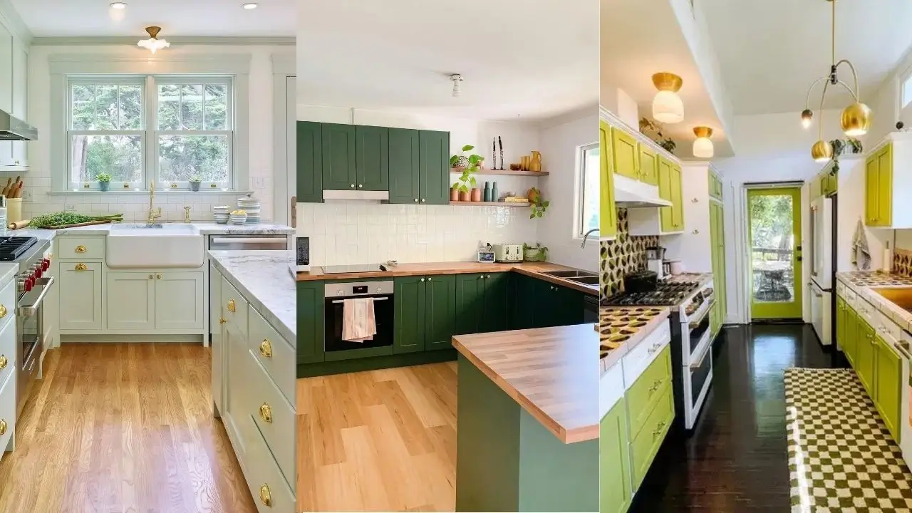
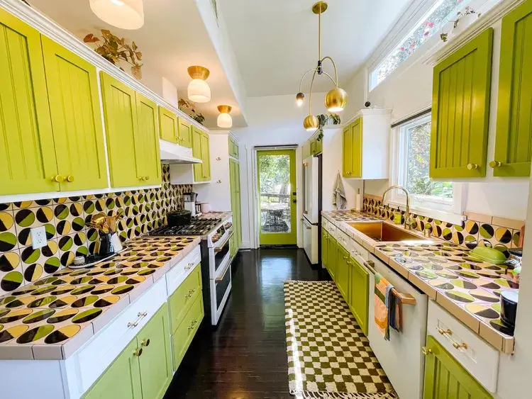
Sage Green Cabinets with White Quartz Balance Classic and Current
Green doesn’t have to scream for attention to work. This kitchen proves restraint can deliver more impact than you’d expect.
r/virginiarph chose a muted sage tone for the cabinetry paired with clean white quartz countertops. The L-shaped layout maximizes corner space while keeping sight lines open. Black matte hardware and matching black wall sconces create intentional contrast points that prevent the soft green from fading into blandness. Notice the crown molding at the ceiling line carries the same green, making the cabinets feel architecturally integrated rather than just painted boxes.
The genius here is temperature balance. Sage green leans cool, but the rich wood flooring and warm beige walls keep the space from feeling sterile. The white backsplash area reflects light back into the work zones without competing visually.
Start with paint samples on large poster boards if you’re considering this approach. View them at different times of day because morning light will show you completely different undertones than evening light. Sage can shift toward gray or yellow depending on your specific light conditions.
Pale Mint Cabinets with Brass Hardware Create Vintage Warmth
Brass and soft green share an interesting history in kitchen design, and this space shows why that combination endures.
The cabinetry here sits in a delicate mint zone that’s barely green, almost hovering at the edge of white. r/SFArchitect1 committed to brass cup pulls and knobs throughout, plus a brass faucet at the farmhouse sink. The white subway tile backsplash runs traditionally with light gray grout that doesn’t fight for attention. Upper cabinets include glass-front doors breaking up the solid mint surfaces and adding function by displaying dishes that feel like decor.
What makes this effective is the warmth infusion from natural wood floors and the brass catching whatever light enters through those double windows. The marble-look countertops provide subtle veining that creates visual texture without pattern overload.
When working with pale green cabinets, your hardware finish matters more than you think. Brass warms the space. Chrome would cool it down. Black would add edge. Choose based on the feeling you want when you walk in, not just what looks good in isolation.
Deep Forest Green with White Subway Tile Feels Fresh, Not Heavy
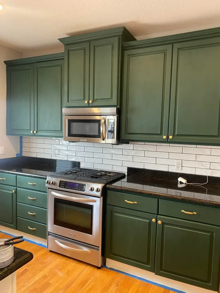
Darker green intimidates people, but proper pairing prevents it from closing in on you.
r/Brilliant_Knee3824 painted existing cabinets in a saturated forest green that reads almost hunter in certain light. The white subway tile backsplash with dark grout creates a grid that gives your eye organized places to rest. Gold-toned hardware pulls add a traditional touch that prevents the green from skewing too modern or stark. The black granite countertop anchors everything downward while the white microwave cabinet and upper cabinets lighten the overall mass.
This works because of the white balance. Remove that subway tile and suddenly you’ve got a much heavier space. The dark countertop was a bold choice that pays off by creating a color sandwich effect: light walls, dark green middle zone, dark counter, then lighter floor below.
If you’re repainting cabinets this color, consider leaving some uppers white or using glass inserts. Full dark green in a small kitchen without enough white or light surfaces can feel like cooking in a closet. You need breathing room.
Emerald Walls and Cabinets with Curated Vintage Details Build Character
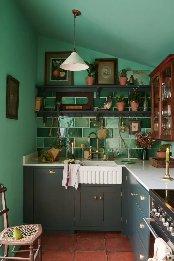
Not everyone wants subtle. Some kitchens should announce themselves the second you enter.
This space commits completely to emerald green on both walls and lower cabinets. r/ManiaforBeatles layered in substantial personality through carefully chosen vintage elements: framed botanicals and old family photos on open shelving, terracotta pots with trailing plants, brass faucet and fixtures, and varied tile on the backsplash that includes different green tones. The white farmhouse sink and light countertops provide essential visual relief. Terracotta floor tiles add an earthy base that complements rather than competes.
The magic here is curation. Those floating shelves could easily look cluttered, but every item earns its spot by contributing to the vintage-meets-botanical theme. The mix of frame styles and pot materials creates organized chaos that feels intentional.
To pull off this level of color saturation, you need excellent lighting. Notice the pendant fixture and likely additional sources not visible. Dark green absorbs light, so you’ll need to overcompensate with both natural windows and artificial sources. Also, edit your open shelving ruthlessly. What looks charming with six items looks messy with twelve.
Chartreuse Cabinets with Bold Geometric Backsplash Commits Fully
When someone says green kitchen and you picture something that makes people stop talking, this is it.
These cabinets hit a chartreuse-yellow-green that doesn’t apologize. Dazey Den doubled down by adding a geometric backsplash in black, white, yellow, and multiple green tones that creates almost optical movement across the surfaces. The countertop extends that pattern. Gold pendant lights and matching hardware maintain the warm metallic thread. Black floors ground everything and prevent the upper brightness from feeling unmoored. Even the exterior door got painted green.
This works for people who want their kitchen to be an experience, not just a functional room. The pattern commitment is absolute. Half measures would’ve failed here.
You need a specific personality to live with this much visual energy daily. I’ve found that people who love maximalism in other areas of their life usually thrive with bold kitchens like this. If you prefer visual calm in your home, this intensity will exhaust you within a month. Also consider resale reality if that matters to you. Unique statements limit your buyer pool, though they absolutely delight the right buyers.
Transitional Green Tones with Natural Wood Creates Flexible Identity
Not every kitchen needs one green. Using multiple shades in the same space creates depth.
The upper cabinets here read as pale green while the lower cabinets lean toward a different green tone. r/Apprehensive_One1450 left one upper cabinet section in natural oak, breaking up the green expanse and introducing warm wood grain. The black countertop connects to black appliances creating a dark horizontal band. White walls and a simple white backsplash let the cabinet color variations be the focal point without competition.
What’s smart about this approach is the flexibility it creates. The two different greens plus the wood section mean you can introduce accent colors through dish towels, small appliances, or decor that work with either green tone. You’re not locked into a single palette.
When mixing cabinet colors like this, test your paint samples next to each other under your actual lighting. What looks coordinated at the store can clash at home. The goal is harmony, not matching. These greens share enough underlying tone to read as intentional rather than indecisive.
Testing Multiple Green Shades Before Committing Shows the Range
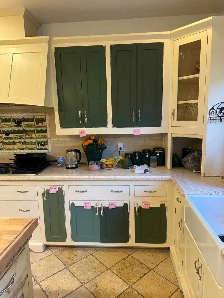
Sometimes the smartest move is seeing your options simultaneously before deciding.
This kitchen is mid-transformation with paint samples applied directly to cabinet doors. r/civman101 tested at least four different green options ranging from deep hunter to sage to something closer to teal. The cream cabinets and current oak upper section provide context for how each green would interact with existing elements. Pink sticky notes mark each shade, likely with paint names for reference.
What you learn from this image is how dramatically different greens behave in the same space. The deeper tones create weight and formality. The lighter sage options feel more casual and contemporary. That teal-leaning option in the middle brings an entirely different energy.
Never skip this testing phase. Buy sample sizes of your top three choices and paint large sections of actual cabinet doors or poster boards you can move around. View them morning, afternoon, and night. Photograph them because cameras sometimes reveal undertones your eye misses in person. Live with them for at least a week before committing to gallons of paint.
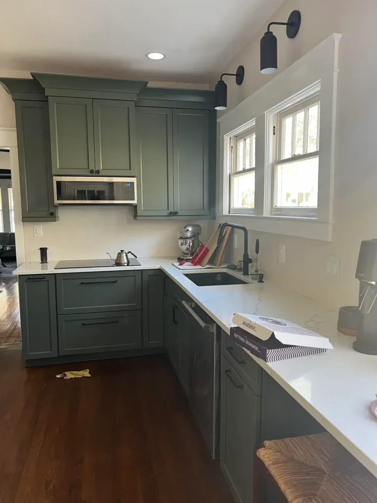
Charcoal-Green Cabinets with Warm Wood Counters Balance Cool and Warm
Green that leans gray creates a sophisticated neutral that still registers as color.
These cabinets sit in that interesting space between green and gray, reading as a deep charcoal-green that feels neither cold nor particularly warm. r/MsKittens topped them with golden-brown granite countertops that introduce warmth and visual texture through the natural stone veining. White appliances lighten the mass. Simple white subway tile keeps the backsplash understated. The cabinet-top display of repurposed bottles and small plants adds vertical interest without formal shelving.
This color strategy works beautifully in kitchens with limited natural light because the gray-green doesn’t fight against cooler light conditions the way a yellow-based green would. The warm countertop prevents the space from feeling dreary.
Charcoal-green is criminally underused. It works with virtually any wood tone, accepts both warm and cool metals, and hides minor wear better than lighter colors. If you’re nervous about green but tired of gray, this is your bridge color.
Soft Green-Gray with Classic White Marble Delivers Timeless Elegance
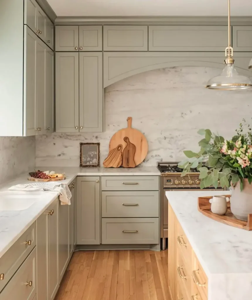
Some kitchens aim for a specific era while feeling current, and this nails that balance.
The green here barely announces itself, sitting closer to a greyed sage that would almost pass as a warm gray in certain light. r/ThedaBarasBoobs paired it with white marble countertops showing subtle gray veining that echoes the cabinet tone. Brass hardware and a brass pendant fixture introduce traditional warmth. The arched marble backsplash behind the range creates an architectural focal point. Wood flooring in a light honey tone keeps the base warm, and a simple woven rug adds softness.
This works because nothing screams for attention. Each element supports the others rather than competing. The green provides just enough color to prevent the white marble from feeling too stark, while the marble keeps the green from reading as heavy or dark.
When aiming for this level of understated elegance, quality materials matter more than bold choices. That real marble will outlast and outperform any laminate alternative. The brass will develop patina that adds character rather than looking cheap. You’re building toward a kitchen that ages gracefully rather than dating itself to a specific year.
Two-Tone Green with Dark Soapstone Creates Modern Farmhouse Blend
Mixing cabinet colors in the same kitchen requires courage, but the payoff can be substantial.
The lower cabinets here hit a deeper teal-green while upper cabinets or shelving areas sit in a softer sage green. r/Moist-War5196 introduced black soapstone (or similarly dark stone) as both backsplash and countertop, creating dramatic contrast against the lighter wall color. Brass hardware and a gold-toned faucet maintain consistency. Open floating shelves in dark wood display minimal ceramic pieces and a small framed artwork. The white farmhouse sink becomes a bright focal point against all that dark stone.
The two-tone green strategy prevents monotony while maintaining color family cohesion. The dark backsplash is an unexpected choice that completely transforms what could have been a standard kitchen into something memorable.
When using dark stone in a small kitchen like this, maximize your light sources. Under-cabinet lighting becomes essential, not optional. The natural light from that window is probably insufficient on cloudy days. Plan for that reality before installation, not after you’re living with a cave.
Hunter Green with Butcher Block Brings Cozy Warmth to Daily Cooking
Natural wood countertops change how green cabinets feel in a space entirely.
These cabinets read as a true hunter green with substantial depth and richness. r/poppiipan chose butcher block countertops in a warm honey tone that immediately softens the dark green and introduces organic texture. White vertical subway tile with minimal grout lines keeps the backsplash clean and light-reflective. Gold hardware and black matte faucet create a mixed-metal moment that feels current. Open shelving displays everyday items that double as decor, and the wood floating shelf matches the countertop material. Natural light from the window helps, but the room is compact enough that the dark cabinets could have overwhelmed without the wood balance.
Butcher block requires maintenance that laminate doesn’t, but the warmth it provides makes it worth the effort for many people. That wood will show knife marks and water stains unless you’re religious about oiling and care, but those imperfections also create character in a way that fake materials can’t replicate.
If you love this combination but worry about upkeep, consider butcher block only on an island or peninsula with different countertops on your primary work surfaces. You get the aesthetic benefit without the full maintenance commitment.
Soft Sage with Shiplap and Brass Creates Farmhouse Contemporary Fusion
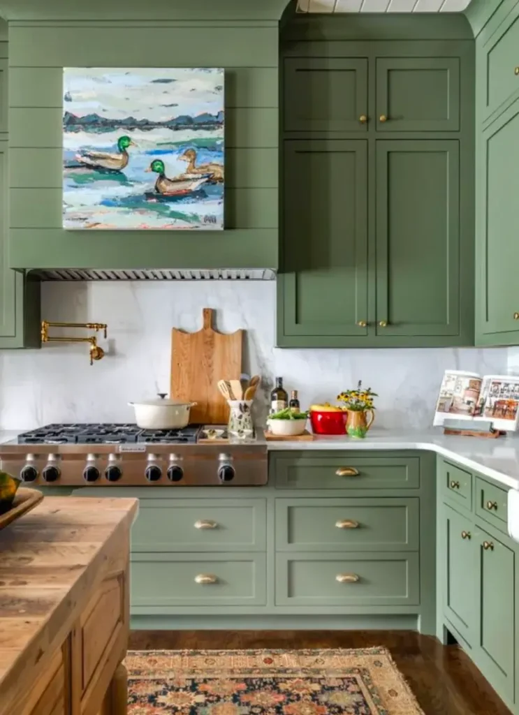
Mixing design styles successfully means understanding what each element contributes to the whole.
The green here sits in a soft sage range with slightly gray undertones that prevent it from going too yellow or too blue. r/sarahscozylife added horizontal white shiplap to the wall and hood area, immediately signaling farmhouse aesthetic. Brass hardware throughout plus a dramatic brass pot filler at the range add traditional warmth. White marble countertops with gray veining maintain the light, airy feeling. The colorful artwork with ducks provides an unexpected personality moment that keeps the space from feeling too safe or predictable.
This kitchen proves you can honor multiple design influences without creating confusion. The shiplap says farmhouse. The sage green cabinets read contemporary. The brass could go either direction. Together they create something that feels both fresh and rooted.
When introducing strong design elements like shiplap, limit where you use it. This kitchen applied it specifically to the hood and upper wall area, not everywhere. Full-wall shiplap in a small kitchen can feel theme-park fake. Strategic placement creates impact without overload.
Choosing the Right Green for Your Kitchen Reality
Not every green works in every kitchen. Your decision should account for factors beyond which shade looks prettiest on a paint chip.
Natural light matters more than almost anything else. Kitchens with south-facing windows can handle deeper greens that would feel oppressive in a north-facing space. Consider your wall color and flooring because your cabinets need to work with what you’re not changing. Think about your cabinet door style since flat-panel doors show color differently than shaker or raised-panel styles.
Here’s what I’ve learned through seeing hundreds of green kitchens: yellow-based greens feel warm and approachable but can go sour in the wrong light. Blue-based greens feel sophisticated and calm but can read as cold without warm elements. Gray-greens offer versatility but can disappear into blandness without strong accent choices.
| Green Type | Best Light Conditions | Works Well With | Avoid Pairing With |
|---|---|---|---|
| Sage | North or limited natural light | Brass, wood, white marble | Chrome, gray walls |
| Hunter | South-facing, bright spaces | Black counters, brass, wood | Light wood, all white |
| Mint | East-facing morning light | Brass, natural wood | Stainless everywhere |
| Emerald | Abundant natural light | White, terracotta, brass | Gray, silver accents |
Your existing elements will guide your green choice more than current trends should. If you have beautiful wood floors you’re keeping, choose a green that complements their undertones. If your countertops are staying, test greens against them specifically.
Making Green Work Long-Term in Your Kitchen
Committing to color requires thinking beyond the initial excitement to how you’ll live with it daily.
Green cabinets will change your decorating decisions going forward. Your dish towels, small appliances, and decor pieces need to work with green, which eliminates some options while opening others. Reds and pinks can look either amazing or terrible with green depending on the specific tones. Yellows generally play well. Blues often harmonize beautifully.
Maintenance considerations matter too. Darker greens hide minor dings and grease splatter better than pale greens. Matte finishes show fingerprints more than satin finishes. If you have young children or cook frequently with oil, factor that into your paint finish choice, not just your color selection.
The resale question comes up constantly. Green cabinets will appeal intensely to some buyers and repel others. That’s reality. If you’re planning to sell within three years, traditional neutrals make more financial sense. If this is your home for the next decade, choose what makes you happy when you pour morning coffee and cook dinner. Life’s too short to design your kitchen for theoretical future buyers.
Final Thoughts on Green Kitchens That Last
These twelve examples show that green kitchen ideas span from barely-there sage to saturated emerald, from traditional farmhouse to bold contemporary. The common thread isn’t the specific shade. It’s the commitment to making thoughtful choices about pairings and proportions.
Your kitchen occupies significant mental real estate whether you realize it or not. You start and end your day there. You navigate it half-awake before coffee and exhausted after long days. The color surrounding you during those moments matters more than most people acknowledge when choosing finishes.
Green offers something white and gray don’t: personality without screaming, color without chaos. It connects you to nature in a space often dominated by appliances and hard surfaces. It works with wood, stone, metal, and tile in ways that create layered interest rather than flat monotony.
The question isn’t whether green can work in your kitchen. These images prove it can. The real question is whether you’re ready to choose something with actual character instead of playing it safe one more time.