Your kitchen feels stuck between modern function and rustic charm, and you’re not sure which direction to commit to. I’ve spent years analyzing farmhouse kitchens that work, and the secret isn’t choosing one or the other—it’s blending them with intention.
The farmhouse kitchen ideas I’m sharing aren’t pulled from staged magazine shoots. These are real kitchens where people cook daily meals, where countertops get cluttered, and where design decisions were made with actual budgets in mind. Each example shows a specific approach that solves a real design challenge, and I’ll walk you through exactly what makes each one effective.
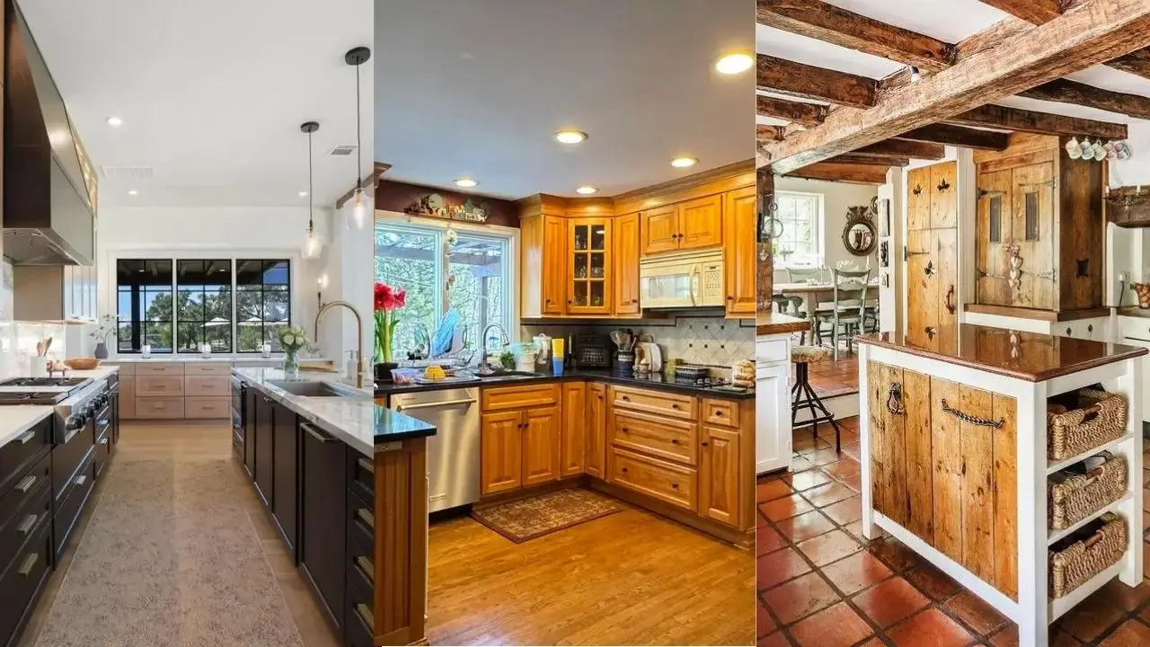
Honey-Toned Wood Cabinets with Black Granite Countertops
Traditional doesn’t have to mean outdated. This kitchen proves you can work with existing wood cabinetry and create something that feels both current and timeless.
The golden oak cabinets here are paired with black granite countertops that create enough contrast to define the workspace without fighting the wood’s warmth. r/Rungottarun demonstrates how crown molding and varied cabinet heights add architectural interest to an otherwise straightforward layout. Notice the glass-front cabinet doors breaking up the solid wood—they create visual breathing room while displaying dishes.
The beadboard island base adds texture without introducing another wood tone, which keeps the space from feeling too heavy. Black hardware would have been the obvious choice here, but the existing brass-toned pulls complement the wood’s honey undertones.
If you have existing wood cabinets you’re considering painting, study this layout first. The key is balancing the wood with enough contrasting elements—dark countertops, lighter walls, and strategic open shelving—so the cabinets don’t dominate. The recessed lighting positioned throughout provides even illumination that prevents the darker countertops from making the space feel closed in.
Deep Green Walls with White Cabinets and Black Fixtures
Color transforms a kitchen faster than any other single change. This space shows how one bold paint choice creates impact without requiring a full renovation.
The deep sage green walls create an envelope of color that makes the white shaker cabinets pop forward visually. What r/mosterpro7544 understood here is that dark walls need adequate natural light to work—notice the large window providing daylight that keeps the green from feeling oppressive. The black barn pendant and black hardware create a third color that ties the scheme together.
The gray speckled granite countertops serve as a neutral bridge between the green and white. Three floating shelves to the right of the window add practical storage while maintaining an open feel that upper cabinets would have eliminated.
To recreate this look, test your green paint in different lighting conditions first. Morning light will make it appear more yellow-toned, while afternoon light brings out the gray undertones. Mount your pendant lower than you think—it should hover about 30 inches above the counter for proper task lighting. The black fixture here provides focused light exactly where prep work happens.
Shiplap Ceiling with Exposed Beams and Oversized Island
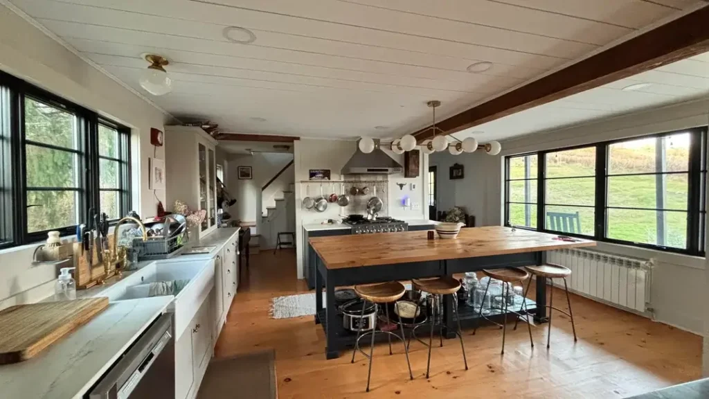
Some kitchens demand to be the center of the home. This open layout embraces that role completely.
The white shiplap ceiling with dark-stained exposed beams establishes farmhouse credentials immediately. r/discreet1 created a kitchen that flows into the dining and living areas while maintaining distinct zones through flooring—notice the terracotta-toned wood underfoot. The oversized island with thick butcher block top serves as both prep surface and dining table, with mismatched industrial stools reinforcing the collected-over-time aesthetic.
Black steel-framed windows and doors are having a moment, and this space shows why. They provide modern contrast against the rustic ceiling treatment while framing the outdoor views. The pendant lighting—a linear arrangement of globe fixtures—provides ambient light without blocking sightlines across the open space.
The farmhouse sink under the window maintains the expected farmhouse element, but the professional-grade range and stainless hood add serious cooking capability. This balance between aesthetic charm and functional performance defines successful farmhouse kitchens.
For high ceilings like this, beams don’t need to be structural. Faux beams made from lightweight wood or polyurethane provide the same visual impact at a fraction of the cost and installation complexity. The key is proper spacing—these beams are positioned about 4 feet apart, which feels substantial without crowding the ceiling plane.
White Cabinets with Gray Walls and Beveled Subway Tile
Neutral doesn’t mean boring. This kitchen uses subtle variations in white and gray to create a layered, sophisticated space.
The white shaker cabinets provide a clean foundation, but the gray-green walls add depth that pure white never could. r/HomeDecorating selected beveled subway tile for the backsplash—the dimensional edges catch light differently than flat tile, adding subtle texture. The reclaimed wood island countertop introduces warmth and organic texture that prevents the space from feeling too clinical.
Three glass pendant lights with brass fixtures hang over the island, their clear glass maintaining visual openness while the brass adds a warm metallic note. The black cabinet hardware creates small moments of contrast throughout, and those matte black lantern-style ceiling fixtures echo that same finish.
The gray speckled countertops tie the wall color to the workspace. This is one of those kitchens where every surface connects to something else—the gray walls relate to the countertops, which relate to the tile grout, which relates back to the walls.
When working with this much white, pay attention to undertones. Cool white cabinets against warm white walls will always look slightly off. These cabinets and trim share the same warm white base, creating cohesion even with the gray walls providing contrast. The raw wood flooring grounds everything with its visible grain and natural color variation.
Marble Waterfall Island in a Double-Island Layout
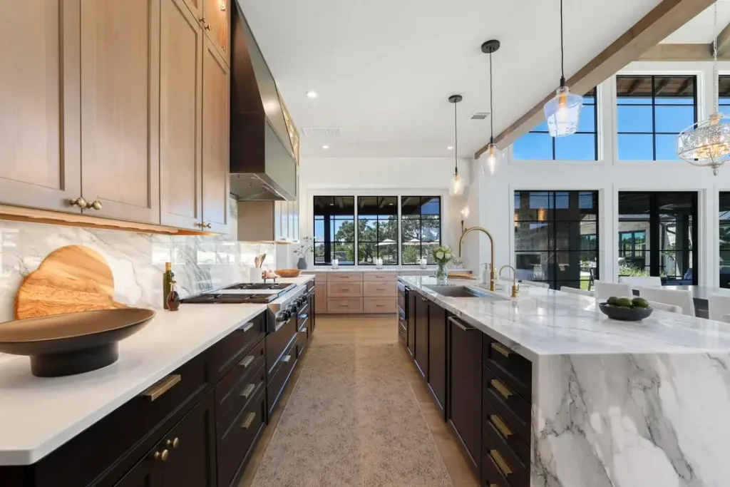
Not every farmhouse kitchen needs to feel rustic. This one leans heavily into refined elegance while maintaining warmth through wood elements.
The dual islands here serve different purposes—the dark wood prep island with marble top provides workspace, while the white marble waterfall island offers a serving and gathering surface. r/tomgreen99200 created distinct zones without walls, using the islands to define traffic flow. Notice the light wood upper cabinets and drawers along the perimeter against the white marble backsplash with dramatic veining.
Natural wood exposed beams on the ceiling provide farmhouse credentials, but the polished brass fixtures and hardware introduce sophistication. The clear glass pendants feel more refined than typical farmhouse lighting, and the high windows flood the space with natural light that makes the white marble glow.
That waterfall edge on the island—where the marble continues down the sides—is a statement. It’s also practical, protecting the island edges from impact damage in a high-traffic kitchen. The varied counter heights create visual interest and define work zones.
For a layout like this, you need serious square footage. Those islands require at least 42 inches of clearance between them for comfortable movement, ideally 48 inches. The high ceilings here prevent the space from feeling crowded despite the substantial cabinetry. If you’re working with lower ceilings, skip the beams and focus on keeping upper cabinets minimal to maintain breathing room.
Gray Lower Cabinets with Farmhouse Sink and Open Shelving
Two-tone cabinetry solves a specific problem: how to add color without committing your entire kitchen to it. This space shows restraint in execution.
The gray lower cabinets ground the space while white uppers keep things light. r/steinah6 positioned the white farmhouse apron-front sink as the focal point under the window, flanked by floating wood shelves that add warmth. The white subway tile backsplash runs full height to the bottom of the upper cabinets, creating clean vertical lines.
That black industrial pendant provides task lighting over the sink while adding a dose of contrast. The gray cabinets have a subtle green undertone that becomes apparent next to the pure white uppers—this prevents the two colors from fighting each other.
The stainless appliances disappear visually against the white cabinets, which is intentional. Not every element needs to make a statement. The gray granite countertops with flecks of black and brown tie into the floor tile while complementing the gray cabinetry.
If you’re considering two-tone cabinets, use the darker color on the bottom. Visually heavy elements at floor level create stability, while lighter uppers prevent the space from feeling top-heavy. The split here happens at countertop height, which is the natural breaking point.
Patterned Tile Floor with Two-Tone Cabinets and Butcher Block
Bold flooring changes everything about how a kitchen feels. This space leads with its gorgeous patterned floor tile and builds from there.
The elaborate black and white patterned cement tiles create movement and interest at floor level. r/RZNCA1N balanced that busy floor with simpler elements above—white upper cabinets, gray-green lowers, and white subway tile. The butcher block countertops on both the lowers and the small breakfast table add warmth that prevents the gray and white palette from feeling cold.
Notice the sink skirt hiding the cabinet opening—a distinctly farmhouse touch that adds fabric texture to a hard-surfaced room. The open shelving displays white dishes that reinforce the upper cabinet color, while the quatrefoil pendant adds a traditional shape in a brushed nickel finish.
That small round breakfast table with mismatched chairs creates an eat-in option without requiring a large island. The charcoal gray of the lower cabinets appears almost black against the white uppers, creating strong contrast that the floor pattern echoes.
When working with patterned floor tile this bold, keep your backsplash simple. These subway tiles in a straight stack pattern provide necessary simplicity. The wood countertops introduce a third major element, but their organic texture reads differently than geometric tile, so they coexist peacefully. If you love this floor but worry about commitment, remember that cement tiles are incredibly durable and only get better with age as they develop a patina.
Cherry Cabinets with Industrial Elements and Creative Backsplash
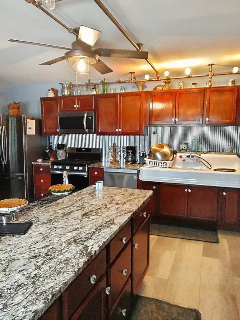
Sometimes the most interesting kitchens come from creative problem-solving. This space shows how to work with existing elements while injecting personality.
The cherry wood cabinets provide warmth, but it’s the corrugated metal backsplash that makes this kitchen memorable. r/Vetiveri created an industrial farmhouse hybrid by introducing materials you’d expect to see in a barn or workshop. Copper pipe exposed along the top of the backsplash doubles as a pot rack, turning plumbing into decor.
The exposed track lighting with vintage-style cage fixtures provides adjustable task lighting while reinforcing the industrial theme. That vintage-inspired ceiling fan with cage detail continues the same aesthetic overhead. The beige granite countertops with dramatic veining ground the space, their earth tones complementing the wood without competing.
White appliances here would have felt wrong, but the stainless refrigerator and black range fit the industrial-meets-farmhouse vibe perfectly. The small window over the sink doesn’t provide much natural light, but the reflective metal backsplash bounces light around effectively.
To recreate this look, source galvanized or corrugated metal panels from a building supply store rather than trying to find “decorative” versions. The authentic material has the right texture and finish. Seal it properly to prevent water damage, especially near the sink. That copper pipe install requires basic plumbing skills and can be mounted with pipe flanges screwed directly into studs behind the backsplash.
White Appliances with Deep Green Walls and Minimalist Hardware
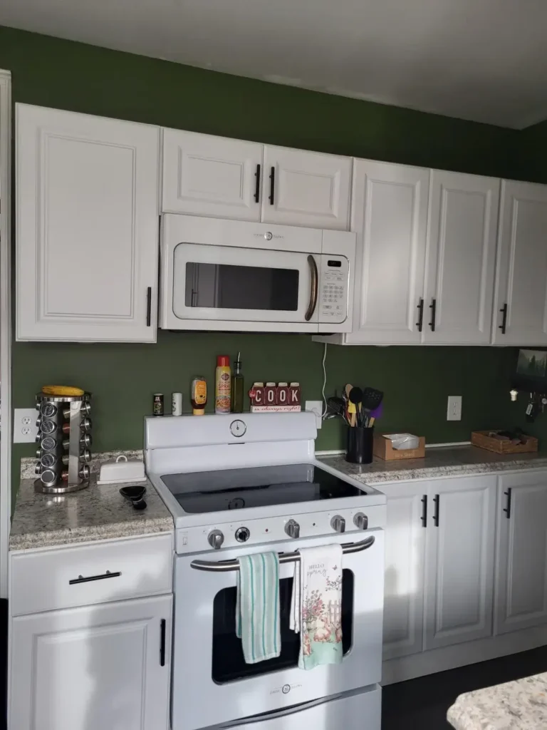
White appliances get dismissed too quickly. This kitchen shows how to make them feel intentional rather than budget-driven.
The deep forest green walls create a moody backdrop that makes the white cabinets and appliances read as deliberate design choices rather than compromises. r/mosterpro7544 committed to the green fully, painting it from counter to ceiling. The white appliances—range, dishwasher, and over-range microwave—create a unified block of white that connects visually to the cabinetry.
Matte black cabinet hardware pops against both the white cabinets and green walls. The beige granite countertops with gray and green flecking tie the two main colors together at the workspace level. The small scale of this kitchen could have felt cramped, but the bold wall color actually creates depth.
That small “COOK” sign and the minimal counter accessories show restraint. Green walls this saturated require discipline with decor—too many competing elements would create visual chaos. The spice rack on the counter provides function without adding color noise.
If you have white appliances you’re stuck with temporarily, embrace them with bold wall color. Deep green, navy blue, or even black makes white appliances look crisp rather than cheap. The key is ensuring your white cabinets match your white appliances in undertone—cool white with cool white, warm with warm. Here, both read slightly warm, which maintains cohesion.
Exposed Ceiling Beams with Terracotta Tile Floor
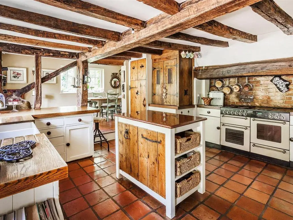
This kitchen transports you somewhere else entirely. The exposed structural elements and terracotta flooring create a European farmhouse atmosphere.
The raw wood beams crossing the ceiling aren’t decorative—they’re the actual structure of what appears to be a centuries-old building. r/horatio_falcon created a kitchen that honors its historic bones while providing modern function. The terracotta floor tiles in varying shades of orange and red ground the space with warm, earthy color.
The white lower cabinets keep things bright despite the dark beams overhead, while the reclaimed wood island with wicker basket storage adds texture and warmth. That professional-style range with multiple ovens indicates serious cooking happens here. Copper pots hanging on the wood plank wall provide both storage and decoration, their metallic sheen catching light.
Notice how the kitchen flows into adjacent rooms without clear boundaries. The doorway visible to the left shows the same beamed ceiling continuing, and the glimpse of a dining area reveals mint-painted chairs that pick up the green undertones in the range wall.
The mix of materials here—rough wood beams, smooth painted cabinets, terracotta tile, wicker baskets, copper pots—could easily feel chaotic, but the consistent warm color palette ties everything together. If you’re working with exposed beams in an old structure, resist the urge to refinish them. That aged, weathered look is authentic and unreplicable.
Natural Wood Cabinets with Beadboard Island and Black Accents
Sometimes you need your kitchen to connect multiple adjacent spaces while maintaining its own identity. This layout handles that challenge gracefully.
The natural oak cabinets with their visible grain provide warmth throughout the space. r/Rungottarun used a beadboard-wrapped island with black granite top to define the kitchen zone while allowing sightlines through to the dining area beyond. The black French door with divided lights frames the view outside and introduces the black finish repeated in the chandelier and hardware.
That rustic wood chandelier over the dining table coordinates with the cabinet wood without matching exactly—an important distinction. Matched wood throughout would feel monotonous, but these two tones complement each other. The open shelving on the right side of the cabinet run displays pottery and cookbooks, adding visual interest to what could have been a solid wall of cabinets.
The layout here is essentially one large room serving as kitchen and dining space, with a glimpse of a mudroom or coat area to the left. This flow between spaces requires careful furniture selection—notice how the ladder-back dining chairs echo the kitchen’s casual farmhouse vibe without introducing a competing style.
The neutral wall color lets the wood tones take center stage. Crown molding at the cabinet tops adds a finished detail that elevates the space beyond basic farmhouse. If you have similar wood cabinets and are debating whether to paint them, consider this: golden oak has regained popularity as trends shift away from all-white kitchens. Sometimes the best move is working with what you have.
Sage Green Cabinets with Open Shelving and Patterned Floor
Color beyond the typical farmhouse white creates personality. This kitchen uses soft sage green to establish a distinct mood.
The sage green cabinets run along one wall, their muted tone feeling more sophisticated than bright colors would. r/ohhomelygirl paired them with open shelving painted a lighter sage, creating tonal variation that adds depth. The patterned backsplash tiles in blue and white introduce a second color family that shouldn’t work with green but somehow does.
That butcher block rolling cart provides mobile workspace and adds natural wood warmth. The black and white checkered floor tile creates drama at ground level without competing with the upper-level color story. Brass drawer pulls and cup handles catch light and introduce metallic warmth.
The exposed bulb table lamp on the counter adds ambient light and reinforces the eclectic, collected aesthetic. Above the sage cabinets, pottery and containers continue up to the ceiling, filling what would otherwise be dead space. This approach works when you have high ceilings and want to maximize storage.
Natural light from the window keeps the sage from feeling dark, though this kitchen would benefit from additional task lighting. The white walls and ceiling provide enough contrast to keep the green cabinets defined rather than blending into the background.
For kitchens with limited space, that rolling butcher block cart is a smart addition. It provides extra prep surface when needed and tucks away when you need floor space. The lighter sage open shelving creates the illusion of more space than closed cabinets would while still providing storage. If you’re considering colored cabinets, sage green offers more flexibility than bolder colors—it reads as neutral while still having personality.
Choosing the Right Farmhouse Style for Your Space
The kitchens you’ve seen demonstrate that farmhouse style isn’t one-size-fits-all. Your space, budget, and lifestyle determine which approach makes sense.
Consider your existing architecture first. Original wood beams and antique details deserve spaces that honor them rather than cover them up. Conversely, a basic rectangular room in a newer build gives you freedom to impose farmhouse elements from scratch.
| Style Approach | Best For | Key Elements |
|---|---|---|
| Traditional Warm Wood | Homes with existing quality cabinets | Natural wood tones, granite counters, classic hardware |
| Modern Farmhouse | New builds or complete renovations | White cabinets, black fixtures, clean lines with rustic accents |
| Industrial Farmhouse | Urban spaces or loft-style homes | Metal elements, exposed utilities, mixed materials |
| European Rustic | Historic homes or spaces with character | Exposed beams, natural materials, aged finishes |
| Cottage Farmhouse | Smaller kitchens or cozy spaces | Soft colors, open shelving, collected accessories |
Budget impacts your approach significantly. If you can’t replace cabinets, work with what exists through paint, new hardware, and updated countertops. The white cabinet examples show how fresh paint transforms spaces affordably.
Think about your actual cooking patterns. If you bake frequently, prioritize counter space and proper task lighting over aesthetic elements. If you entertain often, that oversized island with seating makes sense. Match your design to your life, not magazine images.
Making Your Farmhouse Kitchen Work Long-Term
These real kitchens work because they balance style with function. The prettiest kitchen fails if you can’t cook comfortably in it.
Plan your work triangle—the path between sink, stove, and refrigerator—before committing to any layout. Those islands look beautiful but can disrupt workflow if positioned poorly. Most of these kitchens maintain clear paths between major appliances despite their design elements.
Choose materials that age well. Butcher block develops character over time. Natural stone countertops gain patina. Solid wood cabinetry can be refinished. Farmhouse style should improve with age, not fight against it.
Don’t sacrifice storage for aesthetics. Those open shelves work when you have adequate closed storage elsewhere. Every displayed item requires dusting, while closed cabinets hide the items you need but don’t want seen.
The spaces that work best here show restraint. They commit to a palette and stick with it rather than incorporating every farmhouse trend simultaneously. Pick your key elements—whether that’s a statement floor, bold wall color, or natural wood beams—and build around them.
Your farmhouse kitchen should reflect how you actually live. These examples succeed because real people cook in them daily, and their design decisions serve function first while creating beauty second. That priority order, more than any specific design element, determines whether your farmhouse kitchen becomes a space you love or just another pretty picture you saw once.