Your dining room walls are doing one of two things right now: adding to the atmosphere or quietly draining it.
These 11 real examples prove how much the right wall decor or even just the right paint color can shift the entire feeling of a space.
I’ve pulled together images from real people sharing their dining rooms online, which means you’re not looking at staged showrooms.
These are actual lived-in spaces with actual decision-making behind them. Some are polished, some are works in progress, and all of them have something worth learning from.
A Single Statement Canvas That Anchors Deep Red Walls
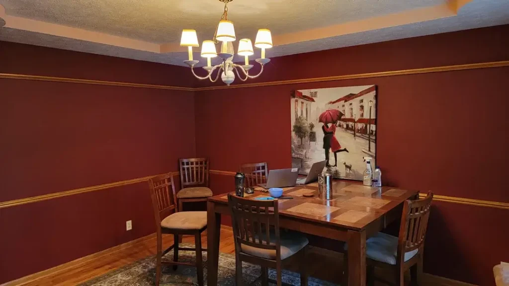
There’s a particular kind of dining room that feels like it belongs in an old European house warm, a little moody, unapologetically bold. This is one of them.
r/Taken4GrantD shared this space featuring deep burgundy-red walls trimmed with gold chair rail molding running horizontally around the room.
A single large canvas a romantic street scene with a couple sharing a red umbrella hangs on the back wall.
The painting is figurative, warm-toned, and just the right size to fill the space without overwhelming it.
What makes this work is that the artwork echoes the room’s color story. The red in the painting pulls directly from the wall color, creating a loop that feels intentional rather than accidental.
The gold molding ties into warm wood tones of the furniture and hardwood floors. Everything belongs together.
The lesson here is about tonal consistency. When your wall color is this saturated, your art doesn’t need to contrast it needs to converse.
A single large-format piece beats a cluster of smaller frames on a wall this rich. If you’re working with deep jewel tones, choose art with at least one color that mirrors the wall, and go big rather than spreading several pieces across the surface.
A Grid of Black-Framed Mirrors That Opens Up a Neutral Room
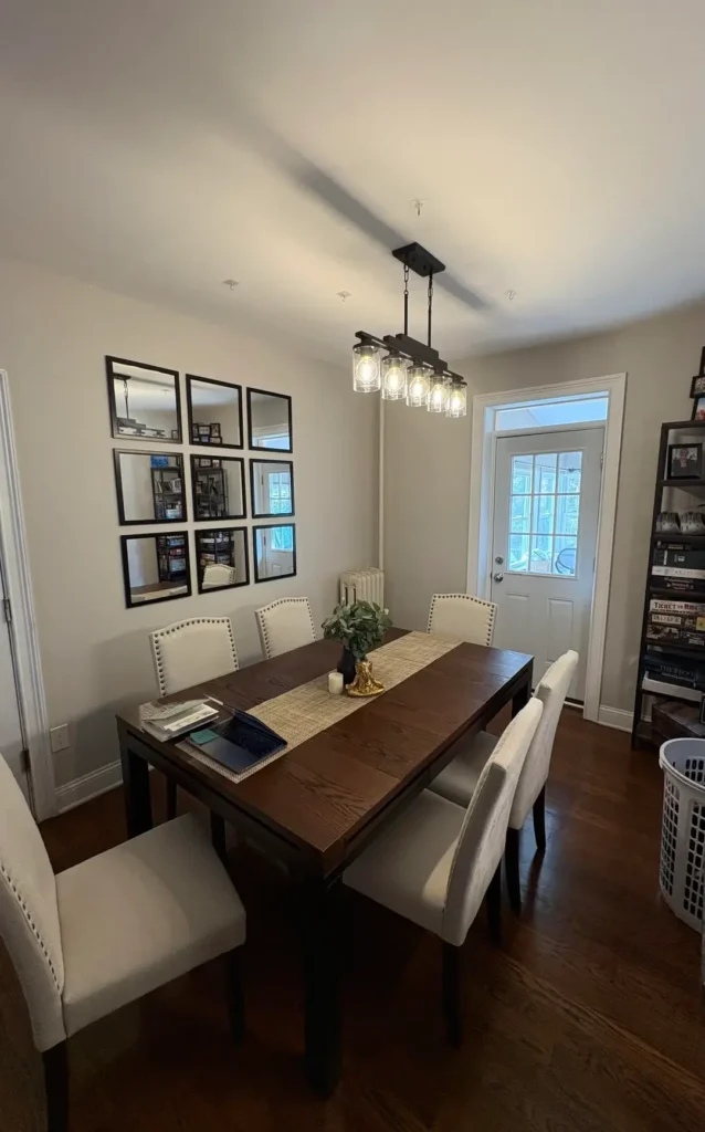
Mirrors as wall decor get underestimated. People think of them as functional objects, not design choices but this setup should change that thinking.
r/Yu_11012 arranged nine square mirrors in a tight 3×3 grid on a soft greige wall, each in a thin black frame.
The effect is architectural, almost like a window grid, and it bounces light from the actual door and windows throughout the room.
The dark espresso dining table and tufted cream linen chairs ground the look below the mirrors without competing with them.
What this arrangement does exceptionally well is solve the “big blank wall” problem without adding visual clutter.
Mirrors reflect the room back at itself, making the space feel larger and more layered simultaneously.
The uniformity of the grid consistent size, consistent frames, consistent spacing — prevents it from feeling random.
To pull this off, measure before you hang anything. The tightest, most evenly spaced grids look the most intentional.
A slight gap between each mirror (roughly 2 to 3 inches) keeps them distinct without fragmenting the overall shape.
Black frames read as modern and clean against neutral walls; if your room skews warmer, try antique brass or natural wood instead.
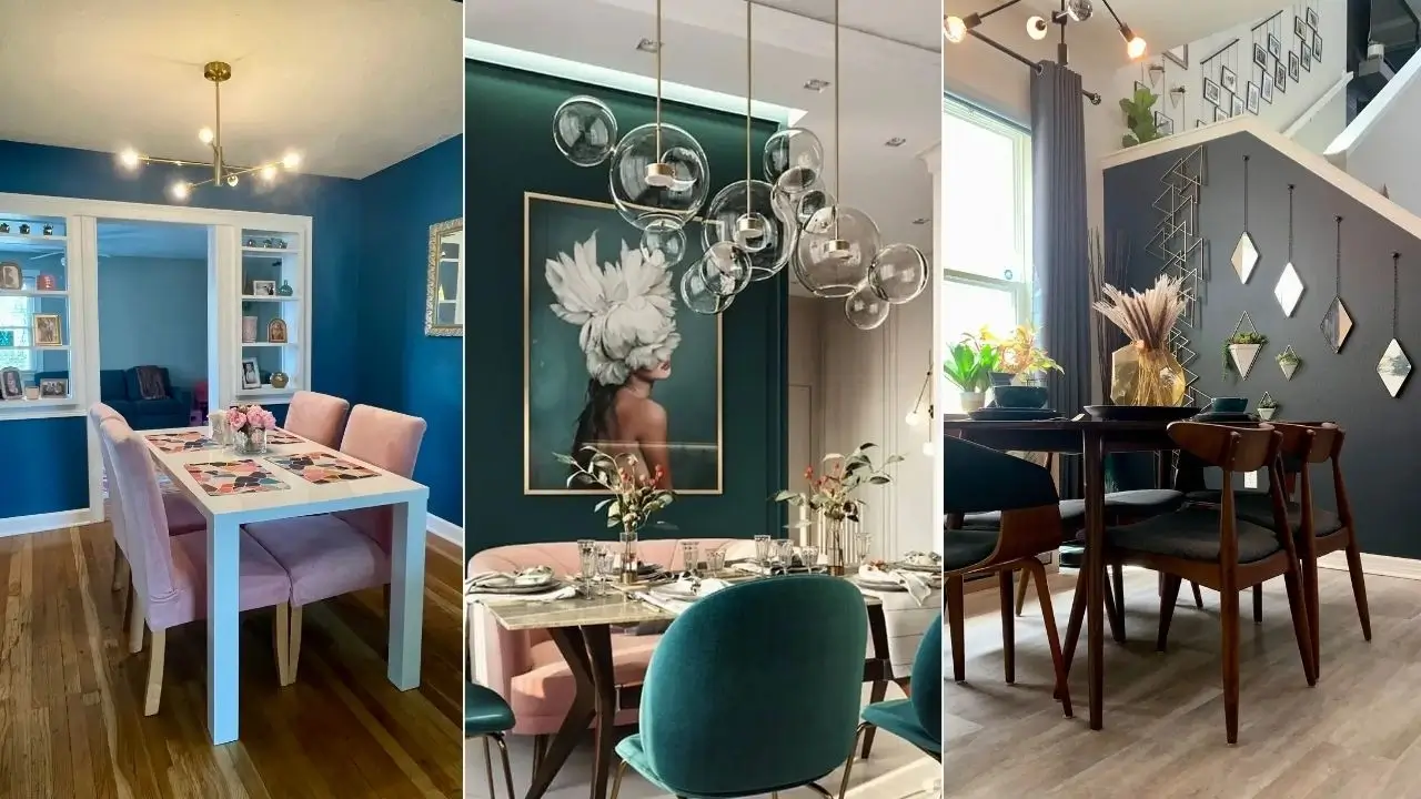
Saturated Blue Walls with Built-In Display Shelves as Living Wall Art
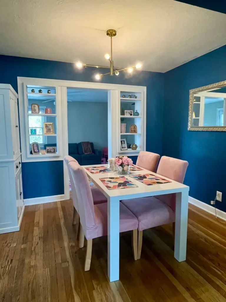
Here’s a room that committed hard to color, and it paid off completely.
r/ktbsquared painted the walls a deep teal-blue and let the architecture do the decorating. Pass-through built-in shelves flanking a central window opening serve as both room dividers and display cases, filled with framed family photos, ceramic vases, small figurines, and candles.
A chunky ornate white mirror hangs on the side wall. Pink velvet chairs sit around a white table, creating a contrast that shouldn’t work on paper but absolutely does.
The built-in shelves function as living wall decor the art is constantly changing as objects get swapped out, rotated, or updated.
This is a smart long-term strategy if you like changing your space seasonally. The shelves themselves become the focal point rather than any single piece of art.
If you have any architectural pass-throughs or built-ins in your dining room, treat them as display opportunities rather than storage overflow zones.
Curate what goes on them. Vary heights, mix textures, and leave negative space. The blue walls here act as a unifying backdrop that makes every displayed item look intentional.
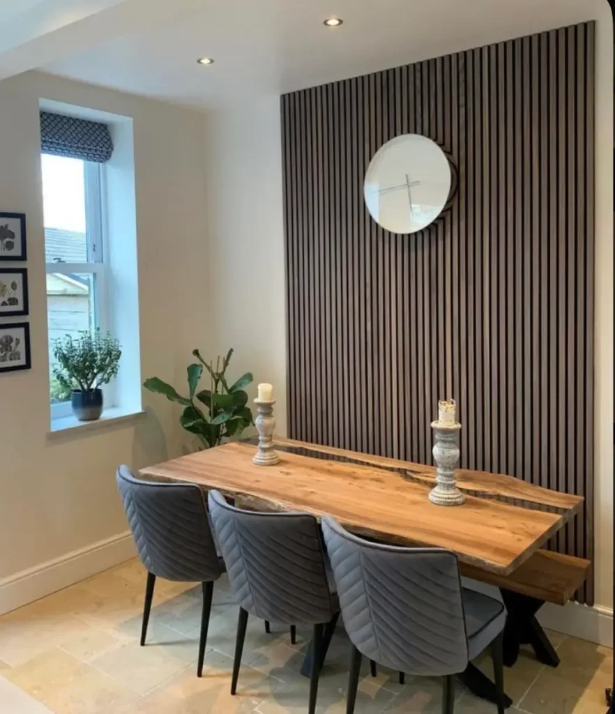
Dark Wood Slat Accent Wall with a Single Round Mirror
Slat walls have been having a moment for a couple of years now, and this example shows exactly why they keep gaining traction.
r/Yu_11012 installed dark charcoal-toned vertical wood slat panels as a full-height accent wall behind a live-edge walnut dining table.
A single round mirror with a dark frame sits centered on the panels, and that’s it. No other wall decor. The restraint is deliberate and precise.
The wood slats bring enormous textural depth to what would otherwise be a flat surface. The vertical lines draw the eye upward, making the ceiling feel higher than it likely is.
Against the warm honey tones of the live-edge table and the stone-tile floor, the dark panels create contrast without coldness the wood material keeps everything grounded and natural.
Slat wall panels are now widely available as DIY-friendly boards, and many come in peel-and-stick or clip-together formats that don’t require a contractor.
For a dining room application, covering just the wall behind the table (the “feature wall”) is enough.
You don’t need to clad every surface. One round mirror centered on the panel is a confident finishing move it softens all those hard vertical lines.
Emerald Green Paneled Accent Wall with an Oversized Fashion-Art Canvas
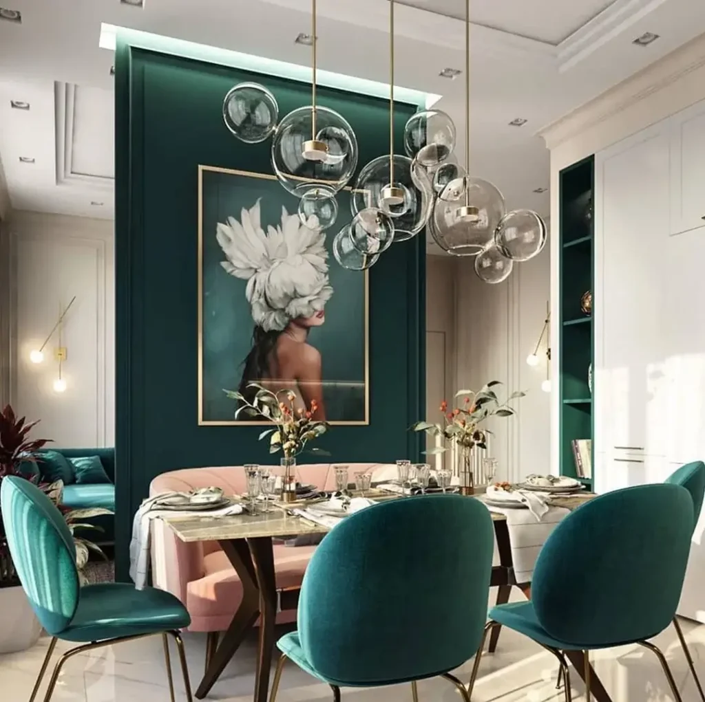
This is the most deliberately designed room in this collection, and it earns that distinction.
r/erdeebee built an interior design moment around a deep emerald green recessed panel wall, backlit with a thin strip of teal LED lighting along the top edge.
A tall, gold-framed canvas dominates the center of the panel a photographic art piece of a woman with dramatic white feathered headwear, her back to the viewer.
Bubble-glass pendant lights in varying sizes drop from the ceiling overhead. Velvet teal chairs and a blush pink bench surround a marble-topped table below.
Every element here is intentional and layered, yet nothing feels cluttered because the color palette is strictly controlled: emerald, gold, blush, and marble white.
The oversized artwork is the anchor, the paneling is the stage, and the backlighting elevates the whole composition to something that looks like a high-end restaurant.
What most people miss when trying to recreate this kind of look is that the wall treatment and the art have to be chosen together, not separately.
The painting works because the green panel makes it pop. The panel works because the painting justifies its existence.
If you want a similar effect on a budget, a single accent wall painted in a deep jewel tone with one large gold-framed print will get you most of the way there.
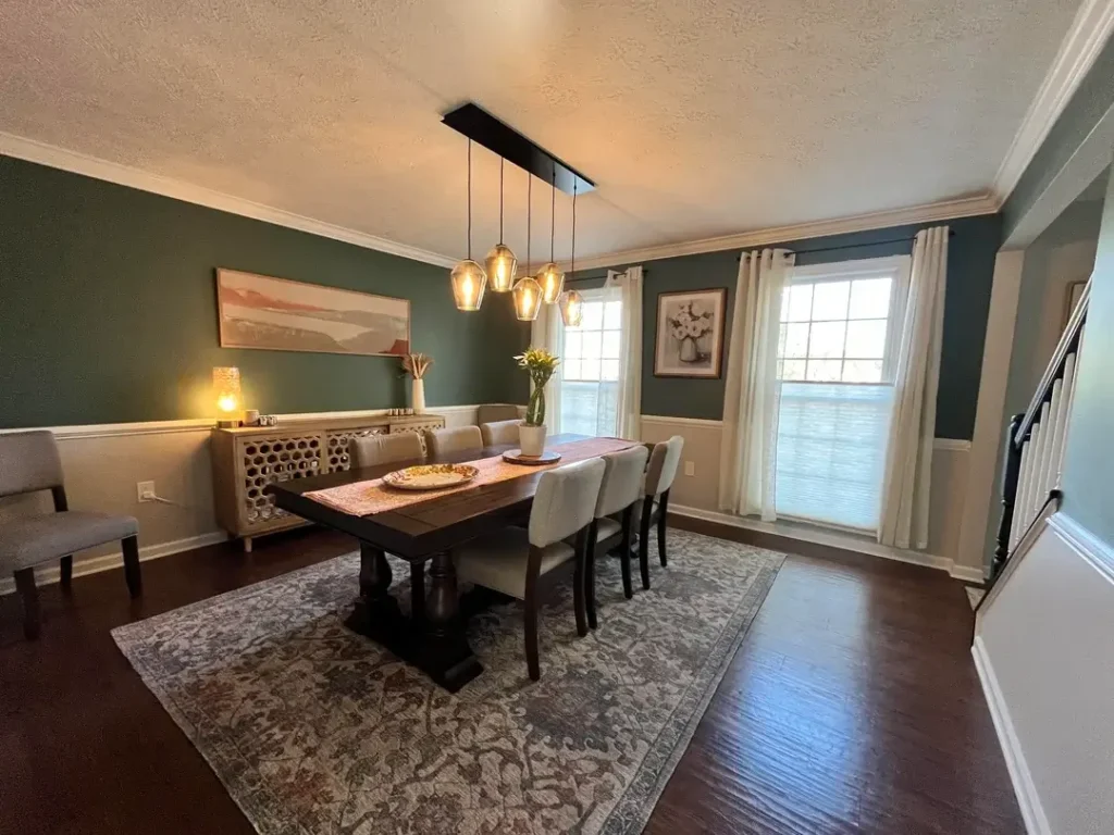
Forest Green Walls with Wainscoting and Layered Art Pairs
Some dining rooms nail the balance between traditional and current, and this one does it without trying too hard.
r/No-Yogurtcloset-9846 painted the upper walls in a muted forest green, kept the lower third white with classic wainscoting panels, and hung two framed art prints: a wide horizontal landscape with warm pink and orange tones on one wall, and a simple botanical floral print near the windows.
A carved wood sideboard sits below the landscape, with a small lamp and a few decorative objects.
The two-tone wall treatment is doing significant work here. The wainscoting breaks the green from overwhelming the space, and the white below visually lifts the room, keeping it from feeling cave-like.
What I find particularly effective is the choice to use art with warm tones against the cool green those peachy landscape hues create a tension that makes both the walls and the art more vivid.
Hanging art at sideboard height meaning the bottom of the frame sits roughly 6 to 8 inches above the top of the sideboard is a tried-and-true placement strategy that grounds the piece to the furniture below.
It stops art from floating aimlessly on a large wall. If you have a sideboard or buffet in your dining room, treat the wall above it as a dedicated art zone.
Floor-to-Ceiling Abstract Canvas as a Modern Focal Point
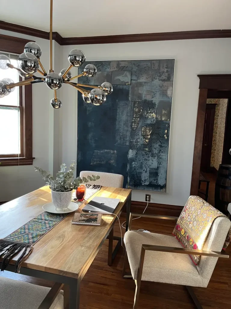
Large-scale abstract art can either feel pretentious or powerful. This one lands firmly in the second category.
r/cocofrankenstein hung a near floor-to-ceiling abstract canvas in deep navy blue with gold leaf detailing against a light gray-white wall.
The painting takes up most of the wall’s width and height, commanding the room without competing with the furniture.
A mid-century style dining table in warm oak pairs with mixed-upholstery chairs below it. A Sputnik-style chandelier with chrome and gold spheres echoes the metallic notes in the painting.
The scale is everything here. A smaller version of this painting would feel like an afterthought. At this size, it becomes the entire reason to look at that wall.
The gold leaf detailing in the canvas catches light and connects to the brass tones in the chandelier, which is the kind of subtle material repetition that makes a room feel cohesive.
Abstract art in large format works best in rooms where the other elements are relatively restrained. The walls here are neutral, the furniture is clean-lined, and the decor is minimal.
That austerity gives the canvas room to breathe and perform. If your dining room already has bold wallpaper or strong paint, a large abstract might fight for attention rather than command it.
An Eclectic Gallery Wall Built Around Personal Art and Meaningful Objects
Not every dining room needs a cohesive design concept. Sometimes the wall tells a story instead.
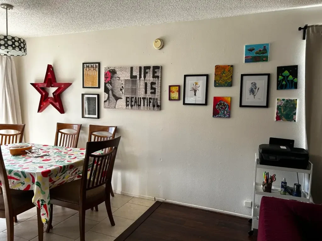
r/kerican covered an entire dining room wall with a mix of framed prints, small original paintings, a large street-art style canvas reading “Life Is Beautiful,” botanical prints, psychedelic mushroom paintings, and a bold red illuminated marquee star.
The objects range in size from small 8×8 canvases to a large horizontal print, arranged in a loose flowing arc across the wall.
What makes this work, despite breaking nearly every “rule” of gallery walls, is that the objects clearly belong to one person.
There’s an unmistakable voice behind the collection it mixes street art aesthetics with botanical illustration and personal expression.
The red star echoes the colorful table covering below. Nothing is trying to be anything other than what it is.
The lesson here isn’t to copy this specific arrangement but to understand that personal collections beat curated ones when it comes to character.
If you have art you love even if it doesn’t match displaying it together communicates something more interesting than a set of matching prints from a home goods store.
Vary the sizes, keep the frames somewhat consistent (here, mostly black), and let the content do its own thing.
Charcoal Accent Wall with Diamond Mirrors and Geometric Wall Sculpture
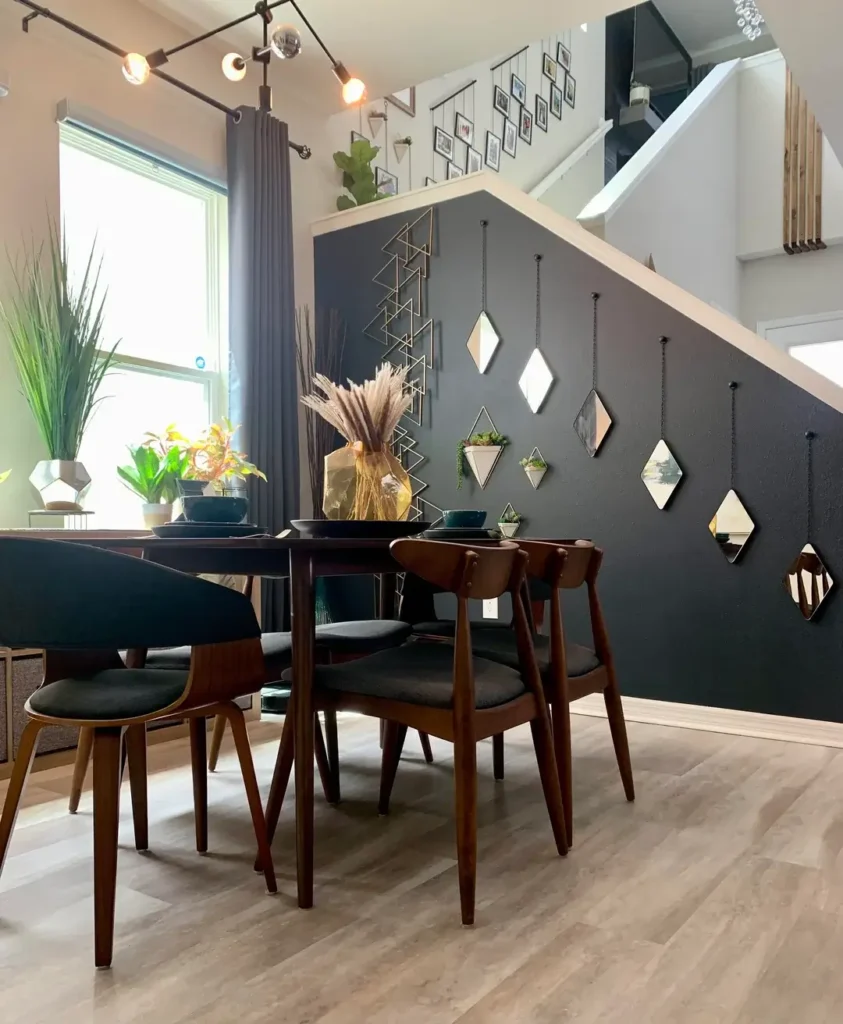
This room takes an unconventional wall the angled wall under a staircase and turns it into the most interesting design feature in the space.
r/EvenJesusHadPubes painted the staircase-adjacent wall in deep charcoal gray and hung a collection of diamond-shaped hanging mirrors at varying heights, paired with a large gold geometric triangle sculpture and small wall-mounted succulent planters.
Mid-century walnut chairs with black upholstered seats surround a dark oval table below. String lights on a track rail add warm ambient glow overhead.
The diamond mirrors are particularly clever because their angular shape echoes the slope of the staircase above them.
This is the kind of spatial awareness that elevates a room from “decorated” to “designed.” The charcoal background makes each gold and mirrored element stand out sharply, and the small plants introduce organic softness against all those hard geometric edges.
When decorating an awkward or architectural wall an angled ceiling line, a sloped staircase wall, or an asymmetric space lean into the geometry rather than fighting it.
Choose decor shapes that echo the angles present in the architecture. It makes the quirk feel intentional.
A Colorful Starburst Clock as the Room’s Sole Wall Feature
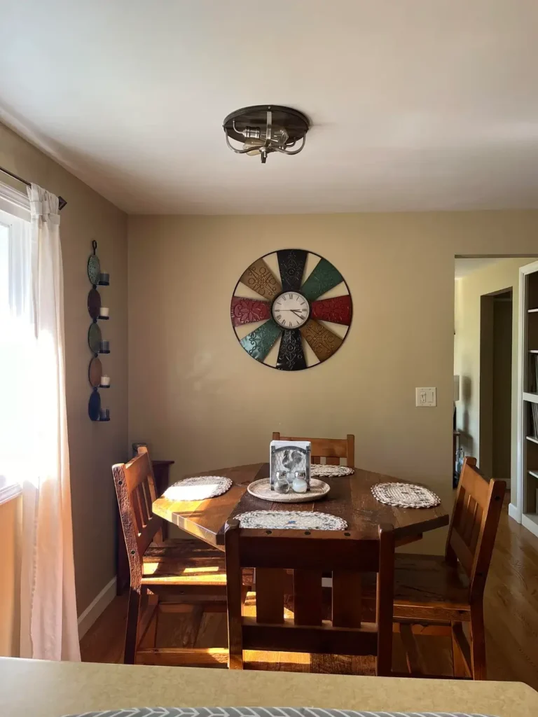
There’s real confidence in doing just one thing on a wall and doing it well.
r/Livid-Cricket7679 hung a single large decorative clock a starburst-style design with a segmented face in jewel tones including teal, burgundy, navy, mustard, and red against a dark starburst frame on a plain warm beige wall.
The clock is the only wall decor in the room. A vertical candle holder with circular iron discs hangs near the window on the opposite wall, but the clock is clearly the star.
The colorful mosaic face of the clock is its own form of art. It introduces every color in one piece, which means the room can stay neutral everywhere else without feeling bland.
The octagonal dark wood dining table below picks up those same warm browns in the clock frame, and the morning sunlight cuts dramatically across the room in the photo, giving the whole space a lived-in warmth.
One piece of oversized, functional wall art a clock, a mirror, a sconce can do the work of an entire gallery wall if it’s the right size and has enough visual complexity.
The mistake most people make is choosing pieces that are too small. If you’re going minimalist with a single item, go bigger than feels comfortable. A clock that reads as “statement” from across the room is doing its job.
Sage Green Walls, a Statement Rug, and Plants as Vertical Decor
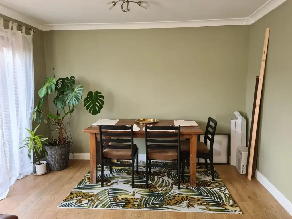
Here is proof that not all dining room wall decor ideas involve hanging something.
r/sultanaramen painted the walls in a soft sage green the kind that reads almost as a neutral but carries unmistakable warmth and let a tall monstera plant in the corner act as the room’s primary vertical accent.
A jungle-print rug with tigers and palm leaves anchors the floor below a simple farmhouse-style wood table and black ladder-back chairs. Framed art and a mirror lean casually against the wall rather than being hung.
The plants here function as living wall decor. A tall monstera placed in a corner draws the eye up along the wall without requiring a single nail.
The sage green walls amplify the plant’s lush quality the two greens work together to suggest a kind of indoor garden, which is exactly the feeling this room achieves.
The leaning art approach also deserves mention. Leaning a large mirror or canvas against the wall instead of hanging it creates an immediately relaxed, collected atmosphere that feels very current. It also makes it easier to swap pieces as your taste evolves.
For this to work, the pieces should be large enough that they don’t look forgotten a leaning print needs to be at least 24 inches wide to register as intentional.
Choosing the Right Dining Room Wall Decor for Your Space
Before you start shopping or painting, it helps to understand what your room actually needs. Here’s a quick reference to match your situation with the right approach:
| Room Situation | Best Wall Decor Approach | Difficulty |
|---|---|---|
| Small room, low ceilings | Grid of mirrors or vertical slat wall | Easy–Medium |
| Large blank wall | Oversized single canvas or gallery wall | Medium |
| Neutral, boring walls | Bold accent color + one large art piece | Easy |
| Dark or jewel-tone walls | Single tonal canvas or minimal decor | Easy |
| Architectural quirks (angles, niches) | Geometric decor that echoes the shape | Medium |
| Rented space, can’t paint | Leaning art, large mirrors, removable panels | Easy |
The Wall Is Just the Beginning
Every room in this article started with a simple decision a color choice, a single painting, a set of mirrors and built outward from there.
That’s the approach worth borrowing. Pick one thing you’re confident about and let the rest of the room respond to it.
What I keep coming back to across all 11 of these examples is that the most effective dining room wall decor ideas share one quality: they look like they belong to someone.
Whether it’s the eclectic gallery wall covered in personal art or the sleek emerald panel with a gold-framed canvas, there’s a point of view behind each choice.
Your dining room is where people sit long enough to actually look at the walls. That’s worth taking seriously even if your version of serious is a chaotic gallery wall that makes everyone smile.