Most dining room advice looks like it was staged for a magazine, not lived in by a real family. These 15 examples came from everyday people sharing their actual spaces, and that is exactly what makes them so useful.
You will find everything here from daring dark accent walls to soft sage greens, from live-edge wood tables to marble-topped beauties.
Each room tells you something specific about how real dining room decor ideas come together when personal style meets practical living.
I have looked at each of these spaces carefully, and I want to share what works, what makes them stand out, and most importantly, how you can pull off something similar without starting from scratch.
Sage Green Walls with Layered Plant Styling
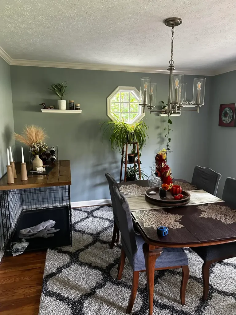
There is something about sage green walls that just works, and this room is a perfect example of why.
r/averysillygooose put together a space that balances warm-toned wood furniture with that cool sage backdrop, and the result is genuinely calming without feeling cold.
The dark espresso dining table sits on a geometric shag rug in grey, black, and white, creating a grounding effect.
Above the table, a brushed nickel chandelier with glass cylinders adds just enough polish to keep the room feeling finished.
What makes this room interesting is the plant ladder in the corner. A tiered wooden stand holds multiple green plants at varying heights, which draws the eye upward and fills what could have been dead corner space.
The floating shelf on the left wall holding a small plant, candles, and a decorative duck shows that not every wall needs a large piece of art.
The seasonal centerpiece on the table, featuring orange and red autumn elements on a dark tray, proves that a tray with grouped items is the easiest way to make a dining table look intentional.
Notice how the candle holders are different heights that variation is what makes table styling feel layered rather than flat.
If you want to recreate this look, start with the wall color. Sage green pairs with almost any wood tone, from light birch to dark walnut.
Add a single floating shelf, style it with three to five items at different heights, and resist the urge to overload it.
Oversized Abstract Art as the Focal Point
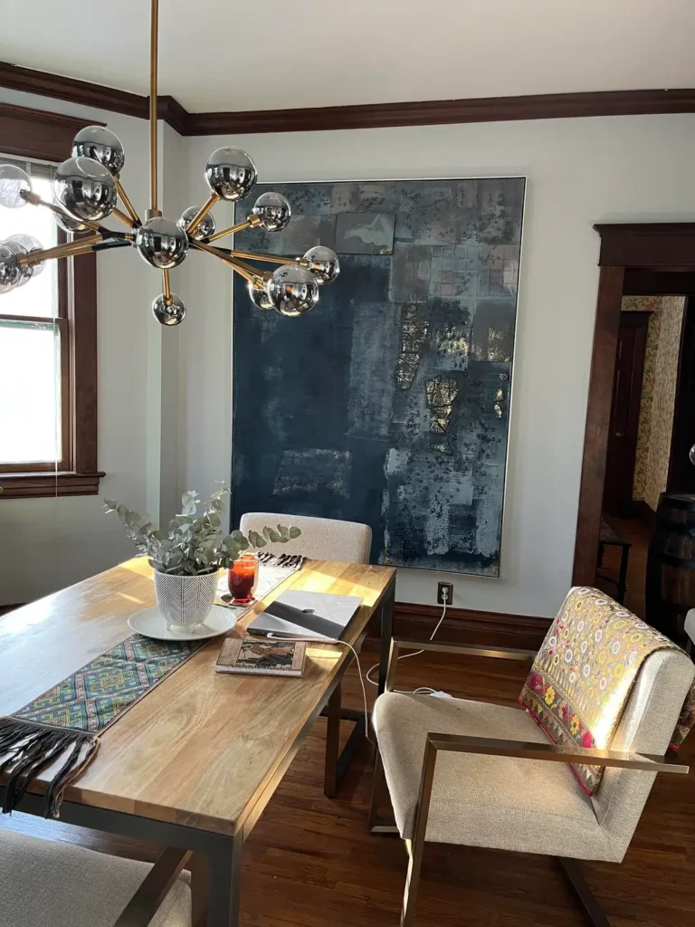
Bold art choices are one of the most effective dining room decor ideas you can pursue, and this room commits to that idea completely.
r/cocofrankenstein hung a massive dark navy and gold abstract canvas easily five feet tall on a white wall, and it transforms the entire room instantly.
The piece features textured layers of charcoal, navy, and gold foil accents, which catches the light depending on the time of day.
Paired with an atomic-style sputnik chandelier in chrome and brass, this room commits entirely to a modern eclectic aesthetic.
The raw wood dining table with metal legs plays a supporting role here, which is the right call when your art is this strong.
A simple eucalyptus stem in a white geometric vase on the table is all the centrepiece this space needs.
The floral accent chair with yellows and reds in the foreground introduces color without competing with the art.
Dark wood trim runs throughout the room’s architecture, which gives the white walls a warm contrast and frames the space beautifully.
This combination of dark trim, white walls, and one dominant artwork is a high-impact formula that works in traditional home bones with modern taste.
The lesson here: if you want one piece to do all the work, let it. Size up when buying art for a dining room a piece that feels slightly too large in the store is usually exactly right on the wall.
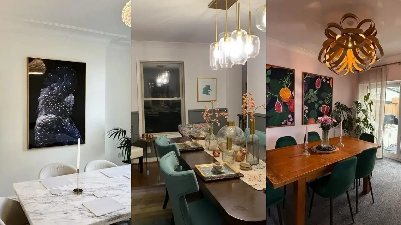
Woven Rattan Pendant Light Over a Round Table
Small dining rooms often get the most interesting solutions, and this cozy nook is proof that restraint can be its own kind of style.
r/Arizona758 created a clean, understated space using a round dark chocolate table, four grey upholstered mid-century chairs, and one seriously good overhead light.
That light a two-tiered woven rattan pendant, likely the IKEA Sinnerlig or a similar style does the heavy lifting for the entire room’s personality.
Rattan lighting has had a long run in interior design, and it keeps working because the woven texture adds organic warmth to any neutral room.
The single small pothos plant on a wooden trivet in the center of the table is quietly perfect. It costs almost nothing, it stays alive with minimal effort, and it communicates that someone actually cares about this space.
The framed watercolor print on the wall soft blues and greens in a silver frame is subtle enough not to compete with the pendant but adds necessary visual interest to the back wall.
Crown molding throughout reinforces the sense that this is a thoughtfully finished room despite its simplicity.
For small dining rooms, this approach is hard to beat. Commit to one strong overhead light, keep the table simple, and add just one piece of art and one plant. That is genuinely enough.
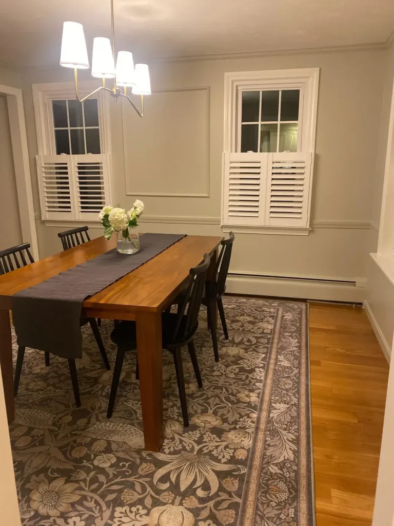
A Botanical Area Rug That Ties the Whole Room Together
What happens when a room has great bones but feels like it still needs something? Usually, it needs a rug.
r/tipsyinmadras anchored this dining room with a large-scale botanical print rug in grey and cream almost certainly Morris & Co. inspired, with its scrolling acanthus leaves and trailing stems and it elevated the entire room in one move.
The warm honey-toned pine dining table and matte black Windsor chairs now look like they were curated together rather than purchased separately.
The light is also working hard here. An asymmetrical brass chandelier with white shades gives off a classic but not stuffy glow, and the two white plantation shutters on the windows frame the scene without adding clutter.
A simple vase of white hydrangeas on the table is the only centrepiece needed soft, fresh, and easy to swap seasonally.
The wainscoting and shadow box wall paneling on the right side are architectural features that add a lot of character. If your room has similar millwork, a patterned rug will only enhance it.
The two elements share a traditional language that makes the space feel considered.
When choosing a rug for dining rooms, go larger than your instinct suggests. The standard rule is that all chair legs should remain on the rug even when pulled out. If you are unsure between two sizes, choose the bigger one.
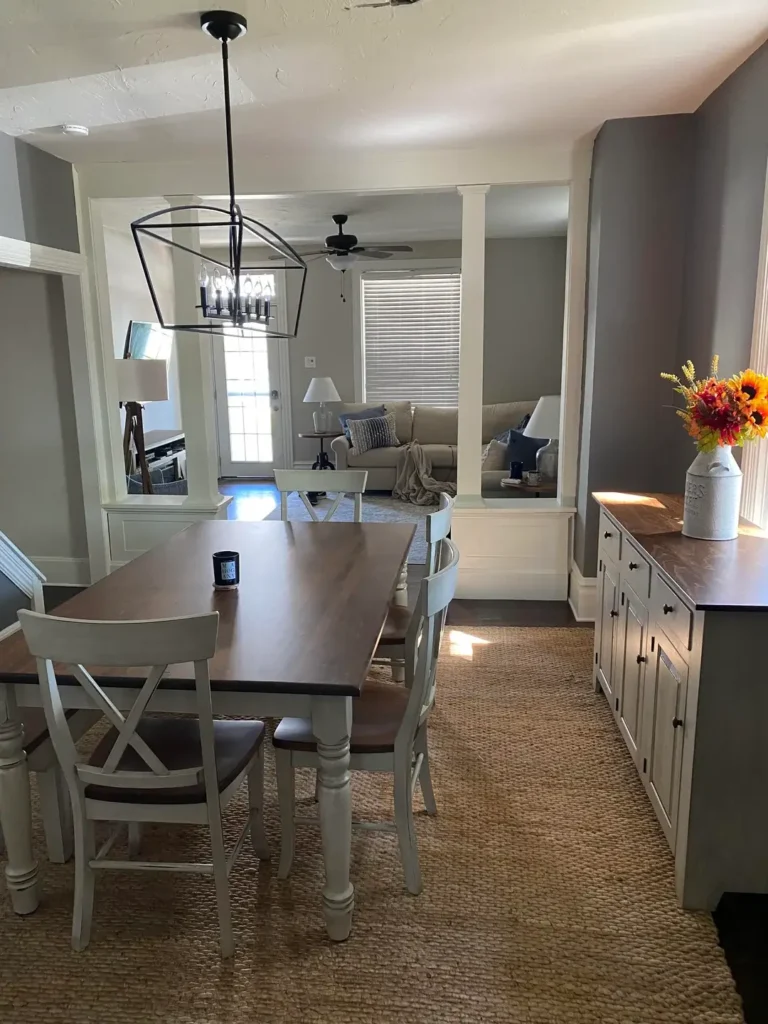
Farmhouse Style with a Sisal Rug and Open-Plan Connection
Open-plan homes present a specific challenge: how do you make the dining area feel like its own defined space without walls to separate it?
r/AMAWalking-SWSD solved this with a sisal rug, a farmhouse table set, and architectural columns that already define the zones.
The dining area features a white-painted wood table with cross-back chairs in matching white and walnut, sitting on a natural fiber sisal rug that grounds the space without overwhelming it.
A black iron cage-style lantern pendant hangs overhead, tying into the grey walls and dark wood floors.
The sideboard on the right with white cabinetry and a dark walnut countertop mirrors the dining set’s two-tone palette perfectly.
A simple ceramic jug with bright sunflowers and wheat stems adds a seasonal pop of orange and yellow without requiring any real decorating effort.
I particularly like how the colonial-style columns with white trim create a natural threshold between the dining zone and the living room beyond.
They give the room a sense of formality that the casual farmhouse furniture then softens. That push and pull between formal architecture and relaxed furniture is a formula that works consistently.
Sisal rugs are a practical choice for dining rooms they are durable, neutral, and easier to spot-clean than plush options. Their texture also adds warmth to rooms that otherwise feel cold or corporate.
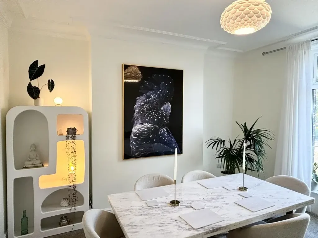
Sculptural Shelving, Marble Table, and One Striking Statement Art Piece
Some dining rooms play it safe. This one does not, and that confidence is exactly what makes it work.
r/cherrypez123 built this space around a large-format photographic print of a black cockatoo dark, dramatic, and set in a thin gold frame against soft white walls.
Below it, a marble-topped dining table with velvet-upholstered chairs in dove grey fills the center of the room.
The juxtaposition between the striking art and the gentle palette everywhere else creates real visual tension.
The star of the corner, however, is the sculptural white shelving unit. Its arched cutouts with interior lighting are almost furniture-as-art, holding a small Buddha figurine, trailing string-of-pearls plant, and a few small objects.
A large dark-leafed elephant ear plant sits on top. This kind of display shelving when styled with intention adds as much character as any large piece of art.
A scallop-shell ceiling light in cream completes the room’s softness, while sheer white curtains flood the space with diffused natural light.
Two slim brass candlesticks on the table add height without visual weight. This room shows that all-white or near-white dining rooms can still feel bold you just need one unexpected element to make the room feel alive.
The key takeaway here is unexpected pairing. A dramatic nature photograph works in a soft, minimal room precisely because of the contrast. Do not be afraid to introduce one element that surprises.
Antique Portrait Art and Cluster Pendant Lighting
There is a certain kind of dining room that feels like it has always existed, and this is one of them.
r/Sriracha4evr paired a solid walnut farmhouse table with a matching bench and mismatched antique gold-framed portraits on the wall, including what appears to be a 19th-century oil painting of a woman in a green dress.
The combination is decidedly eclectic, but the consistent warm tones honey wood, aged gold frames, cream walls keep everything cohesive.
The cluster pendant light deserves special attention: six ribbed green glass pendant bulbs hanging at varying lengths from a single black rectangular fixture creates an installation feel rather than a standard lighting solution.
This type of multi-drop pendant is becoming increasingly common, and for good reason it fills vertical space and creates an intimate zone around the table without the formality of a chandelier.
White wainscoting on the right wall, sheer linen curtains, and dark hardwood floors complete the picture.
A simple white ceramic vase with burgundy leafy stems on the table keeps the centrepiece organic and seasonal.
The built-in white cabinetry just visible to the right adds practical storage that blends cleanly with the architecture.
If you like this aesthetic, sourcing one or two vintage portrait paintings from thrift stores or estate sales costs very little and adds an irreplaceable sense of history. Pair them with warm wood furniture and the room practically styles itself.
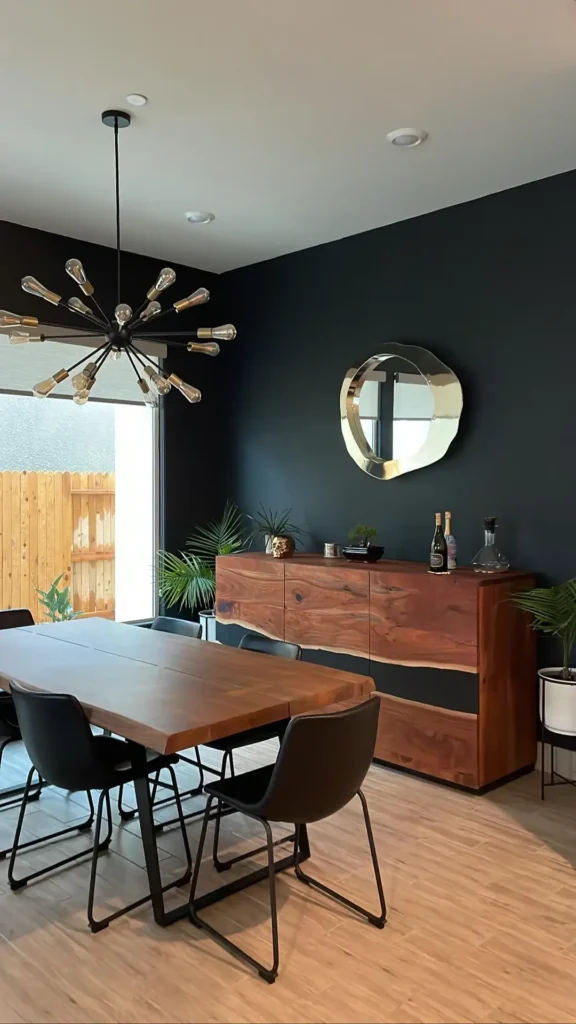
Live-Edge Table Against a Dramatic Dark Accent Wall
Painting one wall a deep, near-black color is one of the most effective dining room decor ideas that most people talk themselves out of. This room shows why they should stop second-guessing it.
r/indecisivegirlie27 committed fully to a dark charcoal-black accent wall, setting a live-edge walnut table against it.
The organic silhouette of the live-edge grain with its natural wavy border stands out dramatically against the dark backdrop.
Black powder-coated sled-base chairs keep the seating modern, while a sputnik chandelier with exposed Edison bulbs in brass adds retro-industrial energy overhead.
On the dark wall, a live-edge walnut sideboard with panel doors and natural grain variation stores items while adding another layer of warm wood texture.
Above it, a wavy organic-shaped mirror in gold reflects light and introduces an unexpected silhouette. Tropical plants in sleek planters frame the corners, and bottles of wine and a decanter on the sideboard make the space feel genuinely lived in.
What makes this work is commitment. The dark wall, dark chairs, and dark accents form a consistent language.
The warm walnut wood and brass fittings provide contrast without breaking the scheme.
This is a room that could feel oppressive but because the warm wood and green plants balance the darkness, it feels moody and welcoming instead.
If you are nervous about a dark accent wall, start with a paint sample card held up against your existing furniture.
Warm dark greens and soft charcoals tend to work better than pure black in dining rooms, giving depth without heaviness.
Cobalt Blue Walls with Cascading Indoor Plants
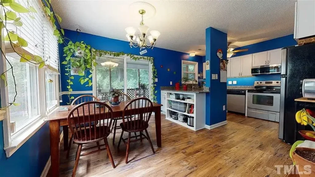
This is the room that most designers would tell you not to do. And yet.
r/interiordecorating went cobalt blue full saturation, all walls in a dining room that opens directly into the kitchen.
The result is genuinely bold, the kind of space that you either love immediately or need a moment to warm up to.
The wooden Windsor-style chairs and simple pine dining table provide warm contrast against that electric blue, while trailing pothos and climbing vines around the window frame blur the line between indoors and garden.
What saves this from feeling overwhelming is the natural light. Large windows on two sides flood the room with daylight, and the greens of the trailing plants absorb some of the visual intensity of the blue walls. The open-plan connection to a white kitchen also gives the eye somewhere neutral to rest.
This is a lesson in commitment with balance. If you choose a saturated wall color, let natural elements and wood tones offset the intensity.
Plants are particularly effective because they share a natural relationship with bold color think of how vivid blue skies look against green foliage. That same principle works indoors.
Bold color dining rooms require confidence more than skill. If cobalt feels too extreme, consider a single accent wall in deep teal or navy. You can always intensify from there.
Botanical Wallpaper That Transforms the Whole Room’s Character
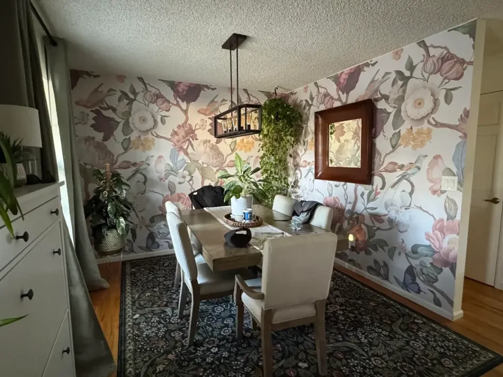
Wallpaper in a dining room is one of those decisions that separates rooms with personality from rooms with furniture.
r/Hanshc17 covered all visible walls with a large-scale botanical print featuring magnolias, roses, birds, and leafy branches in blush pink, cream, soft yellow, and muted green.
The pattern is maximalist but not chaotic the cream background keeps it from overwhelming the space.
Beige upholstered chairs around a wood-toned table feel right at home against the busy pattern.
A small wooden-framed mirror on one wall and a cage-style black pendant light overhead introduce contrast without disrupting the garden-party atmosphere.
The Persian-style navy and green area rug grounds the room and provides a color anchor for the blush and green palette above.
Multiple potted plants including a lush trailing specimen hanging on a hook reinforce the botanical theme.
The white painted sideboard on the left provides visual relief and storage, its clean lines offering a deliberate pause in the pattern.
This is smart design: when a room has a strong pattern, you need a few pieces that visually simplify.
For those worried about commitment, many botanical wallpapers come in peel-and-stick versions that work on a single feature wall.
You do not need to paper an entire room to get this effect one wall behind the dining table is often enough to completely transform a space.
Teal Velvet Chairs, Wainscoting, and a Curated Gallery Wall
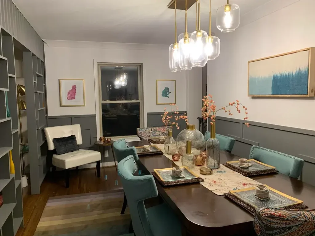
Some dining rooms are designed to be used, and some are designed to be enjoyed. This one manages both.
r/Historical_Reward621 created a jewel-toned dining room using deep teal velvet chairs with brass nail-head trim, a dark walnut-stained table, and grey painted wainscoting that runs halfway up the wall.
Three small framed artworks whimsical paintings of pink and green cats in gold frames are arranged at eye level on the upper wall, and a horizontal abstract blue canvas anchors the far end.
The centerpiece here deserves its own study: a grouping of glass vases, a mercury glass globe, a brass cylinder, and coral blossom branches creates an unusually interesting table display.
None of it matches exactly, but the warm metallics and blush-orange flowers share enough of a palette to feel intentional.
This type of eclectic tablescape works because all the elements are roughly the same mid-size scale there is no single dominant piece.
Clustered glass pendant lights in brass hang above the table, and a white leather chair tucked in the corner with a velvet pillow suggests this room occasionally serves as a reading spot too.
That dual-function approach dining room plus sitting area is worth considering if your space allows it.
The two-tone wall treatment, with grey-green wainscoting below and white above, is one of the most cost-effective ways to add architectural interest to a plain box room. Paint alone can do this, and the result looks like a much more expensive renovation.
Coffered Ceilings, Wainscoting, and Layered Lighting Done Right
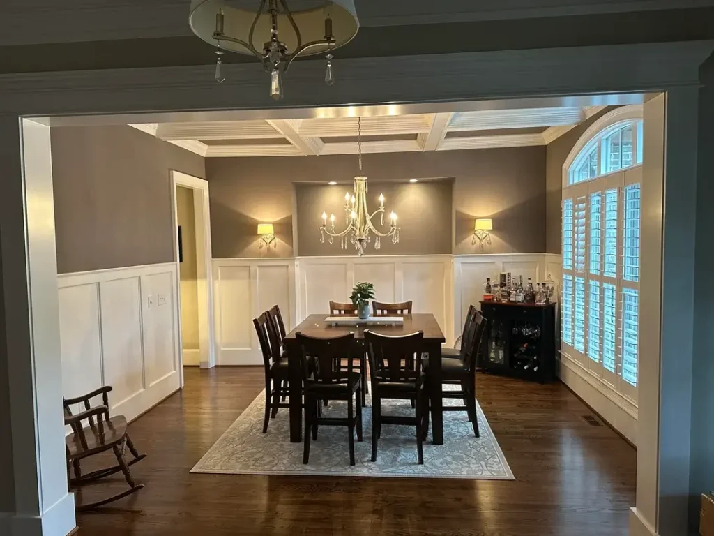
Formal dining rooms are a format that many people dismiss as outdated. This room makes a strong argument for keeping them.
r/EZ-PZY has a space that leads with architecture coffered ceilings with deep white grid beams, chair-rail wainscoting in white below a warm taupe-brown wall, and a large arched window with plantation shutters on one side.
These structural elements do more work than any decor item could. A crystal chandelier with gold finish hangs from the center of the coffered grid, and two matching wall sconces flank a niche recess behind the table.
The dark mahogany dining set a high counter-height table with six matching chairs fills the space with a traditional formality that suits the architecture.
A dark bar cabinet with wine storage sits beside the arched window, adding function that feels organic to the room’s purpose. A small rocking chair in the entry corner introduces an unexpected, slightly quirky touch.
Layered lighting is one of the most important concepts in dining room design, and this room demonstrates it well.
The chandelier provides general illumination, the wall sconces add ambient warmth, and the recessed lights in the coffered grid give flexibility.
Three sources of light at different heights create depth that a single overhead fixture never can.
If your dining room has architectural features like this, your job is largely to stay out of the way. Choose furniture that matches the formality of the space, layer your lighting, and resist the urge to over-accessorize.
Blush Pink Walls with Forest Green Velvet Chairs and Botanical Art
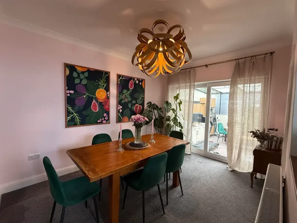
The combination of blush pink and forest green should not work as well as it does. And yet here we are.
r/xoglitter99ox painted the dining room walls a soft powder blush and added six deep forest green velvet chairs around a warm pine dining table.
The color pairing is botanically inspired, and the two framed botanical prints on the wall dark backgrounds with vivid illustrations of figs, oranges, pomegranates and leaves reinforce that theme completely.
The light above is extraordinary: a large sculptural ceiling fixture made from interlocking wooden ribbons or bent strips creates an organic, flower-like form that doubles as art.
This kind of statement light fixture is worth the investment because it is the first thing every guest notices and the thing that makes the room feel designed rather than assembled.
A vase of pink peonies and two slim pink taper candles on the table tie the blush wall color into the table setting, creating cohesion through color repetition.
Sheer linen curtains let diffused light in without blocking the garden view beyond the glass door, and a large monstera plant in the corner brings natural greenery that extends the outdoor connection.
Color repetition is an underused technique. When you bring the wall color into at least one or two other elements a vase, a pillow, a candle the room feels curated rather than accidental. It takes almost no effort but creates a significant visual impact.
A Personal Gallery Wall Built Around a Statement Cityscape Print
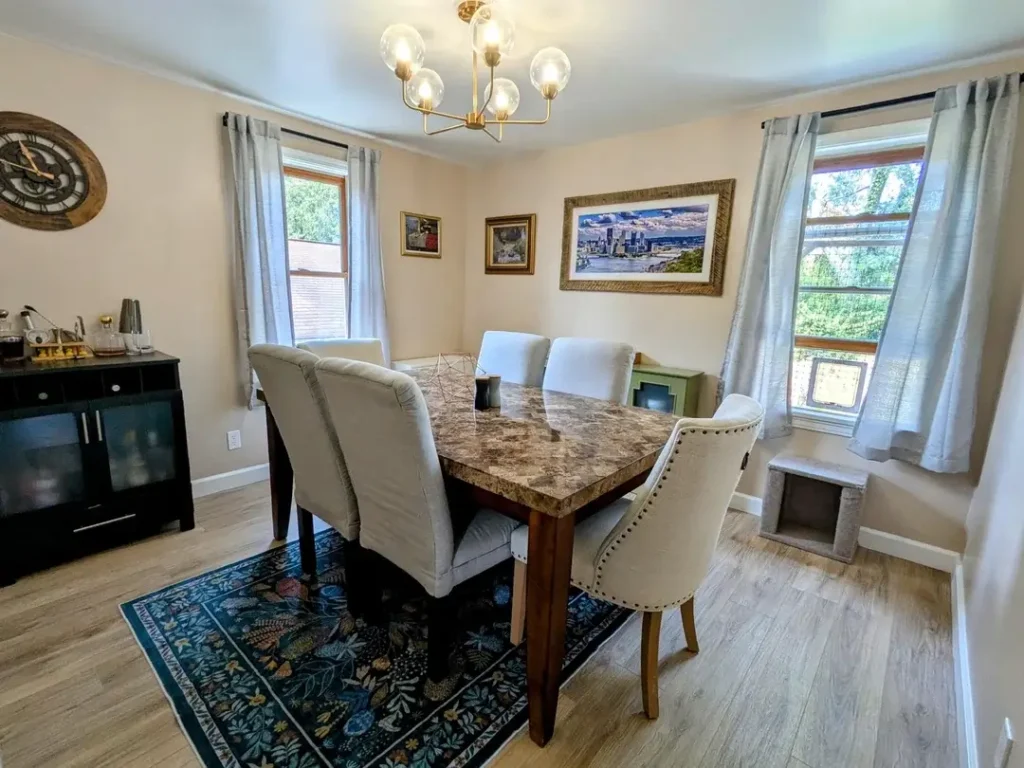
Dining rooms can reflect who you are, not just what style you are trying to achieve. This room leans into that idea without apology.
r/VaveJessop arranged a small gallery wall on the main wall, centered on a large panoramic cityscape print in a textured gold frame the kind of image that clearly means something personal rather than existing purely for aesthetics.
Two smaller framed prints flank it at lower height, creating an asymmetrical but balanced arrangement. A large rustic wooden gear clock on the left wall adds further personality to the space.
The dining table has a faux marble top with warm amber and grey tones, paired with slipcovered chairs in cream linen with gold nail-head trim.
That combination faux marble and linen slipcovers delivers a formal-looking room at a fraction of the cost of real marble or custom upholstery. A botanical navy area rug grounds the space and adds the richest color in the room.
A black bar cabinet on the left side holds a small collection of decanters, adding both function and a dark anchor to that part of the room.
Sheer silver curtains on the windows keep the natural light soft without blocking the green view outside. The warmth and personalization here is real and earned.
The lesson from this room: your dining space does not need to look like anyone else’s. A large print of a city you love, framed properly and centered, can do more for a room than a generic piece of abstract art that means nothing to you.
Deep Teal Walls with Two-Tone Wainscoting and Linear Pendant Lighting
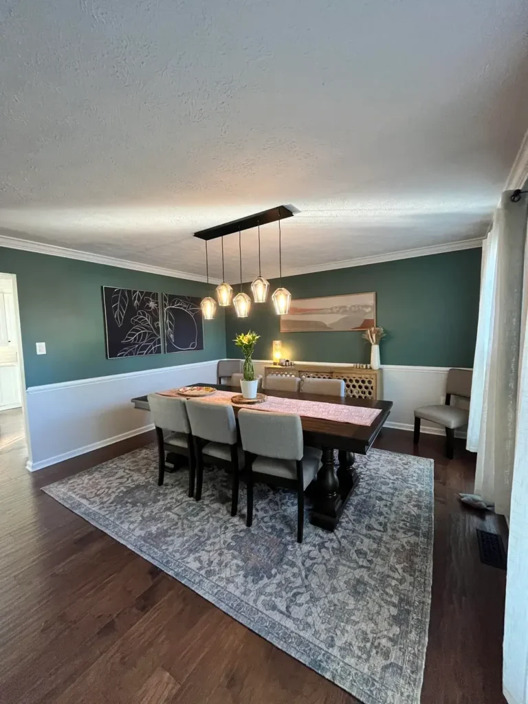
This room saved one of the most versatile dining room decor ideas for last: the two-tone wall with a bold upper color and white lower half.
r/No-Yogurtcloset-9846 painted the upper walls a rich, saturated teal-green the kind of color that reads as sophisticated rather than trendy while keeping the lower wall white with clean chair-rail detailing.
This two-tone treatment adds visual height to the room by drawing the eye upward, and the white lower half keeps the space from feeling enclosed.
A linear black pendant fixture holds four diamond-shaped glass bulbs at varying drop lengths above a dark espresso trestle table with grey linen chairs.
The combination of black hardware and warm amber light is exactly right for this color palette. Two contrasting art pieces sit on the teal wall a botanical line-drawing triptych on the left and a warm horizontal landscape print in warm terracottas and blush on the right creating interest without symmetry.
The vintage-inspired area rug in soft blue-grey and cream ties all the elements together without demanding attention.
A low wooden console along the back wall holds candles and dried arrangements, and two additional chairs flank the table for flexible seating. Crown molding along the ceiling line adds the final architectural polish.
Two-tone wall treatments work in almost any room size. In smaller rooms, they create perceived height. In larger rooms, they add definition.
Choose a color you genuinely love for the upper half this is the version of painting a bold color that feels lowest-risk and highest-reward.
Quick Comparison: All 15 Dining Room Decor Ideas at a Glance
Use this table to quickly match the style that suits your space, skill level, and budget.
| Style | Best For | Difficulty | Budget Level |
| Sage Green with Plants | Existing traditional homes | Easy | Low–Medium |
| Statement Art + Sputnik Light | Maximalist or eclectic spaces | Easy | Medium–High |
| Woven Pendant + Round Table | Small dining nooks | Easy | Low |
| Botanical Rug + Black Chairs | Classic or transitional rooms | Easy | Medium |
| Farmhouse + Lantern Light | Open-plan layouts | Easy | Low–Medium |
| Minimalist Marble + Bold Art | Contemporary spaces | Medium | High |
| Vintage Portraits + Bench Seating | Eclectic/character homes | Easy | Low–Medium |
| Live-Edge + Dark Accent Wall | Modern/industrial rooms | Medium | High |
| Cobalt Blue + Trailing Plants | Bold personality spaces | Easy | Low |
| Botanical Wallpaper Feature | Rental-friendly or renters | Medium | Medium |
| Teal Chairs + Glass Pendants | Long formal dining rooms | Medium | Medium–High |
| Coffered Ceiling + Wainscoting | Traditional/formal homes | Hard | High |
| Pink Walls + Velvet Chairs | Maximalist/colorful spaces | Easy | Medium |
| Mixed Art Gallery Wall | Personalized eclectic rooms | Easy | Low–Medium |
| Two-Tone Green + Linear Pendants | Mid-century modern homes | Easy–Medium | Medium |
What These 15 Rooms Have in Common
Every single one of these spaces has a point of view. Some chose a bold wall color, some chose an unexpected art piece, some chose lighting that doubles as sculpture.
What none of them did was play it completely safe, and that is precisely why they all work.
The rooms that stand out most consistently are the ones where one element is allowed to lead a live-edge table, a cobalt wall, an oversized canvas and everything else supports it.
Trying to make every element equally interesting is the fastest way to a room that feels busy but not beautiful.
It is also worth noting that several of these spaces have visible imperfections dog crates, visible cords, cat doors, textured ceilings that are not exactly Instagram-ready.
Real homes look like real homes. What makes these spaces work is not perfection. It is intention.
Someone chose those chairs, that rug, that painting, and they chose them because they meant something. That specificity is what separates a memorable room from a generic one.
Start with one change. A new rug, a bold paint color, a statement light fixture, or a single large piece of art. Commit to it fully before adding the next layer.
These rooms did not come together overnight, and yours does not need to either. What matters is that you start.