Blue tile has a reputation problem. People either go all-in with total confidence or spend months second-guessing themselves into a beige bathroom they’ll always resent.
These 11 real examples prove there’s a third path thoughtful, bold, and genuinely livable.
I’ve pulled together bathrooms from across the style spectrum, from floor-to-ceiling teal immersion to quiet powder-blue vintage charm.
Each one handles blue tile differently, and each one offers something you can actually steal for your own space.
Whether you’re starting a renovation from scratch or trying to make peace with tiles that came with the house, at least a few of these will give you a clear direction forward.
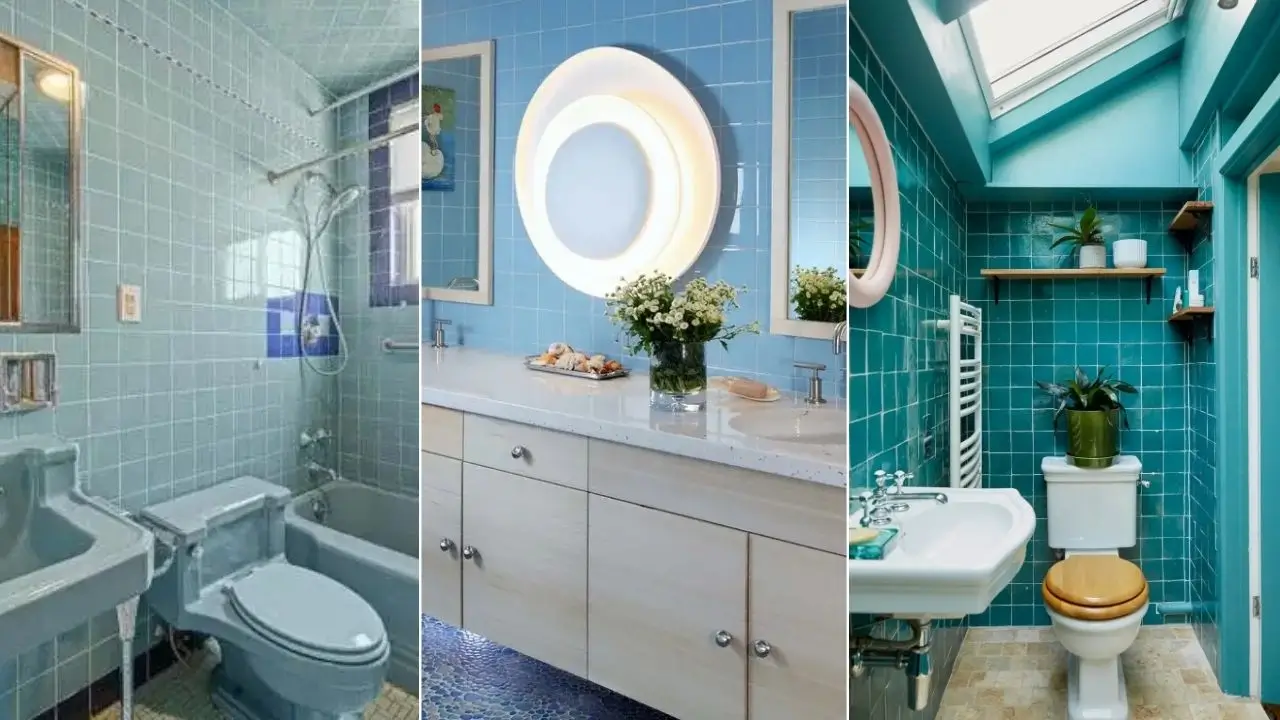
Full-Commitment Teal With a Skylight That Changes Everything
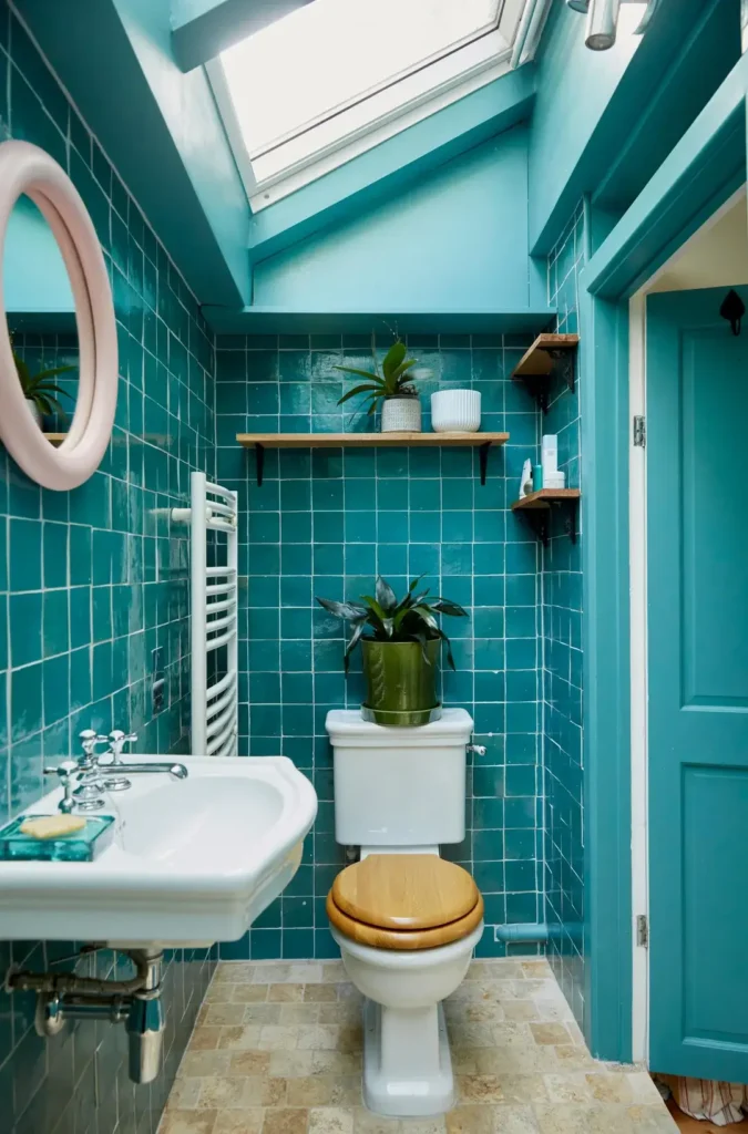
Some bathrooms apologize for their color choices. This one does not. The floor-to-ceiling teal square tiles cover every wall surface, with the matching painted ceiling and woodwork creating a fully immersive environment that should feel overwhelming and somehow doesn’t.
r/ManiaforBeatles put together something that works precisely because nothing is held back. The teal zellige-style tiles have a slight variation in their glaze that keeps the surface alive rather than flat.
White grout lines provide just enough contrast to let the eye rest, and the overhead skylight floods natural light down through the space in a way that shifts the tile color throughout the day. At noon it reads almost turquoise; in the evening it deepens toward teal.
The restraint here comes from the fixtures, not the tile. White ceramic sink and toilet, a warm wood toilet seat, and natural wood floating shelves break the tile’s dominance without fighting it.
A pink oval mirror adds a single unexpected note that somehow ties everything together. Plants tucked on the shelves bring in living green, which sits naturally against teal.
If you want this look, commit fully. Half measures with bold tile colors look like you ran out of money or nerve.
Paint the ceiling the same color as your walls, match your woodwork, and then let clean white fixtures do the balancing work. The skylight is the cheat code here if you have one, lean into a dark tile palette.
Herringbone Blue Shower Tile With Brushed Gold Hardware
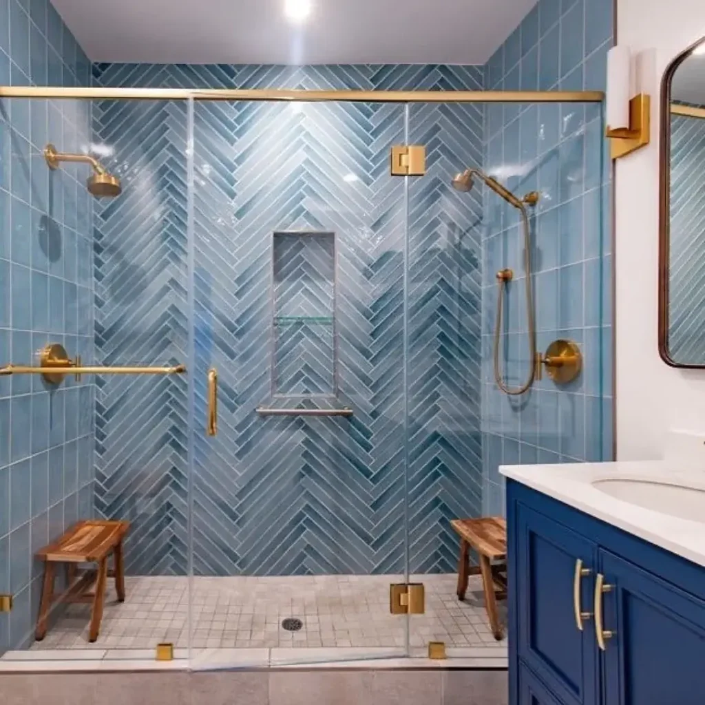
The combination of herringbone tile pattern and brushed gold fixtures is not a new idea, but this execution elevates it considerably.
The medium-blue rectangular tiles are laid in a true herringbone across every shower wall, creating a chevron pattern that draws the eye upward and makes the shower enclosure feel significantly taller than it is.
r/ManiaforBeatles made a particularly smart call with the hardware selection. Every fixture the rainfall showerhead, the handheld wand, the grab bars, the niche shelf edge is finished in brushed gold.
That consistency transforms what could have been a busy space into something coherent. Two teak shower stools sit inside the frameless glass enclosure, adding warmth and practicality in equal measure.
What makes this work beyond the obvious style points is the restraint outside the shower. The vanity cabinet is a deep navy blue a darker echo of the shower tile with a clean white quartz top.
The wall above the wainscoting is crisp white, and the circular mirror has a warm wood frame that bridges the navy and gold. The floor uses a simple small-format gray mosaic that doesn’t compete.
For anyone considering herringbone tile, the most important thing to know is that the pattern requires precise installation.
Even a slightly off-plumb starting point compounds across an entire wall. Budget for an experienced tile setter and specify the layout orientation in writing before work begins.
Vertical herringbone, as shown here, reads more formal and elongating than the traditional 45-degree diagonal version.
How to Lean Into Vintage Light Blue Tile Instead of Fighting It
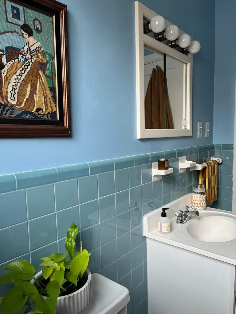
Here’s the situation many homeowners face: you moved into a house with existing light blue tile from about 1962, and you’re not sure whether to replace it or work with it. This bathroom makes a strong case for the latter.
r/guacamoleshawty chose to match the wall paint closely to the cool sky-blue tone of the existing square tiles, creating an almost seamless transition between the lower wainscoting and the upper walls.
Rather than trying to modernize with contrasting colors, the approach doubles down on the vintage character.
A vintage-style needlepoint artwork in a dark wood frame hangs prominently the kind of piece you’d find at an estate sale and it fits perfectly.
The globe vanity lights above the medicine cabinet mirror are deliberately period-appropriate. A trailing pothos plant adds life at the lower level.
Warm-toned towels in ochre and rust provide the complementary contrast that keeps the blue palette from feeling one-dimensional.
What I find most interesting about this approach is the confidence required to say “this tile is original and I’m going to honor that.”
Most renovation advice pushes toward removal and replacement, but original mid-century ceramic tile is often thicker, harder, and more durable than modern equivalents.
Working with it rather than against it saves money and preserves character simultaneously. The key is committing to the era mix modern minimalism into a 1960s bathroom and neither style wins.
Deep Teal Subway Tile in a Modern Shower With White Marble Contrast
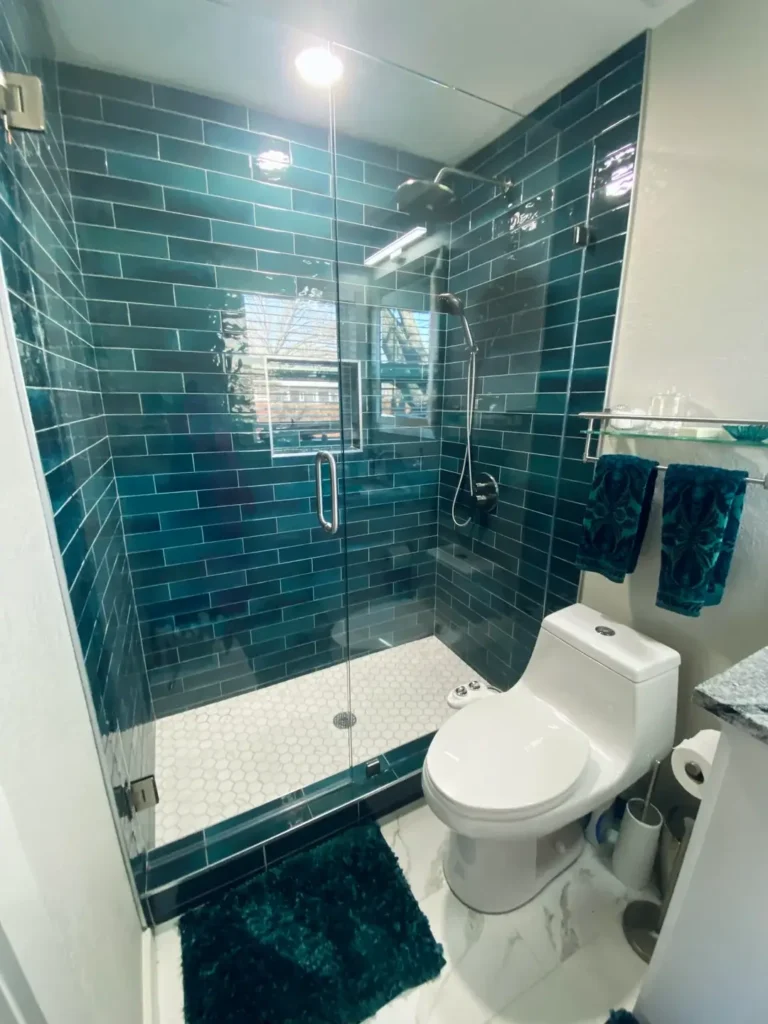
This is one of those combinations that photographs well and lives even better. Deep teal subway tiles a color that sits right at the edge between green and blue line every surface of a frameless glass shower enclosure.
The glaze has visible depth and slight variation, catching light differently depending on angle.
r/PhannyPaqued made a deliberate choice to contrast the dark, saturated shower walls with white small-format hexagon floor tiles inside the shower and large-format white marble-look porcelain throughout the rest of the bathroom.
That contrast is stark and intentional. It keeps the dark tile from making the space feel closed-in.
The fixtures are brushed chrome throughout, which reads cooler than gold and suits the particular blue-green of this tile better.
A matching deep teal bath mat and folded teal towels on a glass shelf extend the color palette outside the shower without requiring more tile.
The walls beyond the shower are a clean, neutral white no competing color, no wallpaper, nothing to distract.
Getting this tile color right requires good samples in your actual space. Teal tiles shift dramatically depending on the light temperature in a room.
A tile that looks richly saturated in a showroom under warm halogen can appear almost black under cool LED recessed lighting.
Always evaluate tile samples under multiple lighting conditions before purchasing, and specifically under whatever fixtures you plan to install.
A Teal Accent Wall Behind the Bathtub That Does All the Heavy Lifting
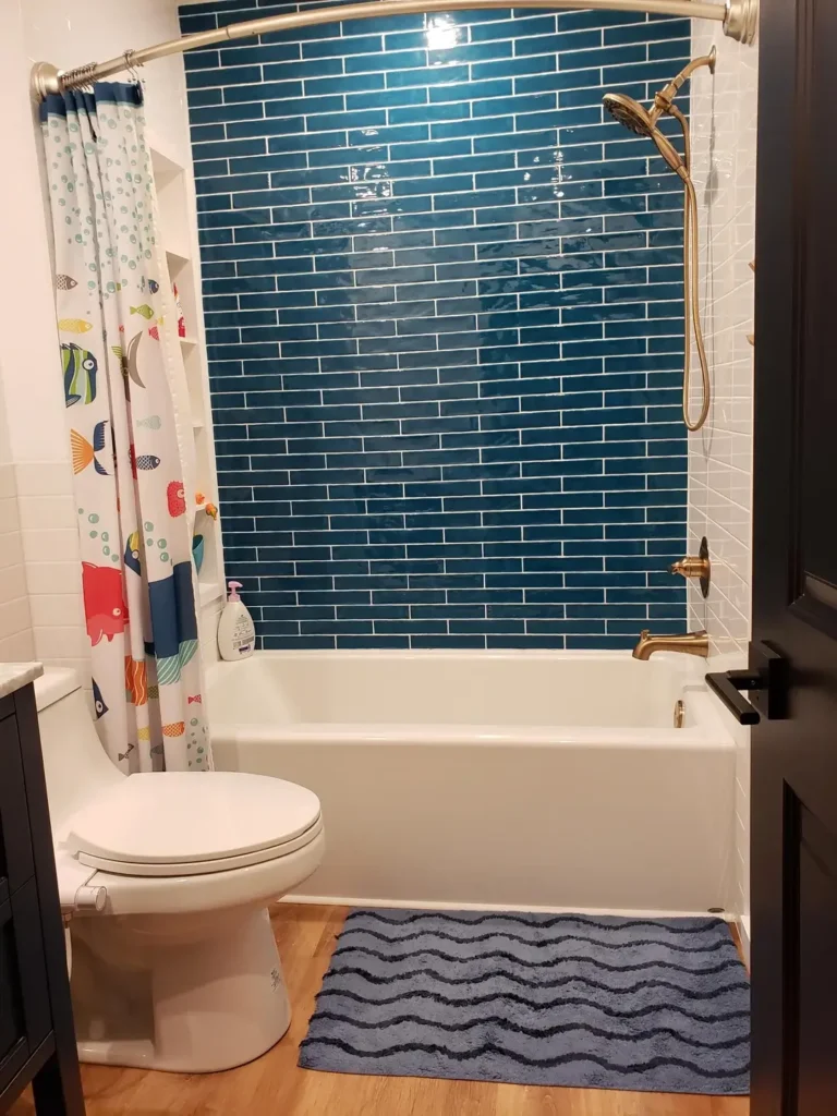
Not every blue tile bathroom idea requires covering every surface. This one demonstrates exactly how much impact a single accent wall can deliver when the tile and color are the right choice.
r/itswineoclock tiled only the wall behind the bathtub/shower with teal elongated subway tiles in a simple stacked horizontal pattern a gloss finish that catches the bathroom light with real intensity.
The remaining three walls are white. White tile on the sides of the tub, white paint everywhere else, warm wood-look plank flooring. The dark charcoal vanity cabinet sits on the opposite wall.
The result is a bathroom that feels cohesive rather than cluttered. The teal wall reads as a feature, not a mistake.
A colorful fish-print shower curtain adds personality without competing with the tile in fact, the cartoon fish feel at home against the ocean-blue background.
This approach suits renters and cautious renovators particularly well. An accent wall of tile over a bathtub surround is a defined, contained scope of work with lower material cost and installation time than a full-bathroom tile job.
If you want to test whether you can live with bold blue tile, this format gives you maximum visual impact with minimum commitment.
Brass fixtures as seen here on the tub spout add warmth that prevents the cool teal from going cold.
The Vintage Light Blue Arabesque Floor Tile That Deserves Saving
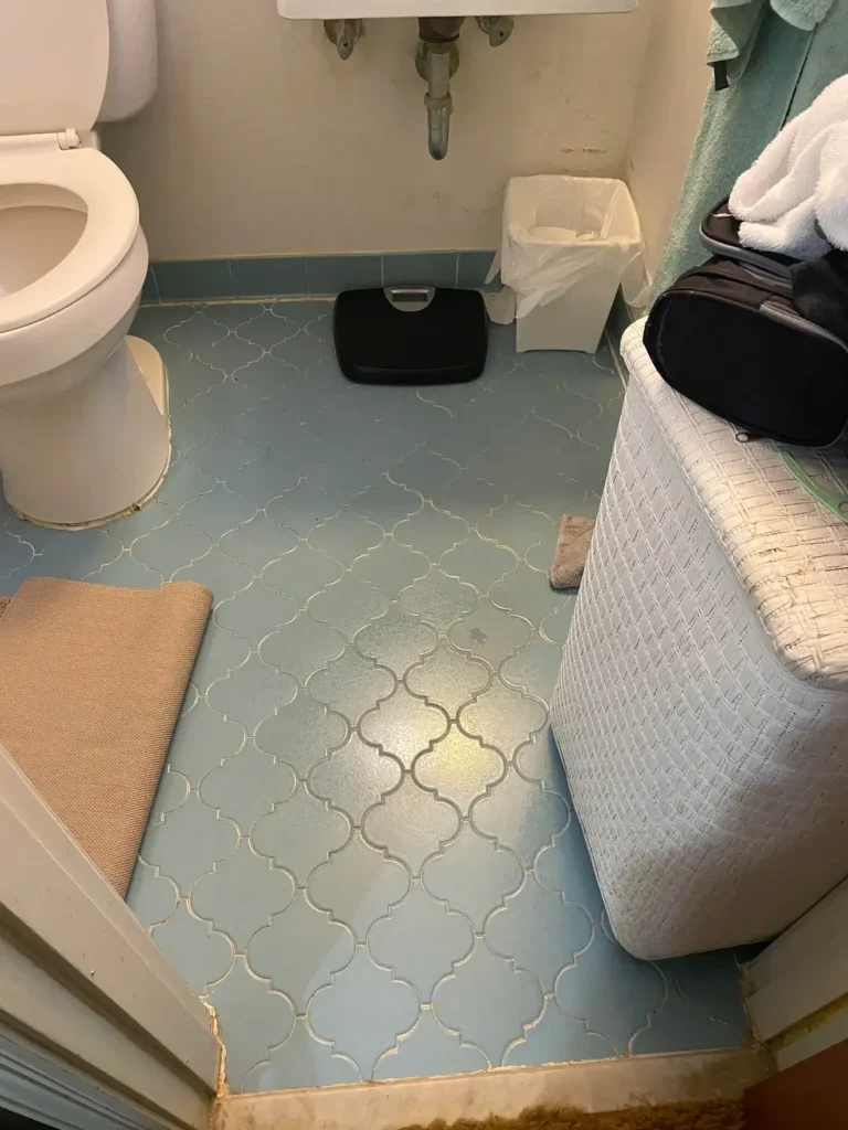
This image captures something that many homeowners genuinely don’t recognize as valuable: original vintage arabesque or lantern-shaped floor tiles in a soft powder blue.
The tile shapes interlock in a pattern that no modern vinyl sheet flooring can convincingly replicate, and the specific blue tone has the slightly greyed, soft quality that comes from original mid-century ceramic glazes.
r/ABigFuckingSword shared this shot, and it reads as a space that needs cosmetic work but not tile removal.
The arabesque tile itself is in reasonable condition the pattern is intact, the color is consistent, and the shape is a shape you’d pay good money to recreate today.
The reason I’m including this is because there’s an entire category of blue tile bathroom ideas that starts with recognizing what you already have.
Arabesque or Moorish-style tile floors were common in homes built between roughly 1950 and 1975. If you have them, a professional cleaning and regrouting job often brings them back completely. The grout lines here look like they need attention, but the tile itself? That’s worth keeping.
If you’re dealing with a similar floor, source grout color samples before committing. Matching the original grout tone (typically a warm gray or buff in these vintage applications) matters more than most people expect.
Fresh white grout on aged mid-century tile often looks jarring it draws the eye to the grout lines rather than the tile pattern itself.
The Retro Teal Tile Countertop and Floor Combination Worth Reconsidering
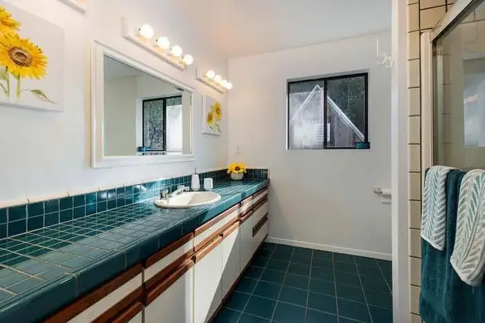
Here’s a bathroom that most listing agents would describe as “original” or “vintage” and most buyers would immediately add to their renovation budget.
I think they’d be wrong to rush that decision. The teal square tiles covering both the floor and the vanity countertop, framed by warm wood cabinet fronts, create a color palette that feels deliberately collected rather than accidentally dated.
r/mo__nuggz captured this space, and what strikes me is how the sunflower artwork above the mirror works with the teal tile in a way that feels fresh rather than frozen in time.
Yellow and teal is a color combination that shows up regularly in contemporary design. The fact that this bathroom has been doing it since approximately 1978 is either ironic or prescient, depending on your perspective.
The vanity countertop tile is the genuinely unusual element here. Tiled countertops went out of fashion decades ago, largely because of grout maintenance concerns.
But if the existing installation is solid, sealed correctly, and cleaned properly, the functionality argument against them is overstated.
The aesthetic argument for them particularly in a teal-and-wood combination is stronger than most renovation shows would have you believe.
If you’re inheriting a space like this, try replacing the mirror and light fixture with something current before pulling out any tile. Updated lighting alone transforms how every surface in a bathroom reads.
Light Blue Square Tile With a Pebble Mosaic Floor and Coastal Layering
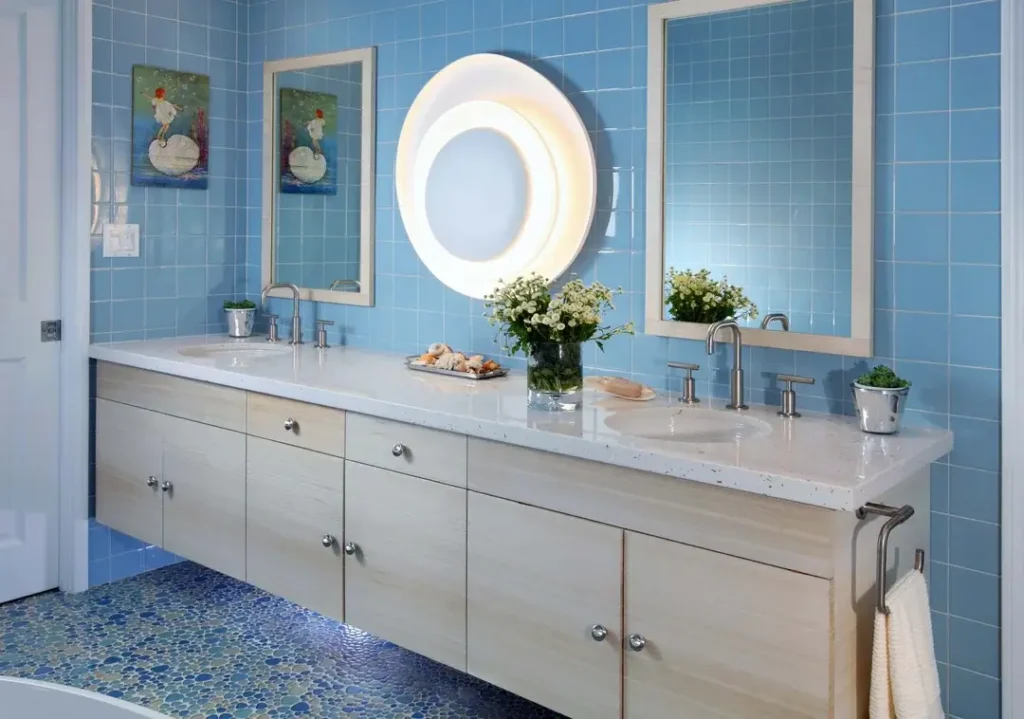
This is a professionally designed bathroom, and it shows but the principles are completely accessible to anyone planning a renovation. Sky blue square ceramic tiles cover every wall surface, providing a consistent, calm backdrop.
The real design interest comes from layering: a pebble mosaic floor in varying shades of blue and white, a floating whitewashed wood vanity, and a large circular illuminated mirror that commands the center of the wall.
r/takaotashmoo captured a bathroom that manages to feel coastal without resorting to any of the predictable coastal clichés no rope, no anchors, no shell-printed towels.
Instead, the coastal quality comes from the layering of blue tones from floor to wall to accessories, and from the use of natural materials (the wood vanity, fresh flowers, seashells on the counter) that reference organic forms.
The pebble mosaic floor is the element I keep coming back to. Standard hexagon or subway tile floors would serve the function, but the pebble mosaic adds texture and a sense of the handmade that elevates the entire room.
It also creates a natural variation in blue tones that makes the flat wall tile more dynamic by comparison.
Dual undermount sinks with separate faucets and individual framed mirrors are centered by a circular illuminated light a hierarchy that works beautifully.
For anyone building a primary bathroom with this palette, floating vanities in natural wood tones are the correct pairing for light blue tile. Dark wood reads too heavy; white cabinetry reads too clinical.
Multi-Tone Blue-Green Zellige Shower With Warm Wood and Concrete Details
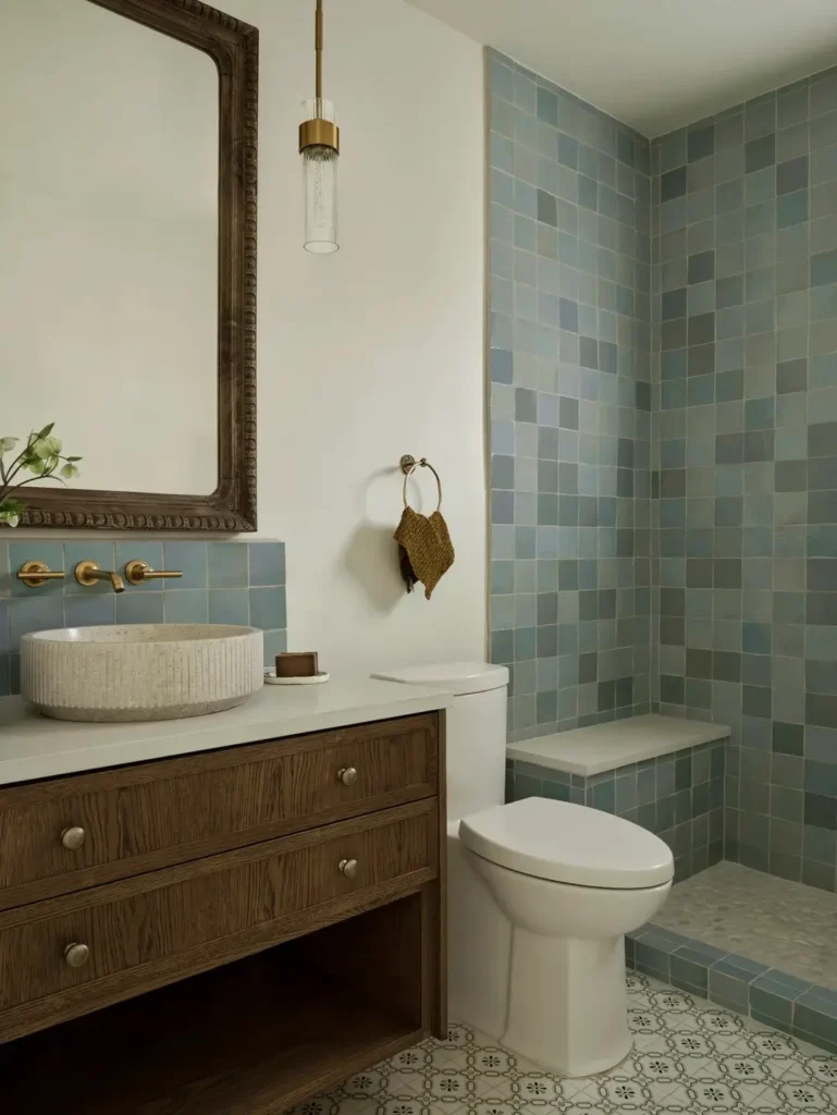
This bathroom earns its own section because the tile work is doing something genuinely interesting: the shower walls use zellige-style square tiles in a range of tones soft blue, sage green, gray, and putty without any specific pattern or color sequence.
The variation is organic, almost watercolor-like, and the overall impression is a shower that looks different every time you look at it.
r/ManiaforBeatles demonstrates how a restrained exterior palette makes an adventurous tile choice more successful. The walls outside the shower are plain white.
The vanity is a warm medium-toned oak with simple drawer pulls. The basin is a textured concrete vessel sink, round and earthy.
A dark carved wood mirror frame provides the most traditional element in the room, and a single brass pendant light hangs from the ceiling on a long gold cord.
The patterned encaustic floor tile in white and soft gray bridges the zellige shower wall and the white exterior space without requiring a hard border between the two.
It’s a sophisticated spatial solution the floor does the transitional work so the walls don’t have to.
What I find most useful about this example is how the warm, organic elements prevent the blue-green tile from going cold.
If you’re working with blue zellige, pair it with wood and stone rather than chrome and glass. The warmth of those materials pulls out the green undertones in the tile, which reads as life-affirming rather than clinical.
The All-Blue Vintage Bathroom That Committed Before It Was Fashionable
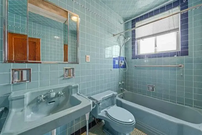
There is a specific kind of blue bathroom that existed in American homes built between 1945 and 1965, where every fixture the tub, the toilet, the sink was manufactured in the same pastel blue-gray ceramic as the wall tiles. This is one of those bathrooms, and it has survived completely intact.
r/sstorrrrr documented this space, which looks like it hasn’t been substantially changed since its original installation.
Light aqua square wall tiles cover every surface, with a darker navy blue tile trim framing the window a detail that shows the original installer understood contrast and framing even within a monochromatic scheme.
The matching colored fixtures are the element most likely to trigger renovation instincts. A blue toilet and a blue sink feel wrong to eyes trained on decades of white fixture standards.
But the argument for preservation here is genuine. These fixtures were made to accompany the tile, not just coexist with it.
The blue-gray of the porcelain exactly matches the blue-gray of the tile glaze. You cannot recreate that coordination with modern white fixtures.
If you have a bathroom like this, the realistic question to ask is: does the plumbing work? If yes, a thorough cleaning and regrouting project may be all you need.
These original colored fixtures are increasingly valued by preservationists and design-forward homeowners, and their replacement with standard white equivalents is a decision that cannot be undone.
Deep Navy Blue Tile in a Compact European-Style Bathroom

This final example comes from a different context entirely a compact apartment bathroom where the tile choice is deep, saturated navy blue covering floors, walls, and ceiling within the wet zone.
The format is small square ceramic tile in a dark cobalt-navy, and it creates a bathroom that feels intentionally moody rather than accidentally dark.
r/kineskisenf shared this space, and what’s notable is how the practical European apartment bathroom layout washer in the bathroom, combined bath and shower, wall-mounted cabinetry above the sink reads as entirely natural within this envelope of deep blue tile.
The white fixtures provide sufficient contrast, and the white shower curtain reflects light back into the space.
This is the most relevant example for anyone living in a small apartment or dealing with a compact urban bathroom.
The instinct in small spaces is usually to go light to make them feel larger. But a deeply saturated, consistent tile color can actually create the impression of infinite depth the opposite of what you’d expect.
The navy tiles in this bathroom make the boundaries of the room less defined rather than more, which works in its favor.
The takeaway for anyone with a small bathroom: don’t automatically reject dark tile on the grounds of space.
If the ceiling is low and the room is narrow, going dark and consistent can be more successful than fighting for lightness with tile that doesn’t suit the space.
Matching Blue Tile to Your Bathroom: A Quick Reference
| Tile Style | Best Application | Hardware Pairing | Difficulty Level |
|---|---|---|---|
| Zellige (multi-tone) | Shower walls, full wet zone | Brushed brass, unlacquered brass | Advanced |
| Subway tile (glossy) | Accent wall, tub surround | Brushed gold, brushed nickel | Easy |
| Square ceramic (light blue) | Full room, wainscoting | Brushed chrome, polished nickel | Easy |
| Herringbone (elongated) | Shower walls, feature wall | Brushed gold | Advanced |
| Arabesque/lantern | Floor tile | Any metal tone | Medium |
| Pebble mosaic | Shower floor, bathroom floor | Brushed nickel, chrome | Medium |
| Deep navy square | Full wet zone, small bathrooms | Chrome, polished nickel | Easy |
Finding Your Blue
Across all eleven of these bathrooms, a few patterns emerge worth keeping in mind. Bold, committed tile choices outperform hesitant ones almost every time.
The bathrooms that work best are the ones where someone made a clear decision all-in teal, or a single decisive accent wall, or a full preservation of what was already there rather than trying to hedge in every direction.
Fixture and hardware selection matters as much as the tile itself. Brushed gold suits medium blues and teal. Brushed chrome suits light aqua and sky blue. Navy blue is versatile enough to take either, though chrome leans more contemporary.
Plants, in almost every example here, do work that no inanimate accessory can replicate. A green plant against blue tile looks correct in a way that’s hard to articulate but impossible to miss once you notice it.
The most interesting insight from this collection might be the vintage bathrooms. Original mid-century blue tile is increasingly rare, surprisingly durable, and genuinely difficult to recreate.
Before you schedule the demo, spend an afternoon online looking at what that tile costs per square foot new. The answer often changes the calculus entirely.