Okay, real talk: beige walls are doing absolutely nothing for your sleep quality or your soul. If you’ve been staring at the same neutral bedroom for years and thinking “there has to be something better,” you’re right. There is. And it’s blue.
Blue is the color that interior designers keep reaching for because it genuinely works. It calms the nervous system, it photographs well, and it plays nicely with almost every other color in existence.
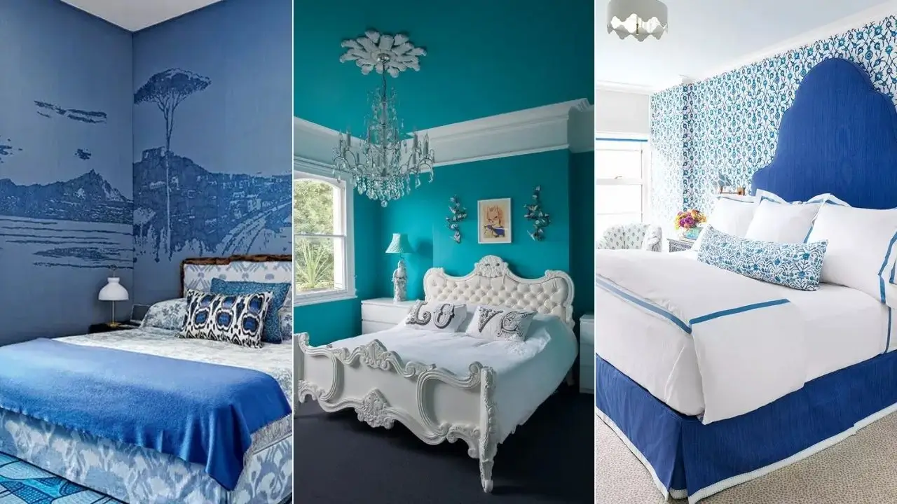
I’ve rounded up 12 blue master bedroom decor ideas that run the full spectrum from barely-there sky blue to full-blown cobalt drama, and every single one of them has something worth stealing for your own space.
1. The Bold Blue Paneled Accent Wall with a Tufted Gray Bed
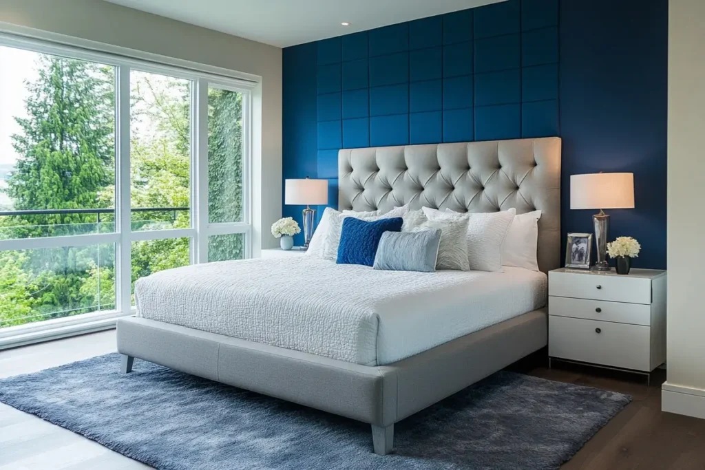
This one is for people who want impact without commitment to an all-blue room.
The headboard wall is covered in a grid of dimensional square panels painted in deep cobalt blue. These panels aren’t just paint they create actual shadow and texture, so the wall looks expensive and intentional from every angle. The remaining three walls stay in light gray, which lets the accent wall breathe instead of competing.
The gray tufted bed mirrors the diamond texture of those panels in a subtle way that feels designed, not accidental. White quilted bedding keeps things fresh. A soft navy area rug pulls the cobalt color down to floor level, which is a smart move it stops the accent wall from looking like a random blue rectangle floating in the room.
The takeaway: Pick a blue that is two to three shades deeper than everything else. Keep your furniture in light gray or warm white. The wall does all the work, so you don’t have to.
2. The Panoramic Landscape Mural That Wraps Three Walls
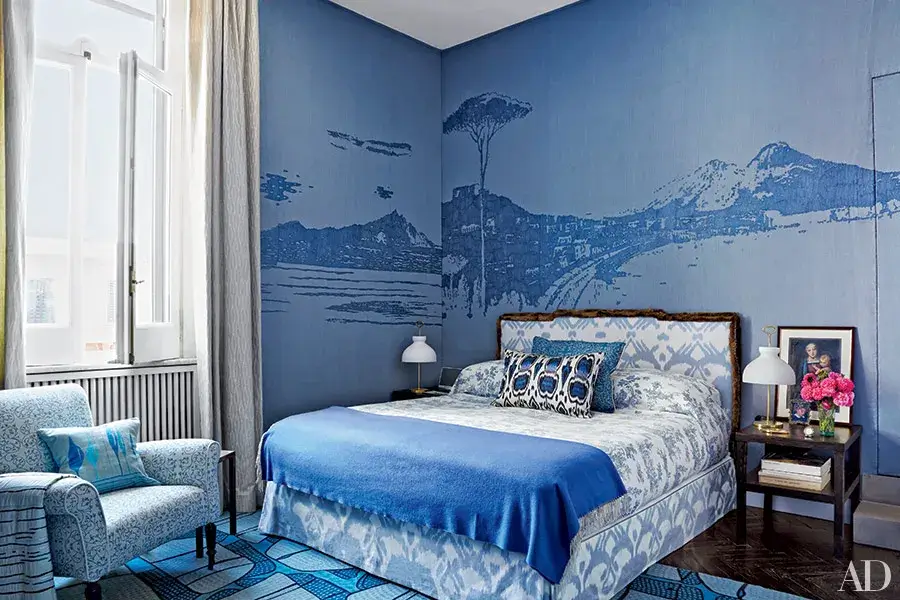
This room genuinely stopped me mid-scroll, and I do not stop easily.
A soft periwinkle blue covers every surface as the base, and layered over it is a full coastal Italian landscape mural mountains, a lone pine tree, a sweeping shoreline, hillside buildings. The genius part? The mural uses a deeper tone of the same blue rather than introducing new colors, so it reads as sophisticated rather than chaotic.
The furniture keeps a respectful distance and lets the walls lead. An ikat-patterned bed frame in blue and white, matching ikat pillows, and a blue patterned armchair in the corner all operate in the same color story. Dark hardwood floors anchor the whole thing.
Not ready to commit to a full mural? Apply it only to the headboard wall. Companies like Rebel Walls and Coordonne sell mural wallpaper panels that give you this effect without needing to hire anyone. Just go tone-on-tone with your color choice and avoid photorealistic prints they tend to feel more like a poster than a design decision.
3. Navy Blue Botanical Wallpaper with Rattan Accents (Coastal Chic Done Right)
Wallpaper on all four walls sounds like a lot. And honestly, it can be unless you do it like this.
The pattern here is a graphic navy and white botanical print with stylized leaves in a repeating symmetrical motif. From a distance it reads classic. Up close it’s intricate. A beaded rattan chandelier overhead introduces warm natural texture that softens what could otherwise feel like a very stiff, formal space.
The smart move is the furniture: a gray upholstered headboard with nail-head trim, white nightstands, and a light area rug. Everything in the light gray to white family. Two dark rattan armchairs in the sitting area echo the chandelier and give the room that casual coastal energy. Gray linen drapes slide across the pattern when you want visual relief.
Here’s the rule when you go bold with wallpaper: keep your furniture noticeably lighter. If the furniture matches the wallpaper energy, the room becomes impossible to read. Contrast is everything.
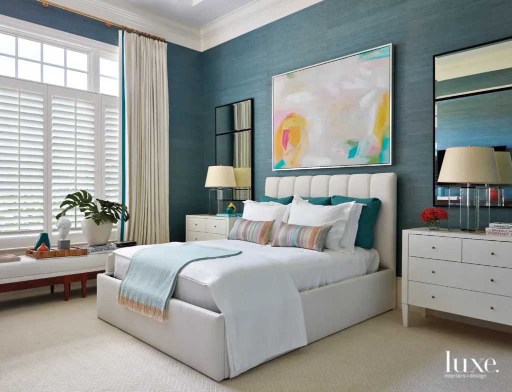
4. Warm Teal Walls with a Classic White Bed and a View That Does Half the Work
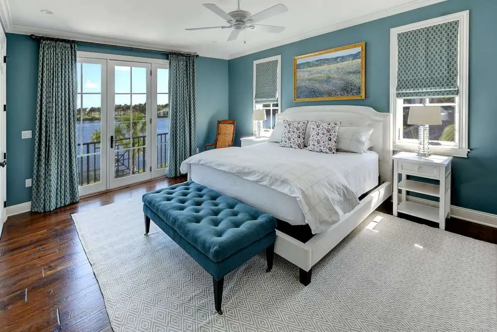
Some bedrooms earn their character as much from what’s outside the window as from what’s inside. This is one of them.
The walls are a warm teal blue, not the sharp jewel-toned kind, but the softer version that sits comfortably between green and blue and reads well in both natural and artificial light. White crown molding, baseboards, and trim keep the room from going heavy. A classic white upholstered bed sits under a gilded landscape painting that, not coincidentally, mirrors the actual waterfront visible through the French doors behind it.
A tufted teal bench at the foot of the bed is one of those quiet, tying-it-all-together details that makes a room feel considered rather than assembled. Roman shades in a small geometric print and matching floor-length drapes add pattern in the same teal family without overwhelming.
Pro tip: Paint your walls a color you can also see through your window. That visual continuity between interior and exterior makes a room feel genuinely calming. It’s a subtle trick but it lands every time.
5. Vivid Turquoise Walls with a White Rococo Bed (Yes, Really)
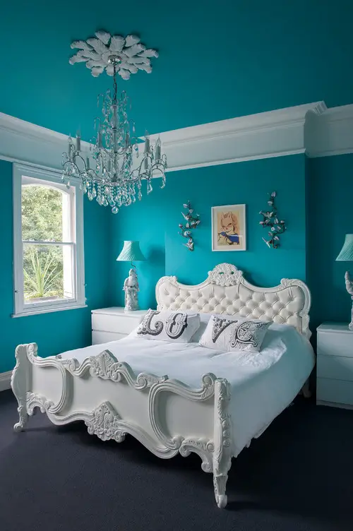
I’ll be honest: when I first saw this one I thought, “that’s going to be a disaster.” I was wrong.
The walls, the ceiling, and even the window trim are all painted the same saturated turquoise. Taking the color onto the ceiling transforms this from a painted room into an immersive experience. A crystal chandelier hangs against that turquoise backdrop and looks like it belongs in a high-end boutique hotel. White plaster wall sconces in a floral relief style echo the intricate carved detailing on the bed frame.
And speaking of that bed: a white-painted French baroque frame with deeply tufted upholstery is the clear star of the room. White linens keep the bed layer bright and clean. Spelled-out letter pillows that read “LOVE” add personal warmth without clashing.
The honest catch: This look only works if you go all-in. Half-saturated turquoise on one wall produces none of this magic. When you try it, choose a turquoise that leans slightly warm rather than cold. It’ll feel less like a swimming pool and more like a getaway.
6. Navy Blue Accent Wall with Wainscoting and Velvet Everything
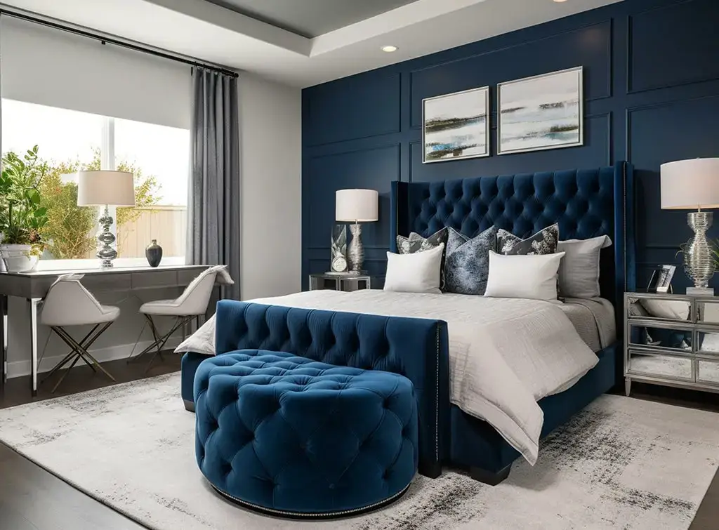
This is the room for people who want luxury without going overboard. It threads the needle between dramatic and livable better than most.
The headboard wall features deep navy paint with white wainscoting panels providing architectural structure. Two framed abstract art pieces in teal, navy, and gray hang symmetrically above the bed and pick up both the wall color and the silver tones in the room. The wingback headboard in button-tufted navy velvet is tall enough to rise above the wainscoting, creating a layered depth effect that feels genuinely intentional.
Silver mirrored nightstands reflect light back into the room and prevent the navy from going cave-like. A navy velvet tufted ottoman at the foot of the bed doubles as a seating option. A sleek desk and acrylic chair in the corner handle the practical without visually competing with the sleeping area.
The key insight here: Monochromatic dressing works when you vary textures. Velvet headboard, matte wall paint, reflective mirrored surfaces, and abstract artwork all operate in the same blue story but feel completely distinct from each other. Texture is doing the heavy lifting.
7. Blue-Gray Paneled Walls with Warm, Eclectic Accents (The Unexpected Combo)
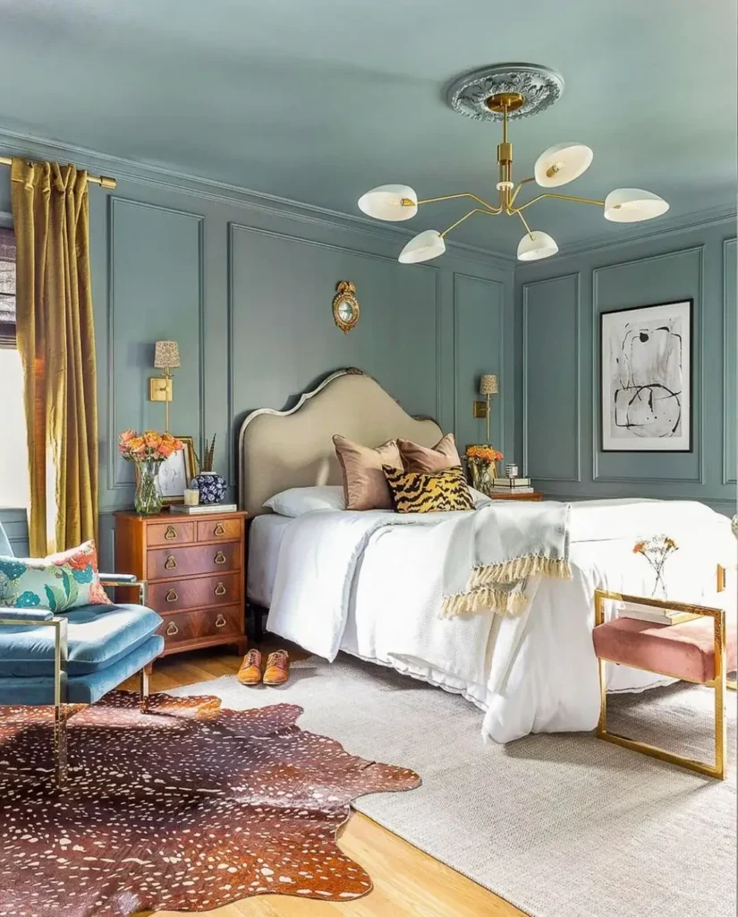
This is the one I’d personally recreate. Blue-gray as a backdrop for warm, layered, almost maximalist furnishings? It absolutely works, and I wouldn’t have predicted that.
The walls and ceiling are painted the same dusty blue-gray with detailed panel molding in the same color. A mid-century brass and glass chandelier introduces the warm metallic thread that runs through everything else. The cream headboard has a sculptural wavy silhouette that feels genuinely artistic rather than catalog-generic.
Here’s where it gets fun: velvet pillows in terracotta and camel brown, a tiger-stripe throw pillow, a fringed ivory blanket, a walnut chest with brass pulls as the nightstand, an antelope print cowhide rug layered over a sisal rug. A blue velvet bench with brass legs and a pink velvet accent chair with a gold frame round out the seating area.
Why does this work without looking messy? Because the blue-gray wall is neutral enough to let every warm element read as intentional. If you want to bring earthy or jewel-toned warm accents into a bedroom, a muted blue-gray is one of the most forgiving wall colors you can choose.
8. Dark Shiplap Accent Wall for the “Blue-ish But Not Really” Crowd
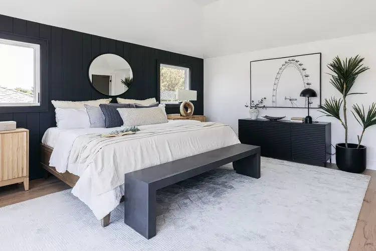
FYI: this one technically has a very dark navy-adjacent shiplap wall, and it earns its place on this list by showing what moody restraint can do.
Vertical black shiplap panels cover the headboard wall while the remaining three walls stay bright white. The contrast is stark. A low-profile platform bed in warm natural wood sits in front of the shiplap and prevents the dark wall from feeling gloomy. White and soft navy pillows against the headboard bridge the color story.
A large round mirror above the bed reflects the room back at itself and makes the dark wall feel less dominant. A black low-profile credenza opposite holds a lamp, a small sculpture, and minimal objects. A large framed black-and-white architectural photograph above it (a Ferris wheel, of all things) maintains the graphic, high-contrast aesthetic. One tall tropical plant in the corner adds the only organic warmth in the room.
Who this is for: People who want drama but feel nervous about actual blue. Use a dark wall and add a few blue-toned pillows and textiles to connect to the idea without overwhelming your instincts.
9. Teal Grasscloth Walls with a Colorful Abstract Painting
Texture changes a room more than most people realize, and this space is the case study.
Teal grasscloth wallpaper covers every wall. The natural woven texture adds depth and warmth simultaneously paint simply cannot replicate the way grasscloth catches and diffuses light throughout the day. White plantation shutters and ivory floor-length drapes stay deliberately neutral to let the walls lead.
The colorful abstract painting above the bed is the best decision in this room. Its palette of pink, yellow, white, and teal speaks directly to the wall color while injecting brightness and life into a space that could otherwise tip into being too calm. A white channel-tufted bed stays simple. Teal accent pillows and a soft aqua throw blanket bring the wall color into the bedding layer. Two tall slim-framed black mirrors flank the bed and amplify the light.
A few grasscloth warnings before you order:
- Always order large samples and observe them in your specific lighting before committing
- Color can shift noticeably between the swatch and the full wall
- Grasscloth dislikes humidity, so stick to bedrooms rather than bathrooms
10. Sky Blue Walls with a Capiz Shell Chandelier and a Barn Door
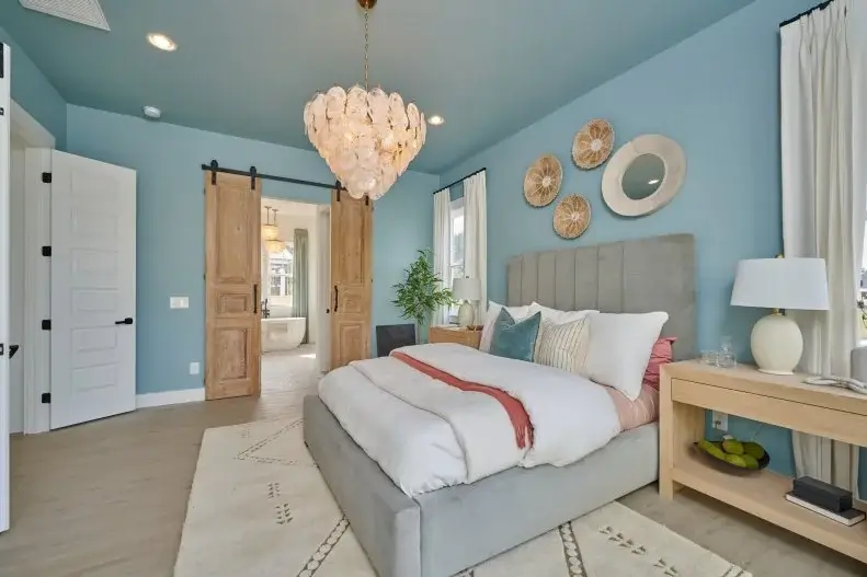
This room has a clear point of view, and it executes it consistently. Every single material choice supports the same story: casual coastal warmth.
The walls and ceiling are both painted a soft sky blue, the kind that feels like clear morning light. Carrying the ceiling color to match the walls softens the distinction between planes and wraps the room in a way that feels cozy rather than clinical. A capiz shell chandelier hangs in the center, and those translucent layered shells catch the light in a way that’s genuinely hard to replicate with anything else.
A reclaimed wood barn door on black iron hardware leads to the en-suite. The warm natural wood against cool blue walls is the central material balance in this room something warm for everything cool. Woven rattan wall medallions and a round mirror form an artful arrangement above the bed instead of a conventional piece of art.
The lesson: A soft blue reads warm, not cold, when you pair it with enough natural wood and organic materials. Light maple nightstands, rattan accessories, and a capiz chandelier push this room firmly into the “inviting” category.
11. Cobalt Blue Floral Wallpaper with a Dramatic Arched Headboard
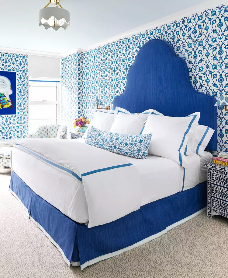
IMO, the headboard in this room is the single most interesting piece of furniture in this entire roundup.
A cobalt blue linen headboard rises to a dramatic Moorish arch point that commands the room without needing backup. Blue and white floral wallpaper in a delicate small-scale block print covers every wall. Because the wallpaper and headboard live in the same cobalt blue family, what could have been chaotic competition becomes a cohesive tonal conversation instead.
White hotel-weight bedding with a blue grosgrain ribbon border trim creates a clean layer between the pattern-heavy walls and headboard. A lumbar pillow in the same floral print as the wallpaper ties surfaces together. Bone inlay nightstands in geometric black and white add artisanal character. A white scalloped flush-mount ceiling fixture and a blue linen bench at the foot of the bed complete the frame without fuss.
This technique is called tonal layering pattern on pattern in the same color family. The secret is keeping the wallpaper background close to white while the dominant pattern color matches the headboard exactly. The eye reads it as a single story rather than two things fighting.
12. Teal and Pink Color-Block Bedroom with a Glass-Front Wardrobe
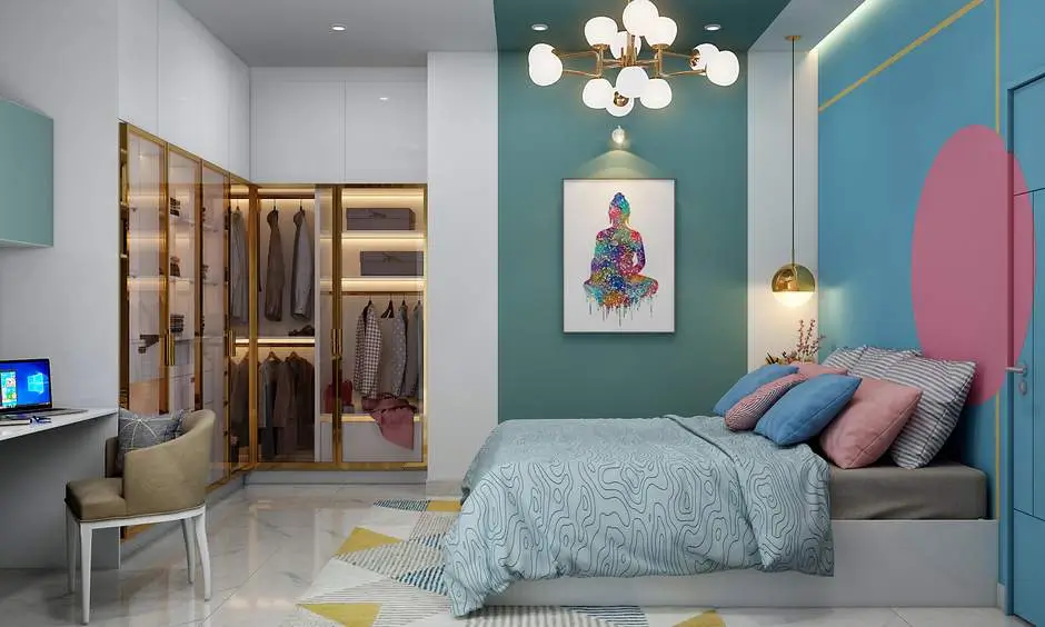
Contemporary residential design in parts of Asia has been doing things with color that most Western bedrooms simply haven’t caught up to yet. This room is a prime example.
The headboard wall is a rich jewel teal. The side wall features a geometric color-block design in sky blue, white, and a large soft pink oval bold enough to function as both art and architecture. Gold pendant lights flank the bed like miniature lanterns, and gold metallic accent lines on the color-block wall add graphic precision that elevates everything. A Sputnik globe chandelier overhead introduces a fun retro-modern energy.
The glass-front wardrobe with gold-framed doors is the practical element, and the designer made it visually interesting by lighting the interior and organizing visible clothing deliberately. The warm internal glow from inside the wardrobe balances the cooler tones of the walls. A geometric area rug in yellow, white, and navy brings the color story down to floor level.
The point this room makes: Your bedroom doesn’t have to choose between personal expression and calm. The teal and pink combination is playful, but gold accents and clean-lined furniture give it a sophistication that keeps it from feeling like chaos.
Choosing the Right Blue: A Quick-Reference Guide
With 12 completely different takes on blue master bedroom decor ideas in front of you, the real question is: which one actually works for your space? Here’s a table that should help clarify things fast.
| Blue Shade | Best For | Mood It Creates | Pairs Well With |
|---|---|---|---|
| Cobalt / Royal Blue | Bold accent walls, dramatic headboards | Energizing, high-contrast | White, silver, gray |
| Navy Blue | Paneled walls, velvet upholstery, maximalist rooms | Sophisticated, grounding | Gold, cream, mirrored surfaces |
| Teal | Spaces needing both warmth and coolness | Balanced, calming | White trim, natural wood, brass |
| Sky Blue | Coastal, cottage, or farmhouse bedrooms | Fresh, airy, relaxed | Rattan, capiz, warm wood tones |
| Blue-Gray | Transitional spaces, eclectic layering | Versatile, quietly moody | Terracotta, amber, mustard |
| Turquoise | Maximalist, fully immersive color | Vibrant, joyful | Crisp white, crystal, chrome |
A few things to check before you paint:
- Light direction matters a lot. North-facing rooms with limited sun can make navy feel like a cave unless you add reflective surfaces and warm lighting. South-facing rooms can handle almost anything on this list.
- Test in big swatches. Paint at least a 12×12 inch sample and observe it at morning, midday, and evening before deciding.
- Consider your floors. Warm honey-toned hardwood tends to work best with teal, sky blue, or blue-gray. Cool gray or white flooring is a natural match for cobalt, navy, and turquoise.
What All 12 of These Rooms Are Actually Doing Right
Look across all twelve spaces and a few consistent principles show up regardless of style or shade.
Every single room manages the relationship between blue and its neutrals deliberately. Not one of these spaces introduces blue and then wings the rest. The neutrals white, gray, cream, natural wood are always chosen to either contrast with or support the specific blue in play.
Texture does consistent work too. Blue can read as flat and lifeless on a smooth surface with nothing to break it up. The rooms that feel the most layered and interesting the grasscloth walls, the shiplap panels, the dimensional square-paneled accent wall all introduce physical texture that gives the color depth and dimension.
The bottom line? Blue is genuinely one of the most livable and versatile choices for a master bedroom. It spans everything from the quietly serene sky blue farmhouse room to an all-in turquoise maximalist suite. There is a version of this palette that works for almost every taste and almost every room.
Start with the shade that made you stop scrolling. Build outward from there. And honestly, stop staring at beige. You deserve better.