Black and white bathrooms have outlasted every design trend that tried to replace them and for good reason.
This collection pulls from real people’s real bathrooms, not staged magazine shoots, so what you’re seeing is genuinely achievable.
Each example here represents a different approach to the same classic palette. Some are budget refreshes, some are full renovations, and a few are works in progress that still manage to look pulled together.
The range is the point. Whatever your space looks like right now, at least one of these will give you something concrete to work with.
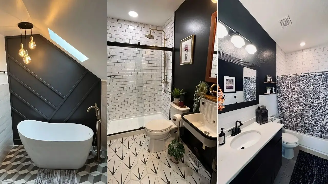
Black Accent Wall with Subway Tile and a Statement Shower Curtain
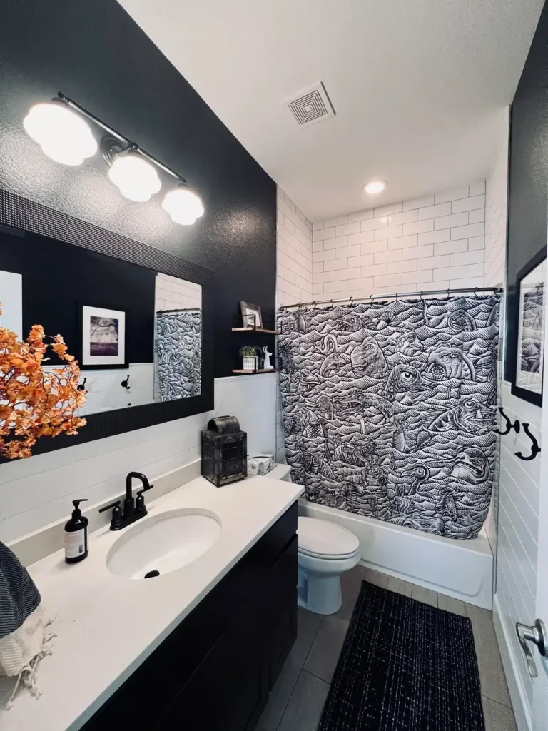
The contrast here does exactly what good black and white bathroom ideas should do it creates drama without requiring a complete gut renovation.
One wall painted matte black behind the vanity and mirror completely changes the weight of the room, making the white subway tile in the shower zone feel brighter by comparison.
r/dark_shadeaux2187 put together a space that balances bold and restrained in a way that takes some thought to pull off.
The black-framed mirror sits flush against the dark wall, almost disappearing into it, which lets the white countertop and undermount sink take visual priority.
The real show-stopper is the shower curtain a dense, illustrated black-and-white print featuring sea creatures, waves, and surreal imagery that functions like a piece of art hung in the most unexpected place.
What makes this work is the way the curtain’s busy pattern contrasts with the clean surfaces around it. Everything else is quiet, so the curtain earns the attention it demands.
The matte black faucet and hardware tie the whole thing together without requiring any additional decorating effort.
If you want to try this approach, paint one wall black before committing to the full room. A single dark accent wall costs almost nothing compared to retiling, and the impact is immediate.
Pair it with matte black fixtures, which are widely available and much more affordable than they used to be, and let one bold textile carry the personality of the space.
Black and White Checkerboard Floor with Bold Orange and Yellow Walls
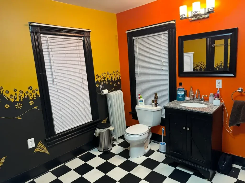
This one surprised me. The black and white checkerboard floor is doing a significant amount of structural work here, grounding a room that could have felt chaotic given the orange and yellow walls meeting at a corner. Instead, the floor reads as the stable, neutral foundation that holds everything else together.
r/Accomplished_Sir3896 made a choice that most people would talk themselves out of pairing an already loud black and white floor pattern with walls painted in two competing warm tones.
The black trim around the windows and the dark-stained vanity cabinet pull those strong wall colors back toward the floor, creating a visual loop that actually feels intentional.
There’s even a painted floral border in gold along the lower portion of the yellow wall, which adds detail without adding clutter.
The lesson here is that black and white doesn’t have to mean cold or minimalist. Used as a foundation element, a checkerboard floor can anchor almost any color palette above it. The black and white provide the visual stability that allows everything else to be expressive.
If your bathroom has a bold tile floor you’re stuck with, lean into it rather than fight it. Choose one or two strong accent colors and let the floor be the mediator between them.
This approach works especially well in older homes where architectural details like the radiator and tall window trim visible here give the space enough character to support the risk.
Vintage 1940s Black Tile Border with White Walls That Doesn’t Need Saving
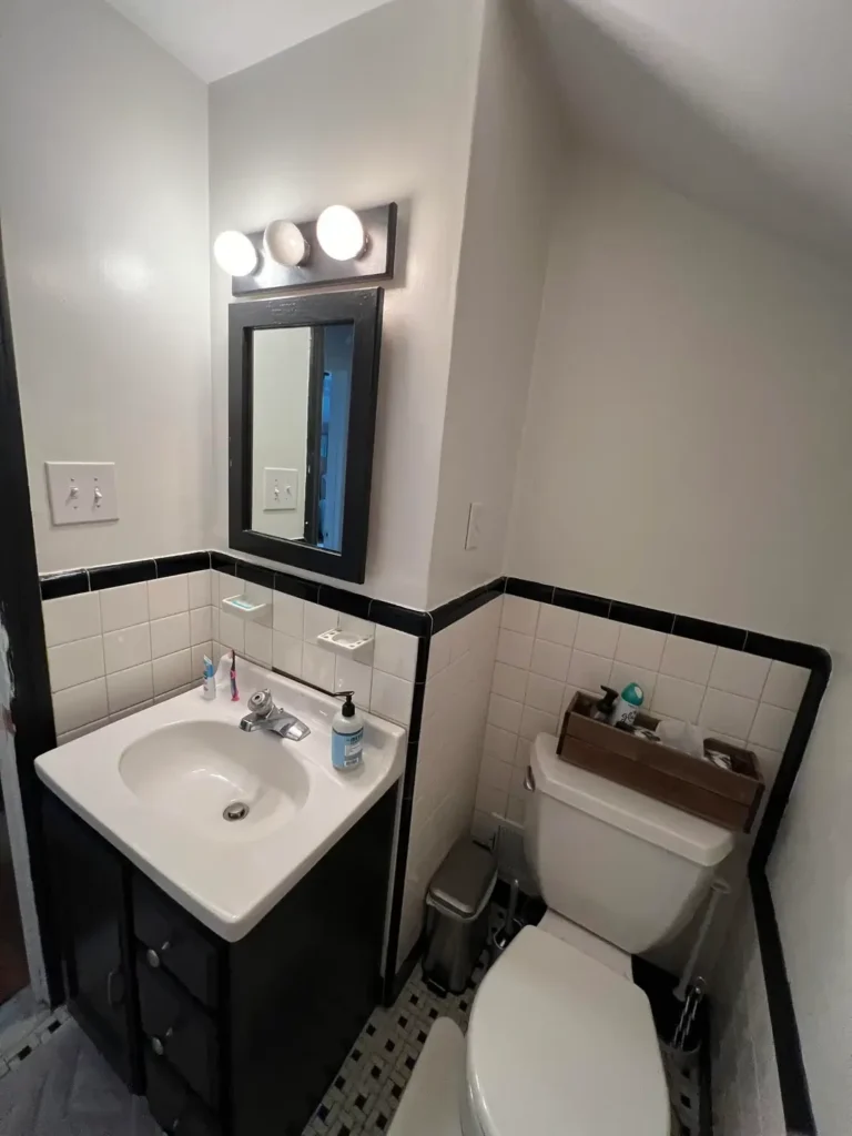
People see a bathroom like this and immediately want to update it. I’d push back on that instinct. The black tile border running at waist height around the entire room, paired with white square tiles below and flat white walls above, is a classic layout that reads as intentional rather than dated when you leave it alone.
r/t1_mm shows a compact bathroom that proves you don’t need to modernize original tile work to make a space feel considered.
The black-framed mirror above the dark vanity cabinet picks up the black tile accent without matching it exactly, which is actually better than a perfect match would be.
The small hexagonal black and white mosaic floor tile just barely visible at the bottom of the frame adds a third pattern element that ties the floor to the walls without overwhelming the space.
What tends to make older tile work feel tired isn’t the tile itself it’s everything around it. The vanity, lighting, and accessories are where dated spaces actually show their age.
Swap those elements for cleaner modern versions while leaving the original tilework intact, and you’ll often end up with something that feels more interesting than a full replacement would.
The black-framed mirror is a straightforward upgrade that works in almost any black and white bathroom.
It costs relatively little, installs in an afternoon, and immediately modernizes a vanity area without touching the tile.
Dark Hexagon Floor Tile with Black Shower Frame and White Vanity Cabinetry
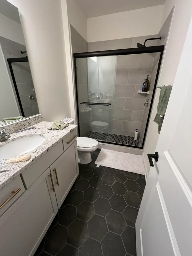
There’s a version of this bathroom that looks generic, and then there’s this version, which doesn’t. The difference comes down to two decisions: the large-format dark charcoal hexagon floor tile and the matte black shower frame. Both choices lean into contrast rather than defaulting to matching everything in the same finish.
r/SnooSprouts1899 built a bathroom addition that demonstrates how hardware finish choices can define the entire aesthetic of a space.
The white shaker-style vanity cabinet has brushed gold bar pulls a small detail that keeps the space from feeling too stark.
Meanwhile, the shower enclosure has a clean black frame around clear glass, and the shower floor uses small black hexagon mosaic tile that echoes the large hexagons on the main floor.
That repetition of shape across two different scales creates cohesion without being repetitive.
The granite countertop in white and grey adds natural variation to a room that could otherwise feel too controlled.
That’s worth noting: in a black and white bathroom, a stone surface with natural patterning does the work that decorative accessories would do in a softer, more colorful space.
For anyone doing a bathroom addition from scratch, this layout is worth studying. The investment in large-format floor tile pays off visually smaller tiles in the same color would lose that bold geometric impact.
Go larger than feels comfortable, and the floor becomes the focal point that pulls the whole room into focus.
Moody All-Black Walls with a Gold Ornate Mirror in Progress
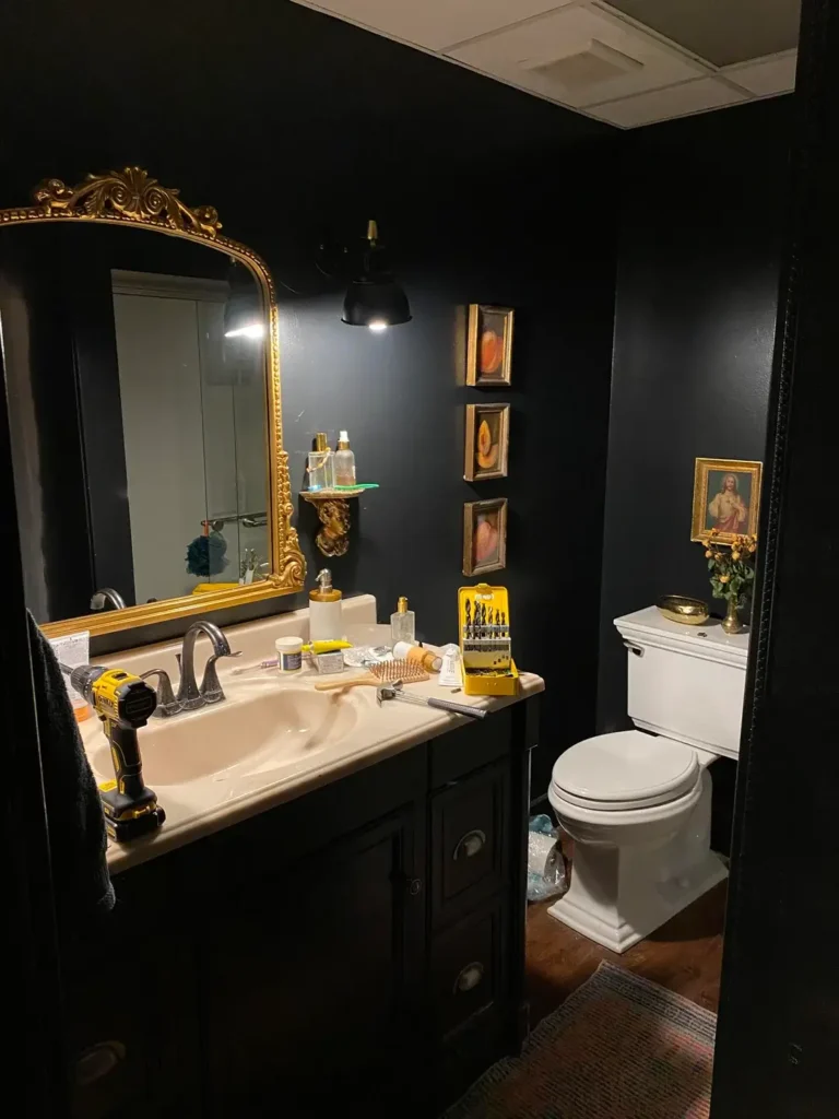
Some of the best black and white bathroom ideas come from rooms that aren’t finished yet. This one is clearly mid-renovation there’s a drill on the counter, a bit set sitting out, and the countertop hasn’t been fully styled but the bones are already compelling.
r/cinderkitten11 is building something that takes real commitment: walls painted in a deep, near-black navy or charcoal that turns the bathroom into something closer to a Victorian parlor than a utility space.
The ornate gold-framed mirror is the centerpiece, its baroque carved detail catching the light from a single black pendant lamp positioned behind it.
Three small portrait-style paintings in gold frames hang vertically on the wall beside the mirror, and a fourth sits above the toilet on the far wall.
Dark walls in a bathroom make a lot of people nervous, and I understand why. The concern is that the space will feel smaller and darker.
What this image shows is that when you pair very dark walls with white fixtures toilet, sink basin and warm gold accents, the room doesn’t shrink. It deepens. There’s a difference.
The key is lighting. A single low pendant lamp creates atmosphere but wouldn’t be sufficient as the only light source.
Plan for at least one additional source a sconce on the other side of the mirror, or a ceiling fixture if you want this look to be functional for daily use. The style is absolutely achievable; just don’t sacrifice illumination to get it.
Geometric Black Accent Wall with a Freestanding Tub Under a Skylight
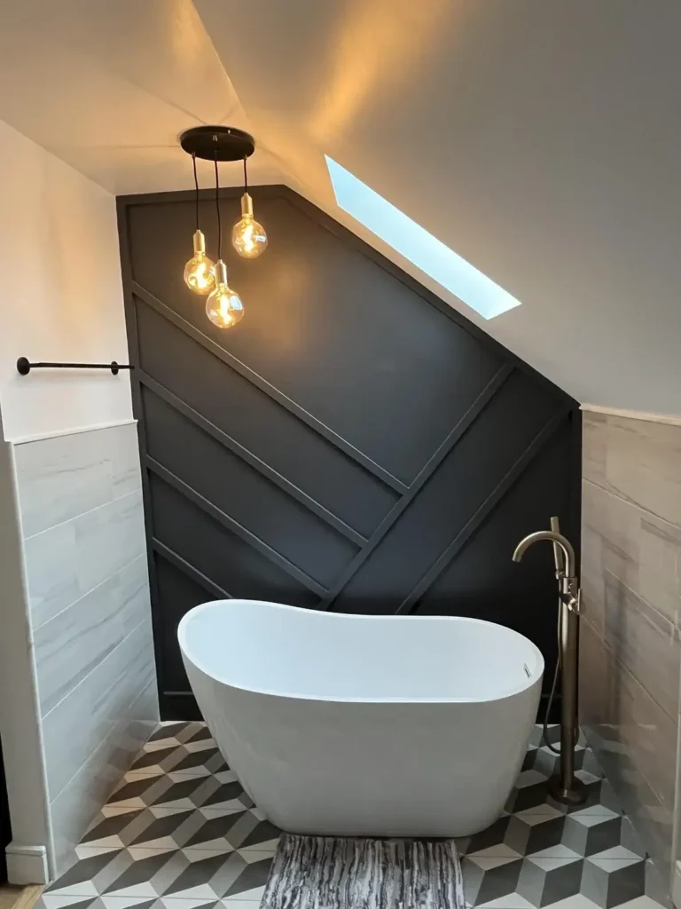
This is the most architectural of all the black and white bathroom ideas in this collection. The accent wall isn’t just painted it’s built with angled wood paneling in a large chevron or arrow pattern, all finished in deep charcoal or near-black paint. The effect transforms an attic-ceiling bathroom into something that looks custom-designed.
r/VoidDeer1234 created a focal wall that works specifically because of its geometry. The diagonal lines of the paneling mirror the slope of the ceiling above, making the architectural constraint of a pitched roof feel deliberate rather than limiting.
A freestanding white soaking tub sits centered against the wall, and the pairing of the pure white tub against the near-black paneling is as clean a contrast as you can achieve.
Three Edison bulb pendant lights hang from a single black canopy above the tub, their warm amber glow softening what could otherwise feel too sharp.
The floor is cement-look geometric tile in a three-dimensional cube pattern grey, white, and dark charcoal that adds depth without competing with the wall behind it.
Natural light from the skylight above the tub makes the space feel open despite the dark wall treatment.
What I find genuinely interesting about this room is how it treats the freestanding tub as a piece of furniture rather than a fixture.
It’s centered, it has its own floor-mount tub filler in an antique bronze finish, and it has breathing room on all sides. That positioning is what makes it a feature rather than just a bathtub.
Navy Painted Bathroom with Playful Typography Art and Botanical Curtain
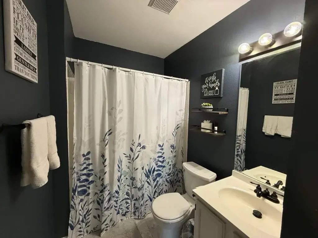
Dark walls in a bathroom work best when they’re paired with accents that add warmth or humor, and this room does both.
The walls are painted in a deep navy dark enough to read as near-black in the photograph and the styling choices are what keep it from feeling heavy.
r/ScarcityOk3512 put together a space that’s comfortable and lived-in without looking messy. Two framed typography pieces hang on the walls, the kind that make a bathroom feel like a person actually uses it rather than preserves it.
A hand-lettered “wash your hands ya filthy animal” sign adds a moment of levity that lands without being overdone.
The shower curtain in white with botanical blue-grey print brings in pattern and a secondary color that bridges the navy walls and white fixtures.
Two floating shelves in dark wood hold small accessories a candle, a bottle, a succulent without overwhelming the wall space. Matte black hardware ties back to the dark wall tone.
The overall effect is a bathroom that feels styled but not staged, which is honestly harder to achieve than it looks.
The takeaway here is that dark bathrooms need personality injected through accessories and art, not just surface materials.
White towels against dark walls, a botanical curtain against a navy background, and a couple of well-chosen prints these things cost very little and shift the mood of a space significantly. Start with the walls, then build the accessories around what the darkness asks for.
Black Swirl Wallpaper Accent Wall with Floating Vanity and Backlit Mirror
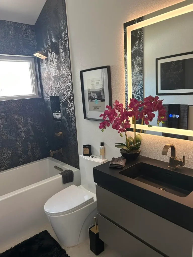
Wallpaper in bathrooms used to be a reliable way to create a future renovation project for yourself. Modern peel-and-stick and moisture-resistant options have changed that calculation, and this room shows what’s possible when you commit to a bold pattern.
r/Miserable_Budget7818 chose a dramatic swirling black-on-black or black-on-dark-grey wallpaper with a topographic or wood-grain quality to its pattern, applied to the tub surround wall.
The texture is visible even in the photograph slightly raised or embossed, which catches the light differently depending on where you’re standing. Against this wall, a white soaking tub looks almost luminous.
The floating vanity is the other standout element. A matte black rectangular vessel sink sits on a matte white floating cabinet, and a large backlit LED mirror provides the primary light source.
That warm LED glow around the mirror’s perimeter creates the kind of lighting you actually want for getting ready it wraps around the face rather than casting shadows from above.
The brushed gold faucet and the vibrant pink orchid in a black ceramic pot add warmth and life to a scheme that could feel cold otherwise.
This is a high-effort bathroom, and that effort shows. But the individual elements the wallpaper, the floating vanity, the backlit mirror can each be tackled independently as budget allows.
The backlit mirror alone would transform almost any bathroom for a few hundred dollars. The wallpaper is a weekend project. You don’t have to do everything at once.
Black Cat-Themed Bathroom with Hexagon Tile and Eclectic Wall Gallery
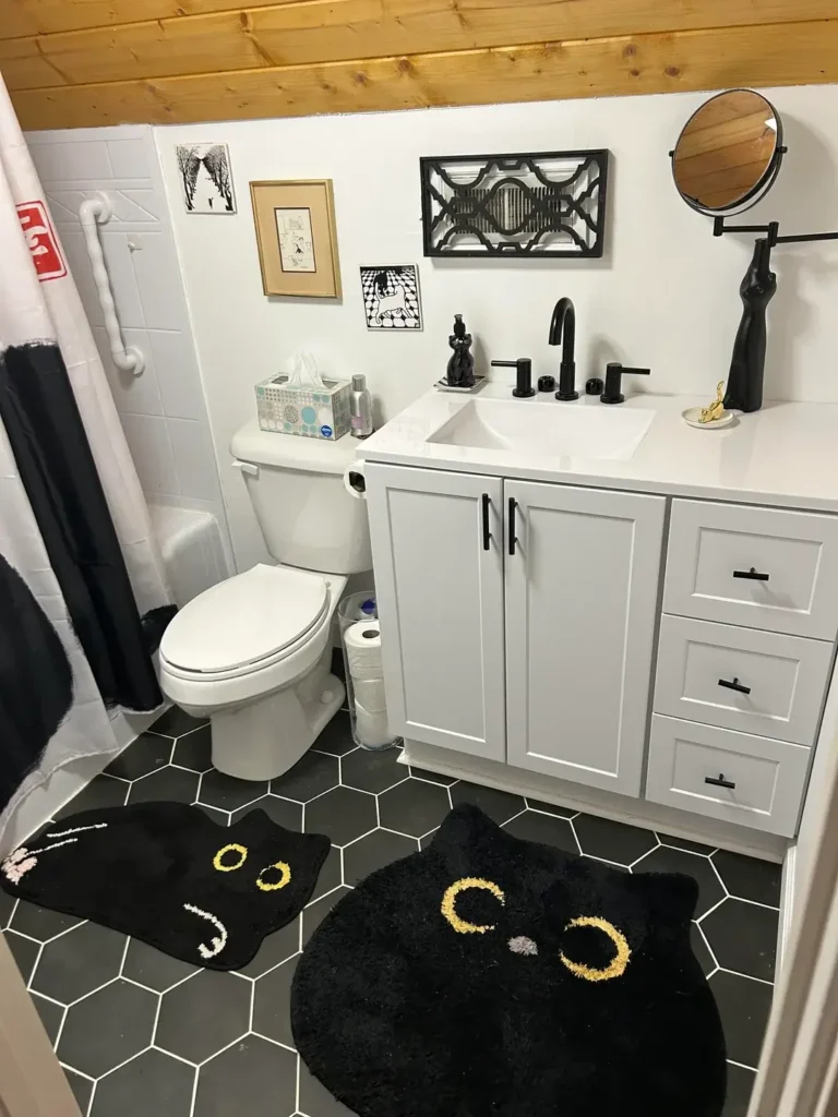
Personality-forward black and white bathroom ideas tend to land one of two ways: they feel cohesive and intentional, or they feel scattered. This room lands on the right side of that line, and it’s worth studying why.
r/Uncle-Istvan built a theme around black cat motifs without letting the theme become cartoonish. The two black cat-shaped bath rugs on the dark charcoal hexagon floor are the most obvious nod to the theme, but they’re presented as functional objects rather than decorations.
The wall gallery above the toilet includes a small black-on-white print of a cat, a couple of framed sketches, and a black geometric metal wall sculpture the kind of eclectic mix that suggests genuine curation rather than a packaged set.
The white shaker vanity cabinet with matte black hardware is clean and relatively standard, which is exactly right here.
When the decorative elements are this specific, the fixtures need to stay neutral. The warm wood-plank ceiling adds an unexpected texture that keeps the space from feeling too utilitarian.
What this room demonstrates is that a personal theme doesn’t have to take over every surface to be effective.
Two cat rugs, one cat print, and a few well-chosen accessories communicate the theme clearly without becoming overwhelming. That restraint is what separates a styled room from a themed room.
Intricate Patterned Floor Tile with Black Vanity and Round Black-Framed Mirror
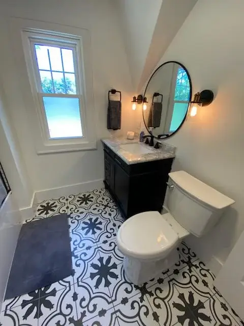
There’s a specific kind of black and white bathroom that gets its character from the floor and keeps everything else simple. This is that bathroom, done well.
r/No_Possibility1919 used a bold black and white encaustic-style floor tile with a circular medallion pattern — the kind of tile that would look at home in a French farmhouse or an English cottage.
The scale of the pattern is generous, which means it reads clearly even in a small room rather than dissolving into visual noise.
Against that floor, a dark-stained vanity cabinet and black-framed round mirror feel grounded rather than heavy.
The round mirror is worth a specific mention. In a room with strong geometric pattern on the floor, a circular mirror introduces a contrasting shape that softens the space without weakening it.
Two Edison bulb sconces flank the mirror on either side, providing warm light that flatters the face and balances the cool white walls.
Natural light from a window on the left wall keeps the space from feeling enclosed. That combination of natural light and warm-toned sconces is the right approach for a bathroom with dark floors and dark furniture you need more sources of light, not fewer.
If you’re choosing floor tile and want this level of impact, look for cement or cement-look tiles in a scale that matches your room size.
Black Wall Paint with White Subway Tile, Brass Shower, and Vintage Sink
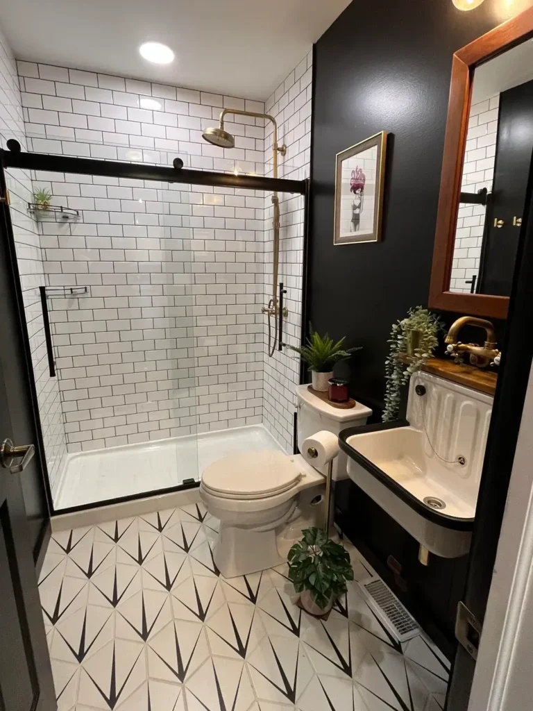
This bathroom is doing something that takes confidence: mixing multiple metal finishes, a vintage-style wall-mount sink, brass shower fittings, and bold black walls and making it all feel intentional rather than mismatched.
r/mJcMistoffelees created a bathroom that reads as carefully edited even though it contains a lot of competing elements.
The white subway tile covers the entire shower enclosure floor-to-ceiling, and the black sliding glass shower door frame gives it a modern edge.
The brass rainfall showerhead and hand shower add warmth to what would otherwise be a stark black and white palette.
Meanwhile, the vintage-style wall-mount sink with a butcher block countertop surface introduces a reclaimed or antique quality that the rest of the room doesn’t have and that contrast is precisely what makes the space feel lived-in and interesting.
The floor tile uses a bold black and white geometric pattern with elongated arrow or diamond shapes, which gives the floor strong visual movement.
Three small potted plants a fern on the toilet tank, a trailing plant near the sink, and a small plant on the floor bring organic softness to a room built almost entirely from hard materials.
This is the most eclectic black and white bathroom idea in this collection, and it works because every element has been chosen with a clear perspective.
It’s not accidental maximalism it’s intentional layering. If you’re drawn to this approach, start with one strong decision and build toward it, rather than trying to plan the whole room at once.
Soft Black and White Bathroom with Linen Sink Skirt and Natural Textures
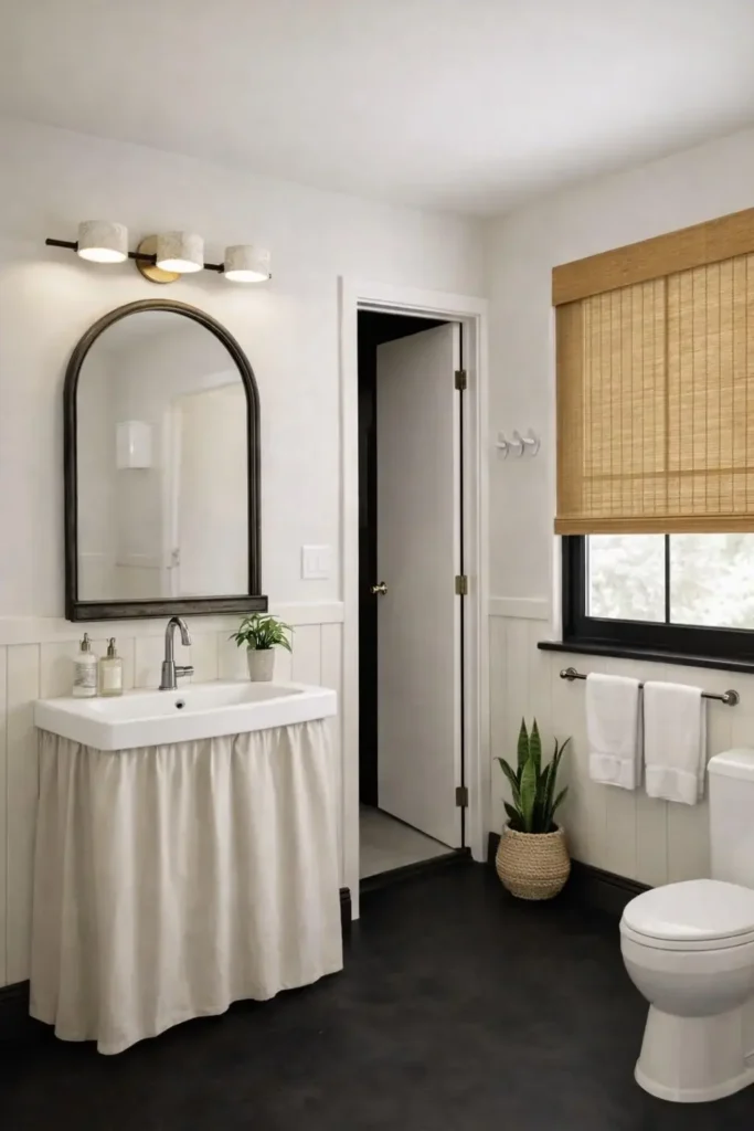
Not every black and white bathroom idea has to be high contrast or dramatic. This room proves that the palette can read as warm and gentle when the materials are soft and the light is good.
r/Theotherjtisme styled a bathroom using a linen or cotton fabric sink skirt in warm off-white, a matte black arched mirror, and a woven bamboo Roman shade that introduces natural texture and warmth against white walls.
The floor is a matte black possibly painted or a very dark charcoal tile which anchors the space without making it feel heavy, partly because the walls are kept very light and the ceiling is white.
The vertical marble-look wainscoting panels add subtle texture to the lower half of the walls without drawing attention away from the mirror and sink area.
Two small potted plants one on the vanity, one on the floor in a woven basket add organic shapes that soften the right angles everywhere else. White towels on a simple towel bar complete the tableau.
What I find effective about this approach is how the softness is achieved through material choices rather than color choices.
The palette is still black and white, but linen, bamboo, and ceramic have a warmth that hard tile and lacquered wood don’t.
If you want a black and white bathroom that feels cozy rather than sleek, the answer is in the materials choose matte finishes, natural fibers, and organic textures wherever possible.
Classic Octagon Floor Tile with Blue Accent Stripe and Dark Vanity Cabinet
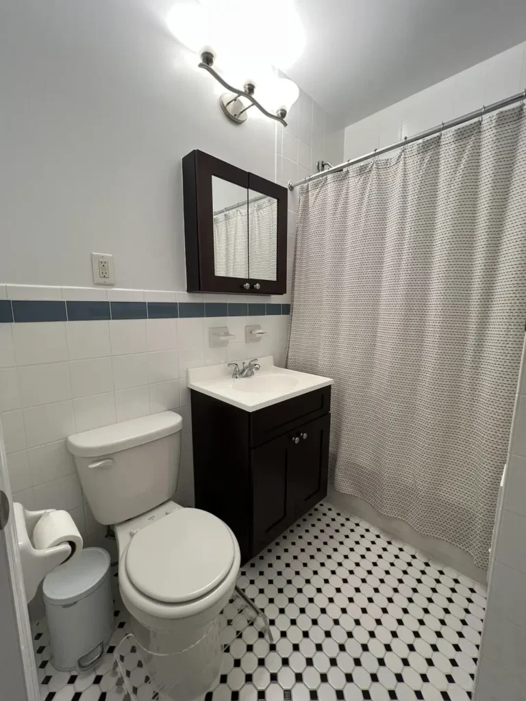
This is the kind of bathroom that exists in hundreds of older apartments and houses, and it’s more interesting than people tend to give it credit for.
The small octagon floor tile in black and white is a classic pattern that was installed by the millions across North America from the 1920s through the 1960s and it still looks right.
r/chopenye has a bathroom that demonstrates how a single unexpected color element can refresh a classic black and white scheme without disrupting it.
A single row of blue ceramic tiles runs horizontally through the middle of the white subway tile wall, creating a thin stripe of color that adds visual interest without committing to a full color scheme overhaul. It’s a subtle move that reads as intentional.
The dark espresso vanity cabinet grounds the room at floor level, and the recessed medicine cabinet above it provides storage without projecting into the already compact space.
A textured or dotted neutral shower curtain adds pattern at the far end of the room without introducing new color.
This bathroom is honest about what it is a small, functional space in an older building and it leans into that rather than fighting it.
The lesson for anyone working with inherited tile they can’t replace: find the one change that costs the least and does the most.
A stripe of accent tile, a new vanity cabinet, or a different shower curtain can shift the entire feeling of a space without touching what’s already there.
Vintage Pink Tile Bathroom Saved by Black Trim and Dark Floral Wallpaper
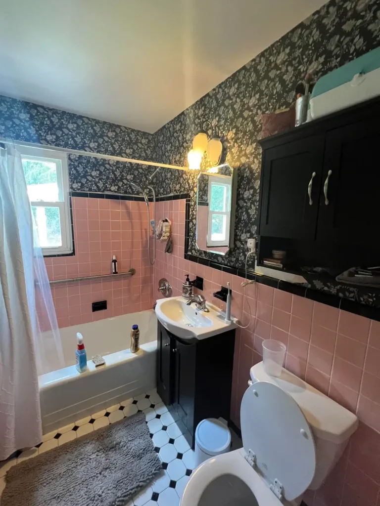
This one takes some courage to appreciate, and I think it deserves it. The pink ceramic tile covering the tub surround and much of the lower walls is a 1950s feature that nobody would install today, but the combination of black trim details and a dark floral wallpaper has turned it into something that reads as deliberately eclectic rather than stubbornly outdated.
r/Live-Active chose to keep the pink tile and work with it rather than against it a decision that required a clear vision of where the room was going.
The wallpaper selected is a dark navy or charcoal ground with a dense white floral pattern, which picks up the white in the tile grout lines and the white ceiling.
Black-painted cabinet fronts on the medicine cabinet and vanity bring the darker tones from the wallpaper down to eye level. The octagon floor tile in black and white connects everything at the bottom.
What could have been an accidental collision of eras instead feels like someone made a considered decision about what kind of room this should be.
That’s the difference between a dated bathroom and a characterful one whether the choices visible in the space feel deliberate.
The practical lesson here is for anyone stuck with pink, green, or harvest gold tile they don’t have the budget to replace: build toward the tile rather than away from it.
Choose one complementary dark color for the walls and lean into the vintage quality of the fixtures. The tile stops being a problem and starts being the point.
Dark Vanity Cabinet with Black-Framed Sliding Shower Door and Light Tile Floor
The last of these black and white bathroom ideas is the most straightforward and sometimes straightforward is exactly what a space needs.
This is a functional family bathroom built around a dark espresso or near-black vanity cabinet, black-framed sliding shower door, and light grey porcelain floor tile. No bold patterns, no statement wallpaper, no art. Just clean contrasts and good bones.
r/anklescarves shows a bathroom that’s honest about being a daily-use space rather than a showroom.
The large-format light grey floor tile keeps the room feeling open. The dark vanity with a white quartz countertop creates the primary contrast point.
Two black-framed rectangular mirrors above the vanity create symmetry without requiring any additional decoration.
The sliding shower door with its black aluminum frame is a common upgrade that significantly changes how a bathroom reads.
The frame acts like a picture frame around the shower enclosure, giving it visual weight and making the white tub surround behind it look intentional rather than basic. It’s a hardware decision, not a renovation.
What this room demonstrates is that black and white bathroom ideas don’t require a dramatic design statement to succeed.
Sometimes the right call is clean lines, quality materials, and finishes that coordinate without matching exactly.
This approach ages well and photographs well, and it accommodates any style of accessories you want to add later.
Finding Your Version of Black and White
Looking across all fifteen of these bathrooms, a few patterns emerge worth noting.
| Approach | Best For | Difficulty | Key Investment |
|---|---|---|---|
| Black accent wall | Rental-friendly refresh | Easy | Paint + black-frame mirror |
| Patterned floor tile | New builds or full renos | Medium | Tile + installation |
| Dark wallpaper feature | Renters with permission | Easy | Wallpaper + one afternoon |
| All-dark walls | Committed homeowners | Medium | Paint + quality lighting |
| Vintage tile preservation | Older homes on a budget | Easy | Dark paint + new accessories |
| Floating vanity + backlit mirror | Modern aesthetic | Advanced | Vanity + plumbing changes |
The most consistent observation across all fifteen examples is that hardware finish makes an outsized difference.
Matte black faucets and fixtures appear in the majority of these rooms, and in each case they function as the thread that ties everything together.
Swapping out chrome hardware for matte black is one of the most cost-effective moves you can make in an existing bathroom.
The second observation is that personal touches the cat rugs, the typography art, the drill sitting on the counter are what make these bathrooms feel lived in rather than staged.
Real black and white bathrooms have personality, and that personality comes from the people using them, not from the tile.
Whatever stage your bathroom is at right now, the palette gives you a clear framework to work within. Start with one change that matters, watch how the room responds, and build from there.