You’ve saved 847 pins. You’ve scrolled through enough “apartment inspo” posts to blur your vision. And yet your living room still looks like a doctor’s office waiting area. No judgment. I’ve been there.
Here’s the thing: most apartment decorating inspiration online is aspirational garbage. Professionally staged rooms with $15,000 budgets don’t help someone working with a hand-me-down couch and a landlord who gets nervous about nail holes.
So I rounded up ten real rooms from real people who figured it out through good old-fashioned trial and error. These spaces range from cozy boho vibes to full-on pop culture shrines and every single one has at least one idea you can steal today. Whether you just got your first set of keys or you’ve been ignoring those beige walls for two years straight, something here will click.
1. The Boho-Eclectic Living Room: Gallery Walls, Plants, and Mid-Century Wood
When “a lot going on” somehow feels calm
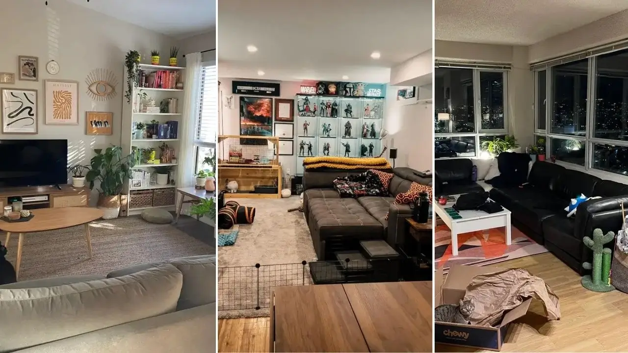
There’s a ton happening in this room from r/sardonic_gavel, and somehow none of it feels like chaos. That right there is a skill most of us don’t have yet.
The gallery wall anchors the whole space with warm neutrals sandy tans, blacks, and an ochre Matisse-style print. A decorative eye piece sneaks in just enough weirdness without veering into “spiritual gift shop.” A macramé wall hanging on the left side announces the boho energy immediately, and a rattan-front TV console in natural wood keeps everything grounded.
The plant game is strategic, not random
I counted at least six visible plants:
- Tall snake plant in a woven basket
- Trailing pothos on the bookshelf
- Fiddle leaf fig near the window
- Several smaller pots scattered at varying heights
They sit at different levels throughout the room, which creates visual rhythm your eye moves up and down naturally instead of getting stuck in one spot. The bookshelf doubles as a plant ledge, which is genuinely smart vertical space usage.
That organic-shaped walnut coffee table deserves a shoutout too. Its curvy, irregular silhouette softens the room and plays nicely against the straight lines of the TV console.
Want to recreate this? Start with a warm greige wall color, invest in one quality mid-century wood piece, then build outward with plants and art. And here’s the real trick with gallery walls: keep the mat colors coordinated even if you mix frame materials (wood, brass, black metal). That’s what makes it look effortless instead of accidental.
2. Warm Terracotta Accent Wall with Layered Lighting
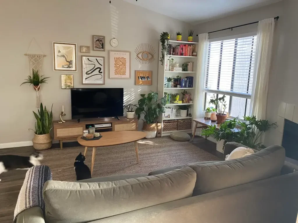
One bold paint choice that changed everything
You walk into this room by r/thanks-a-bundle and something just shifts. It feels warmer before you even sit down. That’s the power of a deep terracotta-adjacent ochre accent wall.
The surrounding walls stay cream-white, so the color doesn’t overwhelm it anchors. A grey sectional sofa that would feel cold and sterile on its own suddenly reads warm against that backdrop. Burnt orange and earthy patterned throw pillows reinforce the whole palette without screaming about it.
Lighting that actually does its job
This room is a masterclass in why ceiling-only lighting is one of the biggest apartment decorating mistakes people make.
Here’s what they used instead:
- A tall arc floor lamp in the corner casting soft upward light
- A smaller sconce-style lamp near the TV console adding a second warm source
Two lamps. That’s all it took to completely transform how this space feels in the evening. Layered lighting isn’t fancy it’s just intentional.
A low-slung navy accent chair with a mud-cloth throw sits at the front of the room. Navy next to terracotta sounds risky, but they’re natural color complements, so it hits perfectly. A layered area rug cream and beige geometric pattern over carpet defines the seating area without needing hardwood floors.
If you’re going to commit to one paint color in your apartment, a warm terracotta or earthy amber is one of the most forgiving and flattering options out there. It works in basically every lighting condition and makes even cheap furniture look more expensive.
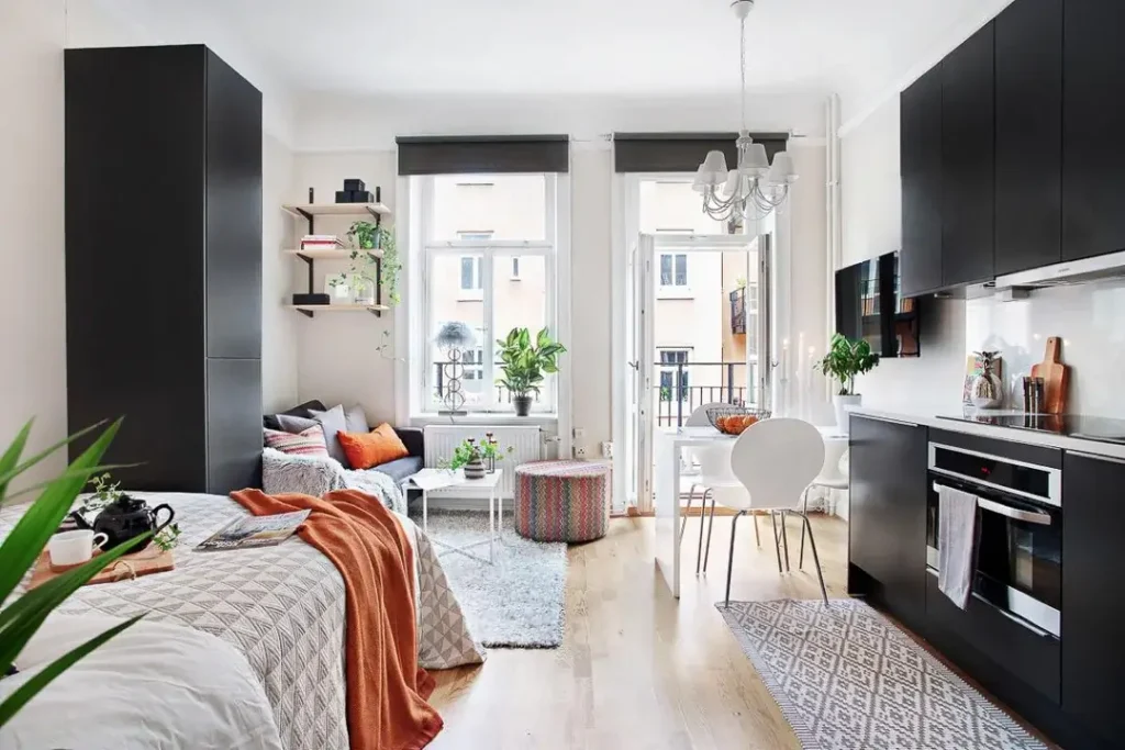
3. Black Steel Glass Partition: Studio Apartment Zoning Done Right
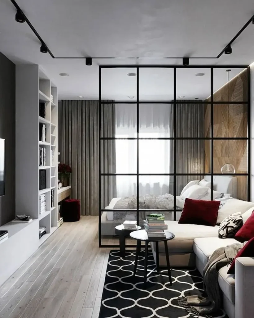
Looks expensive. Solves a real problem.
Studio apartment decorating is genuinely hard because every zone bleeds into every other zone. Your bed is your couch is your dining table is your office. It’s exhausting.
r/Binary_Management solved this with a floor-to-ceiling black steel and glass partition that divides the living area from the sleeping zone. The grid pattern gives off an industrial-meets-loft vibe that feels intentional rather than like a desperate curtain situation. And because the glass panels are semi-transparent, light still flows freely the bedroom doesn’t become a depressing cave.
The living side keeps it clean
The furnishing approach on the living side is restrained and smart:
- Cream sectional sofa
- Black geometric area rug
- Dark side tables
- Deep crimson velvet throw pillows as the only real color pop
- Built-in white shelving styled with books, ceramics, and a few red florals that echo the pillow color
Track lighting overhead gives the whole space a gallery-like quality.
On a budget? You can’t necessarily drop cash on a custom steel partition, but affordable powder-coated steel shelving room dividers create a similar visual effect. You trade some privacy for the same industrial aesthetic which is usually a fair deal in a studio.
What I appreciate most here is the restraint in color. When the architecture is this strong, the furniture doesn’t need to compete. It just needs to show up and behave.
4. Scandinavian Studio: Bold Black Cabinetry Against White Walls
Black cabinets in a tiny apartment? Trust the process.
I know black cabinets in a small studio sounds like decorating suicide. But when everything else is white and the floors are light oak, it reads as sharp and sophisticated, not claustrophobic.
r/Binary_Management (yes, same person they clearly know what they’re doing) uses floor-to-ceiling matte black storage cabinets on one side and matching black kitchen cabinetry on the other. These dark pieces act like bookends for the space. Between them, white walls and natural wood floors keep everything breathing.
Texture saves it from feeling sterile
The living area earns its warmth through texture, not color:
- Grey shag rug underfoot
- A multicolor geometric floor pouf
- An orange throw draped across the bed
- A vintage-style chandelier the kind you’d expect in a Parisian flat, not a modern studio that adds an unexpected note and saves the whole space from feeling too clinical
Wall-mounted floating shelves near the window hold plants and books without eating into precious floor space. Copy this. In any studio or small one-bedroom, floor space is the premium resource go vertical with storage whenever you can.
One more thing: the balcony doors flood the room with natural light, which is honestly the secret weapon here. If your apartment has good natural light, do not block it with heavy curtains or badly placed furniture. Let it do the heavy lifting for free.
5. Dark Moody Dining Nook with Personality-Driven Decor
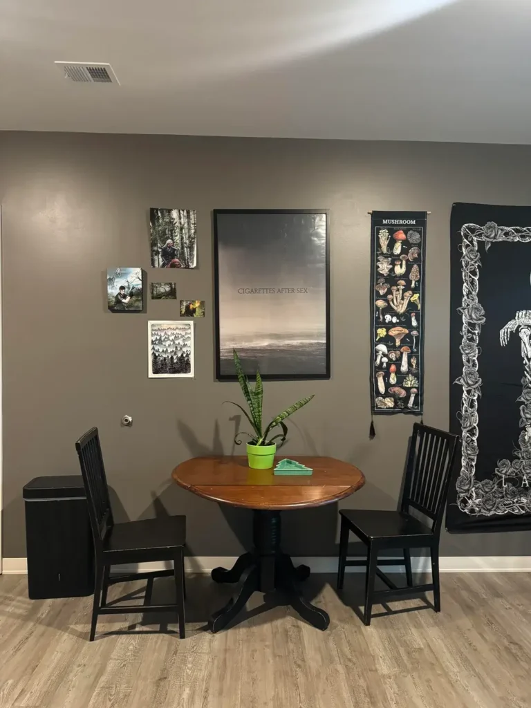
Not everything needs to look like an Airbnb listing
This dining corner from r/Pansnakels looks like a person actually lives there. What a concept.
The deeper, warmer grey walls set a moody foundation that immediately separates this space from typical builder-grade grey. Against them, an informal cluster of wall art tells a story:
- Small fantasy-themed prints and illustration cards grouped casually on the left
- A large framed Cigarettes After Sex poster as the visual anchor in the center
- A narrow mushroom identification banner and a black floral tapestry adding vertical interest on the right
Minimal furniture, maximum personality
The dining setup is intentionally simple: a round walnut drop-leaf table with a pedestal base, two black ladder-back chairs, and a single snake plant in a bright green pot. That pop of green against grey? Small move, big impact.
The drop-leaf table is a genuinely smart pick for a first apartment it scales to what you need. Dinner for one? Fold it down. Friend coming over? Open it up.
Here’s what I love about this space: the wall decor isn’t “curated” in the Instagram sense. There’s no matching frame set. No color-coordinated gallery. It’s personal and that’s exactly what makes an apartment feel like a home instead of a showroom.
If you’re decorating on a tight budget, this approach is 100% achievable. Posters, art prints, and fabric tapestries cost next to nothing, they need no hardware beyond adhesive strips, and they communicate more about you than any expensive accent piece ever could.
6. Farmhouse-Modern Mix: Cognac Leather Sofa and Shiplap Wall
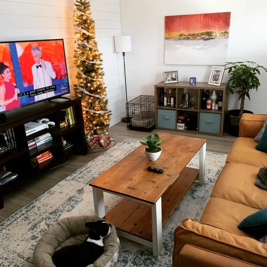
A combo that shouldn’t work this well
Cognac leather plus shiplap sounds like two different Pinterest boards had a baby. But r/lovelyserendipity pulled it off beautifully.
The cognac leather sectional a warm amber-brown tone pairs perfectly with a rustic wood coffee table that has farmhouse written all over it. Thick pine planks on a white painted base, slightly rough-hewn, exactly the kind of piece that looks better with age and scratches.
Shiplap without the commitment
The shiplap wall behind the TV adds texture without adding color, which is a sneaky-smart apartment decorating trick. Can’t paint your rental walls? A shiplap treatment or even peel-and-stick shiplap panels gives you architectural interest while staying neutral. Here it reads almost coastal or Hamptons-inspired, softened by all that warm leather and rustic wood.
Other details worth noting:
- A weathered grey cube storage unit serving as a makeshift bar cart (practical and honest)
- Teal drawer inserts and a matching throw pillow adding a deliberate color accent
- A slim Christmas tree in the corner a good reminder that apartment decorating is seasonal
Swapping in a few seasonal elements a tree, a wreath, a throw in a holiday color refreshes your space without requiring a total overhaul. IMO, it’s one of the easiest wins in decorating.
7. High-Rise Living: Floor-to-Ceiling Windows as the Star
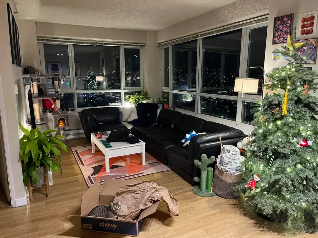
When the view does the decorating for you
Sometimes the best design decision is knowing when to step back. r/Quaxky lives in a high-rise with floor-to-ceiling windows on two walls, and that nighttime cityscape is doing all the aesthetic heavy lifting.
The interior choices are deliberately understated:
- Black leather sectional
- White coffee table
- Warm hardwood floors
That restraint is exactly right. Competing with a view like that would be a mistake.
Personality lives in the details
What’s interesting is how this room expresses personality not through big furniture pieces but through smaller elements. A bold retro-print rug in warm reds and pinks grounds the seating area with energy. Colorful art prints get pinned casually to one wall. A cat tree, a cactus-shaped cat scratcher, and a Christmas tree with eclectic ornaments bring warmth and humor.
The lesson here doesn’t get said enough: views and natural light are the most powerful decorating tools available, and they cost absolutely nothing. If your apartment has significant windows, orient your furniture toward them and choose window treatments that maximize light rather than block it. Everything else plays a supporting role.
8. The Parisian Plant Apartment: Indoor Garden Meets Vintage Charm
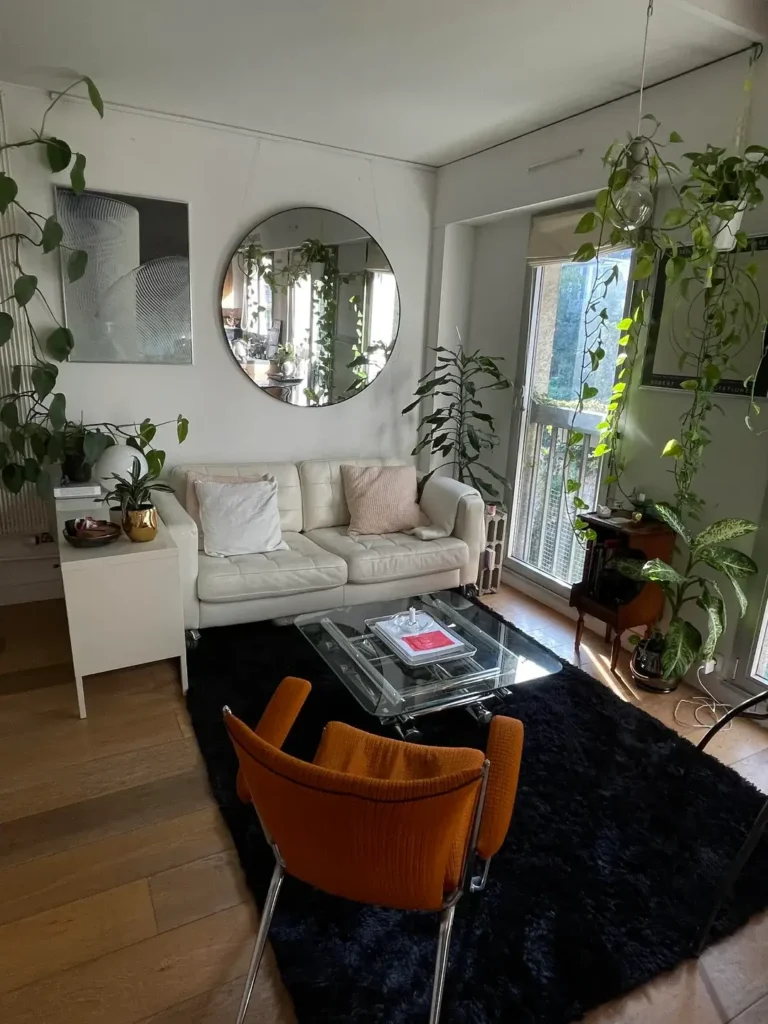
70% houseplant, 30% furniture, 100% intentional
This room from r/ari_s_p_e_c_t looks like it took years to build. It probably did and that’s entirely the point.
The plants aren’t decorations here. They’re the primary design element. Golden pothos trail from ceiling hooks. A tall fiddle leaf fig frames the window. A dieffenbachia sits near the balcony. Smaller pots cover every horizontal surface. The effect is genuinely immersive like sitting inside a greenhouse.
Furniture that supports, not competes
The furniture stays out of the plants’ way:
- Cream leather tufted sofa clean and neutral
- Deep black shag area rug adds contrast and anchors the seating area
- Glass and chrome coffee table keeps the center of the room visually light
- One orange-upholstered vintage chair a warm accent that vibrates beautifully against all that green
A large circular black-framed mirror behind the sofa pulls double duty: it reflects the plants back into the room (effectively doubling the visual impact of the collection) and bounces window light across the space. Mirrors are one of the most underused tools in apartment decorating, and this room proves their potential.
A vintage dark wood side table near the window grounds the otherwise modern mix with a touch of age and history. That contrast between new and old gives the room its Parisian quality. Not everything needs to match. A single antique piece can do more for the atmosphere of a room than a thousand coordinated accessories from the same store.
9. The Book Lover’s Living Room: Floor-to-Ceiling Shelves Flanking a Window
One theme, full commitment
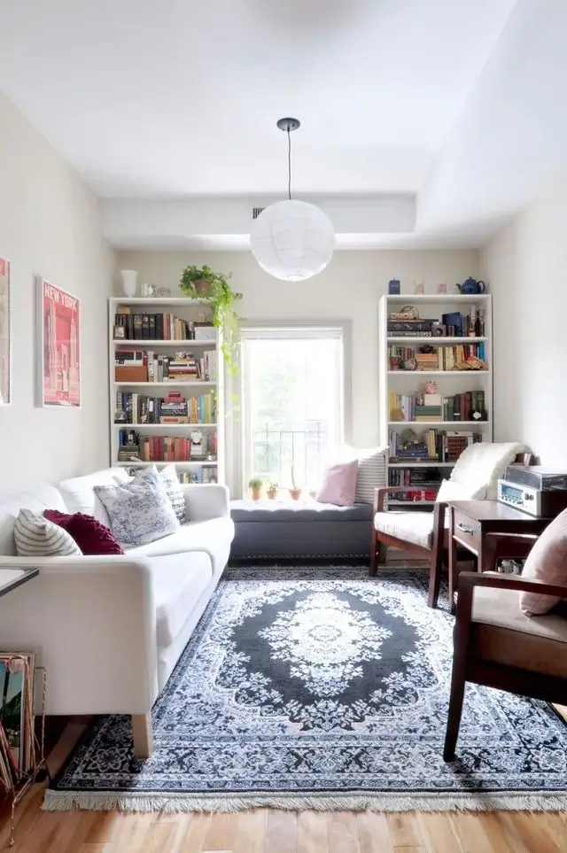
This room from r/midhagroupsrealdecor is about exactly one thing books and it commits completely.
Two tall white bookcases sit on either side of a window, creating a symmetrical, library-like focal point in a narrow living room. Both shelves are genuinely full: color-varied book spines, small knickknacks, a trailing plant, a pink teapot, vintage decorative objects. The window between them doubles as a reading nook with a cushioned bench, small potted plants on the sill, and pink pillows.
The rest of the room plays along
- A large Persian-style rug in slate blue and cream fills most of the floor and adds warmth and scale
- A white sofa with mixed throw pillows in burgundy, grey, and lavender keeps the palette soft
- A white globe pendant light hangs overhead quiet, effective, no distractions
This is apartment decorating through collection. These books aren’t organized by color for aesthetics they’re actually read, used, and loved. And the result is one of the warmest, most lived-in spaces on this entire list.
If you own a lot of books and you’ve been treating them like clutter, stop. Reframe them as decor. A full bookshelf is a rich, personal, textured wall treatment that also tells guests exactly who you are without saying a word.
10. The Collector’s Den: Display Cases, Nerd Culture, and Zero Apologies
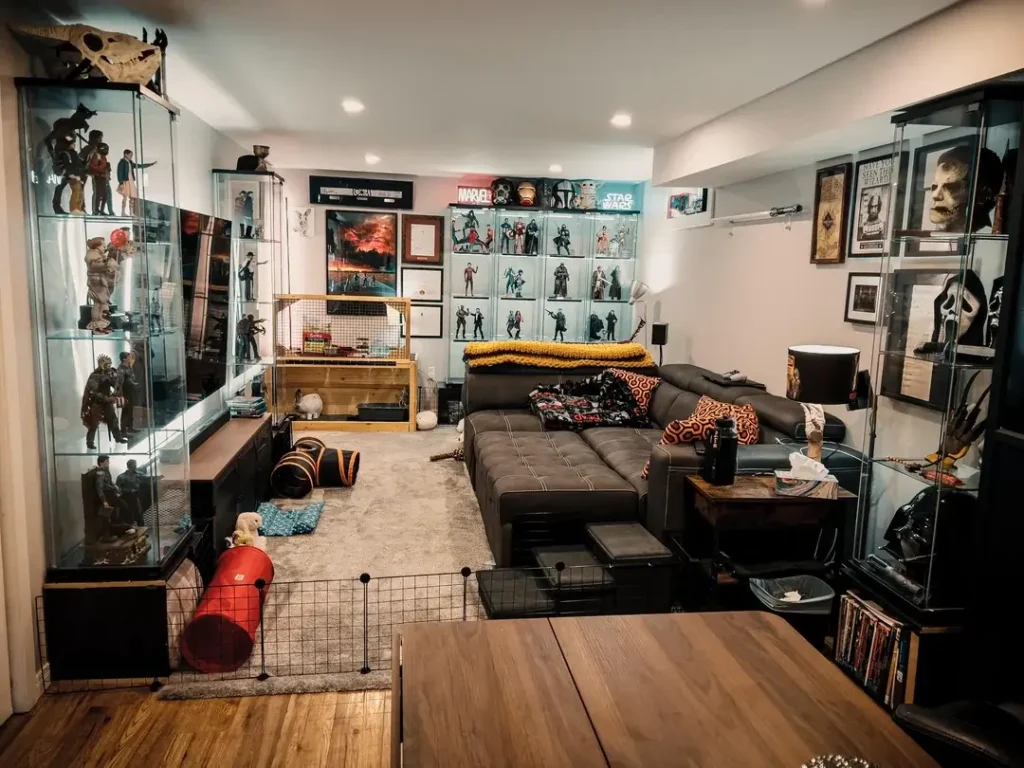
Some people decorate for guests. This person decorated for themselves.
r/DeCurt1998 turned a living room into a fully realized display space for an extensive collection: action figures, pop culture memorabilia, Star Wars neon signs, Marvel and horror movie art, and illuminated glass display cabinets lining three walls. The brown leather sectional in the center is the only nod to conventional living room function. Everything else is display.
The display cases deserve their own paragraph
Those cabinets are tall, glass-fronted, and internally lit the kind you see in museums or high-end retail stores. Using them at home elevates what could feel like clutter into a proper, respected collection. Lighting inside a display case transforms the objects within it. Even a modest collection looks considered and intentional when you light it properly and place it behind glass.
The neon signs provide ambient lighting. Dense but organized art prints movie posters, original fan art cover every wall. The result is overwhelming in the best possible way.
Here’s what this room proves more than any other on this list: there is no single correct approach to apartment decorating. Conventional advice says “edit your collection” and “keep surfaces clear.” That’s fine for people who want a certain kind of space. For someone whose identity is built around these objects, the correct approach is to build the infrastructure to display them well and commit fully to the vision.
No hedging. No apologies. Just full send :/
Quick Reference: Apartment Decorating by Style and Difficulty
| Style | Best For | Key Investment | Difficulty |
|---|---|---|---|
| Boho-Eclectic | Living rooms with natural light | Gallery wall + plants | Medium |
| Warm Accent Wall | Rentals where painting is allowed | Quality paint + layered lamps | Easy |
| Industrial Glass Partition | Studios needing zone separation | Steel divider unit | Advanced |
| Scandinavian Contrast | Small spaces and studios | Black storage + light floors | Medium |
| Personality-Driven Nook | Dining areas and entryways | Posters + tapestries | Easy |
| Farmhouse-Modern Mix | Relaxed living rooms | Cognac leather + rustic wood | Medium |
| Plant-Forward | Any room with decent light | 5–10 trailing/floor plants | Easy |
| Collector Display | Hobby-focused spaces | Lit glass display cases | Medium |
| Book Lover’s Library | Narrow living rooms | Tall bookcases + books you own | Easy |
| High-Rise Minimal | Apartments with great views | Restraint (seriously) | Easy |
The Common Thread: Commitment Beats Budget Every Time
The one thing connecting every room on this list isn’t money. It’s not square footage. It’s not access to some fancy furniture store.
It’s commitment to a clear point of view.
The boho room works because every element reinforces warmth and organic texture. The collector den works because nothing is half-done or apologetically small. The plant apartment works because that person didn’t stop at three plants and call it a day.
Apartment decorating goes sideways when people try to hedge a little bit of every style, no real strength in any direction. The rooms that stick in your memory are the ones where someone made a decision and followed it all the way through.
So here’s my challenge: pick one idea from this list that you keep going back to. Not the safest one. The one that made you pause. Start there. Add slowly. Trust the process.
Your apartment should look like you actually live there. Go make that happen.