Your hallway deserves better than being an afterthought. It’s the first space you see when you walk through the door, the pathway that connects every room in your home, and yet it’s probably the last area you considered when decorating.
If you’ve been staring at blank walls and wondering how to turn that narrow corridor into something special, you’re not alone.
These real-life hallway transformations prove that even the most challenging spaces can become design highlights with the right approach.
Whether you’re working with a tight squeeze or a generous expanse, dealing with poor lighting or odd architectural quirks, there’s a solution that can work for your specific situation.
The beauty of hallway design is that you can experiment more freely here than in other rooms. It’s a transitional space, which means you can take risks with bold colors, dramatic lighting, or statement pieces that might overwhelm a living room or bedroom.
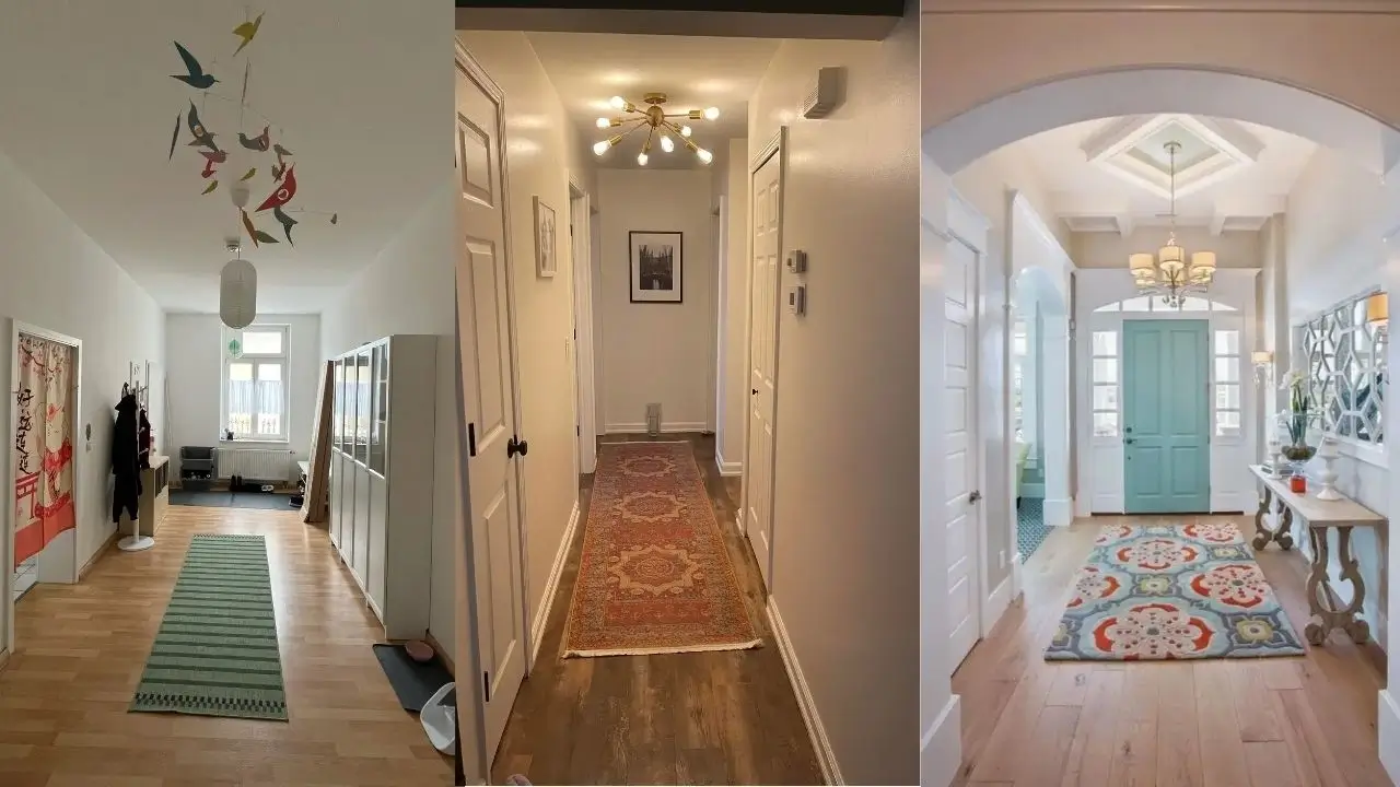
Scandinavian Simplicity Meets Functional Storage
r/interiordecorating created a hallway that perfectly balances minimalism with everyday practicality. The light wood herringbone flooring sets a warm, natural foundation that immediately makes the space feel open and inviting.
This choice of flooring is particularly smart for hallways because the diagonal pattern tricks the eye into seeing the space as wider than it actually is.
The muted green striped runner adds just enough color to create visual interest without competing with the room’s other elements.
What really elevates this space is the thoughtful use of vertical design elements. That colorful bird mobile hanging from the ceiling is pure genius for several reasons.
First, it draws your eye upward, making the ceiling feel higher and the space more expansive. Second, it adds movement and whimsy to what could otherwise feel static.
Third, it introduces pops of color at eye level and above, creating multiple focal points. When you have high ceilings in a hallway, always think about how to use that vertical space rather than leaving it empty.
The white storage cabinet on the right demonstrates that practical furniture doesn’t have to sacrifice style. This appears to be a shoe storage unit with clean lines and a minimal profile that doesn’t protrude into the walking space.
The Asian-inspired textile art on the left brings cultural depth and serves as an excellent conversation starter. Notice how it’s positioned at a natural stopping point where you’d pause when entering or leaving, making it a moment of visual pause rather than something you rush past.
The natural light flooding in from the window at the end of the hallway is the secret ingredient that makes everything else work. If your hallway lacks this advantage, consider adding mirrors or reflective surfaces to bounce whatever light you have around the space.
Pro Tip: When styling wide hallways, resist the urge to push everything against the walls. Use the floor space intentionally with runners that define the walking path, and don’t be afraid to add a statement piece like a plant stand or small bench that doesn’t block traffic flow.
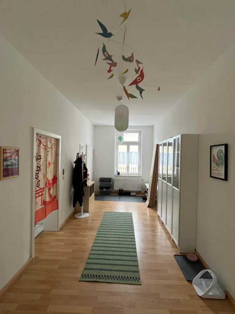
Classic Elegance with Traditional Touches
This hallway showcases how traditional design elements can create a timeless, welcoming entrance. r/sherbertlemonshark opted for a neutral color palette with textured walls that add depth without overwhelming the narrow space.
The vintage chandelier-style pendant light is a showstopper that proves you don’t need a grand foyer to incorporate elegant lighting fixtures. This type of lighting creates ambient warmth and casts interesting shadows on the walls, adding dimension to what might otherwise feel flat.
The gallery wall on the left demonstrates how to curate art in a hallway without creating visual chaos. The frames are mismatched in size but unified by similar tones, creating an organic, collected-over-time feel rather than a matchy-matchy display.
This approach works particularly well in traditional spaces where a too-perfect arrangement might feel forced. The vintage mirror positioned at a functional height serves double duty as both a decorative element and a practical last-minute appearance check before heading out.
The small upholstered bench tucked against the wall is one of those details that separates a well-thought-out hallway from a purely functional one.
It provides a spot to sit while putting on shoes, offers a surface to set down bags or packages, and adds a layer of comfort that makes the space feel more like a room and less like a corridor.
The dark wood secretary desk on the right adds character and suggests this hallway could even function as a compact workspace or mail sorting station.
The Persian-style runner grounds the space and introduces pattern without overwhelming the eye. Notice how it’s sized to leave several inches of flooring visible on each side, which actually makes the hallway feel wider than if it were covered wall-to-wall.
Pro Tip: In traditional hallways, layer your lighting. A statement overhead fixture provides general illumination, but consider adding wall sconces or accent lighting to create depth and eliminate shadows in corners.
Bold Pattern Play with Graphic Runners
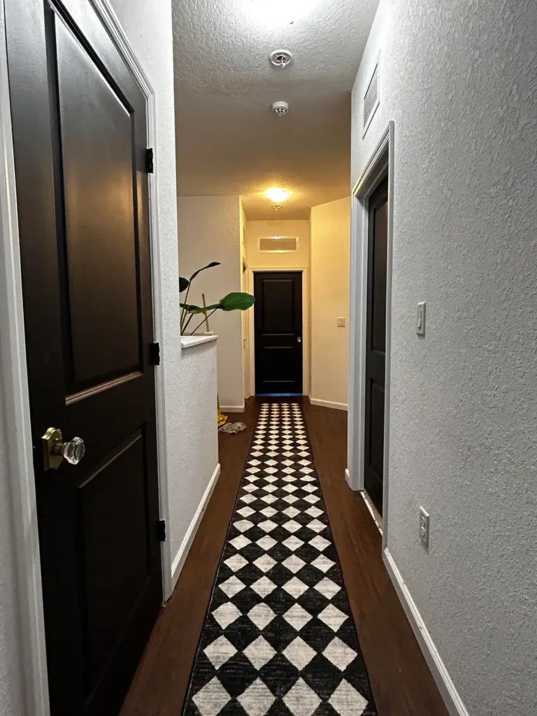
Sometimes all a hallway needs is one bold decision to go from boring to memorable. r/Decor transformed this narrow corridor with a striking black and white diamond-patterned runner that immediately catches the eye and draws you down the hallway.
This geometric pattern creates movement and visual interest without requiring any wall treatment, which is perfect if you’re renting or want a change you can easily reverse.
The genius of this approach is how the high-contrast pattern plays with perspective. The diamond shapes create a sense of depth and make the hallway appear longer and more dynamic.
The dark wood flooring on either side of the runner frames the pattern beautifully, creating defined edges that make the space feel intentional and designed rather than haphazard.
Notice the minimal approach to wall decoration here. With such a strong floor statement, the walls are kept relatively simple with white or light gray paint and just a touch of greenery at the end of the hall.
The black painted doors create a cohesive look that echoes the black in the runner, demonstrating how repeating colors throughout a space creates visual harmony even in small doses.
The crystal doorknob visible in the foreground is one of those small details that adds a touch of elegance. Hardware upgrades are often overlooked in hallways, but switching out basic knobs for something special can elevate the entire space.
The single potted plant positioned at the end of the hallway serves as a focal point and brings life into the corridor, literally and figuratively.
Pro Tip: When using bold patterns in narrow hallways, keep wall colors neutral and minimize other decorative elements. Let the pattern be the star of the show. Also, make sure your runner has a non-slip backing or use a rug pad to prevent shifting and potential tripping hazards.
Sophisticated Wainscoting and Brass Accents
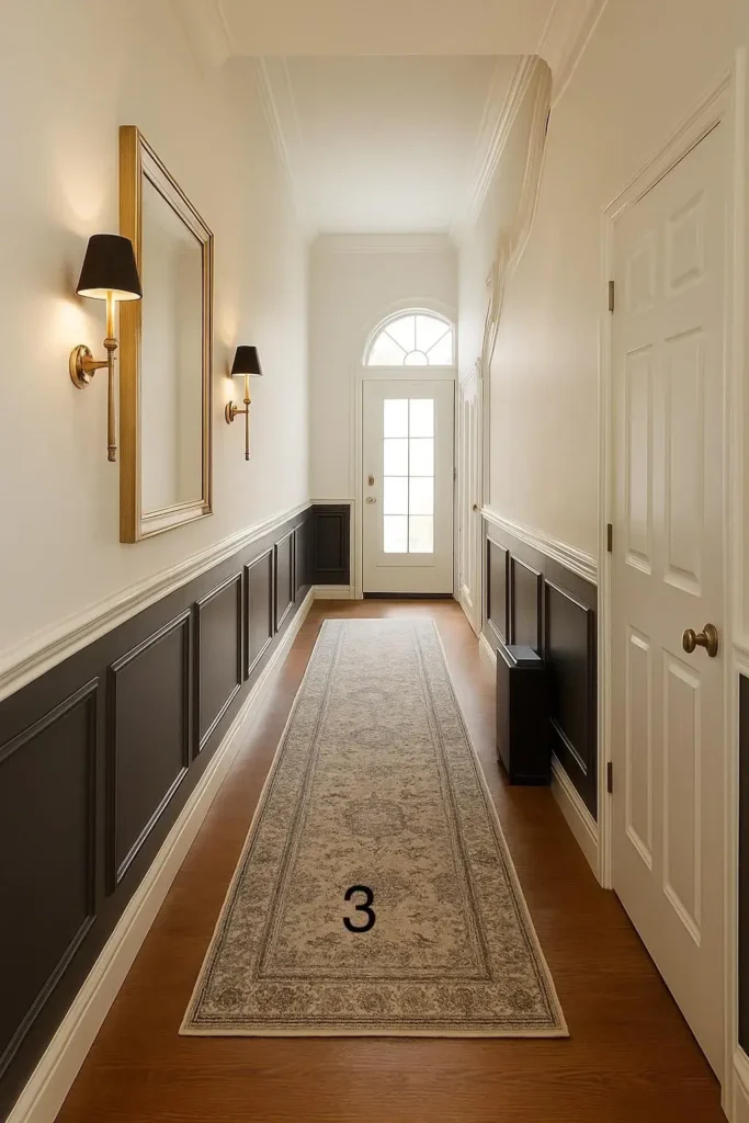
This hallway is a masterclass in how architectural details can transform a simple corridor into something truly special. r/Ready-Step7668 installed dark charcoal wainscoting that runs the entire length of the hallway, creating dramatic contrast with the crisp white upper walls and ceiling. This two-tone approach is brilliant for narrow hallways because the darker lower portion grounds the space while the white upper portion maintains an airy feel.
The brass-framed mirror and matching wall sconces create a cohesive metallic accent that adds warmth and sophistication.
These aren’t just decorative choices; the sconces provide essential task lighting while the mirror reflects that light, effectively doubling its impact.
The black lampshades on the brass fixtures add a modern edge to what could otherwise feel too traditional. This mixing of metals and finishes prevents the space from feeling too matchy or staged.
The front door with its elegant transom window allows natural light to filter into the hallway even when the main door is closed.
This architectural feature is worth preserving or adding if you’re renovating, as it makes such a difference in hallway brightness. The pale wood flooring provides a neutral foundation that lets the wall treatment be the hero.
The vintage-style runner in muted tones adds texture and warmth underfoot without competing with the strong architectural elements. Its subdued pattern complements rather than fights with the wainscoting, showing restraint in pattern mixing.
Pro Tip: When installing wainscoting, the general rule is to bring it up one-third of the wall height, but in hallways with lower ceilings, you can go higher (up to halfway) to create the illusion of taller walls. Paint the upper portion a lighter shade than the lower to maintain brightness.
Coastal Charm with Turquoise Touches
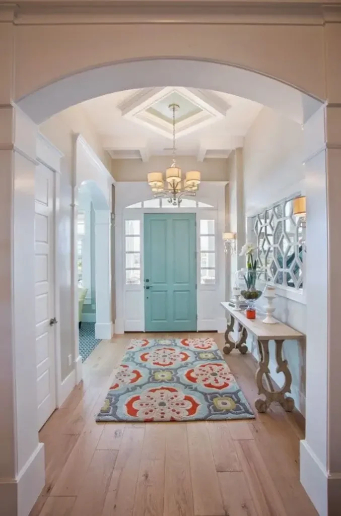
Here’s proof that hallways can handle color when done thoughtfully. r/davidspheres embraced a coastal-inspired palette with a stunning turquoise painted interior door that becomes the focal point of the entire space.
This bold choice works because everything else in the hallway supports rather than competes with it. The arched entryway adds architectural interest and frames the hallway beautifully, creating a sense of arrival.
The coffered ceiling detail is exceptional and shows how much impact ceiling design can have in a hallway. Most people forget to look up, but adding dimension to the ceiling transforms it from a forgettable surface into an architectural feature.
The statement chandelier nestles perfectly into the ceiling detail, creating a layered, thoughtful look. The geometric mirror wall art adds a contemporary edge to balance the traditional ceiling treatment.
The colorful patterned runner picks up the turquoise from the door along with coral and yellow accents, tying the entire color story together. This is a perfect example of how to use pattern in a hallway: choose one with colors that echo other elements in the space.
The console table with scrolled legs provides a landing spot for keys and mail while adding a sculptural element to the side wall.
The pale wood flooring keeps the space feeling light despite all the pattern and color happening above it. Notice how the white walls and trim provide breathing room between all these design elements, preventing the space from feeling chaotic.
Pro Tip: If you’re nervous about painting a door a bold color, remember that doors are relatively easy to repaint if you change your mind. Start with the interior side first to test the color impact before committing to both sides.
Architectural Niche as a Focal Point
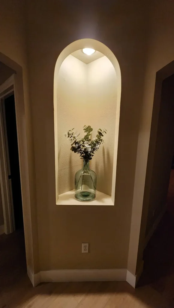
Sometimes your hallway comes with a built-in opportunity, and this arched wall niche is a perfect example. r/RandyMarsh10210 turned what could have been an awkward architectural feature into a showpiece.
The built-in niche with its gentle arch and integrated shelf creates a natural focal point that draws the eye down the hallway.
The spotlight positioned at the top of the niche creates dramatic lighting that makes the simple arrangement of eucalyptus in a glass bottle look like a gallery installation.
The warm taupe paint color creates a cozy envelope that feels intimate rather than closed in. This demonstrates how darker colors can actually work in hallways when you have good lighting to balance them. The ceiling light illuminates the niche while keeping the rest of the hallway from feeling too dark.
The glass bottle and dried eucalyptus stems are perfect choices for this display because they’re simple enough not to clutter the small space but interesting enough to warrant a second look.
The dark wood doors flanking the niche create a sense of symmetry and make the arched detail feel intentional rather than random.
This kind of architectural detail adds character and value to a home, and if you don’t have one, it’s a feature worth considering adding if you’re doing renovations.
Pro Tip: If you have a wall niche in your hallway, change out the displayed items seasonally to keep the space feeling fresh. In fall, try small pumpkins or autumn branches; in winter, evergreen sprigs or candles; in spring, fresh flowers or budding branches. The built-in spotlight makes whatever you display look intentional and curated.
Minimalist Modern with Strategic Mirrors
This hallway proves that less really can be more when each element is carefully chosen. r/Sat1n3 created a sleek, contemporary space with large-format gray tile flooring that makes a bold statement while remaining neutral enough to work with various decor styles.
The oversized tiles minimize grout lines, creating a seamless look that makes the narrow hallway feel more spacious.
The white shoe cabinet with clean lines provides essential storage without visual weight. Its low profile and simple white finish allow it to blend into the background while still being functional.
The decorative oval mirror above adds a softer shape to contrast with all the straight lines and right angles in the space. The floating picture ledges on the far wall create a dynamic display option that you can change easily without putting new holes in the wall.
Notice the thoughtful color palette at work here. The walls are painted in a warm off-white that prevents the space from feeling cold despite the gray flooring.
The beige and cream tones in the accessories on the cabinet top create a cohesive, calming atmosphere. This is a hallway that won’t go out of style because it relies on quality materials and timeless design rather than trendy elements.
The glimpse of darker flooring continuing beyond suggests good flow between spaces, which is important in hallway design. You want your hallway to feel connected to the rooms it serves rather than isolated.
Pro Tip: When working with a minimalist aesthetic, quality matters more than quantity. Invest in one beautiful mirror rather than several mediocre ones, choose substantial hardware rather than flimsy basics, and select flooring that will stand up to heavy traffic while looking good for years.
Statement Lighting Transforms Everything
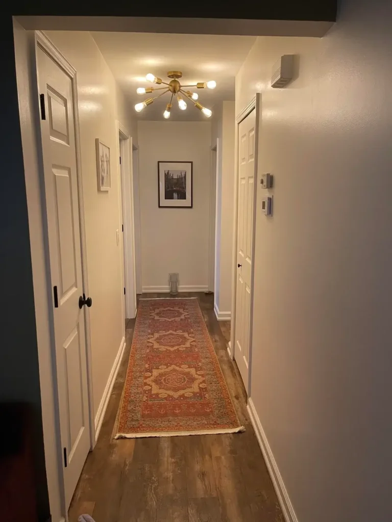
The power of a great light fixture is on full display in this hallway. r/EducatedVeg installed a mid-century modern inspired Sputnik chandelier that completely changes the character of what could have been a forgettable corridor.
The brass finish and multiple arms create visual interest from every angle, and the warm glow from the multiple bulbs provides excellent illumination while creating a welcoming ambiance.
The warm beige walls create a neutral backdrop that lets the lighting fixture shine without competition. The vintage-inspired Persian runner in rich reds and golds adds warmth and pattern at floor level, creating a nice balance with the modern lighting above.
The framed black and white photography at the end of the hall provides a focal point and gives your eye somewhere to land as you walk down the corridor.
The wood-look flooring adds natural warmth and texture while being practical for a high-traffic area. Notice how the runner is sized to leave several inches of flooring visible on each side, which actually makes the hallway appear wider.
The white doors keep things feeling light and fresh, while the black hardware adds small hits of contrast that tie into the black frames on the artwork.
Pro Tip: When choosing a statement light fixture for your hallway, make sure to measure carefully. You want it large enough to make an impact but not so large that people might bump their heads. As a general rule, hang chandeliers and pendants at least 7 feet from the floor in hallways to ensure safe clearance.
Warm Wood Tones and Simple Styling
Sometimes the best hallway design is the one that gets out of the way and lets good bones shine through. r/noollaBdeR created a warm, inviting space by embracing natural materials and keeping decorations minimal. The rich wood doors with their vertical grain pattern add texture and warmth throughout the space.
Staining or replacing hollow-core doors with solid wood versions is one of the most impactful upgrades you can make in a hallway.
The white walls provide a clean canvas that makes the wood tones pop while keeping the space feeling bright. The traditional patterned runner in muted tones adds just enough pattern to create interest without overwhelming the simple aesthetic.
The small potted plant on a white stand at the end of the hallway brings life into the space and creates a natural focal point.
The textured ceiling adds subtle dimension without being distracting, and the simple flush-mount ceiling lights provide necessary illumination without making a big design statement.
This is a perfect example of a hallway that prioritizes timeless appeal over trendy details. It’s a space that will look good for years without needing constant updates.
Pro Tip: If you’re working with wood doors in various conditions, consider painting them all the same color (white, black, or a bold hue) rather than trying to match stains. This creates a cohesive look and is much easier to achieve than perfectly matched wood tones. Alternatively, embrace the variation and make it look intentional by highlighting the natural wood grain.
Personal Gallery Wall on a Budget
This hallway demonstrates that you don’t need expensive art to create a meaningful, personalized space. r/Bacon_and_Megs turned an awkward corner wall into a family photo gallery that adds character and warmth.
The mix of white frames in different sizes and orientations creates visual interest while maintaining cohesion through the consistent frame color. The black multi-photo frame adds variety and allows you to display multiple memories in a compact footprint.
The neutral wall color provides a perfect backdrop for the personal photos without competing for attention. The carpeted flooring suggests this is likely an upstairs hallway or interior corridor, and the soft texture adds warmth and sound absorption. The glimpse into the bathroom with its restroom sign shows attention to detail throughout the home.
The motivational wall art adds a personal touch that reflects the homeowner’s values and creates a positive atmosphere.
This is your home, and your hallway should reflect what matters to you, whether that’s family photos, travel memories, artwork, or inspirational quotes.
Pro Tip: When creating a photo gallery wall, lay out your arrangement on the floor first and take a photo with your phone. This lets you experiment with different configurations without putting holes in the wall. Use painter’s tape to mark where frames will hang, and use a level to ensure everything is straight. For a cohesive look, keep frames within 2-3 inches of each other horizontally and vertically.
Quick Reference Guide: Hallway Design Elements
| Design Element | Best For | Pro Tip |
|---|---|---|
| Bold Runners | Adding color/pattern without permanent changes | Use non-slip pads and leave flooring visible on sides |
| Wainscoting | Adding architectural interest to plain walls | Install at 1/3 to 1/2 wall height depending on ceiling |
| Statement Lighting | Narrow hallways needing visual interest | Ensure 7+ feet clearance from floor |
| Gallery Walls | Personalizing long blank walls | Plan layout on floor first, use consistent frame colors |
| Mirrors | Maximizing light and creating spacious feel | Place opposite windows or light sources when possible |
| Console Tables | Wide hallways with space for furniture | Choose pieces 12-18 inches deep to avoid blocking traffic |
| Architectural Niches | Displaying decorative objects | Add spotlight for gallery-like effect |
| Large Format Tiles | Making small spaces feel larger | Minimize grout lines for seamless look |
| Accent Doors | Creating focal points | Start with interior side to test color |
| Runners & Rugs | Adding warmth and defining pathways | Size to leave flooring visible on edges |
Your hallway is more than just a pathway between rooms. With thoughtful design choices tailored to your specific space, it can become a welcoming introduction to your home, a functional storage area, and a reflection of your personal style.
Whether you’re drawn to bold colors, classic elegance, modern minimalism, or personal touches, there’s a hallway solution that will work for your space and budget.
Start with the element that speaks to you most, whether that’s lighting, color, flooring, or accessories, and build from there. Your perfect hallway is waiting to welcome you home.
