Let’s be honest. Your bedroom shelves are either embarrassingly empty or look like a garage sale exploded on them. You installed them thinking, “This is going to look so good,” and now you avoid making eye contact with them every morning. Been there. We’ve all been there.
The good news? Fixing your shelves doesn’t require a design degree or a budget that makes your bank account cry. It just requires the right approach, and that’s exactly what these 11 real bedroom shelf ideas deliver. No professional staging. No “recreate this with items you definitely don’t own.” Just actual shelves in actual bedrooms that actually work.
Minimalist Floating Shelves Above a Vanity Station
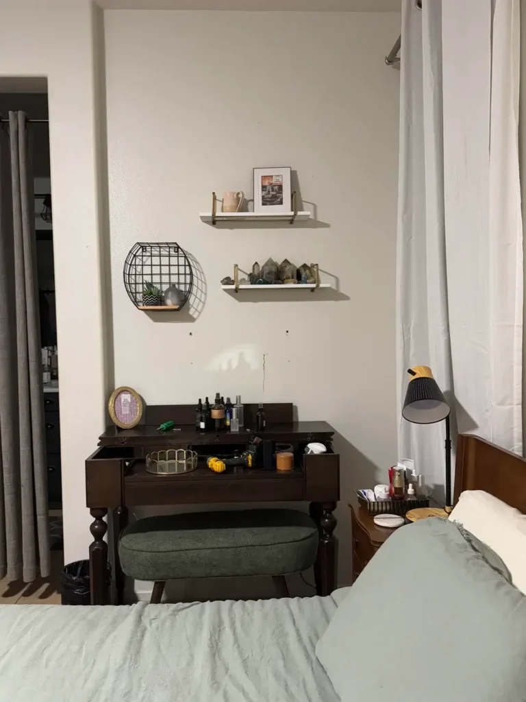
If you have a vanity, you already know the struggle. You want the wall above it to look cute, but you also don’t want it to feel like a cluttered mess while you’re trying to do your makeup at 7 AM.
The solution is almost annoyingly simple: use less stuff than you think you need.
This setup nails it with just two small floating shelves holding a framed print, a tiny vase, and a couple of decorative objects. A wire basket shelf with a single plant sits below. That’s it. And it looks amazing because of the breathing room between each piece.
Here’s what makes it work:
- Neutral tones throughout so nothing fights for attention
- A dark vanity anchoring the whole composition
- Generous spacing between shelves so the wall doesn’t feel suffocated
IMO, this is the easiest shelf style to pull off. Start with half the items you think you need. Seriously, put half back. You’ll thank yourself later.
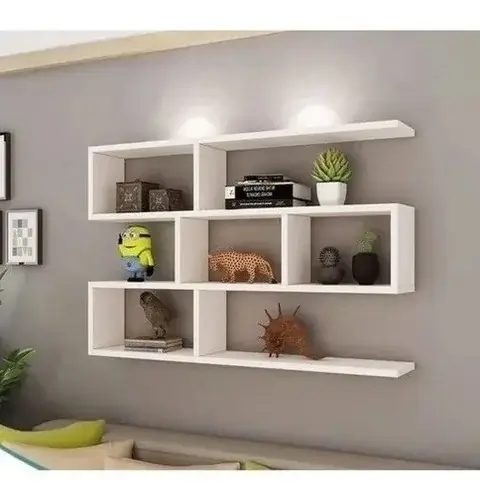
Statement Bookshelf with Geometric Design Elements
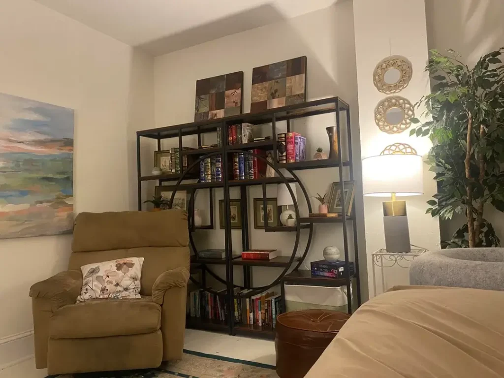
Not every shelf has to blend into the background like a shy kid at a party. Sometimes the shelf itself IS the decor.
This bold black metal bookshelf features an unusual geometric pattern with a circular element breaking up the rectangular shelves. Before you place a single object on it, the structure is already doing the heavy lifting. That’s the goal.
The styling keeps things balanced:
- Books fill most shelves for weight and color
- Framed art leans casually on the top shelf
- Small plants and decorative pieces fill strategic spots
- The circular section stays intentionally light to draw the eye
The metal finish pops against neutral walls without being overwhelming. If you’re a renter who can’t drill into walls, a freestanding statement shelf like this is honestly one of the smartest moves you can make. One piece, maximum impact, zero wall damage.
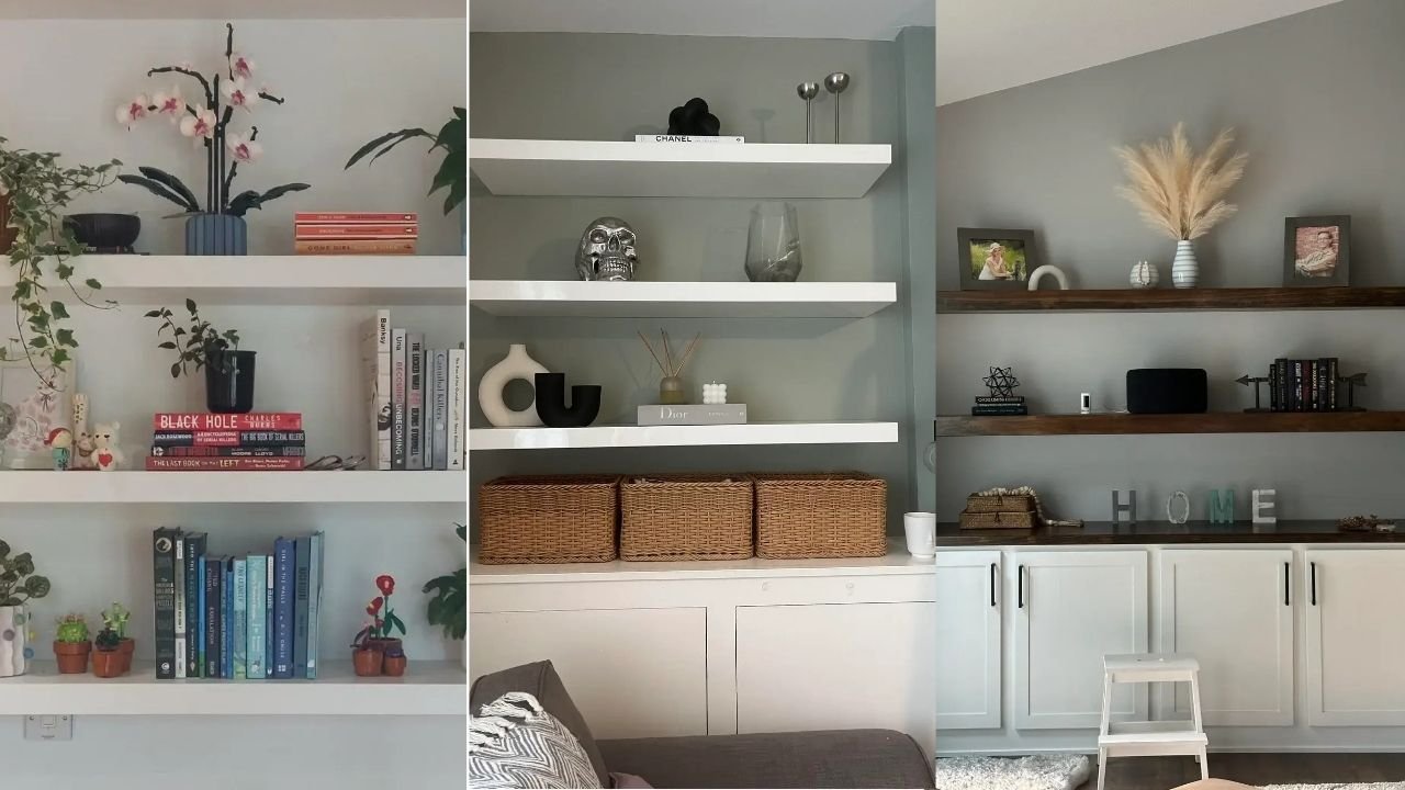
Layered White Floating Shelves with Plant-Heavy Styling
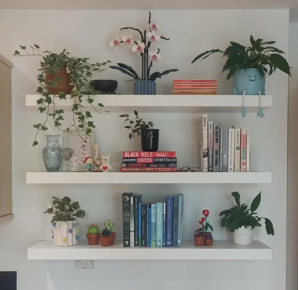
Plants are the secret weapon of shelf styling, and anyone who tells you otherwise is wrong. They add movement, texture, and life in a way that no ceramic bowl ever could.
This setup uses three white floating shelves where plants are the clear stars of the show. Trailing pothos cascade down from the top shelf. Blue ceramic pots hold upright plants in the middle. An orchid makes a surprise appearance. Books appear on each shelf too, but they’re playing a supporting role here.
What makes plant-heavy shelving work:
- Variety in plant types (trailing, upright, flowering)
- Different pot sizes and materials
- Heights that create visual movement up and down the shelf
Fair warning though: this style requires actual commitment. You’re signing up for watering schedules, trimming, and rotating plants toward light. If your last houseplant didn’t make it past month two, maybe start with one pothos and work your way up. They’re basically unkillable.
Also Read: How To Decor Small Master Bedroom – 12 Ideas That Actually Works
Sophisticated Monochrome Shelving with Designer Accents
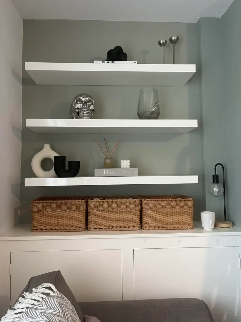
Sometimes less really is more, and this example proves it with zero apologies.
A gray painted alcove with white shelves holds a carefully chosen collection: a silver decorative skull, designer coffee table books, modern black and white sculptures, a glass vase, and metallic candlesticks. Woven storage baskets on the bottom shelf hide the stuff that doesn’t need an audience.
The entire color palette sticks to just four tones:
- Silver
- White
- Black
- Natural wicker
That’s it. No competing colors, no visual chaos, no “why does my shelf look so busy” regrets. Every object earns its spot through either form or function, and the wide gaps between items let each piece breathe and stand on its own.
If your style leans modern or minimal, empty shelf space is not your enemy. It’s actually part of the design. Embrace the gap.
Maximalist Plant and Art Gallery Wall Shelving
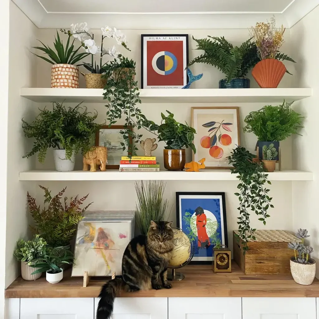
Okay, now we swing to the complete opposite direction. The “more is more” camp, and yes, it absolutely works when done right.
At first glance, this three-shelf setup looks like controlled chaos. Plants of every size, framed art leaning at different angles, a small elephant sculpture, ceramic pieces, a vintage radio, and yes, even a cat who decided the bottom shelf was his now. But look closer and there’s a clear color story holding it all together.
The secret to maximalist shelves that don’t look like a mess:
- Warm woods, blues, greens, and pops of orange and coral create cohesion
- White shelves stay neutral so the objects provide all the color
- Books stack in small groups and act as risers for art and plants
- Every few weeks, remove items, clean, and reassess what stays
This style isn’t for everyone. But if you genuinely feel more comfortable surrounded by visual richness, stop fighting it and lean in. The key is color cohesion, not empty space.
Asymmetric Box Shelving for Modern Spaces
Traditional shelving runs in neat horizontal rows. Box shelving breaks the grid and creates something way more interesting to look at.
This white box shelving unit features compartments of different sizes arranged in a staggered pattern. Some boxes hold small plants, others display a ceramic leopard, books, geometric forms, and small sculptures. The asymmetry keeps your eye moving instead of scanning the same predictable line over and over.
Why box shelving works so well:
- Each compartment becomes its own mini composition
- Smaller decorative objects don’t get lost the way they might on long shelves
- The clean white finish keeps focus on the items, not the structure
The one thing to watch here is visual weight distribution. Heavier or darker objects across the overall unit need to balance each other out. You’re not just styling each box individually. You’re also styling the whole thing as one composition.
Also Read: Blue Master Bedroom Decor Trends: Bold, Beautiful & Budget-Friendly
Natural Wood Corner Shelves Flanking a Fireplace
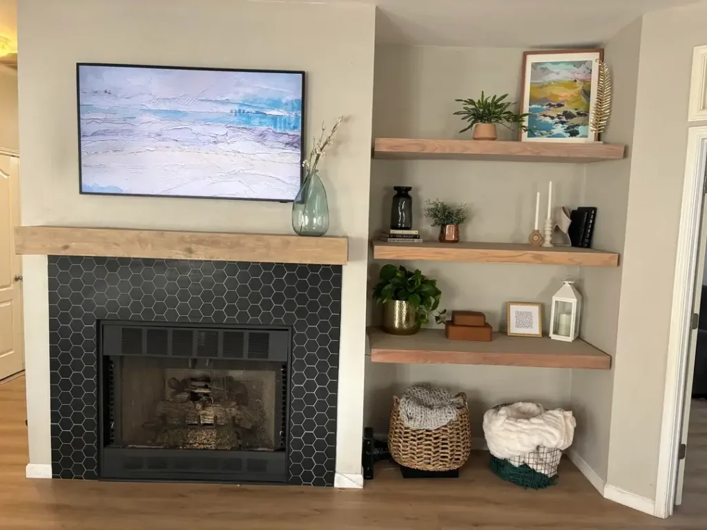
Corner spaces are the most underused real estate in any bedroom. Most people just stick a plant there and call it a day. But floating corner shelves? Genuinely underrated.
This setup uses natural wood floating shelves built around a fireplace corner. The warm wood tone contrasts beautifully with light gray walls and a black hexagonal tile fireplace surround. Each shelf holds a relaxed mix of small plants, decorative boxes, framed photos, candles, and a small lantern. A woven basket on the bottom shelf handles practical storage without making it obvious.
The wood finish adds texture and warmth without competing with the fireplace as the room’s focal point. And that’s the whole point.
When styling corner or alcove shelves:
- Treat the shelf material as part of the room’s color palette
- Match or deliberately contrast existing wood tones
- Let the room’s main feature (the fireplace here) stay the star
The objects matter less than you think in these architectural setups. The shelf material does most of the work before anything gets placed on it.
Dramatic Dark Wood Gallery Wall with Depth Variation
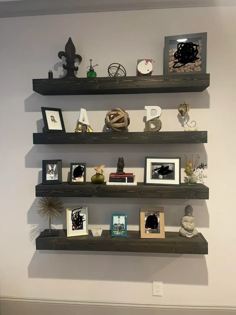
Four dark-stained wood shelves mounted in a slightly staggered pattern. Framed photos, decorative letters, spheres, small sculptures, and accent pieces across each shelf. Some items lean against the wall. Others stand at the front edge. The result is a display that pulls you in rather than just asking you to look at it.
The magic here is depth layering:
- Frames lean toward the back
- Medium-height objects fill the middle
- Sculptural pieces claim the front edge
Your eye travels into and across the composition instead of just scanning left to right. The dark wood finish makes everything pop against the light wall, and mixing frame colors (black, white, natural wood, metallic) prevents the whole thing from feeling monotonous.
Pro tip: If you’re building a gallery shelf wall, never rely on flat items alone. Add at least one dimensional or sculptural element per shelf. Flat things look flat. Shocking, I know.
Warm Wood Floating Shelves with Letter Accent
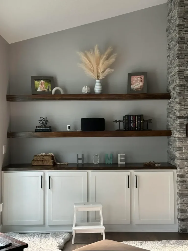
Sometimes one strong focal element is all a shelf needs to tie everything together. Oversized letters? Genuinely underestimated for this.
Three floating shelves in warm brown wood. The middle shelf features individual letters spelling “HOME” as the clear focal point. The top shelf holds framed photos, a vase with pampas grass, and small decorative objects. The second shelf has a speaker, books, and a geometric sculpture. The bottom shelf carries the mix forward.
The letters work because they’re substantial enough to command attention without overwhelming everything around them. The warm wood tones and soft gray walls create a cozy backdrop, and the letters give the more eclectic surrounding objects permission to exist without feeling random.
If you go the letter or word route, size matters. Too small and they look like an afterthought. Make sure they suit both the shelf depth and how far away most people will be standing when they see them.
Also Read: 10 Large Master Bedrooms Decor Ideas That Actually Work
Built-In Shelving Around Stone Fireplace Feature
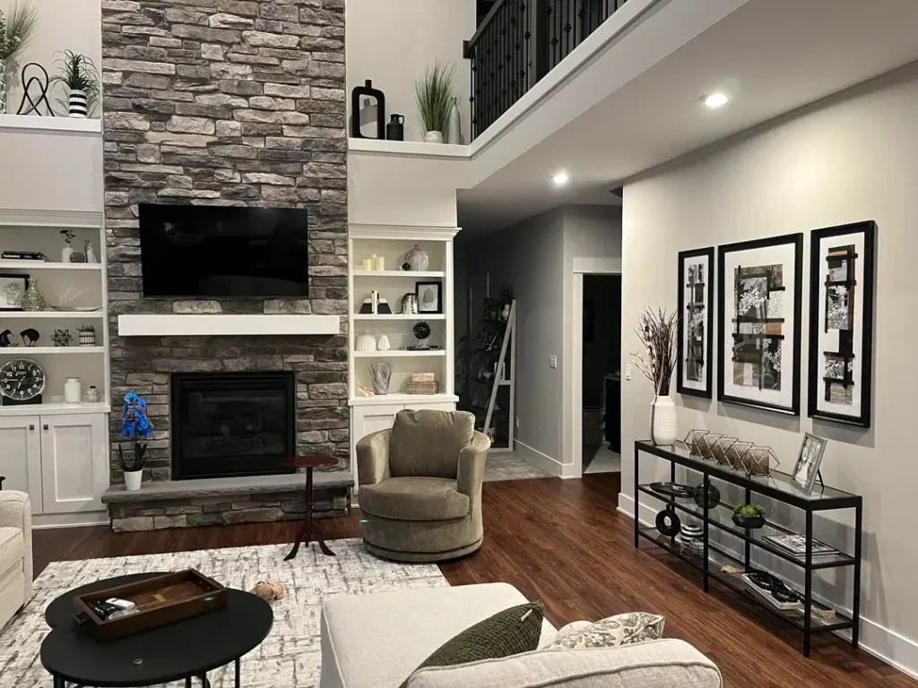
Built-in shelving flanking a fireplace hits differently than anything you can buy off a shelf at a furniture store. It looks like the room was designed this way from day one, because it was.
This setup features white built-in shelves on either side of a stone fireplace, with closed cabinet storage below. The styling stays deliberately restrained: neutral decorative objects, a few framed photos, small plants, and books. The sparse approach is intentional.
This is a crucial styling lesson: when you have a strong architectural feature, your shelves exist to support it, not compete with it.
The white shelves visually step back. The stone fireplace steps forward. The calm styling prevents any visual clutter from fighting the fireplace for attention. When you have something dramatic in a room, let it be dramatic. Give it room to breathe.
Built-ins work best when they respect the room’s existing proportions. These shelves honor the fireplace’s vertical presence while providing quiet horizontal balance on either side.
Corner Floating Shelves in Natural Oak
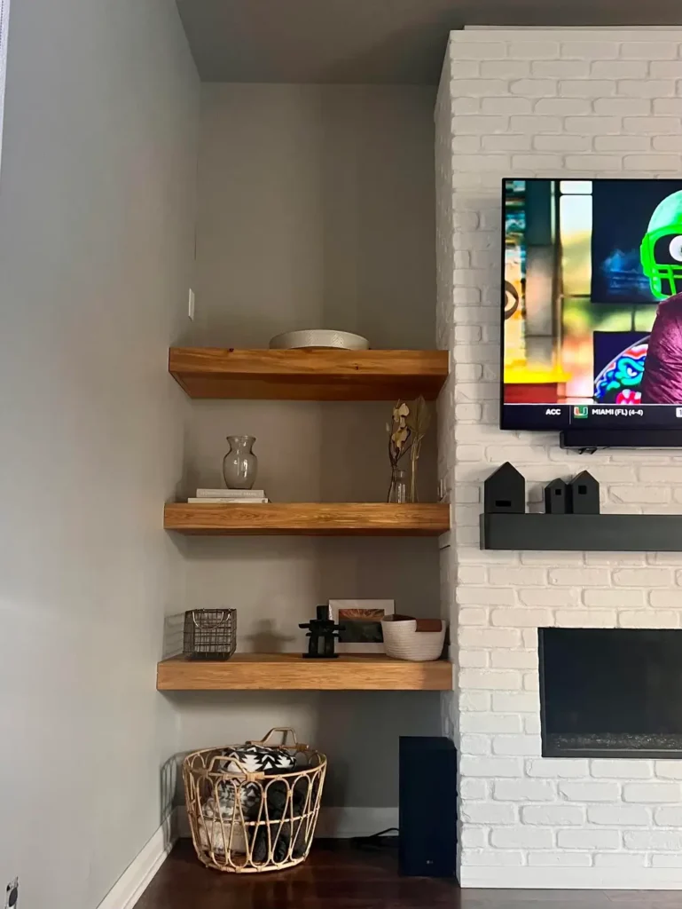
Corners are awkward. Weird angles, limited wall space, and a general feeling of “what do I even do here?” Natural oak corner shelves answer that question beautifully.
Three floating shelves in warm natural oak sit beside a white brick fireplace. The styling stays minimal and intentional: a ceramic bowl and straw hat on top, a glass vase with dried stems and small ceramic houses in the middle, and a wire basket with throws at the bottom. The wood grain shows clearly and adds texture all on its own.
The warm wood against the cool white brick is the whole design right there. They complement each other without trying to match, which is honestly the best kind of contrast.
Corner shelves need a slightly different approach than regular wall shelves:
- You’re viewing them from at least two angles, so style accordingly
- Keep items toward the back corner so they’re visible from multiple directions
- Avoid overcrowding since corners naturally feel tighter than flat walls
Less is genuinely more in a corner. Let the wood and the wall do the talking.
Comparing Shelf Styles for Different Bedrooms
Not every style works for every space. Here’s a quick breakdown to help you figure out which direction makes sense for you:
| Shelf Style | Best For | Styling Difficulty | Maintenance Level |
|---|---|---|---|
| Minimalist floating | Small spaces, modern aesthetics | Easy | Low |
| Plant-heavy | Natural light areas, nature lovers | Medium | High |
| Gallery wall | Personal photos, eclectic style | Medium | Medium |
| Built-in alcove | Architectural integration, storage | Easy | Low |
| Geometric statement | Contemporary spaces, renters | Easy | Low |
The honest truth: the right shelf style depends on your actual life, not what looks good on someone else’s Instagram. Think about your available wall space, how much natural light you get, and how much time you realistically want to spend maintaining things. If you kill plants, skip the plant-heavy look. If you hate dusting dozens of small objects, go minimal. Simple as that.
Final Thoughts: Make Your Shelves Work for You
Here’s the thread connecting all 11 of these ideas, even though they look completely different from each other. Intentional choices. Every setup above reflects someone who thought about what they were placing on those shelves and why.
You don’t need to copy any of these exactly. You need to look at your space, your belongings, your style, and your honest willingness to maintain things, and make choices that reflect all of that.
Start with fewer objects than you think you need. Add slowly. Remove anything that doesn’t earn its spot. And stop trying to fill shelves just because they’re there.
The best bedroom shelves aren’t full. They’re thoughtful. And with a little patience (and maybe one very resilient pothos), yours can absolutely get there. Give it a shot!