Let’s be honest. Most bedroom walls are just… there. Beige, blank, and boring. They’re not doing anything wrong, but they’re definitely not doing anything right either. And since your bedroom is the first thing you see in the morning and the last thing you see at night, it deserves better than “fine.”
Black and white bedroom decor is one of those ideas that sounds simple on paper but delivers so much more in real life. No chasing trendy colors that age poorly. No agonizing over whether terracotta clashes with your curtains. Just bold contrast, clean intention, and walls that finally have something to say.
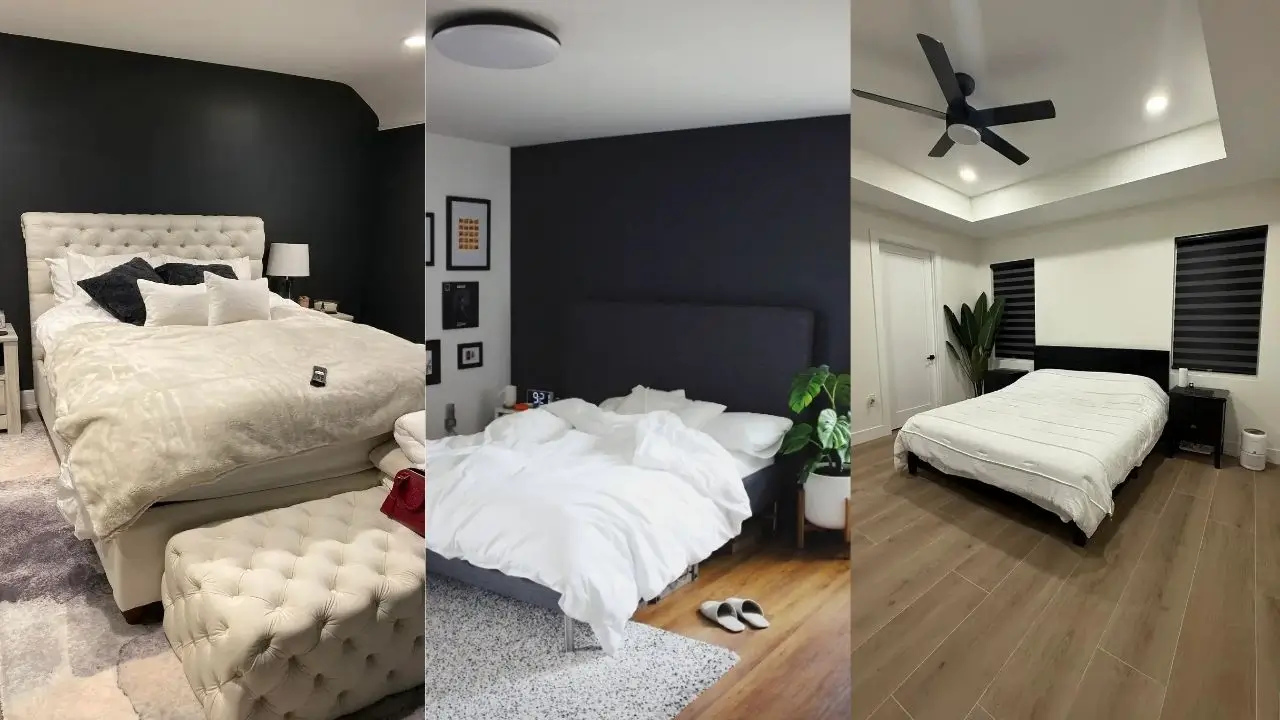
I’ve pulled together ten real bedroom setups, each one solving a different design problem in its own way. Some go dark and dramatic. Others stay light and clean. All of them prove that a two-color palette is anything but boring.
Modern Minimalism with Strategic Black Accents
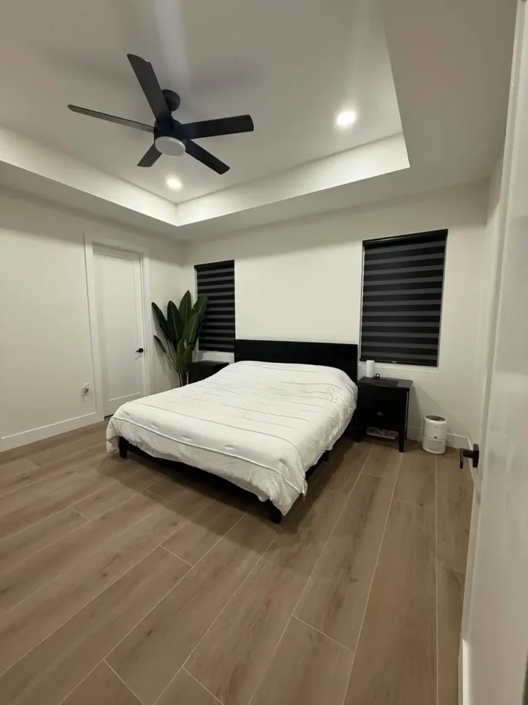
If you’ve ever looked at a “minimalist” bedroom and thought it looked cold and sad, this setup will change your mind fast.
The concept here is simple. A black platform bed and matching nightstand anchor the room against bright white walls, and the contrast does all the heavy lifting. White bedding bounces natural light around the room, while black zebra shades add horizontal lines that break up the vertical space without cluttering it.
Here’s the move most people miss though: warm wood flooring. That single material choice stops the black and white combo from feeling like you’re sleeping inside a chess board. Add one tall plant in the corner, and suddenly the room has life without chaos.
The ceiling is doing quiet work too. A recessed tray ceiling with a black fan gives your eye a place to land and makes the whole room feel finished. Most people never think about their ceilings. Huge missed opportunity.
Quick tip: If you’re working with a smaller bedroom, keep your furniture low and dark, walls light, and add just one organic element like a plant. Proportions matter way more than the number of things you own.
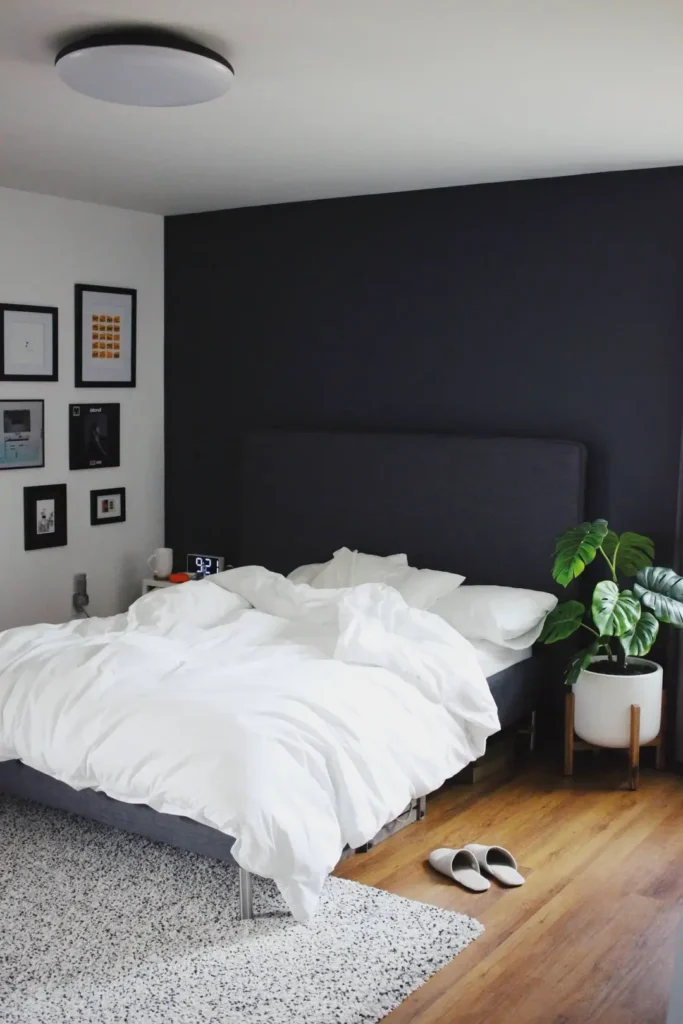
Classic Charcoal Accent Wall with Layered Textures
This one takes confidence. Not everyone can pull off a charcoal accent wall without it looking like a regrettable Saturday DIY project. But when it’s done right? Chef’s kiss.
The charcoal gray accent wall behind the bed creates a focal point that feels deliberate, not desperate. The upholstered headboard in a slightly lighter gray adds dimensional contrast, and the layered bedding in creams and grays with different weaves creates the kind of visual interest that a single flat duvet simply cannot.
What makes this work is the framing of artwork across two surfaces, one piece on the white wall, another on the dark wall. They’re having a conversation. Meanwhile, matching nightstands and lamps lock in the symmetry, which is important because high-contrast rooms need balance. Without it, things get chaotic fast.
A striped area rug grounds the bed and draws a clear boundary around the sleeping zone. That matters more than people realize, especially in larger rooms.
And for anyone who’s scared that a dark wall will swallow all the light in the room, take note. White elements pop harder against dark backgrounds. The room still feels bright where it needs to.
Transitional Style with Subtle Wall Color Variation
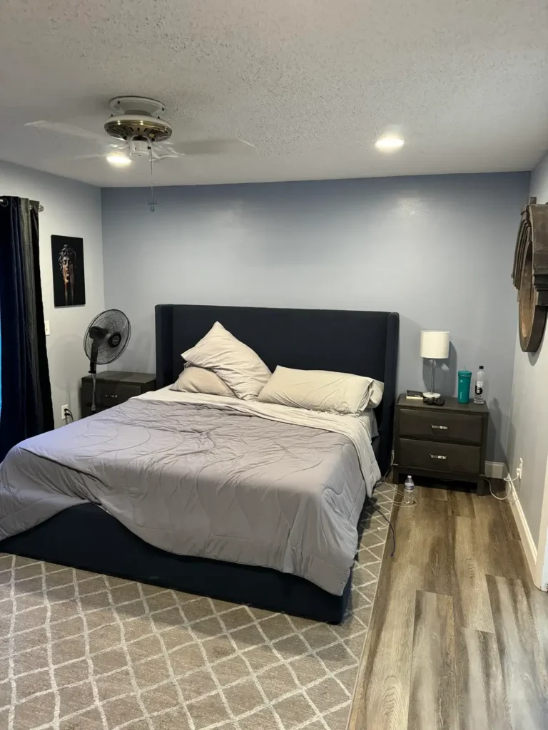
Not ready to go full black and stark white? This approach is your sweet spot.
Instead of pure white, the walls here read as a soft pale blue-gray, which adds warmth while keeping the monochromatic vibe intact. The black platform bed and dark nightstands still deliver contrast, but the overall effect feels softer and more livable.
A single framed piece of wall art sits at eye level from the bed, positioned exactly where your gaze goes first thing in the morning. That kind of intentional placement is something most people never think about, and it makes a real difference.
The patterned area rug keeps things visually interesting without competing with the clean furniture lines. And here’s what I love about this setup: it includes real life. A floor fan tucked to the side, a water bottle within reach. It’s styled without being sterile.
Mixed wood tones across the flooring and furniture add warmth that pure black and white can sometimes lack. If you want a bedroom you actually want to relax in, not just photograph, this temperature adjustment matters.
Also Read: Master Bedroom Decor That Feels Like a Movie Set – Even If You’re Just Turning on the Lamp
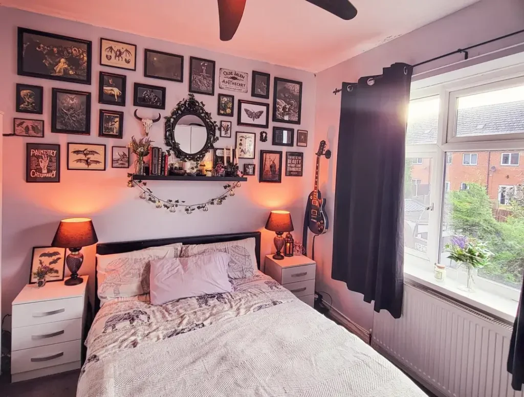
Traditional Bedroom with Gallery Wall and Navy Accents
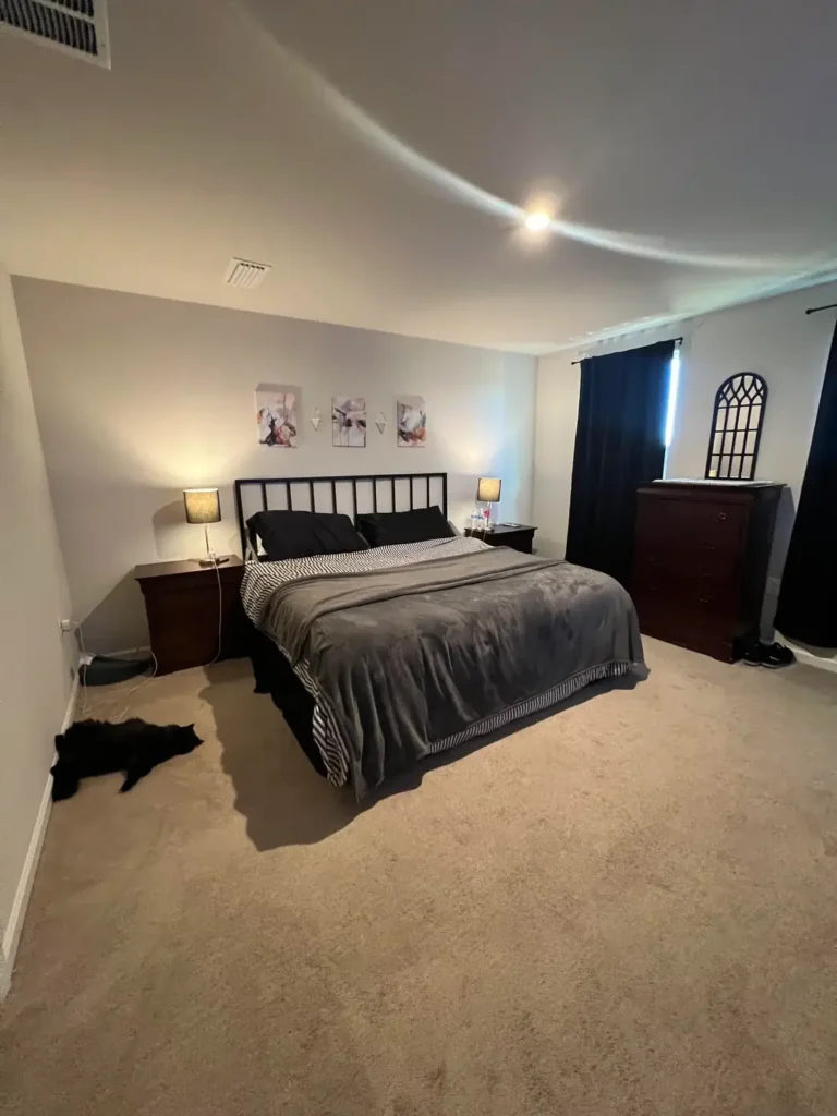
Some bedrooms want to tell a story. This one does exactly that.
The walls stay light, but personality gets packed in through layered wall decor. A trio of abstract prints above the bed creates a focal point, and a smaller framed piece on the adjacent wall keeps things from feeling isolated and lonely. The black metal bed frame with its spindle design nods to traditional style without looking like it belongs in your grandmother’s guest room.
Now, navy blue curtains technically step outside pure black and white. But they’re dark enough to maintain the monochromatic feel while adding warmth. It’s a smart loophole. Use it.
Dark wood furniture mixed with a black metal bed frame is another clever call. It avoids that “matched set from the furniture store catalog” look that makes bedrooms feel like showrooms nobody actually lives in.
The decorative mirror leaning casually against the dresser is the kind of detail that makes a room feel styled rather than staged. It’s functional and beautiful at the same time.
FYI: If gallery walls scare you, start with just three pieces like this. You can always add more later, but scaling back from overwhelming is much harder.
Contemporary Minimalism with Bold Charcoal Walls
Dark walls get a bad reputation. People assume they’ll make a room feel like a cave. But done right, they feel cocooning, moody, and honestly kind of luxurious.
Here, the charcoal wall wraps around the corner, creating an immersive backdrop that makes white bedding practically glow. The low-profile dark gray bed frame keeps sight lines low, which affects how spacious the room feels even when you’re lying down. That’s a detail most people never consider.
A gallery wall on the adjacent white surface gives your eyes a break from the dark expanse. Black frames on a white wall mirror the room’s overall scheme, so it all feels cohesive rather than random. The mix of print sizes and orientations keeps it from looking too rigid or corporate.
A potted monstera in a white planter brings in organic shapes that contrast beautifully with all the geometric precision happening everywhere else. And a speckled area rug adds texture without screaming for attention.
One non-negotiable though: your lighting plan has to be intentional. Recessed ceiling lights plus natural light keep this room from feeling like a dungeon. Skip the lighting and you’re just living in a cave with nice bedding.
Industrial-Chic Bedroom with Exposed Brick and Gallery Wall
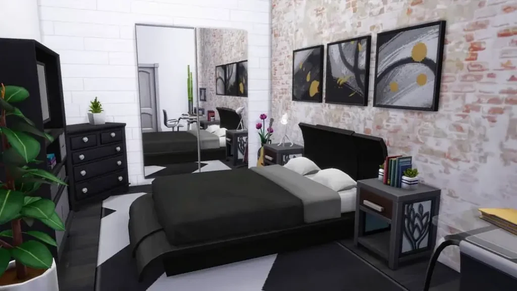
Here’s a wild idea. What if your wall texture was the decor?
Exposed brick does something no amount of paint or wallpaper can replicate. It’s three-dimensional, full of character, and instantly interesting. The whitewashed brick finish here keeps it from overwhelming the space while adding depth that flat walls simply can’t match.
Black furniture, including the bed, nightstands, and dresser, creates strong contrast against both the brick and the clean white walls. Two large abstract canvases introduce hints of gold, which technically steps outside the black and white palette, but the minimal use keeps the overall monochromatic feel.
A full-length mirror pulls double duty: practical use and spatial expansion. In rooms with heavy textures, mirrors bounce light around and prevent the space from feeling too closed in.
Greenery scattered in white or neutral pots adds life without color chaos. Plants are always a good idea, IMO.
If you’re working with existing architectural features like textured brick or exposed beams, don’t fight them. Build your palette around what’s already there.
Also Read: 10 Large Master Bedrooms Decor Ideas That Actually Work
Modern Masculine Design with Geometric Mirror and Dark Walls
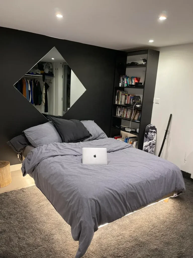
Mirrors are not just for checking your outfit. In the right position, they change the whole energy of a room.
The standout here is a diamond-shaped mirror mounted on a black accent wall. It reflects light back into the room and creates a geometric focal point that naturally pulls your gaze upward. Clever and functional.
Built-in bookshelves beside the bed give the room personality through the things displayed on them. Books, objects, small decorative pieces layered at different depths create visual interest without making the space feel cluttered.
The low platform bed keeps the room feeling open despite the dark palette. Three walls stay light, one goes dark, and reflective surfaces are placed with intention. That’s the formula for making dark bedrooms feel expansive rather than cramped.
A Bruce Lee poster adds a personal stamp without disrupting the color scheme. Black and white imagery reinforces rather than fights the overall design. And the textured area rug adds subtle pattern at a low intensity level so it doesn’t compete with the bolder geometric elements.
Pro move: Think about your room’s layers. Bold statement, subtle mid-layer, quiet base. Each element should operate at a different intensity.
Contemporary Urban Bedroom with Statement Art and Greenery
Statement art can either anchor a room or get completely swallowed by it. The difference is how bold you go.
The large black and white longhorn line art above the bed in this setup is impossible to ignore. It commands attention immediately and sets the tone for everything else in the room. Geometric prints flanking one side create a secondary focal point that balances the space so it doesn’t feel top-heavy.
Consistent black furniture anchors the light walls throughout. And the plants are doing serious work here. A tall fiddle leaf fig, smaller potted plants on surfaces, trailing greenery on shelves. The variety in height and form creates movement without introducing color complexity. It’s organic layering at its best.
A textured throw blanket with fringe adds tactile interest to smooth bedding. A striped area rug introduces linear pattern that works with the angular furniture rather than against it. Corner shelving with books and decor at varying heights keeps things dynamic.
If you’re building your bedroom around statement art, make sure it has strong graphic qualities. Soft, wishy-washy artwork gets completely lost in high-contrast environments.
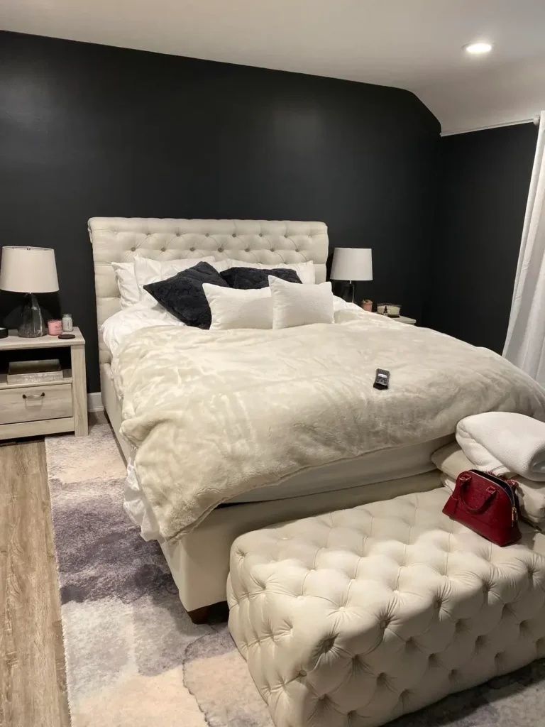
Luxe Modern Bedroom with Tufted Furniture and Dramatic Walls
Sometimes you want your bedroom to feel like a boutique hotel. This one delivers.
The tufted cream headboard against black accent walls is the kind of contrast that looks intentional and expensive. Those button details create shadows and dimension that flat surfaces can’t touch. A matching tufted ottoman at the foot of the bed reinforces the luxe aesthetic while actually being useful.
The bedding situation here deserves its own paragraph. White base layer, cream textured coverlet, black accent pillows, fur throw. Each layer operates at a different tactile level. It looks rich because it actually is layered, not just piled.
White nightstands with clean lines balance the softness of the upholstered pieces so nothing feels too traditional or fussy. Matching table lamps add symmetry. A plush area rug carries the soft, luxurious feeling underfoot.
Notice how the dark walls wrap around corners here. That’s what separates an intentional design choice from an accent wall that looks like someone ran out of paint.
If comfort is your top priority and you want your bedroom to actually feel like a sanctuary, this textural layering approach is the move.
Also Read: Blue Master Bedroom Decor Trends: Bold, Beautiful & Budget-Friendly
Eclectic Maximalist Design with Extensive Gallery Wall
Okay, this one throws out the rulebook. And somehow it works better than most rooms that follow every rule.
An expansive gallery wall covers nearly the entire surface with black-framed pieces in varying sizes. It reads as curated and intentional rather than chaotic, and that’s entirely because of the consistent framing and the white walls providing breathing room between pieces.
A black shelf below an ornate mirror grounds all the floating frames with a horizontal line and a surface for small decorative items. Dried flowers, little sculptures, a few books. It feels personal and collected rather than purchased as a set.
The black bed frame with a simple headboard is smart here. When your wall makes that strong of a statement, your furniture needs to stay quiet. The layered neutral bedding follows the same logic.
And then there’s a guitar leaning in the corner. That single detail tells you everything. This room belongs to a real person with real interests, not a generic design concept.
If you love maximalism but want coherence, black and white is your best friend. The color restraint lets the quantity and variety breathe without descending into visual chaos.
How to Make Black and White Bedroom Decor Work for You
After looking at ten completely different bedrooms, a few patterns stand out:
- One living element changes everything. A plant, a guitar, a meaningful poster. Something personal keeps the room from feeling like a display model.
- Contrast is intentional, not accidental. Every one of these rooms made a deliberate choice about where the dark and light elements sit.
- Texture saves monochromatic rooms. Without different materials, finishes, and surfaces, black and white just looks flat.
- Bold elements need quiet partners. A strong gallery wall needs simple furniture. A dramatic dark wall needs clean bedding.
- Lighting is non-negotiable. Especially in darker rooms, your light sources determine whether the space feels moody or miserable.
Final Thoughts
Black and white bedroom decor works because it forces good decisions. When you remove color as a variable, you start thinking about form, texture, scale, and how things relate to each other. That’s where the real design thinking happens.
Start with your walls and your bed. Everything else responds to those two decisions. If your walls go dark, your bedding needs to provide contrast. If your walls stay light, you have more freedom with furniture and textiles.
And don’t overlook the small stuff. Matte black feels completely different from glossy black. Warm white reads differently than cool white. These subtle variations create depth that keeps monochromatic rooms from feeling flat and one-note.
You don’t need a massive budget or a designer on speed dial. You just need to make intentional choices and stick with them. Pick your direction, commit to it, and let the contrast do the work.
Now go make your walls say something. They’ve been quiet long enough.
