Let’s be honest. Staring at blank bedroom walls every morning feels oddly depressing. It’s like your room is silently judging you for not finishing what you started. I’ve been there. And after going down way too many rabbit holes looking at real bedroom setups, I can tell you one thing for sure: the difference between a room that feels cozy and complete versus one that feels sad and unfinished almost always comes down to the walls.
The good news? You don’t need a designer or a Hollywood budget to fix it. These ten ideas come from real bedrooms where real people actually sleep. No staged photo shoots. No fake plants placed strategically by a stylist. Just genuinely good ideas you can actually use.
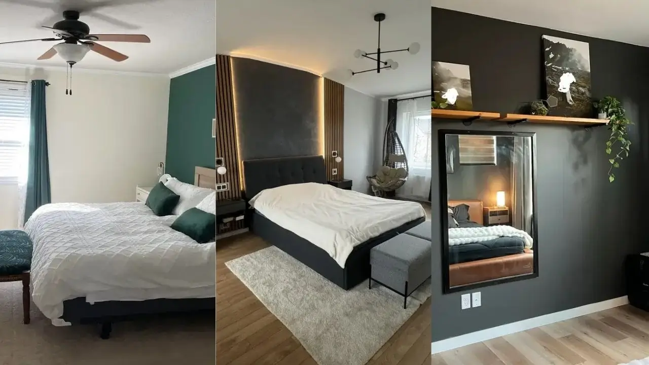
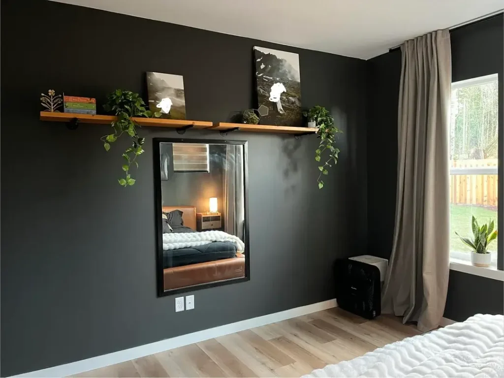
Dark Accent Wall with Layered Shelving and Mirror
If you want your bedroom to feel instantly more put-together, paint one wall dark and leave the rest light. It sounds simple because it is. But the results look anything but basic.
One Reddit user did exactly this with a charcoal accent wall. They added a floating wooden shelf above a large mirror and let trailing pothos plants cascade down on either side. A few books and small art prints completed the shelf. The greenery softens the dark paint without demanding a lot of upkeep. It’s honestly a brilliant low-maintenance move.
The mirror pulls double duty here too. It bounces natural light from the opposite window around the room and makes the space feel bigger than it actually is. And here’s a small but important detail: the shelf sits slightly higher than you’d expect above the mirror, which stops the whole setup from looking too rigid or staged.
Quick tips if you’re trying this:
- Go with matte or eggshell finish on dark walls. It hides imperfections better than glossy paint.
- Mount your shelf at least 12 inches above the top of the mirror. Give those elements some breathing room.
- Start with the paint before buying anything else.
Board and Batten Wall with Personalized Typography
Board and batten paneling is one of those things that looks incredibly impressive but is more approachable than it seems. The vertical lines add architectural texture to plain, boring walls. And in rooms with standard 8-foot ceilings, those vertical lines actually make the space feel taller. Yes please.
What makes one particular take on this idea so smart is the restraint behind it. A single framed typography print sits centered above the bed, flanked by two black wall sconces. That’s it. No clutter. No overloading the wall with too many things fighting for attention. Some trailing greenery drapes over the frame to soften all those clean geometric lines.
The spacing on the panels matters a lot. Aim for around 16 inches between each board. Too close and it looks cramped. Too far apart and it loses that satisfying rhythm that makes board and batten so appealing.
This look fits beautifully in farmhouse or transitional-style bedrooms. Use pre-primed MDF boards if you want to speed up the process. Your future self will thank you during painting time.
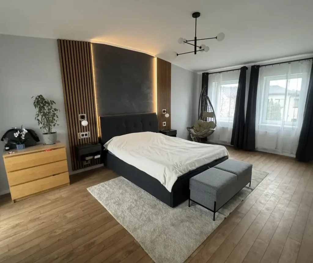
Vertical Wood Slat Accent Wall with Backlit Panel
Okay, this one requires a bit more planning than the others. But the result looks like something straight out of a boutique hotel, so hear me out.
Vertical wood slats running floor to ceiling create a texture that genuinely changes throughout the day as natural light moves across the room. One setup that nails this look features slats flanking a recessed panel behind the bed, with LED strip lighting around the panel’s perimeter. The soft glow at night is chef’s kiss. The charcoal paint inside the recessed area contrasts beautifully with the natural wood tone of the slats.
A few things to know before you start:
- The slats need to be mounted on furring strips to create enough depth for the recessed panel.
- Aim for about 2 inches of spacing between slats. Enough for shadow play, not so much that it looks unfinished.
- Integrated floating nightstands on either side keep the design clean and streamlined.
If you want that high-end, minimal aesthetic without going full renovation mode, this is genuinely one of the best wall treatments out there.
Also Read: 10 Black and White Bedroom Decor Ideas That Transform Your Wall Space
Oversized Mirror as the Primary Wall Feature
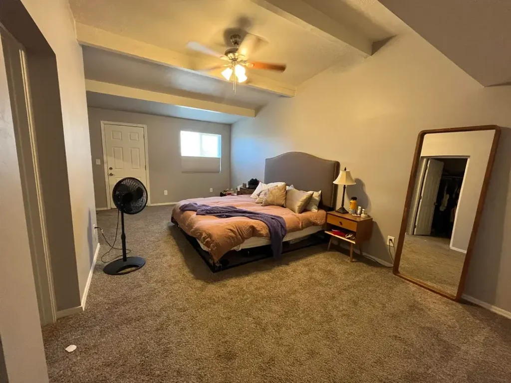
Here’s one for the renters. Or for anyone who isn’t ready to commit to putting a million holes in the wall. An oversized mirror that leans against the wall can anchor an entire room without a single piece of mounting hardware.
Scale is everything with this approach. A small mirror on a large wall just looks lost and a little sad. But a mirror that stretches nearly floor to ceiling? That becomes a full-on design moment. One well-executed version features a wooden-framed floor mirror leaning against a gray wall, reflecting the bed and the opposite side of the room. The result makes the room look significantly bigger than its actual square footage.
The trick is positioning. Lean the mirror on a wall without a window directly behind it. Then angle it to reflect something worth seeing, like natural light from a window across the room or a piece of artwork on the opposite wall.
This is honestly one of the easiest, most impactful bedroom upgrades you can make. Highly recommend.
Oversized Woven Wall Art with Bohemian Accents
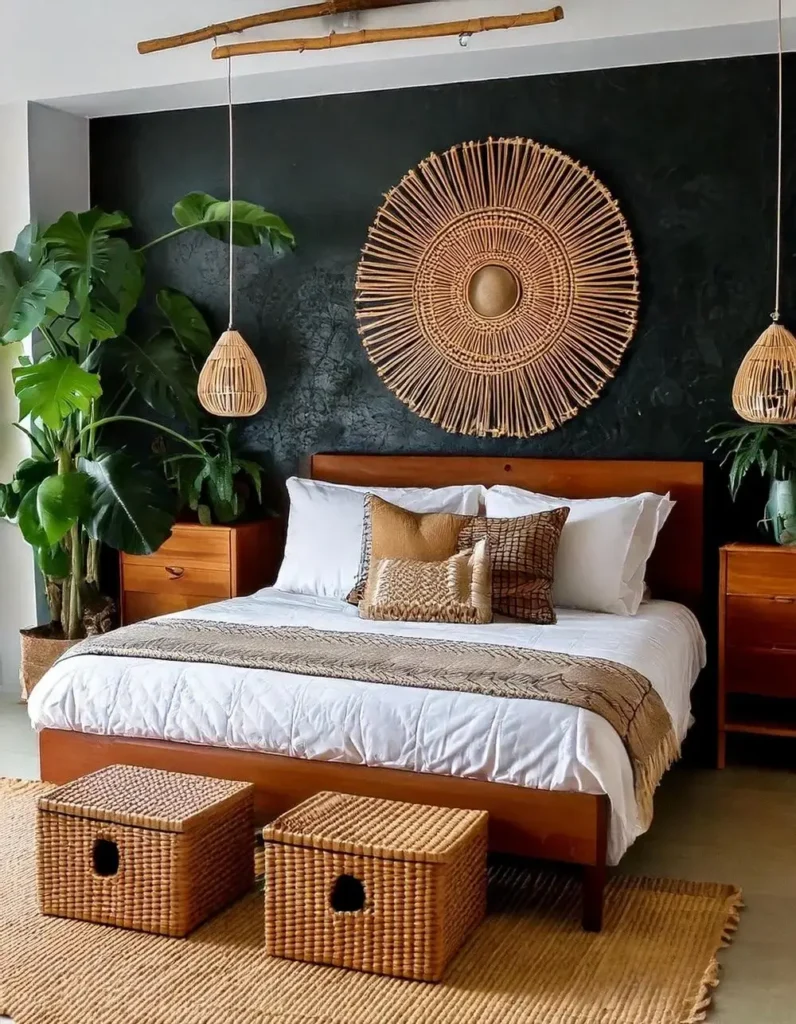
Who said wall art has to come in a frame? Textural pieces like woven rattan or macrame add a dimension that even the most beautiful flat print simply can’t match. They bring warmth, depth, and a kind of organic energy that makes a bedroom feel genuinely lived-in and cozy.
One bedroom nails this with a massive circular woven rattan piece mounted above the bed. The sunburst pattern draws your eye upward naturally, and the natural material connects with the wooden bed frame and nightstands below. Pendant lights hang at slightly different heights on either side, creating just enough asymmetry to keep things visually interesting without feeling chaotic.
Pro tip: the dark accent wall behind the piece is what makes the rattan pop. Against a light wall, it would blend in and lose its impact entirely. The layered textiles on the bed, woven baskets on the floor, and large fiddle leaf figs on either side of the bed reinforce the natural material palette throughout.
If you’re drawn to this aesthetic, start with the large statement piece first. Build everything else around it.
Curated Gallery Wall in Small Spaces
Gallery walls have a bit of a reputation. Done badly, they look like someone just threw random frames at a wall and called it a day. Done well, they’re one of the most personal and visually satisfying things you can put in a bedroom.
The difference is intention. One smart approach keeps it simple: three framed prints in a horizontal row on the wall facing the bed. The black frames match the existing black furniture in the room, creating a cohesive look. The gray walls give the colorful art room to breathe without competing for attention.
Consistent spacing between the frames, around 3 to 4 inches, is what ties the grouping together without making it feel cramped.
Before putting a single nail in the wall:
- Lay your frames out on the floor first.
- Use painter’s tape to map out the arrangement on the wall.
- Step back and look at it before you commit.
Seriously, that painter’s tape trick saves so much frustration. It’s one of those things everyone says and not enough people actually do.
Also Read: 10 Black Bedroom Decor Ideas That Prove Dark Walls Work
Single Accent Wall with Minimal Frame Grouping
Sometimes simple really is better. A painted accent wall with a small, thoughtful arrangement of prints can deliver more visual impact than an elaborate setup that’s trying too hard.
One teal accent wall holds four light-colored botanical prints in matching frames, arranged in a loose grid pattern. The prints share a common subject matter, plants and leaves, which keeps the grouping feeling cohesive even though it’s spread across four separate pieces. Cohesion comes from consistency, not uniformity. That’s a good rule to write down somewhere.
Teal can read cold if you’re not careful. The warm wood tones in this room’s ceiling fan and accent stool do the balancing work. The white furniture and bedding keep the space feeling fresh rather than heavy.
One thing worth noting here: the accent wall isn’t the wall behind the bed. It’s the perpendicular wall you see when you walk into the room. If that’s the first thing your eye lands on when you enter, it might actually be the better choice for your space too.
Deep Teal Wall with Woven Textile Art
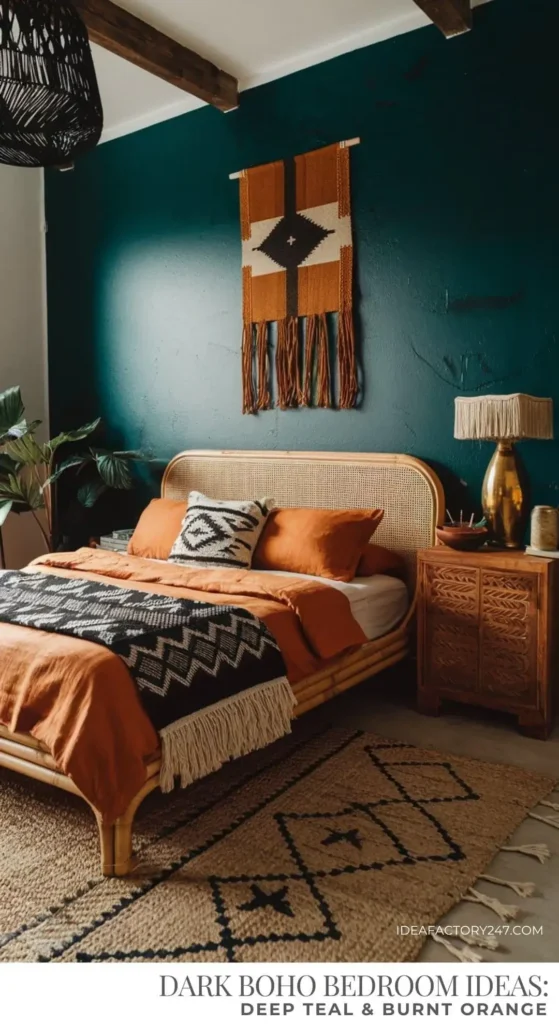
Rich jewel tones in a bedroom are one of those choices that feel scary until you actually do them. Then you wonder why you spent so long staring at beige.
A deep teal wall that shifts from near-black in the corners to a vibrant blue-green where light hits it creates drama without needing a single extra element. One woven wall hanging in burnt orange and cream is all the decoration this wall needs, and that restraint is exactly why it works so powerfully. The geometric pattern and long fringe add movement and texture against the solid color.
The rust-orange bedding picks up the tones in the wall hanging, creating a visual conversation between the textile and the bed. The cane headboard and carved wooden nightstand warm up the cool teal. A black woven pendant light overhead adds one more layer of texture without competing for the spotlight.
FYI, orange and teal sit directly opposite each other on the color wheel. The contrast feels intentional because it is. If you’re nervous about going this bold with wall color, test samples in different lighting conditions throughout the day before committing.
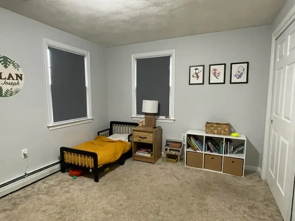
Simple Wall Art in Children’s Rooms
Kids’ rooms are tricky. Go too themed and the room feels dated by the time the kid turns seven. Go too minimal and it feels like a waiting room. The sweet spot is somewhere in the middle.
One well-balanced kids’ room keeps it simple with a three-piece framed print set on the wall and personalized name lettering near the window. Gray walls serve as a neutral foundation that won’t need repainting every time interests change. The yellow bedding adds personality and warmth, and it’s easy to swap out as the child grows.
A storage cube unit along the wall pulls double duty here. It organizes stuff (always a win in a kid’s room) while the books and baskets on top add visual interest at a lower height. Wall-mounted decor stays out of reach, which is always worth thinking about in spaces little hands can access.
Keep kids’ room walls simple and adaptable. The personality can come from textiles, accessories, and whatever obsession phase they’re currently in. That stuff is way easier to change than paint.
Also Read: 11 Shelf Decor Bedroom Ideas That Actually Work in Real Spaces
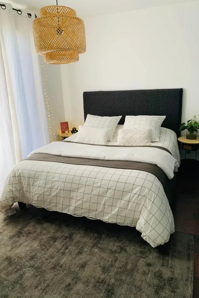
Minimal Bedroom with Strategic Lighting and Texture
Here’s a thought that might feel counterintuitive: sometimes the best wall decor is barely any wall decor at all.
One bedroom proves this beautifully. The walls are almost entirely bare. A woven rattan pendant light serves as the room’s focal point. A dark upholstered headboard provides texture against the white wall behind it. String lights along the curtain rod add soft, ambient warmth without making the space feel cluttered.
The gridded bedding pattern does the visual heavy lifting at bed level, which means the walls can stay clean and calm. No nightstands crowding the space, just a small side table with the essentials. The dark headboard against white walls creates enough contrast that adding anything else to the walls would actually make the room feel busier, not better.
If you naturally lean toward minimalism, don’t let anyone talk you into cluttering your walls just because it seems like you should. Empty space is a design choice too.
How to Choose the Right Wall Decor for Your Bedroom
Not every approach works in every room, so here’s a quick way to think about it before you start buying things.
Match the treatment to the room size:
- Small room? Mirrors and light colors expand the space visually.
- Larger room? You can handle darker walls and bigger, bolder art pieces.
Look at your furniture before your walls:
- Ornate bed frame? Keep the walls simple.
- Minimal furniture? Your walls can do more of the talking.
Think about function too:
- Shelving fills wall space and gives you storage.
- Mirrors reflect light and make rooms feel larger.
- Large-scale art makes a statement but doesn’t do anything practical (which is totally fine, by the way).
Here’s a quick reference to help you decide:
| Wall Treatment | Best For | Renter-Friendly |
|---|---|---|
| Accent Paint | Any room size | Depends on lease |
| Board and Batten | Traditional styles | No |
| Large Mirror | Small spaces | Yes |
| Gallery Wall | Long blank walls | Yes |
| Wood Slat Wall | Modern/transitional | No |
| Woven Art | Bohemian/natural styles | Yes |
Final Thoughts: Make Your Walls Actually Work for You
Here’s the thing. None of these ideas are complicated. Every single example here solves a specific problem, whether that’s adding texture, creating a focal point, making a small room feel bigger, or just bringing some personality into a space that desperately needs it.
Start with one wall. Watch how light hits it at different times of day. Think about what you already have in the room. Then decide what feeling you’re going for, cozy, calm, bold, warm, whatever speaks to you.
Your bedroom walls should reflect how you actually live, not what looks good in someone else’s photos. So whether you go full woven rattan bohemian or barely-there minimal, just make it intentional. That’s honestly the only rule that matters.
Now go do something about those walls. They’ve been waiting long enough.