Look, I get it. Your hallway is basically a glorified tunnel that connects your rooms, and every time you walk through it, you’re reminded that it’s doing absolutely nothing except existing. It’s narrow, it’s bland, and honestly? You’ve stopped even noticing it.
But here’s the thing. I dug up 15 real examples from actual homeowners who looked at their sad little hallways and said “nope, we can do better.” And what they pulled off might completely change how you see that cramped corridor you walk through twenty times a day.
These aren’t those annoyingly perfect magazine spreads where everything looks untouched by human hands. These are real spaces from real people who had limited square footage and still managed to create something that actually feels intentional. Some of these cost basically nothing. Others required a bit more investment. But every single one proves that tiny hallways have way more potential than you’d think.
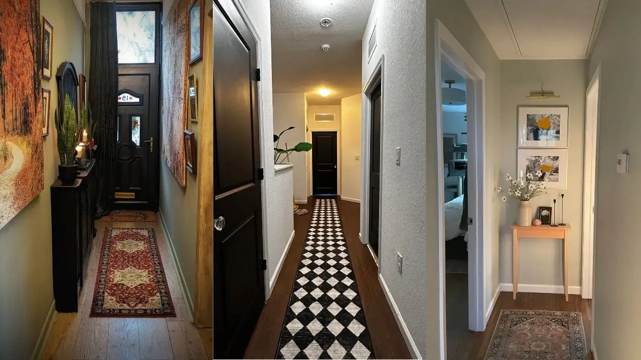
Vertical Storage Tower with Coordinated Hooks
Narrow hallways force you to get creative with your thinking. Instead of spreading things out horizontally (spoiler: you don’t have the room), you need to think in layers. And honestly? That limitation becomes your secret weapon.
This first setup shows exactly what I mean. One slim storage tower tucked against the wall maximizes every inch of vertical space without making the hallway feel like an obstacle course. The light wood finish keeps things from feeling heavy, while the open shoe rack at the bottom and small shelf up top create actual designated spots for your daily stuff.
What makes this work is the restraint. Instead of cramming three different furniture pieces into a space that can barely handle one, this approach uses a single well-chosen storage unit that handles shoes, bags, and small accessories without blocking your path.
Here’s my advice: measure your hallway width before you even think about shopping. You want at least 30 inches of clearance after placing furniture. Any less and you’ll be doing that awkward sideways shuffle every time you walk through. Stick with slim profiles and look for pieces with legs rather than solid bases. They create visual breathing room that makes a huge difference.
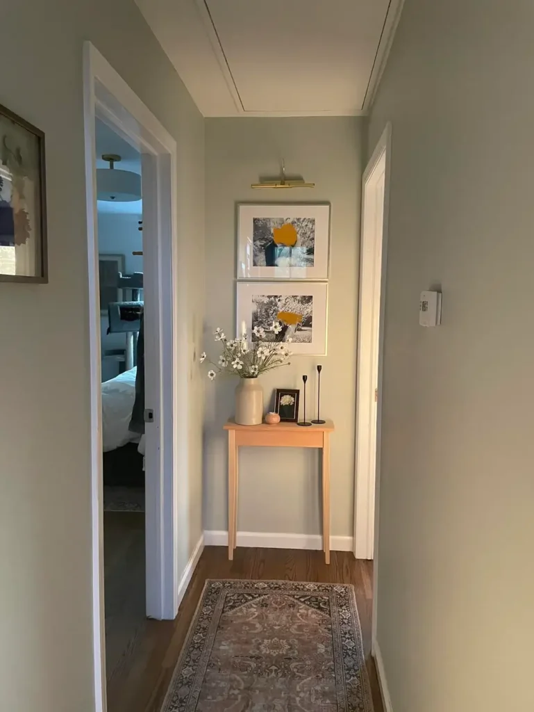
Slim Console Table with Layered Artwork
Sometimes you just need to accept that your hallway will always feel narrow, so you might as well make it feel curated instead of apologetic.
This next example features a narrow console table against the wall with two framed prints hung above it. But here’s the clever part: they’re stacked vertically instead of side by side. The sage green walls create a soft backdrop that makes the white trim pop, and a brass picture light mounted above the frames adds this gallery vibe that says “I definitely meant to do this.”
A small vase with dried flowers sits on the console alongside a few minimal decorative objects, and a patterned runner covers the wood floor.
The genius here is that vertical artwork stacking. In tight spaces, hanging art this way draws your eye upward and creates the illusion of height instead of making you hyper-aware of how narrow everything is. The picture light is a small detail that makes a massive difference because it treats this space like it actually deserves proper lighting.
Choose a console table that’s no deeper than 12 inches if your hallway is seriously tight. Any deeper and you’ll be turning sideways to pass by it, which defeats the entire purpose. The runner should leave a few inches of floor visible on each side rather than going wall to wall. Sounds backwards, but it actually makes the space feel wider.
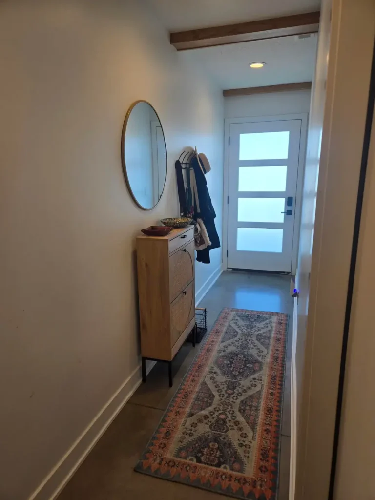
Oversized Mirror with Streamlined Shoe Storage
Mirrors in hallways aren’t revolutionary. Everyone and their mother will tell you to use mirrors in small spaces. But the execution here shows why size and placement matter way more than just slapping any mirror on the wall.
This setup transforms a basic entryway into something that feels deliberate. The large oval mirror with its warm wood frame becomes the focal point, while a sleek shoe cabinet below provides closed storage that keeps visual clutter to a minimum. The modern front door with frosted glass panels brings in natural light without sacrificing privacy, and exposed wood beams on the ceiling add architectural character.
The cabinet style matters here. Those angled shoe drawers take up way less depth compared to traditional shoe racks, and the closed front means you’re not staring at a pile of sneakers every time you walk past. The mirror placement above the cabinet creates one cohesive moment instead of two separate elements fighting for attention.
When selecting a mirror for a narrow hallway, go bigger than feels comfortable. I’m serious. A small mirror in a tight space just emphasizes the lack of room. An oversized one creates depth and reflects light like nobody’s business. Mount it low enough that you can see your full outfit before leaving, not just your face.
Also Read: The Best School Hallway Ideas: 8 Real-Life Transformations to Try
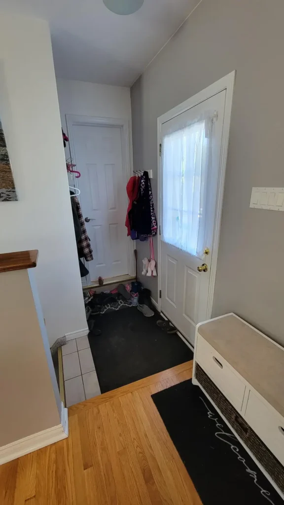
Practical Mudroom Zone with Visible Storage
Not every tiny hallway needs to look like a museum. Some need to function as the family drop zone, and pretending otherwise just creates frustration and resentment.
This space accepts the reality of daily life. A coat rack mounted on the wall holds jackets and bags at various heights, a black rubber mat defines the entryway zone, and a white storage bench provides a place to sit while removing shoes. The light gray walls and white trim keep things bright despite the practical, lived-in nature of the space.
What I appreciate about this approach is the honesty. There’s no attempt to hide the fact that this hallway serves as the main entry point where everyone dumps their stuff after school or work. The mat is easy to clean, the bench has storage inside, and the hooks can handle the actual volume of outerwear a family accumulates during winter.
If you’re setting up a mudroom style hallway, install hooks at multiple heights so kids can reach their own stuff without pulling everything down. Use a mat that’s actually large enough to catch the wet shoes and salt tracked in from outside. The goal here is reducing daily friction, not creating some elaborate system that only works if everyone follows seventeen rules.
Minimalist Approach with Oversized Tile Flooring
Sometimes the best decorating choice is to embrace what makes a small space feel larger instead of trying to add more stuff to it.
This hallway relies on clean lines and a restrained material palette. Large diagonal terracotta tiles cover the floor, creating continuity and making the narrow space feel longer. White walls and minimal door frames keep visual noise to absolute zero, while a floor to ceiling mirror on one side doubles the apparent width. Natural light from a skylight brightens what could otherwise feel like a cave.
The diagonal tile installation is smarter than it looks. Laying tiles at an angle makes your eye work a bit harder to trace the pattern, which distracts from the narrow width. The larger tile size means fewer grout lines, which creates a smoother visual field.
If you’re considering new flooring for a tiny hallway, avoid small tiles or busy patterns that chop up the visual space. Stick with large format tiles or wide plank flooring, and consider running the material diagonally or lengthwise to emphasize the direction you want the eye to travel. Keep the walls light and save any color or pattern for one accent element.
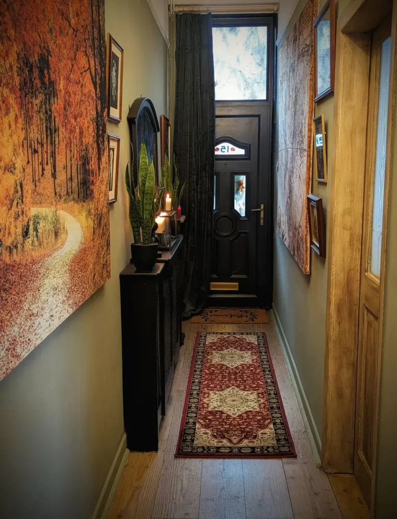
Bold Wallpaper with Gallery Wall Display
Conventional wisdom says to keep tiny hallways neutral and minimal. But some spaces beg for the opposite approach, and honestly? Sometimes conventional wisdom is boring.
This setup proves that bold choices can absolutely work in tight quarters. Dramatic oversized artwork covers both walls. One piece shows a textured landscape in warm oranges and golds, the other depicts a similar scene in cooler tones. A black console table sits against one wall with a snake plant and small lamp, while a traditional Persian runner in deep reds anchors the floor. The black front door with decorative glass panels and brass hardware completes the moody, curated look.
This works because the commitment is total. There’s no timid half measure happening here. The large scale art demands attention and transforms what could be a forgettable pass through into a memorable entrance. The dark door and rich rug colors create cohesion instead of fighting with the walls.
If you’re considering a bold hallway, the key is scale. Small, scattered decorations in a narrow space create visual chaos. One or two large statement pieces give your eye somewhere to land. Keep furniture minimal when you’re going big with art or wallpaper, and make sure your lighting is adequate to prevent the space from feeling like a dark tunnel.
Clean Gallery Wall with Ceiling-Mounted Frames
Picture frames don’t have to sit on walls in the traditional sense, and this example shows an alternative that works particularly well in narrow spaces.
This hallway features a series of black frames at varying sizes along one wall, creating a gallery effect that draws your eye down the length of the space. The warm wood floors contrast with bright white walls and a subtle gray ceiling detail. A simple wooden bench sits at one end with a small decorative item, keeping the floor level mostly clear.
The frame arrangement follows a loose horizontal line rather than a rigid grid, which feels way more organic in a residential space. The ceiling detail (a recessed panel painted in a slightly darker shade) adds architectural interest without taking up any actual physical space.
When creating a gallery wall in a hallway, aim for visual balance instead of perfect symmetry. Start with the largest frame at eye level and build around it, keeping about two to three inches of space between frames. In a narrow hallway, stick to one wall rather than creating a facing gallery on both sides, which can feel overwhelming as you walk through.
Also Read: How to Style Your Hallway: 12 Lighting Setups for Every Budget
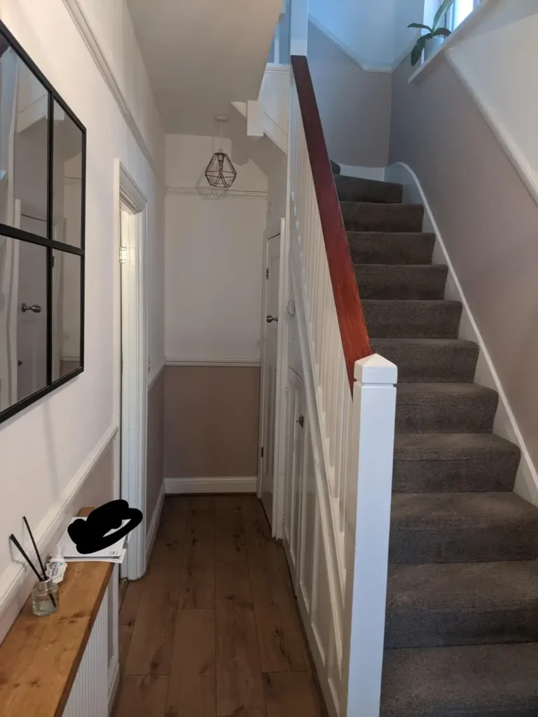
Simple Stairway Transition with Black Accent Walls
The junction where a hallway meets stairs creates this awkward space that many people struggle to define. But treating it as an opportunity instead of a problem changes everything.
This example uses paint to create visual separation between zones. The stair wall gets a soft gray blue, while the hallway remains white with crisp trim. A narrow floating shelf in light wood runs along one wall, providing a landing spot for small items without protruding into the walking path. A black framed mirror reflects light from the rooms beyond, and the geometric pendant light adds a modern touch without requiring any floor space.
The color blocking between the stairway and hallway defines each area without needing physical dividers or walls. The floating shelf is thin enough that you barely notice it’s there, but it prevents the long white wall from feeling completely empty and sad.
For hallways that connect to stairs, consider treating the stair wall as a separate design moment instead of forcing the entire space to match. A floating shelf installed at a consistent height around eye level gives you a place for a few decorative items without committing to full furniture. Keep the shelf depth under six inches to maintain easy movement through the space.
Recessed Lighting with Traditional Wainscoting
Architectural details can transform a plain hallway into something that feels intentional, even when you’re not adding furniture or decorations.
This hallway features floor to ceiling wainscoting painted in crisp white, with a chair rail dividing the panels. Multiple recessed lights line the ceiling, ensuring even illumination throughout the narrow space. The warm wood flooring and simple wood door at the end create a classic, understated elegance.
The wainscoting does two things at once. It adds texture and visual interest to otherwise blank walls, and it creates a horizontal line that makes the hallway feel wider than it actually is. The heavy lighting prevents the white on white palette from feeling cold or institutional.
Installing wainscoting in a hallway is a weekend project if you’re moderately handy, and it immediately elevates a builder grade space. Choose a panel height that’s proportional to your ceiling (typically one third to one half of the wall height). Paint everything in the same color for a cohesive look, or add subtle contrast by making the upper wall a shade lighter. Proper lighting matters more in all white spaces, so invest in quality fixtures that provide enough lumens.
Carpet Runner with Accent Door Color
Carpet in hallways gets dismissed as outdated, but the right application shows it still has a place in modern homes.
This setup uses a beige carpet runner that covers most of the hallway floor, leaving a small border of wood visible on each side. White walls and trim keep the space bright, while the darker wood front door adds a grounding element. Simple flush mount lights provide adequate illumination without any decorative fuss.
The carpet serves a practical purpose beyond aesthetics. It dampens sound, provides warmth underfoot, and protects the floor underneath from the constant traffic hallways endure. The neutral tone ensures it won’t clash with future decor changes, and the border of exposed wood prevents the carpet from feeling wall to wall and institutional.
If you’re considering carpet for a hallway, choose a low pile, durable material instead of plush options that show every footprint. A runner with a border looks more intentional than wall to wall coverage in a narrow space. Secure it properly with rug pads or tack strips to prevent bunching and tripping hazards.
Also Read: How to Decorate a Long Hallway: 10 Real-Life Examples and Pro Tips
Warm Vintage Aesthetic with Multipurpose Storage
Some hallways have just enough width to accommodate furniture, and using that space for both storage and style creates a functional entry area that actually works.
This space combines a dark wood dresser against one wall with a vintage pendant light and framed map artwork. A patterned runner in warm tones covers the wood floor, and a simple coat rack provides hanging storage without needing a built in closet. The overall palette skews warm and slightly eclectic, with a mix of wood tones and brass accents.
The dresser works because it provides closed storage for items you don’t want on display while keeping the hallway from feeling like just a pass through space. The vintage light fixture adds personality without requiring floor space, and the map gives your eye something interesting to study.
When adding furniture to a hallway, measure twice before committing to anything. You need at least 36 inches of clearance for comfortable passage, and furniture should be no deeper than absolutely necessary. Closed storage keeps the space from looking cluttered, which matters way more in hallways than in rooms where you can close a door and hide the mess.
Bold Pattern Runner on Neutral Flooring
Rugs can transform a hallway from a boring connector into a moment that makes you pause. But the pattern and scale need to match the space, or it just looks weird.
This example features a black and white diamond pattern runner that creates strong visual movement down the length of the hallway. The dark wood floor visible on both sides provides contrast, while white walls and simple doorframes keep the upper portion of the space calm. A single potted plant at the end of the hallway adds a touch of life without requiring much space.
The geometric pattern is bold enough to make a statement but simple enough that it doesn’t feel chaotic in a confined space. The high contrast between black and white creates energy and draws your eye forward, making the hallway feel like a destination instead of just a transition.
Choosing a runner for a narrow hallway means thinking about pattern scale. Tiny, busy patterns get lost in the visual field, while oversized patterns can feel overwhelming. Geometric designs in high contrast work well because they create rhythm without requiring you to study the details. Make sure the runner is long enough to cover the majority of the hallway length instead of just a small section, which looks like an afterthought.
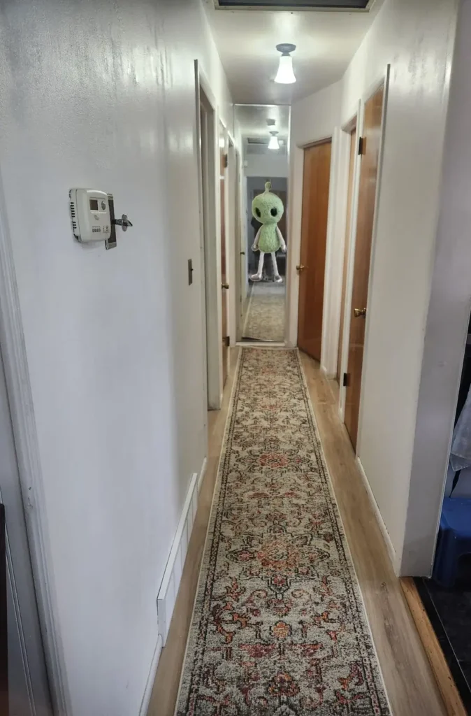
Compact Entry with Decorative Statement Piece

Not every hallway has room for furniture. But even the tightest spaces can handle one unexpected decorative element that creates personality and makes people smile.
This hallway remains almost completely minimal. White walls, wood doors with brass hardware, and simple flooring. The one addition is a large decorative figure at the end of the hallway, which creates a focal point and gives your eye somewhere to land. The figure’s whimsical nature prevents the space from taking itself too seriously.
This approach works when you genuinely don’t have space for functional furniture but want the hallway to feel intentional instead of neglected. The unexpected decoration creates a conversation piece and shows that someone actually thought about this space.
If you’re working with a truly narrow hallway where furniture won’t fit, consider one sculptural or decorative element placed strategically at a sightline. It could be an oversized vase, a large piece of pottery, or a sculptural object. The key is choosing something with presence that can hold its own without requiring additional support from surrounding decorations.
Traditional Hallway with Persian Runner and Slim Cabinet
Classic design elements can make a small hallway feel more substantial without adding actual square footage or requiring a complete renovation.
This setup keeps things straightforward with a traditional Persian runner in muted tones running down the center of the wood floor. A slim white shoe cabinet sits against one wall near the entry, topped with a few small decorative items. An oval mirror in a dark frame hangs on the opposite wall, and black framed artwork adds visual interest without overwhelming the space.
The traditional runner brings warmth and softness to what could otherwise feel like a sterile pass through. The cabinet is shallow enough that it doesn’t impede movement but provides essential storage for a busy household. The mirror placement on the opposite wall from the cabinet creates balance and keeps things from feeling lopsided.
Traditional design in small spaces requires editing. Choose one or two quality pieces (like a good rug and a well made mirror) instead of filling the space with multiple mediocre items. The slim shoe cabinet should be genuinely slim, not just smaller than average. Stick with a cohesive color palette across all elements to prevent the space from feeling chopped up.
Patterned Tile Flooring with Minimal Wall Treatment
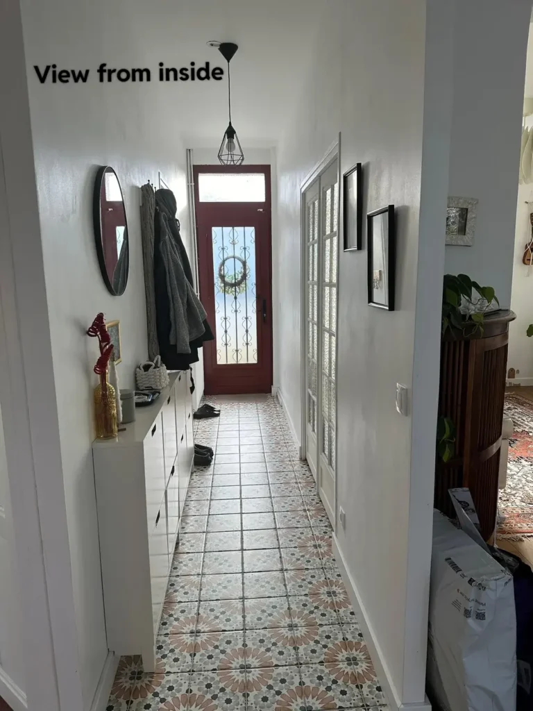
Flooring can carry the entire design of a tiny hallway, especially when you choose something with enough visual interest that the walls can stay simple and quiet.
This entrance features patterned cement tiles in a floral motif with blues, greens, and terracottas. The tiles run the length of the hallway, creating a striking path from the red front door to the interior rooms. White walls, simple cabinetry, and black door hardware keep the focus on the floor without competing for attention.
The patterned tiles do all the heavy lifting here, which is a smart approach when you have limited wall space for decoration. The geometric pendant light echoes the artistic quality of the tiles without adding visual clutter. The red door creates a bold entry statement that works because the surrounding elements remain understated.
Patterned tile is an investment, but it’s permanent and durable in high traffic areas. If you’re considering decorative tile, save it for the hallway floor instead of trying to use it on walls where it might feel overwhelming. Keep the pattern in a scale that’s appropriate for the space. Too large and you won’t see enough of the design. Too small and it becomes visual noise. Balance bold flooring with simple walls and minimal furniture.
What Actually Works in Tiny Hallways
These examples share a few common threads worth noting. The most successful tiny hallway ideas commit to a clear direction instead of hedging with half measures. Whether that direction is bold pattern, classic simplicity, or functional storage, the approach stays consistent throughout the space.
Scale matters more than the number of items you include. One large mirror creates more impact than three small ones. A single bold runner outperforms several small rugs scattered along the floor. Your eye needs somewhere to land in a narrow space, and giving it one strong focal point works better than distributing attention across multiple competing elements.
The hallways that function best balance aesthetics with the reality of how people actually use these spaces. A beautiful runner that slides around becomes a hazard. A mirror hung too high serves no practical purpose. The most thoughtful designs accommodate real life (keys get dropped, shoes get kicked off, bags get set down) while still maintaining a sense of intention.
Here’s the honest truth. You don’t need a renovation budget to transform a tiny hallway. Several of these examples show that paint, lighting, and one or two well chosen pieces create significant change. Start with the elements that bother you most about your current hallway and address those first instead of trying to overhaul everything at once.
Sometimes better lighting alone makes a cramped corridor feel welcoming. Sometimes it’s just a runner that adds warmth and color. Sometimes it’s embracing the narrowness instead of fighting it.
Your hallway might be small, but that doesn’t mean it has to be boring. Pick one idea from this list, try it out, and see what happens. Worst case? You change your mind and try something else. Best case? You actually start noticing your hallway for the right reasons.