Let’s be honest. Your bathroom probably does its job just fine. Toilet works, sink drains, shower gets you clean. But does it actually look good? Most bathrooms are basically the forgotten stepchildren of home design. We pour effort into living rooms and bedrooms while the bathroom gets… a basic soap dispenser and maybe a candle from Target.
Here’s the thing though. Bathroom wall art can completely transform that forgotten space into something people actually compliment. And no, you don’t need a massive budget or a professional interior designer to make it happen.
I’ve pulled together 15 real bathroom wall art ideas that prove even tiny powder rooms can pack serious visual punch. These aren’t Pinterest fantasies that require a contractor and a second mortgage. They’re actual, achievable looks that work.
Immersive Underwater Mural with Ceiling Integration
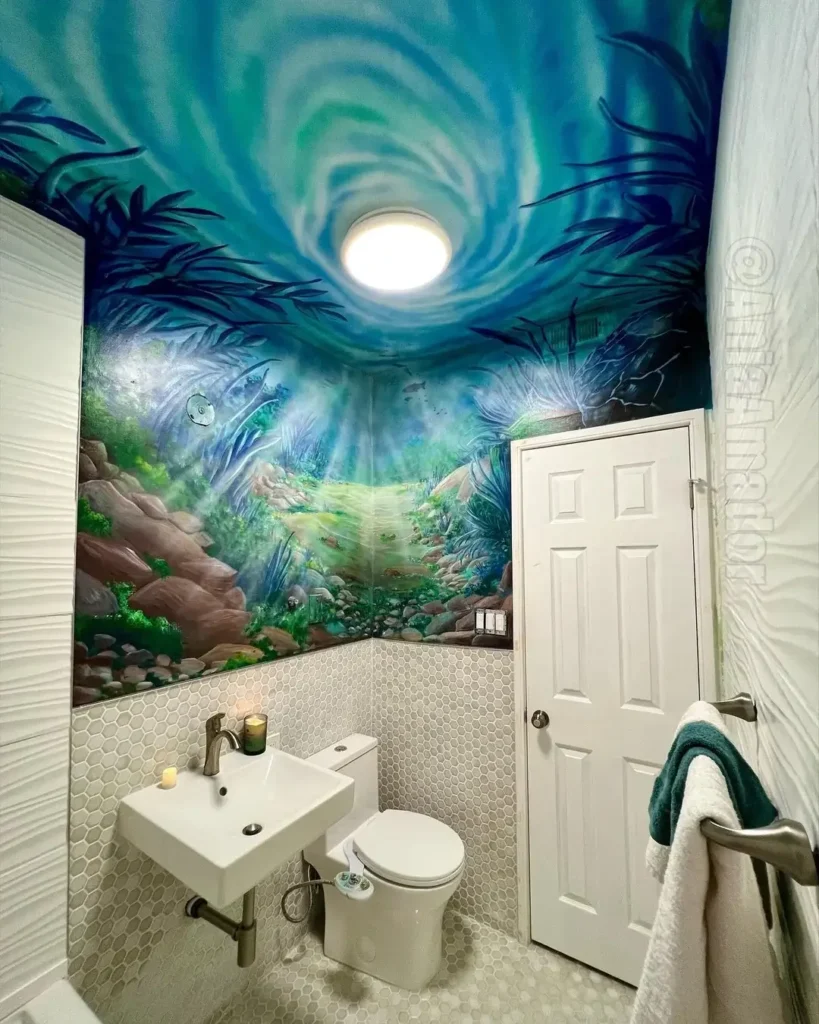
Most people treat the ceiling like it doesn’t exist. Big mistake. One homeowner took bathroom art to another level by creating an underwater scene that wraps from the walls onto the ceiling, turning a basic powder room into something that feels like diving into the ocean.
The turquoise and teal gradient creates a swirling vortex effect around the ceiling light. Tropical foliage and rocky formations wrap the lower walls, while white hexagonal tile wainscoting provides a clean visual break near the floor.
Here’s why this works so well. Continuing the design overhead creates genuine immersion. Your eye naturally travels upward, which makes the small space feel larger instead of claustrophobic. Most people stop their wall treatments at the ceiling line, but pushing past that boundary creates something truly memorable.
Pro tip: If you want this level of impact, hire a mural artist who specifically works with moisture-resistant paints. The whole effect collapses if your artwork starts peeling in six months because someone used standard acrylics in a humid environment. Not a good look.
Vintage Botanical Prints in Traditional Frames
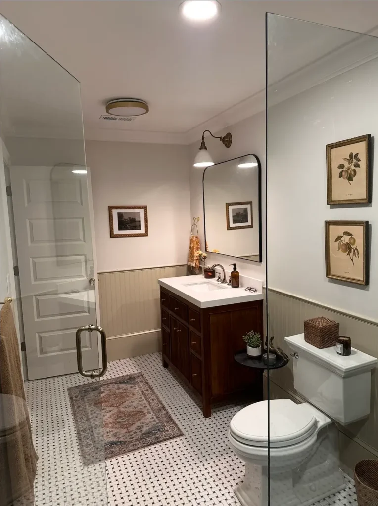
Classic doesn’t have to mean boring. One beautifully designed bathroom proves that traditional framed art can anchor a space without feeling stuffy or like your grandmother’s guest bath.
The setup features vintage botanical illustrations in matching gold frames against white board and batten wainscoting. The prints look like they came straight from old scientific journals, which gives the space an educated, collected over time vibe. Warm brass sconces and classic basket weave floor tile echo the traditional aesthetic throughout.
What makes this composition work is the consistency. All prints share similar proportions and identical frame styles. The botanical theme ties everything together without being matchy in that obvious, try hard way.
When sourcing prints like these, look for actual vintage illustrations rather than modern reproductions. The paper quality and printing technique on genuine vintage pieces adds authenticity you simply cannot fake. Frame them identically to create cohesion, then sit back and accept the compliments.
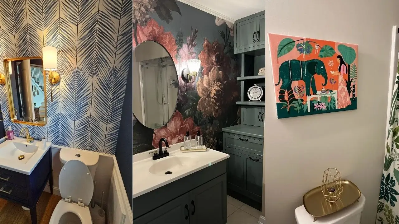
Dramatic Floral Wallpaper as Living Art
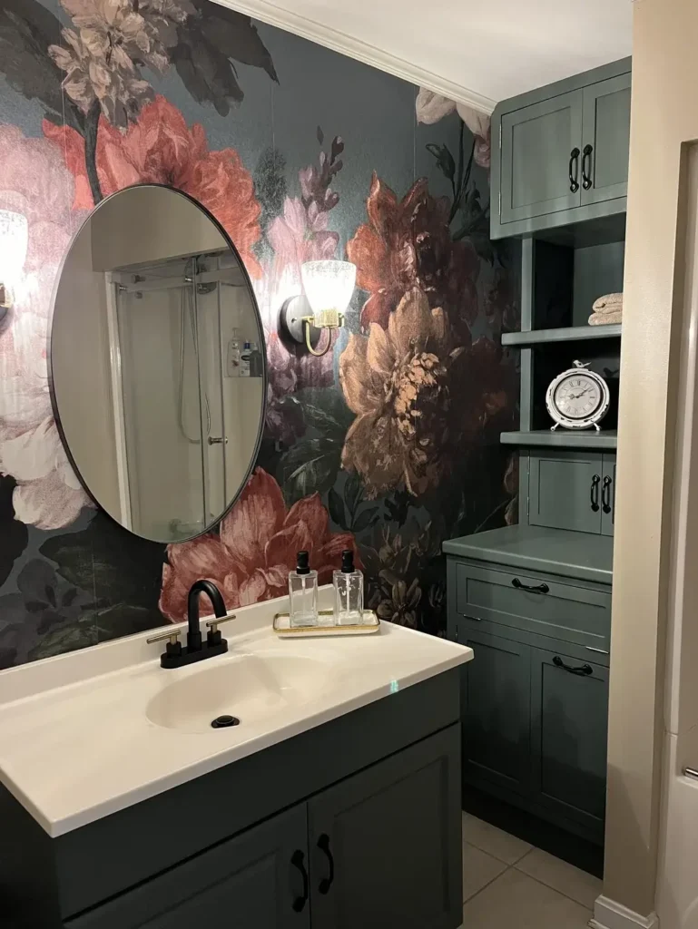
Sometimes the art doesn’t need a frame at all. Bold wallpaper becomes the statement when you choose a pattern with genuine artistic merit.
One stunning example features moody floral wallpaper with oversized blooms in coral, rose, and cream against a dark gray background. Sage green built in storage provides a complementary backdrop without competing for attention. Black fixtures and hardware create visual anchors throughout the space.
The scale of the pattern is critical here. Those flowers are large enough to read as individual artistic elements rather than just background texture. The dark base color makes the blooms pop forward, creating actual depth on what would otherwise be a flat surface.
This approach works best when you treat the wallpaper as your primary art investment. Keep other wall decor minimal and let the pattern do the heavy lifting. Just make sure you’re using proper bathroom wallpaper with moisture resistance. Standard wallpaper will bubble and peel faster than you can say “renovation regret.”
Also Read: 15 Kids and Guest Bathroom Ideas That Actually Work
Floating Shelves as Sculptural Display
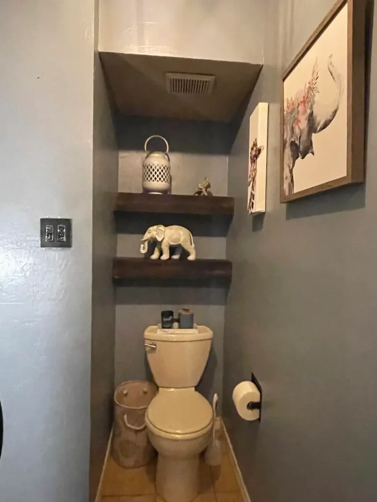
Narrow spaces need vertical solutions. One clever homeowner turned a common storage challenge into an opportunity for layered visual interest.
A gray accent wall behind the toilet features three dark wood floating shelves staggered at different heights. A metallic lantern and small decorative objects sit on the shelves, while a framed floral print hangs to the right. The arrangement draws your eye upward along the vertical line of the wall.
Shelf depth matters here. These shelves are deep enough to be functional but shallow enough that they don’t intrude into an already tight space. The staggered placement creates movement and avoids the static feel of perfectly aligned shelves.
Start with three shelves maximum in a small space. Place your largest or most visually interesting piece on the middle shelf, and flank it with smaller items above and below. The frame to the side provides asymmetrical balance that keeps things interesting.
Salon-Style Gallery Wall in Dark Tones
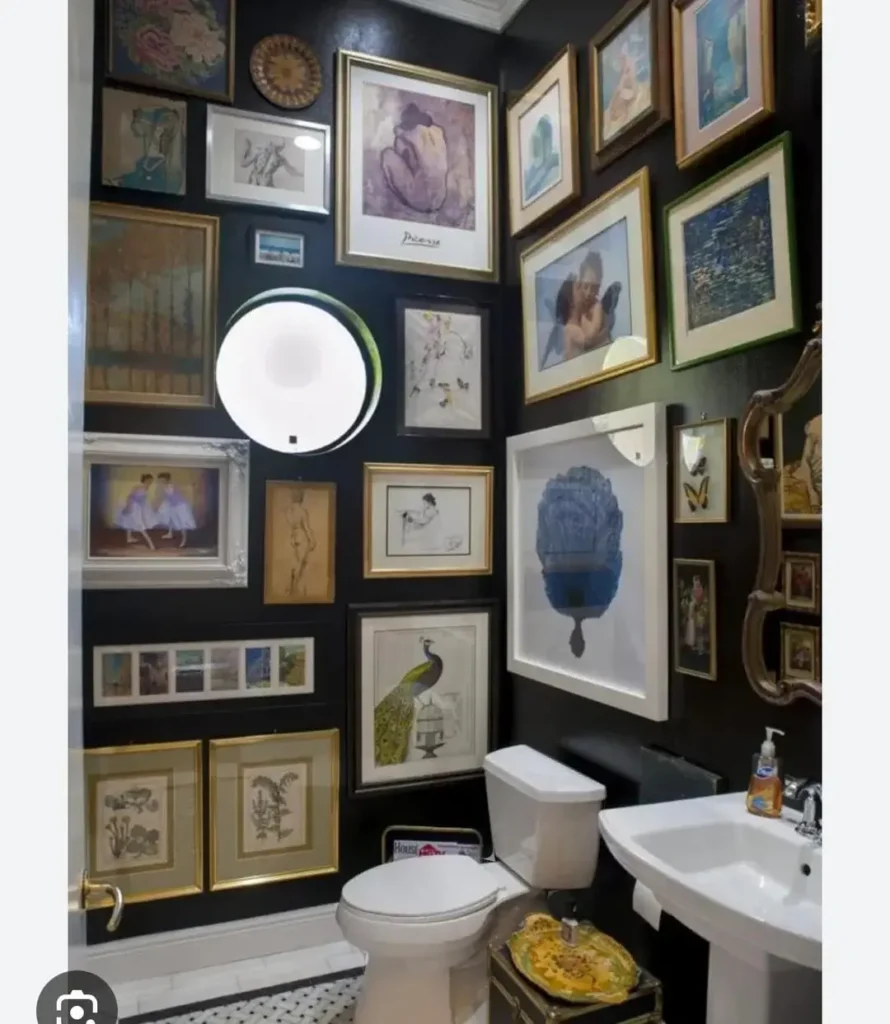
Maximum coverage can actually work in minimal space. One bathroom proves that filling nearly every inch of wall with art creates its own kind of cohesion. Sounds counterintuitive, but stick with me.
The walls are covered with a dense arrangement of framed pieces in varying sizes, all with gold frames against a dark charcoal background. The collection includes florals, figures, animals, and abstract pieces with no single dominant subject. White fixtures and black and white floor tile provide visual relief from the busy walls.
The unifying element is the frame color. Every piece uses a gold or brass toned frame, which creates visual thread throughout the collection despite wildly different subject matter. The dark wall color recedes, making the frames and artwork pop forward.
To pull this off, start collecting frames in your chosen finish before you worry about the art. Hit thrift stores and estate sales. Once you have enough frames in coordinating sizes, you can fill them with prints, pages from old books, or photographs that speak to you. Budget friendly and highly personal.
Hand-Painted Botanical Wall Treatment
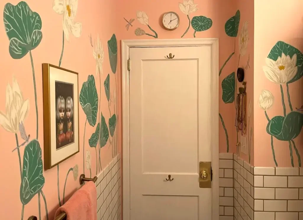
Direct wall painting offers permanence and customization that printed wallpaper simply cannot match. One coral and green design shows how hand painted elements can feel both playful and sophisticated.
Coral toned walls feature hand painted botanicals in sage green and cream. Oversized monstera leaves, tulips, and abstract floral shapes scatter across the walls. A framed figure study and small clock add focal points, while white subway tile wainscoting grounds the design.
The organic, slightly imperfect quality of hand painted elements gives this room personality that perfect digital prints lack. The leaves vary in size and placement, creating natural rhythm rather than mechanical repetition.
If you’re hiring someone to paint directly on your walls, ask to see photos of completed bathroom projects specifically. Wall painting in humid spaces requires specific primers and sealants. The artist needs to understand the technical requirements, not just have painting skills. This is not the time for amateur hour.
Also Read: 15 Vintage Cottage Bathroom Ideas That Bring Charm Home
Statement Wallpaper Behind the Vanity
A single feature wall delivers impact without overwhelming a small space. One gray and gold design demonstrates how strategic wallpaper placement creates a perfect focal point.
An oversized peony and chrysanthemum pattern lives behind the vanity area only. The charcoal gray background with metallic gold and white flowers creates drama without requiring the entire room to commit to the bold pattern. Remaining walls in slate blue provide breathing room.
The placement behind the vanity makes practical sense. This is the wall you face while using the sink, so you actually see and appreciate the pattern. The mirror reflects portions of the wallpaper, extending the visual effect without adding more pattern to adjacent walls.
When doing a single accent wall, choose the wall you naturally face most often. In bathrooms, that’s typically the wall behind the toilet or the wall behind the vanity. These positions give you maximum visual impact for your wallpaper investment.
Simple Framed Print with Mirror Shelf Styling
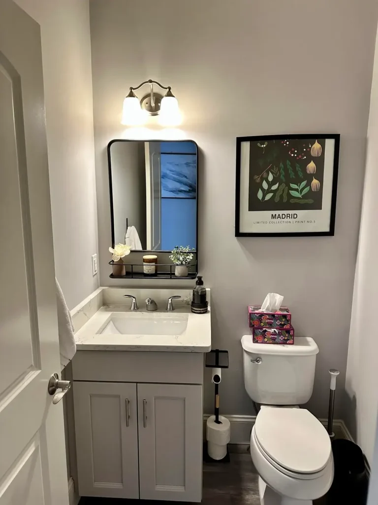
You don’t always need elaborate installations. Sometimes a single well chosen print and thoughtful styling create more than sufficient interest.
One setup includes a framed botanical print with “MADRID” text and a black framed mirror with an attached shelf. The mirror shelf is styled with a small plant, a candle, and another tiny vessel, creating a composed still life against neutral gray walls.
The restraint here is the design strength. The single print provides a color story that the styling on the mirror shelf echoes. The plant picks up the green tones, while the black frames tie both wall elements together.
For this approach to work, your single piece needs to be large enough to hold the wall. Too small and it looks like you ran out of art or budget. The mirror shelf becomes an extension of your wall art when you treat the styling as intentional composition rather than random product storage.
Bold Geometric Wallpaper with Metallic Accents
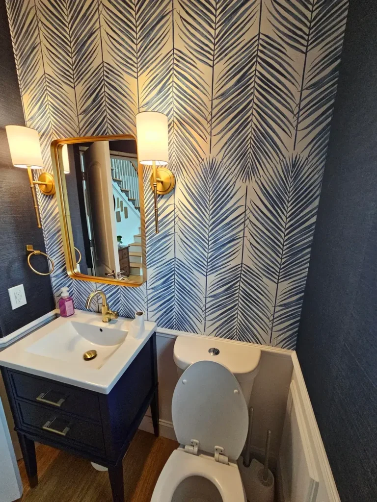
Geometric patterns bring structure and modernity to any space. One herringbone palm design shows how pattern can read as contemporary art when paired with the right finishes.
Navy and white wallpaper features an abstract palm frond pattern arranged in herringbone. Gold framed mirror, brass sconces, and a gold faucet create a cohesive metallic accent story throughout. The navy vanity extends the wallpaper’s color to the floor, making the design feel intentional top to bottom.
The contrast between the organic palm shape and the geometric arrangement creates visual tension that keeps the pattern interesting. The metallic elements catch light and add dimension to what could otherwise be a flat graphic.
When working with bold geometric wallpaper, keep your other patterns minimal. Let the wallpaper be your pattern star and support it with solid colors and metallic finishes. IMO, less is definitely more when your wallpaper is already doing this much work.
Also Read: 15 Kids and Guest Bathroom Ideas That Actually Work
Personal Photography Gallery Wall
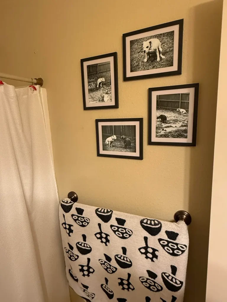
Your own images can absolutely become your bathroom art. One gallery of black and white photographs proves that personal connection matters as much as artistic technique.
A simple asymmetrical arrangement of four black framed photos shows beloved pets in outdoor settings. Uniform black frames and black and white treatment create cohesion despite different compositions. Cream walls let the frames stand out clearly.
The emotional connection you have to images you captured yourself adds a layer of meaning that generic art cannot provide. These photos likely make the homeowner smile every single day, which is honestly worth more than the most expensive print of something that means nothing to you.
Mat your personal photos properly in acid free materials if you care about longevity. Use identical frame styles and sizes when possible to create a deliberate collection rather than a random assortment. Black frames with white mats work in nearly any bathroom color scheme. Super versatile.
Vibrant Modern Art Print with Color Coordination
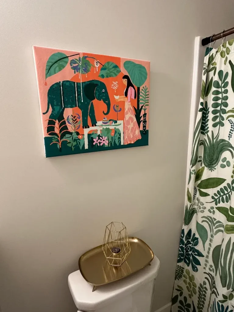
Contemporary illustration brings energy and personality to any bathroom. One tropical themed canvas shows how a single bold piece can set the tone for your entire bathroom palette.
The canvas features a stylized scene with an elephant, a figure, and lush foliage in coral, teal, pink, and green. It hangs directly above the toilet, and the shower curtain picks up the botanical theme in coordinating colors. A gold tray on the toilet tank adds a metallic accent that feels intentional.
The color coordination between the art and the shower curtain is what makes this room feel designed rather than just decorated. The botanical theme repeats without being identical, creating rhythm through the space.
When you find a piece of art you love, use it as your color roadmap. Pull two to three colors from the art for your textiles and accessories. This creates cohesion that feels effortless because it actually is effortless once you’ve chosen your anchor piece.
Coordinated Wallpaper and Shower Curtain

Repeating patterns can unify a space when done with subtlety. One birch tree design shows how continuation of theme creates flow in a small room.
Both the wallpaper and shower curtain feature delicate birch trees with fine branches on a light background. The pattern scale stays identical between both applications, so the shower curtain feels like a natural extension of the walls. Gray accents and minimal styling keep the focus on the tree pattern.
The success here depends on the pattern being interesting but not overwhelming. Birch trees have enough visual movement to be engaging while being neutral enough to live with daily. The vertical lines create the illusion of height, which is always a win in small spaces.
This approach works best with nature inspired patterns that have organic movement. Avoid patterns that are too busy or too bold. Seeing the same intense pattern repeated on multiple surfaces in a small room can feel claustrophobic rather than cohesive. Trust me on this one.
Nature Photography on Patterned Wallpaper
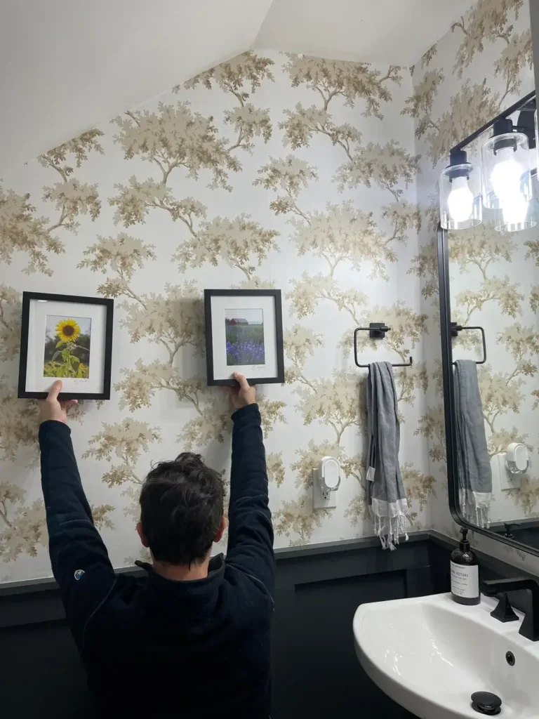
Layering framed pieces over patterned wallpaper adds dimension when done right. One example shows how to make both elements work together rather than compete for attention.
Wallpaper features a subtle tree pattern with beige and tan tones creating a soft forest scene. Two simple black framed photographs of natural subjects hang at different heights, creating visual interest. The frames are small enough that the wallpaper pattern remains visible and relevant.
The key is choosing frames and images that complement rather than fight the background pattern. The black frames provide contrast against the light wallpaper, while the nature photography echoes the tree theme without duplicating it exactly.
When hanging art over patterned wallpaper, use simple frames that create clear boundaries. Ornate frames get lost against busy backgrounds. Keep your framed pieces to two or three maximum so the wallpaper can still be appreciated.
Contemporary Accent Wall with Paired Prints
Clean lines and modern finishes create sophistication without trying too hard. One navy accent wall demonstrates how minimalist art placement can have maximum impact.
One wall painted in deep navy holds two framed ocean themed prints in gold frames. White marble look tiles on the adjacent walls create strong contrast, while a woven basket and gray towels add texture without introducing competing colors. The floating vanity keeps sight lines clean.
The vertical stacking of the two prints creates intentional composition. They’re close enough to read as a pair but far enough apart to each have space. The gold frames pick up warmth that prevents the navy and white from feeling cold.
For modern bathrooms with strong architectural elements like detailed tile work, let the art be simple. Two well placed pieces often work better than six scattered ones. The restraint reads as confidence rather than emptiness when your foundational design is strong.
Accent Niche with Dramatic Wallpaper
Architectural features deserve attention, not neglect. One recessed niche shows how wallpaper in a small area creates outsized impact.
A vertical niche behind the toilet features large scale chrysanthemum wallpaper in charcoal with cream and gold flowers. Surrounding walls stay in solid slate blue, making the papered niche read as an intentional focal point. A small floating shelf with simple styling interrupts the pattern at eye level.
The niche provides natural boundaries for bold pattern. You get the impact without the commitment of papering entire walls. The scale of these flowers is large enough to be appreciated even in this narrow vertical space.
If you have architectural niches or recesses in your bathroom, treat them as opportunities rather than challenges. Bold wallpaper, contrasting paint colors, or even tile that differs from your field tile can turn these features into focal points that feel custom and intentional.
Choosing the Right Approach for Your Space
All these examples cover different styles, budgets, and skill levels. Your bathroom wall art choice should match both your aesthetic preferences and your practical constraints.
Consider these factors when deciding your approach:
- Small powder rooms work best with a single statement piece or accent wall
- Full bathrooms can handle multiple approaches or even full murals
- High humidity spaces need sealed murals or proper bathroom wallpaper
- Moderate humidity spaces can use standard framed art with glass protection
- Limited budgets benefit from DIY painting or thrifted frame collections
- Flexible budgets can explore custom murals or designer wallpaper
- Beginners should start with peel and stick wallpaper or ready made prints
- Experienced DIYers can tackle hand painted murals or complex gallery walls
Your maintenance willingness matters as much as your design preferences. A salon style gallery wall requires periodic cleaning and adjustment. A painted mural is essentially permanent until you repaint. Wallpaper needs proper installation to avoid peeling but requires minimal maintenance once properly applied.aintenance once properly applied.
Final Thoughts
Bathroom wall art works best when it reflects how you actually want to feel in the space. The underwater mural creates escape. The botanical prints create calm. The bold patterns create energy. None of these approaches is objectively better than the others. It all comes down to what resonates with you.
Start with one wall or one idea rather than trying to execute everything at once. The Victorian botanical bathroom and the modern geometric bathroom are equally successful because they commit fully to their respective visions. Mixing too many approaches dilutes the impact of each.
Your bathroom sees you every single day, often first thing in the morning and last thing at night. The art you choose becomes part of your daily rhythm. Make it something you genuinely want to see rather than something you think you should want to see.
That distinction makes the difference between decoration and actual design. Now go make that bathroom something worth looking at!