I’ll be honest. I fell down a sage green kitchen rabbit hole and came out the other side a completely different person. Screenshots everywhere, tabs open for days, and a very concerned look from anyone who tried to talk to me about anything else. And you know what? Zero regrets.
Sage green hits this perfect sweet spot that most colors completely miss. It’s warm but not yellow. Cool but not sterile. Earthy but interesting. It basically makes every kitchen look like it was designed by someone who actually knows what they’re doing.
Whether you’re planning a full kitchen renovation or just eyeing that leftover paint can in the garage, these 15 real kitchens will show you exactly how sage green pulls its weight at every budget level. Some of these are full designer renovations. Others are weekend paint jobs that honestly have no business looking this good.
Let’s get into it.
1. Full Teal-to-Sage Saturation: Going All In on Green
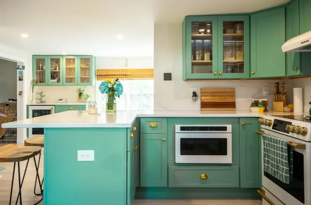
Some people dip a toe. This homeSome people dip a toe. This homeowner cannonballed straight in.
This Westport, CT renovation wraps every single cabinet (base, island, and uppers) in a warm medium green that sits somewhere between teal and sage. And honestly, the full commitment is exactly what makes it work so well.
Brass cup pulls and knobs tie everything together, while white quartz countertops give your eyes a place to breathe. Blue hydrangeas on the island look almost suspiciously well-coordinated, like a stylist placed them there. (They probably did.)
Why It Doesn’t Feel Like Too Much
The secret is contrast, and this kitchen uses it perfectly:
- White appliances and a pale floor pull things back from the edge
- Light wood barstools and bamboo Roman shades add warmth
- Glass-fronted upper cabinets break up the solid green and let the wall peek through
If you’re going full-saturation green, remember this rule: anchor everything with white countertops, weave in natural wood tones, and use brass hardware. Brass warms green in a way that chrome and nickel simply can’t match.
2. Olive Green Cabinets with Black Countertops: Quietly Confident
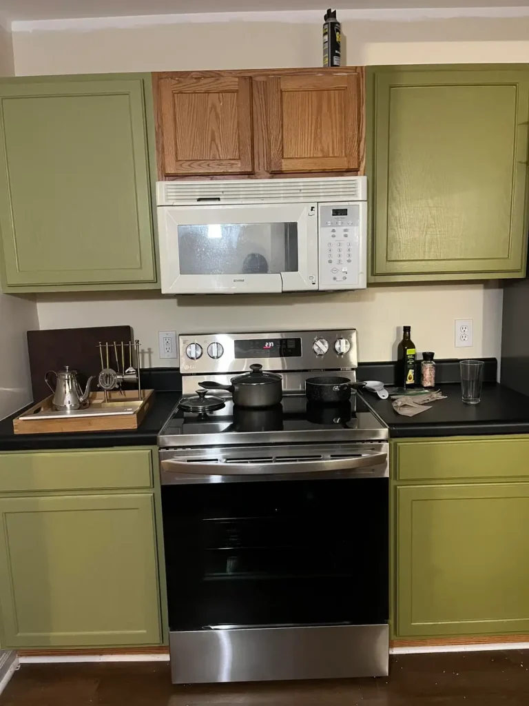
This one honestly surprised me. The green leans more army/olive than classic sage, and paired with matte black laminate countertops, the whole vibe shifts from “cute little cottage” to “I absolutely know what I’m doing in here.”
These raised-panel cabinets got painted a yellow-leaning sage green with stainless range, white microwave, and dark hardwood floors keeping everything else grounded. One upper cabinet above the microwave stayed in its original wood tone. Intentional? Accident? Either way, it weirdly works.
Why the Black Countertops Are the Real MVP
Those dark countertops eliminate any sweetness and push the palette toward modern and grounded. A wooden tray with a silver kettle adds warmth without competing with the overall mood.
Hot take for anyone with builder-grade raised-panel cabinets: don’t replace them. The right shade of green paint plus matte black countertops can completely transform their whole personality. Just commit fully to the dark countertops. A light surface with this green tends to flatten everything out fast.
Also Read: How to Build a Rustic Farmhouse Kitchen – 12 Ideas That Feels Authentic, Not Themed
3. Charcoal Sage Cabinets on a Budget: Paint Is the Whole Personality
This might actually be my favorite kitchen in the entire list, and it probably cost less than a nice dinner out.
The cabinets here went deep charcoal-sage (closer to gray than green), with existing granite-look countertops and a white fridge staying put. A patterned black-and-white runner rug plus a genius shelf display of wine bottles with small dried florals tucked in between adds serious personality without a single power tool needed.
Why “Imperfect” Actually Works Here
The countertops hold a toaster oven, a knife block, and a teal Keurig. This is not a minimalist kitchen. It’s a real kitchen, and that’s a huge part of its charm. Not every space needs to look like a magazine editorial, FYI.
Bottom line: if your budget is tight and your cabinets are dated, skip the renovation. A quart of dark green-gray paint, a statement rug, and some thoughtful countertop styling can carry an entire room. Seriously.
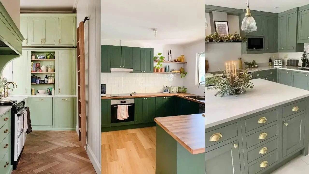
4. Deep Forest Green with Shiplap Hood and Brass Accents: This Kitchen Means Business
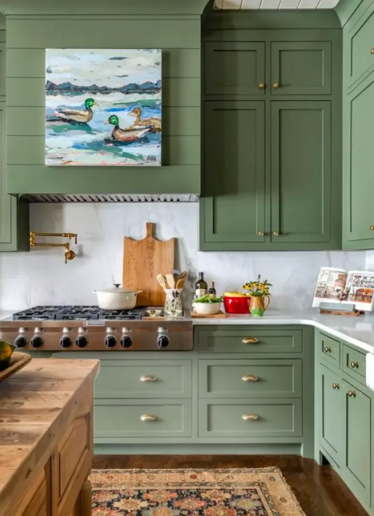
This is the one that makes people rethink their entire renovation plan. I’ve genuinely watched it happen.
The design goes floor-to-ceiling with a deep, muted green somewhere between hunter and sage, and builds a custom shiplap range hood in the exact same color. A loose impressionist painting of mallard ducks hangs directly on the hood surround, which is the kind of unexpected move that separates “nice kitchen” from “I cannot stop thinking about this kitchen.”
The Details That Seal the Deal
- Brass pot filler and cup pulls for warmth
- Professional six-burner range for serious culinary credibility
- Vintage Persian rug on hardwood floors for softness
- Wood-topped island for natural contrast
- White marble slab backsplash behind the range for lightness
Fair warning though: this depth of green needs good natural light and generous ceiling height. In a small, dark kitchen it can start feeling cave-like pretty fast. But if you’ve got the space? Floor-to-ceiling saturated green is one of the most dramatic moves in kitchen design. Full stop.
5. Sage Green Victorian Kitchen with a Red Chandelier (Yes, Really)
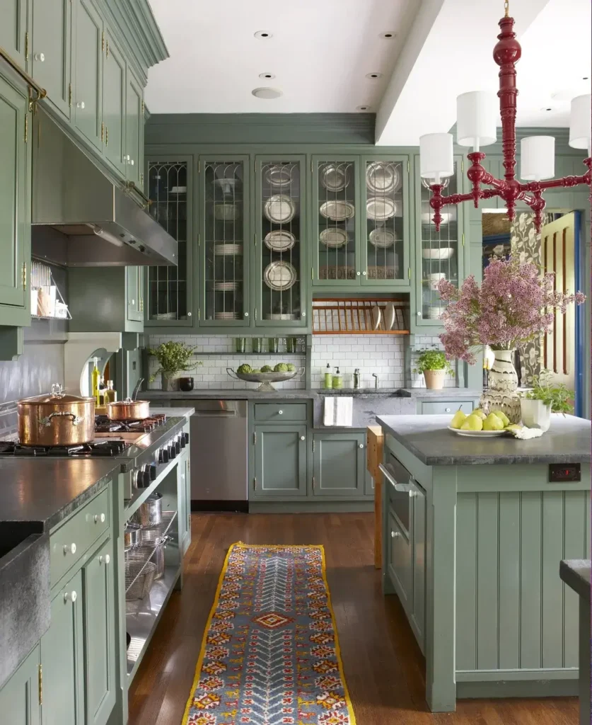
This kitchen broke every rule I thought I had. And it works spectacularly. I’m still a little shocked.
Everything got coated in a muted, slightly gray sage green: island, lower cabinets, tall uppers with arched leaded glass doors displaying stacked china. Then a crimson red chandelier with white drum shades went overhead.
Should it clash? Absolutely. Does it? Not even a little. 😄
The Lesson: Trust Sage Green with Bold Contrast
A colorful kilim runner in orange, red, blue, and yellow echoes the chandelier perfectly. Copper pots on the range add warmth. Pink lilac branches on the island bring unexpected softness.
What this kitchen proves is simple: sage green doesn’t need to be surrounded by other “safe” colors. It’s way more versatile than its neutral reputation suggests. A bold accent like that red chandelier actually gives the green permission to be more interesting. Stop playing it safe in there.
Also Read: The Ultimate Backyard Upgrade: 10 Real-Life Outdoor Kitchen Designs to Steal
6. Light Sage Green Victorian with Herringbone Floors and a Built-In Pantry
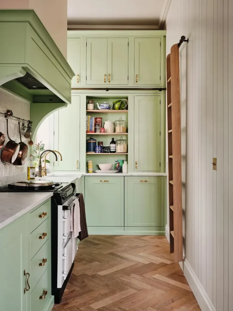
The palest sage green in this collection lives in what looks like a renovated Victorian kitchen in the UK. The green is so light it almost reads as warm white until you get close and the color becomes undeniable, especially against the herringbone oak floor and cream walls.
This one features a built-in pantry with open center shelving, floor-to-ceiling storage panels, and sliding upper cabinet doors with polished brass hardware. An Aga range in black sits to the left, copper pans hang from a rack near an arched alcove, and a wooden library ladder leans against the right wall.
Why Herringbone Floors and Pale Green Are Pure Magic
Warm wood tones in a herringbone pattern pull pale green toward golden rather than cool. If you have flooring flexibility during a renovation, a herringbone or chevron pattern in mid-tone oak is absolutely worth considering with this color palette.
The library ladder is mostly decorative at this height, honestly. But it makes the pantry wall feel intentionally designed rather than just built. That distinction matters more than you’d think.
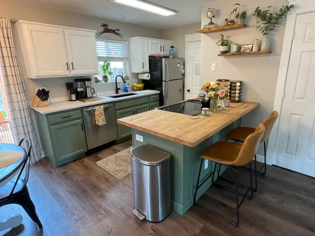
7. Sage Green Island Against White Cabinets: The “Just the Tip” Approach
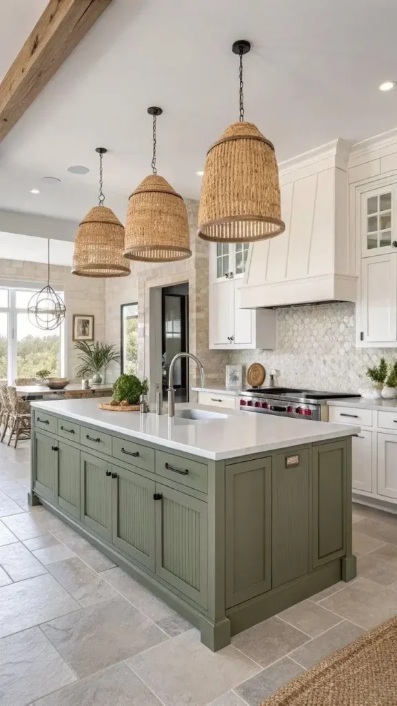
Not ready to go full green everywhere? Totally fair. This kitchen makes the strongest possible case for a partial commitment.
White perimeter cabinets stayed on the walls while a large beadboard sage green island anchored the center. Rattan pendant lights hang overhead, exposed wood beams cross the ceiling, and stone tile covers the walls around the range. It all comes together really naturally.
What Makes This Two-Tone Kitchen Actually Work
- Matte black hardware on both cabinet colors creates continuity and stops the island from looking like it wandered in from a completely different kitchen
- Rattan pendants add warmth, texture, and a relaxed coastal farmhouse energy
- Three pendants at a consistent drop height was the right call (varying heights would’ve cluttered the whole thing)
This is hands-down the lowest-risk entry point into sage green. Love it? Extend the color to the perimeter later. Over it? Repainting just the island is a weekend project. Easy.
8. Two-Tone Sage Green Lowers with White Uppers and a Butcher Block Island
I find this kitchen more appealing than half the polished renovations in this list, and I think it’s because it genuinely feels lived in. No staging, no fuss.
Sage green lower cabinets pair with white uppers and a butcher block peninsula with two cognac leather counter stools. Potted plants crowd the window ledge. Mixed flowers sit on the peninsula. A spice rack lives on the counter. Floating walnut shelves hold plants and small objects. It’s cozy and real.
The Hardware Decision That Ties the Whole Room Together
Matte black pulls on both the sage green lowers and white uppers create a cohesive thread through the entire kitchen. Mixing hardware finishes between uppers and lowers is a common mistake that visually fragments a space. One finish used consistently avoids that problem entirely.
The butcher block peninsula is the warmest material in the room. In a kitchen with cool-leaning sage green and white cabinets, warm butcher block is what makes the difference between “comfortable” and “weirdly clinical.” It does a lot of heavy lifting.
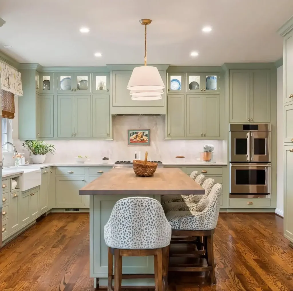
9. Olive Sage with a Dramatic Black Island: Contrast As the Whole Design
TThis kitchen is darker and moodier than most sage green spaces, and that’s completely intentional.
Muted olive/khaki-green wall cabinets pair with an oversized near-black island topped in dark stone. The island doubles as a dining table, set with plates, glasses, and a large potted rosemary plant running down the center. It looks like a kitchen that actually gets used, which is refreshing.
How to Keep a Dark Palette from Feeling Heavy
- White conical pendant lights provide brightness from above
- Linen Roman shades soften the large windows
- Dense green foliage outside keeps the view feeling alive
- Industrial bar stools with warm wooden seats bridge the light and dark elements
Here’s the counterintuitive part: a black island under olive-green cabinets actually makes the kitchen feel more spacious. The contrast creates visual separation between the working island and the perimeter. More contrast, more perceived space. Weird but true, and it consistently works.
Also Read: 15 Sage Green Kitchen Ideas That’ll Make You Grab a Paintbrush
10. Sage Green Shaker Cabinets with Butcher Block and Glass Pendants: Modern Farmhouse, Nailed
If I had to hand someone one single kitchen photo and say “build this,” it would honestly be this one. It’s that good.
Every wall got covered in sage green shaker cabinets, a farmhouse sink sits under triple windows, and a matching sage green island topped in butcher block anchors the center. Glass lantern pendants in black metal hang overhead, and woven rattan bar stools in black metal frames echo the pendant hardware throughout.
The Three-Material Formula That Always Works
Sage green provides color and character. Black metal adds structure and edge. Warm butcher block adds the warmth that keeps everything from feeling too staged.
White subway tile runs along the backsplash, and a matte black range hood with wood trim accents the cooking wall. Every element in this kitchen knows its job. If you’re building a modern farmhouse kitchen from scratch, this is basically a complete template you can follow.
11. Sandy Upper Cabinets with Sage Green Lowers: The Underrated Combo
This color pairing deserves way more attention than it currently gets. It’s genuinely underrated.
The uppers went a warm sandy tan while the lowers got a muted sage green. White countertops and consistent matte black hardware tie everything together. Two floating sage green shelves in the corner create a thoughtful display zone that pulls it all together nicely.
Why Sandy Tan Beats White on Top
Most two-tone kitchens pair green lowers with white uppers. Clean? Yes. Predictable? Also yes. The warm tan alternative softens the contrast and creates a palette that reads more autumnal and grounded. It works especially well with warm-toned wood floors and copper or bronze fixtures.
Pro tip on proportions: the bolder color belongs on the lower cabinets for a reason. Lower cabinets carry more visual weight, and a strong color anchors the room when placed below the countertop line. Flip it bold on top and the whole kitchen feels top-heavy. Trust me on this one.
12. Sage Green Cabinets with Gold Hardware: The Budget Glow-Up
This kitchen was clearly transformed without a massive budget, and the results are genuinely impressive, not just “impressive for a budget renovation.” Actually impressive.
Existing raised-panel cabinets got painted sage green, brass bar pulls and cup handles went on, and the dark laminate countertops stayed. A marble-look vinyl floor and a vintage Persian-style runner rug do almost as much heavy lifting as the paint itself. Smart choices everywhere.
Why Gold Hardware Changes Everything Here
Gold/brass hardware against sage green works at every single budget level. Inexpensive brass-tone bar pulls from your local hardware store look nearly identical to premium options once they’re mounted. The warm metal pushes the green away from military/olive and toward something more refined and intentional.
One thing worth calling out: no window treatment. Natural light pours through the gridded window and makes the green look its absolute best. IMO, covering a kitchen window with heavy curtains is almost always a mistake unless you genuinely need the privacy.
13. Sage Green with White Marble Island and Gold Cup Pulls: Peak Cohesion
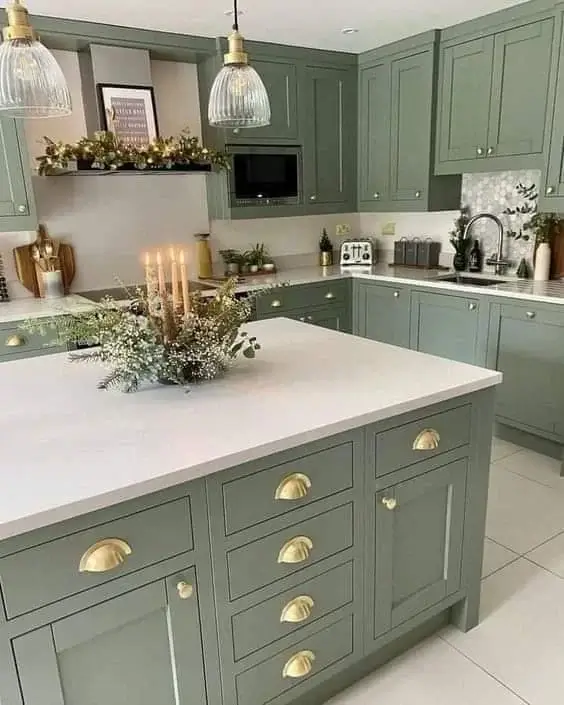
This is the most composed kitchen in the entire collection. Every single cabinet is the same medium sage green. Same gold cup pull hardware throughout. White marble (or quartz) island countertop. Matching glass pendants overhead. No rogue elements trying to steal attention anywhere.
The island got styled with candles, eucalyptus, and baby’s breath in a naturalistic arrangement that leans directly into the kitchen’s green-and-gold palette. A hexagonal mosaic backsplash tile adds texture without competing with anything else in the room.
Why Cup Pulls Specifically Work So Well Here
Cup pulls carry a vintage quality that makes sage green feel purposeful rather than trendy. Using them on every single drawer and door (rather than mixing hardware styles) creates an incredibly cohesive rhythm throughout the entire space.
This kitchen would look equally at home in a Victorian property or a modern new build. If you’re unsure about committing to a specific style, sage green with consistent gold hardware is genuinely one of the safest long-term bets you can make. Future you will thank present you.
14. Pale Sage Green with Animal Print Stools: Unexpected and Brilliant
The most refined kitchen in this list is also the most surprising. And I’m honestly a little obsessed with it.
Every cabinet got covered in a pale sage green (barely distinguishable from celadon), glass-fronted uppers display colorful ceramics, and the wood-top island is surrounded by upholstered bar stools in animal print fabric. A small painting of a dog hangs directly on the marble slab backsplash behind the range. Wild. Wonderful.
Why the Animal Print Stools Are the Best Decision in This Entire Article
I’m not even exaggerating. They introduce pattern and a slightly irreverent quality that prevents the pale green and brass palette from becoming too precious. It reads as confident, not try-hard, mostly because everything else in the room is so carefully considered.
Double stainless wall ovens, a farmhouse sink, and brass hardware keep things practical even as the overall effect leans toward English country house energy. That balance between beautiful and functional is the hardest thing to pull off in kitchen design. This kitchen nails it completely.
15. Forest Green Shaker Cabinets with Butcher Block: Bold and Uncomplicated
The deepest green in the entire collection. We’re talking full bottle green covering every shaker cabinet on every wall. Butcher block countertops run across the perimeter and peninsula. White square tile keeps the contrast crisp and clean.
Open floating shelves got styled with trailing pothos, terracotta pots, amber glass bottles, and a few books. The styling is casual, organic, and fits the cabinet color perfectly. Light oak floors throughout make the deep green feel grounded rather than dark and heavy.
Deep Green Needs Warm Materials, No Exceptions
White countertops under this shade of green can easily read as clinical. Butcher block avoids that entirely. The amber and terracotta tones in the shelf styling echo the wood countertops and create a repeating warm note that keeps the whole space feeling inviting rather than intense.
White knob hardware throughout lets the green do all the work. If it were my kitchen, I’d experiment with brushed brass knobs for extra warmth, but the white reads clean and fresh and is probably easier to live with long-term.
How to Choose the Right Shade of Green for Your Kitchen
After fifteen kitchens, one thing is very clear: “sage green” covers a massive range of colors. Here’s a quick breakdown so you’re not standing in the paint aisle for three hours:
| Green Tone | Best Paired With | Mood | Risk Level |
|---|---|---|---|
| Pale/Celadon sage | Warm wood floors, brass hardware | Refined, airy | Low |
| Medium sage | White countertops, black or brass hardware | Versatile, classic | Medium |
| Olive/khaki sage | Black countertops, dark floors | Moody, grounded | Medium |
| Deep forest green | Butcher block, warm woods | Bold, dramatic | High |
| Teal-leaning green | White countertops, brass, light floors | Playful, saturated | High |
The single most important variable is natural light. Pale sage reads beautifully in any light. Deep forest green needs good light to stay inviting rather than oppressive. North-facing kitchen with limited windows? Stay in the medium-to-pale range and compensate with warm hardware and solid under-cabinet lighting.
Before You Grab That Paintbrush: A Few Things to Know
Hardware Choice Matters More Than You Think
Seriously, don’t overlook this. The wrong hardware finish can make beautiful green cabinets look like an accident instead of a decision.
- Brass/gold: warms the green and pushes toward traditional or transitional
- Matte black: pulls the whole look toward modern farmhouse
- Chrome/nickel: cools it down and suits contemporary kitchens
Paint Sheen Makes or Breaks Durability
Go with satin or semi-gloss for cabinetry. It’s cleanable, it handles moisture, and it holds up to daily life. Flat paint on cabinets looks gorgeous for about six months before normal living absolutely destroys it.
If you’re painting cabinets yourself, use cabinet-specific paint or add a topcoat. And do not skip primer. I repeat: do not skip primer. You will regret it.
Always Test Your Color First
Paint a large sample directly on the cabinet door and watch it at different times of day. A color that looks perfect at noon can shift dramatically in evening light or on an overcast afternoon. There is genuinely no substitute for seeing how a color behaves in your actual specific space before committing.
The Bottom Line
Sage green isn’t just a trend. It’s genuinely one of the most forgiving and versatile kitchen colors available right now. It plays beautifully with brass, black, white, butcher block, marble, and apparently even a random red chandelier (see kitchen #5).
It works on a $50 paint budget and a $50,000 full renovation budget. It looks good in cottages, Victorians, modern farmhouses, and basically everything in between. Get the shade right, nail the hardware, and sage green does most of the heavy lifting for you.
So here’s what I’d suggest: go pick up a sample pot, test it on a cabinet door, and see what happens. Worst case, you’re out $8 and one afternoon. Best case, you end up with a kitchen that people can’t stop complimenting every time they walk in.
Sounds like a pretty good deal to me. 🎨
