Let’s be honest. Most kitchen walls are just… there. Blank, awkward, and silently judging you every time you walk in. You know something should go there. You just have no idea what. Sound familiar?
I’ve been down that rabbit hole, and I can tell you the answer isn’t always “throw some floating shelves up and call it a day.” Sometimes it’s bold tile. Sometimes it’s a gallery wall that looks unhinged but somehow works. And sometimes it’s just paint, done right.
So I pulled together nine real kitchen wall ideas from actual homes, not staged showrooms, not Pinterest fantasies, and broke down exactly why each one works. At least one of these will click for you. Possibly two. You’re welcome in advance.
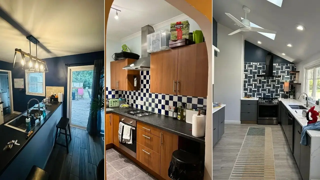
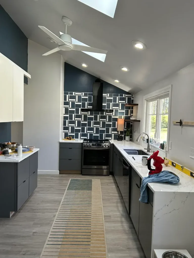
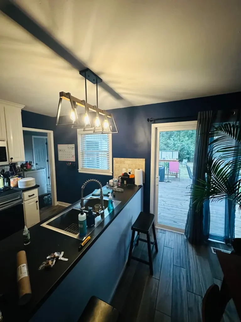
A Bold Navy Backsplash That Does All the Work
Some kitchens get their personality from one single, confident decision. This is exactly that kind of kitchen.
One homeowner installed a geometric navy-and-white tile backsplash that runs floor to near-ceiling around the range wall, and it completely transforms the space. We’re not talking standard subway tile or basic herringbone. The tiles are rectangular, set in an almost abstract, graphic pattern that leans mid-century modern without screaming it.
Against deep navy upper walls and slate-grey flat-front cabinets, the whole thing feels bold but not chaotic.
Here’s what separates this from a “meh” backsplash:
- The tile doesn’t stop at counter height. It keeps going up, flanking the range hood and reaching toward the ceiling.
- That choice makes the backsplash feel architectural, not just decorative.
- White quartz countertops add contrast so the room doesn’t go too dark.
- A warm-toned runner on the floor softens all the hard edges.
IMO, this is the detail most people miss. A backsplash that stops halfway up the wall looks timid. One that keeps going looks intentional.
Pro tip: Deep navy walls need good lighting. This kitchen has recessed lights AND a skylight. Without that, you’d basically be cooking in a submarine.
The Maximalist Gallery Wall That Has Zero Interest in Playing It Safe
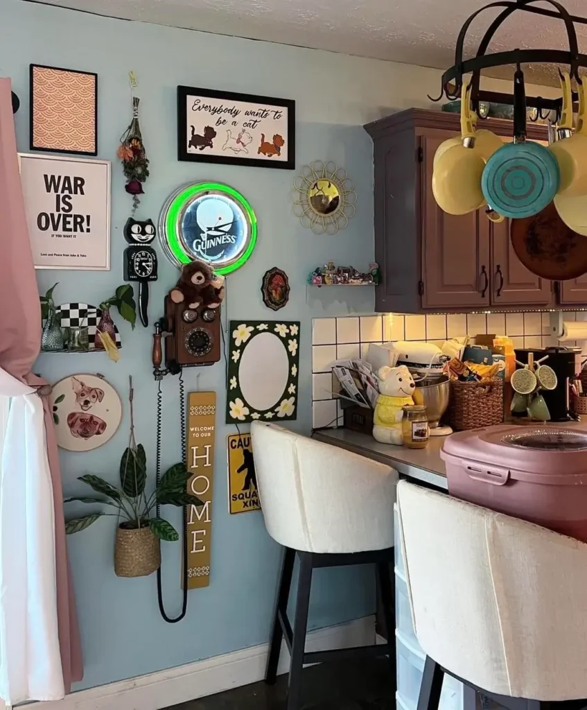
There’s a version of this that goes wrong cluttered, random, exhausting to look at. This isn’t that version.
Every maximalist gallery wall has the potential to go horribly wrong. Cluttered, random, exhausting to look at. This one doesn’t.
One homeowner covered nearly every square inch of a soft blue-grey kitchen wall with an eclectic mix of objects. We’re talking:
- A framed “Everybody Wants to Be a Cat” print
- A glowing green Guinness neon clock
- A vintage rotary wall phone
- A Kit-Cat clock
- Dried botanicals, a portrait embroidery, a Lennon print, a hanging woven plant basket
On paper, chaotic. In practice, oddly cohesive.
The reason it works? The blue-grey wall color ties everything together. It’s a neutral backdrop that lets wildly different objects coexist without fighting each other. And all the objects share a vibe, slightly nostalgic, personal, a little playful. Nothing in here is trying to be fancy.
The Guinness neon clock is the anchor. Every gallery wall needs one piece that the eye keeps returning to. This is it. Its circular green glow sits near center and stops everything from visually sliding off the wall.
Honestly, the secret here is to stop over-editing. Put up what you actually love, step back, and figure out where the gaps are. Matching prints from the same Etsy shop will never give you this kind of energy. It has to be personal.
Open Shelving with Quiet Confidence
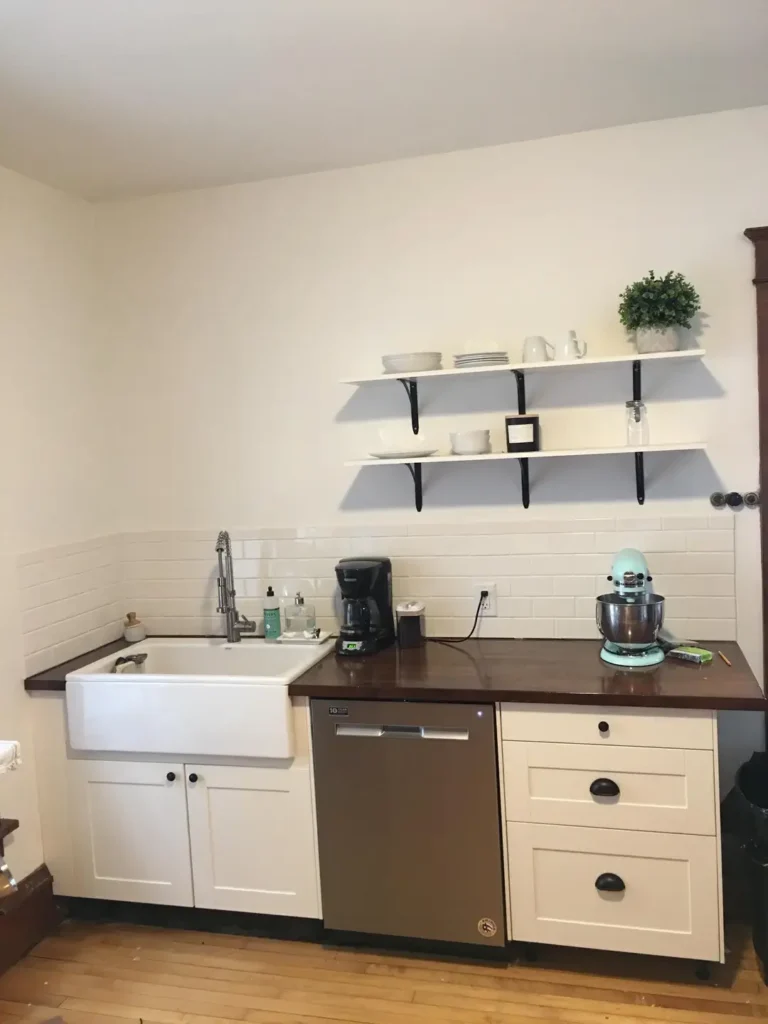
Not every wall needs to yell at you. Sometimes restraint is the move.
This kitchen keeps it refreshingly simple: two white-painted wood shelves with black iron brackets mounted above a farmhouse sink. That’s the whole concept.
What’s on them?
- A few stacked white ceramic bowls and plates
- A small framed photo and a mason jar
- One faux greenery plant in a white ceramic pot
That’s it. And it looks genuinely calm.
The dark walnut countertops add warmth against all that white. A classic white subway tile backsplash stays quiet so it doesn’t compete with the shelves. And a mint-green stand mixer on the counter? One deliberate pop of color. Chef’s kiss.
Open shelving gets a bad reputation because people load it up with junk and then wonder why it looks messy. The fix isn’t to avoid open shelving. The fix is to only display things worth displaying:
- Functional items you use regularly (they stay clean naturally)
- Decorative pieces you’re actually willing to dust occasionally
- A limited palette: whites, natural tones, one accent color max
Stick to that formula and your shelves look like a design choice, not a storage overflow situation.cent color prevents the shelves from reading as storage rather than display.
Also Read: How to Build a Rustic Farmhouse Kitchen – 12 Ideas That Feels Authentic, Not Themed
Deep Navy Walls as the Decor Itself
Here’s an underrated move: the wall IS the decor. Everything else is just supporting cast.
One homeowner painted their kitchen and adjacent dining area in a deep, saturated navy, almost midnight blue in low light. The result? Everything else in the room suddenly looks sharper and more intentional.
- White upper cabinets look crisper against that dark background
- A brushed-gold industrial pendant with Edison bulbs stands out in a way it never would against off-white walls
- Even the indoor palm in the corner looks more considered
The pendant light is worth a mention. Three exposed Edison-style bulbs hanging low over the island against that dark navy wall? The warm amber glow creates an atmosphere that feels more restaurant than residential kitchen. In the best way.
This approach works especially well in open-plan layouts. The color creates visual continuity without requiring extra decorative elements. You’re not filling the wall. You’re using the wall itself as the statement.
One thing to know before you commit: dark colors like this need two to three coats of quality paint and some real thought about your lighting. Natural daylight and warm evening light will read very differently on a dark wall. Plan for both.
A Single Timber Shelf in a Small Kitchen
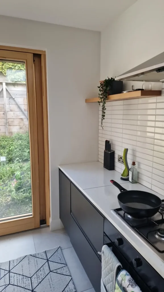
Small kitchen? Limited wall space? This one’s for you.
Instead of cramming in a whole shelf arrangement, one homeowner went with a single floating shelf in solid, warm honey-toned oak mounted at eye level beside a garden-facing window.
On it: a trailing pothos allowed to spill down the wall, plus a few minimal items. That’s the entire wall treatment.
Here’s why it works so well:
- The timber itself carries the visual interest. It’s not a white pine shelf from a big-box store. It has visible grain, warmth, and actual weight.
- Against crisp white walls and subway tile, it reads as a considered material choice.
- The cascading plant adds organic movement that a plain white wall can never achieve.
The bare wall on either side of the shelf becomes part of the composition. It doesn’t read as empty. It reads as intentional breathing room.
For small kitchens, this is genuinely the better approach. One well-chosen shelf with two or three quality items beats a crowded arrangement of cheaper pieces every single time.
Also Read: The Ultimate Backyard Upgrade: 10 Real-Life Outdoor Kitchen Designs to Steal
A High-Gloss Glass Backsplash in an All-White Kitchen
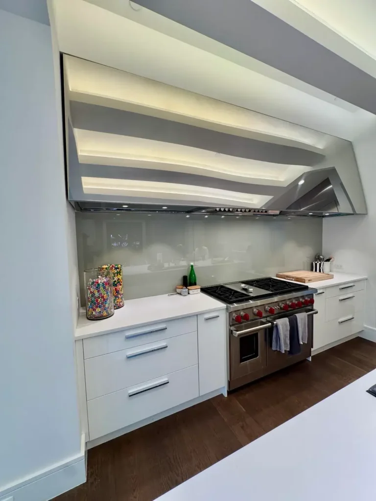
I’ll be upfront: all-white kitchens usually leave me cold. They feel clinical. Like you’re cooking in a hospital cafeteria but with better lighting.
This kitchen changed my mind.
One homeowner installed a full-panel light grey glass backsplash behind a professional-grade six-burner range. Single seamless panel. Subtle warm grey tone. Mirror-like reflective quality without the funhouse-mirror distortion.
Above it, a custom sculptural stainless steel hood extends almost to the ceiling, flanked by recessed cove lighting that wraps the upper perimeter.
The combination of reflective glass, illuminated cove, and industrial range creates a focal wall with real architectural presence. No art. No shelves. No plants. And it doesn’t need them.
This approach only lands if your appliances and materials are strong enough to carry the visual interest themselves. If your range is a standard builder-grade model, this won’t have the same impact. But if you’re planning a kitchen around a statement range, swap the tiled backsplash for a glass panel. It’s easier to clean and dramatically more cohesive.
Bold Checker Tile That Earns Its Boldness
Some people want a subtle kitchen. And then there are people who want a kitchen that makes a statement the second you walk in. This one is firmly in the second camp.
A cobalt blue and white checkerboard tile backsplash runs the full wall behind the range. But here’s the key detail: the tiles are large-format, roughly four-inch squares. That scale gives the pattern impact instead of the visual noise that smaller checkers create.
The kitchen is viewed through a warm amber-orange painted archway, which creates an almost theatrical framing effect. Cobalt tiles through an orange arch? That’s a complementary color contrast that makes both shades more vibrant than they’d be on their own.
The rest of the kitchen stays grounded:
- Warm medium-toned wood veneer cabinets
- Dark slate countertops
- Stainless steel appliances
Against all of that, the bold tile becomes the organizing principle of the room, not a distraction.
FYI, this isn’t a large kitchen either. It’s a compact galley-style space. And the strong pattern makes it feel bigger and more alive than a safer design choice would. Bold patterns in small spaces create energy. Safe choices in small spaces just create boring.
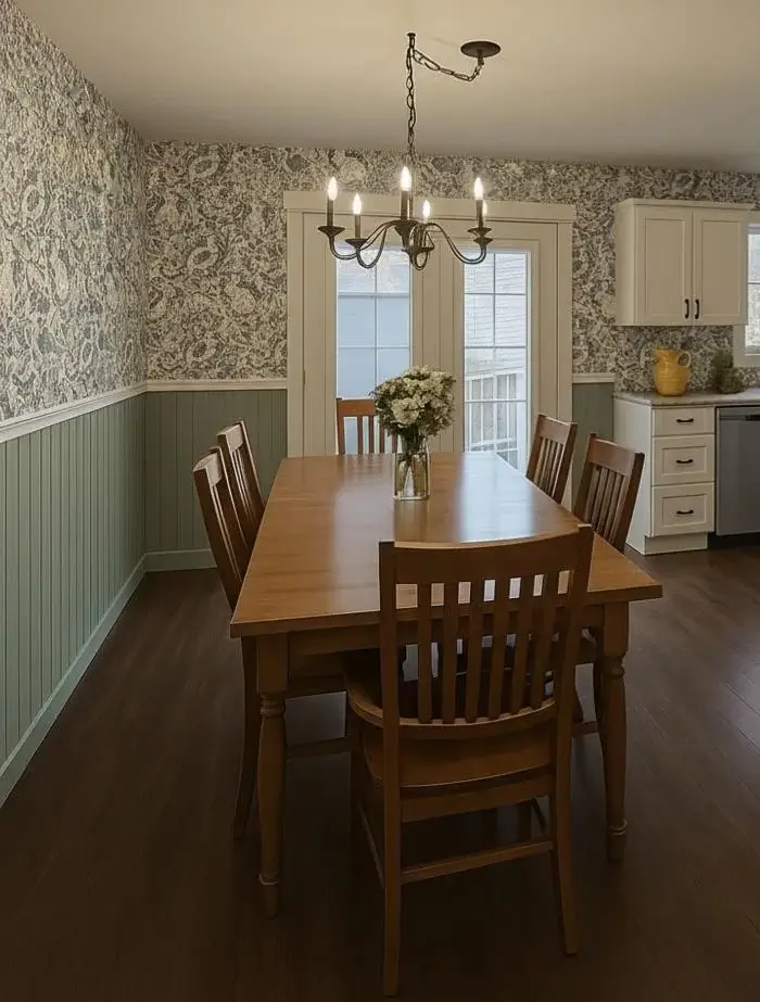
Botanical Wallpaper with Board-and-Batten Wainscoting
This combination has been around forever. It keeps showing up in well-designed kitchens because it genuinely works every time.
One homeowner wallpapered the upper portion of a kitchen-dining area in a dense, tonal grey-green botanical print. From a distance it reads as textured. Up close it reveals individual leaves and florals. Below the chair rail, sage green painted board-and-batten wainscoting grounds the whole composition.
The furniture reinforces the approach perfectly:
- A honey-toned solid wood dining table
- Mission-style chairs
- A wrought iron candelabra-style pendant
- Dark hardwood floors
- One small glass vase of white flowers (the only accessory the room needs)
What makes this work specifically in a kitchen-adjacent space is the color temperature. The botanical print isn’t warm or cool. It sits in that grey-green middle ground that looks sophisticated in almost any light.
And here’s the practical bonus: board-and-batten protects the lower wall from chair backs and everyday wear. It’s not just decorative. It’s actually functional, which is exactly what kitchen walls need to be.
Also Read: 15 Sage Green Kitchen Ideas That’ll Make You Grab a Paintbrush
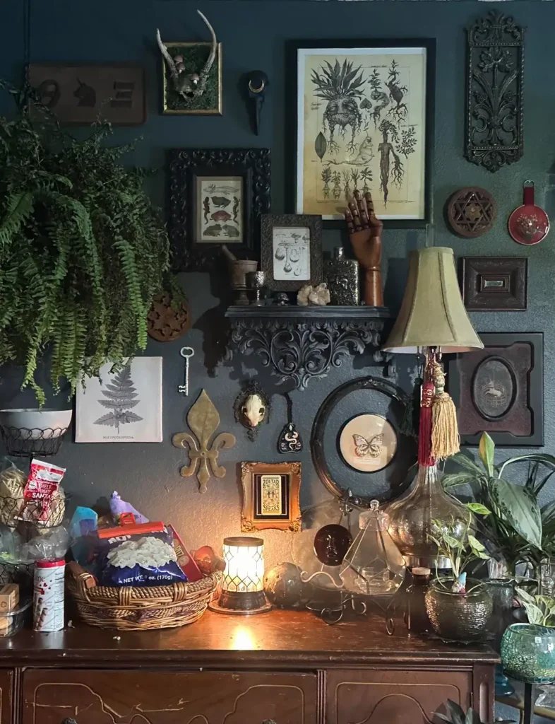
Dark Academia Gallery Wall with Botanical Prints and Curios
Occasionally someone’s personal aesthetic is so fully realized that it stops looking like home decor and starts looking like a movie set. This is one of those walls.
On a deep teal background, this kitchen gallery wall brings together:
- Botanical illustrations in antique-style carved frames
- A taxidermy deer skull in a shadow box
- A brass fleur-de-lis wall ornament
- An articulated wooden hand sculpture
- A large carved shelf laden with crystals and small objects
- A crescent moon hook
- Oversized trailing ferns
- A vintage-style table lamp with warm amber shade
- A large circular frame with a butterfly specimen print as the centerpiece
This is maximalism with academic backbone. Every object belongs to a category: botanical, natural history, occult-adjacent, antique. Those categories overlap and reinforce each other. The deep teal wall gives each object its own visual weight without the background competing.
The ferns are doing remarkable work here. They trail down from ceiling height on the far left, adding organic texture and layered depth that framed pieces alone can’t create. If you’re building a dark moody gallery wall, add a living plant on purpose. Not as an afterthought.
One honest caveat: you can’t buy this kind of wall. You build it slowly by collecting things that actually mean something to you. Inherited objects, thrift store finds, prints that stop you mid-scroll. The coherence comes from a consistent sensibility, not a coordinated shopping cart.
Quick Reference: Which Approach Is Right for Your Kitchen?
| Approach | Best For | Effort | Budget |
|---|---|---|---|
| Statement backsplash tile | Cooking zones, focal walls | Medium | Medium-High |
| Full wall paint color | Any kitchen size | Easy | Low |
| Open shelving with curated objects | Functional + decorative balance | Easy-Medium | Low-Medium |
| Gallery wall | Personal expression, larger walls | Medium | Low-High |
| Wallpaper + wainscoting | Kitchen-dining areas | Medium-High | Medium |
| Single floating shelf | Small kitchens, minimal style | Easy | Low |
| Glass panel backsplash | Modern or high-end kitchens | High | High |
| Checkerboard tile | Bold personality kitchens | Medium | Medium |
| Dark moody gallery wall | Maximalist, eclectic homes | High | Low-Medium |
The One Thing Every Great Kitchen Wall Has in Common
Looking at all nine of these spaces, the common thread isn’t a specific tile or color or style. It’s commitment.
Half-committed decor looks unfinished. A single print on an otherwise bare wall looks like you gave up. A backsplash that stops at counter height when it should keep going looks timid.
The kitchens that feel most resolved all made a clear decision and followed through on it completely. The specific objects matter less than the confidence behind them.
So pick the approach that fits your kitchen’s scale, your taste, and your realistic willingness to maintain it. Then do that thing completely, without second-guessing yourself halfway through.
That’s genuinely it. The rest is just shopping.
What’s your kitchen wall looking like right now? Are you team bold tile or team “I’ve stared at this blank wall for six months and done nothing”? Either way, now you’ve got options. Go make something happen. 🏡
