Here’s something nobody talks about enough: your living room isn’t struggling because of your furniture. It’s struggling because your walls are basically doing nothing. That big blank space above your sofa? It’s either making the whole room look pulled together or slowly bringing everything down with it.
I’ve gone through ten real living room wall decor ideas, each one showing a completely different approach to solving that exact problem. Some are bold, some are minimal, and a couple might seriously make you rethink what “wall decor” even means. No perfectly staged showrooms here. Just real rooms that actually work, and why they work.
One Large Abstract Canvas That Lets Everything Else Breathe
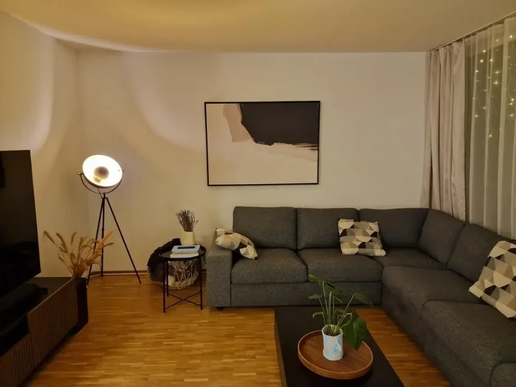
There’s minimalism that looks cold and unfinished, and then there’s this. Picture a large abstract canvas, mostly white with sweeping charcoal and soft taupe tones, hung centered above a dark grey sectional. It hits that sweet spot between “I clearly thought about this” and “I didn’t lose sleep over it.” Honestly? That balance is harder to pull off than it sounds.
The secret is the scale. The canvas is wide enough to hold the wall without bullying everything else in the room. It uses only three tones: near-white, black, and warm beige, which naturally mirrors the sofa, the wood flooring, and the industrial tripod lamp nearby. Nothing is fighting for attention, and the room feels calm because of it.
The stuff around it is just as considered. Dried pampas grass on the TV console adds organic texture. A small plant on the coffee table brings a quiet note of green. Fairy lights peeking through sheer curtains add warmth without the visual chaos.
How to get this look:
- Choose abstract art with a maximum of two to three tones
- Size it so the bottom edge sits roughly 6 to 8 inches above your sofa’s back cushions
- Resist the urge to add more. Seriously, stop there.
That proportion is what makes large canvas art feel grounded instead of like it’s floating in mid-air looking lost.
A Single Floating Shelf Styled Like a Garden
Blank walls don’t always need art. Sometimes they just need life, literally. One floating shelf mounted in the upper corner of a room becomes a layered vignette of trailing plants, dried blooms, small framed photos, a geometric star ornament, and assorted pots in terracotta and blush tones. It’s warm, personal, and genuinely interesting to look at.
The shelf itself is nothing fancy, just a warm walnut-toned plank. But what’s on it is carefully varied in height, texture, and color. The trailing greenery spills over the edge and softens the shelf’s line, connecting it visually to the rest of the room. It’s the kind of thing that looks effortless but clearly wasn’t.
This approach is especially smart for renters. You’re putting one anchor point in the wall, and the styling does all the heavy lifting from there.
To nail this look, start with three types of plants:
- One trailing variety
- One upright plant
- One dried or preserved arrangement for texture
Then add one or two personal items, like a small framed photo or a meaningful object, to keep it from looking like a shop display. The goal is “curated, not decorated.”
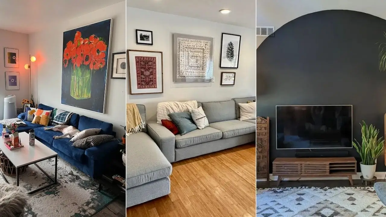
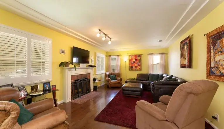
Using Wall Art to Frame a Fireplace Focal Point
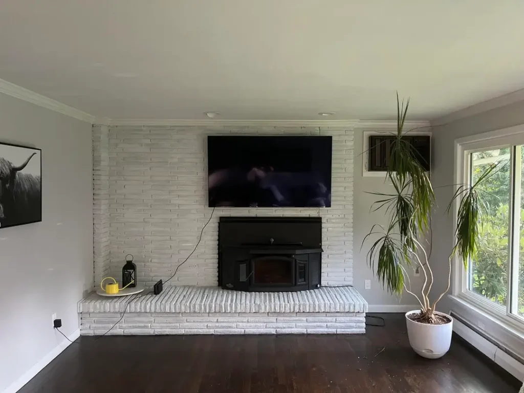
A white-painted brick fireplace wall already does a lot of structural work as the room’s natural focal point. The question is what to do with the space around it. Here, a large black-and-white photograph of a Highland cow is mounted on the side wall, positioned low and to the left of the fireplace. It’s an unexpected choice, and it works precisely because it’s unexpected.
The art doesn’t hang directly above the fireplace. Instead, it anchors the left wall and pulls your eye across the room in a horizontal journey from the cow print, across the white brick surround, to a tall sculptural dracaena standing in the right corner. That visual movement makes a relatively sparse room feel composed instead of empty. IMO, this is one of the most underrated tricks in interior design.
The white-painted brick is textural but neutral. The black-and-white photo with its dark background is bold but monochromatic. They share a tonal language, which is why the whole thing reads as intentional rather than random.
Quick tip: If your fireplace wall feels stuck, try placing a single large-format print on an adjacent wall instead of directly above the mantel. It distributes visual weight more generously and often makes the entire corner feel more deliberate.
Also Read: How to Style Sheer Curtains: 10 Living Room Setups from Real Homes
Oversized Statement Art for High-Ceiling Spaces
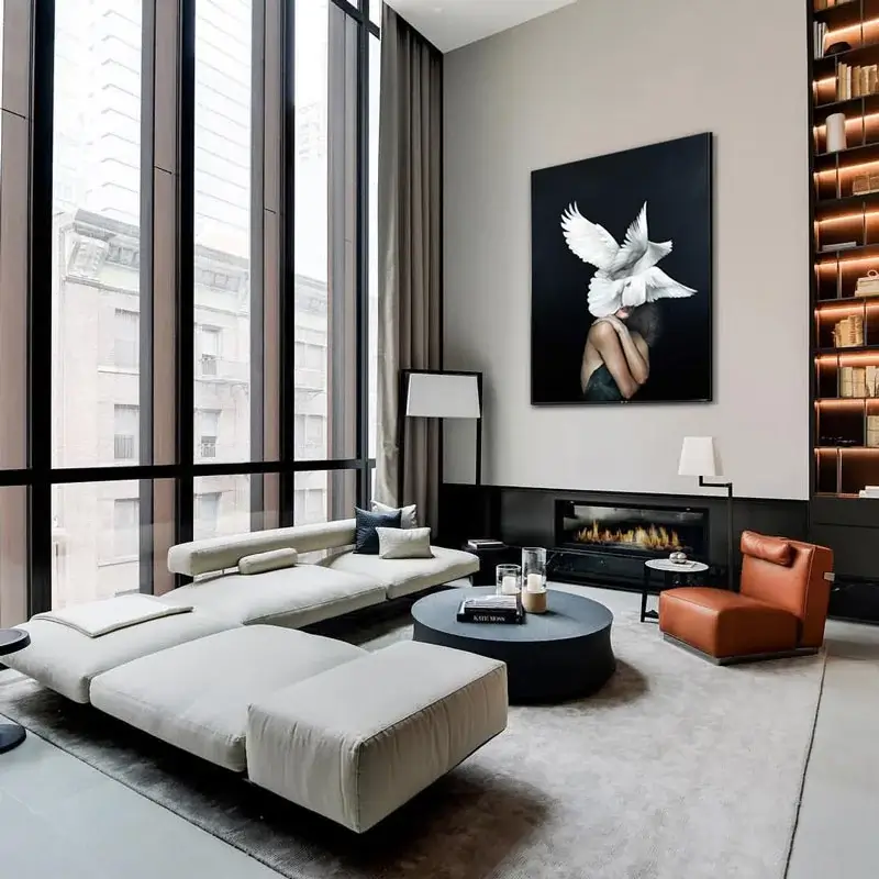
Double-height ceilings are a massive opportunity, and most people completely waste it by hanging art at standard eye level. That leaves a huge expanse of wall above looking like a forgotten afterthought. This room fixes that problem correctly. A massive portrait-format canvas featuring a figure with white doves in stark black and white hangs high on the wall, scaling precisely to fill the vertical space between the fireplace and the ceiling.
Every element in this room operates at the correct scale. The floor-to-ceiling curtains address the tall windows without interruption. The low-slung modular sofa keeps the sightlines open. The oversized painting commands the wall like an architectural element, not just a decoration. It’s confident, and that confidence is the whole point.
The lesson here is simple but important:
Scale your art to your architecture, not to generic hanging guidelines. In a room with ceilings above 10 feet, a canvas that reads as “large” in a standard room might barely register. Go larger than feels comfortable. You can always adjust later, but you genuinely cannot unsee a tiny piece floating in a cavernous room.
A Painted Arch Accent Wall That Replaces Decor Entirely
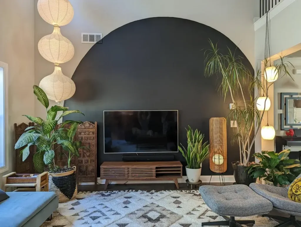
This one costs almost nothing and produces a room you genuinely cannot stop looking at. A semi-circular arch painted directly onto the wall in deep matte black sits centered behind the media console. It frames the television, which is typically the most visually awkward element in any living room, and turns it into something that looks deliberately theatrical. Honestly, it’s kind of genius.
The restraint in what surrounds the arch is what allows it to succeed. Large tropical plants flank the console, softening the hard geometry of the arch with organic shapes. Paper lanterns stack vertically on one side, rattan pendant lights cluster on the other, and a Moroccan-pattern rug grounds the whole composition.
The arch pulls double duty: it provides the wall’s focal point and gives the TV a frame that feels intentional. No more “big black rectangle just mounted to a wall.” Now it’s a cinema backdrop. Big difference.
To DIY this look, you’ll need:
- A weekend afternoon
- A large piece of string to draw the curve
- A sample pot of dark matte paint
The key is scale. The arch should feel oversized, spanning most of the wall’s width. A timid little arch looks like a mistake, so commit to it.
Bold Floral Wallpaper Mural as the Entire Wall Experience
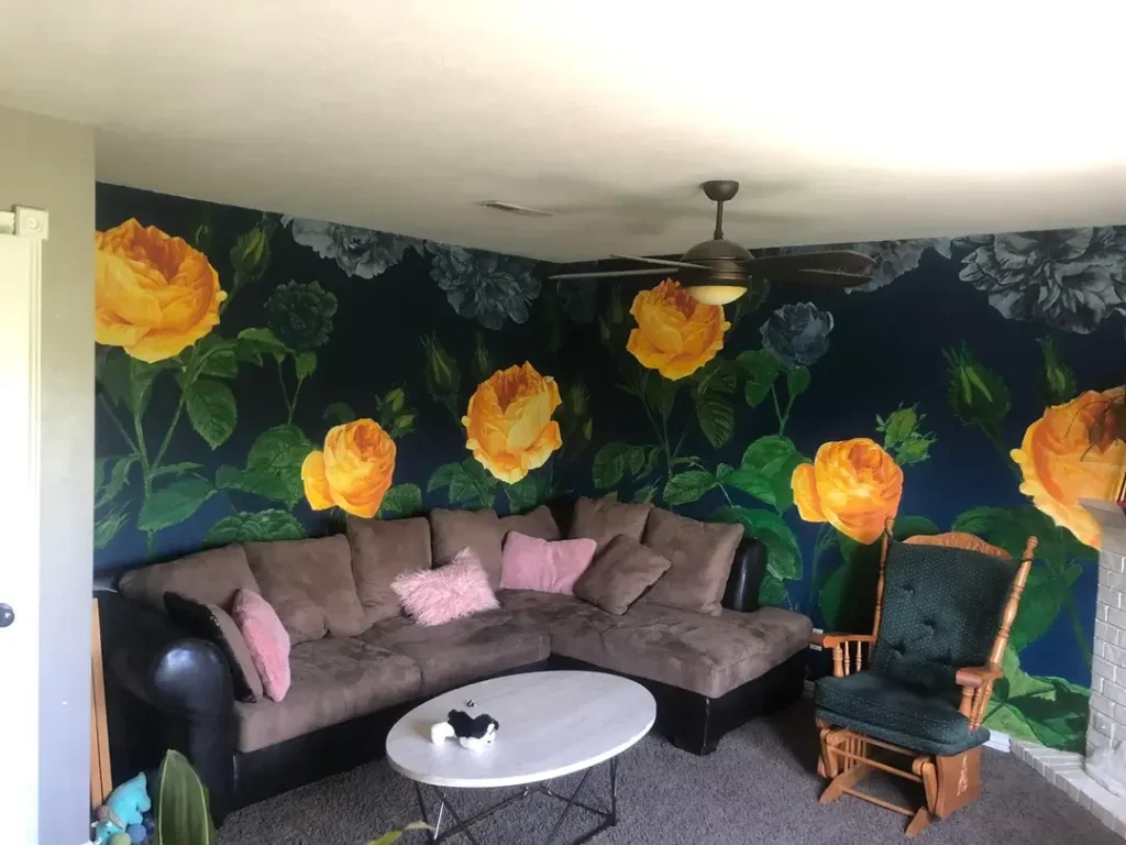
Some wall decor ideas are additions to a room. This one IS the room. An oversized floral mural covers every wall surface, showing giant golden-yellow roses against a deep navy blue background, with grey peonies scattered throughout. The effect is theatrical, lush, and completely committed. There is nothing tentative about this room, and I respect it deeply.
The furniture, including a brown microfiber sectional, a white oval coffee table, and a classic wooden rocking chair, functions as grounding elements rather than focal points. The walls are the art. Full stop.
What stops this from becoming overwhelming is the dark navy background. It gives the room depth and pulls the bold yellow of the roses into dramatic contrast rather than visual chaos. Dark backgrounds in bold wallpaper work the same way a dark gallery wall does: the color pops while the background visually recedes.
FYI, mural wallpaper has gotten really accessible in recent years. Peel-and-stick options exist that require zero professional installation and zero permanent commitment. If you’re nervous about going bold, this is your safest entry point. Just choose a design with a dark background to keep the intensity in check.
Also Read: Stop Choosing Curtains Last: 10 Living Room Ideas from Real Homes
Painted Wall Paneling as Architectural Decor
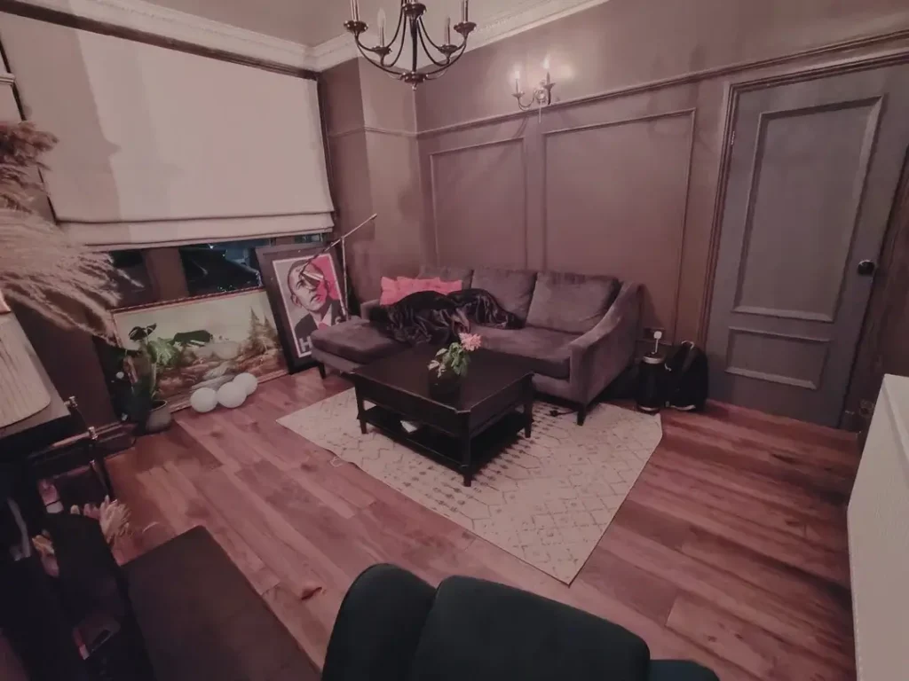
Not every wall decor idea involves hanging something. This room takes a completely different approach: the walls themselves become the decoration. Full-height rectangular panels applied directly to the wall in a grid formation, then painted the same warm taupe-grey as the surrounding walls, create a shadow-and-depth effect that reads as sophisticated architectural detailing. It’s the kind of thing that makes a room feel designed rather than just furnished.
The paneling runs from floor to ceiling. The door integrates into the same paneled system. The overall effect suggests a room that was planned with intention. A candle-style chandelier and ornate picture rail molding at ceiling height reinforce the formal, slightly Victorian atmosphere. It’s a lot, in the best possible way.
The framed art pieces leaning casually against the wall rather than hanging add an interesting contrast to all that architectural formality. It says “I’m still figuring it out,” which is honestly very relatable.
If full-scale paneling sounds too ambitious, start smaller:
Budget: a few hundred dollars and a weekend’s work
Target just the wall your sofa sits against
Use painted MDF panel molding applied directly to existing drywall
Paint it all the same color as the wall for that seamless, built-in look
One Large Painting That Sets the Entire Color Story
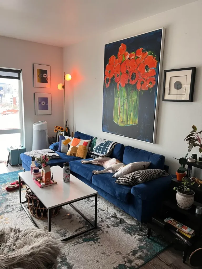
There’s a simple logic to this living room that makes it immediately satisfying. A large canvas painting of vivid red-orange poppies in a green glass vase against a deep navy background dominates the wall above a royal blue velvet sectional. The canvas nearly fills the wall from sofa back to ceiling, and it functions as the room’s entire organizing principle. Everything else in the room answers to it.
The smart move here was letting the painting dictate the room’s color palette rather than the other way around. The navy of the painting’s background echoes in the blue velvet sofa. The warm oranges and reds of the poppies reappear in the throw pillows. The green of the flower stems shows up in small plant accents. This kind of deliberate color mirroring is what separates rooms that feel “put together” from rooms that just feel furnished.
Two smaller prints on the adjacent wall, a purple-toned abstract and a warm yellow piece, play supporting roles without competing with the main piece. They add visual interest to a secondary wall without stealing the spotlight.
The takeaway: If you have one piece of art you truly love, build the room around it. Pull your sofa color, throw pillow tones, and accent objects directly from the painting’s palette. It requires less effort than it sounds and creates remarkable cohesion.
Also Read: 10 Apartment Living Room Ideas from Real People (No “Influencer” Fluff Included)
Fabric Wall Hangings and Tapestries for a Warm, Layered Look
Yellow walls are a commitment, and this room leans into them without a single apology. But the real interest here is how the wall decor works with the bold paint color instead of against it. Two textile wall hangings anchor the side walls: a vibrant patchwork quilt-style tapestry in reds, oranges, and greens on one side, and a smaller framed textile above the fireplace on the other. Both are warm-toned pieces that feel completely at home against the mustard yellow backdrop.
Here’s the important lesson from this room: In a space with strong wall color, your wall decor needs to work with that color, not fight it. Cool-toned art, like a blue or grey abstract, would create visual dissonance against warm yellow walls. Warm textiles and tapestries in complementary earth tones amplify the warmth instead of undermining it.
Textile wall hangings are seriously underused in wall decor. They add softness, texture, and sound absorption that framed prints simply cannot match. They work especially well in rooms with hard flooring, where the space can benefit from surfaces that absorb rather than reflect.
If you have warm-toned or colorful walls and can’t find art that fits, start looking at:
- Tapestries and woven textile art
- Tribal rugs framed under glass
- Vintage fabric panels
- Hand-woven wall hangings
All of these bring warmth and character that canvas prints rarely match.
A Mixed Gallery Wall That Uses Texture and Format Variety
Gallery walls get a bad reputation because most of them look like a collection of things that arrived at different times from different places and never met each other. This one is different. A grouping of five pieces in varying sizes, formats, and materials sits above a light grey sectional in a loose asymmetrical arrangement. The collection includes a framed Persian-style rug print in a warm wood frame, a macramé textile piece in a grey mat, a botanical pine cone print in a black frame, a small landscape photograph, and a small portrait-format piece below the botanical.
The balance works because three things vary simultaneously: frame material, content type, and size. What holds it all together is a consistent use of natural and neutral tones across every piece. No bright colors, no harsh contrasts. Everyone in the group is playing nicely.
| Element | This Gallery Wall | Common Mistake |
|---|---|---|
| Frame styles | Mixed (wood, black, grey mat) | All matching frames |
| Content types | Photography, textile, botanical, pattern | All same-type prints |
| Sizing | Varied from small to large | All same size |
| Color palette | Unified neutrals | Unrelated colors |
| Arrangement | Loose asymmetric cluster | Rigid grid |
The practical approach to pulling this off:
- Lay everything out on the floor first
- Photograph the arrangement you like
- Mark each frame’s position on the wall with painter’s tape
- Then, and only then, put a nail in
This eliminates the “measure, hang, regret, patch, repeat” cycle that turns gallery walls into Swiss cheese.
Bringing It All Together
Here’s what these ten rooms actually prove: there’s no single right answer to living room wall decor, but there are consistent principles working in every room that succeeds. Scale matters more than style. Cohesion matters more than individual pieces. And the rooms that feel most alive are the ones where someone made a real decision and committed to it, instead of playing it safe with small generic prints and predictable arrangements.
The painted arch and the single oversized canvas rooms stuck with me the most, not because they’re the most elaborate, but because they prove how one confident move can do more for a room than ten hesitant ones.
Whatever your budget, your style, or your wall situation, pick one idea from this list and follow it through. A single well-scaled piece of art, a shelf styled with genuine care, or a painted treatment that works with your architecture will always outperform a collection of afterthoughts. Your walls are the largest surface in the room. They deserve a real decision.
So, which one are you trying first? Give it a shot and don’t overthink it. Your future living room will thank you.