A small dining room doesn’t have to feel like an afterthought squeezed between the kitchen and the living room.
The spaces that end up feeling most alive are rarely the biggest ones they’re the ones where someone made deliberate choices about what stays and what goes.
I’ve pulled together ten real examples shared by real people, each tackling the small dining room challenge in a different way.
Some of these surprised me. A couple made me rethink advice I’ve been giving for years. What they all have in common is that they prove square footage isn’t the limiting factor people think it is.
Sage Green Walls with Layered Greenery and Seasonal Accents
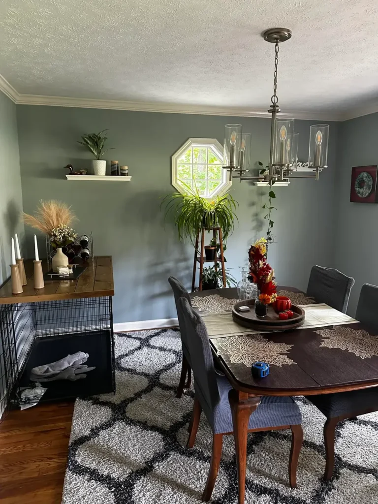
Some paint colors just do more work than others. Sage green is one of them, and this room is a textbook example of why designers keep recommending it for smaller spaces.
r/averysillygooose created a dining room that feels genuinely calm without being boring. The muted blue-green walls likely somewhere in the sage-to-slate family set a tone that works in any season.
Layered on top of that base: a floating shelf with a small plant and a few curated objects, a tiered plant stand near the octagonal window holding a full spider plant, and a dark wood dining table with autumn-toned centerpiece accents.
The warm wood of the sideboard on the left balances the cool wall color beautifully.
What makes this work is how the plants earn their place. They’re not decorative props they’re structural.
The tall plant stand near the window creates vertical interest in a corner that might otherwise feel dead.
The vining plant trailing from the right side of the chandelier adds softness without crowding the table space below.
The chandelier deserves mention on its own. It’s a brushed nickel linear pendant with glass cylinders, and it fits the room’s slightly eclectic, lived-in character without being fussy.
The warm Edison bulbs inside keep the light from going cold.
If you want to pull off a similar look, start with the wall color first. A sage or dusty teal creates the backdrop that makes wood tones and greenery pop.
Then layer your plants at different heights on the floor, on a stand, on a shelf rather than clustering them together.
Oversized Abstract Art with a Statement Sputnik Chandelier
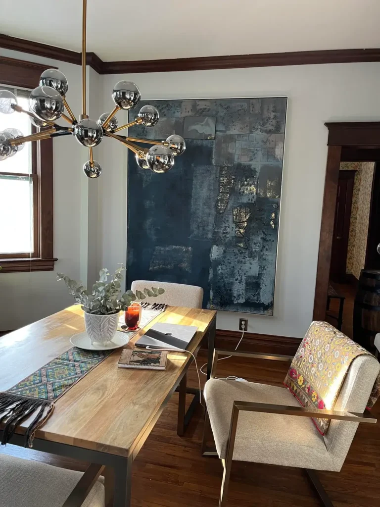
Here’s a question worth sitting with: what if the art is the furniture? This room leans hard into that idea, and it pays off.
r/cocofrankenstein hung an oversized navy and gold abstract canvas it measures nearly floor to ceiling directly behind the dining table.
The scale is deliberate. Large-format art on a dining room wall makes the wall disappear and replaces it with something worth looking at.
The canvas itself has a moody, layered quality with brushed gold details that catch light differently depending on the time of day.
The chandelier overhead is a multi-arm Sputnik style with chrome globe bulbs on brass arms. It’s the kind of fixture that functions as sculpture.
In a smaller room, a chandelier like this works particularly well because it draws the eye upward, making the ceiling feel farther away than it is.
The table is a solid wood trestle design with metal legs, keeping the footprint relatively compact. The chairs mix linen upholstery with a bold floral-backed armchair an intentional mismatch that adds personality without requiring a renovation.
The key insight here is that going big with art is often better than going small in a tight dining room. A single oversized piece reads as intentional and confident. Three small frames at the same location would feel indecisive and make the wall look shorter.
Dark Accent Wall with Live-Edge Wood and an Organic Mirror
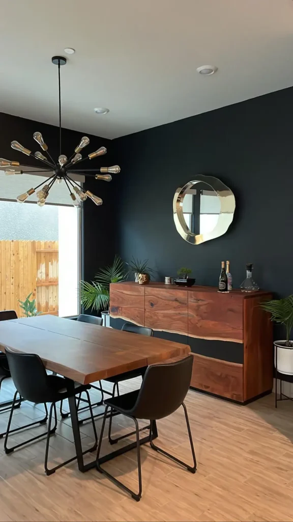
I was skeptical when I first started seeing dark accent walls in small rooms. It feels counterintuitive shouldn’t you be lightening things up? This setup changed my mind on that.
r/indecisivegirlie27 painted one wall in a deep charcoal black and used it as the anchor for the whole room.
Against that dark backdrop, the rich walnut live-edge dining table and matching live-edge sideboard look dramatically warm.
The wood grain reads as art in itself. Without the dark wall behind it, the same furniture would blend into a neutral background and lose that visual punch entirely.
The Sputnik chandelier here uses exposed Edison bulbs on black and brass arms a slightly more industrial version of the style in the previous room. It suits the moodier palette well.
The organic-shaped gold mirror above the sideboard is a perfect counterpoint: its irregular, wavy silhouette softens the straight lines of the credenza below it.
Tropical plants in the corners a palm and a bonsai on the sideboard keep the room from feeling too severe. They’re the relief valve that stops “moody” from tipping into “oppressive.”
The takeaway for small dining rooms: a single dark accent wall, done confidently, creates depth and drama that a white room simply cannot match. The key is to warm it up with wood tones and keep your greenery lush.
A Round Table and Woven Pendant in a Tiny Corner Nook
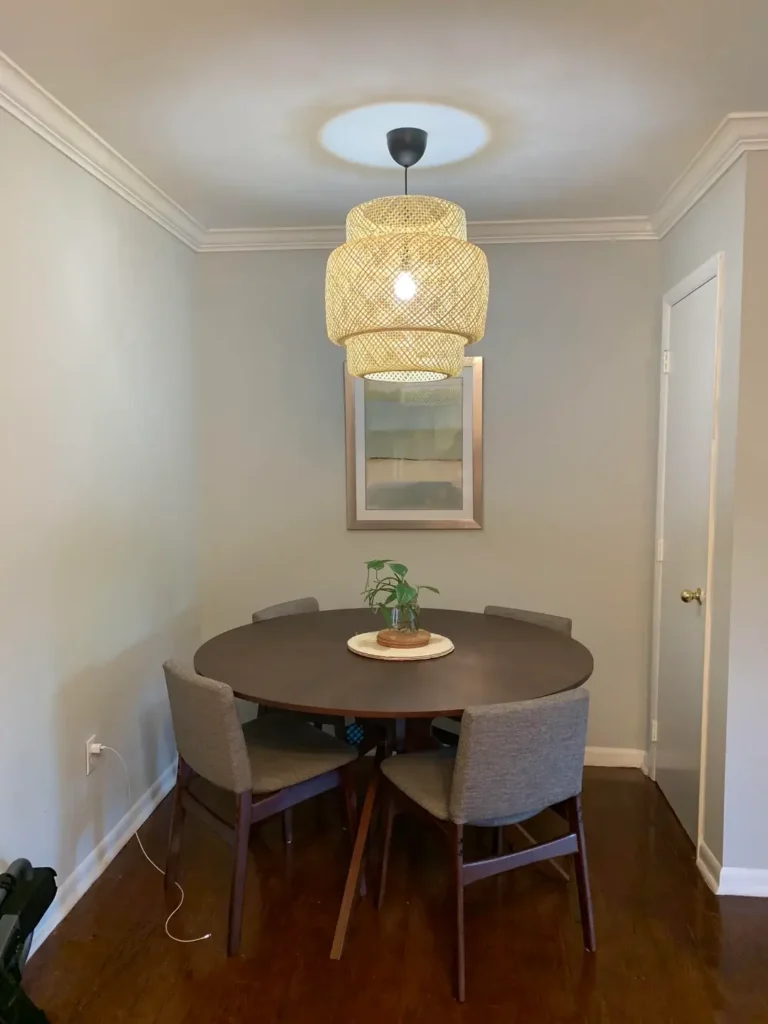
Round tables in small dining rooms are a well-worn piece of advice for a reason they genuinely work. But the pendant overhead is what makes this particular setup worth examining.
r/Arizona758 chose the IKEA Sinnerlig-style woven bamboo pendant, and it’s doing heavy lifting here. The layered drum shape adds texture and warmth that a metal or glass fixture wouldn’t deliver.
It filters the light softly, creating a glow that makes the corner feel intimate rather than cramped.
The table itself is a dark espresso-toned circle with mid-century style tapered legs in a purple-brown stained wood.
Four upholstered gray chairs fit neatly around it without one chair ever feeling like it’s pressed against the wall.
That’s the geometry advantage of round: every seat gets equal access, and there’s no “bad seat” at a round table.
The wall decor is minimal a single framed print in soft blue-green hangs centered between the pendant and the table, creating a vertical axis that gives the eye a clear path.
A small pothos-style plant on a wood stand in the center of the table is the only organic element, and it’s just enough.
What I appreciate about this setup is the restraint. The temptation in a nook like this is to layer in more. r/Arizona758 resisted that, and the room is better for it.
If you have a corner dining space, a round table under a textured pendant is one of the most reliable combinations in small dining room decor.
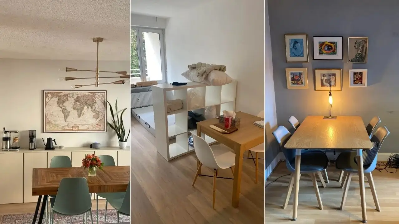
Studio Apartment Dining Zone Defined by a Bookshelf Room Divider
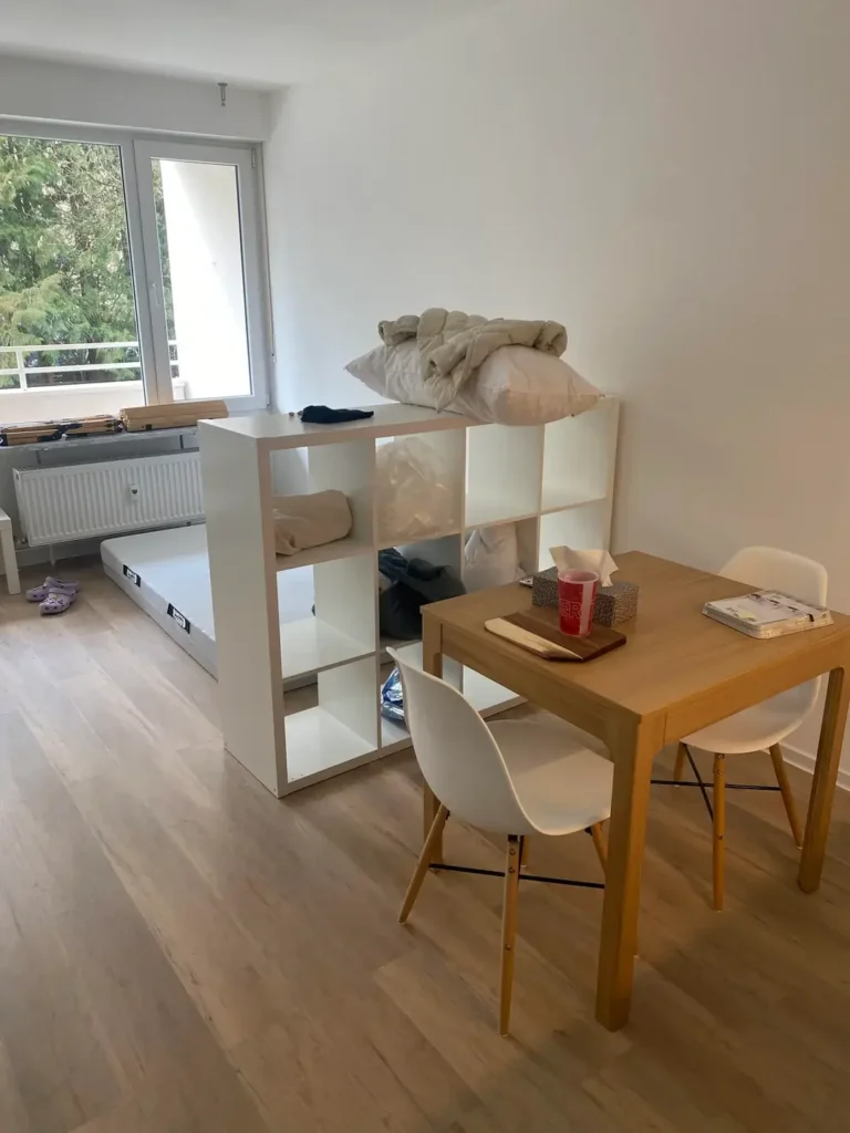
This one solves a problem a lot of people face but fewer are willing to address directly: the dining area that isn’t really a room at all.
r/nocturnalbird placed a white cube-style bookshelf a classic IKEA Kallax configuration perpendicular to the dining area to create a visual boundary between sleeping and eating zones.
The result is a dining “room” that exists without walls. The light oak dining table seats two comfortably, the white molded chairs keep the palette unified, and the large windows bring in enough natural light to prevent the space from feeling cut off.
This approach works because the divider provides psychological separation without blocking light or physically shrinking the space. You’re not building a wall you’re suggesting one. The human brain fills in the rest.
The furniture scale is right for the space. A two-person table in an open studio is the correct call. Anything larger and you lose the ability to move freely, which in a studio apartment matters more than anywhere else.
If you’re dealing with an open-plan situation where your dining area bleeds into another zone, a bookshelf divider is one of the most practical and reversible solutions available.
Style it thoughtfully add a few books, a small plant, a candle and it becomes decor rather than just a partition.
Warm Neutral Palette with a Fluted Oval Table as the Focal Point
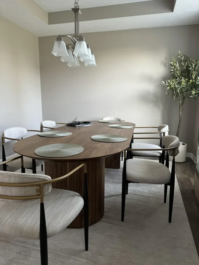
Warmth doesn’t require color. This room proves it.
r/Resident-Rub1119 built an entire dining space around an oval walnut-toned table with a fluted cylindrical pedestal base and that table does most of the heavy lifting aesthetically.
The fluted detail is a current design trend that adds visual texture without needing additional ornamentation.
The oval shape softens the room in the same way a round table would, but with more seating capacity.
The chairs are armchairs with a brass-and-black frame and oatmeal linen upholstery a combination that feels current and considered.
They’re slightly more formal than typical dining chairs, which elevates the room’s perceived quality noticeably.
The color palette is entirely within the warm greige family: the walls, the carpet, the chair fabric, and even the ceiling all stay within a few shades of each other. A tall faux olive tree in the corner adds the only vertical element and the only touch of organic color.
What strikes me about this room is how quiet it is. There’s no gallery wall, no shelves, no statement art. The furniture itself is the statement.
This is a useful lesson for small dining rooms: if you invest in one truly well-designed piece, you can keep everything else neutral and the room still feels complete.
Blue-Gray Gallery Wall with a Table Lamp Centerpiece
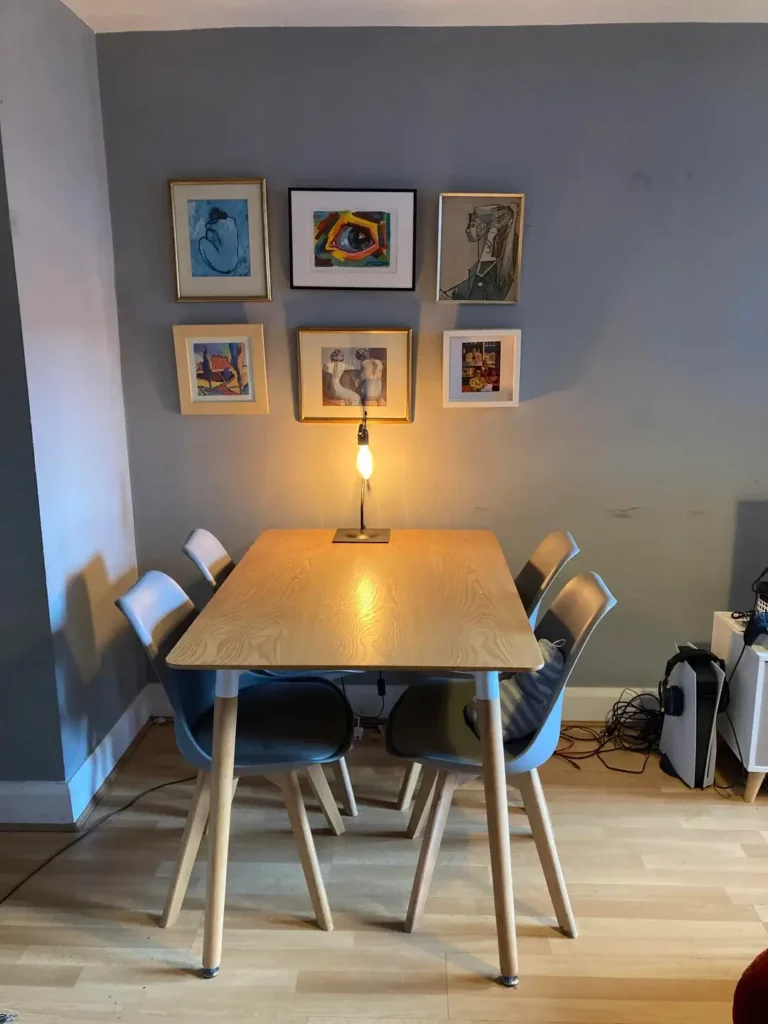
Most dining rooms put a pendant light over the table. This one put a lamp on the table instead, and the effect is worth discussing.
r/afemalegovernor placed a single Edison-style table lamp a slim black stand with an exposed vintage bulb — directly in the center of the light oak dining table.
At night, this creates a warm, candlelit atmosphere without the commitment of candles. It’s practical, adjustable, and far cheaper to swap out than a new chandelier.
The gallery wall behind the table is a 2×3 grid of six small framed art prints, mixing different frame finishes gold and black across abstract, figurative, and illustrative styles.
The grid format keeps the arrangement orderly on the slate-blue wall, which might otherwise feel plain.
What makes the grid work at this scale is the consistency of size across all six frames. When frame sizes match, you can mix content freely without the wall looking chaotic. The frames become a container for variety rather than a source of it.
The chairs are molded plastic in a dusty blue-gray tone on light beech wood legs they match the wall color almost exactly, which creates a cohesive, deliberate feel.
This is a small room trick worth borrowing: chairs that echo your wall color visually reduce the furniture footprint rather than adding to it.
Floor-to-Ceiling Gallery Wall on Deep Forest Green with Eclectic Collected Pieces
This is the most ambitious small dining room decor idea in this list, and honestly, it’s the one I keep coming back to.
r/kelsum painted the dining room wall in a deep forest green a shade that reads almost like a backdrop in a museum and then covered it in an eclectic floor-to-ceiling gallery arrangement.
The collection includes framed photography, botanical prints, abstract paintings, a woven wall hanging, a wicker plate, a textile quilt block, and dried branches arranged in a terracotta pot. No two elements are the same, and yet the whole wall coheres.
The secret is the wall color. Deep forest green creates unity across mismatched frames and styles the same way a dark mat in a frame unifies whatever sits inside it. Every piece looks intentional against that green because the green provides the organizing principle.
The dining table is solid dark wood with mismatched chairs one upholstered in gray linen, one with a striped throw and the surfaces are populated with terracotta pots, stacked books, and small ceramic objects. The room is busy, but it’s curated busy. There’s a difference.
Layered plants throughout hanging in wicker planters, standing in large pots near the window, clustered on a side table turn this into something close to a botanical dining room.
If this style appeals to you, commit fully. Half-measures on this particular look tend to produce clutter rather than character.
World Map Art and a Brass Sputnik Over a Parquet Dining Table
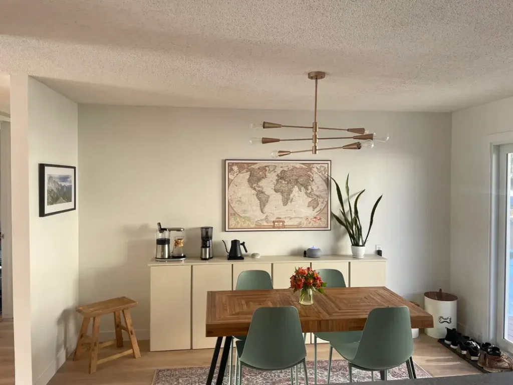
Personal interest reflected in wall art is an underused strategy in dining rooms. This setup uses it well.
r/ComprehensiveMud8812 hung a large framed world map the kind with a sepia-toned antique cartographic finish centered over a low cream-colored sideboard.
The effect is both personal and sophisticated. A world map works in a dining room because meals are inherently social, and social rooms benefit from conversation-starting focal points.
The sideboard below the map serves as a functional coffee and drinks station, complete with a Chemex brewer and electric kettle visible on the surface.
This is a smart move for small homes: give your dining room sideboard a job beyond holding decorative objects.
The dining table is a parquet-topped rectangle with a chevron-pattern wood surface and metal legs. The sage-green molded chairs around it are the kind that look current without being precious about it.
A brass Sputnik chandelier with exposed globe bulbs ties the warm tones of the wood and walls together.
A tall snake plant in the right corner brings the room up without taking floor space. A small wooden stool on the left adds casual seating and doubles as a side surface when needed.
The overall effect is warm, functional, and quietly confident which is exactly the energy a dining room should have.
Black Round Table with Industrial Console and Grid Mirror
The last example takes a slightly more formal approach to small dining room decor and executes it cleanly.
r/bwitt33 anchored the space with a matte black round pedestal dining table and matching cross-back chairs upholstered in cream fabric.
The contrast between black and cream is a reliable combination precisely because it’s so high-contrast it reads as intentional even in modest spaces.
Against the wall, a black iron console table with an X-frame base holds minimal decor: a cream vase with dried pampas, a small pumpkin, and a couple of stacked items.
Above it, a large arched grid mirror in black iron the kind with window-pane divisions reflects the room back and doubles the perceived depth of the space.
This is one of the most effective small dining room tricks available: a large mirror on the wall opposite or adjacent to a window will borrow light and make any room feel larger. The grid design in this case adds industrial character while keeping the reflection clear and useful.
A textured area rug in soft taupe anchors the table, and light sheer curtains on the window allow natural light to flood the space.
The result is composed and livable the kind of room that photographs well and functions even better.
Comparing These Small Dining Room Decor Styles at a Glance
| Style | Best For | Difficulty Level | Key Element |
|---|---|---|---|
| Sage green + plants | Cozy, lived-in spaces | Easy | Wall color + layered greenery |
| Oversized art + Sputnik | Making a design statement | Medium | Single large-format canvas |
| Dark accent wall + live-edge wood | Dramatic, moody character | Medium | Bold wall color + natural wood |
| Round table + woven pendant | Tight corner nooks | Easy | Furniture shape + pendant texture |
| Bookshelf room divider | Open-plan/studio apartments | Easy | Kallax-style shelf as zone boundary |
| Neutral palette + fluted table | Quiet, timeless elegance | Medium | Investment furniture piece |
| Gallery grid + table lamp | Budget-friendly personality | Easy | Matched-size frame grid |
| Floor-to-ceiling gallery + forest green | Maximalist, collected look | Advanced | Deep wall color as unifier |
| World map + parquet table | Personality-driven spaces | Medium | Meaningful focal art |
| Black round table + grid mirror | Modern, high-contrast style | Easy | Mirror to amplify light and space |
The Patterns That Show Up Across Every One of These Rooms
Looking across all ten examples, a few things come up repeatedly regardless of style. Lighting choice is almost never neutral every room that works has a pendant or lamp that contributes character, not just illumination.
Plants appear in nine out of ten setups, at varying scales, and they consistently add life that no decorative object can replicate.
And in every case, the homeowner made a clear choice about what the focal point would be art, furniture, a mirror, a wall color rather than trying to make everything equally important.
Small dining room decor isn’t about minimizing what you have. It’s about editing what you show. The rooms on this list don’t succeed because they’re sparse; they succeed because every element was placed with some degree of intention.
Pick one of these approaches that resonates with how you actually live, start with the anchor element the wall color, the table, the art and build outward from there. You’ll get further with that method than you will trying to recreate an entire room at once.
