Most bathroom renovations stall not because of budget or skill, but because people can’t picture what they actually want.
These eight real-world examples pulled from people who built their own showers fix that problem fast.
What makes this collection different is that none of these come from a showroom or a professional staging shoot.
These are bathrooms that real people tiled themselves, argued over grout colors for, and posted online with equal parts pride and exhaustion.
That’s exactly what makes them useful. You’ll find something here whether you’re working with a modest budget, a tight footprint, or a vision that your contractor keeps calling “ambitious.”
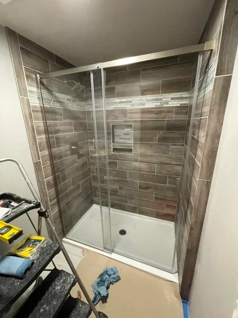
Large-Format Marble-Look Porcelain with a Mosaic Hexagon Floor
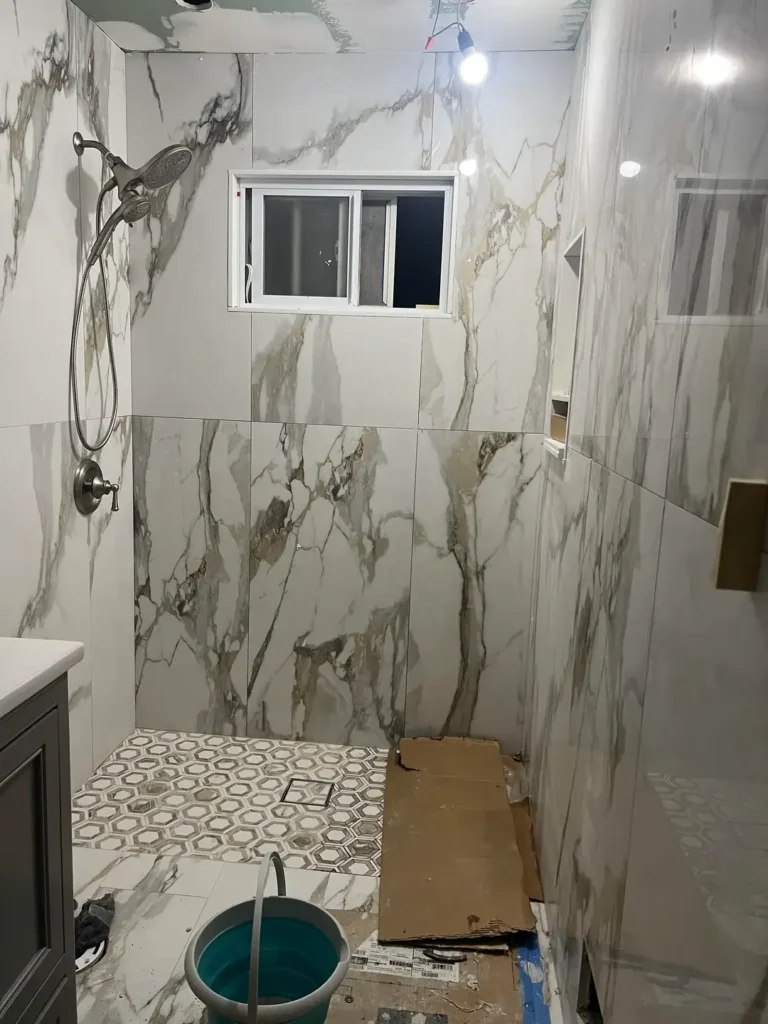
There’s a moment mid-renovation when everything looks terrible and you start wondering if you made a catastrophic mistake.
This shower was clearly in that phase when the photo was taken bucket on the floor, wires dangling, cardboard protecting the floor. And yet even mid-install, the design choice here reads loud and clear.
r/OwlAccomplished7925 chose large-format porcelain tiles with a bold Calacatta-style pattern featuring dramatic gold and gray veining on a white background.
The slabs are substantial, probably 24×48 inches or larger, which means fewer grout lines and a much more seamless, high-end look.
The contrast between those oversized wall tiles and the small hexagonal mosaic floor tiles is the real design move here.
The floor hexagons echo the gray tones from the wall veining, creating cohesion without being matchy-matchy.
What makes this pairing work is the scale contrast. Big statement walls, intricate floor they don’t compete because they operate at completely different visual frequencies.
The mosaic floor also provides the slip resistance you genuinely need in a shower, whereas large-format floor tiles can get dangerously slick.
If you want to replicate this look, shop for porcelain marble-look tiles rather than real marble. They’re more forgiving with moisture, easier to cut, and a fraction of the cost.
Pair them with a hexagon mosaic floor in a coordinating gray-and-white blend, and you’ll land in this same visual territory without the real-marble anxiety.
Dark Dramatic Porcelain with a Light Contrasting Floor
Some people play it safe with their shower tile. Then there are the people who go full storm cloud on the back wall and make no apologies for it.
r/zdayt installed large-format porcelain tiles in a deep charcoal and slate blue with swirling white veining the kind of pattern that looks like satellite imagery of a hurricane.
The back wall gets the full dramatic treatment with these dark slabs stacked vertically, while the floor and surrounding walls stay in a light, almost white porcelain.
The contrast is sharp and deliberate. It works because the back wall acts as a focal point, not a surrounding, so the space doesn’t feel closed in.
The frameless glass enclosure is doing important work here too. Anything but frameless glass would have cut the visual impact in half. The barely-there hardware in brushed nickel keeps things sleek without disappearing entirely.
There’s also a cat standing in the shower, apparently unimpressed with the renovation. Frankly, same energy most of us bring to reading grout color samples.
To pull off this look, commit to the contrast. Don’t try to match the floor tile to the wall tile the whole point is the collision between moody dark and clean light.
Use a light gray or near-white floor tile to keep the space from feeling heavy, and invest in a frameless glass door if at all possible.
Classic White Square Tile with a Decorative Glass Mosaic Border
Not every shower remodel needs to make a statement. Sometimes the goal is simply clean, timeless, and done right and this example nails that approach with admirable precision.
r/Shaydoh33 kept the walls in crisp white 4×4 square ceramic tiles, a format that has been reliably attractive for decades and will continue to be for decades more.
What lifts this out of the ordinary is the single horizontal band of mixed glass mosaic tile running at roughly shoulder height across all three walls.
The mosaic strip contains gray, black, and silver linear pieces that break up what could have been a monotonous expanse of white while adding texture and a thin line of visual interest.
The floor uses small white mosaic squares with hints of marble veining a safe but smart choice that adds grip and a subtle nod to natural stone.
The matte black fixtures and hardware tie the whole thing together, grounding the otherwise soft palette with some modern edge.
This is one of the most achievable looks in this entire list. The individual components are all affordable and widely available.
The execution keeping grout lines even, running the border level and continuous — is what determines whether it looks polished or amateur.
For a similar result, use bright white grout on the wall tiles and a slightly darker gray grout on the floor.
The contrast helps define the floor plane and prevents the whole shower from blurring into one undifferentiated white mass.
Keep your fixture finish consistent if you go matte black, commit to it everywhere.
Original 1940s Pink Ceramic Tile That Deserves a Second Look
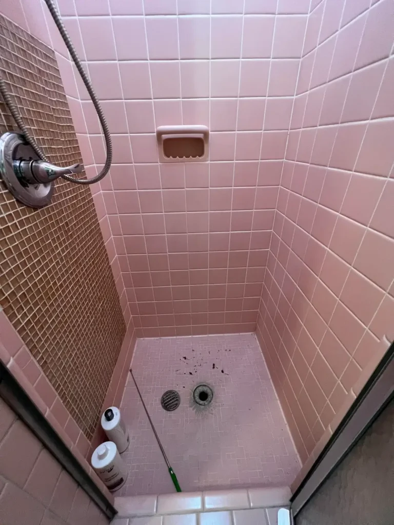
There is a subset of homeowners who inherited mid-century bathrooms and have spent years debating whether to gut them. This image makes a case for reconsidering.
r/ASHWOODandtheENEMY shared a photo of an intact 1940s or 1950s shower in the original dusty rose pink small square ceramic tiles covering every surface, walls and floor, in that distinctly vintage pastel that design culture spent thirty years mocking and is now slowly rehabilitating.
The built-in soap dish is original. The proportions are period-correct. Everything is intact, which is increasingly rare.
What strikes me about this photo is how well-executed the original installation was. These tiles are still flat, still tightly grouted (mostly), and structurally sound after 70-plus years.
Modern tile installations sometimes struggle to match that longevity. The pink reads less dated and more retro-cool when you approach it with that frame.
If you’re living with a bathroom like this and not ready to gut it, the most effective refresh involves re-grouting with a clean matching tone, deep cleaning or repainting the existing grout, and leaning into the vintage aesthetic rather than fighting it.
Pair the pink tile with aged brass or chrome fixtures, white linens, and some period-appropriate accessories, and the whole thing shifts from “dated” to “intentional.”
The harder truth: if the tile is in good condition, replacing it is expensive, wasteful, and not always an improvement. Sometimes the best bathroom shower tile idea is the one already on your wall.
Teal Glass Subway Tile with a Multicolor Mosaic Floor
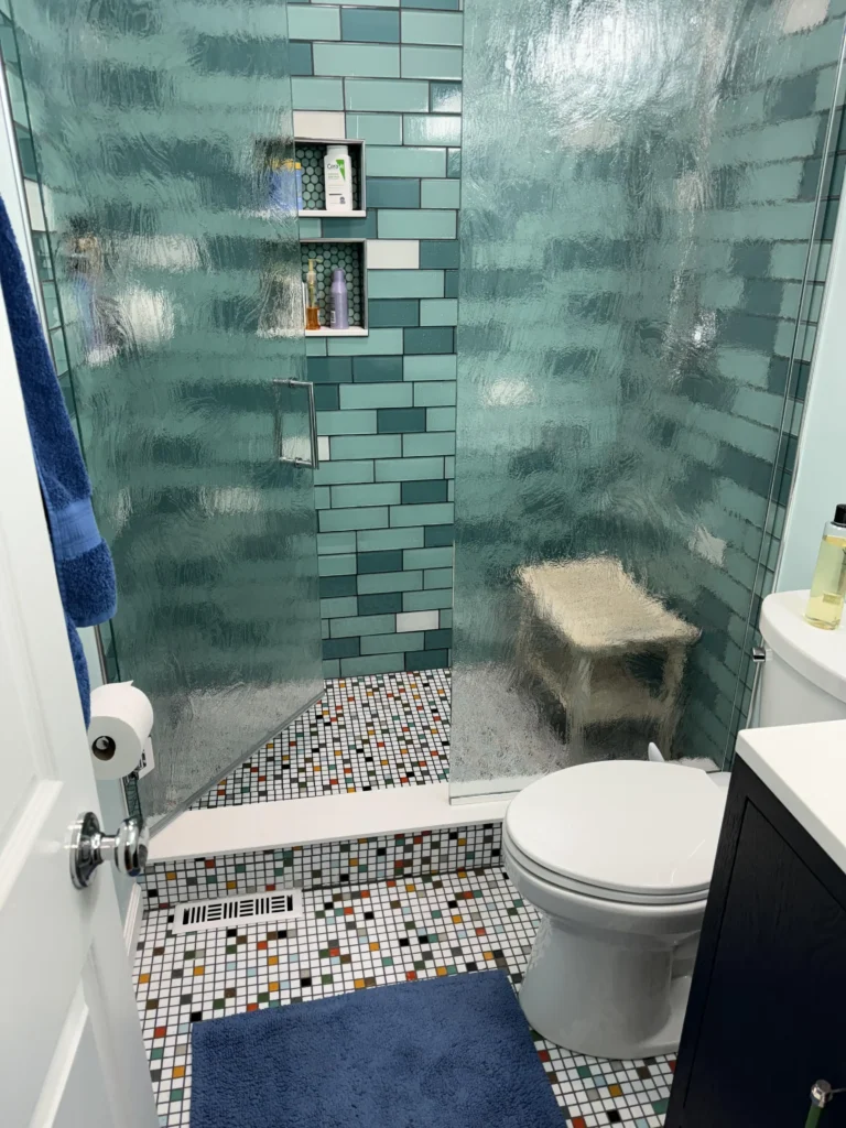
This one surprised me. I wasn’t expecting to respond as strongly as I did to a shower built almost entirely around a color I’d probably never choose myself.
r/Either-Judgment231 covered the shower walls floor-to-ceiling in teal glass subway tiles with a high gloss finish.
The reflective quality of the glass amplifies the color dramatically, bouncing light in ways that matte ceramic simply cannot.
A central niche column uses the same tiles stacked vertically rather than horizontally, creating a subtle directional shift that frames the built-in shelves.
The floor both inside the shower and throughout the bathroom uses a white mosaic base scattered with multicolored square tiles in teal, orange, black, red, and white. It looks like confetti, and it works because the energy of the floor matches the boldness of the walls.
The built-in teak shower bench visible through the glass adds warmth and grounds the whole composition. Without it, the space might read as too cool or clinical.
What this room demonstrates is that color commitment beats color caution. A single teal accent tile surrounded by white would feel tentative.
Going all-in on the teal makes a room that has a genuine point of view. The mosaic floor choice is the risky part it could have felt chaotic but the white base keeps it readable.
If you want to experiment with bold color in your shower tile, glass subway tile is a good vehicle. It reflects light rather than absorbing it, which keeps bold colors from feeling oppressive.
Go full coverage on at least one surface to avoid the “I almost went for it” look.
Concrete-Look Large-Format Tile with Hexagon Mosaic Floor
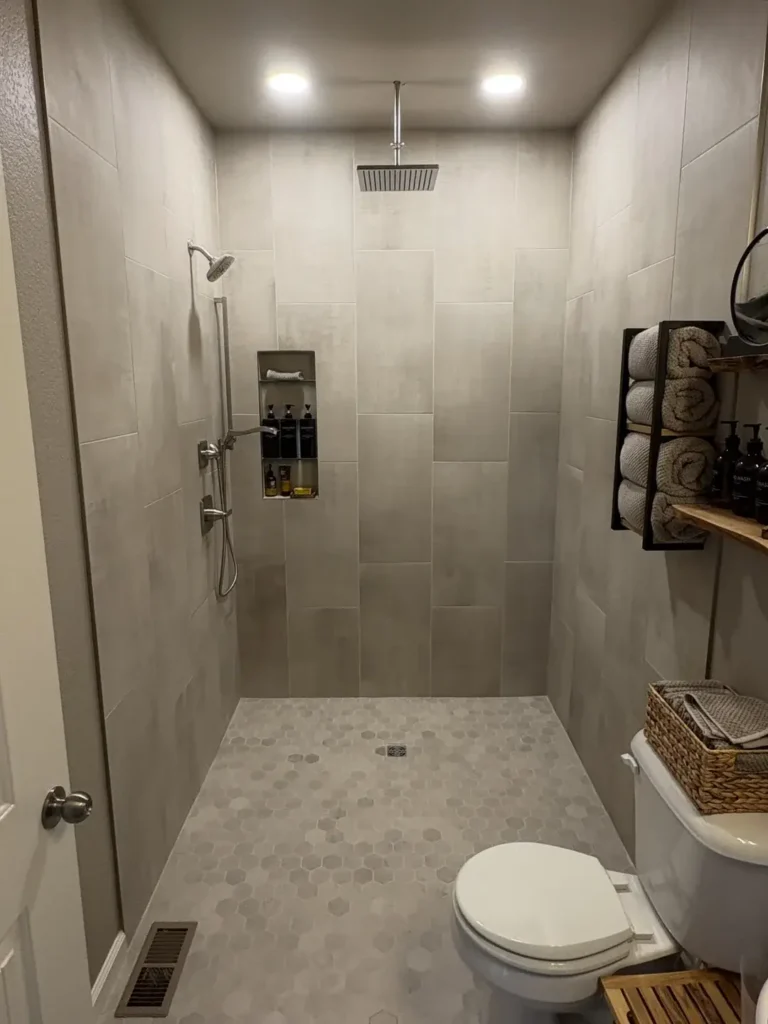
There’s a version of minimalism that feels cold and a version that feels calm. This shower lands firmly in the second category, and the difference comes down to texture and warmth in the material choices.
r/ktizzle420 used large vertical-format tiles in a warm light gray with a concrete or limestone-look finish slightly matte, slightly textured, with the subtle variation you get from natural stone mimics.
The tiles are tall and wide, probably 12×24 or larger, run vertically to draw the eye upward and make the ceiling feel higher.
The floor uses white and light gray hexagon mosaic tiles, which echo the soft gray palette while adding tactile interest underfoot.
The ceiling-mount rain shower head is a strong choice here. It fills the visual center of the space without requiring wall hardware that would interrupt the clean tile expanse.
The built-in niche keeps product storage flush with the wall, preserving the uncluttered aesthetic.
Outside the shower, the wood-and-metal shelving unit with rolled towels adds texture and organic warmth that the shower interior keeps deliberately restrained.
The whole room functions as a composition, with the shower serving as the quiet, meditative core.
To recreate this look, prioritize vertical tile orientation on the walls if your ceiling height allows it transforms a standard-sized shower into something that feels architecturally considered.
Keep the palette to two or three tones maximum, all within the same cool-warm neutral family.
Concrete-look porcelain is widely available in this format and significantly more durable than actual concrete in wet environments.
Gray Glass Subway Tile with Bold Pebble Coin Mosaic Floor
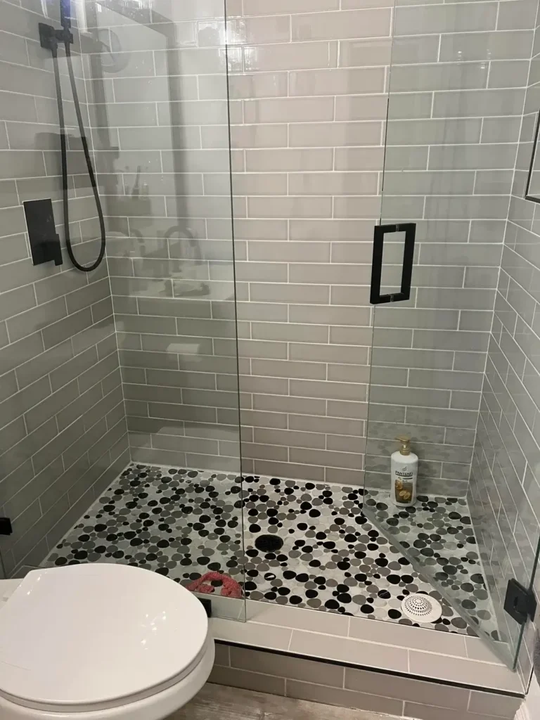
The wall tile here is clean and uncomplicated. The floor tile is the whole conversation.
r/kamy2019 tiled the shower walls in gray glass subway tile a familiar, broadly appealing choice that provides a calm backdrop without demanding attention.
The real decision was the floor: a pebble coin mosaic in varying sizes, mixing black, charcoal, and white circles in an almost random scatter pattern.
The contrast between the orderly horizontal subway tile walls and the organic, rounded floor mosaic is genuinely striking.
The matte black fixtures valve cover, handle, door pull anchor the gray palette with sharp definition.
What I appreciate about this combination is the honesty of it. The designer clearly had a strong vision for the floor and chose a wall tile that would let it breathe rather than compete.
Too many shower designs try to make every surface interesting simultaneously, which usually means no surface reads clearly.
The pebble coin mosaic also solves a functional problem: rounded mosaic tiles provide excellent traction and have enough grout surface area to stay secure on a wet slope.
They’re a genuinely practical choice wearing the costume of a design choice.
For a similar result, source your pebble coin mosaic first since it’s the focal point and then select your wall tile as a complement rather than a co-star.
Keep the wall grout color close to the tile color to maintain that seamless horizontal sweep, and consider matte black fixtures if your tile palette reads in the cool gray family.
Wood-Look Porcelain Tile with Glass Mosaic Accent Band
There’s something genuinely warm about wood-look tile in a shower, and this example demonstrates why the format has stayed popular even as design trends cycle aggressively around it.
r/WhiteCapApparel used medium-format rectangular porcelain tiles with a convincing dark wood grain texture the kind that photographs as actual wood until you notice how perfectly it’s holding up against the water.
The tiles run horizontally across all three walls, creating a plank-like visual rhythm that reads as natural and grounded.
A single horizontal band of mixed glass and stone mosaic tile breaks the pattern roughly two-thirds of the way up the wall, adding shimmer and a subtle change in scale.
The built-in niche uses a similar accent tile treatment, making it feel integrated rather than punched in.
The sliding frameless glass door keeps the installation looking current rather than dated wood-look tile can veer rustic if you’re not careful with the surrounding fixtures and hardware.
The sliding door mechanism in brushed nickel reads as contemporary, pulling the whole thing toward modern rather than cabin.
Wood-look porcelain is one of the better-kept secrets in bathroom shower tile ideas because it delivers warmth without the genuine maintenance concerns of actual wood or teak.
Porcelain is impervious to moisture, highly durable, and increasingly convincing in its grain simulation.
When installing wood-look tiles in a shower, pay close attention to the direction of the “grain” and how it flows around corners.
Consistent grain direction reinforces the illusion; inconsistency breaks it. Plan your layout on paper before you cut anything.
Quick Reference: Matching Tile Style to Your Bathroom
| Tile Style | Best For | Difficulty Level |
|---|---|---|
| Large-format marble-look porcelain | Master bath, high-end feel | Advanced |
| Dark dramatic porcelain accent wall | Spa-style or modern design | Intermediate |
| Classic white square + border | Any bathroom, timeless look | Easy |
| Original vintage ceramic | Preservation, retro aesthetic | Easy (refresh only) |
| Teal glass subway | Bold, eclectic spaces | Intermediate |
| Concrete-look large format | Minimalist, contemporary | Advanced |
| Gray subway + pebble coin floor | Modern with texture detail | Intermediate |
| Wood-look porcelain | Warm, transitional design | Intermediate |
The Most Important Thing Nobody Tells You Before You Tile
After looking at eight very different showers, one pattern stands out clearly: the ones that look best are the ones where someone made a decision and stuck with it.
The marble-look shower committed to drama. The teal glass shower committed to color. The concrete-look shower committed to restraint. None of them hedged.
The most common mistake in shower tile selection isn’t choosing the wrong tile it’s choosing a safe tile because you couldn’t commit to the interesting one.
You end up with something that’s not offensive and also not memorable, and you live with mild regret every time you take a shower.
What these real-world examples prove is that good bathroom shower tile ideas exist at every price point and skill level.
A $2-per-square-foot white ceramic tile can look sharp with the right grout, the right floor pairing, and a consistent fixture finish.
A complex large-format marble-look installation can fall flat if the surrounding decisions are timid.
Pick the idea from this list that made you pause the longest. That’s usually the right one.