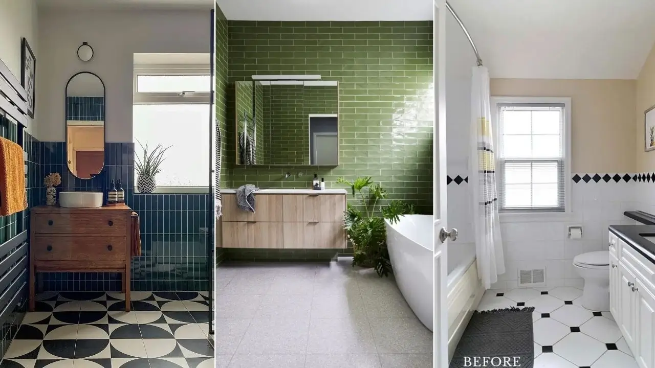
Most people play it safe with subway tile and then wonder why their bathroom looks exactly like everyone else’s.
The truth is that this tile format has far more range than the standard white-on-white setup suggests and these eight real bathrooms prove it.
I’ve pulled together examples that show genuinely different approaches, from classic renovations to bold color choices that take real commitment.
These aren’t staged showrooms. They’re real spaces that real people designed, which makes them far more useful as inspiration.
You can see the trade-offs, the specific choices that paid off, and what you can borrow for your own renovation.
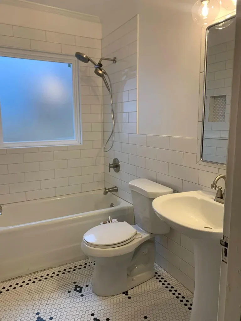
Classic White Subway Tile with a Penny Hex Floor That Earns Every Square Foot
Some combinations become timeless because they genuinely work, not because everyone just copies them.
This bathroom is a textbook example of white subway tile bathroom ideas done with enough restraint and detail to feel considered rather than generic.
r/Sea____Witch shared this renovation, and the first thing I noticed was the floor. White penny hex tile with a black dot pattern creates a subtle vintage feel without being costumey.
The tile runs floor to ceiling in the tub surround, which is a detail that separates thoughtful renovations from rushed ones stopping tile partway up a wall almost always looks like a budget decision rather than a design one.
What makes this work is the consistency of finishes. The brushed nickel showerhead, the simple medicine cabinet mirror, the globe pendant light, and the pedestal sink all speak the same quiet language. Nothing competes.
The built-in shower niche lined with small hex tile is a particularly smart touch it ties the walls and floor together visually.
If you want to pull off something similar, focus on your grout color before anything else. White tile with white grout reads clean and contemporary.
White tile with gray grout reads classic and slightly warmer. That single choice changes the entire personality of the room.
Also, don’t underestimate the pedestal sink it keeps the floor visible, which makes compact bathrooms feel larger than they are.
Dark Teal Subway Tile Run Vertically with a Vintage Dresser Vanity
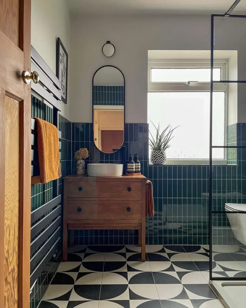
This one surprised me when I first saw it. Dark teal subway tile is bold enough on its own, but running it vertically instead of in the traditional horizontal brick pattern makes it feel like an entirely different material.
r/andrew_cherniy96 put together a bathroom that leans into eclecticism without losing coherence. The tiles a deep forest green teal glaze are stacked vertically across the lower half of the walls, with white painted plaster above.
An antique oak dresser converted into a vanity holds a round vessel sink, and a tall oval mirror with a black frame sits above it.
The floor is a bold black-and-white geometric pattern with large circular motifs that would feel overwhelming in a different context but anchors this room perfectly.
The vertical tile orientation draws the eye upward, which gives the ceiling more presence in what appears to be a mid-height room.
The warm amber of the hanging towel and the ochre tones in the wall art keep the dark tile from feeling cold or oppressive.
That’s a detail worth studying: dark tile needs warmth introduced through textiles and wood tones, or the room tips into feeling like a cave.
The half-tiled approach tile below, plaster above is practical and stylish. It protects the walls where water contact is likely while keeping the room lighter and less visually heavy than floor-to-ceiling dark tile would.
For anyone considering a similar setup, I’d suggest keeping the upper wall a true soft white or pale gray rather than a warm cream, which can clash with cooler tile tones.
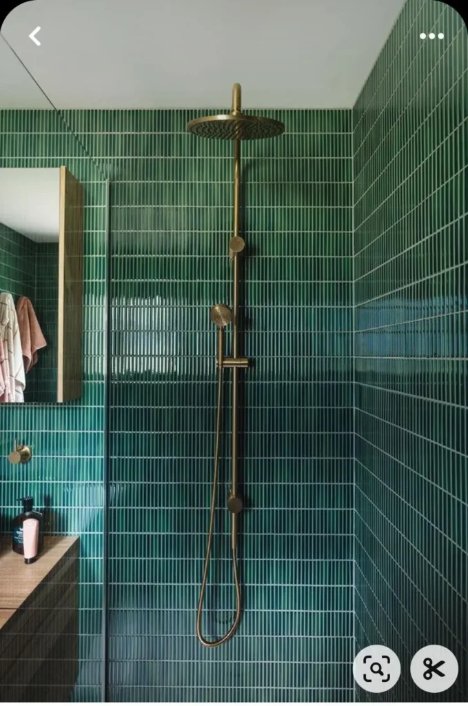
Jewel-Toned Emerald Green Vertical Subway Tile with Brass Fixtures
There’s a version of this look that goes wrong the tile too minty, the grout too chunky, the fixtures too silver and then there’s this version, which gets everything right.
r/Upset-Construction76 captured a shower that uses narrow, elongated emerald green subway tiles stacked in a vertical running bond pattern across every surface, including the floor.
The tiles appear to be roughly 1×4 inches, which gives the space far more grout lines than standard subway tile and that density of thin white grout lines against the glossy green creates a texture that photographs like fabric.
The brass fixtures are the critical decision here. Antique brass or unlacquered brass against deep green is one of those pairings that operates on a different level than chrome or matte black would.
It reads botanical, almost like you’re standing inside a greenhouse. The wooden bench at the shower’s edge provides practical contrast natural teak or similar hardwood against the dense tile gives your eye somewhere to rest.
What I find interesting about this approach is the commitment required. You can’t do emerald green tile halfway. The color only works when it’s used comprehensively walls, floor, corners.
A partial application would look like someone ran out of tile. If you’re considering this direction, go all in or choose a different color. The grout should stay bright white here; gray or colored grout would muddy the effect.
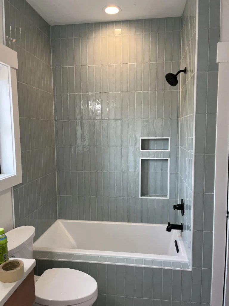
Pale Blue-Gray Subway Tile Installed Vertically in a Tub Surround with Matte Black Hardware
Here’s the thing about orientation: most people never think to run subway tile vertically, and then they see a bathroom like this one and immediately understand why it matters.
r/UnknownUsername113 renovated a standard tub-shower combo using pale blue-gray glossy subway tile, but oriented each tile vertically rather than in the familiar horizontal stagger.
The effect is significant. The wall reads taller, the color appears slightly more saturated because of how the glaze catches light differently, and the whole surround feels custom rather than contractor-grade.
The matte black showerhead and tub filler provide the contrast that makes the cool blue-gray tile pop. This is a pairing I’d actively recommend the flatness of the matte black against the glossy ceramic creates a tension that keeps the room feeling designed rather than assembled.
Two recessed niches, both lined with the same tile, handle storage cleanly without the visual interruption that metal shelving or corner caddies create.
One nuance worth noting: vertical tile installation requires more precise planning around cuts, especially at the ceiling line and the tub deck.
Your installer needs to work out the tile layout before a single piece goes up, or you’ll end up with slivers at the top or misaligned joints at the corners. Budget a bit more for labor if you go this route it’s worth it.
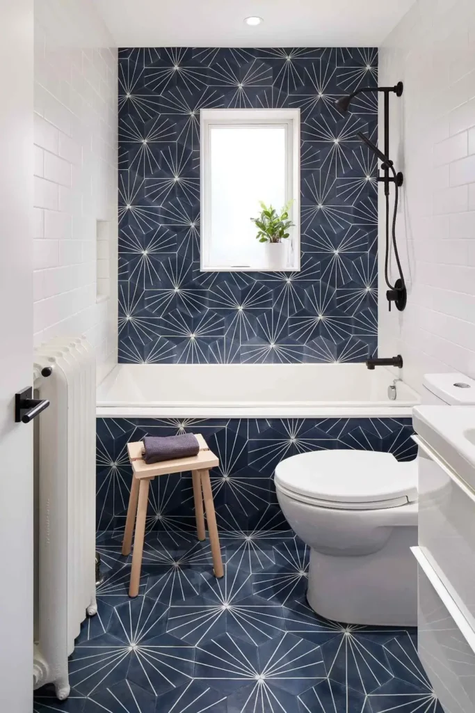
White Subway Tile Paired with Bold Navy Dandelion Pattern Tile for Maximum Contrast
This is what happens when someone treats their bathroom walls the way a designer treats a feature wall with intention and confidence.
r/StenPU used plain white subway tile on the side walls of a narrow bathroom, then covered the back wall and floor in large-format navy hexagonal tiles printed with a starburst or dandelion pattern in white.
The combination shouldn’t work as well as it does, but the logic holds: the subway tile acts as a visual reset, a neutral frame that gives the patterned tile room to breathe.
The navy and white pattern runs continuously from the back wall down to the floor, wrapping around the base of the bathtub. That continuity matters.
Stopping the pattern tile at the floor line or the tub ledge would have fragmented the design. Instead, it creates an immersive effect that makes a small bathroom feel deliberate and complete.
A small natural wood stool and matte black fixtures keep the accessories from competing with the tile.
This approach subway tile as a supporting player rather than the star is something I think gets overlooked in most subway tile bathroom ideas articles. White subway tile doesn’t have to carry the whole room.
Used as a background, it can amplify a more expressive tile choice. The key is keeping the grout on the subway tile white, so it reads as a continuous surface rather than a grid pattern that competes with the feature tile.
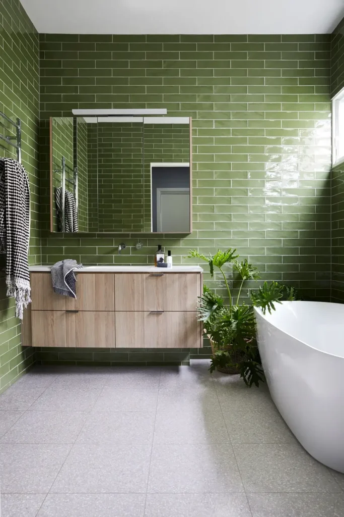
Full-Coverage Olive Green Subway Tile with a Freestanding Tub and Living Plants
Committing to color on all four walls of a bathroom is a different proposition than using a bold tile on one accent wall. This bathroom demonstrates what full commitment actually looks like and why it works.
r/ManiaforBeatles covered all four walls floor to ceiling in olive green glazed subway tile in a standard horizontal running bond pattern.
The glaze has slight variation across the tiles, which gives the walls texture and warmth that uniform factory-finished tile doesn’t.
A floating light oak vanity with a white countertop sits against one wall, and a freestanding white soaking tub occupies the corner.
The plants are doing serious design work here. A large monstera in a wicker basket beside the tub and a smaller philodendron on the vanity counter connect the wall color to something living and organic.
Without them, the room risks feeling like a tiled chamber. With them, it reads as a deliberate indoor garden aesthetic that feels genuinely calm rather than trendy.
The gray terrazzo floor tile grounds the composition without competing. That’s a smart choice a white floor would reflect too much light against the green walls and feel jarring, while a darker floor would make the room feel smaller. Mid-tone terrazzo reads natural and earthy, which suits the overall mood.
For anyone considering full-room colored subway tile, I’d suggest living with large paint swatches of your tile color on the walls for at least a week before ordering.
The color will read differently in morning light, evening light, and artificial light, and you want to be sure you can live with all three versions.
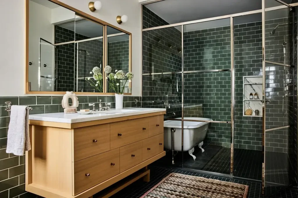
Forest Green Subway Tile with Brass Accents, Clawfoot Tub, and Steel-Frame Shower Enclosure
This bathroom takes a familiar material green subway tile and pairs it with a collection of fixtures that each belong to a different era, then somehow makes it feel cohesive.
r/ManiaforBeatles put together a space that combines dark forest green standard subway tile in a classic horizontal stack with a steel-frame glass shower enclosure, a clawfoot tub tucked behind it, a warm honey oak vanity with white marble countertop, and brass globe sconces. By rights, this should look like a prop room. Instead, it reads as deeply considered.
The key is the color. Dark forest green is neutral enough to carry multiple hardware finishes the chrome faucet on the vanity, the silver clawfoot tub hardware, and the brass sconces all coexist because the tile holds them together visually.
Green is one of the few colors with this property, which is probably why it keeps appearing in well-executed subway tile bathroom ideas.
The recessed marble niche inside the shower is a subtle upgrade worth noting. Matching a shower niche material to a different stone or tile than the surrounding walls creates a deliberate accent rather than an afterthought.
Here, white marble against dark green is an obvious but well-executed contrast. The woven rug in front of the vanity introduces pattern and warmth in a room that could otherwise read cold.
A Before Shot That Reminds You Why Subway Tile Renovations Are Worth the Effort
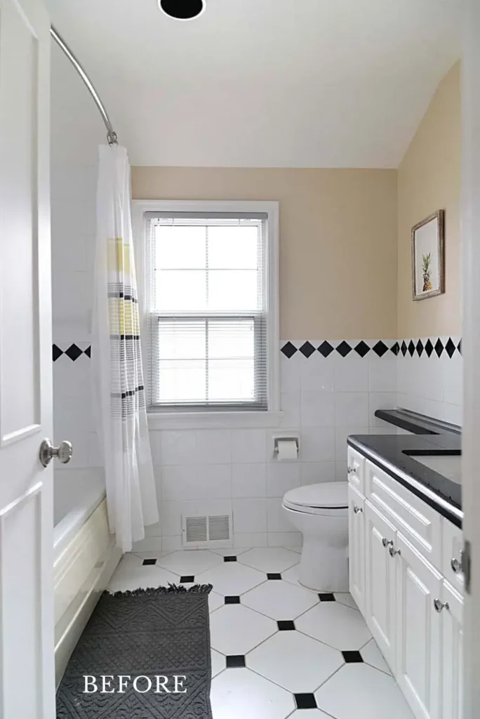
Sometimes the most useful image in a tile renovation article isn’t a polished after it’s an honest before.
r/ManiaforBeatles shared a bathroom in its pre-renovation state, and it captures something worth sitting with.
White square tiles on the floor in a large octagon pattern with small black diamond accents, white subway tile on the walls up to a chair rail height, a black diamond border tile running across the middle, and a beige painted upper wall.
The vanity has a black granite countertop. It’s not a disaster it’s just a bathroom that accumulated choices across decades without a unifying vision.
What this before tells you is that the bones are often fine. The white tile, the window, the basic layout none of it is wrong. What’s missing is a consistent point of view.
The black diamonds and the beige paint and the granite counter all make logical sense individually, and yet together they create something without conviction.
The lesson I take from before-and-after renovations like this: restraint and clarity of vision matter more than budget.
A bathroom full of one tile color, one hardware finish, and one accent material will almost always look more intentional than a bathroom with five moderately priced things that don’t quite agree with each other.
Subway tile is an ideal foundation for that clarity because it’s a background material its job is to support a point of view, not provide one.
How to Choose the Right Subway Tile Approach for Your Bathroom
After looking at eight distinct examples, a few patterns emerge that are worth organizing before you start planning your own renovation.
| Style Approach | Best Suited For | Difficulty Level | Key Decision |
|---|---|---|---|
| Classic white horizontal | Any bathroom, especially rentals or resale prep | Easy | Grout color — white vs. gray |
| Colored tile, all walls | Primary or ensuite with a clear design vision | Medium | Commit fully or not at all |
| Vertical orientation | Tub surrounds in shorter rooms | Medium | Requires precise layout planning |
| Half-tile with plaster above | Period homes, eclectic styles | Easy to Medium | Upper wall color matters |
| Dark tile with warm wood | Larger bathrooms with good natural light | Medium | Warm textile accents are essential |
| Feature wall contrast | Small bathrooms needing a focal point | Medium | Keep the subway tile grout white |
The table above reflects practical experience, not just aesthetic preference. Vertical installation genuinely does cost more in labor.
Full-room color genuinely does require more commitment than an accent wall. These aren’t warnings they’re just honest information so you can plan accordingly.
The One Thread Running Through Every Bathroom Here
Looking back across all eight subway tile bathroom ideas in this article, the common thread isn’t color or orientation or budget it’s decision-making.
The bathrooms that work are the ones where someone made a clear choice and then made every other choice in service of it. The ones that don’t quite land are the ones where decisions accumulated without a conversation.
Whether you’re drawn to the clean simplicity of white tile with penny hex floors, the drama of floor-to-ceiling emerald green with brass, or the bold contrast of dark navy feature tile with white subway side walls, the approach is the same: pick a point of view, then hold it.
Your grout color, your hardware finish, your vanity material all of it either supports your central choice or dilutes it.
What struck me most revisiting these eight examples is how different they are from one another while all using fundamentally the same material. Subway tile is a canvas, not a destination.
The bathroom you end up with depends almost entirely on what you decide to do with it. That’s both the challenge and the opportunity and honestly, it’s what makes renovations like these worth doing.
