Choosing bathroom tile is one of those decisions that haunts people long after the grout dries. Get it right and your bathroom feels like it was always meant to look that way.
Get it wrong and you’re staring at regret every morning for the next decade. The good news is that real people not designers with unlimited budgets have cracked some genuinely clever combinations, and I’ve collected twelve of the best examples to help you figure out what might work in your own space.
These aren’t staged showroom photos. They’re from real renovation projects shared online, which means you get to see how tile choices actually behave in lived-in homes, imperfections included. Each one represents a distinct approach worth understanding, not just admiring.
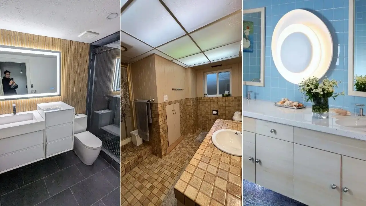
Large-Format Calacatta Marble-Look Porcelain from Floor to Ceiling
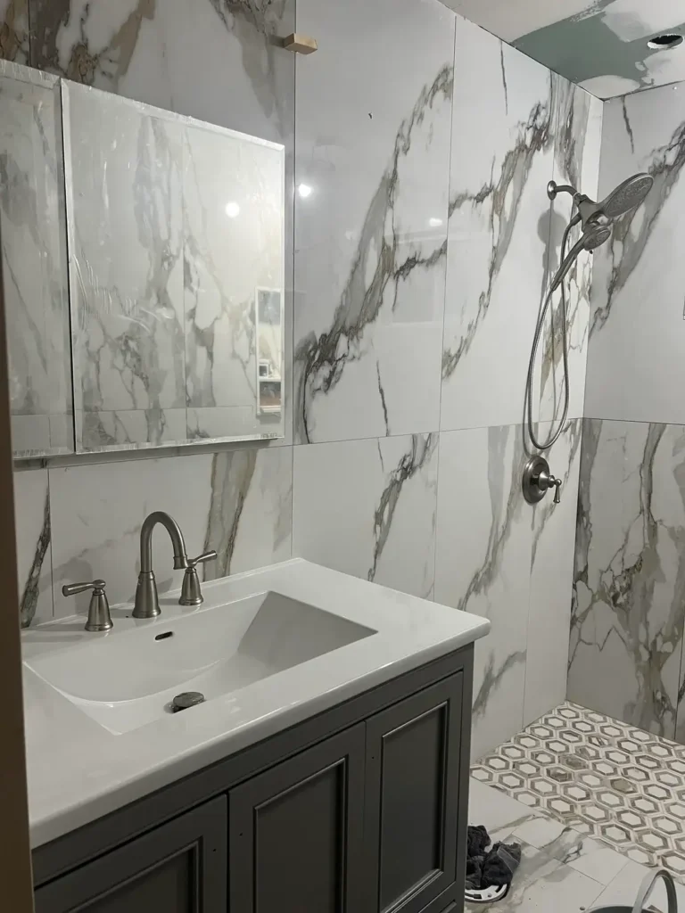
There’s a specific kind of confidence required to tile every wall surface in the same large-format slab, and this bathroom pulls it off without tipping into overwhelming territory.
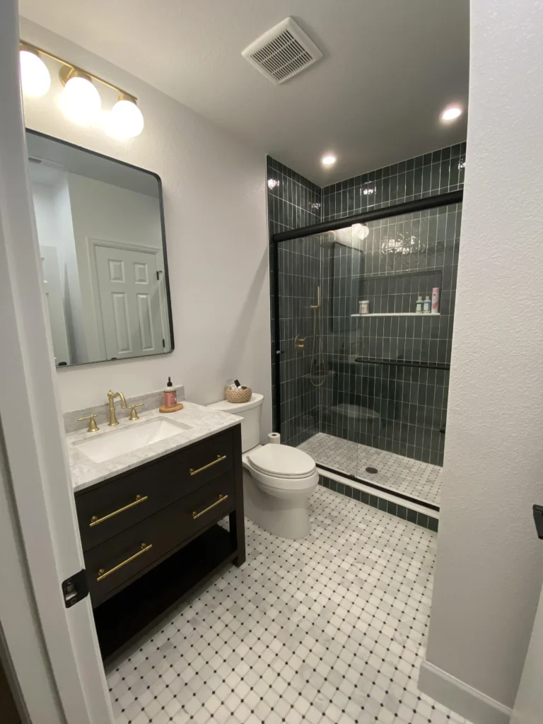
r/OwlAccomplished7925 shared this mid-renovation shot of a bathroom tiled entirely in large-format white porcelain with bold gray and gold veining a convincing Calacatta marble look.
The tiles run floor to ceiling on both the vanity wall and shower enclosure, with the continuity interrupted only by a transition to hexagonal mosaic tile on the shower floor.
That shift in scale and texture on the floor is doing a lot of work here. Without it, the room could read as a single monotonous surface.
What makes this approach succeed is the tile’s movement. Calacatta-style veining has directional energy the eye follows those dark streaks across the wall which prevents the space from feeling flat. The charcoal vanity cabinet and brushed nickel fixtures are deliberately neutral, keeping focus on the tile itself.
If you’re considering full-height large-format tile in a small bathroom, a few things matter significantly. First, minimize grout lines wherever possible thinner lines make the room feel more expansive.
Second, choose a tile with variation in the veining rather than a repetitive pattern, because repeated “book-match” veining becomes obvious fast.
Third, the hexagonal mosaic floor is a smart move you should steal: it adds grip, adds visual interest at the lowest surface, and gives the eye somewhere to land other than pure whiteness.
Porcelain in this style typically runs $4–$12 per square foot, far less than actual marble, and it cleans infinitely more easily.
Vintage Seafoam Green Subway Tile with a Lavender Paint Pairing
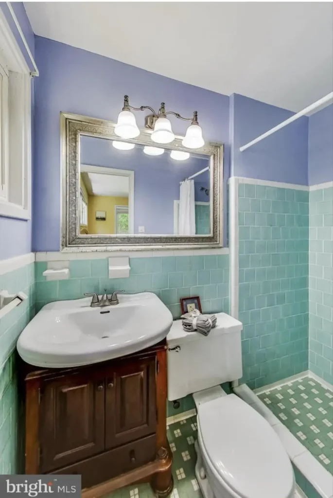
I was skeptical when I first saw this combination. Seafoam green tile plus periwinkle-blue painted walls sounds like it should be a disaster.
r/whishwashy posted this bathroom, and the pairing actually works because both colors share the same cool undertone.
The seafoam subway tile covers the lower half of the walls in a traditional horizontal stack pattern, capped with a thin white trim piece.
Above that, a dusty periwinkle paint finishes the upper walls. The floor features a small green-and-white checkerboard tile that ties the palette together.
The reason this reads as charming rather than chaotic comes down to saturation. Neither the tile nor the wall paint is vivid both are muted, slightly grayed versions of their colors.
High-saturation versions of the same combination would be visually exhausting. The warm walnut vanity cabinet anchors the space and prevents the room from floating into pure pastels.
For anyone living with existing colored tile from the 1950s or 60s, this is the lesson: don’t fight the tile, work with its undertone.
The most common mistake I see in these situations is choosing a neutral gray or beige paint that ends up clashing with the tile’s green or pink undertones.
Find a paint color that shares the same cool or warm quality as the tile, and the room starts to look intentional instead of inherited.
The ornate silver-framed mirror with a three-bulb vanity light is a nice touch it’s slightly mismatched with the tile era, which keeps the whole room from feeling like a museum exhibit.
Classic Black and White Octagon Floor Tile with a Clawfoot Tub
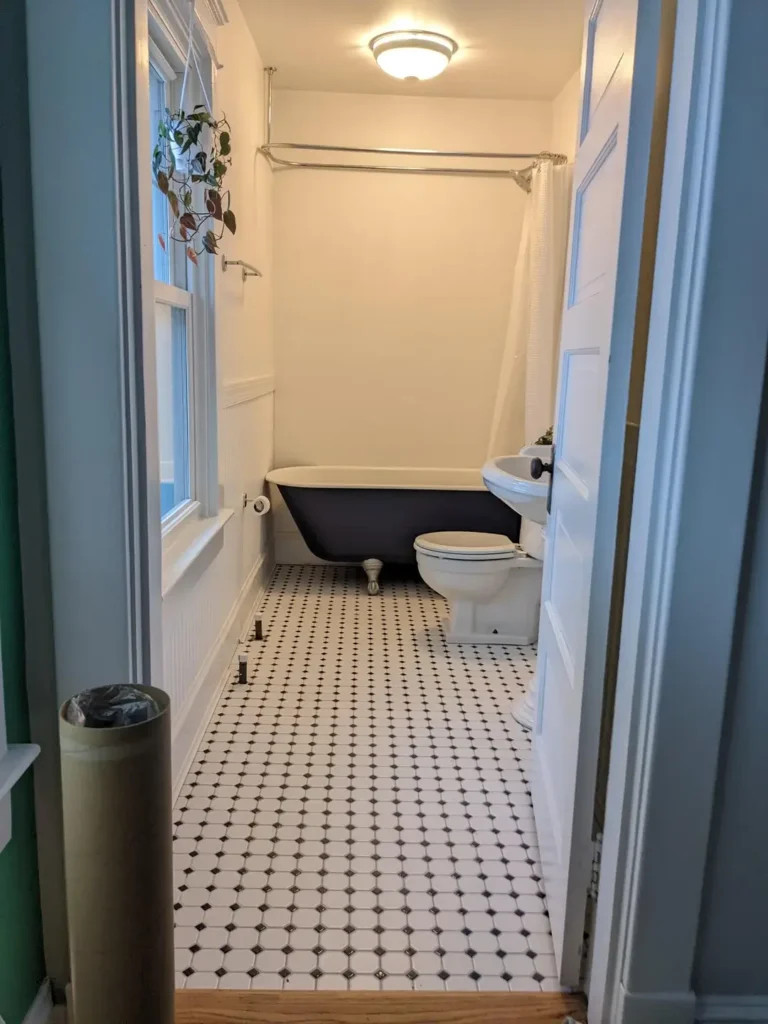
Some bathroom tile ideas have been working for over a hundred years, and there’s a reason for that.
r/tubawooba captured this long, narrow bathroom from what appears to be an older foursquare-style home, showing the original black-and-white octagon floor tile running the entire length of the space.
The white octagons are connected by small black dot accents a pattern often called “octagon and dot” and it reads as crisp and timeless against the white wainscoting. A navy clawfoot tub with nickel feet sits at the far end, commanding the space without competing with the floor.
This tile pattern thrives because of its geometric precision. The small scale of each tile means the pattern doesn’t overwhelm a narrow room; instead, it creates a sense of movement that actually makes the space feel longer. White walls and minimal decor above the wainscoting allow the floor to be the star without any competition.
What this bathroom demonstrates is the value of committing to a period-appropriate approach. The hanging pothos plant in the window and the pull-chain toilet are consistent with the home’s character.
Half-measures rarely work with historic tile if you have original octagon tile, restore it rather than tile over it. Restoration products for old ceramic tile have improved dramatically and can make worn grout look almost new.
For new installations, octagon-and-dot tile is widely available in both ceramic and porcelain, and it installs like any mosaic sheet tile.
The most important technical note: because the small tiles create many grout lines, use a grout color you genuinely like. Gray grout reads more casual; bright white grout reads more formal; dark charcoal grout reads more dramatic.
Forest Green Vertical Stack Tile in a Walk-In Shower
Dark tile in a small shower is one of those moves that people talk themselves out of, and this bathroom is a good argument for reconsidering.
r/Plumrose333 renovated this bathroom ceramic tile running floor to ceiling in the walk-in shower, laid in a vertical stack pattern rather than the traditional horizontal brick offset.
That vertical orientation is doing something specific: it elongates the perception of ceiling height. Combined with recessed LED lighting above the shower enclosure, the green looks almost luminous rather than dark.
The contrast work throughout this bathroom is thought through. A white octagon-and-dot floor (matching the classic pattern from the previous example) lightens the overall palette and prevents the dark shower from pulling the room down visually.
The vanity cabinet is black with brass pulls, the mirror frame is black, and the faucet is brass a combination that bridges the dark shower and light floor.
Brass fixtures against forest green tile have become a reliable pairing because of the way warm yellow-gold reads against cool dark green. It doesn’t match so much as it complements, which is what good fixture-to-tile pairing should do.
If you’re nervous about going this dark inside a shower, a useful approach is to use the dark tile only on the back wall and one side, keeping at least one wall lighter.
This creates a focal wall effect without enclosing the space entirely. That said, with proper recessed lighting and a clear glass door as shown here, a fully tiled dark shower is less claustrophobic than you’d expect.
Two-Tone Geometric Floor Tile with Marble-Look Shower Walls
This bathroom manages to run two distinct tile personalities in the same space without them fighting each other which is harder than it looks.
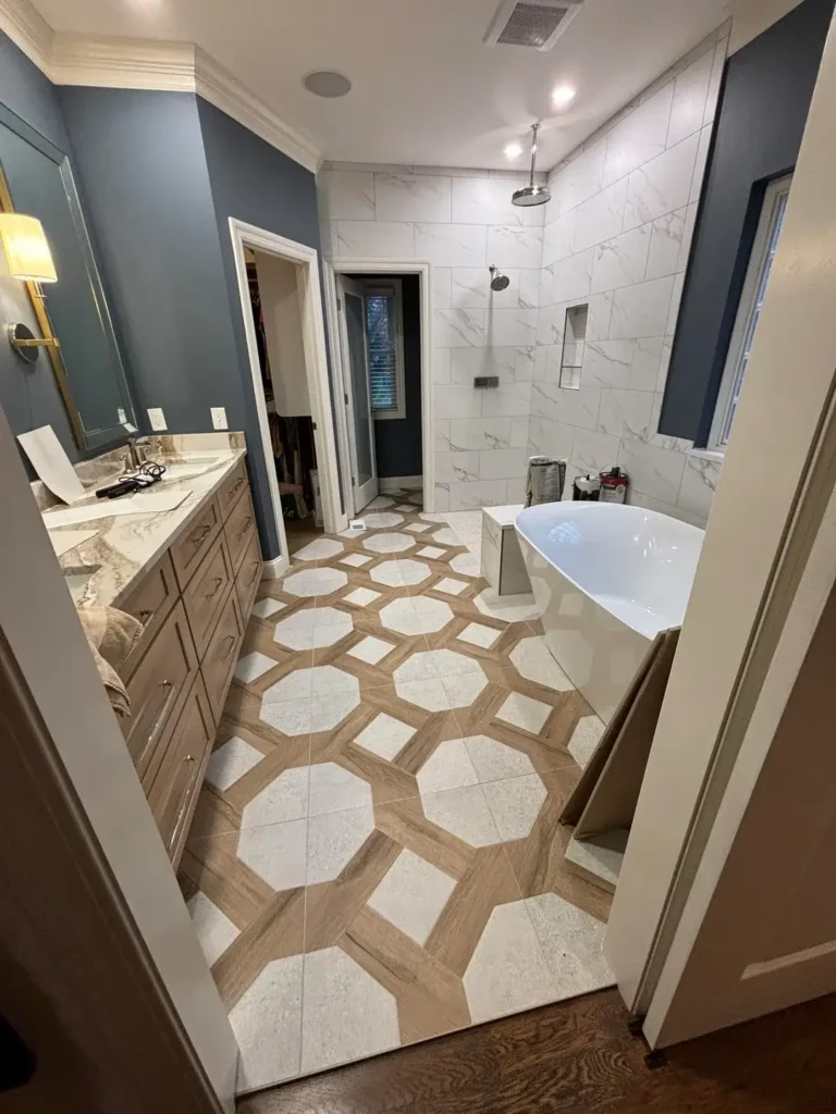
r/Aggressive_Jello_788 shared this master bathroom remodel featuring a bold geometric octagonal floor tile in cream and taupe, where octagonal stone-look pieces connect through wood-tone rectangular insets.
The pattern reads almost like a tortoiseshell or a Venetian geometric and carries significant visual weight. The shower and lower walls, by contrast, use large-format white marble-look porcelain in a simple grid pattern quiet, calm, and clean.
The key to making this dual-tile approach work is the shared palette. The wood-tone grids in the floor pull from the same warm beige family as the light oak veneer on the vanity.
The white octagonal pieces in the floor share the same cool white as the shower tile. Nothing is fighting because everything belongs to the same four-color family: white, warm beige, wood tone, and the slate blue walls.
What I find particularly well-executed is the placement of the freestanding white soaking tub. Positioned on the geometric floor but near the marble shower wall, it creates a visual bridge between the two tile zones.
A round chrome rain shower head hangs overhead, adding a note of refinement without additional visual complexity.
Geometric combination floors like this one are widely sold as coordinated systems, so you don’t have to source the octagonal pieces and inset pieces separately.
Companies like MSI and Emser Tile offer pre-packaged options. One practical note: geometric floors with multiple tile shapes require a skilled installer. The pattern needs to stay aligned across the full floor, and mistakes are difficult to correct after grouting.
Full-Coverage Brown Mosaic Tile: A Study in Period Kitsch
Not every bathroom tile idea in this collection is aspirational and that’s intentional, because understanding what went wrong is just as useful as admiring what worked.
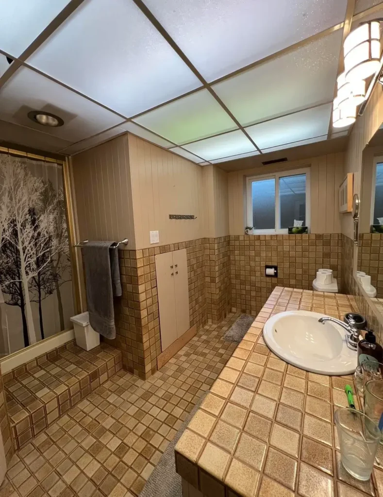
r/SuchSheepherder2730 posted this 1969-era bathroom that represents the full commitment to a single tile choice taken perhaps one surface too far. Brown mosaic square tiles approximately 2×2 inches, in a range of warm beige and brown tones cover the floor, the walls halfway up, the step-up platform, and the countertop surface.
Every horizontal and vertical surface shares the same tile. The wood-paneled walls above the tile line and the dropped fluorescent ceiling panel complete a remarkably complete time capsule.
This is what designers call a “total environment” a single material used so extensively that it creates an atmosphere rather than a surface treatment.
The issue isn’t that the tile is ugly, exactly. Warm brown mosaic tile, used selectively, could read as spa-adjacent. The problem is that covering even the countertop eliminates visual contrast entirely, making the space feel cave-like.
The lesson here applies to any tile renovation: identify one or two primary tile surfaces and keep other surfaces quieter. Floors and shower walls are natural tile zones.
Counter surfaces tiled in the same pattern as walls compress the visual volume of a room. If you’re modernizing a bathroom like this one, replacing the countertop tile with a solid quartz or porcelain slab surface while keeping the wall and floor tile creates immediate visual relief without a full gut renovation.
Sky Blue Square Tile Walls with Pebble Mosaic Floors
This bathroom was clearly designed by someone who understood how to layer two tile choices with completely different textures and scales.
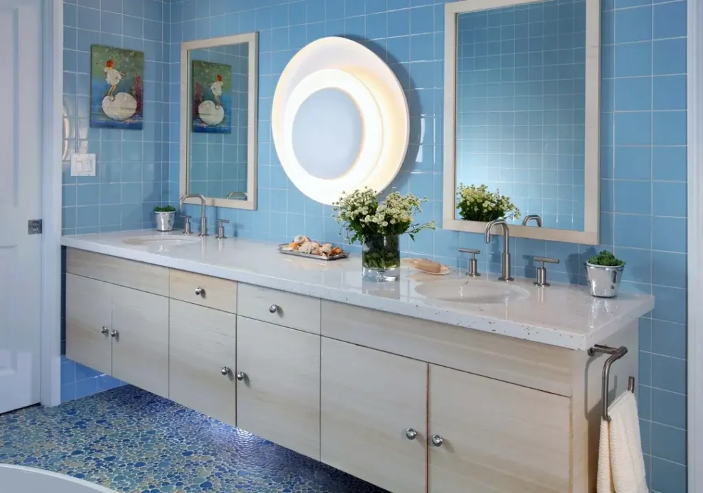
r/takaotashmoo shows what confident use of a single color across multiple tile formats can look like. Medium-format sky blue square tiles cover the walls from floor to ceiling in a simple grid pattern no offset, no diagonal, just even squares of glossy pale blue.
The floor, however, shifts to a pebble mosaic in varying blues and grays, with organic rounded shapes that create a beach-stone effect.
The tonal relationship between the wall tile and floor tile is close but not identical. The walls are a clear, slightly saturated blue; the floor pebbles include blues, grays, and greens, which prevents the room from reading as perfectly matched while still feeling cohesive.
A floating white double vanity with a white quartz counter grounds the room and provides a strong neutral anchor. The large circular backlit mirror above the center of the vanity is the lighting focal point round against a square tile grid creates a pleasing geometric contrast.
Two framed artworks in watery palettes on either side of the mirror show that art belongs in bathrooms. Bathrooms are often the last room people think about when decorating, but a single well-chosen piece of art elevates the whole space.
For anyone who loves this look, glossy square ceramic wall tile in this size (roughly 4×4 inches) is among the most affordable tile options on the market.
The pebble floor mosaic is the more expensive element, but it can be limited to a shower floor rather than the full bathroom floor if budget is a concern.
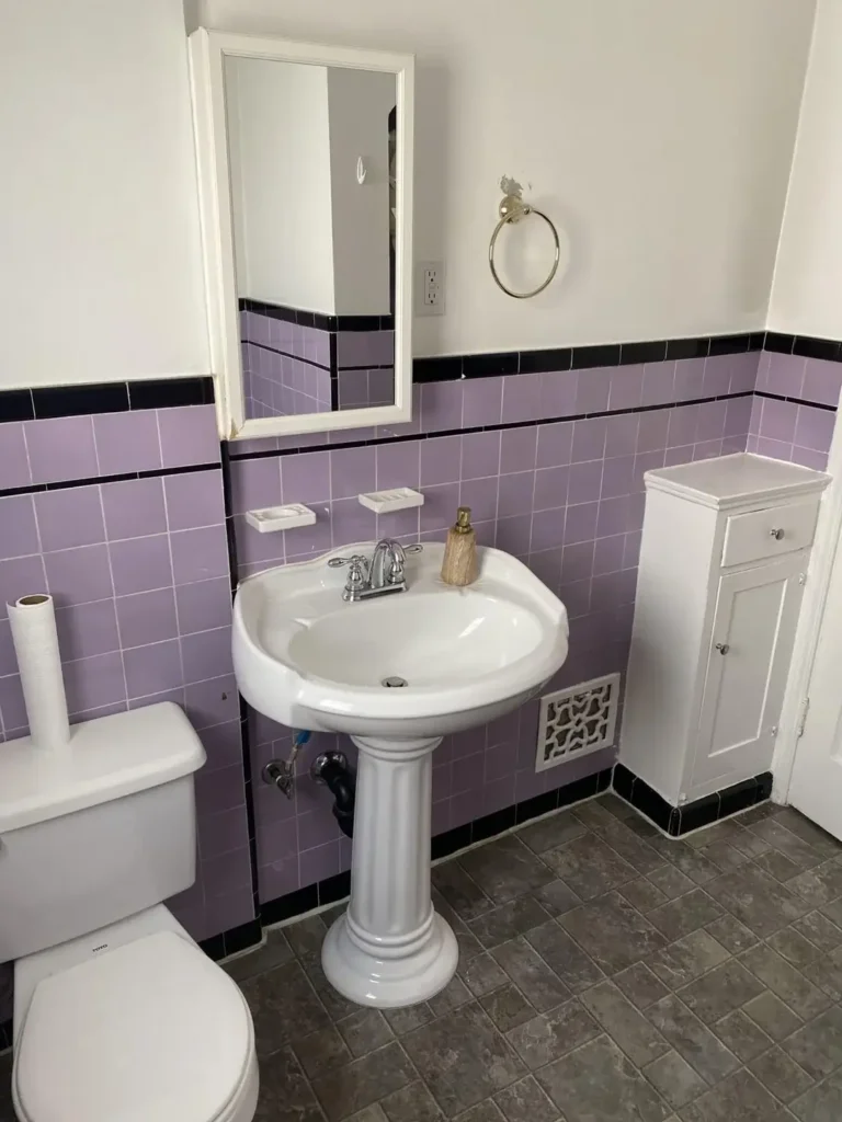
Lavender and Black Half-Wall Tile: Retro Done Right (or Left to Chance)
Retro tile colors from the 1950s are having a cultural moment, and this bathroom is ground zero for the conversation.
r/friendswithgonzo posted this bathroom featuring dusty lavender square tiles covering the lower half of the walls, finished at the top with a horizontal band of black trim tile and a second band of black just below that. Above the tile line, plain white paint finishes the walls.
The combination is unmistakably mid-century lavender was one of the fashionable bathroom colors of the Eisenhower era, alongside seafoam green and baby pink.
What’s interesting here is that the space is in a transitional state. The gray stone-look floor tile is clearly a later addition that doesn’t quite align with the lavender tile’s period.
A pedestal sink in white maintains neutrality, and the small white medicine cabinet is similarly neutral. The result is a bathroom that hasn’t fully committed to either vintage authenticity or modernization.
That’s actually useful information: half-finished period bathrooms often look more awkward than either a full restoration or a complete contemporary renovation.
If you inherit lavender tile like this, the choices are to restore the period character (find vintage-style fixtures, replace the floor with a period-appropriate tile like black-and-white squares) or to modernize everything except the wall tile.
Updating just the floor and fixtures while painting the walls a complementary color tends to look more intentional than mixing eras randomly.
The black trim band at the tile cap is a detail worth noting it creates a clean termination line and prevents the lavender from simply stopping awkwardly. Similar trim solutions are available in modern renovation tile lines and can be retrofitted.
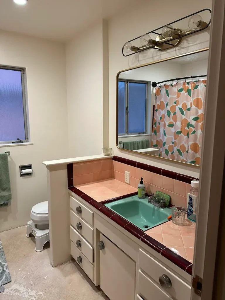
Pink Tile Countertop and Backsplash with a Teal Sink
This bathroom made me stop scrolling, and not for the wrong reasons.
r/HomeDecorating documented a space that is genuinely, defiantly retro: a diagonal-laid pink ceramic tile countertop with dark burgundy trim tiles forming the border, a built-in teal ceramic sink, and a simple beige tile floor.
The counter-mounted tile backsplash continues the pink above the sink area, while the surrounding walls are plain white.
A large gold-framed mirror and a brass globe-bulb vanity light are clearly new additions to an otherwise original 1960s or 70s bathroom.
The color combination pink, teal, burgundy should not work by contemporary neutral-palette standards, and yet it does because these are the colors this bathroom was born with.
The new mirror and light fixture are the only updates visible, and they were chosen with an appreciation for the bathroom’s character rather than against it.
This bathroom illustrates something that gets lost in renovation discussions: originality has value. A bathroom with intact period tile, fixtures, and colors is increasingly rare.
The market for vintage-authentic bathrooms is real, and the cost of genuine 1960s tile work if found intact is often impossible to reproduce at reasonable expense.
Before gutting a colored tile bathroom, consider whether the room might be worth working with rather than against.
The new vanity light in a warm brass tone is a masterclass in period-adjacent updating. It doesn’t match the exact era but shares the same design sensibility, which is the best outcome when adding new fixtures to an old bathroom.
Dark Slate Floor Tile with Wood Slat Accent Wall
Mixing tile and non-tile materials in a bathroom is genuinely tricky, and this renovation handles it with notable confidence.
r/DecentCity completed a full bathroom renovation using large-format dark charcoal slate-look floor tile throughout, including inside the walk-in shower (paired with small black penny tile on the shower floor for texture and slip resistance).
Behind the floating white vanity, a full-height wood slat accent wall vertical planks in a warm natural oak tone provides warmth that prevents the dark tile from reading as cold or industrial.
The large backlit rectangular mirror picks up the LED glow and floods the vanity area with diffused warm light, which works against the dark tile to keep the space from feeling dim.
The floating white vanity with an integrated rectangular sink is strictly contemporary in its profile clean lines, no hardware, matte white finish.
What makes this combination succeed is the temperature balance. Dark slate tile is cool in undertone. The warm oak wood slats push back against that coolness and create a sauna-adjacent atmosphere that feels intentional rather than accidental. If the walls behind the vanity were simply painted white or gray, the room would feel colder and more sterile.
For practical purposes, large-format dark floor tile shows water spots and soap scum more readily than lighter options.
Matte or textured dark tile hides this better than polished. The slate-look porcelain used here appears to have a slightly textured surface, which is the right call for a wet environment.
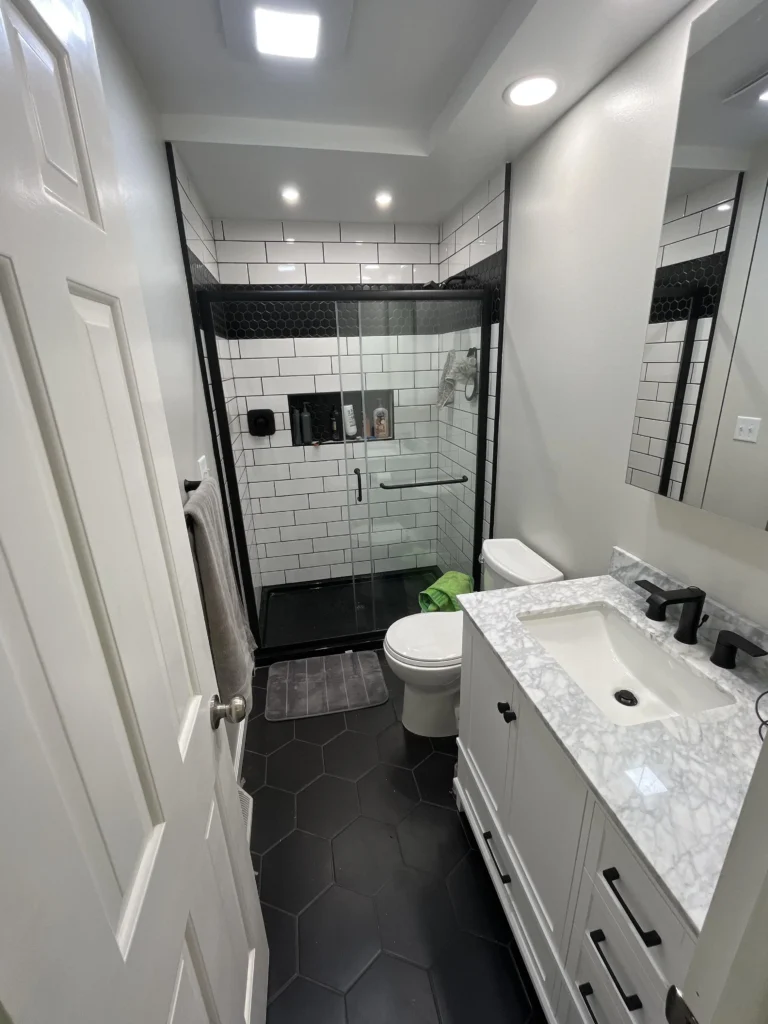
White Subway Tile with Black Hexagon Floor: The Reliable Combination
Some tile combinations achieve their status through sheer repetition of success, and this is one of them.
r/mutad0r renovated a small, narrow bathroom using classic white subway tile throughout the shower, with black grout lines that define each tile crisply.
The floor uses large-format black hexagon tile a generous six-inch-or-larger hexagon which carries the high-contrast black-and-white palette down to the ground plane. The white vanity cabinet with matte black hardware and a marble-look counter completes the scheme.
This combination has become so reliable because of how it handles scale variation. Rectangular subway tile on vertical surfaces and hexagonal tile on horizontal surfaces create two different geometric personalities within the same color palette.
The visual interest comes from the shape contrast, not the color contrast a useful lesson for anyone who wants a dynamic bathroom without taking color risks.
The matte black hardware on the vanity, the matte black shower frame, and the matte black faucet are all consistent, which is important.
Mixing hardware finishes some brushed nickel here, some matte black there is where many renovations lose their visual coherence. Pick a hardware finish and commit to it across every fixture and fitting in the room.
What I appreciate about this particular execution is the scale of the hexagon floor tile. Larger hexagons (in the 6- to 8-inch range) feel more contemporary; smaller hexagons (1 to 2 inches) feel more traditional.
This bathroom is clearly going for a contemporary edge despite the classic color palette, and the large hexagon accomplishes that.
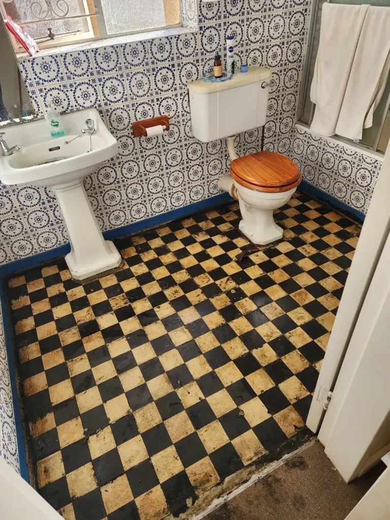
Blue-and-White Delft-Style Wall Tile with Worn Checkerboard Floor
The final bathroom in this collection is a reminder that tile tells stories and that some stories are worth preserving even when they’re imperfect.
r/emkie documented a bathroom that appears to be mid-renovation or in need of renovation, featuring walls covered in intricate blue-and-white Delft-style patterned tile.
The tiles carry a traditional floral medallion motif in cobalt blue on white, running floor to ceiling. The floor, by contrast, is a worn black-and-cream checkerboard not in pristine condition, but clearly original and historically interesting.
The contrast between the ornate wall tile and the simple checkerboard floor is a classic Victorian or Edwardian combination, and it represents a design intelligence that predates our current obsession with matching everything.
The wall tile provides the visual complexity; the floor tile provides the geometric anchor. A white pedestal sink and a high-tank toilet with a wooden seat continue the period character.
The charm of this bathroom is also its challenge: the floor tile is worn enough to warrant replacement, but finding a checkerboard replacement that respects the room’s character requires care.
Standard modern checkerboard is available, but period-appropriate options with smaller scale tiles and the right glaze quality are harder to source and more expensive.
Cement tile companies like Cement Tile Shop and Clé Tile produce reproductions that can match the scale and feel of original Victorian floors.
For anyone drawn to patterned wall tile like the Delft-style shown here, the key design rule is to use it in full rooms or not at all. A single accent wall of busy patterned tile fights with plain surfaces around it.
Full room coverage, as shown here, creates an envelope effect where the pattern becomes the environment and the result is far more successful than the timid half-measure.
Quick Reference: Choosing the Right Bathroom Tile Approach
| Tile Style | Best For | Difficulty | Budget Range (per sq ft) |
|---|---|---|---|
| Large-format marble-look porcelain | Master bathrooms, high-impact renovation | Medium–Advanced | $4–$12 |
| Classic octagon-and-dot floor | Period homes, vintage character | Medium | $3–$8 |
| Subway tile (white + dark grout) | Any bathroom, timeless results | Easy | $1–$5 |
| Patterned Delft/encaustic wall tile | Full-room commitment, high character | Advanced | $8–$25 |
| Dark large-format floor tile | Contemporary renovations, spa feel | Medium | $3–$10 |
| Colored retro tile (pink, seafoam, lavender) | Period restoration, maximalist spaces | Easy–Medium | $2–$6 |
What the Best Bathroom Tile Ideas Share
Looking across all twelve of these bathrooms, the ones that feel most considered share a few consistent qualities that have nothing to do with budget.
They commit. The bathrooms that feel unresolved are the ones that started a design direction and then hedged. Full-height tile versus half-height tile versus no tile each can work, but switching between them awkwardly is where things go sideways.
The most successful rooms in this collection, from the marble-look panels to the Delft-tile enclosure, made a choice and followed through.
They respect scale. The relationship between tile size and room size matters more than most people realize. Large tiles in small rooms can work beautifully (as the marble example proves) but require careful execution with minimal grout lines.
Small mosaic tiles in large rooms can feel busy and dated unless the pattern is compelling enough to carry that scale.
Thinking about how a tile sample will translate across an entire floor or wall surface not just how it looks as a 4×4 inch piece in your hand is the most important mental shift you can make when shopping.
They pay attention to grout. Grout color is a tile choice, not an afterthought. The black grout in the subway tile bathroom defines every tile edge and creates a graphic, precise look.
White grout on the same tile would read entirely differently softer, more traditional. Spend as much time choosing your grout color as you do choosing the tile itself.